Buyer Fit Snapshot
| Best fit | Counter Display Boxes Branding projects where brand print, material claims, artwork control, MOQ, and repeat-order consistency need to be specified before quoting. |
|---|---|
| Quote inputs | Share finished size, material target, print colors, finish, packing count, annual reorder estimate, ship-to region, and any compliance wording. |
| Proofing check | Approve dieline scale, logo placement, barcode or warning zones, color tolerance, closure strength, and carton packing before bulk production. |
| Main risk | Vague material claims, crowded artwork, missing packing details, or unclear freight terms can make a low unit price expensive after revisions. |
Fast answer: Counter Display Boxes Branding: Board, Finish, Dieline, and Unit Cost should be specified like a repeatable production item. The safest quote records material, print method, finish, artwork proof, packing count, and reorder notes in one written spec.
Production checks before approval
Compare the actual filled-product size with the drawing, then confirm tolerance on folds, seals, hang holes, label areas, and retail display edges. Reserve space for logos, QR codes, warning copy, and material claims before decorative graphics fill the panel.
Quote comparison points
Review material grade, print process, finish, sampling route, tooling charges, carton quantity, and freight assumptions side by side. A quote is only useful when the supplier can repeat the same color, closure quality, and packing count on the next order.
Counter Display Boxes branding has one job: get noticed fast enough to move product before a shopper drifts off. That sounds simple until you stand in front of a real counter. Small footprint. Too much clutter. Maybe three seconds of attention, if the line is slow. Good packaging does more than hold product. It gives the brand a face, supports the price, and makes the item feel like it belongs on that counter instead of landing there by accident.
From a packaging buyer's point of view, the display is tiny retail real estate. If the structure feels flimsy, the graphics look generic, or the message takes too long to read, the whole thing loses value before it sells a single unit. That is why Counter Display Boxes branding matters for impulse buys, sample-size products, limited promotions, seasonal launches, and anything sitting near a register, service desk, or pharmacy counter.
Most shoppers do not linger. They glance, decide, and keep moving. A display has to do the work before anyone picks up the product. Structure, print, messaging, and placement need to pull in the same direction. If one part is weak, counter display boxes branding starts looking like decoration instead of merchandising. Pretty. Useless. Familiar story.
I have seen perfectly good products get ignored because the display looked like a rushed afterthought. The fix was rarely dramatic. Usually it was a better silhouette, clearer copy, or a finish that did not fight the store lighting. Small changes. Big difference. Funny how that works.
A display that cannot communicate in five seconds is not marketing. It is furniture.
What Counter Display Boxes Branding Really Does
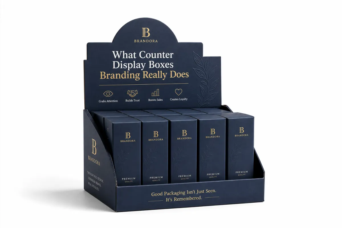
counter display boxes branding turns a small footprint into a sales tool. It gives the product a visible home, a clear face, and a reason to get chosen on impulse. That matters for low-friction products: gum, snacks, lip balm, trial cosmetics, travel items, batteries, small electronics, and promotional items. The best displays do not shout. They make the product feel obvious.
The display needs to answer three questions quickly: what is it, why should I care, and why should I trust it? If the shopper cannot get those answers from the front panel and maybe one side panel, the display is asking for too much attention. counter display boxes branding should act like a compact salesperson, not a brochure that wandered into checkout and got stuck there.
Brand recognition also builds here. A display that matches the rest of the packaging line creates consistency, and consistency makes the shelf feel cleaner and the product feel more established. That matters whether the buyer is managing a chain store, a boutique, or a food service counter. The display is not separate from brand identity. It is part of it.
Placement changes the message. Near a register, the display competes with payment screens, line pressure, and a customer's mental clock. In a pharmacy, it may need more trust and less flash. In a boutique, it may need to feel curated instead of loud. counter display boxes branding should adapt to the environment instead of forcing the same tone everywhere.
For brands that need a stronger reference point, looking at Case Studies can show how different retail settings change the job of a display. If the goal is to support a family of products, pairing the display with Custom Labels & Tags can keep the visual branding consistent across the full purchase experience.
There is also a trust layer people miss. If the display feels aligned with the product price, the shopper relaxes. If it feels too cheap for the item, or too fancy for the aisle, the whole thing starts sending mixed signals. That is not a theory. It is the kind of quiet judgment shoppers make in half a second.
How Counter Display Boxes Branding Works on Shelf
counter display boxes branding works through visual hierarchy. The eye lands on the biggest shape first, then the strongest color block, then the most readable brand name, and only after that does it notice claims or details. If the front panel tries to say everything at once, shelf performance drops. People do not stand there decoding packaging. They glance, decide, move on.
The top panel, front face, side flaps, product window, and cutout shapes all compete for attention. That sounds messy because it is. The fix is to let one element lead. Usually that is the brand name, followed by one clear benefit, followed by proof or a secondary message. counter display boxes branding gets stronger when each surface has a purpose instead of repeating the same line six times.
Bold color blocking helps because it creates contrast fast. Clean typography helps because shoppers do not need a magnifier at the register. High-contrast claims help because white type on a dark field reads faster than a soft pastel soup. Structural shapes can help too, especially if the display rises above nearby clutter or creates a distinct silhouette. That is visual branding doing real work, not just looking busy in a mockup.
Placement changes the rules. A display at checkout can carry a more immediate, impulse-driven message. A display in a pharmacy may need a calmer tone and more trust signals. A boutique counter can support a more premium look, especially if the material and finish match the rest of the store. The same counter display boxes branding approach will not perform equally in all three places, and pretending it will is how brands waste print budgets.
If the display is meant for a fast-moving retail lane, the copy has to stay short. If it is meant for a consultative counter, like skincare or wellness, the shopper may need one extra reason to believe the claim. That is where a window, a short ingredient callout, or a simple proof point earns its keep. No need to turn the thing into a billboard. That usually backfires.
For deeper retail structure references, PMMI and packaging resources at Packaging & Processing Machinery and Materials can help frame how packaging behaves in retail and distribution settings. For transit and handling expectations, the test methods published by ISTA are useful when the display needs to survive shipping as well as shelf time.
Key Factors That Shape Counter Display Boxes Branding
Material choice changes perception immediately. A simple paperboard display can work well for light products and short promotional runs, but it has a different feel from a heavier rigid setup or a reinforced corrugated build. counter display boxes branding should match the product's price point and the retailer's expectations. If the box looks weaker than the item inside, customer perception takes a hit before the first sale.
Finish choice matters too, but only up to a point. Matte lamination can make the display feel more restrained and premium. Gloss can sharpen color and boost contrast. Spot UV can isolate a logo or claim. Foil can signal premium positioning if it is used with discipline. Embossing can add texture, and a window cutout can help prove product shape or color. counter display boxes branding should use finishes to support the message, not to hide a weak concept under a pile of effects.
Audience fit is huge. A candy display can be louder, brighter, and more playful. A skincare display usually needs cleaner copy, softer color control, and more restraint. A hardware or auto accessory display needs clarity and trust more than charm. Brand identity, product category, and visual branding either line up or fight each other. If they fight, the shopper notices. Not always consciously, but enough.
Retail and logistics constraints are the unglamorous part that decides whether a design actually works. Counter dimensions, stackability, refill speed, shipping strength, and assembly time all affect the final structure. A display that looks great in a rendering but collapses under product weight is a bad purchase. counter display boxes branding only earns its keep if it survives real handling, not just art review.
- Paperboard: good for light product loads, promotional runs, and sharp print detail.
- Corrugated board: better for stronger support, heavier items, and shipping durability.
- Rigid board: useful when the display needs a more premium presence and a sturdier feel.
- Window or cutout features: helpful when product visibility boosts trust or reduces confusion.
If sustainability is part of the brief, FSC-certified board is worth asking about. It will not magically improve sales, because paper does not do that, but it can support procurement goals and environmental positioning. For source verification, the FSC site at FSC is a solid reference point for certified fiber expectations. That kind of detail matters more than a vague green claim printed in small type.
One more practical point: finishes should survive handling. A display on a checkout counter gets touched, bumped, wiped down, and occasionally dragged across the surface by staff in a hurry. If the coating scratches after a day, the brand starts looking tired before the promo ends. Nobody needs that mess.
Counter Display Boxes Branding Costs and Pricing
counter display boxes branding pricing is mostly a story about size, structure, print coverage, finishing, and order quantity. Bigger displays use more board and more ink. Special die-cuts take more setup. Inserts add labor. Window patches, foil, embossing, and complex folding features all increase cost. Custom structure is often the biggest jump because it changes tooling, prototyping, and production setup.
Order volume changes the math fast. Small runs carry more setup cost per unit, which is why a 250-piece job can look oddly expensive compared with a 5,000-piece run. Once the tooling and press setup are spread across more units, the price per display usually drops. counter display boxes branding becomes more economical as quantities rise, but only if the artwork and structure are stable enough to avoid repeated revisions.
The cheapest option is the one that ships, but the better option is the one that sells. A plain display might save money upfront, yet lose shelf attention in the place where it matters most. In contrast, a carefully finished display can justify a slightly higher unit cost if it increases brand recognition, reinforces customer perception, and improves sell-through.
Buyers should also watch the hidden costs. Shipping a display flat is usually smarter than shipping it fully assembled. Assembly time at the store can be a real expense if the retailer is handling multiple promotions at once. counter display boxes branding should be priced with the full operational picture in mind, not just the print quote.
There is also a quality-cost tradeoff that gets ignored too often. A display built to save a few cents can end up costing more if it damages product, arrives crushed, or gets rejected by the retailer. That is not penny wise. It is just expensive in a more annoying way.
| Option | Typical Build | Typical Unit Price at 5,000 | Best Use |
|---|---|---|---|
| Stock-style paperboard display | 18pt SBS or similar, standard dieline, 4-color print | $0.35-$0.70 | Short promotions, light products, simple retail messaging |
| Semi-custom branded display | Reinforced paperboard, custom print, matte or gloss lamination | $0.70-$1.35 | Core product launches, stronger visual branding, better shelf presence |
| Premium custom structure | Heavier board, special die-cuts, inserts, foil or spot UV | $1.25-$2.50+ | High-margin items, premium categories, branded retail moments |
Those numbers move depending on print coverage, board grade, freight, and whether the display is packed flat or pre-packed. A tighter budget does not automatically mean low quality, but it does limit structure and finish choices. counter display boxes branding works best when buyers decide upfront where the money should go: structure, print, or finish. Trying to make all three top tier on a thin budget usually ends in disappointment.
Step-by-Step Counter Display Boxes Branding Process
counter display boxes branding starts with a clear brief. That brief should include product dimensions, unit weight, order quantity, retail channel, shipping method, target launch date, and the one message the display must communicate in a glance. If that sounds basic, good. Basic keeps production from drifting into guesswork.
Step one is structure. The display has to fit the product, survive handling, and look stable while it sits on the counter. Step two is artwork placement. The front panel should carry the main message, while the top and side surfaces support it without crowding the design. Step three is proofing. Readability at arm's length matters more than how the box looks on a giant monitor. counter display boxes branding lives or dies in that distance.
- Define the goal: trial, promotion, launch support, or checkout conversion.
- Lock dimensions: product footprint, load height, and counter space.
- Set the message hierarchy: brand name first, benefit second, proof third.
- Review the dieline: check folds, glue areas, and hidden copy zones.
- Approve a sample: confirm color, finish, strength, and assembly speed.
Samples matter more than many buyers expect. A digital proof can tell you if the layout is balanced, but it cannot tell you whether the board bows under load or whether the gloss finish reflects too much light under store fixtures. A physical sample can also reveal whether the display assembles in thirty seconds or turns into a cardboard puzzle. counter display boxes branding benefits from catching those problems before full production.
Timeline-wise, a standard project often moves through concept, proof, sample, revision, production, and delivery. If the structure is simple and the artwork is ready, the process can be fairly quick. If the display needs custom finishes, special die-cuts, or multiple approval rounds, the schedule expands. A realistic planning window is often 12-18 business days after proof approval for straightforward runs, and longer when the brief keeps changing. The display does not care that marketing is still deciding on one word.
For brands comparing packaging systems, it helps to look at the wider mix of Custom Packaging Products. A display should feel like part of the same family as the carton, label, and retail sleeve. That brand consistency is what makes the shelf look intentional instead of patched together.
My rule is simple: approve the sample before anyone starts talking themselves into the render. A render can hide a lot. A sample tells the truth, even when the truth is annoying.
Common Counter Display Boxes Branding Mistakes
The biggest mistake in counter display boxes branding is trying to cram a brochure onto a box that should be selling in one glance. Too much copy creates friction. Too many claims create noise. Too many icons create clutter. If the shopper has to read the display like a paragraph, the display has already lost the battle for attention.
Another common failure is weak structure. A bowed front panel, a tipping base, or a crushed corner does real damage to customer perception. Shoppers read instability as low value, even if the product itself is solid. That is a blunt retail truth. counter display boxes branding is only as strong as the structure holding it up, and a display that collapses halfway through the run makes the whole brand look careless.
Mismatch is another problem. A premium-looking display with a low-priced product can feel dishonest. A playful display for a clinical product can feel off-target. The tone, color palette, type style, and finishing choices should align with the actual product promise. If they do not, brand recognition may still happen, but not for the reason you want.
There are also operational mistakes that are easy to avoid and somehow still keep happening. People hide critical copy on side panels that nobody sees. They choose scuff-prone finishes for high-touch retail environments. They forget refill speed, so staff hate the display after day one. And they ignore shipping compression, which means the display arrives tired and bent. counter display boxes branding should be designed for the store, not for a perfect render.
- Too much copy: the shopper needs one clear reason, not a sales essay.
- Hidden messaging: put the key claim on the face that actually gets seen.
- Weak material: if the display sags, the brand looks cheaper than it is.
- Bad finish choice: flashy is fine; scuffed and dull is not.
- Poor refill design: staff will not fight the box every day.
Testing standards can help prevent some of those problems. For transit and handling, ask about methods similar to ISTA drop and vibration checks. For compression or stacking concerns, a supplier should be able to discuss board performance and load behavior rather than waving a hand at it. This is not overkill. It is just making sure counter display boxes branding survives contact with reality.
And yes, the real world is messier than the mockup. That is kind of the whole point of testing.
Expert Tips and Next Steps for Counter Display Boxes Branding
Start with one goal. Seriously, one. Do you want trial? Launch support? Seasonal sell-through? Checkout conversion? If the answer is all of the above, the display is already too vague. counter display boxes branding gets much stronger when the message hierarchy is built around a single retail outcome. That makes every design choice easier, from copy length to finish selection.
Then test the read. Put the mockup on a counter, step back three to five feet, and ask someone who does not work in design to say what the box is selling. If they cannot answer in five seconds, the structure or graphics need work. That simple test catches more mistakes than a polished presentation deck. counter display boxes branding should win in the real viewing distance, not just in a PDF.
Use a checklist before you approve production. Confirm the final dimensions, print method, finish, insert requirements, retail placement, assembly instructions, and delivery date. If the display needs to pair with labels, tags, or secondary cartons, keep the color and typography aligned. That is how brand consistency shows up across the shelf and the unboxing experience, not just in one isolated box. The best displays feel like they belong to the same system.
Do not skip the operational side. Ask how the displays will ship, how they will be packed, and whether the supplier has tested the board for the intended load. If the project needs stronger retail performance, compare options against the rest of your packaging line through Custom Packaging Products or review how similar runs were handled in our Case Studies. That usually beats guessing based on a render.
If your team is still refining the retail message, ask whether a simpler structure with cleaner graphics would perform better than a fancy build with muddy copy. More embellishment is not automatically more effective. In fact, it often does the opposite. counter display boxes branding should make the product easier to choose, not harder to understand.
Here is the short version: define the goal, match the structure to the product, use finishes with restraint, and test the display before you commit. If you handle those four things well, counter display boxes branding can improve brand recognition, support customer perception, and move product faster Without Wasting Money on unnecessary flourishes. That is the whole point. Not drama. Sales.
One practical takeaway: make the first five seconds do the heavy lifting. If the brand name, product type, and one benefit are not obvious from a standing glance, redesign the hierarchy before anything else. That one move fixes more displays than a round of fancy finishes ever will.
What should counter display boxes branding include?
Lead with the brand name and one clear product benefit. Add only the visual cues that help the shopper understand the category fast, such as color, icons, or a window. If the front panel needs a long explanation, counter display boxes branding is carrying too much text.
How much does counter display boxes branding usually cost?
Cost depends on size, board grade, print coverage, finishes, and order quantity. Basic structures stay lower, while custom shapes and premium finishes raise the unit price. Small runs cost more per box because setup gets spread across fewer pieces, which is why counter display boxes branding gets more efficient as quantity rises.
How long does counter display boxes branding take from design to delivery?
Simple projects move quickly if the artwork is ready and the structure is standard. Custom work takes longer because dielines, proofs, samples, and revisions add time. Build in extra time if the display needs color matching or special finishes, because counter display boxes branding does not reward rushed approvals.
Which materials work best for branded counter displays?
Paperboard works well for light products, promotions, and short-term retail use. Heavier board or reinforced structures make more sense when the display carries more weight or needs a premium feel. The best choice is the one that balances strength, print quality, and cost for the store environment, which is really the point of counter display boxes branding.
How do I know if my counter display branding is too busy?
If the main message cannot be understood in a few seconds, it is too busy. If the design needs a long explanation to make sense, it is doing too much. A good test is to cover part of the display and see whether the core message still lands instantly. That simple check catches most counter display boxes branding mistakes before production.


