Why bag art fails even when the design looks great
A polished logo can still look wrong on a bag if the artwork was built as a flat design instead of a production file. Handles cut into the top edge. Folds interrupt the side panel. Gussets steal more real estate than most designers expect. Paper bags are not posters, and the bag does not care how nice the file looked on screen.
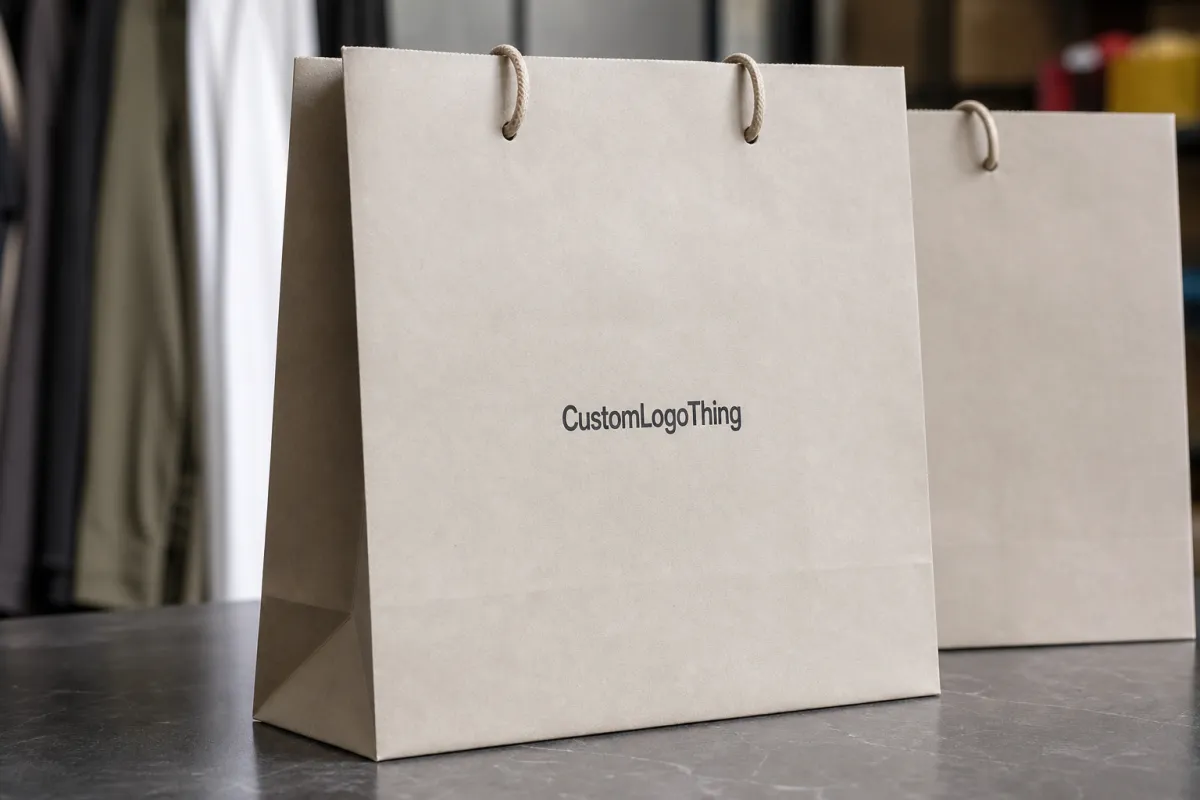
That matters for clothing retail because the bag is often the last thing a customer touches before leaving the store. It carries more brand weight than people admit. If the artwork lands too high, gets clipped by a fold, or prints too dark on kraft stock, the bag can make the whole brand feel cheaper than it actually is.
The problem is usually not the creative direction. It is the setup. A matte white SOS bag, a laminated boutique bag, and a heavy luxury carrier all behave differently in production and in hand. The structure changes the artwork. The paper changes the color. The handle placement changes what can stay visible. That is why Custom Clothing Store Paper Bags artwork file setup has to be treated like packaging work, not general graphic design.
From a buyer's point of view, bad setup costs time twice. First in proofing. Then in delay. A clean file can move through review quickly and keep the order on schedule. A messy file usually creates a back-and-forth loop, which is just a polite way of saying the launch date gets pushed.
What custom clothing store paper bags artwork file setup means
Custom Clothing Store Paper Bags artwork file setup means building artwork on the exact dieline for the bag you ordered, with bleed, safe zones, fold awareness, and the right print layers. In plain language, it is the step where a concept becomes a file the printer can actually run without guessing.
A proper production file usually includes four things. The dieline shows the bag shape, handles, gussets, folds, and no-print zones. Bleed extends background color or imagery beyond the trim so the edges do not expose white paper. Safe areas keep important text away from folds and seams. Print layers separate the live art from the technical marks the press team needs.
The difference between a design file and a production file is simple. A design file can look great in Illustrator or a PDF review. A production file has to survive press. That means fonts outlined, images high-resolution, colors set correctly, and nothing left floating in a layer named "final_final_v7." Yes, that still shows up.
Print method changes the setup too. Flexo, offset, screen print, and digital each handle ink coverage and registration a little differently. Paper finish matters as well. Uncoated kraft absorbs ink more aggressively than coated or laminated stock, so dark solids may print softer and fine detail can lose edge sharpness. If the bag uses FSC-certified or recycled paper, the surface can be a little less forgiving than buyers expect. That is normal. It is also why a screen proof is not the same thing as a finished bag.
For brands comparing Custom Packaging Products, the same rule applies across the line. A logo that works on a mailer or rigid box may need different spacing, line weight, or color handling on a paper shopping bag. The usable print field is different. The folds are different. The way the customer holds the package is different. Template first. Artwork second.
A bag can look simple from the outside and still be technically picky underneath. Good artwork setup respects the structure instead of pretending it is a flat sheet.
If you want one practical rule, use the supplier's exact dieline every time. A generic bag outline is fine for sketching. It is not a substitute for the real thing. The final size, handle location, gusset depth, and finish all affect placement. If those details are off, the design can drift out of balance even when every element is technically "centered."
Process and turnaround: proofing, revisions, and production flow
Most orders follow the same path: file upload, art check, digital proof, revisions if needed, final approval, production, finishing, and shipment. The path is not complicated. The delays are. Missing dielines, broken links, low-resolution files, and vague color references usually slow the job before proofing even starts.
The smoothest timelines happen when the buyer sends everything in one clean package. Bag size. Handle type. Quantity. Finish. Color references. Approved copy. Logo files. If those pieces arrive scattered across multiple emails, somebody has to spend time sorting out basic decisions before the art team can even check the layout.
Approval timing matters more than most teams plan for. For a store opening or seasonal launch, a one-day delay on proof approval can become a shipping problem fast. A typical printed paper bag order might run 12 to 15 business days from proof approval, but that window can stretch if the job uses foil, heavy ink coverage, specialty paper, or a larger quantity that needs extra press time.
There is also a limit to how fast production can move if the artwork is still unclear. A vendor can run a job faster when the file is ready. That sounds obvious. It is also the part people forget after the first round of design revisions. The clean file does not just look better. It reduces the number of questions before the press starts.
For teams that reorder across retail packaging and other printed items, the proof should be treated like a production checkpoint, not a loose draft. Once the proof is approved, the artwork is locked. Any change after that point can trigger a new review cycle, a new queue position, or a revised quote if the printer has already started prep.
Where the timeline usually gets lost
- Wrong template: The dieline does not match the actual bag size or construction.
- Missing source files: The printer gets a screenshot instead of editable vector art.
- Color ambiguity: Brand colors are referenced by name but not by CMYK or Pantone values.
- Late copy changes: A new address, URL, or tagline arrives after the proof is built.
- Special finishes: Foil, embossing, and spot coating need extra coordination.
Good prepress habits matter as much as creative direction. A strong Custom Clothing Store Paper Bags artwork file setup gives the printer less to interpret and more to execute. That usually means fewer revisions, less waiting, and a better chance the first proof is close to final.
Cost, pricing, and MOQ: what changes the quote
Paper bag pricing comes down to a handful of variables, and most of them are visible before anyone starts quoting. Bag size. Paper weight. Handle style. Finish. Print coverage. Number of colors. Whether the artwork lives on one panel or wraps across multiple sides. A simple one-color logo on kraft stock is a very different job from a full-bleed boutique bag with rope handles and lamination.
MOQ has a direct effect on unit price. Smaller runs usually cost more per bag because setup, plate work, and press time are spread across fewer pieces. Larger runs usually bring the unit cost down, but only if the store can actually use or store that volume. For many clothing retailers, the practical range lands somewhere between 1,000 and 5,000 bags, depending on traffic and how fast packaging moves through the floor.
| Bag setup | Typical MOQ | Indicative unit price | Best fit | File impact |
|---|---|---|---|---|
| Single-color kraft paper bag | 1,000-3,000 | $0.18-$0.28 | Everyday retail packaging | Simple logo, light prepress cleanup |
| Full-color printed boutique bag | 2,000-5,000 | $0.28-$0.55 | Higher-end clothing stores | More color control, tighter alignment |
| Laminated premium bag with rope handle | 1,000-3,000 | $0.60-$1.20 | Luxury or gift-heavy purchases | Needs exact dieline and finish notes |
Those numbers are broad on purpose. Paper market pricing shifts. Freight shifts. Print method shifts. Still, the pattern is useful. A cleaner file lowers the risk of art fixes, reproofing, or a late template change. Those are the hidden costs that annoy buyers more than the actual base price.
Setup charges can show up in a few places. Custom dielines, spot color matching, plate or screen prep, and extra proof rounds all take time. Specialty finishing, like soft-touch lamination or foil stamping, may add both cost and lead time. If the artwork is organized properly from the start, those charges are easier to understand and less likely to feel like surprises.
Retail teams that order both bag stock and other branded items often keep the same source files in one approved folder. That is less about convenience and more about control. Logos stay consistent. Brand colors stay consistent. Copy stays consistent. The next run does not need to be rebuilt from scratch because someone found a different version of the mark in a marketing deck from two years ago.
Step-by-step artwork prep for print-ready paper bag files
Start with the exact bag spec before you place a logo. Size, paper weight, handle type, finish, quantity, and print method all need to be confirmed first. A small change in width or gusset depth can change the visual balance once the bag is folded, filled, and carried out of the store.
- Confirm the bag spec: size, paper weight, handle type, finish, quantity, and print method.
- Build on the exact dieline: use the printer's template, not a generic bag outline.
- Work in vector where possible: Illustrator or another vector format keeps logos sharp at press size.
- Set color correctly: use CMYK for process printing and specify Pantone references when spot colors are supported.
- Outline fonts and check links: convert type to outlines and embed or relink all placed images at press quality.
- Extend bleed: push backgrounds and edge-to-edge graphics past the trim line by the supplier's required amount, often 0.125 inch as a starting point.
- Keep the safe area clean: keep critical copy and logos away from folds, seams, and handles.
- Export the final proof file: send a press-ready PDF unless the vendor asks for AI, EPS, or another source format.
If the art includes photography, check resolution before you send it. A web image can look fine on a laptop and still break apart in print. For paper bags, high-resolution placed art is the safe default. The same goes for gradients, shadows, and textured backgrounds. They can work, but they need enough contrast and enough breathing room to survive the paper surface.
Color deserves the same level of attention. Designing in RGB and converting at the end can shift brand colors in ugly ways, especially with bright reds, deep blues, and warm neutrals. For color-sensitive branding, ask for Pantone targets or a hard proof reference. That still does not guarantee a perfect match on every substrate, but it gives production a real target instead of a screen approximation.
For clothing retail, the strongest artwork is often the simplest. Clear typography. Bold marks. Enough white space around the logo. It is not an accident that some of the best-looking bags are also the least crowded. The bag has structure. Let it show.
If the order needs special handling, say so in the file package. Matte varnish, gloss lamination, embossing, reverse print on dark stock, and metallic accents all need clear notes. The art team should not have to guess whether a layer is decorative or structural. That kind of detail is part of a real custom clothing store paper bags artwork file setup, not a bonus.
Common mistakes that slow printing or raise costs
The most expensive mistakes are usually the boring ones. A low-resolution logo. An RGB color build. A text block sitting too close to a fold. None of those feels catastrophic while a designer is working on screen. They become expensive once the order is in queue and the proof has to be rebuilt.
Ignoring the bag structure is another common miss. The front panel is only part of the story. Gussets, bottom panels, handle reinforcements, and fold lines all affect placement. A design that looks centered in a flat mockup can look slightly off once the bag is assembled and filled with folded apparel or boxed accessories.
Thin reverse type on dark coverage causes trouble too. Small white lettering knocked out of a solid field can soften if the ink spread is heavy or the paper is rough. The same warning applies to hairline logos and delicate strokes. They may survive the file check and still print less crisp than the brand expected.
Here are the errors I would catch first:
- Wrong logo version: The old file gets sent instead of the approved one.
- Unclear ownership: Different people make different edits before approval.
- Too much full-bleed coverage: Heavy ink can increase cost and complicate drying.
- Hidden text on folds: Store names, URLs, or taglines disappear in the structure.
- Untested brand colors: Screen color and printed color are treated as if they are identical.
The cleanest fix is to treat the bag like part of the packaging system. A paper shopping bag sits in the same brand family as hang tags, inserts, and custom printed boxes. The visual rules should be consistent across all of them. Different format, same discipline.
For heavier retail loads, some buyers also ask about paper strength, handle reinforcement, or basic transit handling. That is sensible. If the bag is meant to carry boxed apparel, shoes, or dense folded stock, the paper weight and construction matter just as much as the logo. A weak bag with great art is still a weak bag.
Next steps before you send final bag artwork
Before you send final artwork, confirm the bag style, quantity, size, handle choice, print method, and delivery date. Then gather all source assets in one place: logo files, brand colors, approved copy, legal text, and any reference images that show the finish you want. That small bit of organization saves more time than any clever design trick.
Review the proof like a production file, not a mood board. Check spelling. Check placement. Check color intent. Check every phone number, URL, and store name. If something feels off, fix it before approval. After approval, changes are slower and usually more expensive.
Keep the approved version archived. Reorders are much easier when the printer can pull the same PDF, dieline, and notes instead of rebuilding the job. It also helps if the brand later orders matching tissue, inserts, or a new run of Custom Packaging Products that needs to sit beside the same visual system.
The best teams do not treat the checklist as admin clutter. They treat it like part of the brand standard. Good custom clothing store paper bags artwork file setup protects the logo, shortens proof cycles, and keeps the bag looking right in the hand, on the counter, and on the way out the door.
FAQ
What file format is best for custom clothing store paper bags artwork file setup?
A press-ready PDF is usually the safest delivery format. Vector AI or EPS source files are also useful if the printer needs to edit the art. Outline fonts, embed linked images, and keep the file organized so prepress does not lose type or artwork during output. If the vendor provides a dieline, build on that template and follow the export instructions exactly.
How much bleed should paper bag artwork include?
Use the printer's template first, because bleed requirements can vary by bag style and production method. A common starting point is 0.125 inch on all sides, though some jobs need more depending on trim and finishing. Extend backgrounds and edge-to-edge graphics past the trim line, while keeping logos and copy safely inside the live area.
Should clothing store bag artwork be built in CMYK or RGB?
Use CMYK for print files, since that is how most packaging artwork is separated for production. If color accuracy matters, ask whether spot colors or Pantone references are supported for the specific bag and print method. Designing in RGB and converting later often shifts color in ways that are hard to predict.
How long does the proof and approval process usually take?
Simple files can move quickly, but the timeline depends on proof review, revision count, and how fast approvals come back. Missing assets, unclear colors, and layout changes are the most common reasons a proof takes longer than expected. Once the proof is approved, production time starts, so a quick response on your side is one of the biggest schedule levers.
What should I check before finalizing a custom clothing store paper bags artwork file setup?
Confirm the dieline, bag dimensions, bleed, safe area, and final quantity before you export the file. Check spelling, logo placement, color mode, image resolution, and any legal or contact text that must stay readable. Save both the working file and the approved print file so reorders and edits are easier later.

