A clothing bag can spend seven minutes in a boutique and forty minutes moving through a mall, a parking lot, a hotel lobby, or a city street. That imbalance is the whole point. A Custom Clothing Store Paper Bags logo placement guide is not about decoration. It affects visibility, perceived value, print cost, and whether the bag photographs like retail packaging or like something the brand tolerated because the deadline was ugly.
Small choices travel far. A black logo centered on kraft paper reads restrained and practical. A foil mark placed low on a thick white bag feels more premium, especially with rope handles and a matte finish. An oversized fashion logo across the front panel is built for recognition from across a corridor. None of those choices is automatically right. They serve different stores, different price points, and different customers.
Apparel bags behave differently from food, jewelry, and gift bags. They are usually larger, carried at torso height, reused more often, and more likely to show up in mirror selfies, event photos, and resale posts. That changes the placement strategy. A jewelry bag can stay quiet. A clothing store paper bag needs movement, scale, and a logo that still reads after the shopper shifts it into one hand.
The practical goal is simple: know where the logo goes, how large it should be, what printers need from you, and which upgrades add cost without adding real brand recall.
Why Logo Placement on Clothing Store Paper Bags Changes What Shoppers Notice
The first mistake buyers make is treating the logo like a sticker on a blank rectangle. It is not. The bag has handles, folds, shadow lines, gussets, weight distribution, and a moving human hand blocking part of the panel. A logo that looks balanced on a flat PDF can feel cramped once the paper is folded and filled with denim, knitwear, or a boxed jacket.
From a packaging buyer's point of view, the front panel carries the highest advertising value because it faces outward during the carry moment. That moment is short, but repeated. A shopper walking through a mall may expose the logo to dozens of passersby. The cost per impression can be surprisingly low compared with local ads, especially if the bag gets reused.
Perceived value matters just as much. A 250gsm kraft shopper with a giant black logo can work well for promotional retail, but it rarely feels premium. A 350gsm C1S artboard bag with soft-touch lamination and a smaller foil stamp can make a $90 garment feel more considered. Same function. Different signal.
Packaging rule of thumb: if the logo placement fights the structure of the bag, the structure wins. Handles cover. Creases distort. Bottom folds shorten the visual field.
That is why this Custom Clothing Store Paper Bags logo placement guide treats the logo as part of package branding, not a floating graphic. The job is to make the store name readable, keep the bag balanced, and avoid paying for print areas nobody notices.
How Paper Bag Logo Placement Works: Front, Back, Gusset, and Handle Zones
A paper shopping bag has five zones worth understanding before anyone approves artwork: the front panel, back panel, side gussets, bottom fold, and handle clearance area. The front and back are the broad flat panels. The gussets are the folded side panels that expand when the bag opens. The bottom fold is the base construction area. The handle clearance zone is the space around rope, ribbon, die-cut, or twisted-paper handles.
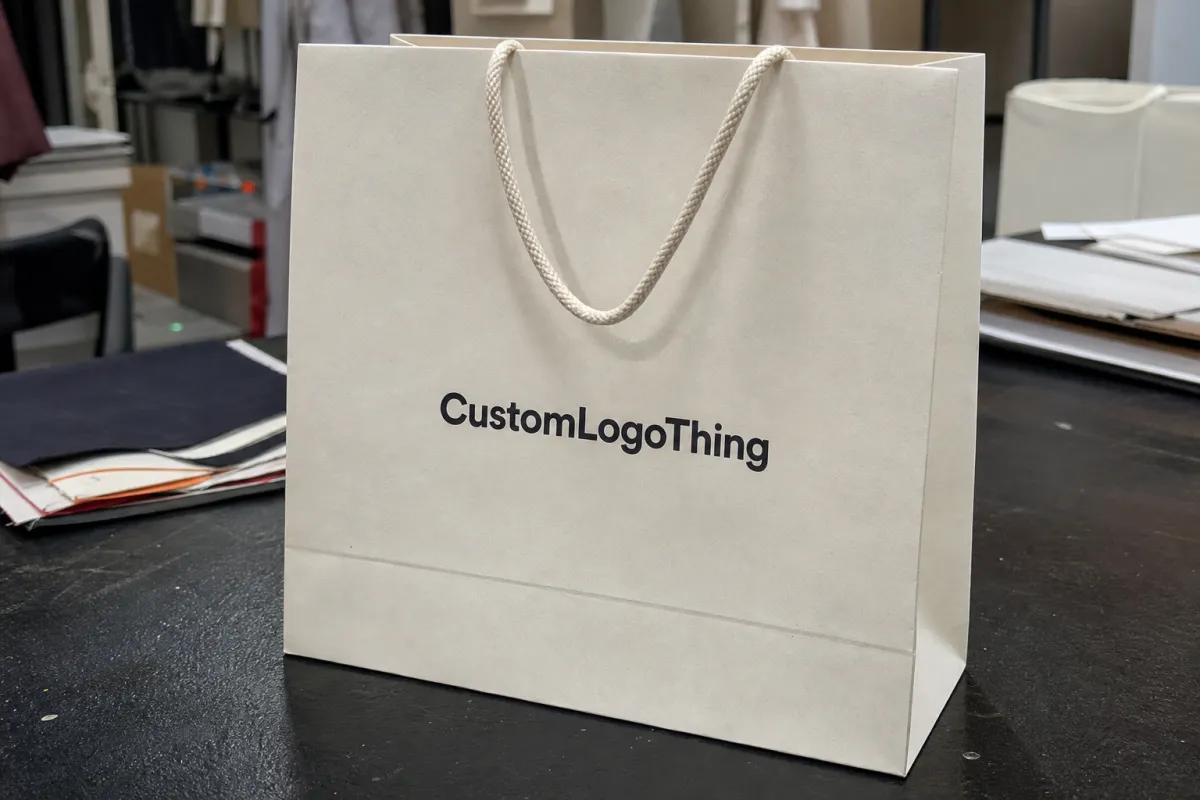
The front panel is usually the strongest position for clothing stores. It faces outward when carried, sits flat when displayed at checkout, and gives the logo enough uninterrupted space to be recognized. On a common apparel bag around 16 x 12 x 6 inches, a front logo width of 6 to 9 inches often reads well without swallowing the panel.
The back panel can do more than most retailers expect. Use it for a website URL, return reminder, FSC claim, QR code, sustainability statement, loyalty prompt, or seasonal message. Keep it secondary. If the front panel is the billboard, the back panel is the label copy.
Gusset printing looks sharp when it is handled with restraint. It also has limits. Side folds create shadows and motion, so tiny type, delicate scripts, and detailed emblems often lose clarity there. A simple repeat logo, short URL, or vertical brand wordmark can work. A QR code or a dense sustainability paragraph usually should not go there.
Safe zones matter. Keep the main logo away from handles, creases, and edges. Many suppliers prefer at least 0.5 to 1 inch of clearance from structural lines on small bags and more on large coat or dress bags. A logo placed too close to the top can be covered by fingers or cords. Too low, and it competes with the bottom fold.
Key Placement Factors: Bag Size, Logo Shape, Ink Coverage, and Store Positioning
Bag size comes first. Apparel retailers often use wider bags because folded garments need horizontal room. A boutique selling scarves and accessories may use 8 x 10 x 4 inch bags. A denim or coat retailer may need 18 x 15 x 6 inches or larger. If logo placement gets chosen before the bag size, the artwork can look perfect on screen and awkward in production.
Logo shape changes the layout quickly. Horizontal wordmarks usually sit well centered across the front panel. Circular marks need more negative space because the eye reads them as objects, not lines of text. Tall emblems can feel unstable if they are placed too low, especially once the bag bulges with clothing.
Ink coverage is both a design issue and a production issue. A large solid logo may look bold, but it can increase ink use, drying time, and scuff risk on textured kraft paper. On uncoated stocks, heavy ink can absorb unevenly. On laminated artboard, dense ink can look crisp but may require more careful handling during finishing.
Store positioning should steer the decision. Luxury boutiques often use smaller marks, more white space, foil stamping, and thicker paper. Streetwear stores may use oversized placement because loud visibility is part of the brand language. Promotional apparel retailers may favor one-color screen or flexo printing to keep unit cost controlled.
Too many brands copy luxury placement without copying the supporting specs. A tiny logo on 400gsm board with cotton rope handles can look deliberate. The same tiny logo on a thin 150gsm promotional shopper can look underprinted, not elegant. The bag stock and the print scale have to agree with each other.
A useful target is simple: the logo should usually occupy roughly one-third to one-half of the usable front-panel width, depending on the mark. Readability from four to eight feet matters more than how the PDF looks at 200% zoom. Retail packaging lives in motion, not in a design file.
| Placement Option | Best Use | Typical Cost Effect | Buyer Watchout |
|---|---|---|---|
| Centered front logo | Most boutiques and apparel retailers | Lowest custom print setup for a branded bag | Can look generic if scale and paper stock are weak |
| Front and back print | Logo plus URL, QR code, or campaign message | Often adds setup, alignment, ink, or press time | Back panel should not compete with the main logo |
| Side gusset print | Premium detail or vertical brand repeat | Moderate to high, depending on print method | Folds can distort small type |
| Foil logo near lower center | Luxury boutique presentation | Higher due to foil die and stamping setup | Needs enough paper stiffness to feel intentional |
| Oversized full-panel graphic | Streetwear, events, high-visibility launches | Higher ink coverage and handling risk | Can scuff or feel aggressive if poorly balanced |
Logo Placement Process and Timeline from Artwork to Approved Proof
The process is straightforward, but every skipped detail has a cost. Choose the bag size and paper stock. Submit vector artwork. Confirm the print method. Review a placement mockup. Approve the proof. Then production begins.
A supplier needs more than a logo file before recommending placement. Send bag dimensions, handle type, logo file, brand colors, desired print sides, order quantity, and the product use case. Lightweight tees behave differently from bulky sweaters. If the bag must hold boxed apparel or multiple garments, the structure changes how the panel sits when carried.
Clean artwork speeds everything up. AI, EPS, or print-ready PDF files are usually preferred because they scale cleanly and allow color separation. Fonts should be outlined. Thin strokes may need adjustment for flexographic, screen, offset, or foil production. A 1-pixel line from a web logo is not a production-ready line.
The proofing stage is the checkpoint. Inspect logo scale, distance from handles, edge clearance, color contrast, and the way the bag photographs. Zoom out. Print the proof on office paper at approximate size if possible. Tape it to a wall. Stand back six feet. That crude test catches more visibility errors than polished mockups do.
Timelines vary. Artwork review may take one to three business days if files are clean. Physical sampling, foil stamping, custom sizes, special inks, or multi-side printing can add days or weeks. Many standard custom paper bag runs land around 12 to 20 business days after proof approval, but that depends on material availability, print queues, finishing, and shipping.
Approval delays are a hidden bottleneck. If a founder, marketing lead, store manager, and compliance reviewer all need to sign off, the bag can sit idle while production slots move on. For store openings, seasonal launches, influencer events, or inventory drops, build in a buffer. Paper, handles, foil, and cartons are physical inputs, not pixels.
Packaging standards can help set expectations. The International Safe Transit Association offers packaging test resources at ista.org. For responsibly sourced paper claims, the Forest Stewardship Council provides certification information at fsc.org. Claims on the bag should match what the supplier can document. Fancy wording does not pass an audit.
Pricing, MOQ, and Unit Cost Effects of Different Logo Positions
Logo placement changes pricing because every print location may require setup, alignment, plates, screens, dies, or extra handling. A single front logo is usually the most economical custom option. Add a second side, gusset detail, foil stamping, spot UV, or full-coverage print, and the job becomes more complex.
For a simple one-color front logo on a standard paper shopper, a rough unit range might sit around $0.18 to $0.45 at several thousand pieces, depending on size, paper weight, handle, and region. A thicker boutique bag with rope handles, lamination, and foil can move into the $0.70 to $1.80+ range. Small runs cost more per unit because setup costs are spread across fewer bags.
MOQ deserves sober thinking. Custom Paper Bags often become more economical at 3,000 to 5,000 units than at 500 or 1,000. Yet over-ordering has a cost too: storage space, cash tied up in inventory, and the risk of rebranding before the bags are used. A boutique with limited backroom space should price volume breaks, then decide what quantity can actually be stored.
Quotes should reflect bag size, paper weight, handle style, number of ink colors, print sides, finish, logo technique, quantity, packaging, and shipping. If the quote looks vague, ask for the assumptions. “Custom bag with logo” is not enough detail for a fair comparison.
The cheapest placement is not always the best value. A tiny front logo may save a little ink but disappear beside competitors' branded packaging. Full-panel graphics may grab attention but add cost without improving recall if the logo itself becomes harder to identify.
Ask for side-by-side options: centered front print only, front-and-back print, and a premium version with foil or gusset detail. The Custom Clothing Store Paper Bags logo placement guide approach is useful because it turns opinion into costed choices. Then the extra $0.08 or $0.35 per unit can be judged against something real.
Step-by-Step Guide to Choosing the Best Logo Location Before Ordering
A short process before approval saves money, especially on first orders. The best packaging decisions happen before plates, screens, or foil dies are made.
- Match the bag size to the clothing first. A logo chosen for an accessory bag can look lost on a coat bag. A mark sized for a large shopper can crowd a small boutique bag.
- Decide the primary viewing moment. Checkout display, sidewalk carry, delivery unboxing, event giveaway, and social media photo each favor a slightly different position.
- Choose the main print panel. For most clothing stores, the front panel gets the logo. Secondary details can move to the back panel, inside lip, or side gusset.
- Test scale at real distance. View the mockup from four to eight feet, not only on a laptop screen. Many print mistakes are visibility mistakes dressed up as design preferences.
- Confirm contrast. Natural kraft, black, navy, olive, and recycled stocks can swallow subtle ink colors. Metallic foil needs light to read, so placement and finish matter.
- Request a proof. For high-value launches, consider a physical sample or pre-production proof before the full run.
One practical trick: photograph the mockup in the kind of environment where the bag will appear. A clean white artboard proof flatters almost everything. A store counter with warm lighting, dark clothing, and busy shelving is less forgiving.
If your store also ships apparel, coordinate bags with other product packaging. Custom paper bags, tissue, stickers, mailers, and Custom Packaging Products do not need to match perfectly, but they should feel like the same brand made the decisions. Packaging gets weaker when every item uses a different logo scale.
The test is simple: would a shopper recognize the store name in a candid photo without zooming in? If not, adjust size, contrast, or placement before production.
Common Logo Placement Mistakes That Make Apparel Bags Look Cheaper
The oversized-logo trap is common. A huge logo can feel confident in a flat mockup, then cheap or aggressive once the bag is folded, filled, and carried. The larger the mark, the more the paper texture, ink density, and panel distortion matter.
Another error is placing the logo too close to the handles. Hands, cords, ribbons, and twisted-paper loops can cover the brand during the exact carry moment that matters most. Leave breathing room around the top third of the bag unless the design has been tested with the handle style shown.
Folds and gussets cause trouble too. If important text crosses a crease, it can break or distort after assembly. Fine taglines, URLs, and QR codes should stay on flatter areas. QR codes need enough quiet space around them and should be tested at actual printed size before approval.
Low contrast wastes money quietly. Pale beige ink on natural kraft can look tasteful in a PDF and nearly invisible under store lighting. Gloss black on dark paper can disappear unless the light hits perfectly. For recycled stocks, ask whether the surface variation will affect sharpness.
Copying luxury placement is risky if the rest of the bag does not support it. A tiny centered logo can look refined on thick artboard with rope handles, reinforced top folds, and tissue inside. On a thin promotional bag, the same placement may feel accidental.
File quality creates its own failures. Raster logos, unoutlined fonts, hairline strokes, low-resolution PNGs, and screen-first brand marks can all print unevenly. If the only logo file is a JPG, ask whether artwork redraw is needed before proofing. Paying for cleanup is usually cheaper than accepting blurry retail packaging.
Here is what most people get wrong: they judge the bag while it is empty. Apparel bags are rarely viewed that way. Fill one with the actual merchandise weight, hold it at torso height, and then judge. That is the practical version of a custom clothing store paper Bags Logo Placement guide.
Next Steps: Build a Placement Brief Your Bag Supplier Can Price Accurately
Before requesting a quote, assemble a simple placement brief. Include bag size, paper color, logo file, preferred logo position, print sides, quantity, deadline, and reference images. Add the garment types too: tees, denim, dresses, coats, boxed accessories, or mixed purchases.
Create two versions. One should be budget-conscious: one front logo, one ink color, standard handle, standard paper weight. The other can be premium: back-panel message, foil stamp, thicker stock, custom handle color, or gusset detail. Pricing tradeoffs become clearer when the supplier is not guessing.
- Must-haves: exact logo, minimum size, brand color, delivery date, FSC-certified paper, or a specific handle type.
- Flexible items: paper shade, logo scale, finish, back-panel message, carton packing, or alternate print method.
- Quote questions: what is the safest print area, what placement adds the most cost, and what timeline risk could affect delivery?
Document the final approved placement in a saved spec sheet. Include the bag dimensions, stock, GSM, handle type, logo width, distance from top edge, distance from bottom edge, print color, finish, and proof date. Reorders are much easier when the original run is not reconstructed from a photo.
If you are building a full retail packaging system, compare the paper bag with tissue, garment boxes, stickers, ribbon, and other Custom Packaging Products. A bag does not need to say everything. It needs to say the right thing from the right distance.
Use this framework to decide the viewing moment, protect the safe zones, test real scale, price the options, and approve the proof with the same care given to the garments going inside. That is how the bag stops being filler and starts doing actual work.
FAQs
What is the best logo placement for custom clothing store paper bags?
For most clothing stores, the centered front panel is the safest and most visible placement because it faces outward when carried and displays cleanly at checkout. Premium boutiques may use a smaller centered logo with more white space, while trend-driven apparel stores may choose a larger mark for stronger street visibility. Avoid placing the main logo too close to handles, folds, or the bottom edge because those areas can hide or distort the design.
How large should a logo be on clothing boutique paper bags?
The logo should be large enough to read from normal carrying distance but not so large that it crowds the panel or feels promotional rather than retail-ready. Logo shape matters: wide wordmarks often need less height, while circular or stacked logos may need more surrounding space. Ask for a scaled mockup on the actual bag dimensions rather than approving logo size from a cropped artwork file.
Does printing a logo on both sides of custom paper bags increase cost?
Usually yes. Two-side printing can require additional setup, alignment, ink, labor, or press time depending on the print method. The unit cost increase may be modest at higher quantities but more noticeable on smaller custom runs. If budget is tight, use the front panel for the logo and reserve the back panel for a later reorder or seasonal campaign.
Can I put a QR code with my logo on clothing store paper bags?
Yes, but the QR code should usually sit on the back panel or a secondary area so it does not compete with the main logo. Keep enough quiet space around the code and avoid placing it across folds, gussets, or textured areas that can reduce scan reliability. Test the QR code at printed size before production, especially on kraft paper, dark paper, or metallic finishes.
What files are needed for a custom clothing store paper bags logo placement guide proof?
Suppliers typically prefer vector files such as AI, EPS, or print-ready PDF because they scale cleanly and support accurate color separation. Include brand color values, preferred placement notes, bag dimensions, and any rules about minimum logo size or clear space. If only a PNG or JPG is available, ask whether the supplier can redraw or convert the artwork before proofing to avoid blurry or uneven print results.
