A logo can look correct on a screen and still land badly on a real coffee bag. Seams shift the center line, gussets cut into the print field, and valves or heat seals can remove more usable space than buyers expect. That is why a custom coffee paper Bags Logo Placement guide matters before artwork is approved.
Placement affects shelf impact, photos, and how the bag reads across a cafe counter. A centered mark can feel established. A logo pushed too low or too small can make even good print quality look weak. The best choice has to work with the bag structure, the budget, and the information that still needs room on the pack.
Custom coffee paper bags logo placement guide: what buyers miss
The first mistake is treating the bag like a flat rectangle. Coffee packaging has folds, gussets, seal zones, and sometimes a one-way valve that cuts into the printable area. Once those are mapped, the front panel can be much smaller than the dieline makes it seem. A layout that looks balanced in a mockup can feel cramped or off-center in production.
The second mistake is treating placement as decoration instead of hierarchy. A logo placed high and centered usually reads as deliberate. A logo shoved low can disappear once the bag is filled or placed in a display bin. Buyers may not describe the issue in design terms, but they notice it immediately.
The bag also has to work in three contexts: retail shelf, market table, and product photo. The front panel needs to read from a few feet away, the print still has to hold up in a phone camera, and the rest of the copy has to fit without crowding the brand. Good placement starts with the structure, not the artwork.
A proof can be technically correct and still look wrong after the first fold lands. Packaging exposes assumptions fast.
How logo placement works on flat, gusseted, and valve bags
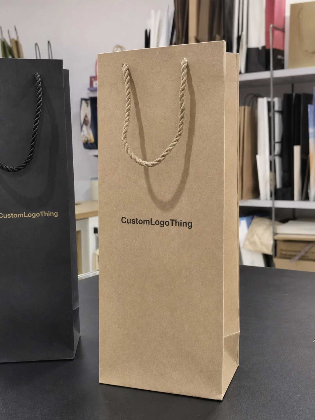
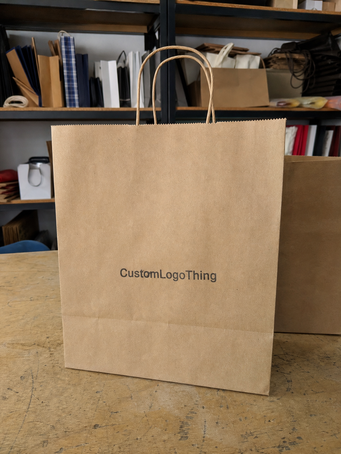
Flat bags are the easiest to design for because they give you one clear primary panel. If the brand mark is the hero, Flat Paper Bags are usually the least demanding option. They are also easier to manage on smaller runs because the layout has fewer places to drift.
Gusseted bags are more flexible, but less forgiving. Side gussets can carry a repeat logo, a short origin line, or a compact secondary mark. That works when the artwork is disciplined. It fails when a logo crosses a fold or when the design tries to do too much in a tight space.
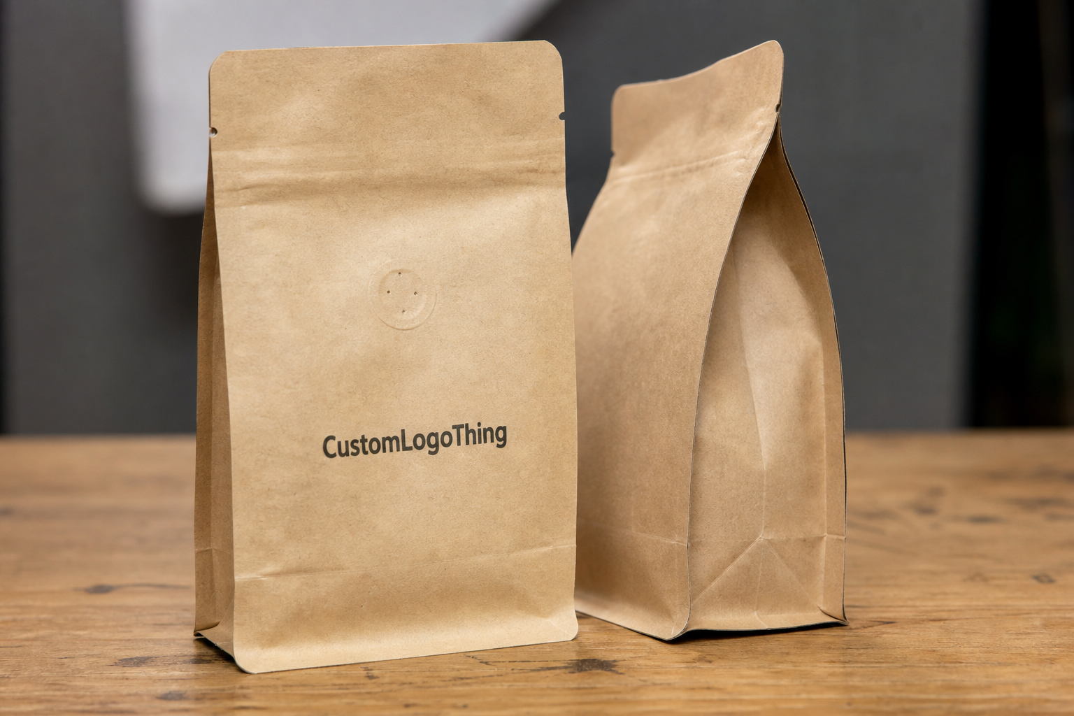
Valves, tin ties, tear notches, and heat seals all change the map. A valve near the top back panel may force the logo lower. A seal band can remove a section that looked safe in the proof. On coffee bags, printable area is set by construction first and bag size second.
- Front panel: best for the primary logo and quick shelf recognition.
- Back panel: better for roast notes, product details, and regulatory text.
- Side gussets: useful for secondary branding or repeating marks.
- Bottom panel: rarely the best home for the main logo because it disappears on shelf.
- Seal areas: usually should stay clear unless the supplier marks them as printable.
Most buyers end up with one of four patterns: centered front logos, top-weighted logos, side-gusset branding, or back-panel branding. None is universally best. The right one depends on how the bag sits in a display case and how much information has to compete with the logo.
Choosing the right panel, size, and artwork density
Bag size changes the visual balance more than most teams expect. An 8 oz bag has a tight front panel, so the logo and supporting copy need discipline. A 2 lb or 5 lb bag can carry a broader hierarchy without feeling crowded. Smaller bags usually look better with a simpler mark and fewer supporting elements.
Artwork density is the next pressure point. A clean logo-first layout often performs better than a front panel packed with claims, icons, and marketing lines. Buyers add more because they want the pack to feel valuable, but coffee already has enough visual competition. The front panel should identify the brand first and then support it with only the details that help the sale.
Material and finish matter too. Kraft paper absorbs light and can mute pale colors. White paper usually holds fine detail better. Matte coatings reduce glare and help photos. Natural textures can feel premium, but they also make thin strokes and tiny text less forgiving. That is why logo placement, stock, and color should be decided together.
A practical rule helps keep the design grounded:
- If the bag will sell mostly online, make the front camera-friendly and the logo easy to read in a thumbnail.
- If the bag will sit on shelves, prioritize recognition from 3 to 6 feet away.
- If the bag needs more copy, move it to the back or side gusset so the logo can breathe.
For brands building a wider packaging system, the bag should stay related to the rest of the line without becoming a clone. If you already use Custom Packaging Products for boxes, labels, or mailers, match one or two brand elements instead of forcing the exact same layout everywhere. That keeps the system coherent and avoids visual fatigue.
Pricing and MOQ: what changes your quote the most
Logo placement affects pricing whenever it changes ink coverage, print sides, or setup time. A one-color front logo is usually the simplest and cheapest route. Full-wrap printing asks the supplier to register more artwork across more surface area, which means more setup, more inspection, and more room for error.
- One-color versus multi-color printing: more colors usually mean higher setup and tighter registration.
- Full-wrap coverage: more print area often raises cost and can slow production.
- Special finishes: foil, embossing, and soft-touch coating add labor and material cost.
- Custom die shapes or windows: structural changes push the quote up quickly.
- MOQ: lower quantities usually cost more per unit because setup is spread across fewer bags.
As a rough rule, a simple one-color layout is usually the low end. Multi-color work and print on both sides tend to move the quote up. Special finishes can add enough cost to change the packaging strategy. Small orders often carry the highest unit price because the setup cost is divided over fewer bags.
Here is the comparison most buyers need:
| Placement style | Typical cost impact | Best for | Risk level |
|---|---|---|---|
| Centered one-color front logo | Lowest | Starter runs and clean branded packaging | Low |
| Front logo plus back-panel copy | Moderate | Retail packaging that needs story and compliance text | Medium |
| Two-sided or wraparound print | Higher | Premium package branding and strong shelf presence | Medium to high |
| Foil, embossing, or special finish | Highest | High-end lines, gifting, and limited editions | High |
If you are comparing quotes, make sure the specs match exactly: same bag size, same paper stock, same print sides, same color count, same finish. Otherwise the numbers are not comparable. One supplier may be quoting a simple front print while another is pricing a more complex build.
For certified material, ask for FSC options and confirm chain-of-custody documentation through FSC. If the bags will move through distribution before they reach customers, rough-handling expectations matter too. ISTA testing principles are a useful reference for package protection and transit stress.
Production timeline, proofing, and sample approval steps
The production path is usually straightforward on paper: brief, proof, revision, prepress, sample approval, production, packing. The friction comes from details. If the dieline is unclear, the art team has to guess where the folds and seals sit. If the logo file is low resolution, someone has to rebuild it. If the buyer changes copy after proofing, the schedule slips.
Simple one-color jobs usually move faster. More complex builds, especially those with multi-panel artwork or special finishes, need buffer time. For many paper bag programs, a clean order can run in about 12 to 18 business days after proof approval. More intricate projects can take longer. The real answer depends on the supplier, the print method, and whether the artwork is production-ready.
First-time orders should usually get a physical sample. One sample confirms logo size, placement, color on the actual paper, and whether the bag still reads well when filled. If the order matters and the artwork is not extremely simple, skipping the sample is a false economy.
This is also the stage where buyers should check how the coffee bag will sit beside labels, sleeves, or matching boxes. The same brand can look polished across Custom Printed Boxes and still fail on a bag if the logo is too small or the contrast is weak. Packaging should feel related, not copied and pasted.
- Inspect the proof at actual print size, not zoomed in on a monitor.
- Check every panel, not just the front.
- Confirm the logo stays clear of folds, valves, seals, and tear notches.
- Review text legibility in black and white.
- Approve one physical sample before bulk production when the order is important.
Artwork setup and file rules that prevent ugly surprises
Suppliers usually want vector logo files, outlined fonts, clear color references, and a dieline with safe zones marked. AI, EPS, or a clean PDF is usually the safest starting point. A low-resolution PNG can be used for reference, but it is not a real production file. If the art team has to rebuild the logo, that adds time and invites mistakes.
Bleed, seam lines, and minimum line weight matter more than many teams realize. A line that looks elegant on a laptop can vanish on kraft paper. A tiny reversed-out word can fill in and become unreadable. A logo that crosses a seam may technically pass proofing while still looking slightly off once the bag is assembled.
Color is another place where expectations drift. Screen color is not print color. Dark kraft paper changes the appearance of light inks. White ink, soft beige, and pale metallics can look excellent, but only if the stock and coverage support them. Texture also changes the result, so fine detail should be checked at actual print size.
Before approving artwork, run a simple preflight:
- Compare the design to the dieline and confirm the safe zones.
- Check the logo at actual size, not just in a mockup.
- Test the mark in black and white.
- Review contrast on the chosen paper stock.
- Verify that the website, roast level, or origin copy is still readable.
A useful custom coffee paper Bags Logo Placement guide is not only about where the logo sits. It is about whether the file survives production without losing balance, legibility, or contrast. Mockups can hide a lot. Paper cannot.
Common placement mistakes that make bags look cheap
The easiest mistake to spot is a centered logo that ignores the fold. One bad fold can make the front feel crooked or visually heavy on one side. Buyers notice it immediately, even if they cannot explain the problem in design language.
Another common problem is a tiny logo with too much empty space. Some brands call that minimalism. Often it just reads as weak branding. Small can work, but only when the proportions are deliberate and the rest of the panel supports the choice.
Clutter causes just as much damage. QR codes, certifications, tasting notes, roast descriptors, and claims all have a place, but the front panel is rarely that place. If everything fights for attention, the brand mark loses. Put secondary information on the back, the side gusset, or the lower panel where it will not crowd the identity.
Color mistakes are another quiet way to downgrade a pack. Low-contrast ink on kraft paper can disappear. Thin reversed-out text can fail. Gradients can break down on textured stock. If the design depends on subtle tone shifts to look premium, test it before you commit.
For branded packaging, simple usually wins. That does not mean boring. It means the logo has space to breathe, the type is readable, and the bag feels intentional from a distance and close up.
Expert rules and next steps before you place the order
Start with the hero panel. Size the logo for distance reading, not for a pretty mockup. Leave quiet space around it. Those three choices solve a surprising number of problems before they happen and make the bag easier to read on shelf and in photos.
If the bag will be photographed often, test two placement options. A slight upward shift or a little more breathing room can make the pack feel more expensive. That is not magic; it is visual hierarchy doing its job.
Before approval, ask for two things: one proof with annotated dimensions and one physical sample if the order is large enough to justify it. The annotated proof shows exactly where the logo lands. The sample shows whether the chosen paper stock and finish actually support the design.
Before you request quotes, collect these details:
- Bag size and style
- Paper type and finish
- Print colors
- Quantity
- Target timeline
- The exact panel you want branded
If you want the order to move cleanly, keep the specs tight and compare quotes on the same basis. Decide what the front panel has to do before you start arguing over decoration. That is how the guide turns from a design note into a buying tool. If you are also building the rest of the line, pairing the bag order with Custom Packaging Products can keep the package branding consistent without making every item look identical.
How do I choose the best logo placement on custom coffee paper bags?
Start with the front panel if shelf visibility matters most. Move the logo to a side gusset only when the front needs to stay clean for product copy or a window. Match the placement to the bag size, fold lines, and the distance shoppers will actually see it from.
Should my coffee bag logo go on the front panel or the gusset?
Use the front panel for instant brand recognition. Use the gusset for secondary branding, origin details, or a repeating mark. Avoid putting the main logo on a gusset if the bag folds tightly or sits deep in a display case, because the mark can disappear fast.
Does logo placement affect the price of custom coffee paper bags?
Yes. Placement changes cost when it changes the number of print sides or the amount of ink coverage. Full-wrap layouts, foil, embossing, and multiple colors usually raise the quote. Cleaner one-panel designs are usually cheaper and easier to produce.
What files do I need before asking for a coffee bag proof?
Send a vector logo file, ideally AI, EPS, or PDF. Include exact colors, bag size, and any text that must appear near the logo. Ask for a dieline so you can check safe zones and folds before approving.
How can I avoid placement mistakes on a first coffee bag order?
Request a proof at actual size, not just a pretty mockup. Check how the logo sits near seals, folds, and valves. Approve one sample before bulk production if the order is important or the artwork is complex.