Poly Mailer Bags Logo Placement Guide for Ordering
A logo can look dead-center on a mockup and still end up awkward once the mailer is packed, sealed, stacked, and handled by three different people. That is why a Poly Mailer Bags logo placement guide starts with usable print area, not with the artwork itself. The buyers who understand that usually get fewer proof rounds, cleaner branding, and a bag that looks intentional the moment it lands on a doorstep.
Placement is about more than “front or back.” It means choosing the right panel, staying clear of side seals, bottom seams, closure flaps, zipper tracks, and any no-print zone the construction creates. On a flat proof, the bag can look like a simple rectangle. In production, it is a converted piece of film with limits. Miss those limits and the logo will look off even if the ink laid down correctly.
There is also a practical side that gets ignored until the order is already in motion. Good placement helps the logo stay visible around shipping labels, keeps the brand readable in transit photos, and avoids the visual clutter that makes a package feel cheap. The goal is not decoration for its own sake. The goal is a printed mailer that still looks clean after handling.
Poly Mailer Bags Logo Placement Guide: what really prints cleanly
The first rule in this Poly Mailer Bags logo placement guide is simple: judge the panel the press can actually print, not the fantasy panel shown on a blank artboard. A 10 x 13 inch mailer may seem generous until the side seals, bottom seal, and closure area are removed from the usable space. Once those are accounted for, the safe canvas shrinks faster than most first-time buyers expect.
Buyers usually talk about front and back panels. The print team thinks in terms of flat film, seal margins, and how the bag will fold when it is filled. A front-panel logo can sit on a clean rectangle and look balanced. A back-panel logo may need to stay away from return address space, carrier labels, or handling stickers. If the bag has a flap or resealable closure, that edge often cuts through the eye line and should not bisect a logo.
Filled bags behave differently from empty ones. A centered mark that looks perfect on an empty mailer can ride too high once contents push the lower film outward. A logo placed too low can disappear into a fold created by the product inside. That difference shows up in warehouse lighting, in quick customer unboxing shots, and in stacked cartons where the bag is only visible for a second. Design for the packed state, not the flat one.
"If the logo crosses a fold line, the eye reads it as a mistake, even when the press hit registration."
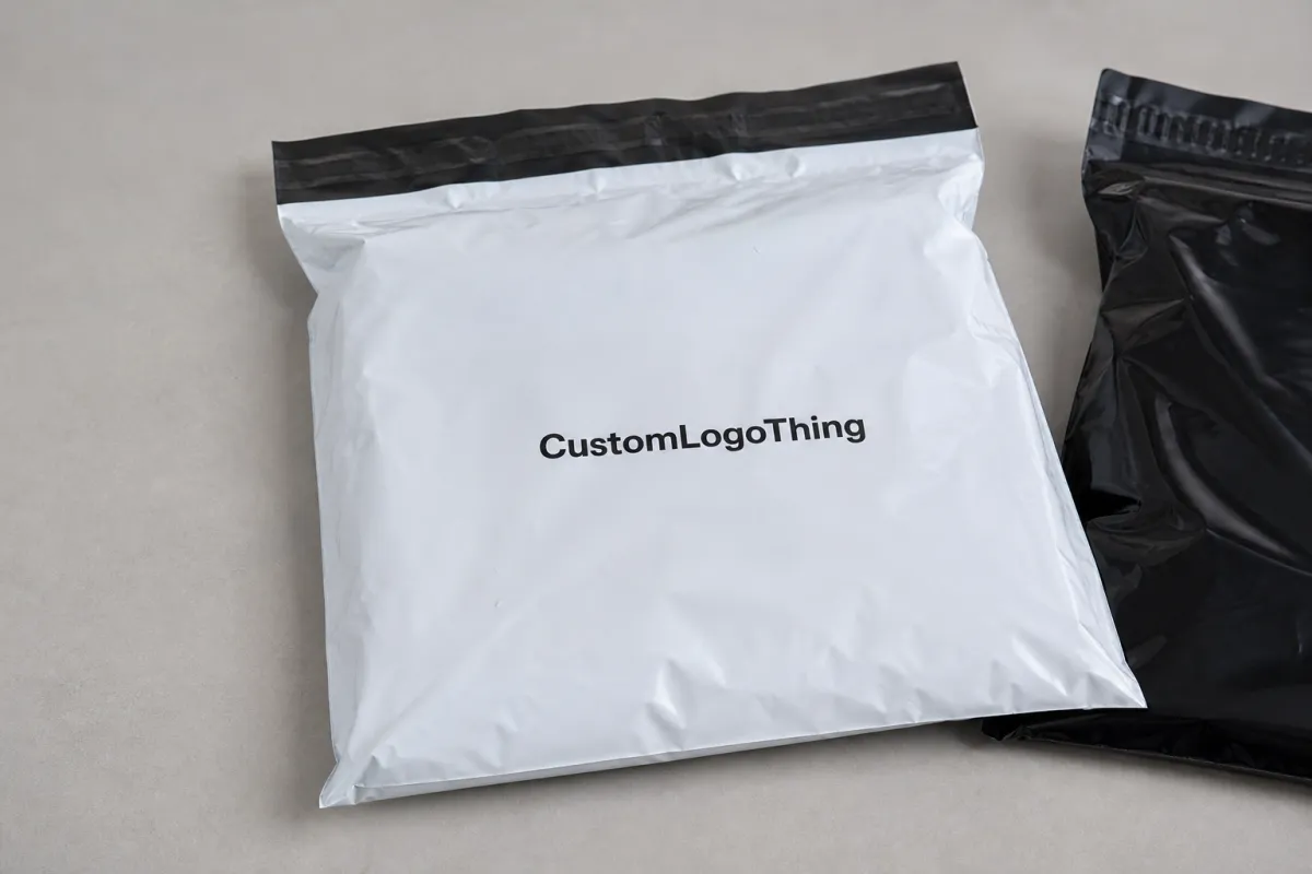
That is why placement comes before color polish or tagline debates. Once the logo sits in the correct spot, decisions about size, contrast, and supporting text become easier. A small mark can work if it has breathing room. A larger mark can still fail if it crowds a seal. For buyers comparing formats, Custom Poly Mailers usually offer the cleanest starting point because the usable panel is easier to plan around than on odd-shaped mailer styles.
How logo placement works on poly mailer film
Poly mailer film prints flat and performs in three dimensions. That sounds obvious, but it changes the placement decision in a real way. A design that feels centered on-screen may need to move up a few millimeters, shrink slightly, or shift left so it still reads balanced after the bag is sealed and loaded. A useful Poly Mailer Bags logo placement guide prevents the usual back-and-forth that comes from guessing at that shift.
The print method matters. Flexographic and gravure printing are usually strongest for larger runs with simple, repeatable layouts. They reward cleaner artwork and fewer moving parts because setup time is spread across more units. Digital printing can handle smaller quantities and more variation, but it still needs safe margins and a clear print field. No process likes artwork pushed right against a seal line.
Orientation is another detail with outsized impact. A horizontal logo often works best on a wide front panel. A vertical mark can fit a narrow bag or a back panel better, especially if the shipping label will cover part of the face. Some constructions also need mirrored artwork so the image lands correctly after conversion. If the proof does not show the print direction and the exact dimensions, ask for a revised one.
Surface finish changes how the same logo reads. Gloss film can make colors feel brighter, but it also throws glare under warehouse lights. Matte film usually cuts that glare and improves readability. Frosted or translucent film can mute contrast, so fine type may need a stronger ink build. Dark bags often need a white underprint to keep the logo visible. Even then, tiny elements can drift if the artwork is too close to the edge or too detailed for the chosen process.
Practical sizing matters too. On standard mailers, logos around 2.5 to 5 inches wide are often easier to keep clean than oversized artwork that tries to use every inch of the panel. Bigger is not automatically better. A mark that leaves white space around it usually prints and reads better than one crammed into the corners.
Placement factors that affect cost, pricing, and unit cost
The poly mailer Bags Logo Placement guide is also a pricing tool. Placement affects cost because it changes print complexity, ink coverage, setup time, and reject risk. A simple one-color logo on a white mailer is much easier to produce than a full-panel design with multiple colors, a white underbase, and tight registration on tinted film.
Film color has a bigger effect than many buyers expect. White film gives the most flexibility and usually the cleanest print. Black or colored film can look strong, but it often needs extra ink passes or a white layer under the logo. That adds time and increases spoilage risk during setup. Clear or frosted film can look premium, but low-opacity art on those substrates may need thicker strokes or larger type to stay legible.
Bag size changes the quote too. Larger bags use more material, but the real cost pressure often comes from the usable panel. If the safe print area is tight, the press operator has less room to recover from minor drift, and inspection becomes slower. Small runs feel this the most because setup cost is spread over fewer bags. That is why a short order can look expensive per piece even when the design itself is simple.
Here is a practical pricing view buyers can use when comparing quotes:
| Placement option | Best for | Typical unit cost effect | Notes |
|---|---|---|---|
| Small front-panel logo | Simple branding, lower MOQ orders | Often lowest; about $0.18-$0.28 per unit at 5,000 pieces | Fast to approve, easier to keep centered |
| Large centered logo | Premium unboxing, stronger shelf presence | Usually mid-range; about $0.22-$0.34 per unit | Needs better safe margins and cleaner file prep |
| Full-panel print with white underprint | Dark film, bold retail branding | Often highest; about $0.28-$0.42 per unit | More setup time and tighter registration control |
MOQ logic is straightforward. Smaller quantities usually carry a higher per-bag price because setup cost does not shrink just because the order is short. Larger quantities usually improve the quote, especially if the artwork is simple and the placement is standardized. Revisions after the first proof can add time and sometimes prepress charges if the position or color target changes after the file has already been prepared.
There is a tradeoff worth facing honestly. Saving a few cents by squeezing the logo into a corner can cost more later if the mark becomes hard to read, looks faint, or lands too close to a seam. For teams comparing bag style, print area, and presentation together, Custom Packaging Products gives a wider view of how those choices interact before the order is locked.
Production steps and turnaround from mockup to shipment
Production usually follows a predictable sequence: the buyer sends bag size, artwork, and placement notes; the supplier builds a proof; the buyer checks dimensions and position; revisions happen if needed; and production starts after final approval. The sequence is standard. The delays are not. A vague brief creates a vague proof, and a vague proof usually creates extra rounds.
The first mockup should show the actual bag style, the measured safe area, the seal or flap position, and any no-print zones. If a shipping label needs its own clear field, that should be marked too. A dimensioned proof catches problems early because it shows where the eye will land and where the logo will get trimmed, hidden, or crowded.
Lead time depends on more than the press schedule. Prepress review, plate or file prep, color matching, drying or curing, finishing, packing, and freight booking all sit inside the timeline. For a straightforward order, 12-15 business days from proof approval is common. Larger runs, special finishes, or multi-color artwork can push that out. If a rush is needed, ask where the real bottleneck is. Most often, it is not the print run itself. It is waiting for proof approval.
Buyer response time matters more than many teams admit. Sample approval, revised proof approval, and ship-window confirmation should happen before production starts. Once the run is underway, the schedule is much harder to steer. For shipping-heavy orders, some teams also compare the packaging against test methods through ISTA so the bag is judged against actual transit stress instead of a desk-side visual only.
A good supplier will also flag a few things before printing starts: whether the logo is too close to the edge, whether the artwork needs a vector rebuild, whether the film color changes legibility, and whether the design will still read after the bag is folded. That check saves more money than any last-minute cosmetic tweak.
Common logo placement mistakes that create rejects
The most common error is putting the logo too close to a seal, edge, or zipper track. Those areas can distort the artwork or hide part of it after the bag is filled. Even when the press is technically within tolerance, artwork sitting on a fold or closure line tends to look slightly wrong. That is enough to make a package feel less polished.
Low-resolution files create a different problem. Fine lines, tiny text, and delicate symbols can break up on film, especially on glossy or tinted substrates where contrast is already limited. A vector file is usually the safer choice. If the logo includes small text, the supplier should know the minimum readable size before proofing begins. A little extra file prep can prevent a reprint.
The shipping label zone gets overlooked often. Once fulfillment starts, the carrier label, barcode, and handling stickers need a clear landing spot. If the logo is too large or sits in the wrong field, branding and logistics fight for the same space. The bag may still function, but the presentation takes a hit. That mistake often shows up only after the first packed batch, which makes it an expensive lesson.
Color drift is easier to miss on a screen than on a finished bag. White, clear, kraft-look, and colored film all change how ink appears in real light. A design that looked crisp on a monitor may lose contrast once it is printed. The best way to catch that is to review the proof under indoor LED light and daylight, not just on a laptop. Another common miss is sizing the artwork for the flat mockup instead of the usable panel, which makes the final logo feel crowded or oddly small.
There is also a practical production limit that buyers often overlook: very thin strokes and tiny reversed type can fall apart on some films, especially if the bag is handled a lot or packed tightly. If the logo depends on fine detail to stay recognizable, ask the supplier where the safe threshold sits before approving the art. That threshold is different for every combination of film, ink, and print method.
Expert tips for cleaner branding and better handling
If the goal is cleaner branding, keep the mark simple. Bold shapes, strong type, and enough breathing room usually hold up better than thin strokes or busy artwork. On moving cartons, in warehouse lighting, and in customer unboxing photos, simplicity tends to look more deliberate. Printed Poly Mailers do not need decoration crowded with ideas. They need a logo that still reads quickly.
Leave a quiet margin around the art. A design that sits comfortably inside the safe area still looks balanced if the bag shifts a few millimeters during sealing or packing. That cushion matters more than many design teams expect, especially when the same artwork must work across multiple bag sizes. If the brand uses a slogan, consider whether it belongs on the mailer at all. In many cases, the logo alone is the better call.
Ask for a proof with exact measurements, not just a polished image. A measured visual makes it easier to compare logo placement against the actual bag construction and catches problems before anything is printed. It also helps internal reviewers because the decision is tied to the bag geometry instead of a subjective preference.
"A logo that reads clearly in a warehouse photograph usually reads well everywhere else too."
One more check pays off: compare samples under indoor LED light and natural daylight. Film finish can change how the same ink color feels from one setting to another, and edge sharpness can look different on gloss versus matte stock. If sustainability claims or paper-based components are part of the brief, verify sourcing standards with organizations such as FSC. That is not a placement issue, but buyers often evaluate it in the same approval cycle.
For thicker mailers, around 2.5 to 3 mil, the surface usually tolerates handling better, but the heavier film can also make shallow folds more visible. On thinner stock, the opposite problem appears: the bag may look smoother, yet the artwork can distort sooner if the fill is uneven. Both cases argue for a placement zone with margin to spare.
Next steps: send specs, compare proofs, and approve
Start with a tight spec sheet: bag style, flat width, usable print area, closure type, logo file format, color targets, and any panel that must stay clear for labels. The cleaner the brief, the cleaner the proof. If the supplier has to guess where the mark should sit, the proof becomes guesswork too, and that usually means more revisions.
Then ask for a dimensioned proof that shows the logo against the actual bag structure, not a generic rectangle. That proof should make it easy to see the no-print zones, safe margins, and final visual balance when the mailer is folded and sealed. Once that looks right, approve one placement version before discussing quantity changes or add-ons. Clean first approval keeps the order moving and protects the launch schedule.
For teams building a repeatable buying process, the final check is simple: compare the proof, the cost, the lead time, and the way the artwork reads in hand. That is the real value of a Poly Mailer Bags logo placement guide. It turns a branding choice into a production choice, which is how packaging stays consistent once the bags move through printing, packing, and shipping.
Where is the best logo placement on poly mailer bags?
The strongest placement is usually the largest flat panel with enough margin away from seams, flaps, and seal lines. Centered art often looks balanced, but the final answer should follow the usable print area shown on the proof. If shipping labels will cover part of the bag, keep the logo away from that zone.
How does logo placement affect poly mailer bags pricing?
Bigger print areas, more colors, and tighter registration usually raise the unit price. Simple placements with fewer ink passes are often cheaper to produce and easier to approve. Revisions after proofing can add time and sometimes extra prepress cost.
Can I place a logo near the seam or resealable flap?
It is usually better to avoid seams, flaps, and closure edges because those areas can distort or hide artwork. A proof should show the exact no-print zones so the placement stays clean after sealing and handling. If the design must approach an edge, ask for a measured safe zone first.
What file should I send for a logo placement proof?
Send a vector file when possible, such as AI, EPS, or PDF, so the artwork stays sharp at production size. Include color references, bag dimensions, and any preferred front or back placement notes. If the logo has fine detail, mention the smallest readable size you want to protect.
How long does production take after placement approval?
Turnaround depends on the print method, order quantity, and how quickly the proof is approved. Artwork review and setup usually happen before printing, so fast buyer feedback shortens the schedule more than almost anything else. Ask for the estimated lead time before final approval so launch dates and inventory needs stay aligned.

