Custom Event Hats logo placement guide is a buyer checklist for whether a logo will still read once it is stitched, patched, worn, photographed, and packed. A mark can look perfect on a flat proof and still lose clarity when it crosses a seam, bends over a crown, or lands on a foam-front trucker that does not sit flat. Placement affects visibility, decoration method, unit cost, and how likely the hat is to pass inspection.
The real decision is less about where space exists and more about where the logo still works after production and use. For event organizers, sponsors, merch buyers, and team managers, that means balancing brand size, decoration method, budget, MOQ, and Lead Time against the actual hat style.
What the Custom Event Hats Logo Placement Guide Covers
This guide focuses on the choices that matter most: visibility, decoration method, hat construction, budget, and speed. Those are the variables that determine whether the cap feels intentional or rushed. A bold front hit may fit a sponsor team, while a smaller side mark may work better for staff or a premium merch drop.
The useful question is not “Where can we place it?” It is “Where will it still read after production, wear, and photos?” Hats have limited usable surface area, and the crown shape starts shaping the message the moment decoration begins. If the logo has to fight seams, curves, or crowded text, the result usually looks weaker than the proof suggested.
A logo that reads from six feet away usually performs better than one that only looks good on a screen.
That is why the placement decision should be made with the actual hat style in mind, not a generic mockup. The front panel, side panel, and back panel all behave differently, and the decoration method changes how much detail the art can keep.
Why Hat Curves Change Logo Visibility
Hats are not flat canvases. A structured snapback, a foam-front trucker, and an unstructured dad hat each curve differently, and those curves change how the logo reads. Front panels angle inward, seams break up lettering, and crown height can make a logo feel larger or smaller than it looked on the artboard.
Compared with apparel, hats compress more brand information into less space. Thin strokes, tiny taglines, and tightly spaced lettering are usually the first things to fail. Embroidery makes that more obvious because thread has thickness; woven or embroidered patches preserve more detail, but they still need enough room to stay legible.
The wearer matters too. Staff on the floor need faster reads than a back-of-house crew. Sponsors usually want recognition from across the room, while a limited merch release can tolerate a quieter look. The more complex the logo, the more important placement and spacing become.
If the hat is part of a broader kit, use the same discipline you would use for custom printed boxes: one primary message, clean hierarchy, and enough white space to let the branding breathe.
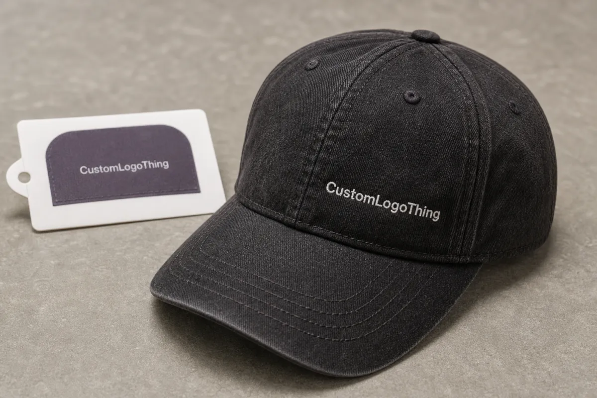
Front, Side, Back, or Under-Brim: Picking the Right Zone
Front center is usually the best choice for distance viewing, sponsor visibility, and photos. If the hat needs to read quickly in a crowd, this is where the primary mark should usually go. On many caps, a clean front placement around 2.75 to 4.25 inches wide works better than trying to fill the whole crown.
Side placement fits secondary branding, event names, or a compact icon when the front is already busy. It creates a quieter look and can be a good choice for staff or support roles. The tradeoff is visibility: side logos are less obvious in straight-on photos, so they work best when the wearer is moving or turning.
Back placement is useful for a URL, support mark, or sponsor name that should be seen as people walk away. It rarely carries the main story by itself, but it adds value in a crowded event environment where people are visible from multiple angles.
Under-brim decoration is more of a premium detail than a primary branding location. It can be memorable for merch, but it is a poor choice if the logo needs to appear in stage photos, social recaps, or sponsor coverage. Use it as a surprise element, not the main read.
| Placement | Best Use | Typical Size Range | Cost and Complexity Impact |
|---|---|---|---|
| Front center | Main brand, sponsor logo, photo visibility | 2.75-4.25 in wide | Often the simplest single-location setup |
| Side | Secondary mark, staff ID, quieter branding | 2.0-2.75 in wide | Can stay efficient if the art is compact |
| Back | URL, event name, support logo | 2.0-3.5 in wide | Usually works best as a second hit |
| Under-brim | Premium detail, hidden message | 1.5-3.0 in wide | High proof scrutiny, limited visibility |
Placement affects pricing as well as appearance. A simple front embroidery run may add about $1.25-$2.75 per unit on mid-size quantities, while a woven patch, dense stitch count, or multi-location layout can move into the $2.50-$5.00 range or higher before freight. Blank choice matters too: a basic cotton twill cap costs less than a structured performance cap with mesh panels, and a foam-front trucker may need a different decoration method entirely.
If the hats are part of welcome kits or sponsor packs, keep the visual logic consistent across the set. Pairing the cap with Custom Packaging Products helps the full presentation feel deliberate instead of assembled from unrelated pieces.
Pricing, MOQ, and Unit Cost Tradeoffs
Placement changes pricing in two ways: setup complexity and production risk. A single clean front hit is usually easier to price than a front-and-back combination, and a simple embroidered wordmark is usually cheaper than a layered logo with tiny details or many color changes.
MOQ matters just as much. Some blanks can be ordered in small runs, but decoration minimums often climb once embroidery, patches, or multiple placements are added. A supplier may accept 48 units for a simple front logo but ask for 100 or more when the order includes a second decoration location or multiple hat colors.
The cheapest option is not always the best value. If a logo is too small to read or too complicated for the cap style, the whole run becomes weak merchandise. Spending a little more on cleaner placement usually protects the brand better than saving a few cents per unit.
For teams already thinking in terms of branded packaging solutions, the logic is familiar: spend where the customer actually sees the brand, not where the spreadsheet looks tidy.
Logo Placement Process, Proofs, and Turnaround
The approval flow should start with artwork review, not blind trust in a template. A good proof shows the logo on the actual hat style, with the front panel shape, seam lines, and decoration method visible. If the supplier only sends a flat graphic, ask for a hat-specific mockup.
Before approving, check line thickness, small text, and color count. A logo with thin scripts and a tiny subline may look fine on a screen but fail on thread. Embroidery generally needs bolder strokes than print; patch art can hold more detail, but border width and edge finish still matter.
- Review the artwork. Check line thickness, small text, and color count before production starts.
- Confirm the placement. Look at distance from the center seam, logo width, and any panel breaks.
- Approve the proof. Verify thread colors, patch edges, and whether the logo still reads at camera distance.
- Release production. Lock the art only after the proof matches the hat style and the event deadline.
Turnaround depends on complexity. A straightforward front placement may move through proofing and production in about 12-15 business days after approval, while a multi-location layout, custom patch, or correction round can extend the timeline. Shipping time comes on top, so event dates should be backed into the order deadline early.
Do not approve placement from a graphic that ignores the crown shape; that is how expensive reprints happen.
For brands shipping hats inside larger kits, transit matters as much as decoration. The testing language at ISTA is worth knowing, and broader packaging references at packaging.org can help teams think beyond a single item and toward the full presentation.
Common Placement Mistakes That Make Event Hats Look Cheap
The first mistake is oversizing. A logo that sprawls across the front panel and crosses seams can make even a good hat look forced. It draws attention for the wrong reason, and the crown starts working against the artwork.
The second mistake is shrinking the mark until it disappears in photos. Tiny placements are easy to approve because they feel safe on a proof, but they often vanish once the hat is worn outdoors or seen from across a room.
The third mistake is mismatch. Intricate logos do not belong in tiny embroidery zones, and long text should not sit where the curve bends it into a slump. A clean icon may deserve the front, while the longer copy moves to the back or side.
The fourth mistake is lazy proofing. If the approval image does not show the actual cap style, panel count, and decoration method, you are guessing. Guessing is expensive, and so is rework.
- Do not approve a logo that touches seams unless the supplier shows why it will still read cleanly.
- Do not assume a small mark will scale up later; the stitch path or patch border may change the look.
- Do not choose a placement that only works from one angle if the hat will be worn in motion.
- Do not treat the proof like a formality; it is the last chance to protect the order.
Expert Tips for Cleaner, Faster-Reading Hat Branding
Start with contrast. Dark thread on a dark crown rarely performs well, and low-contrast artwork is even worse on textured fabrics. A crisp wordmark, an icon with enough open space, or a two-color design usually reads faster than a complex multicolor lockup.
Then match the logo to the hat style. Structured snapbacks can support a more assertive front placement because the front panel stays flatter. Dad hats usually want a smaller, softer mark. Trucker caps often favor a patch or embroidery that respects the foam front, while performance caps may need a lighter touch to avoid stiffness.
Material choice matters too. Brushed cotton gives thread a softer base, but it can fuzz around tiny details. Polyester blends hold shape better and can support crisper stitching. Mesh-backed styles breathe well, yet the front panel often needs extra stabilizing so the logo does not distort. If the artwork is borderline, a woven patch or appliqued patch may be safer than direct embroidery.
Use the flattest part of the crown for the primary mark and move secondary detail elsewhere. If a logo has a tagline, ask whether that line really belongs on the hat. Often it does not. The cleaner the read, the more premium the piece feels.
If the hats are part of a sponsor bundle, keep the cap branding aligned with the rest of the kit. A hat that echoes the same hierarchy used in Custom Packaging Products or related event mailers gives the entire package a more considered finish.
One more practical note: think about cameras, not just faces. Event hats live a second life in photos, recap reels, and social posts. If the placement survives a phone camera at arm’s length, it usually survives the room.
Next Steps: Build a Proof and Approve With Confidence
Before sign-off, build a short checklist and keep it visible:
- Chosen placement and exact logo width
- Decoration method, such as embroidery, patch, or print
- Hat style, panel count, and crown profile
- Color match, thread chart, or patch art
- Delivery deadline and shipping buffer
Then ask for one thing that saves a lot of trouble: a hat-specific mockup. Not a flat artboard. Not a generic cap template. The actual style you are ordering. If the logo is borderline for size or readability, compare two placement options and choose the one that survives distance and motion. That matters most for event hats that need to read in photos, in crowds, and under time pressure.
If the order sits inside a larger merch plan, tie the hat decision back to the full event experience. A cap, a box, and a handout should feel like one system, not three separate purchases. The custom event Hats Logo Placement guide is useful because it keeps the brand readable, the proof process calmer, and the production path closer to the deadline.
What is the best custom event hats logo placement for maximum visibility?
Front center is usually the strongest option for crowds, stage photos, and sponsor recognition. It gives the eye the fastest read, especially on a structured crown. Side placement is better only if the front is already occupied or the design needs a quieter look.
How big should a logo be on custom event hats?
Size should follow the hat shape and decoration method, not the original artwork file. On many caps, a front logo around 2.75 to 4.25 inches wide is a practical starting point, but thin text and fine lines may need more room. A hat-specific proof is the safest way to confirm the final read.
Which logo placement is usually cheapest for custom event hats?
A simple single front placement is often the easiest to produce and price. Once you add extra locations, dense stitch counts, or a more complicated patch, the unit cost usually climbs. The cheapest option is not always the best if the logo becomes hard to see.
How long does the custom event hats logo placement process take?
Proof review is often the first moment buyers see how the logo truly sits on the hat. Standard decorated runs often move in about 12-15 business days after proof approval, but the timeline changes if the art needs revisions or if the order has multiple placements. Shipping should always be padded with extra time.
What should I check before approving custom event hats logo placement?
Check the exact position, logo width, and distance from seams or panel breaks. Confirm the decoration method, color match, and whether the logo still reads at camera distance. If the proof does not match the real hat style, ask for a corrected version before production starts.
If you remember only one rule, make it this: judge the proof on the hat, not on the artboard. Keep the logo readable, keep it respectful of the crown, and use the Custom Event Hats logo placement guide to confirm the final layout before payment and production release.

