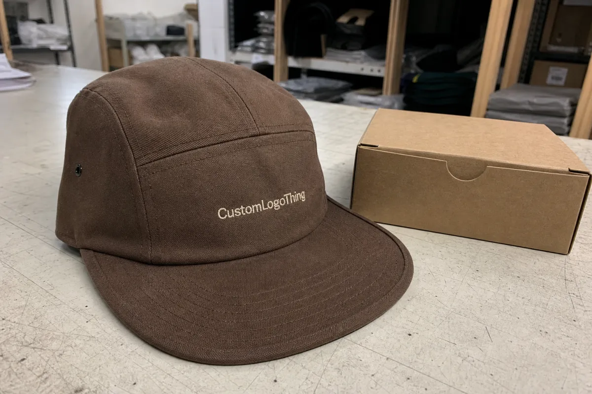
Custom Five Panel Caps for coffee roaster merch work for the same reason a strong coffee bag design works: the format gives the brand one clear surface to speak on. There is less visual noise, fewer seams cutting through the artwork, and more room for a logo that needs to read fast from across a counter. That sounds simple. It is simple. The hard part is making simple look deliberate.
Coffee merch has a particular problem. It sits next to bags, tasting cards, mugs, and often a wall of other branded goods, all trying to justify their place in the same retail ecosystem. If the hat looks like an afterthought, customers feel it. If it looks too precious, staff stop wearing it. The sweet spot is a product that feels practical, slightly collectible, and aligned with the roastery’s packaging system instead of drifting away from it.
That is why custom Five Panel Caps for coffee roaster merch keep showing up in staff uniforms, retail add-ons, event tables, and online drops. They are easier to brand than many curved-brim styles, but they still feel current. For a roastery, that combination matters more than novelty.
Why Five-Panel Caps Fit Coffee Merch Better Than You Think
A five-panel cap gives you a flatter front panel than many classic caps, which helps a logo read cleanly at first glance. That matters for coffee brands because roastery identities often rely on wordmarks, origin cues, monograms, or small symbols that need breathing room. A front panel broken by too many seams can turn a good logo into visual static.
There is also a commercial reason five-panel caps work. Coffee merch has to function in several places at once: on the shelf, behind the bar, in a wholesale sample kit, and on someone’s head in a social post. A five-panel silhouette usually looks tidy enough for retail, but not so formal that it feels disconnected from daily wear. That balance is hard to beat. A hat that looks great but never gets worn is just inventory with embroidery on it.
Compared with a dad hat, the five-panel shape can feel a little more purposeful. Compared with a trucker cap, it tends to look less generic and more like an actual brand product. That distinction is useful if the goal is brand merchandise rather than broad promo stock. The cap should belong beside the coffee bag, not beside a random pile of leftover conference swag.
Most roasters use caps in one of four ways:
- Staff wear for baristas, roasting teams, and wholesale reps.
- Retail add-ons placed near bags of coffee or counter displays.
- Event giveaways for tastings, festivals, and launch days.
- Online merch drops where the cap needs to hold up in product photos.
The best five-panel caps also support the rest of the brand system. If the coffee bags use earth tones, tight typography, and restrained details, the cap should echo that language instead of inventing a new one. That is the same logic behind cohesive product packaging and custom printed boxes: the customer should recognize the family resemblance instantly. Not identical. Recognizable.
There is one more reason the shape works. Five-panel caps usually offer enough surface area for a logo without encouraging overdesign. That restraint is useful. Coffee brands already carry a lot of meaning in the bag copy, origin information, and tasting notes. The hat does not need to explain the whole business. It just needs to look like it came from the same place.
How the Front Panel, Crown, and Fit Affect Decoration
The structure of the cap decides what the decoration can realistically do. A five-panel cap usually has one front panel, two side panels, and a crown that reads cleaner than many low-profile hats. Some are unstructured, some lightly structured, and that difference changes how a logo behaves once it is stitched or patched.
If you plan to use embroidery, the front panel needs enough calm space for the design to stay legible. Thick strokes, bold icons, and short wordmarks usually work well. Fine lines and tiny text usually do not. They either vanish or stitch up into something fuzzy that looks like a quality issue. On hats, small type tends to punish optimism.
Patches broaden the design options. Woven patches handle detail better than standard embroidery, while leather and faux-leather patches create a more lifestyle or workwear feel. They suit roasters with clean marks, small symbols, or line art that would get lost in thread. The tradeoff is obvious: more setup, more cost, and usually a longer lead time.
Fit matters just as much as decoration. Retail customers try hats on. Staff wear them for hours. If the crown sits too high, the closure feels awkward, or the front panel wrinkles in a bad way, the hat stays on the shelf. Adjustable straps, buckles, and snap closures all work, but they create different impressions. Lower-profile fits tend to feel softer and easier to wear. Mid-profile fits often look more structured and retail-ready.
For decoration planning, think in practical terms. If the logo depends on clean geometry, choose a cap with a smoother front panel and enough structure to keep that panel stable. If the brand leans toward a washed, worn-in, everyday look, a softer fabric and lighter build can make more sense. The same rule applies to packaging. A design that works on a coffee box may need simplification before it works on headwear.
There are also production limits that buyers sometimes miss. Stitch density can make a logo dense and heavy if the art file is too complex. Patch borders need clean edges, or the cap starts looking sloppy under close inspection. Even seam placement can matter, especially if a logo is meant to sit low or stretch wide. Good sampling catches those problems before the order turns into expensive stock.
Materials, Colors, and Decoration That Match Roastery Branding
Fabric choice changes how the cap reads before anyone notices the logo. Cotton twill is the most reliable all-rounder. It holds shape well, takes embroidery cleanly, and feels familiar enough for broad retail appeal. Washed cotton softens the look and works well for roasters that want a small-batch, lived-in feel. Nylon leans lighter and sportier, which can fit a more technical or outdoor-oriented brand. Heavier blends sit somewhere between, adding structure and a slightly more premium hand feel.
Color choice has the same effect. Black, navy, stone, olive, and washed brown remain popular because they are easy to wear and usually easy to stock. Earth tones line up naturally with coffee language: espresso, smoke, oat, bark, roast brown, charcoal. That does not mean every cap needs to be muted. A strong roastery can use contrast stitching, a brighter underbill, or a two-tone crown to create a more collectible product. The key is consistency. A cap should still look like it came from the same brand family as the bags and shelf labels.
Too much contrast can break that connection. If the packaging system is warm and minimal but the cap is neon and loud, the merch line feels split in two. Customers may not articulate why it feels off. They just know it does.
Decoration options usually break down like this:
- Embroidery for clear wordmarks, simple icons, and minimal branding.
- Woven patches for sharper detail and multi-color logos.
- Leather or faux-leather patches for a heritage, premium, or workwear direction.
- Printed patches for art with gradients or small details that thread cannot hold.
- Tonal branding for understated merch that feels closer to fashion than promo.
If the cap cannot sit next to the coffee bag without looking unrelated, the design system needs another pass. The hat should feel like it was approved with the label, not after the fact.
For brands that care about sourcing, ask for specifics rather than vague promises. If paper tags, inserts, or hang cards are part of the package, confirm whether any paper claims need FSC chain-of-custody support. If the caps are shipping through retail or e-commerce channels, ask how the cartons are protected against crush, friction, and moisture. A cheap-looking carton can damage the product before the customer ever sees the decoration.
Material quality also shows up in the small things. Check whether the fabric pills after handling, whether the crown keeps its shape after compression, and whether the closure hardware feels flimsy. Hardware is easy to overlook until one clasp snaps in transit and the whole order starts looking like a budget compromise. Good merch rarely depends on one dramatic feature. It usually depends on a dozen quiet details being acceptable at the same time.
Custom Five Panel Caps for Coffee Roaster Merch: Cost, MOQ, and Unit Pricing
Pricing gets misunderstood because people compare a blank hat to a fully decorated one and expect the numbers to scale gently. They rarely do. Decoration method, setup, artwork complexity, fabric choice, and quantity all affect the final cost. A straightforward embroidery run can stay relatively affordable. A specialty patch with custom finishing will not.
For a small to mid-size merch order, the usual pricing framework looks something like this:
| Option | Typical MOQ | Approx. unit price | Best for | Main tradeoff |
|---|---|---|---|---|
| Simple embroidery on cotton twill | 100-300 pcs | $5.50-$8.50 | Staff wear, low-risk retail test | Less detail in the logo |
| Woven patch or printed patch | 100-300 pcs | $6.50-$10.50 | Retail merch with more artwork detail | Patch setup adds time and cost |
| Leather or faux-leather patch, premium fabric | 150-500 pcs | $8.50-$14.00 | Brand-forward drops, stronger retail margin | Higher setup and higher minimums |
| Special finishes, contrast stitching, mixed materials | 300+ pcs | $10.00-$16.00+ | Limited releases, more collectible merch | More risk if the design is untested |
Those prices are realistic enough to plan with, but they are not the whole bill. Digitizing embroidery artwork can add roughly $25-$60. Patch mold setup may land around $40-$120 depending on the construction. Sampling often adds another $30-$80 before bulk production starts. Custom labels, woven tags, individual polybags, and special carton packs can each add a little more. The order starts looking inexpensive until the extra lines show up.
The MOQ matters because a lower run spreads setup cost across fewer units. That is why a 100-piece order can feel expensive on a per-hat basis even if the factory is being fair. If the cap is only for a weekend event or a single cafe launch, a smaller run makes sense. If the cap is meant for retail shelves and repeat reorders, a larger batch can bring the unit cost down enough to protect margin.
A useful way to think about it:
- Giveaway cap: simple decoration, lower unit cost, less emphasis on detail.
- Retail cap: enough quality to survive comparison shopping and actually sell at a mark-up.
- Premium drop: better fabric, stronger finishing, and a design that can support a higher price point.
That retail distinction matters. Customers can usually tell the difference between a $14 cap and a $22 cap within a few seconds, even if they cannot explain their judgment. Stitch density, patch finish, crown shape, and fabric hand all feed into that decision. This is one of those product categories where perceived value rises or falls on very small details.
Shipping and carton planning deserve the same attention. A cap that arrives crushed loses value fast, especially if it is intended for online orders or wholesale distribution. Ask how the brim is supported, how the crown is protected, and whether case packs are built for transit rather than just storage. If the outer pack uses paper components and a sustainability claim matters to your audience, verify the documentation instead of assuming it exists.
Process and Timeline: From Art Proof to Packed Caps
The production process is usually straightforward if the artwork is prepared and decisions are final. It becomes messy when the logo file changes after the proof, or when three people keep adjusting placement after production has already been lined up. That turns a simple cap order into avoidable back-and-forth.
- Artwork review: the supplier checks logo resolution, color count, placement, and size.
- Mockup or digital proof: you confirm the decoration method and the final position.
- Sampling if needed: especially useful for premium caps or detailed patch work.
- Bulk production: caps are cut, sewn, decorated, and finished.
- Packing: hats are bagged, boxed, and prepared for shipment or distribution.
Typical timing depends on the decoration method. Standard embroidered runs often take about 12-18 business days after proof approval, assuming the factory is not backed up and the logo does not need major cleanup. Patch-based styles usually take a little longer, often 15-25 business days, because setup and approval add steps. If a sample is required first, add at least a week, sometimes more.
Artwork preparation is the most common delay. A logo that looks fine on a coffee bag label may not survive the move to headwear without edits. Thin strokes, tiny text, and stacked elements often need to be simplified. That is not a compromise on the brand. It is a necessary adjustment for the product surface. Good packaging teams understand this instinctively: one design rarely behaves the same across bags, boxes, tags, and caps.
For seasonal launches, event merch, or cafe openings, build backward from the deadline. Do not start with the launch date and assume the rest will behave. If the hat needs to sit on a booth table on Friday, the artwork should be locked before the week starts, not after two rounds of revision and a last-minute debate over thread color. Delays rarely come from sewing. They come from indecision.
Lock these items early:
- Logo file: the exact version that will be used.
- Colorway: cap color, logo color, and any contrast details.
- Quantity: enough to reach a sensible price break without overbuying.
If the cap is part of a larger release, coordinate it with the rest of the merch. A hat that lands with a coffee launch feels intentional; a hat that arrives three weeks late just feels late. Tight timing also makes quality control easier, because the merch can be evaluated as one system instead of as a stack of unrelated products.
Common Ordering Mistakes That Make Caps Look Cheap
The fastest way to make a cap look cheap is to ask too much of the front panel. Tiny copy, delicate linework, and overcomplicated art rarely translate well to headwear. What looks elegant on a screen often turns muddy once thread, patch edges, or seam placement enter the picture. The factory did not necessarily fail. The art may simply have been too ambitious for the format.
Color mismatch is another easy mistake. If the coffee line uses soft, earthy packaging and the cap arrives in a loud neon tone, the merch system fractures. The hat might still sell, but it will not feel like part of the same brand world. The same issue shows up in packaging programs: product, label, box, and merch all need to speak the same visual language or the whole set feels assembled from different moods.
Over-ordering is common, especially with a new cap design. Staff may like it. A designer may love it. None of that guarantees sell-through. Customers decide with their wallets, and they often prefer one color or one closure style over the rest. A first run should usually be a test, not a storage commitment. Inventory is expensive when it sits.
Fit gets ignored more often than it should. If nobody checks the actual wear, the cap can sit too tall, pinch at the forehead, or look awkward on the target audience. For younger, style-conscious buyers, a cleaner five-panel profile can outperform a bulkier cap. For wholesale or staff use, comfort and durability may matter more than a fashion edge. The right answer depends on the job the cap is supposed to do.
Packaging mistakes can be just as damaging. A well-made cap can still arrive with a flattened crown or bent brim if it is packed badly. Loose cartons, poor stacking, and weak outer packs all create problems that show up as customer complaints later. It is boring work to ask about carton strength, but boring is usually what keeps the product intact.
In other words, the common failures are familiar: weak art, mismatched color, the wrong quantity, the wrong fit, and careless packing. None of them is glamorous. All of them cost money.
Next Steps to Launch a Coffee Roaster Cap Drop
A good cap release starts with restraint. Pick one logo, not four. Pick one core color, not a palette that needs a meeting to explain it. Decide whether the cap is primarily for staff, retail, or giveaways before you ask for pricing. That order matters because the use case determines the build.
Gather the practical basics before you request quotes:
- Exact artwork files in vector format if possible.
- Target quantity with a realistic pilot-run number.
- Budget range so the right decoration method can be suggested.
- Launch date so production timing can be matched to the release.
If the cap is meant to sell, start with a small pilot run and watch what moves. Which color sells first? Does the patch version outperform embroidery? Do staff actually wear the hat long enough to create real visibility? That data is more useful than opinions in a design review, which are often delivered with much more confidence than evidence.
For roasters building a broader merch line, the cap should sit comfortably beside the rest of the system. The same standards that guide your labels, bags, and Custom Packaging Products should guide the headwear too. When the cap looks like it belongs to the same brand family, customers read it faster and trust it sooner.
Custom Five Panel Caps for coffee roaster merch make sense when the build, decoration, and price all match the job. Keep the logo honest, choose materials that fit the brand, and respect the production limits of the format. The result is less likely to feel like throwaway promo stock and more likely to behave like a real retail product.
FAQ
Are custom five panel caps for coffee roaster merch better than dad hats?
Often, yes, if the goal is a cleaner front panel and a more deliberate retail feel. Dad hats can suit softer branding, but five-panel caps usually give the logo more room and read a bit sharper in product photos and on shelf.
What decoration method works best for coffee roaster logos on five-panel caps?
Simple embroidery is usually the best fit for bold wordmarks and minimal icons. If the logo has small details, multiple colors, or a more textured look, a woven patch or printed patch will usually preserve more of the artwork.
How many custom five panel caps should a coffee roaster order first?
Start with a pilot run if the design is new or untested. That gives you real sell-through data before you commit to a larger quantity, which is much safer than guessing and filling storage with hats nobody asks for.
What drives the cost of custom five panel caps the most?
Decoration complexity, fabric choice, and setup charges usually have the biggest impact. Higher quantities lower the unit price, while specialty patches, premium fabrics, and custom finishing details push cost upward.
How long do custom five panel caps for coffee roaster merch usually take?
Standard embroidered runs often take about 12-18 business days after proof approval. Patch-heavy orders usually need a little more time, and sampling adds another layer before bulk production begins.

