Five Panel Caps print method Comparison for Bulk orders
Five Panel Caps print method comparison sounds technical until a logo comes back pinched at the seam, too small for the crown, or so oversized it looks pasted on. A five-panel front gives you a cleaner decorating surface than many six-panel caps, but the shape still works against the artwork more than mockups admit. Curve, panel height, fabric stretch, and stitch density all change what survives production.
For bulk orders, the real decision is not which method looks impressive in a sample folder. It is which method keeps the logo readable at arm’s length, holds up through wear, and stays inside the target landed cost. That balance changes with quantity, cap construction, and the kind of art you are trying to place on a smaller front panel.
Buyers usually compare methods after the quote comes back, which is late. A better approach is to compare them before artwork is finalized. That saves redraws, reduces sampling churn, and avoids the awkward moment when a supplier has to explain that a detailed logo simply does not belong on a tight cap front.
Five panel caps print method comparison: what changes first
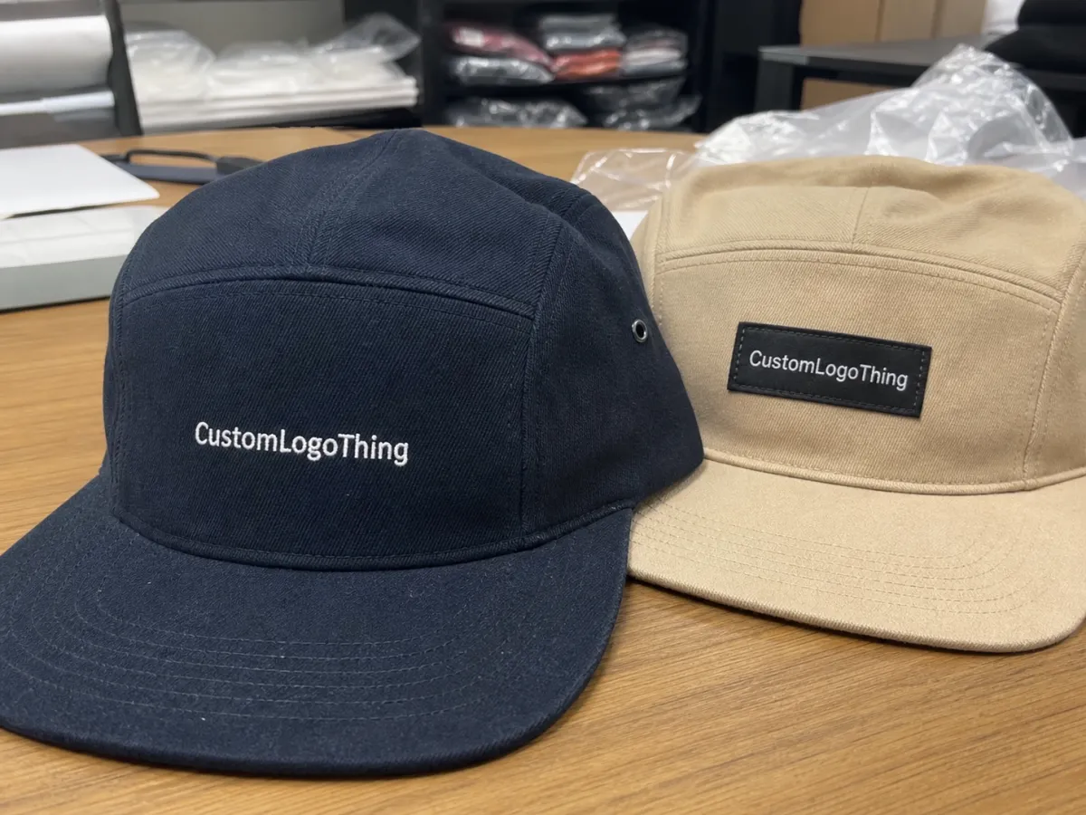
The first constraint is surface area. A five-panel cap gives you one uninterrupted front panel, which is useful, but the usable space is still smaller than most people picture on screen. The crown rises quickly, the sides angle away, and the top seam line sits close enough to the mark that oversized artwork can look crowded even when the measurements seem reasonable on paper.
That is why the same logo can work on a flat sign, look acceptable on a tote, and fail on a cap. A cap is not a miniature poster. It is a curved product with a limited visual window and a very short viewing distance. The closer the viewer, the more detail matters; the farther away, the more the logo has to rely on shape and contrast rather than nuance.
Five-panel caps also behave differently from six-panel dad caps, truckers, and structured snapbacks. Six-panel styles often introduce a center seam, which can split artwork or force placement to move lower. Trucker fronts are often foam-backed or mesh-adjacent, which changes how ink, stitches, and adhesives sit. Structured snapbacks are firmer and can support sharper edges, but the stiffer profile is not right for every brand.
That is the practical core of a Five Panel Caps print method comparison: which decoration method matches the cap structure, the artwork complexity, and the order volume at the same time. Anything else is just style preference dressed up as sourcing strategy.
Think in terms of retail math rather than decoration theory. A brand launch, a club run, or a promotional drop needs legible branding, stable quality, and a price that does not collapse the margin. If the method cannot handle all three, it is the wrong method even if the sample looks impressive.
Which decoration methods hold on a five-panel front?
Screen printing, embroidery, woven patches, PVC patches, and heat transfers all work on five-panel caps, but they do not solve the same problem. Screen print is the cleanest route for bold graphics and simple color work. Embroidery adds texture and a more premium feel. Woven patches handle fine detail better than stitching alone. PVC patches are durable and visually strong. Heat transfers can be useful for short runs and full-color art, especially when speed matters more than texture.
For a simple logo that needs to read quickly, screen print often gives the sharpest visual impact. For a logo that should feel elevated or retail-ready, embroidery is usually the first method buyers ask about. If the design includes small text, intricate linework, or a layered emblem, a woven patch or transfer may preserve the art better than direct decoration. That is not a sales line. It is the difference between a mark that survives production and one that needs to be simplified twice.
Fine type is the usual trouble spot. A brand might send a logo that looks crisp on a web banner or a shirt tag, then discover that the same detail disappears on a cap because the front panel curves and the viewing field is tighter. A good supplier should flag this early. If they do not, the risk usually shows up in sampling or, worse, in the first bulk carton.
Durability depends on use. Embroidery and woven patches tend to handle everyday wear well, including sweat and light abrasion. Screen printing is reliable for many promotional runs, but heavy folding and repeated friction will age it faster than stitching. Heat transfers can last well if the film, adhesive, and application temperature are correct; cheap transfers fail in predictable ways, usually by cracking, lifting at the edges, or losing color fast.
| Method | Best use | Typical decoration cost at 500 pcs | Setup / tooling | Main tradeoff |
|---|---|---|---|---|
| Screen printing | Bold 1-3 color logos, larger front marks | $0.45-$1.10 per cap | $35-$90 per color/screen | Less texture, weaker on tiny detail |
| Embroidery | Simple logos, premium retail look | $1.20-$3.25 per cap | $25-$75 digitizing | Not ideal for fine type or gradients |
| Woven patch | Detailed logos, clean edges, flexible branding | $1.10-$2.60 per cap | $45-$120 patch setup | Extra step, not as flat as direct print |
| PVC patch | Outdoor feel, bold shapes, durable branding | $1.40-$3.50 per cap | $80-$250 mold fee | Heavier look, less suitable for delicate art |
| Heat transfer | Small runs, CMYK artwork, quick sampling | $0.90-$2.10 per cap | $20-$60 setup | Needs good application control |
The table excludes blank cap price on purpose. Too many quotes hide the actual economics by bundling the cap and decoration together, then calling the number “competitive.” It is hard to compare two suppliers fairly if one is quoting a $2.10 blank and another is quoting a $3.60 blank with different fabric weight, crown shape, or closure hardware.
Buyer warning: a polished mockup does not prove fit. If the logo needs to be simplified, thickened, or converted into a patch, it is better to hear that before production starts. Later corrections cost more and usually slow the whole order.
For packaging and sustainability-related checks, paper inserts, hangtags, and carton spec should stay consistent with recognized sourcing standards such as FSC. For shipping and handling expectations on packed goods, the ISTA library is a practical reference, especially once cartons start moving through stacked freight and parcel networks.
Cost, MOQ, and quote math buyers should expect
Most cap quotes are a stack of small charges rather than one clean number. There is the blank cap, then the decoration method, then setup, then any digitizing or mold work, then packaging, and sometimes a fee for revisions if artwork changes after proofing. On modest bulk orders, those fixed costs show up quickly. That is why two seemingly similar quotes can differ by a dollar or more before shipping even enters the conversation.
Embroidery can feel expensive at the low end because digitizing sits on top of the first run. At 50 pieces, that setup can distort the unit price. At 1,000 pieces, it becomes much easier to absorb, especially if the logo is simple and the stitch count stays reasonable. Screen print works the other way: lower setup on the whole, often better at larger quantities, but less forgiving if the art needs sharp micro-detail or many color breaks.
Minimum order quantity matters because some methods need enough pieces to justify the prep. Woven patches and PVC patches usually make better financial sense once the run is large enough to dilute tooling. Heat transfers can be friendlier for low quantities and samples. Embroidery stays flexible, but the final price depends on stitch count, size, thread count, and whether the artwork has to be rebuilt before it can be digitized.
Watch for these line items in any quote:
- Cap blank price: fabric, structure, closure, and crown profile.
- Decoration price: screen, stitch, patch, or transfer.
- Setup charges: digitizing, screens, molds, or art prep.
- Packaging add-ons: polybag, size sticker, hangtag, carton mark.
- Rush fees: charged when the production window narrows.
On a realistic bulk order, a simple five-panel cap can land around $3.50 to $8.50 landed before shipping, depending on blank quality, decoration choice, and packaging. Retail-grade blanks, dense embroidery, molded patches, and extra finishing can push higher. Lower-cost promo caps can sit below that range, but often at the expense of hand feel, consistency, or long-term shape retention.
If the goal is a quote that can actually be compared, ask every supplier to quote the same cap style, same color, same logo width, same placement, and same packaging. Then ask them to separate blank and decoration pricing. That makes cost differences visible instead of hiding them inside a blended total.
Process and turnaround: from art file to delivered cap
The production path is straightforward on paper: artwork review, placement confirmation, method-specific setup, proof or sample approval, bulk production, finishing, then shipment. The schedule becomes less predictable once the artwork is incomplete or the cap stock is not confirmed. A fuzzy PNG, a missing color reference, or a late placement change can slow an order more than the decoration method itself.
Digitizing for embroidery often takes one to two business days when the art is clean. Screen print setup can be fast, but color separation and placement review still take time. Woven and PVC patches usually add another approval step because the patch artwork has to be checked for edge clarity, fill density, and scale before tooling starts. If the cap blank is a special order, supply timing may matter more than decoration timing.
The fastest orders usually have three things in common: vector art, a confirmed blank, and one approved decoration path. The slowest orders tend to have the opposite: vague artwork, multiple “just in case” revisions, and a buyer asking for four decoration options before choosing one. That is how a one-week job becomes a three-week job without anyone doing anything technically wrong.
A few practical timeline ranges help set expectations:
- Simple embroidery or screen print: often 7-12 business days after proof approval.
- Patch-based orders: often 10-15 business days, sometimes longer if a sample is required.
- Rush production: possible on stocked blanks, but usually costs more and narrows method options.
Rush does not erase production constraints. A molded PVC patch still has to be made. A transfer still has to be applied within temperature and pressure limits. A complicated placement still has to fit the cap surface. Fast quotes are useful, but they are only credible if the method and schedule match what the factory can actually control.
Once the caps are packed, shipping and carton handling become part of quality control. Ask how caps are counted, bagged, and cartonized before production begins. That is where damage and shortage claims often appear, especially on larger outbound shipments. Testing references from ISTA are worth checking if the order is moving through multiple handoffs.
Design variables that change the final result
Fabric choice changes the result more than many buyers expect. Cotton twill, brushed cotton, canvas, polyester blends, and foam-front constructions all respond differently to heat, stitch density, and adhesive pressure. A logo that lays flat on one blank may lift slightly or look more rigid on another. That is normal; it is also why the blank should never be treated as a generic line item.
Fabric weight matters too. A heavier twill can support denser embroidery and hold its shape better, while a softer fabric may show more distortion around the mark. On lighter promotional caps, a heavy stitch count can pull the panel and make the surface pucker. That is one of the more common quality issues on cap orders: the art is correct, but the fabric was not the right partner for the decoration.
Placement changes the look as much as the method. Center front is the most common choice because it reads clearly from a distance. Left-front and right-front placements feel subtler and often more retail-minded. Side placements can work for understated branding, but they shrink visibility. Above the opening can look clean if the logo is short and the cap shape gives enough room. Placement should be chosen with the logo proportion, not just habit, in mind.
Contrast is non-negotiable. A pale logo on a washed or muted cap can look elegant in a proof and vanish in daylight. Good cap decoration usually depends on a stronger contrast than buyers first request. That is especially true on headwear, where the viewing angle changes as soon as the wearer moves.
Artwork style should be judged honestly. Bold type, simple icons, and clean geometry travel well across most methods. Tiny serif text, hairline borders, and gradient fades do not. If the logo has to survive on a curved front panel, simplification is not a compromise; it is often the difference between a decent production result and a brand mark that looks strained.
Screen print and digital print can also affect color expectations. Screen print generally prefers spot colors and strong solids. Digital or transfer-based work can carry CMYK details better, but only if the artwork and application method are suited to the blank. The method is part of the design brief, not an afterthought.
Common mistakes that wreck the order
The biggest mistake is choosing the decoration method because it sounds premium in a mockup. Mockups are useful, but they hide everything that hurts caps: stitch pull, patch thickness, edge lift, heat distortion, and the way curved panels compress art. A good render is not proof that the production result will feel intentional.
Low-resolution artwork is the second classic failure. A tiny JPG sent with a request for crisp lettering almost always turns into a redraw. Thin outlines and small type need vector art or a proper rebuild. If the supplier says they can “make it work” without a redraw, ask what that means in actual production terms.
Another mistake is ignoring setup charges until the quote is emotionally accepted. Then buyers start trimming the wrong things: finishing, packaging, approval rounds, or logo size. That is rarely the right place to save money. It is usually better to simplify the decoration than to underfund the parts that keep the order clean.
Reorders can fail too when buyers assume the first method will always be the best one. A 150-piece promo run and a 2,000-piece retail run do not share the same economics. Costs move, use case changes, and quality expectations rise. Keeping the same decoration method just because it worked once is not consistency; it is habit.
Skipping approval is the last expensive mistake. A digital proof catches placement and size. A physical sample catches texture, density, color, and how the cap sits when worn. If the logo matters, one of those checks should happen before bulk production. Rework is slower than approval, and usually less forgiving.
Expert tips for cleaner decoration specs
Send the supplier a spec, not a vague request. Include cap style, blank color, decoration method, logo width, placement, quantity, target budget, and deadline. If you already know stitch count limits, print color count, or packaging requirements, add those too. Fewer assumptions means fewer surprises when the proof arrives.
Ask for a method recommendation before asking for price. That sounds backward, but it usually shortens the process. Once the artwork and quantity are visible, a supplier can often narrow the options quickly. If the logo should move from embroidery to a patch, or from direct print to a transfer, that answer should come before the quote locks into place.
For complicated art, simplify early. Reduce tiny text. Thicken hairlines. Drop a color if it improves legibility and lowers setup. Move to a woven patch if the detail matters more than the stitched texture. A restrained logo often looks more deliberate on a cap than an overloaded one.
Request a pre-production sample when the logo is sensitive, the color match is critical, or the caps will be visible to customers. Retail collections, event merchandise, and brand launches usually justify that extra check. In those cases, decoration quality is part of the product value, not a minor production detail.
If your packaging already uses FSC paper, recycled inserts, or restrained brand language, keep the cap order aligned with that standard. Buyers notice inconsistency quickly, even when they cannot name it. The cap, the hangtag, the carton, and the artwork should feel like they belong to the same system.
Practical rule: if the logo only looks right when the cap is motionless under perfect studio light, the decoration plan is too optimistic.
Next steps: build the right sample request and quote brief
For a useful quote round, do not send a dozen open-ended questions and hope the supplier interprets them correctly. Choose two decoration methods, one quantity, and one cap color. That gives enough structure to quote the right path without forcing a long back-and-forth over basics.
A simple comparison sheet helps. Rank each method by appearance, durability, unit cost, and turnaround. If one method wins on looks but loses badly on price and lead time, the tradeoff becomes obvious. If another is cheap but weakens the logo, that will show too. Structure does what guesswork cannot.
Ask for one sample or mockup before you lock the order if the artwork is detailed, the front panel is tight, or the cap will be used in front of customers. The cheapest correction is the one made before production starts. The second-cheapest is the one caught in sample review. Everything after that costs more.
Use the same comparison framework for reorders. That is how you keep product consistency and notice price movement without treating sourcing like detective work. Materials shift, labor shifts, and finishing costs shift. A clean record makes those changes easier to explain.
For a five panel Caps Print Method comparison that is actually useful, the answer stays the same: match the decoration to the artwork, the blank, the quantity, and the deadline. Do that before the RFQ goes out, and the quote becomes a decision instead of a gamble.
Which five-panel cap print method works best for small orders?
Heat transfers and patches usually make the most sense at low quantities because they give flexibility without demanding large runs to absorb tooling. Embroidery can still work, but digitizing and setup can make the first dozen units feel expensive. If the logo is simple, compare sample cost and final appearance before choosing the method.
Is embroidery or screen printing better on five-panel caps?
Embroidery gives a textured, premium look and usually wears well on simple logos with solid shapes. Screen printing is better for flat graphics and larger marks when the front panel layout supports it. If the design has tiny text or fine borders, a patch or transfer may be the safer choice.
Can I print a detailed logo on a five-panel cap?
Yes, but the detail has to survive a smaller front panel and the cap’s curve. Thin lines, tiny type, and gradients may need to be simplified before production. Ask for a method recommendation first so the design is matched to the cap instead of forced onto it.
What is the usual turnaround for custom five-panel caps?
Turnaround depends on blank stock, decoration method, and how fast artwork is approved. Simple embroidery or screen print often runs faster than patch-based work, while samples and revisions add time. The safest move is to confirm the full schedule before approving the quote.
What artwork should I send before asking for a quote?
Send vector artwork if possible, plus the cap color, logo placement, quantity, and any hard limits such as target unit cost or deadline. If you only have a rough sketch, say so upfront so the supplier can quote the right decoration path and flag any rebuild work early.


