Buyer Fit Snapshot
| Best fit | Custom Kraft Labels for Boxes projects where brand print, material claims, artwork control, MOQ, and repeat-order consistency need to be specified before quoting. |
|---|---|
| Quote inputs | Share finished size, material target, print colors, finish, packing count, annual reorder estimate, ship-to region, and any compliance wording. |
| Proofing check | Approve dieline scale, logo placement, barcode or warning zones, color tolerance, closure strength, and carton packing before bulk production. |
| Main risk | Vague material claims, crowded artwork, missing packing details, or unclear freight terms can make a low unit price expensive after revisions. |
Fast answer: Custom Kraft Labels for Boxes: Material, Adhesive, Artwork, and MOQ should be specified like a repeatable production item. The safest quote records material, print method, finish, artwork proof, packing count, and reorder notes in one written spec.
Production checks before approval
Compare the actual filled-product size with the drawing, then confirm tolerance on folds, seals, hang holes, label areas, and retail display edges. Reserve space for logos, QR codes, warning copy, and material claims before decorative graphics fill the panel.
Quote comparison points
Review material grade, print process, finish, sampling route, tooling charges, carton quantity, and freight assumptions side by side. A quote is only useful when the supplier can repeat the same color, closure quality, and packing count on the next order.
Custom kraft Labels for Boxes do one very specific job: they make a shipping carton look like somebody cared how it showed up. Not in a fussy, overdesigned way. Just enough to signal brand discipline, decent taste, and a packaging team that understands brown board is not a free pass to wing it.
Used well, they fit product packaging, subscription mailers, retail cartons, and DTC shipments that need a natural look without drifting into craft-store cosplay. The whole point is to keep the box honest. Clean. Quiet. Intentional.
From a buyer’s angle, the appeal is pretty obvious. Custom kraft labels for boxes can carry branding, barcodes, handling instructions, batch codes, flavor names, and seasonal copy in one adhesive layer. That means fewer print steps on Custom Packaging Products, less overprinting, and more flexibility when the box itself stays plain, recycled, or FSC-certified. One label can do the work of several moving parts. Nice when your budget is not made of fairy dust.
Kraft is not magic. The stock, adhesive, print method, and application process decide whether the final box looks intentional or like a rushed warehouse fix. Corrugated board brings its own personality too. It is textured, sometimes dusty, and rarely interested in making your life easier.
I have seen beautiful label art fall apart because the carton surface was rougher than expected, or because the adhesive was chosen for a nice mockup instead of a real shipping lane. That is the part people miss. The sample is not the job. The job is the box after handling, stacking, transit, and a tired person applying it at speed.
What Are Custom Kraft Labels for Boxes?
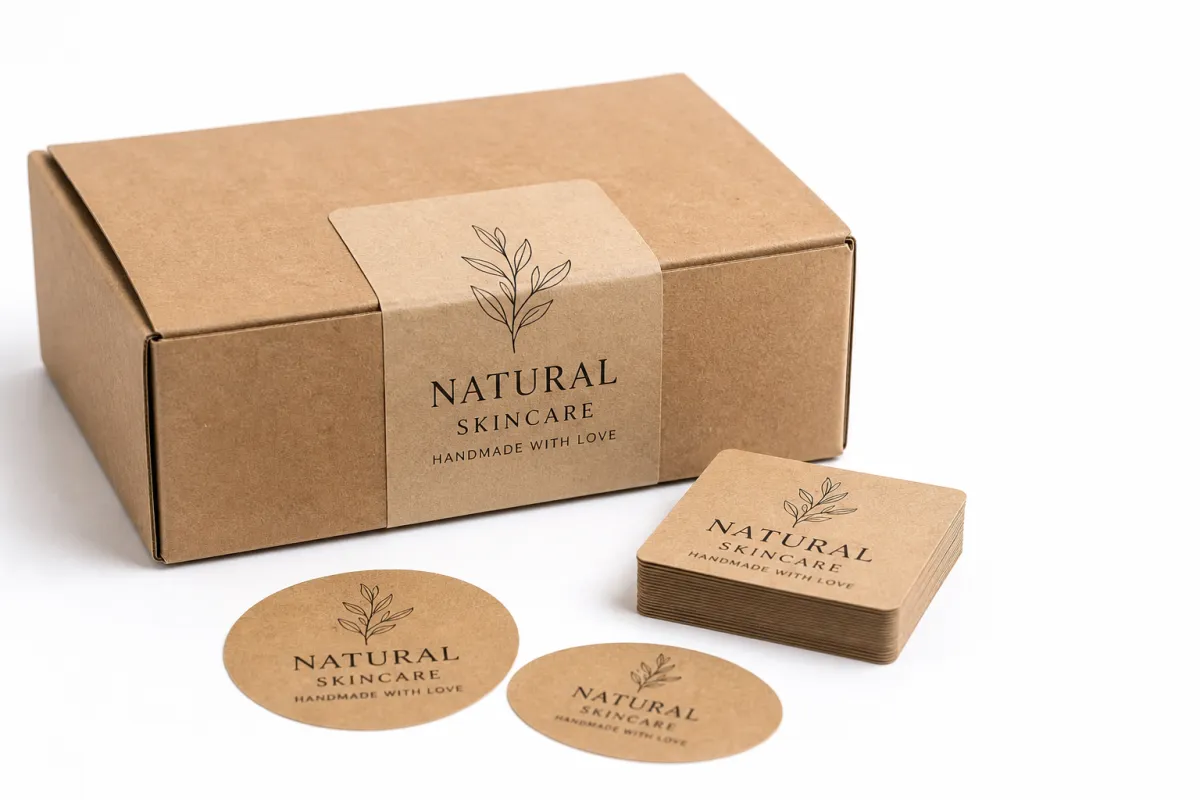
Custom kraft labels for boxes are paper-based labels printed on kraft-style stock so they sit naturally on corrugated cartons, folding cartons, mailers, and other packaging with a warm, earthy finish. They are built to belong on brown board instead of fighting it.
That matters because a white label on a brown carton can work, but it can also look disconnected if the art, size, or color balance misses the mark. Custom kraft labels for boxes usually blend more naturally into the packaging system, especially when the brand wants recycled content, less visual clutter, and a grounded look. That is why they show up so often in sustainable packaging programs and in brands that want package branding to feel honest instead of loud.
In practice, brands use kraft labels in a few different ways. Some put one large front-panel label on the box with the logo and shipping details. Others use smaller labels for scent, size, flavor, collection, or internal SKU. On custom printed boxes, a kraft label can also cover the gap when the base carton stays stock plain and the business needs a flexible way to change artwork without ordering a full new run every time a promotion changes.
There are three common kraft looks worth separating:
- Uncoated kraft has the rawest feel, with a matte surface and visible fiber texture that works well for simple, earthy branding.
- Coated kraft gives a smoother face, which helps fine text, small barcodes, and richer color coverage print more cleanly.
- Textured kraft adds more tactile character, but the extra variation can soften detail and make tiny elements harder to read.
The choice changes more than appearance. It affects ink holdout, contrast, scannability, and the way the label feels in a customer’s hand. A buyer looking for custom kraft labels for boxes should think past color swatches and ask what the label needs to survive in real shipping conditions.
That is where people get lazy. A kraft label is not just decoration. It often has to survive warehouse handling, vibration in transit, and maybe cold or humid storage before it reaches the customer. If the job includes barcodes or compliance copy, the label has to stay readable, not just pretty enough for the mockup.
Think of custom kraft labels for boxes as one layer in a larger packaging system. The label sits on top of the corrugated construction, the print method, and the fulfillment workflow, so it needs to match the rest of the box program. Rough recycled board wants one kind of treatment. A smoother liner can handle a more refined label without looking out of place.
There is also a branding angle that gets missed a lot. Kraft labels give a company room to look calm without looking generic. That is a hard balance to strike, and it is one of the reasons these labels keep showing up in food, beauty, apparel, and specialty goods. They are not flashy. They are dependable. That counts for more than people admit.
How Custom Kraft Labels for Boxes Are Made and Applied
The production path for custom kraft labels for boxes is usually simple on paper and a little less simple in real life. It starts with artwork setup, where the printer checks trim size, safe area, bleed, barcode placement, and any versioning such as scent names or batch numbers. Then comes material selection, print setup, finishing, inspection, and final packing for shipment.
Digital printing usually wins on short runs because setup is faster and artwork changes are easier to manage. Flexographic printing often makes more sense at higher quantities because the unit cost improves once the press is running steadily. Specialty finishing, like spot varnish or a tactile detail, can be added when a brand wants the label to stand out without losing the kraft look that makes custom kraft labels for boxes attractive in the first place.
Application matters just as much as printing. Labels may be applied by hand, with a tabletop dispenser, or on a semi-automatic line if the volume justifies it. On a smooth folding carton, placement is usually easy. On corrugated boxes, especially recycled board, the texture can make the edge less predictable, so pressure and alignment matter more. A label that is slightly too small can look lost. A label that straddles a flap line can make a good design look careless.
Surface prep is one of those unglamorous steps that saves money. Dust from corrugated board, loose fibers, or warehouse residue can weaken adhesion. When a team is applying custom kraft labels for boxes by hand, it helps to wipe the panel lightly and avoid seams, scores, or high-friction edges. That small habit prevents a lot of rejected cartons later.
Color checks and proof approval matter too. Kraft stock is not a blank white sheet, so inks behave differently on it. A dark logo can look rich and solid. A pale pastel can disappear if the contrast is too soft. Good production teams compare the proof to the actual board, not just the screen mockup. That is how custom kraft labels for boxes stay consistent from the first carton to the fiftieth pallet.
Coordinated packaging systems benefit from labels that match tissue, inserts, mailers, and box prints. That is where coordinated Custom Labels & Tags keep the set looking unified without forcing every component to be printed the same way. If the brief is cost control plus presentation, modular packaging usually beats trying to make every surface do the same job.
Teams that care about transit performance often use the same discipline they would use in shipment testing. The general principles behind ISTA transit testing apply here: good packaging is not only about how it looks on a bench. It has to survive handling, vibration, compression, and drops after it leaves the facility.
A kraft label is doing two jobs at once: it has to carry the brand story and still behave like a working production component.
That sounds basic, but it is exactly where a lot of packaging projects wobble. The design team wants a clean visual. Operations wants fewer failures. Procurement wants a good rate. The label has to answer all three, which is why the process deserves more attention than a quick approval over email.
Key Material, Adhesive, and Design Factors
The best custom kraft labels for boxes start with the right stock. Recycled content, FSC-certified paper, face texture, thickness, and liner choice all shape the end result. If the brand wants a visibly natural surface, uncoated kraft is usually the most authentic option. If the artwork needs sharper detail or the label carries a barcode, a smoother kraft face stock is the better call.
Buyers who care about sourcing often ask about responsible fiber claims. Good instinct. Check chain-of-custody details on the paper itself instead of trusting a marketing line that sounds nice and proves nothing. The standards behind the FSC mark give buyers a clearer way to compare paper sources, especially when sustainability is a real requirement and not just a brand mood.
Adhesive choice is where a lot of packaging headaches start. Permanent adhesive is the most common for shipping boxes because it stays put through fulfillment, parcel movement, and customer handling. High-tack adhesive helps on rough, dusty, or highly recycled board, where the surface needs a stronger bond. Removable adhesive can work for reusable packaging or limited-time promotions, but it is not the answer for every shipping job. Freezer-grade adhesive is the specialist option for cold-chain or chilled storage, where standard adhesive can fail once condensation or low temperature gets involved.
For custom kraft labels for boxes, design has to respect the color of the stock. Brown paper lowers contrast, so thin line work and pale colors disappear faster than people expect. Bold type, heavier strokes, and cleaner layouts usually perform better. If a logo is delicate, it may need a simplified version for kraft stock so it does not blur into the background and vanish like a timid intern at a trade show.
Shape matters too. Square and rectangle labels are the easiest to position and work well when a box panel has a clear center zone. Circle labels can feel friendlier or more premium, but they need room around them. Custom die-cut shapes can help brand storytelling, yet they also raise setup complexity and can push the unit cost higher. For many brands, custom kraft labels for boxes work best when the shape stays simple and the design is allowed to breathe.
Finish choices deserve restraint. Matte and uncoated finishes usually reinforce the natural look, while heavy gloss can feel out of step with a sustainable packaging brief. Foil can look great, but it can also pull the label away from the low-waste visual language the brand is trying to build. Laminates add durability, yet they may complicate recyclability depending on the construction. If the goal is honest package branding rather than decorative excess, restraint usually wins.
Barcode placement deserves its own attention. Quiet zones around codes should stay intact, and the print contrast needs to be strong enough for reliable scanning. Kraft stock makes that more important because the background can visually flatten thin bars or small QR codes. A label can look fine to the eye and still scan badly if the art is too intricate. Good custom kraft labels for boxes leave room for machine readability, not just visual balance.
Here is a quick way to think about the common options:
| Option | Best Use | Typical Strength | Typical Tradeoff |
|---|---|---|---|
| Uncoated kraft | Earthy branded packaging and simple graphics | Natural feel, low-glare finish | Less sharp detail on fine artwork |
| Coated kraft | Barcodes, small text, fuller color coverage | Cleaner print reproduction | Slightly less raw texture |
| Textured kraft | Premium retail packaging and tactile presentation | Strong handmade character | More variation in print clarity |
| High-tack adhesive | Rough recycled cartons and tough surfaces | Stronger bond on uneven board | Harder to reposition once applied |
That table is a starting point, not a rulebook. A solid packaging buyer still has to match the label to the box, the fulfillment method, and the customer experience. The right material for custom kraft labels for boxes is the one that balances appearance, adhesion, and production reality without making the warehouse team wrestle with every carton.
One more thing that matters in the real world: temperature swings. Labels that behave beautifully in a climate-controlled office can get weird in a loading dock, then fine again once the box warms up. That kind of movement is normal. If your packaging program lives in that environment, the label spec should account for it instead of pretending the building is always comfortable.
Cost and Pricing: What Changes the Quote?
Pricing for custom kraft labels for boxes comes down to the usual suspects: size, quantity, print method, number of colors, adhesive type, stock thickness, finishing, and whether the label needs a Custom Die Cut. A simple planning range helps. Short digital runs might sit around $0.18-$0.42 per label, while higher-volume orders can move into the $0.05-$0.16 range depending on coverage and spec. Those ranges are broad on purpose because label economics shift fast with run length and material choice.
Short runs cost more per piece because setup gets spread across fewer labels. Larger runs reduce unit cost because press setup, inspection, and buying power are shared across more pieces. That is why a quote for custom kraft labels for boxes can look expensive at 500 pieces and much friendlier at 5,000 or 10,000. The printer is not just selling paper and ink. They are selling setup time, process control, and consistency.
Some costs are obvious. Others hide in the margins. A proof round, a revised dieline, a custom knife, rush freight, and split shipments can add cost without changing the label itself. If artwork needs versioning for multiple SKUs, that affects price too because the press workflow becomes more involved. The same goes for barcode checks or a specific adhesive that is harder to source.
Do not compare quotes by unit price alone. Look at labor savings, fewer misapplied labels, better consistency on the box face, and the way the final carton supports retail packaging or direct-to-consumer presentation. A label that saves ten minutes per case line and cuts rework is often worth more than a cheaper label that creates friction every week.
Multiple quote scenarios help. Ask for two or three quantities, then compare a base kraft stock, a smoother face stock, and an adhesive upgrade. That gives you a real view of where the cost-to-performance balance sits for custom kraft labels for boxes instead of forcing the decision off one line item. The best quote is not always the lowest quote; it is the one that still works when the cartons hit the fulfillment floor.
If the program includes both product packaging and shipping cartons, quote comparisons can show whether labels, inserts, and box finishes should be standardized. A bit of standardization often improves buying efficiency, especially when the brand wants custom kraft labels for boxes across several product lines.
And yes, the cheapest option can still be the most expensive one once you count reprints, rejected cartons, and warehouse time. That part is kinda annoying, but it is real.
Process and Timeline: From Proof to Finished Labels
The timeline for custom kraft labels for boxes usually starts with art review and material selection. After that comes proofing, approval, print setup, finishing, inspection, and shipment. Simple repeat orders move faster because the printer already knows the stock, press settings, and die. New work takes longer because every variable has to be checked, especially when the design includes multiple label versions or a new adhesive spec.
A typical planning window for standard production is often 10-15 business days after proof approval. Simpler repeat runs can move faster, and more complex jobs can take longer. If the order needs a custom die, a special adhesive, or multiple SKUs, the schedule stretches. Teams managing launch dates should build in extra time for proof review and correction rounds. That matters even more for custom kraft labels for boxes that must coordinate with custom printed boxes, inserts, and fulfillment inventory arriving on separate schedules.
Delays usually show up in predictable places. Artwork is one. A logo may need to be resized, the barcode may need more quiet space, or the label may need a stronger contrast ratio to work on kraft stock. Compatibility testing is another. If nobody confirms how the adhesive behaves on the exact corrugated board, the team may find too late that the label lifts at the corners or does not wet out properly on the liner.
Sample proofs and short test runs are worth the time. A single proof sheet can show whether the board tone makes the type too light, whether a QR code scans cleanly, and whether the label edges lift when the carton is rough. In production terms, a test roll or pilot carton run is cheap insurance. It is much cheaper to catch a problem before 25,000 labels are printed than after the cartons are already scheduled for fulfillment.
Humidity, cold storage, and transit handling can change the outcome. A label that looks fine in a dry office may behave differently after a day in a cold dock or a damp warehouse. That is why the best packaging teams treat custom kraft labels for boxes as part of a system, not a standalone print job. The box, the label, the storage environment, and the application method all need to agree.
The cleanest launch workflow is simple: confirm the box spec first, approve the label art next, and align the label arrival with the carton inbound date. When those pieces are sequenced correctly, the packaging line stays calm and the brand avoids rushed changes that usually cost more than they should.
If you are working with a new supplier, ask for the exact approval sequence in writing. Not a vague timeline. The real sequence. Which proof gets signed first, what triggers the production lock, and when the final spec becomes non-negotiable. That clarity keeps everybody from improvising later.
Common Mistakes to Avoid with Kraft Box Labels
One of the biggest mistakes with custom kraft labels for boxes is judging the proof instead of the real box. A label can look clean on a bright white sample sheet and then lose clarity on a dusty recycled carton with a rough liner. The board changes the visual result, so the final surface has to be part of the approval process.
Another common problem is artwork that is too detailed for the stock. Thin line art, tiny serif fonts, and very light colors can vanish against the brown background. The failure is rarely dramatic. That would almost be easier. The label just feels weak, which is worse because it drags down package branding without announcing itself as one obvious mistake.
Adhesive mismatch creates practical headaches. If the box travels through a humid distribution channel, moves into cold storage, or gets handled many times before the customer sees it, a weak adhesive can lift, curl, or slide. Custom kraft labels for boxes need a bond profile that matches the actual route the carton takes. Rough or dusty board usually needs high-tack.
Inconsistent sizing makes a box lineup look sloppy. If one SKU uses a label that is too large and another uses one that is too small, the unboxing experience loses rhythm. Standardized sizes across similar cartons help a lot. They make the warehouse team’s job easier, they make the buyer’s job easier, and they make the whole line look more disciplined. Small decision, big visual payoff.
Another sustainability mistake shows up more often than it should: treating “kraft” as proof of eco-credibility all by itself. Kraft paper can support a lower-impact presentation, but the actual claim depends on the paper source, adhesive, coating, and overall package structure. If a brand is making environmental claims, those claims should be backed by the real material spec and sourcing documentation, not just the color of the label.
Do not ignore the line between decorative and functional. If the box needs a barcode, a lot number, or a customer service code, that information has to stay readable after printing and application. That is where custom kraft labels for boxes earn their keep. They let a brand keep the carton plain while giving the important details a clean place to live. Useful first. Attractive second. The best labels manage both.
There is also the classic mistake of overpacking the design. Too many icons, too much copy, too many claims. Kraft stock already brings texture and character, so the art does not need to shout over it. A little restraint makes the box feel more expensive, not less.
Expert Tips for Better Custom Kraft Labels for Boxes
If you want better results from custom kraft labels for boxes, start with the actual carton, not a generic sample. Test the label on the exact corrugated board, paper texture, and box color you plan to use. The same artwork can look tighter on one substrate and muddy on another, and the difference is often enough to change the final impression completely.
Bolder typography usually helps. On kraft stock, heavier type reads more clearly than thin, delicate lettering. That does not mean the label has to look blunt. It means the design needs enough visual weight to stand up to the brown background. Clear hierarchy, good spacing, and a restrained palette usually beat busy layouts. Let the material be part of the design instead of pretending it is not there.
Standardize label sizes wherever possible. If the same format can serve multiple products, buying gets easier, inventory clutter drops, and application on the packing line gets simpler. A packaging team that handles custom kraft labels for boxes across several SKUs often does better with a few trusted sizes than with a long list of one-off shapes.
Think about the label in relation to the rest of the packaging system. If the brand uses custom printed boxes for flagship products and plain corrugated cartons for fulfillment, the kraft label can bridge the two worlds. It gives consistency without forcing every carton into the same print method. That matters for brands that want branded packaging with some flexibility built in.
Here are a few habits that save trouble later:
- Ask for a printed proof on the actual stock instead of only a digital mockup.
- Test adhesion on a real box panel, including the edge and any slightly rough areas.
- Check barcode scans under the lighting used in the warehouse or packing area.
- Confirm whether the artwork needs a matte look, a rawer texture, or a smoother face stock.
- Keep one or two backup label sizes if your product line changes often.
A pilot order is one of the smartest moves a buyer can make. It does not need to be huge, but it should be large enough to test print clarity, line speed, adhesion, and stacking behavior. Many issues with custom kraft labels for boxes show up only after the team starts applying labels at production speed. A controlled test run catches those issues while they are still cheap to fix.
If you are building out the broader packaging system, think in layers. You may need a box, a label, a tag, and a shipping insert that all speak the same design language without being identical. That is where a coordinated approach to Custom Packaging Products helps. The goal is not perfect matching. The goal is a system that feels intentional and easy to run.
Keep the sustainability story grounded in facts. If the label stock is recycled, say so. If it is FSC-certified, keep the claim accurate. If the adhesive or finish affects recyclability, understand that before the order goes live. Buyers appreciate honesty, and customers can usually tell the difference between a genuine low-waste choice and a recycled-looking surface doing all the talking.
I also tell teams to keep one physical “golden sample” on the packing floor. Not in a drawer. On the floor. That reference piece makes it easier to spot drift in color, cut, or placement before the problem spreads across a run. It is a small habit, but it saves a lot of guesswork.
Final Takeaways for Custom Kraft Labels for Boxes
Custom kraft labels for boxes work because they solve a real packaging problem: how to make a carton feel branded, credible, and visually calm without overcomplicating the box itself. They fit naturally into sustainable packaging programs, they support package branding, and they give brands a flexible way to manage product packaging without committing every job to full-color box printing.
The best results come from matching the label to the board, the adhesive to the environment, and the artwork to the stock. That sounds basic because it is. It is also where a lot of packaging projects win or lose. If the box is rough, choose a stronger adhesive. If the artwork is detailed, move to a smoother face stock. If the brand wants a lower-impact presentation, keep the finish modest and let the texture do the work. That is the practical side of custom kraft labels for boxes, and it is the side that still holds up after the proof stage is over.
For brands that want the look to feel intentional instead of improvised, the smartest path is usually a sample, a test run, and a careful review of the real carton. Once those pieces line up, custom kraft labels for boxes become more than decoration. They become a dependable part of the packaging system, one that keeps the box looking clean, keeps the line moving, and gives the customer a better first impression right from the outer carton.
If you need one practical next step, make it this: choose the exact carton you plan to ship, print a proof on the real kraft stock, and test it under the same handling conditions your boxes will actually face. That one move tells you almost everything you need to Know Before You place a full order.
Are custom kraft labels for boxes better than white labels?
They often are when the goal is a natural, lower-waste look on brown or recycled cartons. White labels can deliver stronger contrast for colorful artwork, but custom kraft labels for boxes usually feel more integrated with the box when the brand wants an earthy, coordinated presentation. The better choice depends on the artwork, the carton color, and how much contrast the design needs to stay readable.
What adhesive works best for kraft labels on shipping boxes?
Permanent adhesive is the most common option because it stays put through shipping and customer handling. High-tack adhesive is useful on rough, dusty, or heavily recycled board, where the bond has to work harder. If the carton will be reused or the label needs to come off later, a removable adhesive may be worth considering, but it is not the best fit for every custom kraft labels for boxes application.
Can custom kraft labels for boxes hold barcodes and QR codes?
Yes, as long as the code has enough contrast, enough quiet space, and a print method suited to the brown background. Very fine lines or tiny codes can fail if the artwork is too delicate for kraft stock. It is smart to test the scan on a printed proof before ordering full production for custom kraft labels for boxes.
How much do custom kraft labels for boxes cost?
Price usually depends on label size, quantity, print coverage, adhesive type, finish, and whether the shape is standard or custom die-cut. Short runs tend to cost more per unit, while larger runs spread setup cost across more labels. For planning, ask for several quantity tiers so you can see where the best value sits for custom kraft labels for boxes.
How should I design custom kraft labels for boxes so they stay readable?
Use strong contrast, bold type, and clean spacing so the design stands out against the natural brown stock. Avoid extremely fine details, pale inks, and crowded layouts that can blur on textured paper. Good custom kraft labels for boxes give the eye room to breathe and leave enough margin for logos, copy, and machine-readable codes.

