Buyer Fit Snapshot
| Best fit | Custom Kraft Stickers for Boxes That Elevate Unboxing projects where brand print, material claims, artwork control, MOQ, and repeat-order consistency need to be specified before quoting. |
|---|---|
| Quote inputs | Share finished size, material target, print colors, finish, packing count, annual reorder estimate, ship-to region, and any compliance wording. |
| Proofing check | Approve dieline scale, logo placement, barcode or warning zones, color tolerance, closure strength, and carton packing before bulk production. |
| Main risk | Vague material claims, crowded artwork, missing packing details, or unclear freight terms can make a low unit price expensive after revisions. |
Fast answer: Custom Kraft Stickers for Boxes That Elevate Unboxing should be specified like a repeatable production item. The safest quote records material, print method, finish, artwork proof, packing count, and reorder notes in one written spec.
Production checks before approval
Compare the actual filled-product size with the drawing, then confirm tolerance on folds, seals, hang holes, label areas, and retail display edges. Reserve space for logos, QR codes, warning copy, and material claims before decorative graphics fill the panel.
Quote comparison points
Review material grade, print process, finish, sampling route, tooling charges, carton quantity, and freight assumptions side by side. A quote is only useful when the supplier can repeat the same color, closure quality, and packing count on the next order.
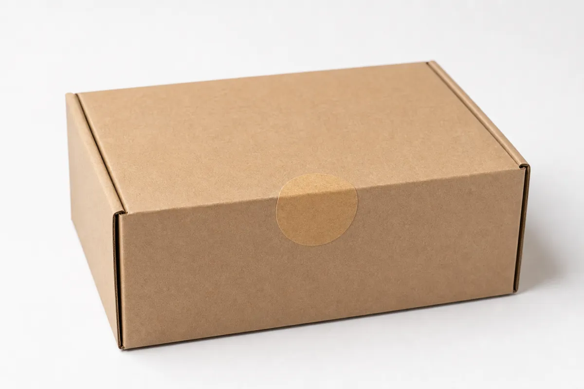
Custom Kraft Stickers for boxes can turn a plain shipper into packaging that feels deliberate, honest, and ready for a brand without forcing a full carton redesign. That is why so many teams use custom kraft stickers for boxes as their first packaging upgrade: the box stays simple, the label does the talking, and the whole thing feels more finished the second the customer cuts the tape.
The effect is not magic. Kraft has a natural brown tone that gives type, line art, and a simple logo more weight than a glossy label usually gets on busy packaging. Brands chasing an earthy, handmade, recycled, or small-batch look often find custom kraft stickers for boxes to be the cleanest way to make packaging feel branded without making production messy or expensive.
I have seen this work in everything from candle cartons to subscription mailers. A good kraft label changes the read of the package before anyone opens it. The box goes from "we found a spare shipper" to "this was planned."
Why custom kraft stickers for boxes feel premium on plain packaging
A plain corrugated carton can do its job and still feel forgettable. Drop a well-sized kraft label on the top panel and the box suddenly reads like a planned brand experience instead of a random mailer. That is the real draw of custom kraft stickers for boxes: they add identity, structure, and a tactile cue without asking the packing line to do much more than place a label cleanly.
Custom kraft stickers for boxes are paper-faced labels with a kraft appearance, usually used to seal cartons, identify products, show a logo, or print a short thank-you message. They show up in ecommerce mailers, retail boxes, bakery cartons, specialty food shippers, and subscription packaging because they belong on cardboard and kraft paper. Once the customer opens the parcel, the label feels part of the box instead of something slapped on later.
The visual trick is restraint. On kraft stock, black ink, deep green, dark brown, or a bold brand mark often looks sharper than a glossy, overworked design. Thin artwork and crowded layouts tend to disappear into the texture, while a clean layout with confident typography can feel expensive because the material already brings warmth and character. That is one reason custom kraft stickers for boxes work so well in packaging design: the background does half the storytelling before the ink even shows up.
That matters on the shelf and at the doorstep. Retail packaging has to catch the eye fast, while ecommerce packaging has to earn its moment during unboxing. Custom kraft stickers for boxes help on both fronts because they support the carton instead of fighting it. A neat flap seal, a centered logo, or a product name set in strong type can make a low-cost carton feel closer to a custom printed box.
A good kraft label does not shout. It steadies the package, gives the eye somewhere to land, and makes the box feel like it belongs to the brand from the first glance.
They also make sense for brands that want to keep the box itself neutral. One stock box can do the job while the message changes with custom kraft stickers for boxes. That approach works well for seasonal promos, limited-edition runs, and short product batches where full-color carton printing would burn too much setup money. If you also need inserts, mailers, or outer cartons, it helps to look at broader Custom Packaging Products so the full system stays aligned.
Honestly, the appeal feels technical and emotional at the same time. Technical because labels are easy to run in controlled quantities. Emotional because people connect kraft texture with care, honesty, and a less wasteful approach. Brown paper does not automatically mean sustainable, and I would never pretend it does. Still, custom kraft stickers for boxes can support that story when the rest of the packaging choices are built with some discipline.
There is also a practical side that gets overlooked. A simple kraft label makes inventory easier when one box size has to serve multiple SKUs. You can change the message without changing the carton. That saves time, reduces storage clutter, and keeps the brand from painting itself into a corner with expensive printed boxes.
How custom kraft stickers for boxes are made and applied
The production path for custom kraft stickers for boxes usually starts with artwork setup, then moves through material selection, print method, cutting, and finishing. A decent supplier checks the label size against the box panel, confirms bleed and safe areas, and asks whether the design needs a matte feel, a more natural uncoated texture, or a smoother surface for print. That planning matters because kraft can look excellent, but only if the artwork respects the stock.
Most orders land in one of three formats: sheeted stickers, roll labels, or individual die-cuts. Sheeted labels usually work best for smaller hand-applied runs, especially when a packing team places labels one at a time during fulfillment. Roll labels move faster if you are using a dispenser or an automated applicator, since the liner feeds cleanly and keeps the pace up. Individual die-cuts make sense when the shape matters and the quantity stays low, but they can slow things down in high-volume packing operations.
Adhesive choice is not just a question of "Will it stick?" It is really, "Will it stick to this carton, in this environment, after handling, transport, and storage?" A standard permanent acrylic adhesive may be fine on smoother cartons, while rough recycled corrugate often needs stronger tack or a formulation meant for textured packaging. Custom kraft stickers for boxes are only as reliable as the bond under them, and a corner that lifts can make the whole package look sloppy.
Surface type matters more than most buyers expect. A kraft label can behave differently on a brown corrugated mailer, a white SBS carton, a coated retail box, or a recycled box with visible fiber variation. Dust, liner residue, and slight curvature around a flap can change how the label lays down. That is why I always push for a real surface test instead of a sticker stuck to a desk. When a team uses custom kraft stickers for boxes on the actual carton, they get a much better read on adhesion and visual balance.
Application is straightforward, but only if the operator respects the box. Peel the label, place it with a light initial touch, then press from the center outward to avoid trapping air. A dispenser speeds things up, yet the rule stays the same: clean placement beats raw speed. A label that sits crooked by a few millimeters can make a premium box feel rushed. With custom kraft stickers for boxes, the textured finish invites scrutiny, so the human part of application matters.
Print method changes the outcome too. Digital print is flexible for lower quantities and variable data. Flexographic printing often makes more sense for repeat runs with simpler artwork and better unit economics at scale. Some buyers ask for spot colors or white ink to improve contrast on kraft stock. That white support can make logos, small type, and barcode elements far easier to read on custom kraft stickers for boxes.
For food, cosmetics, or anything that may face temperature swings, the spec gets a little more serious. Grease resistance, freezer performance, and moisture exposure all matter. Kraft face stock can look natural, but if the adhesive fails in cold storage or the print smears near condensation, the label has done exactly none of its job. Packaging is kinda unforgiving that way.
If your operation uses more than one packaging format, it helps to align labels with Custom Labels & Tags so the look stays consistent across inserts, product packaging, and shipping cartons. Consistency is where branded packaging starts to feel intentional instead of improvised.
What affects the look, durability, and pricing of custom kraft stickers for boxes
Pricing for custom kraft stickers for boxes comes down to a few concrete variables, and size usually sits at the top. A 2-inch seal label and a 5-inch front-panel label do different jobs, but they also use very different amounts of material, press time, and cutting time. When buyers ask for a price, the first useful question is often how large the sticker needs to be on the box, not how large it can be.
Shape changes cost too. Simple rectangles, squares, and circles are usually the most efficient because they cut cleanly and nest well on the press sheet or roll. More intricate shapes can look great, but they may add tooling costs or waste. If your artwork is still evolving, it makes sense to compare a simple cut with a custom die shape before committing to a large run of custom kraft stickers for boxes.
Quantity has a clear effect on unit price. A small run of 500 pieces will usually land at a much higher per-unit cost than 5,000 or 10,000 pieces because setup time gets spread across fewer labels. Exact numbers depend on print coverage, adhesive, finishing, and shipping, but the pattern stays the same. Small runs cost more per piece. That is normal label production, not a bad quote.
Print coverage matters as well. A label with one color and a modest logo usually costs less than a design with heavy solids, multiple spot colors, or a white underprint. Fine typography can also create problems if it gets too small for the kraft surface. That does not mean the design has to be boring. It just means the design should respect the material. The best custom kraft stickers for boxes usually lean on hierarchy instead of visual clutter.
Durability is another place where reality matters more than wishful thinking. Kraft Paper Labels can hold up well in normal warehouse and shipping conditions, but they are not all equally suited to moisture, freezer exposure, condensation, or abrasion from rough transit. If a box will live in a damp environment or move through a cold chain, ask whether the stock and adhesive are made for that. For shipping-related testing, many teams also look at methods used by organizations like ISTA, especially when packages need to survive vibration, drops, or temperature swings during transit.
The box surface Shapes the Final look just as much as the label. A kraft label on a smooth white carton often looks sharper than the same label on a heavily textured recycled box. White board can raise contrast. Brown board can create a quieter, tonal finish. Printed cartons can make the label feel integrated or visually crowded depending on the artwork. That is why custom kraft stickers for boxes should be judged as part of the packaging system, not as a standalone object.
A lot of brands underestimate how much ink coverage changes the feel. Heavy floods can make kraft lose its natural charm. Sparse layouts keep the paper visible and usually feel more premium because they let the substrate breathe. That is not me being poetic. It is just print behavior.
| Format | Best for | Typical advantages | Watch-outs |
|---|---|---|---|
| Sheeted labels | Small to medium hand-applied runs | Easy to store, easy to count, simple for manual pack stations | Slower in high-volume fulfillment, more handling than rolls |
| Roll labels | Fast packing lines and dispenser use | Efficient application, good for repeat SKUs, better for automation | Needs compatible dispenser or applicator, roll specs must match equipment |
| Individual die-cuts | Premium presentation pieces and lower volumes | Strong visual impact, flexible shapes, good for special promotions | Can slow hand application and raise unit cost if the shape is complex |
For brands building a broader packaging system, the environmental angle also comes into play. Kraft face stock may support a natural look, and some applications may use recycled content or FSC-certified paper, but those are separate questions from print quality or adhesive performance. If sustainability claims matter to your customers, verify them carefully through the paper chain. The Forest Stewardship Council is a useful reference point, and you can review its standards at fsc.org. I would never treat a brown label as proof of sustainability on its own.
Step-by-step process and timeline for ordering custom kraft stickers for boxes
The cleanest orders for custom kraft stickers for boxes start with a short but specific brief. Before anything gets quoted, define the box size, where the sticker will sit, what the sticker needs to do, and how it will be handled. A seal label for a flap is not the same spec as a front-facing brand mark, and a shipping carton label with barcodes has different legibility needs than a thank-you sticker tucked into the corner of a mailer.
Once the brief is clear, the next step is artwork proofing. Ask for a digital mockup at the correct dimensions, then check the design against the real carton color instead of a generic white background. On kraft stock, contrast shifts quickly. A logo that looks great on a screen may need thicker strokes, darker ink, or a simpler layout to read cleanly in print. That is especially true for custom kraft stickers for boxes that use small type, fine borders, or multiple lines of copy.
After proofing comes production planning. Simple repeat runs can move quickly because the supplier already knows the size, stock, and finishing format. New shapes, specialty adhesives, or multi-color artwork usually need more setup time. In many label programs, a straightforward order might be produced in roughly 10-15 business days after proof approval, while more complex jobs can take longer depending on press schedule and finishing. Add shipping time on top of that, and the real lead time becomes easier to plan around.
That buffer matters more than people think. If the stickers are tied to a launch, a holiday shipment window, or a packaging changeover, squeezing the schedule too tightly creates avoidable stress. A production slot might be open, but shipping delays, proof revisions, or carton changes can still push the order back. For that reason, I always tell teams to plan custom kraft stickers for boxes with some breathing room, especially when the labels sit inside a larger branded packaging rollout.
Here is a practical ordering sequence that keeps most projects on track:
- Measure the box panel and define the label purpose.
- Select one or two sizes that fit the most common carton format.
- Confirm the artwork version, color usage, and required text.
- Request a proof and verify contrast, margins, and cut lines.
- Test adhesion on the actual carton surface.
- Approve production only after the test feels right.
- Schedule delivery with enough time for packing and staging.
A pre-production test is one of the cheapest ways to avoid a mess later. Stick a sample onto the exact carton stock, leave it for a day, then check the edge behavior, the artwork under warehouse lighting, and the placement next to tape seams or printed graphics. With custom kraft stickers for boxes, that simple check often catches problems before they turn into a full-run headache.
If your team handles shipping cartons and retail packaging, it also makes sense to line up the label order with other custom printed boxes and inserts so the presentation shares the same visual language. That kind of coordination is where package branding starts to feel controlled instead of patched together.
Common mistakes that weaken custom kraft stickers for boxes
The biggest mistake I see with custom kraft stickers for boxes is overdesign. Kraft is not a loud surface, and it does not reward tiny copy, delicate strokes, or crowded layouts. If the design depends on thin gray text or a busy background image, the natural paper tone can swallow the detail and make the label feel weaker than intended. Strong, simple artwork almost always performs better.
Wrong adhesive is another common miss. A label that looks fine on a smooth sample sheet may fail on rough corrugate, recycled board, or a dusty production line. Edge lift usually starts small, then grows as the box flexes during handling. That is why material selection is not a side issue. For custom kraft stickers for boxes, adhesive choice is part of the design, not a footnote.
Ignoring the carton surface is just as risky. Recycled cardboard can vary from batch to batch, and that variation affects both appearance and bond strength. One pallet may feel more fibrous; another may hold more dust from cutting and converting. If the same label has to work across several box lots, test the worst-case carton, not the nicest one. That advice saves time and usually saves rework too.
Sizing errors are another easy way to flatten the finish. A sticker that is too small can look timid on a large mailer, while an oversized label may cross a seam, cover a structural fold, or fight with printed carton graphics. For custom kraft stickers for boxes, proportion is part of the premium feel. The label should feel present, not combative.
People also rush proof approval. That is where spelling mistakes, misaligned logos, wrong SKU references, or off-brand color choices are easiest to catch. Proofing is not a formality. It is the last quiet chance to stop a batch of wrong labels before they become a warehouse problem. If the proof looks off, trust your eye and ask for a revision. With custom kraft stickers for boxes, even a small correction can protect the whole presentation.
Storage gets forgotten too often. Labels held in heat, humidity, or direct sun can behave differently once they reach the pack station. Keep them flat, dry, and away from temperature swings so the adhesive and liner stay stable. Basic production hygiene, sure. Still matters.
Another failure point is trying to make one label do every job. A shipping seal, a retail front panel, and a promotional insert are not the same thing, even if they share a logo. When the use case changes, the size, finish, and adhesive should change too. Otherwise the label is doing compromise work before it even reaches the box.
Expert tips for better custom kraft stickers for boxes
If you want custom kraft stickers for boxes to look strong without getting fussy, start with typography. Choose one clear type family, keep the weights bold enough to survive the paper texture, and let the logo or message breathe. Kraft is forgiving in some ways, but it rewards confidence. A label with one strong focal point almost always reads better than one trying to say too much.
Testing a few sizes on the actual carton is one of the most useful things a packaging buyer can do. Print mockups, tape them to the box, step back, and look at the package from the same distance a customer would normally see it. Then open the carton and look again under indoor light. A label that feels balanced at arm's length and still works when the box is opened is usually the right choice for custom kraft stickers for boxes.
When clarity matters, consider white ink or a darker print palette. On brown kraft stock, some colors lose presence faster than people expect. Black, dark green, navy, and deep red usually read cleanly, while pale tones can disappear into the background. Heavier line weights help too. If a logo is intricate, talk with the printer about simplifying it for better reproduction on custom kraft stickers for boxes.
Consistency across SKUs is another practical win. If one company uses five box sizes but keeps the same sticker height and a similar layout, pack teams make fewer mistakes and move faster. That consistency also helps with brand recall because the customer sees the same visual system across product packaging, subscriptions, and returns. In a busy warehouse, that kind of repeatability is worth real money.
There are also a few operational habits that pay off more than people expect:
- Keep label rolls or sheets flat and sealed until use.
- Store them in a dry staging area away from heat.
- Confirm the application point on the box before production starts.
- Train the packing team on pressure and placement standards.
- Check the first 20 boxes before running the full batch.
Those steps are simple, but they cut waste. They also help make sure custom kraft stickers for boxes look the same from the first parcel to the last. If your operation also needs bags, inserts, or branded secondary packaging, it is smart to keep those decisions coordinated so the packaging design does not drift from one item to the next.
One more thing: do not pay for complexity you do not need. A clean rectangle with a strong mark often gives better package branding than a highly elaborate shape. The goal is not to prove the label can be complicated. The goal is to make the box feel right in the hand and clear to the eye.
How to decide on your next order of custom kraft stickers for boxes
The easiest way to decide on custom kraft stickers for boxes is to work backward from the box itself. Measure the panel, identify the most common carton size, and decide whether the sticker is meant to seal, identify, decorate, or do all three. Once that job is clear, the rest of the order gets easier to shape because the sticker has a purpose instead of just a look.
From there, compare a small test order against your current packaging. Put the labels on the real boxes, photograph them under the same light your customers will see, and ask whether the presentation feels more polished, more memorable, or simply more consistent. That test tells you a lot more than a digital proof ever will. For custom kraft stickers for boxes, physical fit is the real proof.
It also helps to build a short checklist before you ask for quotes:
- Box dimensions and panel location.
- Label size and preferred shape.
- Intended use: seal, branding, product ID, or promotion.
- Quantity and target replenishment schedule.
- Adhesive requirement based on carton surface.
- Finish, print colors, and any white ink need.
- Delivery deadline and shipping destination.
That checklist makes quotes easier to compare because you are not just looking at sticker price. You are comparing stock, adhesive, finishing, production format, and freight. Two quotes for custom kraft stickers for boxes can look similar on paper and still differ quite a bit in real value once the labels hit the packing line.
If you are unsure how much to commit to, start with a short-run pilot for one product line or one carton size. That lets you confirm placement speed, adhesion, customer response, and waste issues before you scale. It is a sensible way to introduce custom kraft stickers for boxes into the workflow without locking yourself into a bigger order than the operation can comfortably carry.
That pilot approach also helps with brand development. A label that looks right on one shipping box may need a slight adjustment on a retail carton or a subscription box, and those differences are easier to solve when the order is smaller. Once the team likes the result, scaling up gets much less risky.
For brands that care about package branding, the real decision is not just whether to buy labels. It is which version of custom kraft stickers for boxes best supports the product experience, the warehouse workflow, and the story you want the customer to feel as soon as the box lands on the table. Pick the version that does all three well, and the packaging starts doing real work for the brand.
Practical takeaway for custom kraft stickers for boxes
Start with the carton, not the artwork. If the label size, adhesive, and placement are right for the box, the design can do its job without fighting the package. That is the cleanest path with custom kraft stickers for boxes, and it usually saves time, money, and a few headaches in fulfillment.
My blunt recommendation: print one sample on the exact box you will ship, leave it overnight, and inspect it under warehouse lighting the next day. Check for lift, contrast, seam interference, and whether the label still feels balanced once the box is actually closed. If it passes that test, you are probably in good shape. If it does not, fix the spec before you place the order. That one step catches more bad runs than a pretty mockup ever will.
Are custom kraft stickers for boxes strong enough for shipping cartons?
Yes, if the adhesive matches the carton surface and the box is clean, dry, and free of loose dust. For rough or recycled corrugate, ask for an adhesive designed for textured packaging rather than a generic paper label adhesive. If the box may see moisture or abrasion, test custom kraft stickers for boxes on the actual carton before a full run.
What size should custom kraft stickers for boxes be?
Choose a size that leaves breathing room around the logo or message instead of filling the whole panel. For shipping boxes, a mid-size label often works better than a sticker that crosses seams or corners. The best proportion for custom kraft stickers for boxes changes with mailers, cartons, and rigid boxes, so test on the exact packaging you plan to use.
Do custom kraft stickers for boxes work on recycled cardboard?
Yes, but recycled cardboard can vary more in texture, dust content, and porosity than coated board. That variation can affect initial tack and long-term adhesion, so a stronger adhesive and a quick surface test are smart. If your line is fast, choose a format that feeds cleanly and keeps custom kraft stickers for boxes consistent across batches.
How long does it take to produce custom kraft stickers for boxes?
Simple repeat orders are usually faster than new shapes, special finishes, or highly customized artwork. The timeline depends on proof approval, print method, finishing format, and shipping distance. Build in extra time if custom kraft stickers for boxes are tied to a launch date, holiday order surge, or packaging changeover.
What is the most cost-effective way to order custom kraft stickers for boxes?
Keep the shape simple, use a standard size, and order enough quantity to reduce the unit price without overbuying. Use one consistent label across multiple box sizes when possible so you avoid separate tooling and artwork setups. Compare quotes by material, adhesive, finishing format, and shipping, not just the sticker price for custom kraft stickers for boxes.

