Buyer Fit Snapshot
| Best fit | Custom Mailer Boxes Design for Better Branding projects where brand print, material claims, artwork control, MOQ, and repeat-order consistency need to be specified before quoting. |
|---|---|
| Quote inputs | Share finished size, material target, print colors, finish, packing count, annual reorder estimate, ship-to region, and any compliance wording. |
| Proofing check | Approve dieline scale, logo placement, barcode or warning zones, color tolerance, closure strength, and carton packing before bulk production. |
| Main risk | Vague material claims, crowded artwork, missing packing details, or unclear freight terms can make a low unit price expensive after revisions. |
Fast answer: Custom Mailer Boxes Design for Better Branding: Film, Print, MOQ, and Carton Packing should be specified like a repeatable production item. The safest quote records material, print method, finish, artwork proof, packing count, and reorder notes in one written spec.
Production checks before approval
Compare the actual filled-product size with the drawing, then confirm tolerance on folds, seals, hang holes, label areas, and retail display edges. Reserve space for logos, QR codes, warning copy, and material claims before decorative graphics fill the panel.
Quote comparison points
Review material grade, print process, finish, sampling route, tooling charges, carton quantity, and freight assumptions side by side. A quote is only useful when the supplier can repeat the same color, closure quality, and packing count on the next order.
I remember standing on a corrugate line in Shenzhen, watching a stack of freshly cut mailers come off the Bobst folder-gluer, and thinking, “Yep, the box is the brand now.” That was after a very long day, a bad coffee, and one supplier insisting a 4 mm flap issue was “basically fine.” It was not fine. That’s the kind of moment that teaches you why Custom Mailer Boxes design tips are never just about making a box look pretty. A smart mailer can reduce packing mistakes, protect a fragile product through courier handling, and make the unboxing feel intentional before the customer even sees what’s inside. I’ve seen that play out on factory floors from Shenzhen to Columbus, Ohio, and the difference between a well-planned box and a rushed one shows up fast in breakage reports, labor time, and customer reviews.
If you sell product packaging, branded packaging, or subscription kits, a custom mailer box sits in a funny middle ground. It is not a plain shipping carton, and it is not quite full retail packaging either. It has to ship efficiently, print cleanly, fold accurately, and still carry enough package branding to feel like it belongs to your business, not to a freight warehouse. Honestly, I think that balancing act is exactly why Custom Mailer Boxes design tips matter so much. You are juggling structure, graphics, cost, and production realities in one object that has to work on a line in Dongguan or Vietnam and in a customer’s hands in Dallas.
People often start with the artwork and work backward from there, which is where the trouble begins. The better path is to think about size, protection, and assembly first, then shape the visual design around those decisions. That’s the practical side of packaging design, and once you understand it, you can make faster choices, fewer revisions, and better custom printed boxes overall. Less drama. Fewer “urgent” emails. More boxes that actually run.
Why Custom Mailer Boxes Design Tips Matter More Than You Think
The best mailer I ever saw on a packing line was almost boring to look at, and that was exactly the point. It fit the product with 3 mm of clearance on each side, used a 32 ECT corrugated board with a clean kraft liner, and closed fast without extra filler. The team on that line told me they had dropped their packing error rate because workers no longer had to guess which insert went where. That is one of the quietest wins in Custom Mailer Boxes design tips: the box can improve speed before the customer ever sees it.
Custom mailer boxes are typically corrugated folding cartons made for shipping and presentation at the same time. You’ll see them used for cosmetics, supplements, apparel, candles, electronics accessories, and subscription boxes where the outer shipper is part of the brand experience. They differ from standard shipping cartons because they usually carry more print coverage, more precise sizing, and more emphasis on presentation. They differ from retail packaging because they must also survive parcel handling, warehouse stacking, and the occasional rough toss at a distribution center in places like Memphis, Louisville, or Rancho Cucamonga.
That combination changes everything. A design choice influences print registration, board yield, glue requirements, die-cutting accuracy, and the finished look on the porch. If you are ordering custom mailer boxes design tips for a product launch, the visuals and the structure both matter because one affects the other. A heavy ink flood on a large panel might look sharp in a mockup, but it can slow drying, warp a lighter board, or show rub marks after a few hundred miles in transit from Shenzhen to Chicago.
Here’s the real takeaway: your box is a working piece of manufacturing, not just a canvas. Good custom mailer boxes design tips help you use the right material, reduce waste, and present a brand story that feels deliberate. When I visited a subscription co-packer in New Jersey, the plant manager showed me two versions of the same mailer, one with a cluttered lid and one with a clean centered logo. The cleaner version packed faster, printed better, and got fewer complaints about “cheap-looking” presentation, even though both used the same 32 ECT board and the same flute profile.
“A box that looks expensive but fights the line is not a good box. I’d rather have a simple mailer that runs at 18 packs a minute than a fancy one that slows everybody down.” — conversation I had with a production supervisor at a Midwest fulfillment center
How Custom Mailer Boxes Design Tips Translate Into Real Production
Every custom mailer project moves through a sequence, and if any one stage is rushed, the problems usually show up later in production. It starts with the concept, then a structural dieline, then artwork placement, then a prepress check, then a sample or proof, and finally the full run. In a good factory, that progression is controlled and repeatable, because the die-cutting and folding equipment depends on exact geometry. A few millimeters off on a panel can mean weak closures, poor stacking, or a lid that bows after gluing. On one run I watched in Shenzhen, a 2.5 mm flap shift meant the operator had to stop the line twice before lunch. That is not “minor.” That is a headache with a barcode.
Board selection matters just as much as the graphics. Common choices include 350gsm C1S artboard for premium rigid-feel sleeves and inserts, E-flute for lighter direct-to-consumer products, B-flute for stronger general-use mailers, and sometimes kraft or white-lined corrugated sheets depending on the brand look. Paper liners affect print clarity; a white-lined face gives brighter color reproduction, while kraft can feel earthy, premium, or more sustainable depending on your brand story. Coatings like aqueous, gloss, matte, or soft-touch lamination all change how the box handles under light, touch, and shipping abrasion. This is where custom mailer boxes design tips become very practical, because the finish has to match the board, not fight it.
At the prepress stage, design files move into proofing and color management. If you are printing CMYK on corrugated, I always advise checking the proof against the actual liner, because color shifts on kraft are not the same as on bright white SBS or coated art paper. A deep navy that looks rich on screen can read muddy on brown board if the ink limits are too high. I’ve watched clients learn that lesson after the first proof, and the smart ones adjust the palette before tooling is locked. The stubborn ones? They usually discover the problem after the first shipment, which is a very expensive way to become “educational.”
Timeline is where a lot of people get surprised. A simple one-color mailer on a standard die line can be approved and produced in 12 to 15 business days from proof approval, depending on factory load and freight. If the artwork is ready and the size is standard, that timeline is realistic for suppliers in Guangdong, Ohio, or northern Mexico. Add structural changes, sample rounds, or a seasonal rush, and that timeline expands. Good custom mailer boxes design tips always account for the calendar, not just the mockup.
Timeline variables that slow things down
Three things tend to stretch a project more than anything else: artwork revisions, structural changes, and sample approvals. I once watched a beauty brand go through four dieline edits because their insert tray kept shifting the serum bottle by 6 mm, which sounds tiny until you realize that each edit meant new cut paths, new proof checks, and more back-and-forth with the finishing team in Dongguan. Seasonality matters too. Before holiday peaks, a box plant may already be booked for retail packaging and subscription runs, which means the slot you want is not always the slot you get. If you are quoting in October for a November ship date, you are already flirting with stress.
One more thing: tooling. If your box needs a new cutting die, that creates an up-front setup step that has to be correct the first time. A well-managed factory will send a structural proof or sample, especially for custom printed boxes with unusual folds or locking tabs. That small delay is often cheaper than reworking 5,000 finished units because the flap length was off by 4 mm. Ask me how I know. Actually, don’t — I’ve already stared at enough rejected pallets in warehouse bays from New Jersey to Shenzhen for one lifetime.
Key Design Factors to Consider Before You Order
Start with fit. I know that sounds obvious, but too many teams guess the internal dimensions and then wonder why the product slides around or needs unnecessary void fill. Measure the product in its final retail configuration, not just the bare item. If you are shipping a candle in a rigid glass jar with a dust cover and a booklet, measure all of that together. Even 2 to 3 mm can change whether the box feels snug or sloppy, and that difference shows up in both protection and presentation. A mailer that fits a 79 mm jar perfectly in Shenzhen may fail once someone in Austin adds a hang tag and a kraft insert.
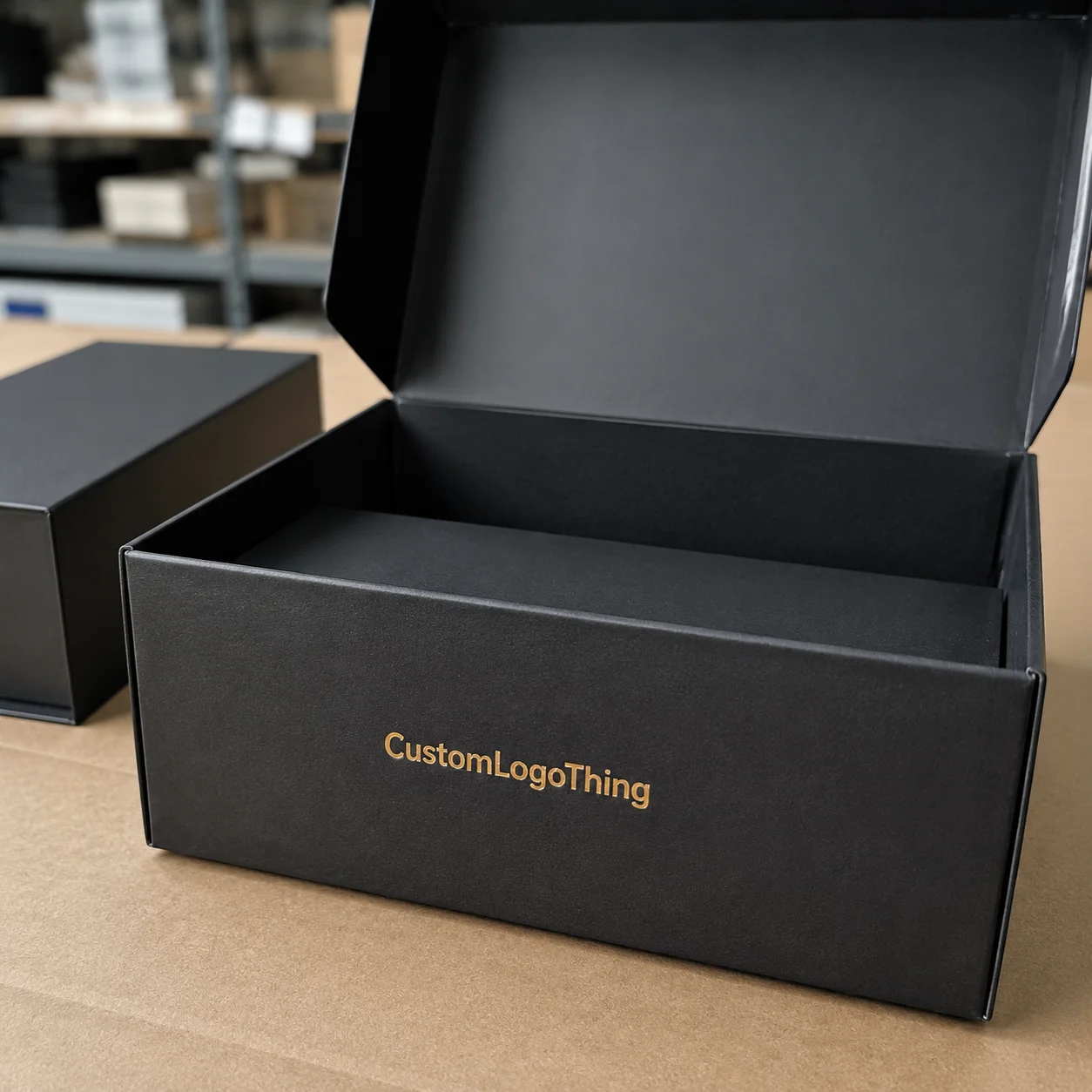
Branding choices come next, and this is where custom mailer boxes design tips get visual. Logo placement should be planned for the opening moment, the side view in transit, and the top-down unboxing shot. Keep the main message where the customer will actually notice it. I often recommend one strong focal point on the lid and lighter treatment on the side panels. If you fill every panel with graphics, the box can feel busy and expensive in the wrong way, like it is trying too hard. Customers in Seattle and Sydney do not need a box shouting at them from three angles.
Typography needs space to breathe. Fonts that look polished in a digital ad can become hard to read when they are printed on a corrugated surface with a slight texture. A 7 pt serif may be fine on coated paper, but on kraft corrugate it can fill in, especially if the ink density is heavy. White space is not wasted space. On packaging design, it creates a cleaner, more premium read, and it helps your message stay legible from arm’s length. If your box is read at 36 inches in a fulfillment center, not on a phone screen, design accordingly.
Structural decisions also matter. A standard roll-end tuck top mailer works well for many e-commerce brands, but you may need a different closure if the product is heavier or if you need extra crush resistance. Dust flaps, reinforced corners, and custom inserts all serve a purpose. Subscription boxes often need a more theatrical unboxing, while retail packaging used as a shipper may need stronger edge protection. If you are unsure, talk to your supplier about the product’s weight, the shipping distance, and how the box will be handled at fulfillment in places like Dallas, Toronto, or Rotterdam.
Materials and finish options can elevate the box, but they also affect cost and production speed. Here is a quick comparison I often share with clients:
| Option | Look and Feel | Typical Use | Cost Impact |
|---|---|---|---|
| Kraft corrugated | Natural, warm, eco-leaning | Apparel, wellness, subscription kits | Usually lower |
| White-lined corrugated | Cleaner color reproduction, brighter print | Beauty, lifestyle, premium retail packaging | Moderate |
| Matte coating | Soft, understated, refined | Luxury product packaging, gifts, subscriptions | Moderate to higher |
| Gloss coating | Bold, vivid, reflective | Promotion-driven branded packaging | Moderate |
| Soft-touch lamination | Velvety, premium hand feel | High-end custom printed boxes | Higher |
| Spot UV | Gloss highlight on selected artwork | Logos, icons, focal design elements | Higher |
Pricing is tied to all of that. A straightforward 1-color mailer on a standard die line can land around $0.38 to $0.62 per unit at 5,000 pieces, depending on board grade and shipping origin. In some Guangdong factory quotes, a simple two-color print on 32 ECT corrugated can come in around $0.15 per unit for 5,000 pieces if the structure is standard and freight is excluded, while a premium white-lined mailer with matte coating and a custom insert can climb to $0.95 or more. I’ve quoted projects where a simple size change added less than 2% to board usage, but a switch from kraft to white-lined sheet pushed the unit cost up by 14% because the supplier had to alter material sourcing and press setup. That is why custom mailer boxes design tips should always include cost thinking from the beginning.
For brands building a larger product line, I also like to compare mailers against other Custom Packaging Products and even paired shipping options like Custom Poly Mailers when the product calls for a lighter, less rigid outer layer. Not every item needs the same box, and the smartest packaging programs usually mix formats by SKU weight, fragility, and branding value. A 220 gsm paper envelope is not going to replace a 32 ECT mailer for a glass jar, no matter how optimistic the procurement team feels on a Tuesday.
Step-by-Step Custom Mailer Boxes Design Tips Process
Step 1: define the product and shipping conditions. Before any artwork starts, write down the product dimensions, weight, surface fragility, and whether the item will ship alone or with inserts, literature, or samples. A 12-ounce candle behaves very differently from a 2-pound skincare set with glass components. If the box has to survive parcel transit, stacking on pallets, and end-user storage, say that up front. In a warehouse in Nashville, I watched a packout team reject a box because the product shifted 9 mm during a drop test. That 9 mm saved a lot of future returns.
Step 2: choose the box style and request a dieline. A good supplier should provide a structural dieline that includes cut lines, score lines, glue areas, and bleed allowances. This is where custom mailer boxes design tips become technical. The dieline is the map, and if your artwork ignores it, the final box will not look the way you imagined. When I worked with a contract packer in Southern California, we spent one afternoon moving a logo 8 mm higher so it would clear a tuck flap. That tiny shift saved them from a very visible misalignment on 10,000 units.
Step 3: place the artwork correctly. Use the dieline layer as a guide, and keep text away from folds, tabs, and closure edges. Bleed usually needs to extend beyond the cut line, while safe zones should keep critical elements inward. Vector art is best for logos and typography because it stays sharp at print size, especially on custom printed boxes. If you are using photos, make sure they are high resolution and color-corrected for CMYK, not RGB. A 300 dpi image that looks fine on screen can still fail if it was compressed into a 72 dpi web file.
Step 4: review proofing carefully. A digital proof is useful, but it can hide texture, ink absorption, and panel distortion. A physical sample tells a more honest story. Check how the lid closes, how the insert fits, whether the print sits cleanly across the fold, and how the colors read in real light. I’ve seen excellent screen proofs turn into weak-looking boxes because the brand color was too close to the kraft substrate and disappeared into the board. A sample in hand, under daylight in a factory yard, beats a monitor every time.
Step 5: approve the sample and confirm production details. Once the sample passes, lock the quantity, delivery address, carton counts, pallet spec, and timing. A project that looks easy on paper can become expensive if the freight assumptions are wrong. If your boxes are going direct to a fulfillment center, ask whether they need master cartons, barcode labels, or pallet height limits. This final stage is where professional custom mailer boxes design tips protect your budget and your launch schedule. A good supplier in Shanghai or Houston will ask for all of that before the first press sheet moves.
In factory terms, the best workflow is boring in the best possible way. You want one clear handoff after another: design, dieline, proof, sample, approval, run. The plants that run smoothly are usually the ones where everybody knows what “done” means before the first sheet enters the press. And if someone says, “We’ll fix it later,” that is your cue to ask for a firmer answer and probably a stronger coffee.
Common Mistakes That Hurt Mailer Box Performance and Budget
The first mistake is overdesigning the artwork. A box can absolutely be beautiful, but if every surface is crowded with gradients, tiny text, and multiple focal points, production becomes harder and the finished box can look muddy. I’ve seen a brand spend money on a full-panel illustration, only to discover that their matte-coated corrugated sheet dulled the contrast so much that the details were lost from two feet away. The fix was a simplified lid design with one focal logo and a cleaner side panel, which actually made the box feel more premium.
The second mistake is ignoring structure. A mailer that looks perfect on a monitor may fail in the warehouse if the board is too light or the flap geometry is weak. If the box is going to be stacked, compressed, or slide across rough conveyor belts, the board grade and closure style need to match that abuse. This is one of the most practical custom mailer boxes design tips because presentation does not matter much if the box arrives crushed. A 28 ECT mailer might be fine for socks in Orlando, but not for glass skincare in a transcontinental lane from Shanghai to New York.
The third mistake is choosing the wrong dimensions. Oversized boxes waste material and create empty space, which often means more filler, more packing time, and more movement in transit. Undersized boxes can crush corners or force workers to overstuff the contents, which is worse. A company I advised in the Midwest was paying for extra void fill on 18,000 units a month because their mailer was 11 mm too tall. That sounds small, but it translated into filler cost, labor minutes, and a slightly awkward unboxing experience.
The fourth mistake is proofing too casually. Low-resolution files, missing fonts, wrong color mode, and artwork crossing folds all cause avoidable delays. Corrugated production is forgiving in some ways, but it is not magic. If a logo sits right on a crease or a barcode gets stretched across a flap, the finished result can fail both visually and functionally. Smart custom mailer boxes design tips always treat proofing as a serious production step, not a checkbox.
The fifth mistake is spending too much too soon on finishes that do not add value. Spot UV can look fantastic on a premium beauty line, but it may not help a simple apparel subscription that ships every month. Soft-touch lamination can feel amazing, yet it adds cost and sometimes complicates recycling. Ask whether the finish supports the brand story, the audience, and the shipping route. If not, skip it. Your budget will thank you, which is rare and lovely.
“The cheapest mistake is the one you catch at proof stage. The expensive mistake is the one sitting in a warehouse as 20,000 printed boxes.” — something a senior buyer told me during a corrugated sourcing review
Expert Custom Mailer Boxes Design Tips for Better Results
I always advise clients to design from the inside out. Start with the product, then the protection, then the presentation, then the print treatment. If the product needs a tray insert, build around that first. If it needs to arrive without scuffing, choose a liner or coating that supports the surface. Only after those decisions are set should you move into brand graphics. That order saves time, and it prevents a lot of “beautiful but unusable” packaging.
One of my favorite custom mailer boxes design tips is to choose a single hero moment. Maybe it is the lid logo, maybe it is an inside print message, maybe it is a clean reveal when the customer opens the tuck flap. Use that one moment to carry the emotional weight, and let the rest of the box stay clean. Side panels do not need to shout. In fact, they often perform better when they simply support the main idea. A box opened in Brooklyn at 8 a.m. does not need a novel; it needs one clear impression.
Another practical tip is to select materials based on the customer journey, not just on trend language. A wellness brand shipping lightweight items across short zones may do fine with a kraft E-flute mailer and a matte finish. A premium electronics accessory sold through retail packaging channels may need a white-lined B-flute structure with tighter print control. A subscription product that ships monthly might benefit from a durable board that resists scuffing and opens consistently after repeated handling. These are production choices, not just style choices.
Keep standard sizes whenever you can. Custom dimensions make sense when the product demands them, but if you can fit within a proven size range, you usually save on board optimization, tooling, and lead time. The factories I trust most like predictable formats because the die-cutting, gluing, and folding sequence stays steady. That steadiness can matter more than a flashy design detail. Standard footprints also make freight planning easier in hubs like Los Angeles, Rotterdam, and Singapore.
Color count is another quiet cost driver. A 4-color process on a heavily customized board can look great, but if the brand can communicate just as well with 1 or 2 colors, the project often becomes easier to print and less expensive to maintain. I’ve had clients save enough on print setup to put that money into a better insert or stronger outer shipper. That kind of tradeoff is part of mature custom mailer boxes design tips, and it usually beats chasing a fancy effect that does not change customer behavior.
One more production-minded habit pays off every time: test a short run in real shipping conditions. Send a few units through the same courier lanes your customers use, then inspect corner wear, surface scuffing, closure integrity, and unboxing quality. I’ve seen a great-looking mailer fail after only one 900-mile transit because the glue area on the lid picked up rub marks from adjacent cartons. A small sample test would have caught it for a fraction of the cost.
For brands building a full packaging system, I also recommend thinking about how the mailer integrates with labels, tissue, inserts, and other branded packaging pieces. The outer box should not fight the rest of the kit. It should set the tone, then let the product speak. If your insert tray is a 350gsm C1S artboard piece and the outer mailer is kraft corrugate, make sure the color palette and copy tone still feel like one family.
If you want more context on durability and shipping standards, two useful references are the ISTA testing standards for transit performance and the FSC framework for responsibly sourced paper and board. For broader packaging industry information, the Institute of Packaging Professionals has solid technical resources.
What Are the Best Custom Mailer Boxes Design Tips for Beginners?
The best place to start is with fit, structure, and print simplicity. Beginners often focus on colors first, but that is backward. A box can have perfect artwork and still fail if the product rattles inside or the closure is weak. The strongest custom mailer boxes design tips for beginners are the ones that keep the project practical: measure the product carefully, request a dieline, use safe zones, and test a sample before approving a full run.
Keep the design clean enough that the box still looks good if the ink, board, or lighting is not perfect. That means clear typography, one strong brand moment, and a finish that matches the material. If you are choosing between three finishes and one of them only adds “nice to have” value, skip it. The box should work hard. Pretty is good. Functional is better.
Next Steps: Apply These Custom Mailer Boxes Design Tips
If you are ready to move forward, begin with three simple actions. Measure the product carefully, write down the shipping conditions, and decide what the box should communicate about your brand in the first three seconds. That sounds basic, but it keeps the project grounded in reality. A box that protects well and tells the right story is almost always better than one that merely looks expensive on a monitor.
Next, gather your practical assets: logo files in vector format, Pantone references if you use them, product photos, and current dimensions. If possible, prepare a rough sketch of how the customer opens the box and what they should see first. Those details make the conversation with a packaging supplier much easier, especially when you are comparing custom printed boxes, inserts, and material options. I’ve sat through enough meetings in Chicago, Los Angeles, and Shenzhen to know that a scribbled sketch can save an hour of vague hand-waving.
Then ask for a dieline, a material recommendation, and a sample quote. Those three pieces tell you whether your idea is actually manufacturable at the price point you want. If the quote jumps because the structure is too complex, simplify the box now instead of after the first proof. That is one of the most valuable custom mailer boxes design tips I can give you, because every revision avoided is time and money saved.
At Custom Logo Things, the strongest packaging programs are the ones that balance branding, protection, and manufacturability in the same conversation. If you keep those three in view, your mailers will do more than move products from point A to point B. They will support package branding, reduce mistakes, and help the customer feel like the box was made with purpose. That is the real value behind custom mailer boxes design tips, and it holds up across small startups, busy fulfillment centers, and high-volume product packaging lines alike.
The practical takeaway is simple: lock the dimensions first, choose the board and closure that match the shipping lane, then build the artwork around the dieline instead of forcing the dieline to rescue bad artwork. Do that, and your next mailer has a much better shot at looking good, running clean, and arriving without drama.
FAQ
What are the most important custom mailer boxes design tips for beginners?
Start with accurate product dimensions and shipping needs before thinking about graphics. Keep the layout simple enough to print cleanly and fold correctly. Ask for a dieline and sample so you can verify fit, strength, and branding in real form. A 2 mm measurement error can become a very visible problem on a 1,000-unit run.
How do custom mailer boxes design tips help reduce costs?
They help you avoid oversized boxes, excess filler, and unnecessary finishing effects. Simple artwork, standard structures, and efficient material choices usually lower per-unit pricing. Planning early reduces costly revisions, remake charges, and production delays. In many cases, a standard-size mailer can save 8% to 15% versus a fully custom shape.
How long does the custom mailer box design and production process usually take?
Timeline depends on artwork readiness, sample approval, box complexity, and order volume. Straightforward projects can move from proof approval to production in 12 to 15 business days, while custom structures with special coatings or inserts may take longer. A realistic timeline should include proofing, revisions, manufacturing, finishing, and freight time from the factory in places like Guangdong, Ohio, or northern Mexico.
What file types and artwork setup are best for custom mailer boxes?
Vector files are usually best for logos and text because they stay sharp at print size. Artwork should be set up on the correct dieline with bleed, safe zones, and fold awareness. A high-resolution proof helps catch color and placement issues before production. For print, 300 dpi is a much safer baseline than anything web-sized.
How do I choose the right finish for a custom mailer box?
Match the finish to your brand style, shipping conditions, and budget. Matte and kraft finishes often feel natural or premium, while gloss can look bold and vibrant. Soft-touch, spot UV, and similar upgrades should be used when they support the product story, not just because they are available. If your shipment is going through rough parcel lanes, test the finish on a sample before approving a full run.