Buyer Fit Snapshot
| Best fit | Custom Pizza Boxes With Logo projects where brand print, material claims, artwork control, MOQ, and repeat-order consistency need to be specified before quoting. |
|---|---|
| Quote inputs | Share finished size, material target, print colors, finish, packing count, annual reorder estimate, ship-to region, and any compliance wording. |
| Proofing check | Approve dieline scale, logo placement, barcode or warning zones, color tolerance, closure strength, and carton packing before bulk production. |
| Main risk | Vague material claims, crowded artwork, missing packing details, or unclear freight terms can make a low unit price expensive after revisions. |
Fast answer: Custom Pizza Boxes With Logo: Branding, Design & Cost should be specified like a repeatable production item. The safest quote records material, print method, finish, artwork proof, packing count, and reorder notes in one written spec.
Production checks before approval
Compare the actual filled-product size with the drawing, then confirm tolerance on folds, seals, hang holes, label areas, and retail display edges. Reserve space for logos, QR codes, warning copy, and material claims before decorative graphics fill the panel.
Quote comparison points
Review material grade, print process, finish, sampling route, tooling charges, carton quantity, and freight assumptions side by side. A quote is only useful when the supplier can repeat the same color, closure quality, and packing count on the next order.
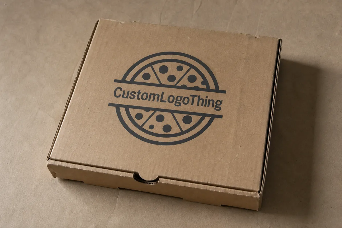
Custom Pizza Boxes With Logo: Branding, Design & Cost
Custom pizza Boxes with Logo do more than keep a pie warm on the way out the door. They shape the first impression at pickup, show up in delivery photos, and keep the shop name visible long after the last slice is gone. A pizza box is packaging, yes. It is also a billboard, a transport container, and a quiet sales tool made from corrugated board.
The box has to earn its keep. It should stack cleanly, resist grease, open without a fight, and survive the trip from oven to doorstep without the lid collapsing or the print turning muddy. That means branded packaging cannot be treated like a leftover item from procurement. If the carton is going to travel farther than the menu ever will, it deserves real attention.
The logo alone does not make the box work. Good package branding starts with board choice, print method, and a layout that matches how the kitchen actually runs. If you want to compare box styles and print-ready formats before locking in a spec, our Custom Packaging Products collection makes that easier to sort through.
A pizza box can make the brand look sharp or make it look careless. There is not much middle ground.
What Custom Pizza Boxes With Logo Really Do
Restaurants keep paying for custom printed boxes for a simple reason: the box keeps working after the food is gone. A plain carton protects the pie. Custom Pizza Boxes with logo keep the name in front of customers while the order moves through the lobby, into the delivery bag, across the table, and onto social media. That reach matters. One box can be seen by the customer, the driver, the family at the table, the office break room, or the neighbor who catches the package on the way in.
The box has three jobs. It protects the food. It signals quality before the lid opens. It makes the shop easier to remember the next time someone gets hungry. That mix is hard to beat for pizzerias, ghost kitchens, stadium vendors, and chains that need every order to look like it came from the same place.
In real life, the carton becomes part of the meal. A clean, well-printed lid feels intentional. A stained, crushed, or fuzzy-looking box feels cheap, even when the pizza inside is great. Customers may not call that out in so many words, but they notice. They absolutely notice it. That is why package branding on pizza cartons still matters even when the design stays simple.
Most box styles fall into a few familiar buckets: single-wall corrugated pizza boxes, usually with kraft or white liners, often paired with grease-resistant coatings or inserts. Some are built for straightforward one-color flexographic printing. Others use smoother surfaces that can handle sharper graphics, QR codes, slogans, and more polished visual treatment. The best fit depends on the pace of the kitchen, the amount of branding space needed, and whether the box is supposed to feel practical or premium.
The real question is not whether the logo prints. The real question is whether the carton protects the pizza, supports the brand, and keeps service moving. If the box fits poorly, drinks up grease, or tears at the corners, the branding does not matter much. If it holds shape and looks sharp, the box becomes one of the easiest forms of custom printed boxes a restaurant can use to stay memorable.
For a late-night shop pushing high-volume delivery, that might mean a plain kraft box with one strong mark and a phone number. For a boutique pizzeria with dine-in traffic, it might mean a cleaner white board, tighter type, and a box that looks good in a customer photo. The right answer depends on the actual operation, not the mockup.
How Custom Pizza Boxes With Logo Are Made
The build usually starts with corrugated board. Single-wall stock is common because it gives pizza boxes the right balance of stiffness, cost, and heat performance. Depending on the job, the board may be specified as 32 ECT or 200# test, with kraft or white liners on the outside. Kraft gives a natural, rougher feel. White creates stronger contrast for logos, especially when the design uses fine type or darker brand colors.
Food service packaging has to deal with more than appearance. The inks and coatings matter too. Food-safe inks are standard in many programs, and the print system has to keep its color through die-cutting, stacking, and folding. Grease resistance is another big one. Pizza boxes deal with steam and oil all the time. If the coating or structure is wrong, the surface gets soft fast. That is where product packaging gets specific to the food it carries.
Printing methods depend on volume and the final look. Flexographic printing is common for larger runs with bold graphics and simple color blocks. It is efficient and repeatable, which suits logos that need to stay crisp on corrugated material. Digital printing works better for shorter runs, seasonal promotions, and artwork that changes often. Litho-lam options come into play when the buyer wants a cleaner, more finished look, with printed paper laminated to the board for stronger image quality.
The dieline turns a flat sheet into a box that actually works. It defines folds, locking tabs, venting, panel sizes, and where the art can sit without getting sliced, buried, or broken by seams. A good dieline prevents the usual mistakes: a logo too close to a score line, a tagline landing on a fold, or copy disappearing once the box gets assembled. It is technical work. It also saves headaches later.
Artwork placement matters just as much as the structure. Some shops want the logo centered on the lid because it reads fast. Others want a repeating pattern or border treatment to make the carton feel more complete. Some use the lid for the logo and the side panel for a website, phone number, or QR code. All of those can work. The trick is keeping the message readable under kitchen lighting, in a moving car, and in a phone photo taken one-handed at a table.
For teams that care about materials, board sourcing deserves a look too. Materials certified through the FSC system can support responsible fiber sourcing goals, while recycling and source-reduction guidance from the EPA can help buyers compare options with a little more discipline. It does not solve every packaging problem. It does give procurement teams a better way to judge the options.
One practical detail often gets skipped: color matching on corrugated board is not the same as color matching on coated paper. A bright brand red or deep navy may need a simplified palette, a stronger contrast choice, or a different board color to hold up well. Ask for a print sample if the brand color is doing a lot of heavy lifting.
Key Design Factors for Branding and Performance
Size comes first. The box has to fit the pizza. Too much empty room lets the pie move around, which can smear toppings and make the lid look messy before the customer even opens it. Too tight a fit presses into cheese, traps steam, and leaves the top looking tired. The right box gives the pizza room to breathe without letting it slide into chaos.
Board color changes the feel of the brand more than people expect. Kraft suggests something natural and straightforward. It works well for simple graphics and rustic positioning. White board pushes the print toward cleaner contrast and a sharper finish, especially for black type or full-color artwork. A smoother or coated surface can improve appearance, but the price and the heat and grease demands have to make sense for the menu. White is not always the premium answer, either; it can show scuffs and grease marks faster than people expect.
Logo size should help recognition, not crowd the lid. Delivery packaging gets seen quickly and often from a few feet away. A simple mark with a strong shape usually wins over a crowded layout packed with tiny text. If a box tries to say too much, it usually says less. A clean logo, one short line, and maybe a web address or QR code usually beat a busy promo panel.
Print coverage affects both look and cost. One-color printing can look sharp, economical, and easy to read, especially on kraft. Two-color or full-color artwork can create more punch, but only if the design holds up on corrugated board. A screen-perfect image can lose detail once it hits a textured surface that gets folded, stacked, and handled in the middle of a rush.
Structure matters too. Vent holes can help release steam, but they have to be placed carefully so they do not weaken the lid or cut into the logo area. Tab design changes how cleanly the box opens and closes. Lock strength matters when cartons are stacked in delivery bags or carried under pressure. Even the little things, like score crispness and fold ease, affect how the box feels in the kitchen and at the table.
Box features that affect real-world performance
- Ventilation: Releases steam, but too much can weaken the lid panel.
- Compression strength: Helps the box hold up in stacks, bags, and storage.
- Grease resistance: Cuts down on staining and keeps the logo readable longer.
- Panel layout: Controls where the logo, copy, and QR code can sit without conflict.
- Assembly speed: A box that folds cleanly saves time during busy service.
| Option | Visual Style | Typical Use | Indicative Unit Cost at 5,000 Units | Notes |
|---|---|---|---|---|
| Single-color kraft corrugated | Simple, earthy, high-contrast logo | Independent shops, value-focused menus | $0.42-$0.78 | Good balance of cost and brand visibility, usually before freight |
| White corrugated with 1-2 color print | Cleaner, brighter, more polished | Delivery-focused operations, modern branding | $0.55-$0.98 | Better contrast for detailed type and icons |
| Litho-laminate premium box | High-image, full-color presentation | Promotional launches, higher-end concepts | $0.95-$1.80 | Stronger visual impact, higher setup cost |
The prices above are directional, not gospel. Board grade, freight, print coverage, and market swings all move the number around. Still, the table gives buyers a real starting point. The cheapest box is not always the smartest choice. The best one protects the food, fits the workflow, and puts the brand in front of the customer without slowing the line down.
There is also a middle path that many operators miss. A single-color kraft box can look better than a crowded premium box if the brand is clear and the artwork is disciplined. A good-looking box that is impossible to assemble quickly is not a good box for a busy Friday night.
Custom Pizza Box Production Steps and Timeline
The process usually starts with the size and structure. Once the dimensions are set, the artwork team builds the layout against the dieline so the logo, copy, and extra graphics sit where they should. Proofing comes next. That is the checkpoint where the buyer verifies spelling, color placement, fold lines, and anything that might get cut off during manufacturing. After approval, the order moves into production.
The sequence sounds simple. It is not always simple. Delays usually start when artwork is not ready, dimensions are off, or the buyer wants several rounds of changes. Custom tooling can add time too, especially for unusual sizes or special venting. In my experience, the cleanest orders are the ones where the buyer already has current box measurements, approved logo files, and a quantity target before the quote arrives.
The sample stage matters more than many teams expect. A digital proof catches some problems. A physical sample or a careful dieline proof catches more. That is where you spot a logo that is too small, a fold line that crosses a key detail, or copy that feels crowded once it lands on the actual carton. With branded packaging, the design has to work in the real structure, not just on a monitor.
Turnaround depends on volume, print complexity, board availability, and freight distance. A simple one-color run can move faster than a multi-panel printed box. Shipping can still stretch the calendar if the cartons are coming from far away. The safe move is to order early before openings, menu launches, holiday spikes, or rebrands. A little extra time beats a hard deadline with no room for fixes.
Buyers who care about transit performance should ask whether the supplier references compression or distribution testing. The ISTA testing standards are widely used for transit simulation and package performance. They give teams a common language for talking about stacking, vibration, and shipping stress instead of guessing. Not every pizza box order needs formal testing. The standard still helps frame the conversation.
If you are ordering for multiple store locations, build in time for one more review step. A box that works for a downtown delivery zone may need different stack performance than one shipped to a suburban store with longer holding times. That kind of operational detail changes the spec more often than people expect.
Typical production timeline checkpoints
- Specification review: Confirm size, board grade, print method, and quantity.
- Artwork setup: Build the design on the dieline and check panel placement.
- Proof approval: Review the box layout, text, and color expectations.
- Production run: Print, cut, score, and finish the cartons.
- Pack and ship: Bundle cartons to protect edges and reduce freight damage.
The safest timeline includes space for corrections. A phone number changes. A web address gets updated. Freight gets delayed. Things happen. That is exactly why custom pizza boxes with logo work best as part of a managed packaging plan, not as the last thing someone remembers after the rest of purchasing is done.
Custom Pizza Boxes With Logo: Cost, Pricing, and MOQ
Pricing for custom pizza boxes with logo comes down to a few predictable inputs: board grade, box size, print coverage, number of ink colors, finish level, and total quantity. Bigger boxes use more material. Full-coverage artwork takes more production effort than a single logo. Premium litho-laminate builds cost more than a basic kraft carton because the print and finishing steps are more involved.
MOQ, or minimum order quantity, changes the math fast. Setup, plates, and press prep are spread across the run, so a small order can carry a much higher unit price than a larger one. That does not make small runs bad. A short run is useful for testing a new logo, running a seasonal promotion, or checking how the artwork reads on the real box before placing a bigger order.
Some costs hide outside the first quote. Freight is the obvious one, especially when the order is heavy or the plant sits far from the warehouse. Artwork revisions can add time and sometimes add cost. Specialty coatings, extra venting, custom inserts, and unusual dimensions can also push the price up. If you are comparing printed pizza packaging quotes, the full landed cost matters more than the box price alone.
A clean way to compare suppliers is to ask what proofing includes, how many revision rounds are allowed, what the MOQ actually is, whether freight is separate, and how the boxes are packed for shipment. A quote with a low per-box price can still end up expensive if every step around it is billed separately. Good procurement here is about the whole package, not the first number on the page.
For many shops, the sweet spot lives in the middle. A one-color or two-color corrugated box usually gives solid branding without pushing the budget too far. That is why a lot of operators begin with a simple layout and a board color that fits the brand. If the design works, reorders stay easy and the look stays consistent. If the box tries to do too much, the price rises and the operation gets more complicated.
If you are still deciding how much print makes sense, it helps to review a few structures in our Custom Packaging Products selection and compare them with your current box size, daily volume, and delivery zone. The right answer usually gets clearer once the spec is matched to actual use, not just to a mockup.
One more reality check: the box price only looks low until the wrong details are added. A quote that excludes freight, setup, or proof revisions may not be the bargain it appears to be. Ask for the number that actually lands in the warehouse.
How to compare quotes without getting fooled by the sticker price
- Check quantity tiers: Make sure every vendor is quoting the same run size.
- Ask about setup fees: Plates, tooling, and prepress can change the true cost fast.
- Confirm freight terms: Delivered pricing is often more useful than factory pricing.
- Review proofing terms: One proof or multiple cycles can affect both timeline and budget.
- Look at included features: Coatings, venting, or special sizing may be bundled differently.
If budget is tight, think in monthly packaging spend instead of only the per-box number. A slightly higher unit cost can still be the better buy if the box improves customer perception, cuts down on damage, and keeps the branding consistent across every order. In pizza, a few cents matter. So does the signal the carton sends before the customer opens it.
Common Mistakes to Avoid With Logo Pizza Boxes
One of the easiest mistakes is designing for a screen instead of the actual carton. A logo can look centered in a mockup and still land awkwardly on a seam, fold, or panel break once the box gets cut and scored. That is why dieline review matters. The panel layout is not decoration. It is the structure the artwork has to survive inside.
Trying to say too much is another common problem. Delivery packaging gets a quick glance, often in a kitchen, in a car, or under lighting that does no favors for tiny text. Strong logo pizza boxes usually rely on a bold mark, clear type, and a restrained message. The busier the layout gets, the easier it is for the important part to disappear.
Heat and moisture get ignored more often than they should. Pizza boxes live in a rough environment. Steam, oil, and stack pressure all change how the carton looks and feels. A print method that looks great on a sample sheet may fall apart if the real use includes hot pies, long delivery times, or humid storage. Food-service buyers should ask direct questions about grease resistance and board performance instead of pretending every box is the same.
Spelling and contact details are another easy place to fail. A phone number with one wrong digit, a web address with a typo, or a QR code placed in a low-contrast area can undo the value of the whole run. Once the boxes are printed, those mistakes get expensive. The simplest fix is to review the artwork on the actual dieline and have more than one person check the final proof.
Ordering too late causes its own mess. Restaurants wait until stock is almost gone, then discover that artwork revisions, approval cycles, or freight timing need more breathing room than expected. That can force rush shipping, split deliveries, or emergency substitutions that weaken the package branding effort. A small inventory buffer is cheap insurance.
Storage gets overlooked too. Boxes kept in damp areas, dusty back rooms, or overloaded stacks can reach the line looking rough even when the print is perfect. For any food packaging or retail packaging program, the carton has to stay protected after delivery as well as during transit. A clean box on arrival is part of the promise.
Another quiet mistake is assuming every printer understands food-service work the same way. A supplier who makes nice retail cartons may not automatically understand grease holdout, stack pressure, or how fast a pizzeria needs the line to move. Ask questions that reflect the actual use case, not just the art file.
Expert Tips and Next Steps for Better Results
Start with the customer journey, not the artwork file. Think about the box at pickup, in the delivery bag, on the counter, and in a social post. Those are the moments where the package either strengthens the brand or fades into the background. If the goal is better recall, the design has to work in all of those settings, not just on a monitor.
Use the logo as part of a system. A strong box design usually includes the brand mark, one short line of copy, and either a website or a QR code. Repeating patterns can work too if the shop wants the carton to feel deliberate instead of simply stamped. That approach tends to hold up better over time because it gives the brand room to change menus and promos without starting over.
Ask for a proof that shows the artwork on the actual dieline. That step catches more layout issues than most teams expect. It also confirms that the logo sits where it should, the copy has enough breathing room, and any social handle or promo code still reads clearly after folding.
Keep one master spec sheet. Include the box dimensions, board type, print style, approved artwork version, and supplier production notes. Reorders get easier. Accidental changes get less likely. The whole team stays aligned when someone new takes over purchasing. For larger operators, that document becomes a simple control point that pays for itself quickly.
If the packaging has to support a real business change, treat it that way. A rebrand, a new delivery radius, or a menu shift can all change what the right carton looks like. Build the box around the operation you actually run, not the one the design file imagines.
Next, measure the current box, count monthly usage, decide how much print coverage makes sense, and request quotes that show full landed cost. Compare the printed box price, freight, setup charges, and the time needed to approve artwork. Then choose the version that fits the kitchen workflow and supports the brand without adding friction. Done right, custom pizza boxes with logo are not just packaging. They are a practical branding tool that protects the product and keeps the business easy to remember.
FAQ
What are custom pizza boxes with logo used for besides branding?
They protect the pizza during pickup and delivery while keeping the package recognizable and professional. A well-planned box can also carry useful details like a website, QR code, or store name, which makes reorders easier. Just as useful, a clean carton helps the customer remember the shop before the lid even opens.
How do I choose the right size for custom pizza boxes with logo?
Match the box to the actual pizza diameter and leave enough clearance so toppings are not pressed into the lid. Check whether the box is meant for one pizza, a slice pack, or a specialty shape such as square or deep dish. Ask for a sample or dieline before ordering so the fit can be checked against the real product.
What printing method is best for custom pizza boxes with logo?
Flexographic printing is often a strong fit for larger runs and simple, bold artwork. Digital printing can work better for shorter runs or detailed graphics when setup needs to stay flexible. The right method depends on quantity, artwork complexity, and the final look you want on the box surface.
How much do custom pizza boxes with logo usually cost?
Pricing depends on size, board grade, print coverage, quantity, and any setup or plate charges. Larger orders usually lower the unit price, while small runs often cost more per box because setup work is spread across fewer cartons. Shipping, artwork changes, and specialty coatings can also affect the final landed cost.
How far in advance should I order custom pizza boxes with logo?
Order early enough to allow for artwork review, proof approval, production, and shipping. If you are planning a rebrand, launch, or seasonal promotion, build in extra time for revisions and backup stock. A small buffer helps prevent service interruptions if approvals take longer than expected.

