Buyer Fit Snapshot
| Best fit | Custom Retail Boxes with Cmyk projects where brand print, material claims, artwork control, MOQ, and repeat-order consistency need to be specified before quoting. |
|---|---|
| Quote inputs | Share finished size, material target, print colors, finish, packing count, annual reorder estimate, ship-to region, and any compliance wording. |
| Proofing check | Approve dieline scale, logo placement, barcode or warning zones, color tolerance, closure strength, and carton packing before bulk production. |
| Main risk | Vague material claims, crowded artwork, missing packing details, or unclear freight terms can make a low unit price expensive after revisions. |
Fast answer: Custom Retail Boxes with Cmyk: Board, Finish, Dieline, and Unit Cost should be specified like a repeatable production item. The safest quote records material, print method, finish, artwork proof, packing count, and reorder notes in one written spec.
Production checks before approval
Compare the actual filled-product size with the drawing, then confirm tolerance on folds, seals, hang holes, label areas, and retail display edges. Reserve space for logos, QR codes, warning copy, and material claims before decorative graphics fill the panel.
Quote comparison points
Review material grade, print process, finish, sampling route, tooling charges, carton quantity, and freight assumptions side by side. A quote is only useful when the supplier can repeat the same color, closure quality, and packing count on the next order.
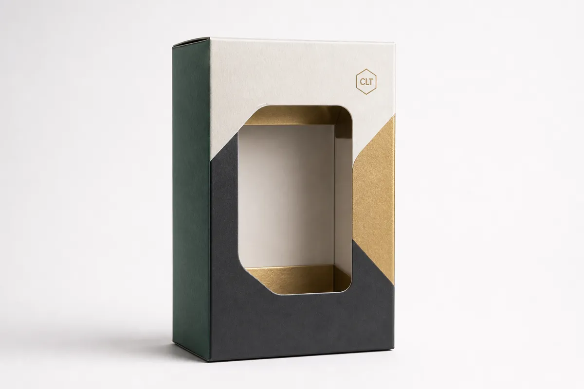
Custom Retail Boxes with CMYK: A Sustainable Print Guide
Custom retail Boxes With CMYK can look sharp on a monitor and still miss the mark once they are folded, coated, packed, and set under actual store lighting. That gap matters because packaging is judged fast, often from a few feet away, on paperboard that behaves nothing like a backlit screen. The good news is that custom retail boxes with CMYK can still deliver strong color, cleaner inventory planning, and better unit economics if the print plan is built carefully from the start.
For a packaging buyer, color is only one piece of the decision. The bigger question is how custom retail boxes with CMYK perform across the whole run: the board, the coating, the proof, the press setup, the folding score, the freight, and the reorder. If you are comparing structures as well as artwork, review Custom Packaging Products alongside your print plan so the box spec and the artwork strategy support each other before production begins.
The costliest packaging mistakes rarely begin with the wrong shade of blue. They usually start with the assumption that custom retail boxes with CMYK will look identical on every material, under every finish, and at every quantity. That assumption is expensive far more often than it is true.
Custom retail boxes with CMYK: the gap between screen and shelf
Custom retail boxes with CMYK rely on four process inks, cyan, magenta, yellow, and black, which build images through tiny dots instead of using a separate ink for every color in the artwork. On screen, those colors are backlit and forgiving. On board, they are physical, layered, and affected by everything from fiber brightness to coating absorbency. A design that feels crisp in Photoshop can look flatter once it is printed on recycled kraft or uncoated chipboard.
From a packaging design standpoint, custom retail boxes with CMYK are the natural choice for artwork that needs gradients, photographs, skin tones, product renders, or detailed illustrations. They are also common for seasonal launches and branded packaging programs that change often, because custom retail boxes with CMYK are easier to revise than a setup built around multiple spot colors. For product packaging that rotates every few months, that flexibility has real value.
The sustainability angle matters just as much as the visual one. Good custom retail boxes with CMYK planning can reduce reprints, prevent spoiled inventory, and keep teams from ordering more cartons than they need because the first proof was unclear. That matters when storage, freight, and disposal all carry cost. A box that gets rejected after printing wastes more than paperboard; it also wastes press time, shipping, and the carbon tied to the full production cycle.
The practical takeaway is simple: custom retail boxes with CMYK should be treated as a system, not as a file. The board choice, coating, ink limit, proof standard, and launch timeline all shape the final result. If one of those pieces is off, the carton may still function, but the package branding will feel weaker than it should. That is the difference between a box that supports the brand and one that merely holds the product.
For retail packaging, “pretty on screen” is not a production standard. A solid custom retail boxes with CMYK plan is built around substrate behavior, proof discipline, and real shelf conditions.
If you are building Custom Printed Boxes for a launch, a refresh, or a retail display program, start with the shelf rather than the software. Ask how the carton will read under warm store lighting, how a dark fill behaves on a matte recycled board, and how much contrast you need before the logo starts losing legibility. Those questions save money later, and they are the sort of questions people only ask after a few rough production cycles, which is kinda the point of learning them now.
How custom retail boxes with CMYK printing works
Custom retail boxes with CMYK printing uses four process inks to build color through halftone dots rather than through a dedicated ink for every shade in the artwork. A photographic image, for example, is not printed with a single “photo ink.” It is built from thousands of cyan, magenta, yellow, and black dots arranged at specific screen angles and densities. That is why custom retail boxes with CMYK can reproduce rich imagery without turning the job into a spot-color puzzle.
The workflow usually begins with a dieline, then moves into artwork placement, color separation, proofing, press setup, and finishing. Once the design is approved, the file is converted into press-ready plates for offset printing or into a digital print file for shorter runs. The choice between offset printing and digital printing depends on quantity, turnaround, and whether the job needs long-run consistency or a faster setup for a smaller order.
Substrate choice changes the outcome. Coated SBS board tends to hold detail and saturation better than a rough, fiber-heavy stock. Kraft creates a natural, premium feel, but bright colors can mute more quickly because the paper tone is not neutral. Recycled chipboard supports a strong sustainability story, yet it usually needs tighter color expectations. Corrugated structures behave differently again because flute construction, liner quality, and surface smoothness all influence image sharpness and ink laydown.
That is where custom retail boxes with CMYK become more than a print method. They become a controlled translation from digital artwork to physical retail packaging. If the artwork depends on photography, gradients, or a full-color pattern, the box spec needs to reflect that from the outset. A disciplined CMYK workflow can also reduce press waste because the operator is not constantly stopping to manage several custom inks.
For brands focused on sustainable packaging, CMYK often sits in the practical middle ground. It supports full-color product packaging without requiring the plant to run extra spot plates for every accent. That can shorten setup and simplify inventory. It can also make reorders cleaner, because the files, separations, and proof path are easier to preserve between runs.
There is one caution that keeps showing up in production. Custom retail boxes with CMYK are only predictable when the file is prepared correctly. Oversaturated shadow areas, low-resolution imagery, and weak black builds can create muddy results, especially on uncoated or recycled stock. A careful prepress review usually catches those problems before they become an expensive box run.
For structural and material choices, compare options through Custom Packaging Products before finalizing the artwork. Matching the box style to the print process is often the least expensive improvement a packaging team can make.
Packaging teams that track quality standards often also refer to broad industry guidance from ISTA when shipping and transit performance matter. That is not a print standard, but it belongs in the same conversation: a good-looking carton still has to arrive intact.
File control matters as much as print control. Save the exact proof, the substrate notes, and the ink profile used for the approved version. If the next run of custom retail boxes with CMYK changes board, finish, or print method, expect the color to shift. That is normal, not a defect.
Key factors that shape color, waste, and brand impact
Several variables decide how custom retail boxes with CMYK actually perform, and none of them act alone. The board stock sets the base tone. The coating changes gloss and perceived density. The artwork coverage affects drying and consistency. The brand strategy determines how much visual drama is worth the added cost. A strong packaging design balances all four.
Board brightness and fiber content. Brighter stocks usually make custom retail boxes with CMYK feel sharper because the white point supports cleaner contrast. Recycled content can lower brightness, which is not a problem if the brand wants a natural or earthy look. It only becomes a problem when the artwork was built as though the carton were pure white.
Finish selection. Matte, gloss, aqueous, and soft-touch finishes each change the final impression. Gloss tends to deepen color and increase pop. Matte can soften saturation and feel premium in a quieter way. Soft-touch creates a tactile cue that supports package branding, though it can raise cost and may complicate recycling claims depending on the full structure and coating system.
Ink coverage. Heavy solids and rich blacks look striking, but they demand more attention during drying, trapping, and scuff resistance. If a design uses broad dark panels, custom retail boxes with CMYK may need tighter production controls than a lighter, more open layout. Photographic graphics can also show banding if the file or press calibration is weak.
Shelf reading distance. A shopper usually sees retail packaging from several feet away before ever picking it up. That means brand marks, contrast, and hierarchy matter more than subtle art details. A box that looks elegant in a design review can still fail if the logo disappears at arm’s length. That is especially true for fast-moving consumer goods, beauty, supplements, and giftable product packaging.
From a sustainability point of view, custom retail boxes with CMYK should not be over-designed just because the press can handle it. Every extra finish adds process complexity. Every high-coverage area increases the risk of waste. Every specialty effect raises the chance of over-specification. A lot of retail packaging programs look simpler now than they did a decade ago because simpler is often easier to print, easier to reorder, and easier to keep aligned with cost targets.
Packaging buyers who want a clearer carbon story should also check whether the board carries FSC certification or an equivalent chain-of-custody claim. The Forest Stewardship Council is one of the most recognizable references here. Certification does not make a box sustainable by itself, but it does give procurement a cleaner paper trail.
There is also a design discipline built into custom retail boxes with CMYK. Keep the color system consistent. Use a controlled black build. Define acceptable delta between proofs. Choose one finish family and hold it. The more variables you lock down, the less waste you create during reorders and late-stage fixes.
A lot of brands overspend because they try to make the box do too much. If the carton is supposed to carry brand story, shelf impact, sustainability claims, regulatory copy, and multiple photographic scenes, the print plan needs to be ruthless about hierarchy. That is where custom retail boxes with CMYK either stay efficient or get messy.
Custom retail boxes with CMYK process and timeline: from dieline to delivery
Custom retail boxes with CMYK move through a sequence that is predictable when the inputs are disciplined. The usual path is dieline review, artwork placement, preflight, proofing, substrate approval, press run, finishing, cutting, folding, and final packing. Each step can add a day or two if the team is slow to approve, which is why the earliest files matter so much.
What happens first
The first step is the dieline. That file defines the size, glue flap, folds, panels, and bleed area. If the dieline is wrong, everything after it is vulnerable. A clean dieline keeps custom retail boxes with CMYK from being resized after design has already started, which is one of the easiest ways to avoid rework.
Artwork placement comes next. This is where package branding becomes concrete. Logos need safe margins. Barcodes need quiet zones. Copy needs enough contrast to stay legible. If the carton is a display piece as well as a product package, the side panels and top closure should receive the same attention as the front panel.
Proofing and approval
Proofing is the point where expectation meets material reality. Digital proofs are useful for layout checks, but a physical sample gives better information when color matters. For custom retail boxes with CMYK on recycled board, a physical proof should be treated as the baseline whenever the run is large enough to hurt if it goes wrong. A proof is not a luxury; it is insurance against a warehouse full of cartons that look slightly off.
One practical rule is to approve only after the board, finish, and ink limit are known. If any of those change later, request a fresh sample. That sounds cautious because it is. A later correction on a 10,000-unit order is usually more expensive than an extra sample at the front end.
Production and finishing
Production time depends on quantity and complexity. A straightforward digital print job with simple folding carton construction can move in a shorter window, often around 7-12 business days after proof approval if the plant schedule is open. A more involved offset printing run with coatings, special die cuts, or higher-volume folding may run 12-18 business days or longer. Custom retail boxes with CMYK that require custom inserts, rigid builds, or multiple revision rounds can stretch further.
Finishing can include aqueous coating, matte lamination, gloss lamination, embossing, foil, spot UV, or die-cut windows. Each one changes how the printed surface behaves. The more finishing steps you add, the more carefully custom retail boxes with CMYK need to be scheduled because one delay can cascade through the rest of the line.
Shipping and transit should not be overlooked. Packaging that ships flat is more efficient than assembled boxes, but flat shipping still needs pallet protection and moisture control. The transit side matters because a beautiful carton that arrives crushed or warped still creates waste. Some teams use general transit testing guidance from ISTA to reduce surprises before distribution.
For planning purposes, the shortest path to custom retail boxes with CMYK is straightforward: final dieline, final copy, one proof round, one approval owner, and one material choice. Every extra revision adds friction. That friction becomes delay, and delay often becomes cost.
Custom retail boxes with CMYK cost, pricing, MOQ, and quote drivers
Pricing for custom retail boxes with CMYK is shaped by more than the ink on the page. Box style, board type, finish, quantity, and setup complexity all move the number. A simple folding carton printed in four-color process at 5,000 units may land in a very different range than a rigid setup with soft-touch coating and foil. The spread is wide because the variables are real.
As a practical benchmark, straightforward custom retail boxes with CMYK on coated SBS or a similar board can sometimes sit around $0.25-$0.75 per unit at moderate quantities, while more complex builds or premium finishes can move past $1.00 per unit. Those figures depend on size, print coverage, structural details, and freight. They are starting points, not promises.
| Option | Typical use | Price signal | Sustainability note |
|---|---|---|---|
| Standard folding carton, CMYK only | Retail packaging, cosmetics, supplements, small consumer goods | Lower setup burden, usually the most efficient per unit | Easier to optimize for less waste and lighter freight |
| Folding carton with matte or gloss coating | Branded packaging that needs stronger shelf presence | Moderate increase from finishing and drying steps | Can still be recycle-friendly depending on coating system |
| Soft-touch or specialty finish | Premium product packaging, giftable retail items | Higher cost from added process complexity | Best reserved for launches where tactile impact matters |
| Rigid or heavily structured box | High-value retail presentation, premium sets | Highest material and labor intensity | Often heavier to ship, so freight and storage matter more |
MOQ is another point buyers often underestimate. Lower minimums sound convenient, and sometimes they are, but the unit price usually rises because setup gets spread across fewer cartons. Higher minimums lower per-box cost, yet they increase inventory risk if the artwork changes, the SKU is discontinued, or the season ends early. With custom retail boxes with CMYK, the right MOQ is the one your sales forecast can realistically support.
Quote drivers usually include size, ink coverage, structural complexity, finishing, color correction, sampling, and whether the vendor includes prepress support. If the supplier is also helping with packaging design, the quote may look higher at first but save money by reducing proof rounds. That trade is better than chasing the lowest number and paying for mistakes later.
There is a helpful way to think about cost. Custom retail boxes with CMYK cost money in three places, not one. There is the print cost, the inventory cost, and the failure cost. A smart spec reduces all three. If a lighter board still protects the product and supports the shelf image, the lower freight and lower material load may be worth more than a thicker sheet with prettier language in the sales deck.
For larger packaging programs, it often helps to compare custom retail boxes with CMYK against other custom printed boxes within the same product line. Sometimes one hero SKU needs premium finishing while the rest can use a simpler, more efficient build. That split keeps the brand sharp without spreading the premium spec across everything.
Packaging teams also benefit from asking for a written spec sheet that lists the substrate, coating, ink profile, allowed color variation, and reorder assumptions. That document is boring in the best way. It prevents disputes and keeps custom retail boxes with CMYK repeatable.
Common mistakes when ordering custom retail boxes with CMYK
The biggest mistake is designing from the screen alone. A display monitor can make colors appear richer, cleaner, and brighter than the final carton will ever look. If the proof is never tested on the real board, custom retail boxes with CMYK may arrive with muted reds, soft blacks, or a less premium finish than the mockup suggested. That gap is common, and it is avoidable.
Another common error is using too much ink coverage for the substrate. Heavy solids on absorbent board can dry slowly, scuff easily, or look muddy instead of deep. This is especially true on recycled surfaces or uncoated stocks. A restrained build often reads cleaner than a dense, overworked file. More ink is not always more brand value.
Skipping proof approval is a separate problem. Multiple stakeholders can slow the process, but rushing approval is worse. Marketing wants visual impact, operations wants fit, procurement wants cost control, and everyone wants the boxes now. That pressure can turn custom retail boxes with CMYK into a compromise that nobody fully reviewed. The box then becomes a shared regret.
Structural neglect is another hidden cost. A design can be beautiful and still fail if the tuck flap opens too easily, the product rattles, or the carton crushes in transit. Product packaging has to work visually and mechanically. If the structure does not protect the contents, the print is doing only half the job.
Reorder drift is easy to underestimate. If the original run used one coating, one board, and one press, the reorder should use the same baseline whenever possible. Changing any one of those variables can alter the final look. For custom retail boxes with CMYK, consistency is not an accident; it is a controlled repeat of the same spec.
- Do not approve from a screen capture alone.
- Do not push heavy full-bleed solids onto a weak substrate.
- Do not change board stock and assume color will stay identical.
- Do not let the design team and procurement team approve different versions.
- Do not treat structure, print, and shipping as separate problems.
One more issue deserves attention: the premium trap. A brand can add foil, soft-touch, spot UV, and a high-density CMYK image, then wonder why the box overshot budget and delayed production. A better rule is to decide what the carton must do at shelf level, then spend only on the features that support that job. That is the discipline behind efficient retail packaging.
Expert tips and next steps for smarter sustainable packaging
If you want custom retail boxes with CMYK to work harder and waste less, start with the board, not the artwork. Choose the substrate first, define the finish second, and build the design around those limits. That order sounds simple because it is. It also prevents a lot of expensive revision.
Requesting two samples can be useful: one on the preferred recycled stock and one on the closest premium alternative. That comparison makes tradeoffs visible. A file review cannot tell you how a matte coating will change black density or how a recycled liner will soften a bright red logo. A sample can.
Ask your supplier for a written spec sheet that captures the exact board, coating, ink profile, reorder notes, and any color tolerance expectations. For custom retail boxes with CMYK, that document is the closest thing to a memory system. It keeps package branding consistent even when the original project team has moved on.
It also helps to separate “must have” from “nice to have.” Does the retail packaging need photo realism, or would a stronger illustration work better on a lower-cost stock? Does the logo require a spot color, or can CMYK hold it accurately enough? Is a premium finish actually visible on shelf, or is it mostly visible in the presentation deck? Those questions often reveal where money can be saved without weakening the brand.
For many brands, the smartest next step is to compare a few production paths side by side: one economical version, one premium version, and one version optimized for lower waste. That comparison makes custom retail boxes with CMYK easier to approve because the decision rests on real tradeoffs rather than assumptions. If you are building that kind of lineup, Custom Packaging Products can help you review the structure and material choices before final artwork is locked.
My practical advice is simple: approve one proof path, document every setting, and repeat the same spec on the next order unless there is a real reason to change it. That is how custom retail boxes with CMYK stay consistent, affordable, and easier to defend from a sustainability standpoint. The more disciplined the system, the less waste the brand creates.
For teams that want a broader sustainability reference, the EPA packaging and sustainable materials guidance is a useful place to sanity-check claims and material choices. It will not choose the box for you, but it does keep the conversation grounded.
Custom retail boxes with CMYK do not need to be a choice between color and responsibility. Done well, they support stronger shelf presence, steadier reorders, and less waste at press and in storage. That is the real win for brands that want packaging to look good and behave intelligently.
And if you are still deciding how much print complexity you actually need, remember the simplest rule: custom retail boxes with CMYK should earn their place on the shelf, not merely fill space in a rendering. That is the standard worth protecting.
Are custom retail boxes with CMYK printing a good choice for recycled packaging board?
Yes, but the board changes the final color, so recycled stock should be proofed before a large run. Uncoated or fiber-rich boards can mute bright colors, which works for some brands and creates a problem for others. Ask for a physical sample on the exact material you plan to use so the shift is visible early. With custom retail boxes with CMYK, the proof matters more when the stock is less white.
What is the difference between CMYK and Pantone for custom retail boxes with CMYK designs?
CMYK is best for full-color images, gradients, and complex artwork built from four process inks. Pantone spot colors are better when a brand needs a specific, repeatable hue that must stay consistent across many runs. Many packaging projects use custom retail boxes with CMYK for the main artwork and a spot color only for the logo or a critical accent.
How do I keep custom retail boxes with CMYK colors consistent across reorders?
Keep the same artwork file, substrate, finish, and print profile for every reorder. Save proof approvals, color notes, and supplier specs so the next run starts from the same baseline. If you change board type or coating, assume the color will shift and request a fresh proof. That discipline is what keeps custom retail boxes with CMYK from drifting over time.
What drives the price of custom retail boxes with CMYK the most?
The biggest drivers are box size, board choice, ink coverage, special finishes, and production quantity. Lower MOQ usually means a higher unit cost because setup is spread across fewer boxes. Complex designs and premium coatings can raise price faster than simple artwork on standard stock, so custom retail boxes with CMYK should be priced against the exact spec, not a rough visual guess.
How long does production usually take for custom retail boxes with CMYK?
Simple jobs move faster when the dieline is approved, the artwork is final, and the proof is accepted quickly. Lead time grows when there are multiple revision rounds, custom finishes, or hard-to-source sustainable materials. The quickest way to avoid delays is to confirm the spec first and submit print-ready files on time. For custom retail boxes with CMYK, the calendar usually rewards preparation more than speed.

