Buyer Fit Snapshot
Use this page when logistics or fulfillment teams need warning labels that stay readable on corrugated boxes through handling and transit.
| Decision point | What to specify before quoting |
|---|---|
| Material and construction | Substrate, thickness, coating, print coverage, finish, and tolerance requirements. |
| Order economics | MOQ, unit tiers, sample run, lead time, packing method, and freight assumptions. |
| Production control | Dieline, artwork proof, barcode or warning copy, QC checks, carton marks, and reorder plan. |
Custom warning labels for boxes are not there to dress up a carton or make it look more finished than it really is. They exist to stop preventable errors before a pallet leaves the dock, before a handler stacks a case the wrong way, and before a customer opens a shipment that needed a little more care than the average parcel. A box can be structurally sound, beautifully printed, and still fail if the warning is too small, too vague, or placed where nobody actually sees it during the rush of daily handling.
That practical job is what makes custom warning labels for boxes such a useful part of packaging operations. They turn handling instructions into something visible in a few seconds, which is usually all the time anyone has on a busy line. They support warehouse speed, carrier handling, and customer confidence without asking people to stop and interpret a long note or a cluttered instruction sheet. For brands that are growing, the label becomes part of the operating system: a printed cue that helps packaging perform in real conditions, not just in a neat mockup on a screen.
Custom Logo Things works with packaging buyers who need useful results, not decorative extras. A label does its best work when it protects margin, cuts down rework, and fits into the larger branded packaging system without creating confusion. That is the standard worth using, and it is the standard I would trust on a real production floor.
A warning that cannot be understood at a glance is not a warning. It is just ink on a carton.
For a broader view of packaging formats, see Custom Packaging Products and our Custom Labels & Tags page if you are comparing label formats for different carton sizes, shipping routes, or retail packaging needs.
Custom warning labels for boxes: what they are and why they matter
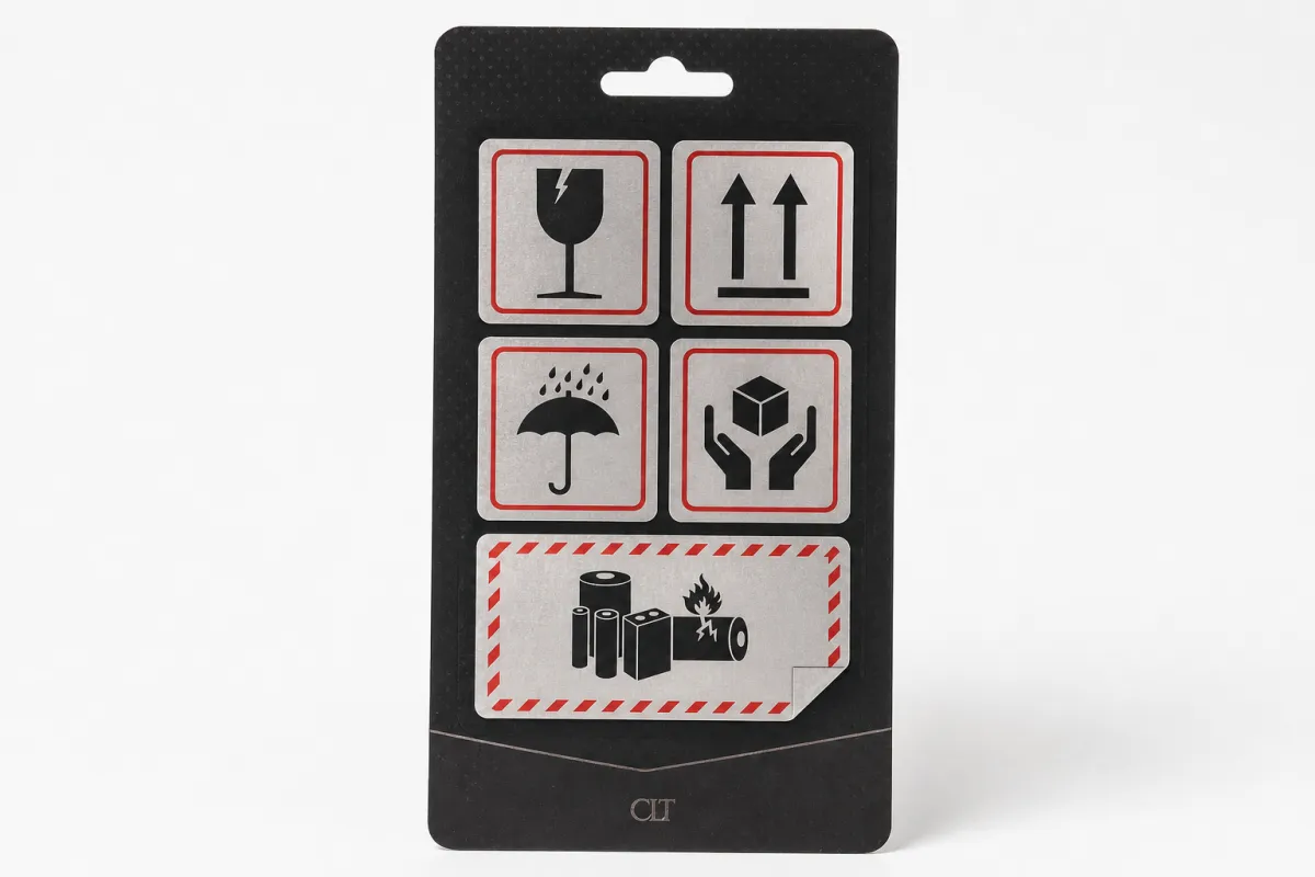
Put simply, custom warning labels for boxes are printed identifiers that tell people how a carton should be treated. That can mean fragile handling, this-side-up, keep dry, temperature-sensitive, tamper awareness, battery warnings, or a more specific internal instruction tied to a product family. The label may be pressure-sensitive adhesive stock, a direct-applied carton mark, or a printed panel built into custom printed boxes. The format changes, but the job stays the same: reduce mistakes before they happen.
The value goes well beyond compliance language. A clear warning can reduce sorting errors, speed up receiving decisions, and prevent the kind of low-level problems that quietly chew into profit. One misplaced carton can trigger a return, a reshipment, a damage claim, or a customer service issue that costs far more than the label itself. In that sense, custom warning labels for boxes are often cheaper than the first mistake they stop. That sounds blunt, but it is true.
Standard icons and true custom versions are not the same thing. A generic fragile symbol may be enough for simple shipments, but growing brands often need something more specific: bilingual copy, a different icon size, a carton-size adjustment, or wording that matches the actual product risk. That is where custom warning labels for boxes earn their place. They can reflect the exact package branding, the handling channel, and the type of buyer or receiver who will see them.
From a packaging buyer’s point of view, the value is control, not decoration. A carton that says what it needs to say, clearly and consistently, helps every person who touches it make the right choice faster. That matters whether the shipment is moving through a high-speed warehouse, a retail packaging program, or a direct-to-consumer fulfillment line. If the line is moving fast, the label has to move with it, not slow everybody down.
There is a subtle but important point here: a warning label is a decision aid. It does not physically strengthen the box. It changes behavior. For that reason, custom warning labels for boxes should be treated as part of packaging design, not as a last-minute add-on after the artwork is already frozen. I have seen too many teams treat the label as a cleanup item, and that almost always leads to awkward placement or rushed copy.
Industry groups such as The Association for Packaging and Processing Technologies and testing bodies like ISTA both reinforce a simple idea: if packaging has to perform in transit, then its communication system has to be tested with the same seriousness as the corrugated structure itself.
How custom warning labels for boxes work on the line
Custom warning labels for boxes work best when they are designed with the line in mind, not just the artwork file. The workflow looks simple on paper: Design, Print, Apply, ship. In a real warehouse, each step has a physical consequence. Pickers need to see the label quickly. Packers need to place it in the right spot without slowing down. Carriers need to notice it during handling. Receivers need to understand it before the carton is opened or restacked.
Location changes the outcome more than many teams expect. A top-panel label is easy for warehouse staff scanning a case on a bench. A side-panel label may be better for palletized freight because it stays visible when cartons are stacked. If the carton includes a seam or opening instruction, a seam-adjacent label can reinforce tamper awareness or show where the box should be opened. Those are small layout decisions, yet they strongly affect whether custom warning labels for boxes actually change behavior. This is the part that is kinda easy to miss if you only review the artwork on a computer.
Visual hierarchy matters just as much. The strongest labels usually follow a simple order: icon first, directive second, support text third. A dock worker with gloves on and ten seconds per carton does not read dense copy. They recognize shape, color, and large type first. If the message takes more than a glance to decode, the label is already behind. That is not a design nitpick; it is a practical limit of how people process information in motion.
That is why label wording and contrast matter as much as the artwork. Black on white is easy to read, but not every carton needs that exact look. A bright carton can use a high-contrast warning panel with a bold border. A brown corrugate box can use a white label with red or black text. The point is not to make it loud; the point is to make it unmistakable. If the warning is important, it should not have to compete with decorative flourishes.
Custom warning labels for boxes also need to match the rest of the package system. If the carton print says “keep upright,” the tape says nothing, and the insert says “store flat,” staff will start ignoring the whole package. People trust systems that stay consistent. They distrust packaging that appears to argue with itself. That is one reason custom warning labels for boxes should be reviewed alongside carton graphics, carton tape, inserts, and any other customer-facing package branding.
In a well-run operation, the label is a visual handshake between the packaging line and the supply chain. It tells the next person what the previous person already knows. That is not glamorous, but it saves money, and it saves a surprising amount of time when the volume starts climbing.
Key factors that shape custom warning labels for boxes
Not every carton carries the same risk, so custom warning labels for boxes should begin with the product profile. A glass bottle needs different language than a battery pack. Liquids need different handling than frozen foods. High-value electronics need different warnings than a sample kit or prototype shipment. The more specific the risk, the more specific the label should be. “Fragile” is useful. “Do not stack” is useful. “Keep between 2 C and 8 C” is more useful when temperature is the real issue.
Material compatibility matters just as much. Corrugated texture, kraft liners, coated surfaces, freezer storage, condensation, and abrasion all affect whether the label stays put and stays readable. A label that performs well in a dry packout area can fail after a day in a cold room with a humidity swing. That is why custom warning labels for boxes often need a face stock and adhesive matched to the environment, not only the carton size. The adhesive choice can be more important than the print method if the package is going into refrigeration or rough handling.
Size and readability are frequent sticking points. The label needs to be visible from a normal handling distance without swallowing the whole carton. That sounds obvious, but it is easy to get wrong when a team tries to pack too much information into one panel. If the message is overloaded, the actual warning gets buried. A clean 3 x 5 inch label can outperform a crowded 4 x 6 inch version if the hierarchy is stronger. Bigger is not always better; clearer is better.
Regulatory and carrier considerations can shape the design too. Some shipments need standardized symbols. Others need multilingual copy because the carton crosses regions or is handled by different teams. Hazard-related labels should always be checked against the relevant rules before production. Not every warning falls under the same regulatory umbrella, and not every internal instruction needs to look like a dangerous goods label. That distinction keeps custom warning labels for boxes accurate without turning them into false alarms.
Brand experience is another factor that gets overlooked. A warning label can be strict and still look polished. It does not need to feel harsh. That matters in premium product packaging because the outer carton may be the first physical impression a customer gets. A clean, well-placed warning panel can fit branded packaging without creating visual noise. A sloppy one can make even a good box look rushed, which is the last thing a brand wants after spending money on the rest of the package.
If you are choosing paper-based materials, ask whether the liner has FSC-certified sourcing and whether the print method supports your sustainability claims. If the box is part of a broader retail packaging program, ask how the warning label will look beside the rest of the graphics. Small details often separate a label that simply exists from one that genuinely supports the operation. That kind of alignment is what keeps a packaging system from feeling improvised.
Custom warning labels for boxes: process, timeline, and production steps
The cleanest way to produce custom warning labels for boxes is to start with a detailed intake. Gather carton dimensions, product hazards, storage conditions, language requirements, application method, and expected shipping route before design begins. That sounds basic, yet it prevents the most common production delay: rework caused by missing information. If you know the application point is a high-speed pack line, the design should be built for fast placement. If you know the boxes will sit in cold storage, the adhesive selection has to reflect that from the start.
Proofing should happen before the run is approved. A digital proof is good for copy and layout. A physical sample is better when the label must survive cold, moisture, or rough handling. In many packaging programs, proofing is where the real problems surface: icon too small, warning line too long, contrast too weak, or adhesive not suited to the substrate. One careful review can save several days of correction later. I have watched teams catch issues at proof stage that would have been painful, expensive, and entirely avoidable after production.
Timeline depends on complexity. Simple custom warning labels for boxes can move quickly when the artwork is ready and the stock material is standard. More complex jobs take longer because they include multilingual text, specialty adhesives, heavy ink coverage, or a compliance check that slows the approval chain. The printing itself is rarely the longest step. The bottlenecks are usually internal sign-off, legal review, and changes to product scheduling.
That means the schedule should include buffer time. If a seasonal shipment launches on a fixed date, do not plan label approval for the same week. A production team may be ready, but one copy change can move the whole order. A practical window is 7-10 business days for straightforward label work after proof approval, and 12-15 business days when the job needs custom artwork, multiple versions, or more exact test checks. Those are not universal numbers, but they are a realistic planning baseline for most packaging teams.
For operations that want repeatability, the handoff matters as much as the print. Confirm how the labels will be stored, which team will apply them, where they should sit on the carton, and what reorder point triggers the next run. A label system only works when the warehouse can use it without guessing. If someone has to stop and ask every time, the process is already leaking time.
It also helps to align custom warning labels for boxes with the rest of the packaging procurement plan. If cartons, inserts, and labels are sourced separately, the team needs a shared timeline and one owner for approval. The simplest programs are the ones where packaging design, production, and storage all point in the same direction. That is where the work gets easier, not because the packaging became magical, but because the process became clear.
When brands build a structured labeling process, they often pair warning labels with other package components from the same supplier set, such as Custom Packaging Products or a dedicated Custom Labels & Tags order. That reduces mismatch risk and keeps the visual language consistent across product packaging and shipping cartons.
Custom warning labels for boxes: cost, pricing, MOQ, and quote drivers
Pricing for custom warning labels for boxes is driven by a handful of variables, and most buyers can predict the quote once they know what those variables are. Material type, adhesive strength, label size, print coverage, finish, quantity, and whether the label is simple or highly customized all move the number. A one-color warning on a stock face stock is a very different job from a weather-resistant, die-cut, multi-language label with specialty adhesive.
MOQ matters because it shapes the unit cost. Smaller test runs often cost more per label, even when the total order value is lower. That is normal. A 500-piece order does not benefit from the same economies of scale as a 10,000-piece run. Buyers sometimes focus on the total invoice and ignore the unit economics, but the shipping and reordering pattern should guide the decision. If the label is a short-term test, a smaller run makes sense. If the format is stable, larger quantities usually improve cost per piece.
Here is a practical way to compare common options for custom warning Labels for Boxes:
| Label option | Best for | Typical specs | Indicative unit cost |
|---|---|---|---|
| Stock paper warning label | Dry, short transit shipments | 1-color or 2-color print, standard adhesive, simple icon | $0.06-$0.14 at 5,000+ units |
| Premium adhesive label | Retail packaging and branded packaging programs | Higher contrast print, stronger adhesive, better facestock | $0.10-$0.22 at 5,000+ units |
| Weather-resistant label | Cold chain, moisture exposure, rough handling | Durable face stock, strong tack, abrasion tolerance | $0.18-$0.38 at 5,000+ units |
| Multilingual custom label | Cross-border shipping or mixed-language facilities | Expanded text, larger panel, careful hierarchy | $0.14-$0.30 at 5,000+ units |
| Highly customized compliance label | Regulated or complex handling instructions | Special symbols, proof review, version control | $0.22-$0.50+ depending on scope |
Those prices are directional, not fixed. A 2 x 3 inch label on a standard roll can be very different from a 4 x 6 inch die-cut panel with heavy ink coverage. The quote also changes if you need multiple versions, rush production, or a more demanding adhesive. In other words, the artwork matters, but the spec sheet matters more.
Hidden cost drivers show up more often than buyers expect. Multiple proof rounds, late copy edits, compliance adjustments, and changes to the carton substrate can all raise the cost. Specialty adhesives can also add cost faster than the print itself. If the label has to survive refrigeration or condensation, the material selection may be the deciding factor. That is why custom warning labels for boxes should be priced as a functional tool, not as a generic print commodity.
Value should be judged against failure cost. A low quote that peels off in cold storage, curls at the edge after a week, or gets ignored because the warning is too weak is not a bargain. It is a false economy. For buyers comparing packaging suppliers, the better question is not “What is the cheapest label?” It is “What label survives our process with the fewest exceptions?”
Common mistakes that make box warnings fail
The first mistake is vague wording. A label that only says “handle with care” may be too soft for operations that need a specific action. If the shipment must stay upright, say that. If it must stay dry, say that. If it needs refrigeration, say that clearly. Custom warning labels for boxes work best when the instruction is direct and operational, not generic.
Placement errors are just as damaging. A warning hidden under tape, placed across a box fold, or applied to a damaged panel is easy to miss. The label should sit where a person naturally looks during handling. That may be the top panel, the lead side, or the panel facing outward on a pallet. Poor placement can reduce the label’s effectiveness more than a bad font choice.
Contrast and size problems are common, especially when a design team tries to make the carton look cleaner. Tiny icons, light text on a light background, and crowded copy all weaken readability. If the warning cannot be read from a normal distance, it fails the basic test. The same goes for labels that use too many decorative elements. The eye should go to the instruction first, not to a visual flourish.
Another failure point is mismatch. If the carton graphics say one thing and the label says another, staff may ignore both because the system looks unreliable. Consistency builds trust. In packaging, trust is operational. When a warehouse sees the same instruction repeated in the same way across custom printed boxes, inserts, and custom warning labels for boxes, compliance improves because the signal is clear.
Environment is the last major risk. Labels that are not tested for moisture, cold, rubbing, or long dwell times may pass application and fail later. That is especially true for cartons that sit in a truck overnight, spend time in a chilled room, or get stacked and restacked before final delivery. If you do not test the label in the actual environment, you are guessing. And guessing is expensive, plain and simple.
A practical way to reduce failure is to review damage reports and customer complaints every quarter. If the same warning keeps getting missed, the issue may not be the message. It may be the size, the panel choice, or the adhesive. That is the kind of operational clue that turns custom warning labels for boxes from a one-time print job into a useful control point.
Expert tips for stronger custom warning labels for boxes
One of the smartest moves is to test labels in the real environment before broad rollout. Simulate warehouse lighting, gloved handling, pallet stacking, refrigeration, and vibration if that is part of the transit path. You do not need a laboratory for every decision, but you do need proof that the label can survive the conditions it will actually face. A short test on a representative carton can reveal more than a polished PDF ever will.
Another useful step is building a label library instead of treating every order as a one-off. A repeatable template for “fragile,” “this side up,” “keep dry,” or “temperature-sensitive” saves time and protects consistency. Over time, that library becomes part of your packaging design system. It also makes it easier to expand product packaging without redesigning the warning structure every time the catalog changes.
Match the language to the audience. Internal staff may need concise, functional copy. Carriers may need highly visible icons and less text. End customers may need a warning that feels firm but not alarming. The core instruction should remain the same, but the supporting detail can change by use case. That is especially helpful when custom warning labels for boxes are used across both warehouse flows and retail packaging programs.
Audit the system periodically. Look at damaged cartons, rejected shipments, and customer complaints, then ask whether the label needs stronger wording, better placement, or a more durable material. Do not assume the first version is the final version. Real shipping conditions expose flaws that mockups do not. Brands that monitor those signals usually improve their results faster than brands that treat labels as a fixed item.
It also helps to connect labeling decisions to broader sustainability choices. If you are trying to reduce waste, a label that prevents reshipment is often more valuable than a slightly cheaper one that fails. If your carton program uses recycled paperboard or FSC-aligned materials, make sure the warning label does not undermine the rest of the package with awkward adhesives or poor print quality. The whole system should work together.
Here is the simple path I recommend to most packaging teams: choose the top three handling risks, draft the label copy, request a proof, test one short run, and then scale the version that performs best. That sequence keeps custom warning labels for boxes grounded in evidence rather than habit. It also makes the label part of a larger packaging strategy instead of a last-minute correction. If you only do one thing after reading this, do that sequence before placing a larger reorder.
For teams comparing suppliers, custom warning labels for boxes should sit beside the rest of the label and carton conversation, not outside it. The more the label fits the carton, the faster operations move. The more it fits the workflow, the fewer errors slip through. That is the real win: fewer exceptions, fewer surprises, and a carton system that does what it is supposed to do.
What should custom warning labels for boxes include?
The label should name the specific handling risk, such as fragile, this side up, keep dry, or temperature-sensitive. Use a clear icon, short directive text, and enough contrast that the message reads at a glance. If the shipment crosses regions or teams, include any required multilingual copy or internal handling notes.
How durable should custom warning labels for boxes be?
Durability should match the environment. Short transit, cold storage, moisture, abrasion, and long dwell times all change the material choice. Test for peel strength and print legibility after handling, not just at application. For rough logistics environments, a stronger adhesive and tougher face stock usually prevent costly failures.
What affects the price of custom warning labels for boxes the most?
Quantity, material, label size, and print complexity usually drive the biggest price differences. Special features like weather resistance, die cuts, or multilingual versions can raise unit cost. Rush timing and multiple proof rounds can also change the final quote.
How long does it take to produce custom warning labels for boxes?
Simple runs can move quickly, but artwork approval and compliance checks often set the pace. Special materials, multiple versions, or sample testing usually add time to the schedule. Build in buffer time if the labels must match a shipping launch or seasonal inventory push.
Do custom warning labels for boxes need to match the carton design?
Yes, the warning should fit visually and operationally with the carton so it does not look like an afterthought. The message should stay consistent with any printed box copy, tape, or inserts that also mention handling instructions. A coordinated system is easier for staff to trust and follow.
When the job is done well, custom warning labels for boxes become invisible in the best possible way: they prevent confusion, keep shipments moving, and protect the business from avoidable losses. The most practical takeaway is straightforward: define the top handling risks, Choose the Right material for the real environment, prove the layout on an actual carton, and lock in one consistent placement standard before you scale. That is how a small label becomes a dependable part of the packaging system.


