Wholesale Beanie Logo Placement Guide for Woven Labels
The hard part of Woven Label Beanies logo placement is not choosing a logo. It is getting that logo to sit correctly on a garment that stretches, folds, and changes shape every time someone pulls it on. A label can look centered in a flat mockup and still drift 8-10 mm once the cuff is folded or the crown relaxes. On knit goods, that is enough to change the read from polished to careless.
That small shift matters more than most buyers expect. Placement affects visibility, but it also changes the perceived value of the beanie. A label set cleanly on the front cuff reads as retail-ready. The same label too close to a seam or fold can feel like an afterthought, even if the weaving quality is excellent. Buyers usually focus on five variables: front cuff, side panel, folded edge, back seam, and center crown. The better question is not where a label fits, but where it still reads after the beanie is worn, handled, and packed.
Woven labels sit in a different category from embroidery or patches. The weave density, edge finish, and minimum readable size all affect the final result. That is why placement and label construction should be approved together. If one moves without the other, the whole spec starts to wobble.
What Buyers Miss About Woven Label Beanies Logo Placement
A flat art file is flattering. It hides the stretch in the knit, the thickness of the cuff, and the way a soft crown pulls to one side once the beanie is worn. That is why placement decisions should never be made from artwork alone. The actual garment tells a different story.
Buyers often ask whether the logo fits. A better question is whether it still reads after the fold moves and the fabric settles. That distinction sounds small, but it separates a functional placement from a decorative one. A centered front cuff label usually gives the strongest visibility. A side-panel placement can look quieter and more modern. A back-seam placement is usually the weakest option unless the design intentionally wants the mark out of sight.
The main placements behave like this:
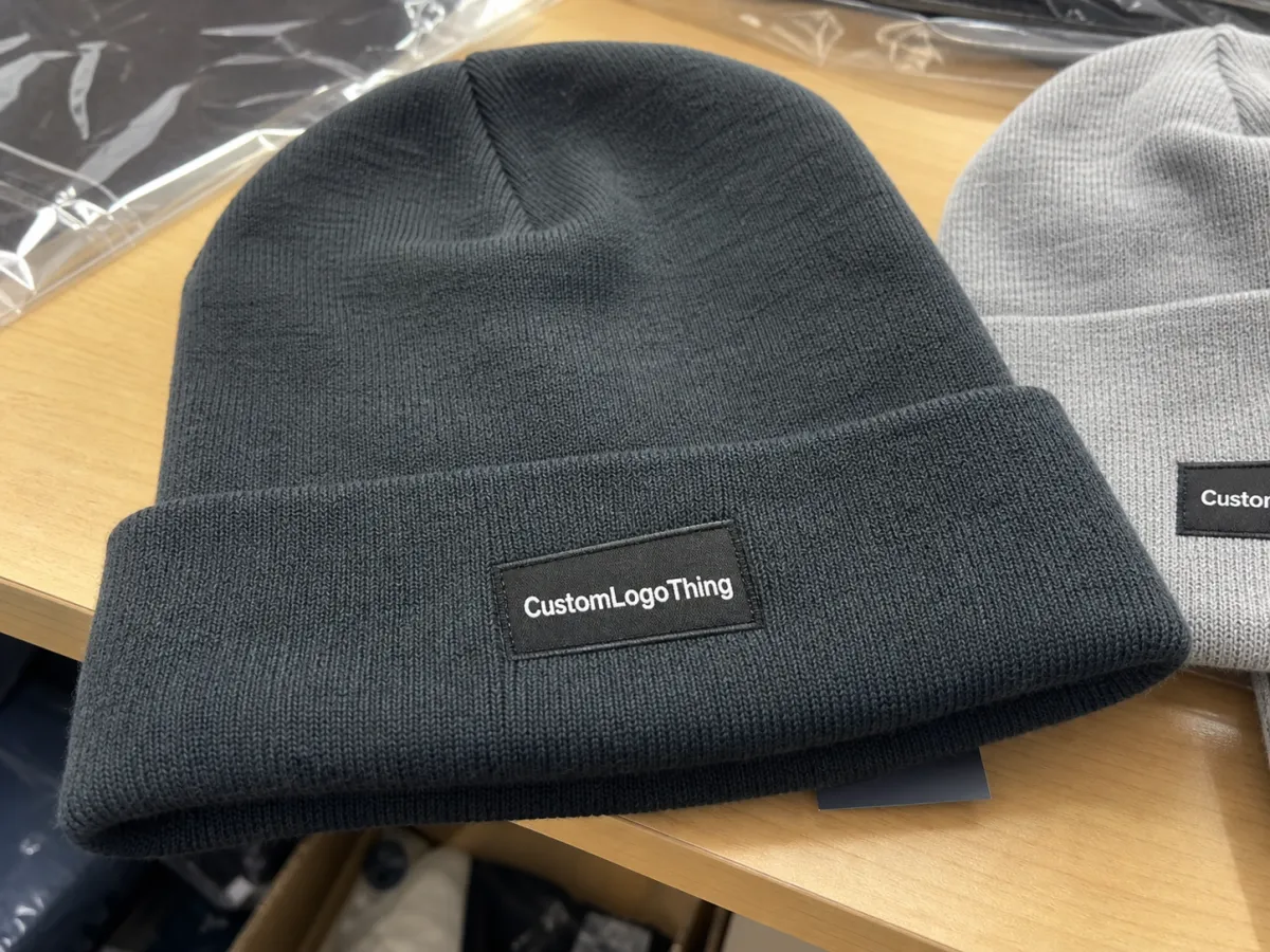
- Front cuff: the most reliable for visibility and brand recall.
- Side panel: useful for minimal branding or slouch styles.
- Folded edge: workable only if the fold is wide and consistent.
- Back seam: easy to lose visually, so use it sparingly.
- Center crown: best left to structured styles, not soft drape-heavy knits.
Woven labels also have a ceiling. Tiny typography can survive on a dense jacquard weave, but only up to a point. Past that point, the edge finish becomes as important as the logo itself. A 35 x 50 mm label may hold up better than a 25 x 40 mm version simply because the letters have room to breathe. Buyers usually discover this after the first sample, not before it.
Centered on screen is not the same as centered in hand. On knit goods, the fold decides the reading angle.
If you are comparing trim options across a broader apparel line, it helps to start with Custom Labels & Tags. The same placement logic shows up on scarves, hoodies, and other soft goods. The principle is simple: choose the position that survives actual wear, not just the one that looks neat in proofing software.
Best Placement by Beanie Style
Cuffed beanies are the easiest to work with. The fold creates a built-in display area, and front-center placement usually reads fastest from a distance. In most wholesale programs, the cleanest result sits about 10-20 mm above the bottom fold, centered or adjusted a few millimeters to avoid the seam. That small offset is often the difference between a label that lies flat and one that puckers at the edge.
Slouch beanies are less predictable. The fabric pools differently from head to head, which means a centered label can disappear into the drape or wrinkle as the crown collapses. Side-panel placement often performs better here. A lower-front position can also work if the knit stays relatively flat in that zone. For soft slouch styles, place for the drape, not for the artboard.
Pom beanies add a competing focal point. The pom itself already pulls attention upward, so the label should usually stay on the cuff or in a clean side area. A large woven label in the crown zone can look crowded, especially on chunky rib knits where the texture is already doing a lot of visual work.
A practical rule helps narrow the choice:
- If the beanie has a stable fold, use it.
- If it drapes heavily, find the flattest section instead.
- If a seam breaks the visual field, move the label away from it.
Knit structure matters more than the style name on the spec sheet. A tight 1x1 rib usually holds a label flatter than a looser gauge. Heavier yarns often recover better after wear and washing, which helps keep the label from twisting. The attachment method matters too. Sew-on woven labels are the most dependable choice for larger wholesale runs. Heat-applied or adhesive-backed options can save time on small orders, but they are not the first choice if the beanies will be stretched, washed, or used in cold outdoor conditions.
If you are still deciding between trims, compare the beanie against other custom woven labels and tags in the same approval cycle. That keeps the brand standard consistent across the line instead of letting each item drift into its own visual language.
Cost, MOQ, and Quote Drivers for Wholesale Orders
Woven Label Beanies logo placement changes cost in ways that do not always show up immediately. The main drivers are label size, stitch count, color count, backing, attachment method, and order quantity. A compact two-color woven label on a standard cuffed beanie may only add a small amount per piece. A larger, multi-color label with tighter finishing can move the quote enough to matter, especially on low-MOQ runs.
Low quantities carry the highest unit cost because setup and proofing are spread across fewer pieces. At 250 to 500 units, a supplier still needs to recover digitizing, machine setup, and sampling work that would be absorbed more easily at 2,500 units. That is also why late-stage artwork changes are expensive in time as well as money. Even a simple placement shift can trigger a new proof and push the schedule back.
For a rough comparison, these are the most common decoration paths on beanies:
| Option | Typical look | Common add-on cost per unit | Best use case | Watch-out |
|---|---|---|---|---|
| Woven label | Clean, flat, retail-friendly | $0.18-$0.60 at scale; higher at low MOQ | Sharp branding on cuffed or structured beanies | Too-small labels lose legibility fast |
| Embroidery | Textured and direct | $0.35-$1.20 depending on stitch count | Bold logos with simple shapes | Can distort on very soft knit fabrics |
| Patch | Chunkier, more visible | $0.45-$1.50 depending on material and build | Outdoor, workwear, or premium retail programs | May feel heavy on thin beanies |
Those ranges are directional, not universal. Supplier location, material choice, stitching density, and finishing method all shift the quote. Still, the pattern holds: a small change in label size or weave complexity can change the perceived value more than the dollar difference suggests. A 40 mm woven label that reads clearly often looks more expensive than a 55 mm label that crowds the cuff.
Ask for the quote in specifics, not generalities:
- Exact placement distance from the fold or seam.
- Label dimensions in millimeters.
- Color count and whether Pantone matching is required.
- Attachment method and whether sewing is included.
- Quantity breakpoints and sample costs.
- Revision policy for artwork or placement changes.
That level of detail makes supplier comparison fairer. It also cuts down on the usual back-and-forth where one vendor is quoting a stitched woven label and another is quietly assuming a different build. The cheapest quote is not always the best number. The right number is the one that matches the look, the schedule, and the end use.
Workflow and Lead Time From Artwork to Delivery
The production path is usually straightforward if the placement is locked early: artwork review, placement proof, sample or digital mockup, approval, production, finishing, packing, and shipping. Once the approval loop starts, every extra revision adds time. That matters because placement is not something you want to renegotiate after the labels are already woven.
Most delays happen in the same places. First, the buyer sends artwork without dimensions, which forces the supplier to guess at scale. Second, approval happens on the wrong stage of the garment. A label that looks fine on a flat body can shift once the cuff is folded and the seam is stitched. Third, one order includes too many styles. Cuffed, slouch, and pom beanies may all need their own placement confirmation, even if the logo is the same.
Lead time depends on a few concrete factors:
- Stock availability: blanks on hand shorten the schedule.
- Color complexity: more label colors usually take longer to weave.
- Queue length: a busy production line can add days.
- Sampling needs: pre-production samples slow things down but lower risk.
- Packout requirements: retail folding, bagging, or carton labeling adds labor.
For straightforward decorated stock, 12-15 business days after proof approval is a realistic starting point. Complex programs can run longer, especially if a sample is required or if packaging needs extra work. That is not a warning sign by itself. It is what happens when quality control is actually part of the process.
For packaging standards and material references, the Institute of Packaging Professionals at packaging.org is a useful reference. If the shipment is headed into retail or distribution channels, transit testing guidance from ista.org is worth checking as well. A crushed cuff can make even good decoration look off.
One shortcut saves more time than people expect: approve one master placement spec and reuse it across colors, sizes, and reorders. That is especially useful for phased rollouts and seasonal restocks, where the same style keeps returning with only minor changes.
Mistakes That Make Beanie Logos Look Off
The most common error is placing the label too close to the edge. On a cuffed beanie, the fold moves. If the label sits right on that movement line, the mark can bend, tilt, or vanish partially once the beanie is worn. The stitching also starts to look crowded, which is a subtle quality cue buyers notice immediately, even if they never say it out loud.
Size errors come next. Oversized labels overpower the knit texture and can make the beanie feel more like signage than apparel. Tiny labels create the opposite problem. They disappear beyond a few feet and do not carry enough visual weight to help the brand. A practical middle ground is usually a woven label large enough to hold one line of readable type or a simple icon without squeezing the border.
Seams cause more trouble than most mockups admit. If a seam cuts through the visual field, the label may tilt after wear. On soft slouch knits, that tilt becomes even more obvious because the fabric does not hold a rigid plane. The safest move is to map seam position before artwork approval, not after.
Color contrast is another trap. Low-contrast combinations can look refined in a close-up proof and unreadable in real life, especially under store lighting. Dark charcoal on black may feel elegant, but if the logo disappears from arm’s length, the decoration has failed the brief. Proofs should be checked at a normal viewing distance, not just zoomed in on a screen.
A mockup can flatter a poor decision. The actual hat will expose it in seconds.
Approval bias matters too. People tend to trust the first centered render they see, even when the beanie will fold, stretch, or compress the mark in use. The better practice is to review three views before signing off: flat, folded, and worn. If any one of those looks awkward, the placement probably needs work.
How to Improve Readability and Brand Recall
Readability is not just about making the logo larger. It is about making it easier to recognize where it will actually be seen: at arm’s length, in motion, and often at a slight angle. If the label only works on a perfectly still mockup, it is not ready for production.
Contrast should be deliberate. Strong contrast helps a logo stand out, but too much can make the label feel pasted on. A more measured approach often works better: enough separation to read quickly, but not so much that the woven label looks disconnected from the knit. That is one reason woven labels remain popular in retail branding. They look integrated rather than attached as an afterthought.
Placement should match the brand story. A premium lifestyle label may want front-cuff visibility because the logo sits cleanly and reads fast. A minimalist outdoor brand may prefer a side-panel placement that feels quieter. Neither approach is automatically better. The right answer depends on what the beanie is supposed to communicate.
Hierarchy matters as well. If the beanie is part of a larger package with hang tags, neck labels, cartons, or inserts, the woven label should coordinate with those elements rather than compete with them. A small, tidy mark on the cuff can create more recall than a louder one that fights the rest of the set.
- Test the logo at arm’s length.
- Check it folded and unfolded.
- Look at it in motion, not just flat.
- Compare it against the rest of the packaging system.
A slightly smaller label often works better than a larger one that crowds seams, folds, or textured knit patterns. That is one of those practical lessons buyers learn after a few runs: clarity beats size more often than not. For Woven Label Beanies logo placement, the cleanest option usually outperforms the flashiest one.
Build a Placement Spec Before You Order
If there is one step that saves the most friction, it is this: build a one-page placement spec before requesting quotes. List the beanie style, cuff height, target placement, label size, logo file, quantity, and any color constraints. Add front and side views. Then have every stakeholder approve the same document before production begins.
That spec becomes the shared reference. It keeps sales from approving one placement, marketing from expecting another, and production from building a third. It also makes supplier comparison much cleaner. Once every vendor is quoting the same exact placement, the differences between them become easier to evaluate.
Include these fields in the spec:
- Beanie style and material.
- Cuff height or slouch depth.
- Label dimensions in millimeters.
- Exact distance from seam or fold.
- Color references, including Pantone targets if needed.
- Attachment method and finish.
- Order quantity and reorder assumptions.
Set one formal sample checkpoint and require written signoff on placement, color, and finish before mass production. That matters even more if you are comparing suppliers that offer custom woven labels and tags against vendors quoting embroidery or patch construction. If the builds are not judged on the same terms, the price comparison is meaningless.
The strongest wholesale programs remove guesswork before the first stitch is sewn. That is the practical value of treating Woven Label Beanies logo placement as a production spec instead of a visual guess. It trims revision loops, reduces avoidable delays, and produces a final hat that looks intentional the first time it reaches a buyer.
Frequently Asked Questions
Where is the best woven label beanies logo placement for cuffed beanies?
Front-center on the cuff is usually the strongest option because it is visible and easy to read. Slightly off-center placement can look more refined if the brand wants a quieter presentation. Keep the label away from the fold edge, or the mark may bend once the beanie is worn.
Does woven label beanies logo placement change the price?
Yes. Label size, color count, backing, and attachment method all affect unit cost. More complex placement can also add proofing time or sample work. Higher quantities usually reduce the per-piece cost even if the placement stays the same.
How do I choose placement for slouchy beanies with woven labels?
Use the flattest area that will not collapse into the crown when the beanie drapes. Side-panel or lower-front placement often reads better than a centered position on soft knits. Check the label both folded and unfolded before approval.
What should I ask for in a woven label placement proof?
Ask for exact label dimensions, placement distance from seams, and mockups on the actual beanie style. Request confirmation of color, weave detail, and attachment method. Make sure the proof shows the logo at full size, not just a cropped close-up.
How long does production usually take after placement approval?
Timing depends on quantity, blank stock availability, and whether a sample is required. Complex logos or multi-color labels can extend the schedule a bit. Final approval of placement is often the biggest factor in avoiding avoidable delays.


