Custom Water Bottle Labels look straightforward until they meet condensation, curvature, and a packed production schedule. A label can be clean in the design file and still fail on the bottle if the adhesive, stock, and application conditions are not matched to the actual use case. That gap between screen and surface is where most expensive surprises start.
They sit in a practical middle ground within branded packaging. The label has to identify the product, carry the design, survive handling, and still look acceptable after cold storage, transport, and stacking. You see them on event giveaways, private label beverages, fitness studio bottles, hospitality welcome sets, fundraising campaigns, and seasonal retail runs. If the bottle is part of a larger package system, keeping the label aligned with the rest of the line matters just as much as the artwork itself. It should not look detached from the cartons, inserts, or other Custom Packaging Products around it.
The practical point is simple: a water bottle label is small, but it behaves like a real packaging component. It needs a construction that matches the bottle, the temperature, and the way people will handle it. Ignore any one of those, and the result is usually peeling edges, cloudy print, or a bottle that looks more temporary than intended.
Custom water bottle labels: why a small label does big work
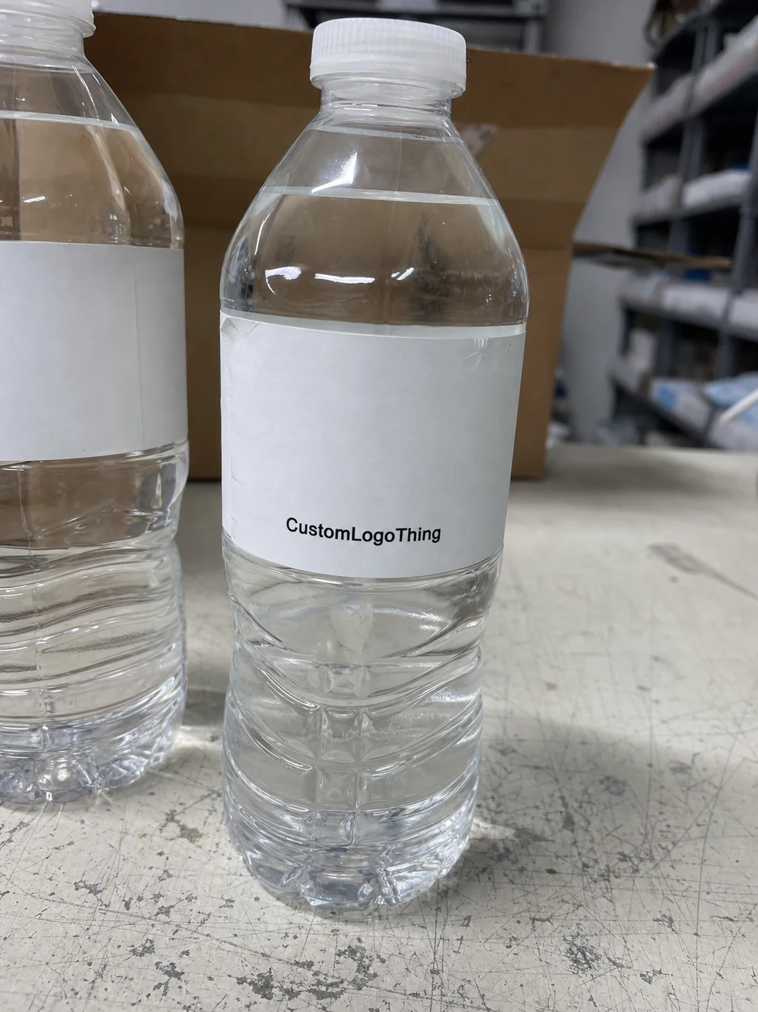
Custom Water Bottle Labels are pressure-sensitive labels sized for a specific container, print method, and handling condition. That sounds basic. It is not. On a curved surface, small changes in width, finish, or adhesive behavior can decide whether the label sits flat or fights the bottle from the first hour.
In practice, these labels usually do three jobs at once. They identify the product, they support the brand, and they have to hold up long enough to matter. That means the label is not only a design asset. It is part of the product packaging system, and it needs to survive real use, not just a mockup review.
The most common applications are easy to recognize. Event teams need fast-turn labels for conferences, races, and branded coolers. Beverage brands need short seasonal runs or private label packaging with a polished finish. Gyms and studios use them for memberships, retail add-ons, and promotional bottles. Hospitality teams use them for rooms, welcome trays, and conference service. Fundraising campaigns often want a small, custom-looking run without committing to a full retail launch.
The fit matters because weaknesses show up quickly. A label that is slightly too wide can wrinkle on a tapered bottle. An adhesive that is fine on paper can lift when the bottle sweats. A finish that looks sharp on a monitor may scuff in a tray or smear under ice. Those are not design failures. They are spec failures.
That is why the first conversation should be about the bottle, not the art. Diameter, taper, seam placement, surface finish, and storage conditions shape what label construction will actually work. Once those are defined, the rest of the job becomes much more predictable.
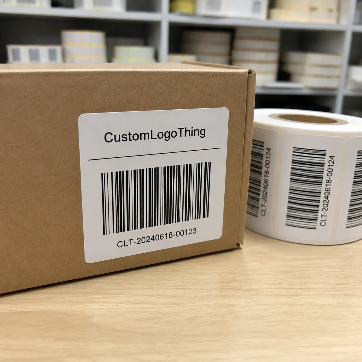
How the label sticks, and where it fails
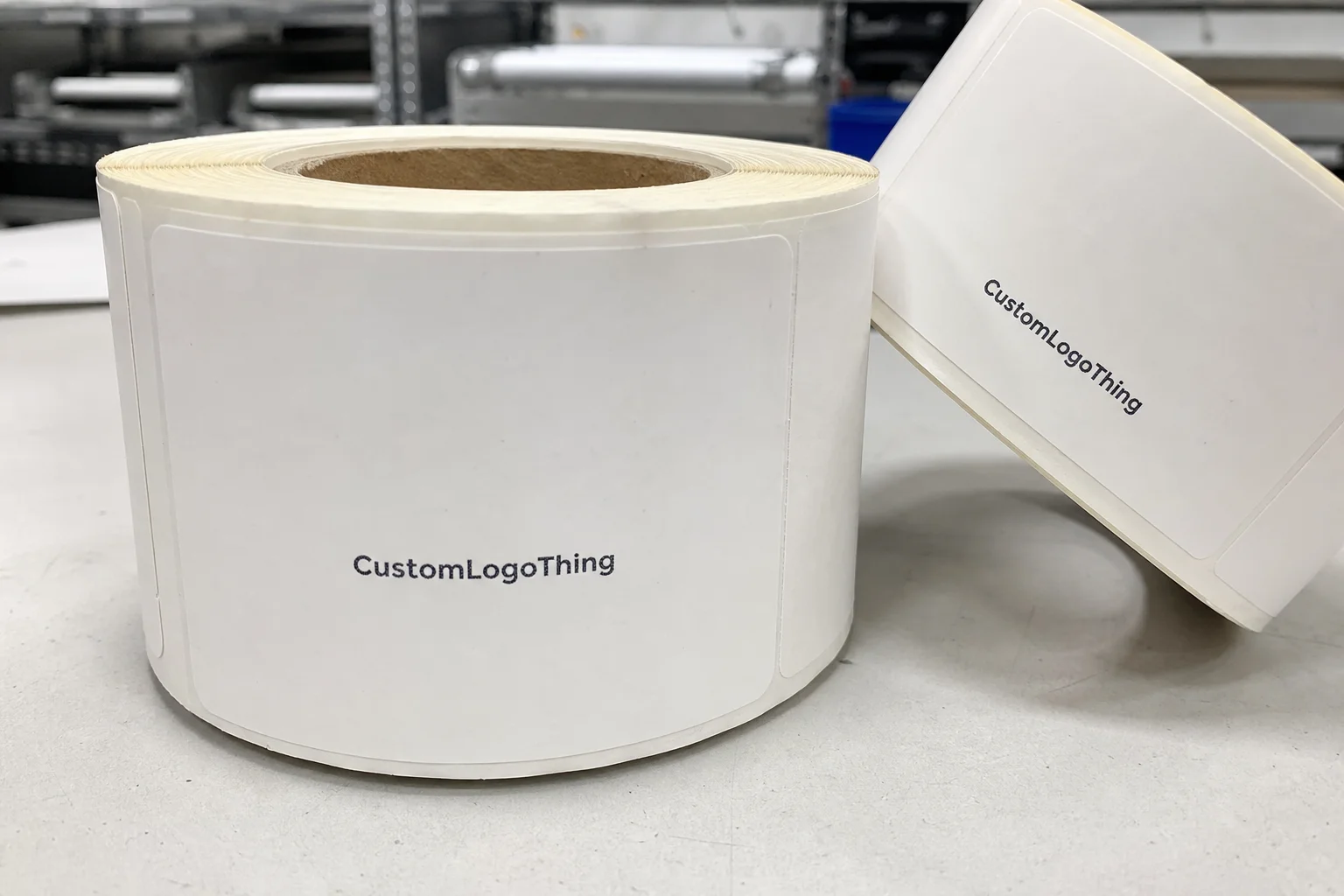
Every pressure-sensitive label has three parts that matter: the face stock, the adhesive, and the liner. The face stock is the printed surface. The adhesive bonds the label to the bottle. The liner carries the label through print and conversion. Change any one of them, and the label can behave differently on glass, PET, or chilled plastic.
The bottle surface is part of the equation too. A dry, clean container gives the adhesive a chance to bond evenly. A cold bottle pulled straight from refrigeration is different. Condensation weakens immediate tack, especially at the edges, so a label may look fine at application and then start lifting later. That is one reason many failures show up after the product is packed, not during the first few minutes on the line.
Permanent acrylic adhesives are common for beverage work because they hold well on smooth surfaces. Removable adhesives are useful when the label must come off cleanly later, but they are not always the best choice for cold drinks or long storage. Specialty cold-temperature adhesives can help when bottles are applied in refrigerated conditions, though they still need proper handling and surface prep.
Print method matters too. Durable inks and a suitable overlaminate can improve resistance to scuffing, condensation, and tray abrasion. For a one-day event, buyers may only need the label to survive transport and presentation. For retail bottles, the standard is higher. The label may need to stay legible after repeated handling, cooler storage, and shipping vibration. Standards and test methods from groups such as ISTA are useful when the bottles will move through rougher logistics, because they expose weak points before the run is released.
The short version: match the label construction to the surface, the temperature range, and the real use case. If the bottles are refrigerated, iced, or hand-applied on a busy line, that should be stated at the start. It changes the recommendation in a meaningful way.
Material, finish, and shape: the specs that matter
Material choice is usually where the biggest performance difference appears. Paper labels are the most economical and can work for dry, room-temperature use or short event runs. BOPP, a polypropylene film, is the more reliable choice when condensation enters the picture. It resists moisture better and tends to hold its appearance longer under handling.
Clear film can create a no-label look, but it asks more from the design. Pale colors, fine type, and white areas behave differently on transparent stock, so the artwork has to be planned for that result instead of adapted after the fact. Gloss produces a brighter, more retail-forward finish. Matte softens the look and can read as more restrained or premium. Uncoated or very low-gloss looks can be attractive, but they also show bottle texture and any flaws more clearly.
Shape is the hidden variable. A straight-sided bottle gives the label more predictable real estate. A tapered bottle narrows as it moves downward, which means the dimensions on a flat proof may not behave the same way on the actual container. Seam placement matters too. If the seam lands in a bad position, overlap issues, bubbling, or a visible design break can show up even when the artwork itself is correct.
Opacity is another decision that changes the result. Some brands want a fully opaque white-backed label so the artwork stays crisp on any bottle color. Others want clear or lightly translucent stock so the bottle shows through. Both can work. The question is whether the design depends on strong contrast, fine type, or a clean shelf read. If so, white backing usually protects legibility.
If the label is being sourced alongside Custom Labels & Tags, it helps to think about how the label will sit next to cartons, sleeves, or inserts. That level of consistency matters more than many teams expect. A clear bottle label can look elegant alone, but if the rest of the package uses heavy coated board or high-gloss custom printed boxes, the set can feel visually split. Good package branding usually comes from alignment in material weight, finish, and tone, not from one standout component.
Some buyers also ask about FSC paper options. That does not change the water-resistance question, but it can matter if sustainability claims are part of the brief and the label sits within a broader paper-based program.
Production and turnaround: what happens after proof approval
The production path is usually simple on paper and more detailed in practice. It starts with file review. The printer checks dimensions, bleed, resolution, barcode placement, and whether the dieline matches the bottle panel. Then comes proofing, where copy, layout, color expectations, and finish are confirmed. After approval, the job moves into material setup, printing, finishing, conversion, quality checks, and packing.
Artwork readiness controls a lot of the timeline. A file that is already print-ready can move quickly. A file that needs dieline cleanup, copy edits, or layout corrections will take longer. Custom shapes, special inks, white underprint, metallic effects, and layered finishes all add setup time. A standard rectangle on a common film is a much faster job than a clear label with tight registration and a Custom Die Cut.
A realistic planning range helps keep schedules honest. Simple label runs often land around 5 to 8 business days after proof approval. More complex jobs usually sit in the 10 to 15 business day range, and that can extend if new tooling, special adhesive testing, or a press proof is required. Those numbers are not universal, but they are close enough to be useful for planning.
Sampling is a tradeoff worth making in the right situations. A test stage adds time, but it reduces the risk of reprints. That is especially true for chilled bottles, clear film, or any label that will be applied by hand rather than on a consistent machine line. A day spent checking fit and adhesion is cheaper than a full run that peels once it reaches the cooler.
Shipping matters as part of the lead time, not after it. A printer may finish a job on time, but if the freight cutoff is missed, the launch date still moves. Treat proofing, production, and transit as one schedule. That is the only version that tends to hold up.
Cost, pricing, and MOQ: what moves the number
The quote for Custom Water Bottle labels is usually driven by quantity, size, shape, material, finish, and print complexity. The math is straightforward. Simple labels in larger quantities are cheaper per unit because setup is spread across more pieces. Clear film, white ink, metallic effects, and custom die cutting raise the price because they add production steps and tighter control requirements.
Minimum order quantity matters more than many buyers expect. A 1,000-piece order can look attractive if the label is only needed for a small event, but the unit cost is usually much higher than at 5,000 pieces. If the project is a tasting run, launch test, or short promotional campaign, the buyer may accept a higher unit price in exchange for lower inventory risk. That is a valid trade.
The ranges below are broad market estimates, not fixed quotes, but they help set expectations before the first vendor response comes back.
| Label option | Typical use | Approx. unit cost at 5,000 pieces | What usually raises the price |
|---|---|---|---|
| Paper pressure-sensitive | Dry storage, short event runs | $0.10-$0.18 | Heavy ink coverage, short quantity, custom shape |
| BOPP gloss or matte | Chilled drinks, condensation, general beverage use | $0.16-$0.30 | White backing, overlaminate, complex dieline |
| Clear film with white ink | No-label look, premium shelf presentation | $0.22-$0.38 | White underprint, tight registration, specialty finish |
| Specialty or decorative finish | Launches, premium seasonal packaging, retail display | $0.30-$0.50+ | Metallic effects, soft-touch lamination, custom die cutting |
Precise input produces a useful quote. Bottle dimensions, use environment, quantity tiers, and finish preference should be sent together. A quote based on a bottle photo alone is usually too loose to compare against anything else. The more specific the brief, the less guesswork the estimate contains.
Rush timing affects cost too. A job that must move through production ahead of the normal queue can require priority handling, and that changes the quote. If the launch date is fixed, say so early. It helps avoid pricing that looks competitive but fails the schedule.
Quality-control checks that prevent waste
Good label work depends on practical checks, not only visual approval. The first is dimensional verification. Measure the bottle itself, not a photo of it. A photo hides taper, curvature, seam clearance, and label panel height. That is how labels end up too wide, too tall, or placed where the bottle shape starts to work against the adhesive.
Next comes temperature testing. If bottles will be refrigerated, chilled, or packed with ice, the label should be evaluated in that condition. Moisture changes the behavior of the adhesive, especially along the corners. A label that stays down on a dry sample may fail in a cold tray after an hour of handling.
Artwork should be checked on the actual label size, not just in a brand deck. Fine type can disappear when wrapped around a curved surface. Weak contrast becomes harder to read on clear film. Too much visual detail can make the bottle feel crowded. In retail packaging, shelf read is fast. If the label needs explanation, it is doing too much.
Application method matters as well. A label applied by hand on a busy line is more vulnerable to skew, trapped air, and edge lifts than one applied with a controlled machine setup. If application will be manual, the label design should leave some tolerance for real-world placement. If the line is automated, the equipment spec matters just as much as the label itself.
A label can pass a proof review and still fail on the bottle if the stock, adhesive, and surface prep are not matched to the real handling conditions.
For chilled or high-touch runs, a small test batch is worth the time. It is the fastest way to catch edge lift, opacity problems, and alignment issues before they become a full reprint.
Common mistakes that show up on real bottles
The easiest mistake is treating the bottle as generic. Two bottles with similar silhouettes can still behave differently because of surface coating, material, or taper. One may accept the adhesive cleanly while another resists it enough to cause corner lift. That difference is small on paper and obvious in production.
Another common problem is applying labels to wet bottles without adjusting the material choice. Condensation is not a minor nuisance. It changes tack. If the label is going onto a cold bottle, the construction needs to be chosen for that condition or the bottles need to be handled so the surface dries before application.
Artwork issues also show up more often than buyers expect. Very thin type can blur when wrapped around a curve. Light colors can disappear on clear film. Heavy artwork can crowd the bottle and make the package look less deliberate. The label may still be technically correct, but the bottle can lose shelf clarity.
Adhesive choice is another quiet source of waste. Some teams select a generic adhesive because it is available, not because it fits the bottle finish. That often works until the first cold case or the first shipment. Small lifts at the corners are usually the first warning sign. If they appear in sampling, they are rarely improved by scaling up.
There is a deeper mistake too: comparing only the sticker price. A cheaper label that scuffs, peels, or misses a launch date is not cheaper. It only appears that way until reprint, labor, and delays are counted.
What to prepare before requesting a quote
A good brief saves time and reduces proofing rounds. The more specific the request, the less room there is for correction later.
- Measure the bottle diameter, label panel height, and any taper or seam constraints.
- State the use environment clearly: refrigerated, iced, room temperature, hand-applied, or event-only.
- Choose a quantity range and compare tiers rather than asking for a single number.
- Prepare artwork files, logo assets, copy, brand colors, and any required regulatory text.
- Decide whether the job needs paper, BOPP, or clear film before proofing starts.
If the launch also includes cartons, inserts, or custom printed boxes, keep those decisions aligned with the bottle label early. That keeps the package consistent instead of assembled from separate visual ideas. For many brands, the strongest result comes from treating the label and the outer packaging as one system.
That is the practical path. Custom water bottle labels work best when the bottle spec, environment, and budget are defined before the first proof is sent. Get those pieces right, and the label becomes part of the packaging instead of a fragile extra.
What material is best for custom water bottle labels on cold drinks?
BOPP or another film stock is usually a better choice than paper when condensation is expected. A moisture-resistant adhesive helps the label stay down when bottles come straight from refrigeration, and a gloss or matte overlaminate can improve scuff resistance if the bottles will be handled repeatedly.
Are custom water bottle labels waterproof?
They can be highly moisture resistant, but not every label is fully waterproof in the same way. Film face stocks and the right adhesive handle condensation better than standard paper labels. Ask whether the label is meant for splash resistance, refrigeration, or full immersion, because those are different performance targets.
How many custom water bottle labels should I order for a short run?
Base the order on actual usage plus a buffer for setup waste, application errors, and spoilage. Short campaigns often benefit from comparing multiple quantity tiers first. If the label is tied to an event or launch, leave room for a future reorder so the program does not stop early.
How long does production usually take for custom water bottle labels?
Turnaround depends on proof approval, material availability, finishing, and run size. Simple jobs move faster when artwork is print-ready and no custom tooling is needed. Ask for the estimate in business days and confirm whether shipping time is included or separate.
What should I have ready before I request a quote for custom water bottle labels?
Have bottle dimensions, quantity, use conditions, and a finish preference ready. Share artwork files or at least the logo, copy, and brand colors so the quote reflects real production needs. If you want a usable comparison, ask for pricing at multiple quantities and note any deadline.