A bag can look perfect on screen and still print badly. That's the usual problem with Custom Wine Paper Bags Artwork File Setup: the art was built for a flat rectangle, but the real bag has folds, seams, handles, and a bottom panel that all steal safe space. Get the file right, and production stays calm. Get it wrong, and the proofing emails multiply like weeds.
For B2B buyers, this is not just a design issue. It affects lead time, waste, margin, and whether your branded packaging lands cleanly across a reorder. I see the same pattern over and over: teams treat artwork as a creative handoff, then act surprised when the printer starts flagging trim, bleed, and color problems. That is exactly why packaging design needs a production mindset from the first file.
Why wine bag artwork fails even when the design looks finished
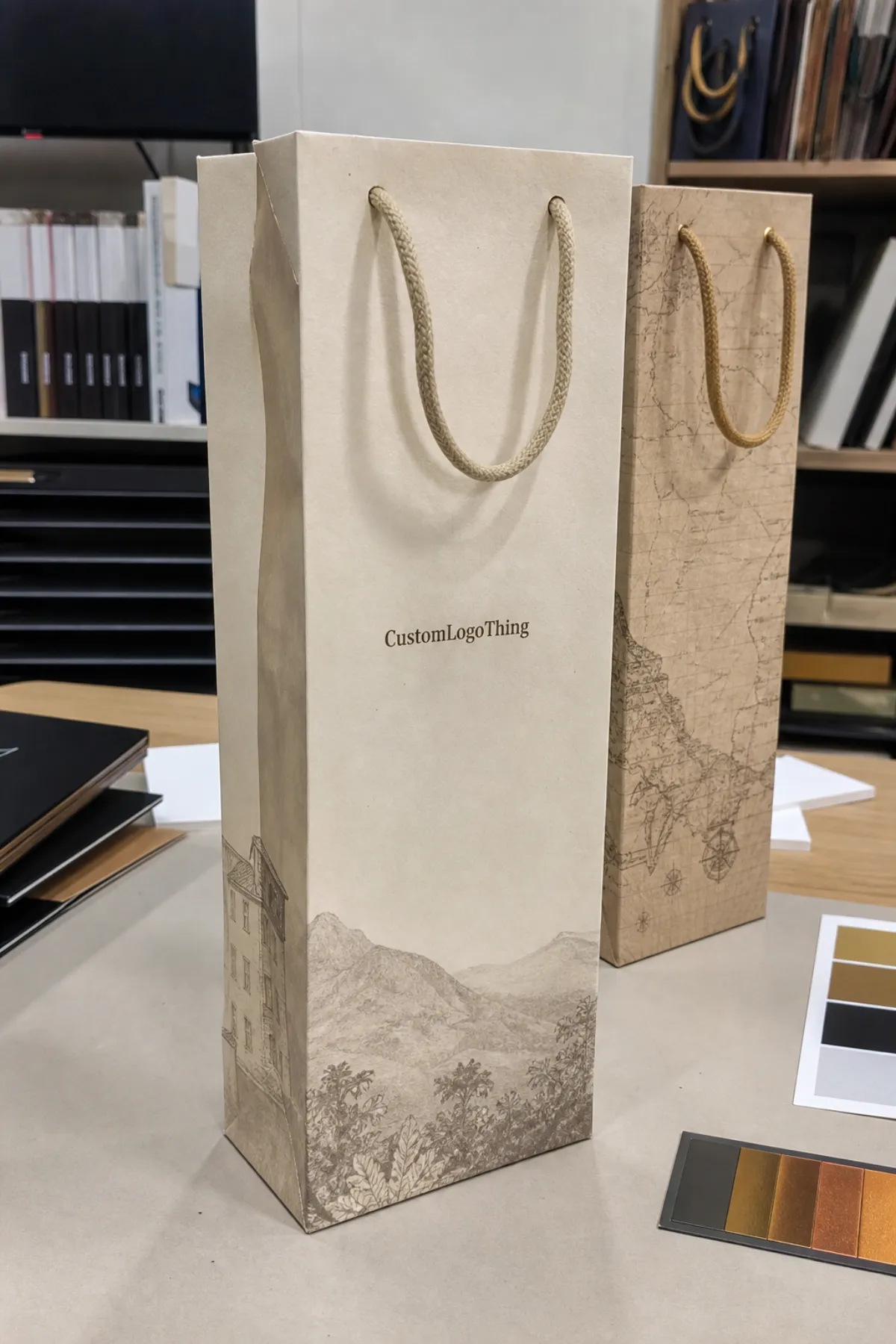
The most common failure is simple: the file looks finished on a monitor, but the bag does not behave like a brochure. A wine paper bag has narrow panels, a wraparound layout, a gusset, a fold at the base, and usually a handle attachment zone that can eat into the print area. If a logo sits too high, it may get clipped by the top fold. If copy sits too low, it can disappear into the bottom crease. If artwork spans a seam without planning, the brand mark can split in a way that looks cheap, not intentional.
Printers flag problems before production because they have to. Missing bleed leaves white edges after trimming. Text too close to the cut line can drift into danger during die cutting. Low-resolution images go soft fast on kraft stock, especially if the bag is a larger format and the artwork gets scaled. Color mismatches show up because your screen is backlit and the bag is not. That sounds obvious, but plenty of teams still approve files based on what looks “close enough” on a laptop.
For repeat B2B orders, artwork setup is a production-control step. It protects schedule, reduces rework, and keeps the same package branding across multiple runs. That matters if you are building retail packaging for seasonal wine programs, corporate gifting, or hospitality kits. A clean file makes the whole order easier to quote, proof, and repeat. A sloppy file tends to turn a simple reorder into a mini project.
Honestly, the bag itself is usually not the problem. The problem is a design file built without the physical product in mind. The right setup makes even modest artwork look deliberate. The wrong setup makes good artwork feel like an afterthought.
And if your team is comparing bag styles with other printed formats, it helps to keep the whole order family organized through Custom Packaging Products. That makes it easier to keep one visual system across bags, sleeves, and related product packaging.
Custom wine paper bags artwork file setup basics
Start with the exact dieline for the bag size, handle style, paper weight, and print method. Do not guess. Do not build from a random template that “looks close.” A 1-bottle wine bag and a 2-bottle carrier may share the same idea, but the usable print area, folds, and handle positions are different enough to move artwork by inches, not millimeters. That is a big deal on a narrow front panel.
For Custom Wine Paper Bags artwork file setup, I would build in CMYK, place logos as vector files wherever possible, and keep all critical elements inside the safe area. Use a press-ready PDF when the supplier wants a locked file. Use AI or EPS if the printer asks for editable vectors. If they provide a packaged workflow, include linked images, fonts, and a proof PDF so nothing gets lost in translation. That is boring admin work, sure, but boring admin work is usually what saves the order.
- Use the supplied dieline rather than redrawing the bag from scratch.
- Work in CMYK unless the supplier specifically accepts spot color builds.
- Keep logos vector-based so edges stay sharp on kraft, white, or coated stock.
- Leave room for seams and folds on the front, back, and gusset panels.
- Match the printer's dimensions before you move any art into the layout.
File format matters less than file discipline, but it still matters. A layered PDF is often the safest handoff because it preserves structure without relying on live software files. AI is fine if the printer works in Adobe Illustrator. EPS still shows up in older production workflows. What matters is that the file is organized, named clearly, and built with the actual bag spec in mind. A messy file is a warning sign, even if the art itself is good.
If you are sourcing paper grades or checking whether a supplier references FSC-certified materials, the standards side is worth a look at FSC chain-of-custody guidelines. It is not glamorous, but it helps buyers separate real paper claims from decorative marketing fluff.
Dielines, bleed, and finish zones that protect the print
Bleed is the extra artwork that extends beyond the trim line, usually 0.125 inch or 3 mm on each side unless the printer specifies otherwise. Without bleed, slight cutting shifts can leave a thin white line at the edge. On a wine bag, that can be especially visible because the panels are narrow and the eye catches edges fast. If the design uses a solid background color, the bleed must be clean and consistent. If it uses imagery, the image needs to extend past the trim too, not stop exactly at the line like it is trying to be helpful.
Safe zones are the opposite of bleed. This is the area where important elements live because they are least likely to get clipped, folded, or hidden. Keep product names, legal copy, barcodes, and logos away from the cut edge, fold lines, and handle anchor areas. For a standard wine bag, I usually expect the safe zone to be at least 0.125-0.25 inch inside the trim, and more if the bag has a complex structure or a decorative top. That extra space is cheap insurance.
"If a logo sits too close to a fold, the fold will win. The proof is where you catch that, not after 5,000 bags are printed."
Special finishes need their own planning zone. Foil stamping, spot UV, embossing, matte lamination, and gloss coatings all behave differently on paper stock. They can look sharp, but they also need enough margin from the edge so the finish does not break or misregister. On kraft paper, foil can lose detail if the lines are too thin. On coated stock, spot UV can read beautifully, but only if the mask is mapped cleanly and the designer respects the substrate. That is not a mood issue. That is production math.
Some bag styles shrink the usable print area more than people expect. Window cutouts remove real estate. Reinforced tops can hide artwork near the opening. Decorative ties, ribbon closures, and thicker handles can interfere with top-edge printing. If the bag is part of a premium gift set, the artwork should be designed around those features, not placed first and prayed over later. That is how you end up with a polished front panel and a compromised top edge.
Practical bleed and zone checks
- Confirm the trim size against the supplier dieline.
- Extend all backgrounds and images past trim by the specified bleed.
- Move text and logos inward from folds, seams, and cut lines.
- Check finish layers separately for foil, UV, or embossing.
- Review hidden areas near handles and closures before approval.
For transit-sensitive branded packaging, especially if bags are packed with bottles or boxed sets, it is smart to understand shipping stress too. The ISTA transit testing standards are useful because they remind buyers that print quality is only half the job; the bag also has to survive handling without denting, scuffing, or crushing.
Teams that bundle wine bags with other launch items often keep everything moving through Custom Packaging Products so the same artwork rules and finish notes carry across related SKUs.
Image resolution, fonts, and color management checks
Vector graphics should carry the logo, icons, rules, and line art. Raster images should be reserved for photos or textured backgrounds. If you place a bottle shot, vineyard image, or pattern texture, it needs enough resolution at final size. As a practical target, 300 dpi at actual print size is the safe standard. You can sometimes push lower on large, low-detail art, but if the artwork includes fine labels or realistic glass highlights, low resolution starts to show fast.
Fonts deserve more respect than they usually get. Outline type when a printer requests it. Embed fonts when the workflow allows. Never assume the supplier has your exact typeface installed, because they probably do not. On a wine bag, tiny text is risky. Anything below 6 pt can get hard to read once it lands on paper texture, especially on uncoated kraft. If the message matters, make it bigger or cut it. Small copy that no one can read is just visual noise pretending to be detail.
Color management is where a lot of brand expectations go sideways. CMYK is the baseline for process printing, but many brands still show up with spot color values they want matched exactly. PMS references help, but they are not magic. Paper stock, coating, and ink method all influence the final look. A deep black on coated stock may feel rich. The same build on kraft may feel flatter and warmer. That is normal. If the color must stay tight across repeat orders, the file should note the exact target, the stock, and the approved proof condition. Otherwise, every reorder becomes a small argument with physics.
Overprint settings also matter. Some designers leave black text set to overprint by default, which can be fine for small copy but disastrous if it sits over a dark background without checking knockouts. Spot colors can also interact with overprint in ways that alter the final result. A preflight check should catch that before plates or digital output start. If the supplier does not preflight, the buyer should. Somebody has to.
In practice, this is where packaging design becomes a discipline instead of a decoration exercise. Clear vector art, clean fonts, and sensible color builds are what keep custom printed boxes, wine bags, and other retail packaging aligned across the same brand system. That is package branding doing real work, not just looking nice in a pitch deck.
Proofing and approval workflow before production starts
A good proofing workflow is usually simple, and simple is good. The more layers of confusion you add, the more likely someone approves the wrong file. For custom wine paper bags artwork file setup, I like a sequence that starts with submission, moves through preflight review, then lands on a digital proof, and only then moves to production. That sounds obvious because it is. The challenge is getting every stakeholder to follow the same path.
- Submit the artwork package with the correct dieline, source files, and notes.
- Let the printer preflight the file for bleed, safety, resolution, and color setup.
- Correct the flagged issues before proofing, not after approval.
- Review the digital proof for size, copy, finish placement, and color intent.
- Approve one named version and keep that version locked.
The proof itself should be checked line by line. Does the bag size match the order? Are the handle zones and fold lines shown correctly? Is the logo centered the way your brand team expects? Is the legal text readable? Are the foil or UV layers mapped where they should be? Buyers should also confirm whether the proof is a color-managed simulation or a simple layout proof. Those are not the same thing, and pretending they are will only cause disappointment later.
Version control saves real money. Marketing often wants a prettier file. Procurement wants the order moving. Packaging teams want the spec to stay locked. If there are three versions floating around in email, somebody will approve the wrong one. Named approvers and a single master file prevent that mess. Honestly, the fastest way to slow production is to let everyone feel free to “just make one small change” after approval.
Clear approval also keeps purchase orders moving. If the supplier has a signed proof and a clean file, the job can shift into production without extra back-and-forth. That matters on seasonal launches and event-driven orders, where the difference between shipping on time and missing the window may be a week of sales. No printer can fix late decision-making.
Typical production timeline and lead times for custom orders
Timelines depend on the file, the finish, the quantity, and whether the order is a first run or a reorder. For a straightforward wine bag order with a clean file, the process often looks like this: 1-2 business days for preflight review, 1-3 days for proof corrections and approval, 7-12 business days for production, and then shipping time on top. If the order uses special finishes or a new dieline, the total can stretch to 15-20 business days before freight. That is not slow. That is normal once the order stops being basic.
Simple reorders usually move faster because the dieline, setup, and proof history are already locked. New projects take longer because the printer is still checking the artwork against the bag structure. If the team needs metallic foil, embossing, or mixed print zones, the schedule gets longer again. Specialty work asks for more setup, more checks, and more opportunities for a tiny mistake to become a big delay.
The biggest schedule killers are predictable. Late file changes. Missing dielines. Rebuilt logos. Brand approvals that arrive after the proof deadline. Holiday demand. Rush shipping. There is nothing mysterious here. The timeline slips because something upstream was not ready. If you need the bags for a campaign, plan backward from the in-hand date and build a cushion. I would rather see a buyer ask for a tighter design deadline than a tighter print deadline. The first one is usually fixable. The second one is where panic lives.
For teams coordinating inventory around launches, the safe play is to lock artwork before the order is placed. That keeps custom wine paper bags artwork file setup from becoming the bottleneck that holds up the rest of the package. It also makes it easier to scale the same artwork across related branded packaging, whether the order includes bags only or a broader set of product packaging materials.
Pricing factors that affect custom wine paper bag orders
Price is mostly a function of spec complexity and quantity. Bag size matters because larger bags use more paper and often need more careful handling. Paper weight matters because thicker stock costs more and can affect print behavior. Print coverage matters because a full-bleed design costs more than a single-color logo. Sides printed matter because front-only and front-back jobs are not priced the same. And finish work matters because foil, embossing, spot UV, matte lamination, and gloss all add steps.
Setup fees are where small orders feel the pain. Plate charges, prepress setup, and proofing costs can raise the landed price on short runs. A 500-piece order may look expensive per unit because those fixed costs get spread across fewer bags. Once you move into higher quantities, the unit cost usually drops hard. That is why a 5,000-piece reorder can be dramatically cheaper per bag than the first 500. Not because the printer suddenly got generous. Because setup costs are finally diluted across volume.
| Order type | Typical setup | Best for | Approx. unit range |
|---|---|---|---|
| Basic one-color bag | Standard dieline, single print pass | Corporate gifts, simple branded packaging | $0.42-$0.95 at 1,000 units |
| Full-color bag | CMYK art, tighter prepress checks | Retail packaging, launch kits | $0.58-$1.20 at 1,000 units |
| Premium finish bag | Foil, emboss, spot UV, or coating | High-end gifting, luxury wine lines | $0.85-$1.80 at 1,000 units |
| Higher-volume reorder | Locked file, repeat production | Ongoing campaigns, replenishment | $0.18-$0.45 at 5,000 units |
Those are working ranges, not promises. Paper choice, print coverage, and freight change the picture fast. Artwork fixes can add cost if the printer has to rebuild a file. Rush turnaround adds cost because it compresses production and shipping choices. Specialty embellishments add cost because they need separate setup and more labor. If you are budgeting, build a small buffer for prepress changes. It is cheaper to catch the mistake in the file than to pay for the mistake in the factory.
Buyers sometimes compare wine bags to other formats like custom printed boxes and assume the bag should be cheaper by default. Sometimes yes, sometimes no. A simple bag is usually economical. A premium bag with heavy stock, multiple print zones, and finish work can approach the cost of a modest carton. That is why the spec matters more than the category. The bag is not expensive because it is a bag. It is expensive because of what you asked it to do.
If you are standardizing a line of product packaging, keep the artwork rules consistent and reuse the same naming structure across files. That lowers correction time and makes repeat orders easier to quote. It also keeps the supply chain boring, which is exactly what good packaging should do.
What file format is best for custom wine paper bags artwork?
A press-ready PDF is usually the safest handoff, especially if it is built from vector art and locked to the correct dieline. AI or EPS can work too if the supplier asks for editable artwork. The real priority is clean structure, correct dimensions, and a complete custom wine paper bags artwork file setup package that does not leave anyone guessing.
Do I need a dieline before creating the artwork?
Yes. Build from the actual dieline for the exact bag size, handle style, and print method. Without it, you are guessing at folds, seams, and safe zones. Guessing is how good design gets clipped in production.
How much bleed should I add to the artwork file?
Most suppliers want about 0.125 inch or 3 mm of bleed on each side, but always follow the printer's spec. The key is to let backgrounds and images run past the trim line so no white edge appears after cutting.
What resolution should images be for wine bag printing?
Use 300 dpi at final size for raster images whenever possible. Logos and line art should stay vector-based. If the image is blurry in the proof, it will be worse on press. Paper texture does not forgive soft files.
How long does artwork approval usually take?
For a clean file, approval can happen in 1-3 business days if decision-makers are available. If the file needs corrections, missing fonts, or layout fixes, it can take longer. The fastest approval process is the one with one owner and one version.
What usually increases the cost of custom wine paper bags?
Higher quantities lower unit cost, but setup, print coverage, premium finishes, rush turnaround, and artwork changes all push price up. Full-color designs and foil or embossing usually cost more than a simple one-color logo. If the file is not ready, prepress fixes can add another layer of expense.
Clean bag printing is rarely about luck. It is about file discipline, clear specs, and a supplier who can read the artwork instead of guessing at it. If you build custom wine paper bags artwork file setup the right way, the print result is easier to approve, easier to reorder, and a lot less expensive to correct. That is the part people skip right up until the first bad proof lands in their inbox.

