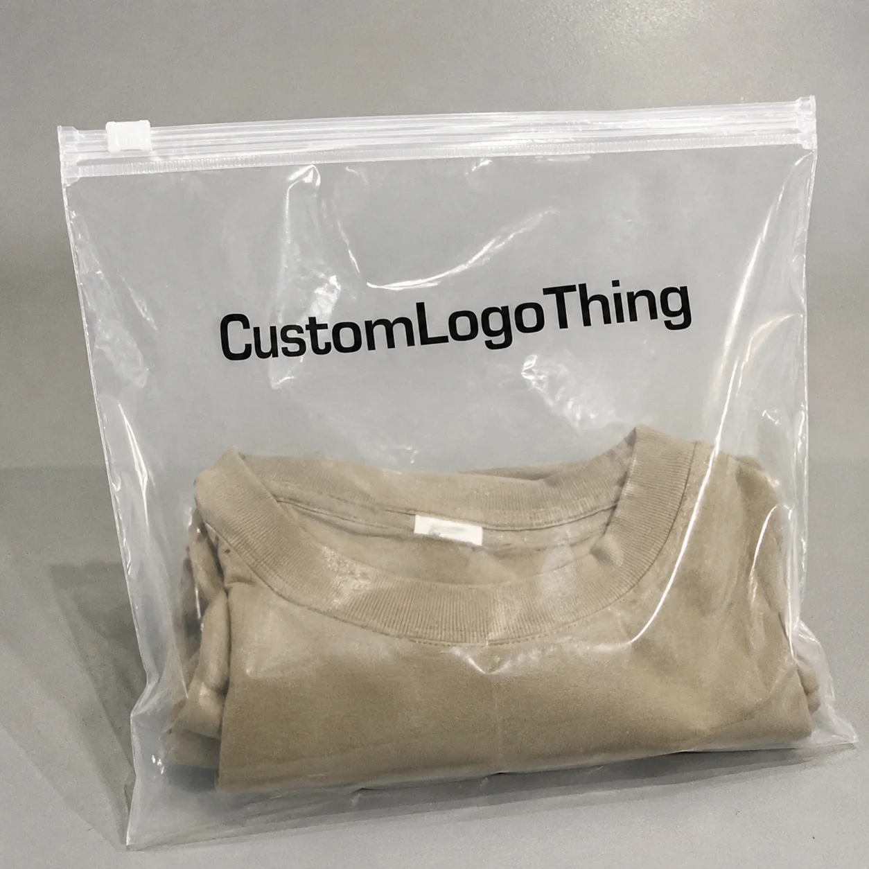
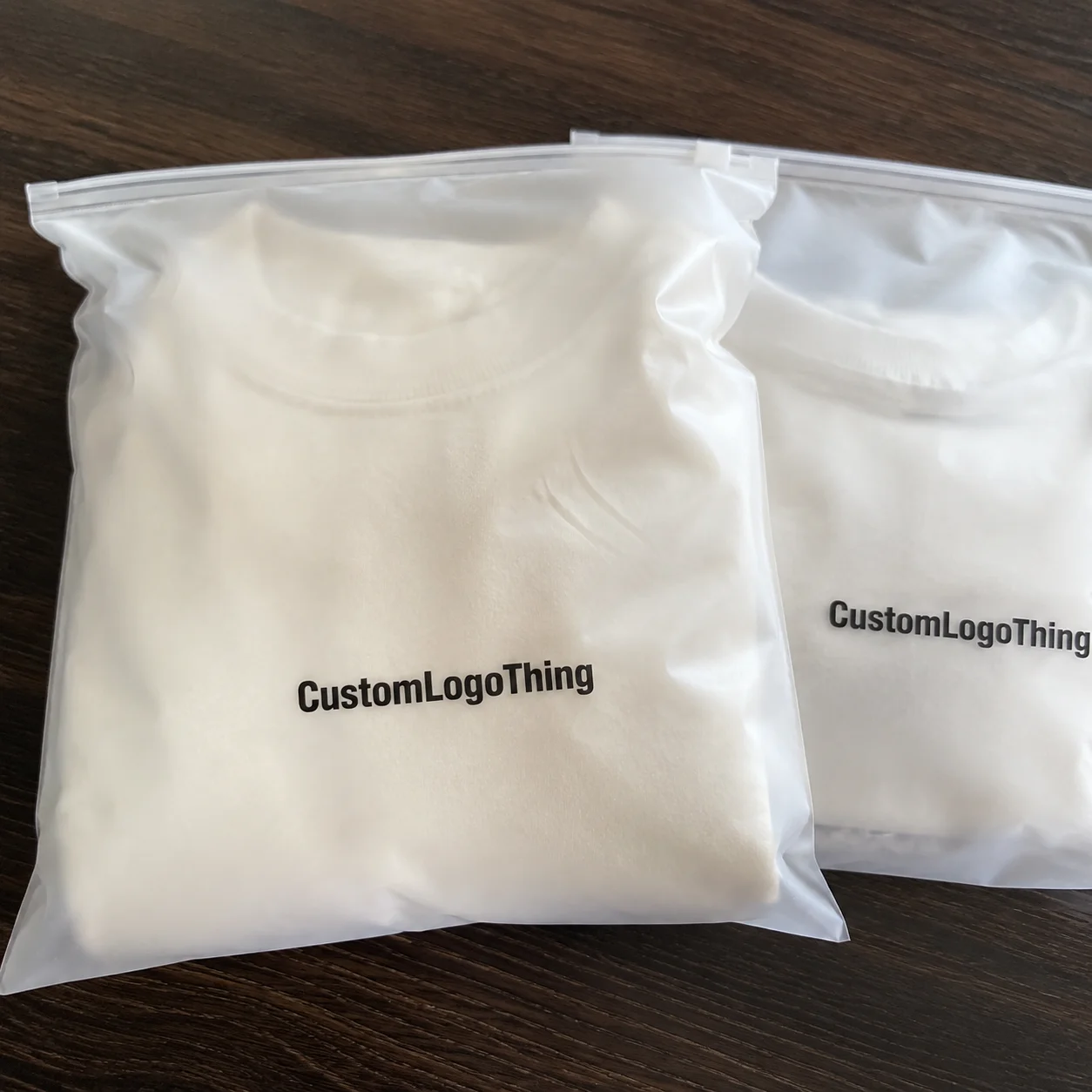
fitness brands OPP Header Bags warning label guide jobs look simple on paper and then become difficult for entirely ordinary reasons. A warning can be legally correct and still fail if it is too small, buried under a barcode, or placed on a glossy panel that reflects every light in the room. A pack can also look polished and still trigger a retailer correction because the copy reads like a marketing note instead of a product warning.
That gap between appearance and function is where most packaging problems start. Fitness accessories are small, crowded with claims, and often sold through more than one channel. A resistance band set, a jump rope, a massage tool, or a compact training kit may all use the same OPP header bag format, but the warning needs to match the product, the market, and the buyer’s acceptance rules. The structure is straightforward: clear OPP body, printed or applied header, and a warning area that has to be legible at a glance.
"If the warning cannot be read at arm's length, it is not doing its job, no matter how polished the package looks."
For buyers, the important question is not whether the bag looks neat in a render. It is whether the text survives production, still reads under warehouse lighting, and lands in the right hierarchy once the pack is hanging on a peg hook. That is the real test. Everything else is decoration.
Fitness Brands OPP Header Bags Warning Label Guide Basics
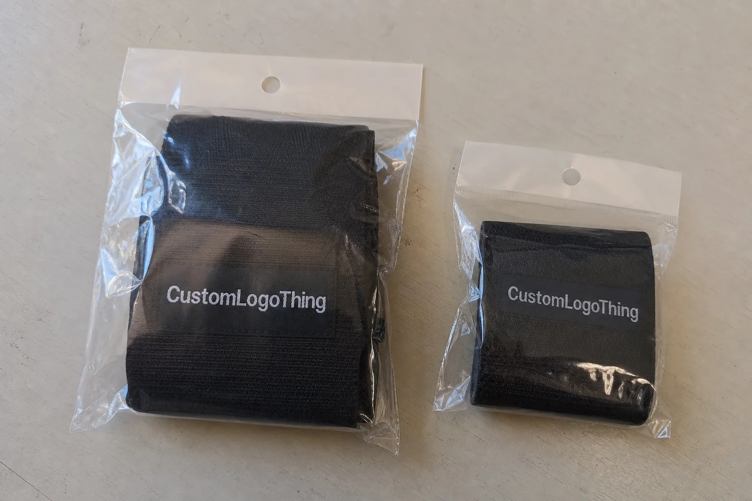
OPP means oriented polypropylene, a clear film widely used for lightweight retail packaging because it is inexpensive, visually clean, and easy to hang. In fitness packaging, the format shows up again and again because it gives buyers product visibility without adding the cost of a rigid box. It is a practical choice, not a premium one. That distinction matters when you are deciding how much to spend on the header, the print, and the warning system.
The header card is where the package does the heavy lifting. It usually carries the brand mark, SKU identification, barcode, and warning copy. On some programs the warning is a short safety note. On others it is a handling instruction, a product limitation, or a channel-specific notice required by a retailer. The exact wording depends on the product and the destination market, so the bag format alone does not determine compliance.
Typical sizes are modest. Small accessory packs often use something close to 3 x 4 inches or 4 x 6 inches with a header around 1.5 to 2 inches. Larger kits can move to wider cards and thicker film, especially if the product has edges, tension, or repeated handling that stresses the seal. A flimsy header folds badly. A too-thin film looks cheap and can split during packing. Those are not theoretical issues. They show up in receiving, not in a spec sheet.
One useful way to think about the layout is to separate the package into four zones:
- Clear body: shows the product and helps buyers identify the SKU quickly.
- Header card: carries branding, SKU data, and warning copy.
- Seal area: affects stiffness, hangability, and whether the pack stays flat.
- Warning field: needs contrast, room, and type that stays legible after production.
That structure sounds basic because it is basic. The difficulty comes from what has to fit inside it. A logo wants space. A barcode wants quiet margins. The warning wants contrast and enough size to be read instantly. Put too many messages on a narrow header and the package starts reading like a flyer. Retail buyers notice that faster than brands expect.
Neutral packaging references are useful if you want a broader view of materials and package communication. The non-profit resources at Packaging.org are a solid starting point, while ISTA test profiles help frame transit durability when the bagged item has to survive master-carton handling and still arrive retail-ready.
How Warning Labels Work on OPP Header Bags
A warning label has one job: communicate risk, limitation, or handling instruction faster than a shopper can second-guess it. That means readability comes before style. If the copy is elegant but hard to parse, the package fails. If the warning is technically accurate but hidden by art, it fails in a different way. Either result ends with a revision request.
There are three common execution methods. Direct print puts the warning into the artwork itself. Pressure-sensitive labels add flexibility when copy changes often. Built-in header copy is the cleanest option when the warning is stable and the brand can design around it from the start. Each method solves a different production problem.
Direct Print Versus Applied Labels
Direct print works best on repeat programs with stable artwork. It reduces one handling step and avoids the common failure mode where a label drifts off position by a few millimeters and suddenly looks careless. If the warning is baked into the header, the package tends to look more unified and less temporary.
Applied labels are more forgiving. They make sense for pilot runs, changing compliance language, seasonal SKUs, multilingual updates, and test markets. They also help when the same bag body is shared across several products but the warning has to vary. The tradeoff is practical, not philosophical: labels add labor, inventory complexity, and a point of failure on the line.
For buyers, the question is not which method is better in the abstract. It is which method matches the stability of the artwork. If the copy is still changing, do not lock it into print too early. If the copy is fixed and the run is large, do not pay for a removable label you do not need.
What Should Be Requested In Proof
Ask for a scaled mockup on the actual bag size, not just a flat artwork file. Ask for the exact warning line length, the font size, and the final placement relative to the seal and barcode. Those details matter because a label that looks generous on a screen can feel cramped once it is imposed on a real header card.
If the layout includes bilingual copy, icons, lot coding, or product care notes, make the hierarchy obvious. The eye should land on the warning first, then the brand, then the rest. When brands reverse that order, the pack may look lively, but it stops behaving like a package and starts behaving like a poster.
A practical rule of thumb: if the warning takes longer than three seconds to understand, simplify it. Packaging is a fast-reading medium. It is not the place for legal paragraphs masquerading as a label.
Material, Adhesion, and Compliance Factors
The film surface matters more than it first appears. OPP is smooth and often glossy, which gives the pack a clean retail look but can make small print harder to read under bright store lighting. It also creates practical issues for label adhesion. Static can attract dust, and a lightly curled edge can lift the corner of a sticker. None of that is dramatic. It is just what happens when a light film meets handling, humidity, and real production conditions.
For lighter fitness accessories, film thickness around 30 to 40 micron is common. Heavier items, or products with sharp edges and higher stress on the seal, may need 40 to 60 micron. Thicker film is not automatically better, but thin film is often the wrong economy. It feels cheaper in the hand, and that can matter even on a low-priced SKU where the package is doing some of the brand-building.
Header construction is the other half of the equation. A better fold, stronger board, or tighter seal keeps the warning area flatter. That improves both appearance and scanability. A bowed header can make text look distorted, and a slightly warped card is enough to interfere with barcode reading in some warehouse settings.
Compliance is tied to the product class, the claim language, and the channel rules. A resistance band set may need a different warning than a recovery accessory. A general fitness item may be treated differently from a product that touches skin or is sold as part of a bundled promotion. If the retailer has its own packaging spec, that spec usually wins. A SKU can pass in direct-to-consumer and fail in wholesale without changing the bag at all.
Whitespace around the warning is not wasted space. It is one of the cheapest forms of risk control. Give the message room to breathe so it does not collide with the logo, QR code, or barcode. Overcrowding rarely saves money. It usually creates a correction, and corrections are never cheaper than clean spacing at the proof stage.
There is also a straightforward color rule. Black text on white or pale stock remains the most reliable option. White text on translucent film or busy artwork is a gamble. If the brand insists on a dark header card, the warning should sit inside its own contrast block. That one decision can eliminate the most predictable reprint.
Compliance language should be validated before production, not after. The packaging supplier can help with layout, but the brand still needs to confirm the exact wording for the relevant market. That is especially true for products that involve latex, small parts, age-related cautions, or usage restrictions. A well-printed mistake is still a mistake.
OPP Header Bags Pricing, MOQ, and Unit Cost
Cost is usually driven by a handful of variables: bag size, film gauge, print colors, header structure, warning complexity, and finishing steps. The part that catches buyers off guard is that these variables do not behave independently. A one-color warning on a standard bag is inexpensive. Add a shaped header, multiple languages, or a separate label application step, and the price can move quickly.
MOQ has an outsized effect on unit cost. A small run spreads setup costs over fewer pieces, so the per-unit number rises. A larger run usually lowers unit cost, but only if the artwork is final and the supplier can run efficiently without extra proof cycles. If the warning text is still changing, a bigger order can become a liability rather than a savings opportunity.
| Option | Typical MOQ | Indicative Unit Cost | Lead Time | Best Fit |
|---|---|---|---|---|
| Standard OPP bag, one-color warning | 3,000 to 5,000 pcs | $0.08 to $0.14 | 10 to 14 business days | Stable SKUs, repeat orders |
| Custom header artwork with warning block | 5,000 to 10,000 pcs | $0.12 to $0.22 | 12 to 18 business days | Retail programs, branded launches |
| Applied warning label on finished bag | 2,000 to 5,000 pcs | $0.15 to $0.28 | 12 to 20 business days | Short runs, changing copy, test markets |
| Multi-language or icon-heavy layout | 5,000 pcs and up | $0.18 to $0.30 | 14 to 20 business days | Cross-border retail and broader compliance needs |
Those are working ranges, not locked price sheets. Freight, carton pack, plate charges, proof corrections, and rework can change the final number. Buyers often forget the hidden costs: prepress time, extra revisions, late artwork changes, and the labor needed to apply labels by hand if the warning is not integrated into the structure.
It helps to compare standard and custom runs side by side. Standard sizes with a simple warning are usually the most efficient. Custom runs make sense when the brand needs a very specific retail presentation, a more controlled compliance system, or a pack that must support several SKUs with slightly different messaging. If the product is still being tested, simpler packaging is usually the wiser place to start.
For commercial buyers deciding how to structure the package, the product detail pages for Custom Labels & Tags are useful if the warning may be better as a separate applied element. If you need to compare packaging approaches in real use cases, the Case Studies section is a practical reference point before locking a spec.
Production Process and Lead Time
A clean production run usually follows the same path: spec review, artwork check, proof creation, sample or soft-proof approval, production, quality check, then shipment. The fewer unknowns in the first step, the fewer delays appear at the end. That sequence sounds obvious because it is obvious. The problem is that many projects start with incomplete dimensions or provisional copy and then wonder why the schedule slips.
The fastest orders are the ones with finished dimensions, final warning text, and a clear dieline from the start. If the supplier has to infer usable header space or resize the warning after proofing begins, the schedule expands. It may only be by a few days, but that is enough to blow up a launch if the purchase order is tight.
The usual delay points are repetitive. Missing compliance language. A last-minute rewrite of the warning. Artwork that looks fine on screen but fails once it is placed onto the actual bag. A label that is physically too wide for the header. These problems are preventable if the product, the copy, and the channel requirements are finalized before quoting.
For a typical custom run, many suppliers quote something like 12 to 15 business days after proof approval, with shipping on top. Smaller label-only jobs can move faster. More complex multi-language or multi-SKU programs can take longer. The practical way to plan is to work backward from the launch date and add room for one proof correction. That buffer is not pessimism. It is what keeps a sales team from explaining a missed ship date.
A good buyer keeps the process moving by answering three questions early:
- What exactly goes inside the bag?
- What warning must stay visible on the header?
- Does the package need to support retail hanging, shipping, or both?
When those answers are clear, the supplier can quote accurately and the packaging team can spend less time on revisions. That usually produces a better result than trying to force a highly flexible spec into a fixed production slot.
Expert Tips for Cleaner Approvals
Keep the warning short. It sounds almost trivial, but overly long copy is one of the most common reasons a header pack fails review. The strongest warning language reads like instruction, not brand copy. Short words. Strong contrast. No decorative treatment that makes the message feel optional.
Ask for a proof on the actual bag size. Not a loose artwork file. Not a floating mockup with no scale. A scaled layout on the real dimensions catches spacing failures early, especially when the header is only a few centimeters high and the type size looks larger on screen than it will on press.
If you change the adhesive, substrate, or print method, ask for another proof pass. A material swap can alter how the label sits, how the ink reads, or how the surface reflects light. Those are not cosmetic differences. They affect whether the warning remains legible after handling, packing, and transit.
Use bilingual copy only when the product or channel requires it. The same logic applies to lot codes and date codes. Those elements are useful in the right context, but on a small header card they can crowd out the message buyers need to see first. On compact retail packaging, clarity usually beats completeness.
Compare front-of-pack hierarchy with back-of-pack hierarchy before approving anything. If the warning sits in the least visible area, the package is asking the buyer to work too hard. Good packages do not force a shopper to hunt for safety or use notes. They present them where the eye naturally lands.
If one version of the copy has to satisfy the retailer, the distributor, and the internal QA team, send that same controlled wording to all three. Rewriting it in parallel is how reprints begin.
Another detail that matters more than brands expect: how the pack looks after it has been handled for a few minutes. A pristine sample on a desk is not the same as a pack that has been counted, boxed, and moved twice. If the warning is still readable after ordinary handling, the layout is probably sound. If it depends on perfect positioning, it is too fragile.
Next Steps: Build a Quote-Ready Spec
The cleanest quote requests are boring in the best possible way. They include finished bag dimensions, header dimensions, warning copy, target quantity, product category, and any channel-specific rules. If the product will be sold through a retail chain, say so. If it is a promo run for events, say that too. The supplier needs the use case, not just the size.
Send one reference image and one annotated mockup. That combination prevents a lot of mismatch. The image shows the visual direction. The annotation shows what is fixed. Together, they keep suppliers pricing the same version of the job instead of three different interpretations of it.
Use side-by-side comparison for the final decision. Do not choose on headline cost alone. Compare price, MOQ, lead time, proofing rules, reprint policy, and how warning text changes are handled. Those details matter more than a few cents per unit if the order is tied to a launch date or a retailer review.
If the bag will repeat across seasons, lock a master spec sheet now. That single document should hold the approved dimensions, warning line, approved artwork version, and approval history. Repeating the same spec is the best way to keep future runs consistent and avoid the slow drift that happens when teams rely on memory.
That is the practical side of the fitness Brands OPP Header Bags warning label guide: not a design exercise, not a legal memo, just the sequence of checks that keeps a small package from becoming a costly correction.
What warning label do fitness brands need on OPP header bags?
The warning should match the actual product risk, use limitation, or channel requirement instead of relying on a generic line. A resistance band set, a general accessory, and a mixed promo kit may need different copy even if the bag format is identical. Keep the message short, readable, and placed where the buyer looks first.
Can the warning be printed directly on the bag instead of using a sticker?
Yes. Direct print works well when the warning text is stable and the run is repeatable. A label is usually easier if the copy changes often, if you are testing multiple SKUs, or if you want to keep the bag body unchanged while the warning varies.
What affects the MOQ and unit cost for custom warning labels?
Bag size, film gauge, print color count, setup work, proof changes, and whether the warning is built into the header or applied later all affect cost. Higher MOQs usually lower unit price, but only if the artwork is final and the spec will not change mid-run.
How long does production usually take for OPP header bags with warnings?
Many orders land in the 12 to 15 business day range after proof approval, though shorter or longer schedules are common depending on complexity. Late edits, missing warning copy, and unclear dielines are the usual reasons a project slips.
What files should I send for an accurate quote?
Send the finished bag dimensions, header dimensions, warning copy, quantity, intended product, and one reference image. If you have an annotated mockup or a final dieline, include that too. It saves proofing time and makes the quote much more reliable.
For buyers, the value of this fitness brands OPP Header Bags Warning Label guide is simple: better specs, fewer proof rounds, and a cleaner package that is easier to approve, price, and repeat.