Bakery packaging problems usually reveal themselves at the least forgiving point in the schedule: after design is approved, after the flavor name has been signed off, and often just before the bags are due to go into production. A cookie pouch can look polished on a monitor and still fail once it is folded, heat-sealed, hung on a peg, and viewed from three feet away under store lighting. That gap between mockup and finished bag is where a lot of avoidable reprints start.
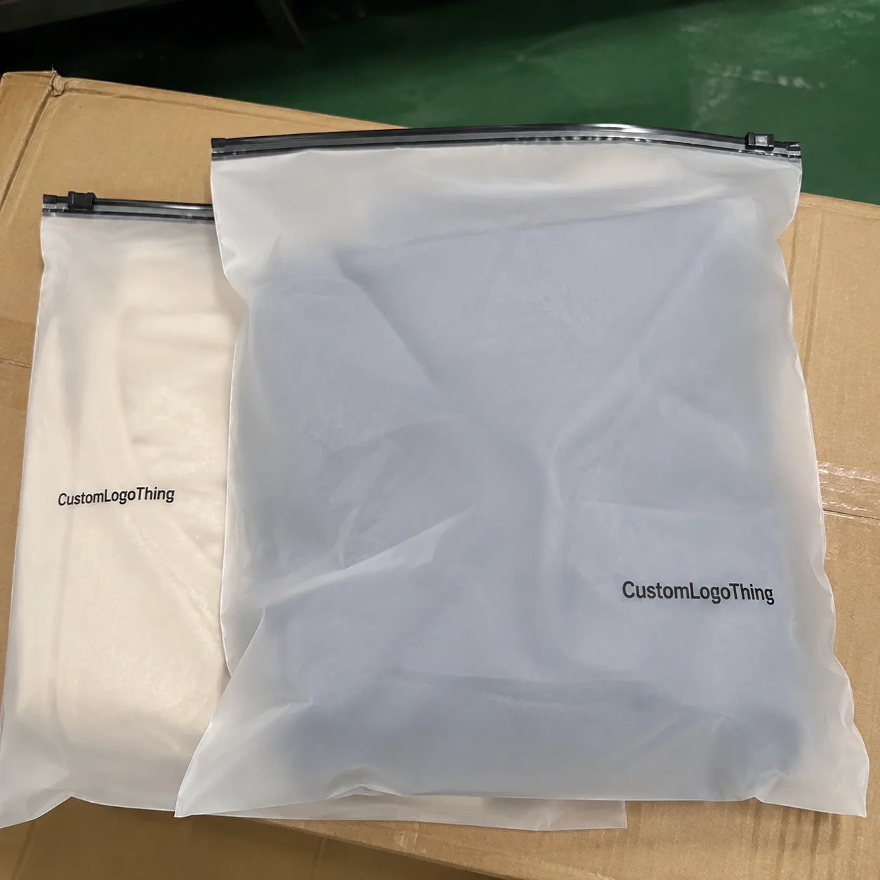
OPP Header Bags, short for oriented polypropylene header bags, are common in bakery packaging because they let customers see the product while giving brands a dedicated printable top section for logos, flavor copy, holes for hanging, and retail information. The material is clear, glossy, and relatively economical for dry bakery items such as cookies, biscuits, biscotti, pretzels, and snack mixes. It also has production constraints that are easy to underestimate. The header is not just extra space; it is a structural zone with seals, cut lines, and display requirements that change how the artwork must be built.
A bakery brands opp header Bags Artwork Proof Checklist is useful because it keeps the review grounded in packaging reality. A proof is not simply a prettier version of the design. It is the last technical checkpoint before the artwork is locked for plates, print setup, or digital production. If the review skips over dimensions, seal zones, barcode placement, or contrast on clear film, the final bag can come back with a logo clipped by a seal or a flavor line that disappears once the pouch is filled.
Why OPP header bag proofs go wrong faster than you expect

The main reason OPP header bag proofs fail is simple: flat artwork does not behave like a finished package. A digital mockup may look balanced in a layout file, yet the real bag has a top header, hanging feature, seal allowances, and a product body that changes visually once filled. A cookie bag that seems centered in the proof may look high or low on shelf because the hanging hole, heat seal, and product weight all affect the final read.
That is why the first draft of the proof often exposes issues that were invisible in design. A logo placed too close to the top edge can disappear into the seal area. A barcode can end up too near a perforation. A pale ingredients line can turn weak against a transparent background. None of these problems are dramatic on their own, but any one of them can delay a launch if it is discovered after approval.
Clear OPP also creates a visual trap. Because the film shows the product, designers sometimes rely on the cookie, snack, or biscuit inside the bag to provide contrast. That can work only if the content is consistent and the print is built for it. A light-colored item inside a clear pouch can swallow pale typography. A dark product can make a black logo harder to distinguish. The proof needs to answer a practical question: will the package still read cleanly when it is filled, hung, and viewed at speed?
The biggest mistakes are rarely creative mistakes. They are structural ones. Seal zones eat into usable area. Fold lines alter the perceived center. Hanging holes remove space from the header. Buyers who understand those constraints catch problems early, and they avoid the much more expensive version of the same mistake: reprinting thousands of bags because one line of copy sat two millimeters too high.
How the proofing process works from file to final approval
The workflow is usually straightforward, but only if the file is prepared correctly. The brand sends artwork, generally in AI, EPS, or print-ready PDF format. The prepress team then places that artwork on the real dieline, checks the technical fit, and returns a proof showing the actual bag dimensions, header depth, cut lines, seal areas, and any transparent or printed zones. If the file is ready, approval can move quickly. If it is not, the proof comes back with correction notes.
The proof should show more than just the front panel. It should reveal where the bag will be sealed, where the hang hole sits, how much space is usable above the product, and what portion remains clear. For a bakery SKU with a printed header and transparent body, the proof needs to make the print boundaries obvious. If the artwork crosses a seal line or runs too close to the edge, the final bag may look cropped even if the screen file appeared fine.
There are also different types of proofing, and buyers sometimes mix them up. A soft proof is a digital file, useful for spelling, layout, dimensions, and general color direction. A press proof or physical sample shows how the artwork behaves on the actual film. On OPP Header Bags, that distinction matters. Gloss, opacity, and white ink can shift the final appearance enough that a beautiful screen proof does not necessarily mean a good finished bag.
Approval should also include the details that affect retail readiness: ingredient statement, allergen notice, net weight, barcode, storage instructions, and any market-specific compliance text. Those are not optional extras. A bag with a missing allergen line is not just a design problem; it can become a release problem. And if the brand sells in multiple regions, the risk multiplies because a line that is correct for one SKU may be wrong for the next.
Version control deserves more attention than it usually gets. A minor correction can trigger a new proof, a fresh sign-off, or a change in setup. If one person approves Version 3 while another is still editing Version 2, the confusion can spread quickly. The best proof process is the one that makes it hard for old files to survive.
Artwork proof checklist for bakery branding and print accuracy
The most useful checklist starts with fit, not aesthetics. Confirm the bag dimensions against the dieline: width, height, header depth, seal allowance, and any gusset or bottom structure. If the bag is a standard header style, check how much of the top section is truly printable once the seal and hanging hole are factored in. On the flat template, the design area usually looks larger than it is in the finished bag.
Next, check the safe zone. Critical elements such as the brand mark, flavor name, and required product copy should sit well inside the trim and seal boundaries. A logo that touches the edge on screen can end up cut off in production. This is especially important for header bags, where the top section is busy and every millimeter counts.
Then review file quality. Vector logos are preferred because they stay crisp. Images should be high resolution at final size, commonly 300 dpi or better. Fonts should be outlined or properly embedded. If the file uses the wrong color mode or low-quality screenshots, prepress will usually catch it, but by then the review cycle has already lengthened. Many packaging delays begin with a file that was “good enough for approval” but not really production-safe.
Bakery-specific copy deserves a separate pass. Check the flavor name, product description, ingredient statement, allergen warnings, nutrition facts, storage instructions, and net weight. If the packaging includes a barcode, confirm that the size, contrast, and placement support scanning. A barcode placed too close to a fold or printed over a busy graphic often scans poorly, and that can create problems for retail intake or warehouse handling.
White ink, metallic effects, and transparent-film behavior need extra scrutiny on OPP. What looks bright on a monitor may print thinner than expected. Fine white outlines can vanish on a clear or lightly tinted film. If the design depends on subtle contrast, ask for a sample or a physical proof rather than relying on screen color alone. Clear film is unforgiving in that way; it does not reward assumptions.
Hierarchy matters too. A shopper usually needs to read the brand first, then the flavor, then the product type, then any claim such as “baked fresh,” “made with butter,” or “gluten free.” If everything competes at the same visual level, the bag reads like clutter. On a hook in a crowded aisle, that clutter gets worse because the package is rarely seen straight on.
A practical review order looks like this:
- Dieline fit: dimensions, header height, seals, and hang hole position.
- Typography: legibility, font size, spelling, and text spacing.
- Color and finish: CMYK setup, white ink, contrast, and special effects.
- Content accuracy: allergens, nutrition, net weight, and SKU-specific copy.
- Retail visibility: what the shopper sees on a hook or shelf peg.
For brands managing multiple SKUs, a master content sheet is worth the time. Keep the flavor name, ingredient line, allergen statement, barcode data, weight, and claim language in one controlled file. That reduces the chance of mixing copy between variants, which is one of the easiest ways to create a costly production error. If the program is expanding, the content library becomes just as valuable as the artwork itself.
For broader packaging standards and terminology, resources from the Institute of Packaging Professionals can help teams align proofing language with common industry quality checks.
Cost, pricing, and MOQ factors that change your proof
Pricing for OPP header bags is driven by more than size. Film thickness, number of print colors, finish type, hanging structure, and whether the order is stock or custom printed all affect cost. A plain unprinted header bag is much cheaper to make and proof than a fully printed retail pouch with multiple spot colors, white ink, and a detailed nutrition panel. The proof reflects that difference because more complex artwork takes longer to check and more setup to run.
MOQ matters as well. Larger minimum order quantities usually justify more setup work and tighter production planning. Smaller runs can be faster to approve, but they still need the same level of artwork scrutiny if the graphics are detailed or the copy is compliance-heavy. In practice, the proof is rarely the expensive part. The expense appears later, when an approved file needs to be changed after plates, setup, or material allocation has already started.
Buyers often ask for pricing without accounting for how the artwork itself changes the quote. That leads to surprises. Simple print coverage costs less than full coverage. One color costs less than four. White ink adds complexity. Special finishes add more. Seasonal or multi-SKU orders also raise the amount of prepress work because each variation needs checking, version control, and sign-off. A clean proof can keep those costs contained. A messy one almost always moves the project in the other direction.
Here is a practical comparison that gives a rough sense of how the market usually behaves. Exact prices vary by supplier, bag structure, and decoration method, but these ranges are useful for budgeting.
| Option | Typical MOQ | Approx. Unit Cost | Best For |
|---|---|---|---|
| Plain OPP header bags | 5,000-10,000 pcs | $0.02-$0.05 | Basic bakery packing, labeling after fill |
| Custom printed single-SKU bags | 10,000-20,000 pcs | $0.06-$0.14 | Retail-ready branded presentation |
| Custom printed with special finish or white ink | 20,000+ pcs | $0.12-$0.28 | Premium bakery branding and higher shelf impact |
Before approving a quote, ask three questions: what is included in the price, what counts as a revision, and whether sampling is separate from production. Those questions prevent a lot of friction later. It also helps to confirm whether artwork corrections after approval trigger new plates, new setup, or a new timeline. Packaging budgets tend to blow up when those rules are left vague.
Process and timeline: from proof approval to production steps
Once the proof is approved, the job moves into production planning, conversion, printing, finishing, inspection, packing, and shipping. If the file is clean and all sign-offs are in place, the schedule can move quickly. If one piece is missing, the project can stall in places that are easy to underestimate.
Missing dielines are a frequent delay. So are low-resolution images, inconsistent font handling, and compliance text that is still being reviewed by a legal or regulatory team. Bakery brands often know what they want the package to say, but final ingredient language or claim wording may not be ready at the same time as the artwork. That disconnect is more common than people admit, and it can add several days to the schedule.
Retail timing makes those delays more painful. A seasonal cookie launch, a holiday run, or a trade show display often has a fixed ship date. If the proof lands late, the delay usually does not stop with the bag order. It can affect filling, pallet planning, warehousing, and retail distribution. The package is just one part of the chain, but it is often the part that sets the pace.
Typical lead time after clean proof approval often falls around 12-15 business days for straightforward custom runs, though complex artwork, special inks, or extra proof rounds can stretch that window. The actual timeline depends on print method, order size, film availability, and how fast the brand responds to comments. If the product is being packed for transit-sensitive distribution, ask whether the supplier can speak to handling or packaging test expectations; the ISTA site is a useful reference for transit testing terminology and distribution packaging context.
That lead time is not just a factory issue. It affects receiving schedules, warehouse space, labor planning, and whether a promotion can launch on time. A good proof approval keeps those downstream pieces aligned.
Common proof mistakes bakery brands should avoid
The most common mistake is forgetting bleed. If the design stops exactly at the trim edge, even a slight shift in cutting or sealing can leave a white line or clip an element. The second mistake is placing key text too close to the seal or hang hole. On a header bag, that top section is crowded, and the usable area is always smaller than it appears in a flat file.
Color management causes trouble as well. RGB files may look bright on a screen, then print differently once converted. Low-quality screenshots are another weak link. They are fine for internal discussion, but they are not production artwork. If a logo is fuzzy in the proof, the final print will not make it sharper. Packaging does not reward shortcuts in resolution.
Transparent film creates its own set of problems. Pale typography can disappear against a light product. Heavy graphics can overpower the product view. A centered layout in the art file can still feel off-center when the bag is filled and hanging. People often judge balance too early, before the package has its real shape.
Regulatory mistakes can be more damaging than visual ones. Missing allergen statements, an outdated ingredient line, or a net weight that does not match the SKU can force a rework even if the design looks beautiful. Multi-flavor bakery programs are especially vulnerable because one version may be correct while another was copied from an older file. That kind of mismatch is easy to overlook and costly to fix.
One proof error can create a chain reaction: reprints, delayed shipments, missed launch windows, and inconsistent shelf presentation. If the brand is scaling, those mistakes become more expensive with each new flavor. A careful bakery brands opp header Bags Artwork Proof Checklist is usually cheaper than a rushed correction, and the math is not close.
Expert tips for cleaner proofs and faster approvals
Use vector artwork whenever possible. It keeps logos sharp and reduces prepress cleanup. Outline fonts if requested, and make sure all linked images are high resolution at final size. These basics sound mundane, but they solve a surprising number of review problems.
Build a master content file for each SKU and keep it current. Store the flavor name, ingredient line, allergen notice, net weight, barcode data, and claim language in one place. That habit reduces confusion between variants and shortens the time it takes to compare one proof against another. For brands managing seasonal flavors, it prevents old copy from sneaking back into a new run.
Review the proof on more than one screen if you can. What looks balanced on a large monitor may feel crowded on a laptop. If possible, print the file at actual size and view it from the distance a shopper would use in store. That simple check often reveals weak hierarchy, cramped copy, or contrast problems that are easy to miss online.
Consolidate internal comments before sending them out. If three people deliver three separate sets of edits, the revision cycle slows down and contradictions creep in. One decision-maker, or at least one final consolidated response, keeps the proof clean and avoids version confusion. The fastest packaging reviews usually have fewer voices at the final stage, not more.
“The best proof answers every operational question before the press starts running. If the proof still leaves room for guessing, it is not ready.”
For teams balancing packaging decisions with reduction goals, material efficiency and waste handling deserve a look too. The EPA’s sustainable materials guidance is a practical reference for brands comparing packaging choices, recycling claims, and broader waste considerations.
Next steps before you approve your bakery bag proof
Before you sign off, run a last internal check. Confirm that the artwork, copy, barcode, dimensions, and brand colors all match the intended SKU. If the seal zone, bleed, or product claim still feels uncertain, request a revised proof rather than hoping the issue will disappear during printing. It usually does not.
Record the version number, approval date, and contact person so there is a clear trail if questions come up later. Confirm the quantity, shipping timeline, and packaging format so the bags arrive ready for filling and display. Those details may feel administrative, but they are what keep production from drifting.
A solid final approval is not about perfectionism. It is about making sure the bakery brands opp header Bags Artwork Proof Checklist has been applied to the actual bag structure, the chosen print method, and the retail conditions the package will face. If the dieline is correct, the content is clean, and the print boundaries are respected, the chances of an expensive surprise fall dramatically.
What should bakery brands check first in an OPP header bags artwork proof checklist?
Start with dimensions, safe zones, and bleed so critical text does not fall into seals or folds. Then verify the logo, flavor name, ingredient copy, allergen warning, and barcode placement against the actual bag size.
How do OPP header bags affect artwork placement for bakery products?
The header area, hanging hole, and seal structure change how much artwork can be used safely. Design needs to account for how the bag looks when filled and displayed, not only when it is flat on screen.
What file format is best for bakery brand proof approval?
Vector files such as AI, EPS, or PDF are usually best because they preserve sharp type and logo edges. High-resolution linked images and outlined fonts help prevent quality loss during prepress.
Why does pricing change after the artwork proof is reviewed?
Revisions can require layout resets, plate changes, new sampling, or extra prepress time. Complex graphics, multiple SKUs, and special print effects also increase setup and unit cost.
How long does it usually take from proof approval to production for bakery packaging?
Timeline depends on file readiness, revision count, print method, and order size. If the proof is clean and approved quickly, production can move faster; missing details or changes extend lead time.