Fitness premium cuffed Beanies Logo Placement looks straightforward until the cuff folds the branding zone, stretches the knit, and changes the visual center of the hat. A flat mockup can make nearly any logo look disciplined. A worn beanie is less forgiving.
That gap matters for gyms, activewear labels, clubs, and merch programs because the beanie has to do two things at once: read instantly and still look refined. The cuff gives you a usable surface, but it also reduces vertical space and magnifies small layout decisions. A mark that sits one way in a proof may sit very differently on a real head.
Bulk buyers feel those differences first. The wrong placement can make a premium blank look promotional, overworked, or just slightly off. The right placement usually feels quiet and intentional, which is harder to achieve than a loud logo suggests.
Fitness premium cuffed beanies logo placement: why it works
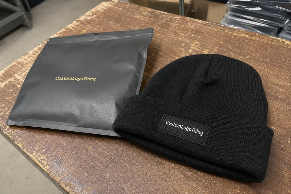
Cuffed beanies are popular for branding because the cuff creates a flatter, more controlled panel than the body of the hat. That panel gives embroidery or a patch a better chance of sitting cleanly. It also adds a little structure, which helps the decoration hold its shape after wear, folding, and packing.
Still, the cuff is fabric, not signage. It moves, stretches, and relaxes depending on yarn weight, knit density, and head size. A centered logo on a proof can drift a few millimeters once the beanie is worn. That small shift changes the tone of the whole product. For this category, the best results usually come from designing around the cuff first and treating placement as part of the product engineering, not just the artwork stage.
For premium fitness merch, the most reliable formulas are usually simple: one strong mark, enough negative space, and a logo size that respects the knit texture. Tiny type and intricate borders tend to blur once they meet ribbing and stretch. They may look polished in a digital file, but knitwear is rarely as precise as a screen.
Good placement is a production decision as much as a design decision. It affects visibility, durability, and how the beanie photographs under real lighting. If the mark stays readable from a few feet away, holds its shape on the cuff, and does not fight the knit, the piece feels deliberate. If not, buyers can usually tell immediately.
How cuff placement changes the finished look
The cuff changes the silhouette because it gives you a flat-ish band inside a curved garment. That band only behaves if the cuff depth, fold line, and tension are right. Too high, and the logo appears to float toward the crown. Too low, and it sinks into the fold or lands too close to the wearer’s brow.
Centered front placement is still the safest option. It balances the visual weight and usually photographs well from multiple angles. Slightly offset placement can look more fashion-led, especially for lifestyle brands, but the margin for error gets smaller. Left or right placement can work for understated merch, though it is a weaker choice if the logo needs instant recognition in a crowded retail setting or on a busy gym floor.
The knit itself changes the result more than many buyers expect. Rib structures, yarn thickness, and stretch all affect line clarity. Fine strokes can soften. Small internal spaces in letters can close up. Even a tidy vector file may need simplification before production if the blank has a deep rib or a thick yarn. That is not a fault in the factory. It is a normal limitation of the material.
“The mockup sold the idea; the production proof sold the reality. Those are not the same thing.”
The use case should drive the layout. Retail merch usually benefits from a balanced, polished mark with breathing room. Team gear needs fast recognition and enough contrast to stand out from a distance. Promotional orders often push for oversized branding, but that can make a beanie look cheaper rather than stronger. Bigger logos create more visual noise, and on knitwear, noise tends to read as clutter.
Key sizing, stitch count, and placement factors
Most cuffed beanie logos live in a fairly tight size range. A restrained mark may sit around 1.75 to 2.25 inches wide. A stronger front logo usually lands between 2.5 and 3.5 inches, depending on cuff depth and design style. Past that, the logo starts to dominate the hat unless the artwork is extremely simple.
Stitch count is one of the clearest indicators of how a logo will behave. A compact embroidered wordmark might stay around 6,000 to 8,000 stitches. A badge with fills, outlines, and layered detail can move into the 10,000 to 15,000 stitch range quickly. More stitches do not automatically improve the result. On ribbed knit, dense stitching can make the surface stiff and can hide small details instead of sharpening them.
The decoration method changes the rules again:
- Embroidery: works best for bold marks, strong contrast, and everyday durability.
- Woven patch: fits tighter text, cleaner edges, and more detailed artwork.
- Faux leather patch: gives a more premium, outdoorsy feel with simpler graphics.
- Woven label: keeps the branding subtle and light on the cuff.
Material specs matter too. Acrylic blanks are usually the most economical and hold color well, though they can pill if the yarn quality is weak. Acrylic-wool blends often feel a little more substantial and can improve hand feel, but they raise cost. Polyester blends tend to resist moisture and can be useful for performance-minded programs, though they are not automatically more premium. A buyer should judge the fabric by weight, recovery, and knit consistency, not by the fiber name alone.
Fit variables affect placement just as much as the artwork does. Head circumference, cuff depth, crown height, and knit density all influence where the logo lands in wear. Two beanies can look nearly identical in a product sheet and still sit differently once folded. That is why sample approval on the actual style is worth the extra step. It catches the difference between acceptable and genuinely clean.
There is also a practical quality-control point here: the logo should stay clear after the cuff is folded, refolded, and packed. If the artwork only looks right when the beanie is perfectly opened and laid flat, it is probably too fragile for bulk production.
Cost, pricing, MOQ, and quote drivers
Pricing for cuffed beanies depends on more than the blank. Decoration method, stitch count, number of colors, logo size, art cleanup, and finishing all affect the quote. A simple embroidered logo on a standard acrylic beanie is usually the most efficient build. A multi-piece patch with specialty backing or edge treatment costs more, and that is expected.
Minimum order quantities vary by supplier, but the economics are similar across the category. At 50 to 100 units, the per-piece cost is usually higher because setup and labor are spread across a smaller run. By 500 to 1,000 units, unit price generally drops. For many decorated orders, a realistic range sits around $4.50 to $9.50 per beanie depending on blank quality, decoration method, and volume. Premium blanks, heavier yarn, or specialty finishing can push the number above that.
| Decoration method | Typical use | Common add-on at 500 pcs | What drives cost up |
|---|---|---|---|
| Embroidery | Bold, durable branding | $0.90-$2.25 per unit | High stitch count, extra colors, dense fill areas |
| Woven patch | Sharper detail and small text | $1.20-$2.80 per unit | Patch shape, border finish, custom backing |
| Faux leather patch | Premium lifestyle look | $1.50-$3.20 per unit | Debossing, color fill, special edge work |
| Woven label | Subtle branding | $0.70-$1.80 per unit | Label size, stitch density, attachment method |
There are a few extra line items that buyers often miss. Digitizing can run about $20 to $60 for a straightforward embroidery file, more for difficult artwork or multiple versions. Pre-production samples often add $25 to $100 or more depending on decoration type and shipping. Rush production usually changes the schedule more than the blank itself. Freight, carton prep, and retail folding can also affect the final number.
Comparing quotes is easier if the same questions go into every request: Is setup included? Does the price cover one placement or more? Are revisions included, or does each change require a new proof? Is the quote based on a decorated sample or only the blank beanie? That last question matters because a blank cost and a finished cost are often separated by more than buyers expect.
For packaging components, sourcing standards can matter too. If the beanies ship with inserts, hangtags, or retail cartons, FSC certification is worth checking for paper pieces, and shipment-testing ideas from ISTA help when cartons need to arrive without crushed presentation or distorted shape. For paper sourcing more broadly, FSC remains the obvious reference point.
Process, timeline, and turnaround from proof to ship
The cleanest orders follow a simple chain: brief, artwork review, placement proof, digitizing or patch setup, sample approval, bulk production, finishing, and shipping. Break that chain and the calendar slips. Most delays start with missing information or late changes, not with the production line itself.
Artwork review can move in one to two business days if the file is clean and already vector-ready. If the logo needs cleanup, tracing, or color correction, more time is needed. Digitizing or patch setup usually adds another day or two. After that comes sample review. One revision is normal. Three revisions often means the brief was underspecified.
Lead time depends on both quantity and decoration method. Simple embroidered cuffed beanies can sometimes ship in 10 to 15 business days after approval. Patch orders, especially those with custom shape or special backing, often land closer to 15 to 20 business days. Larger runs, premium blanks, or seasonal production peaks can extend the schedule further.
Most timeline problems come from a handful of predictable issues:
- Artwork files that are low-resolution, flattened, or not vector-based.
- Placement edits after setup has already started.
- Color matching questions left until after the first proof.
- Approval of a flat mockup without checking the exact cuffed style.
- Shipping assumptions that ignore transit time and carton finishing.
Rush work is possible, but the design has to be simple and the decisions have to be fast. One-color embroidery on a standard blank can move quickly. A layered patch with multiple finishes cannot. That is not hesitation from the supplier; it is the natural pace of setup, labor, and queue management.
Common placement mistakes that wreck the look
The first mistake is placing the logo too close to the cuff seam. Once the knit stretches, that area distorts. A mark that touches the fold line on the proof can disappear or clip in wear. A little margin usually improves both appearance and durability.
The second mistake is oversizing the logo because it looked strong on screen. On a real head, a huge mark can feel heavy and blunt. It takes over the cuff, pulls attention away from the shape of the hat, and often reads less premium than a smaller, cleaner graphic. Restraint usually photographs better too.
The third mistake is asking embroidery to carry tiny text or hairline artwork. Thin strokes sink into the knit. Small counters close up. A logo that needs a magnifier is usually the wrong tool for the fabric. That is when a woven patch or label earns its place.
The fourth mistake is approving one view and assuming another wear position will look the same. A flat proof is useful, but it is not the same as a folded, worn, and packed beanie. The crown collapses. The cuff shifts. The logo moves with it. That is why production proofs on the actual style matter more than generic templates.
“If the approval file does not show the logo on the exact beanie style, the buyer is guessing more than they realize.”
Expert tips for cleaner branding on cuffed beanies
Build the logo around the cuff, not the other way around. That usually means simplifying the artwork. Short wordmarks, strong icons, and compact badges survive knitwear better than layouts with too many parts. A cuff is a constraint. Used well, it sharpens the branding instead of shrinking it.
Test the design at the distance it will actually be seen. A beanie for gym staff needs to read quickly across a room. Retail stock needs to catch the eye from a stack or hanger. For either use, contrast and proportion matter more than ornate detail. A front mark around 2.75 inches wide is often a useful middle ground, but the right answer still depends on the blank and the art.
Trim the artwork when necessary. Keep the focal point and one short line of text if the brand needs both. Skip slogans unless they are central to the identity. Busy decoration rarely improves a cuffed beanie. Usually it just makes the product harder to produce and less elegant in hand.
Ask for the proof on the actual beanie style, not a generic template. Flat renderings are useful for rough approval, but they do not show cuff depth, knit pull, or how the decoration sits near a seam. A real placement proof takes more time upfront and saves much more time during revision.
Check the product after folding and packing, not only when it is open on the table. A placement that looks perfect loose can press oddly once the beanie is polybagged or stacked for retail. That issue is easy to miss in development and hard to fix after a run is finished.
One more production reality: darker knits tend to hide small registration issues better than pale ones, but they also expose contrast problems if the logo color is too close to the base. The blank and the brand palette need to be reviewed together, not separately.
Next steps before you request samples or a quote
Before asking for pricing, gather the logo file, target quantity, colorway, decoration method, and the actual use case. “For gym staff” and “for resale” are different jobs. So are embroidery and patch builds. Clear inputs lead to cleaner quotes. Vague inputs usually lead to extra revisions and avoidable assumptions.
Measure the cuff depth and decide where the mark should sit: centered, just above the fold, or slightly offset. If the logo must stay visible while the beanie is worn, say so early. If the goal is a quieter retail piece, say that too. Quotes shift when the supplier knows whether the order is meant to read like premium merch or functional team gear.
Ask for one proof on the exact beanie style, a sample timeline, a bulk timeline, and any revision fees. If the supplier cannot explain what changes affect cost, that is a warning sign. Reliable production is built on shared specs, realistic lead times, and a placement that works in the hand, not just on a screen.
That is the practical version: fitness Premium Cuffed Beanies logo placement succeeds when the cuff, the art, and the decoration method are treated as a single system. Get those three parts aligned, and the beanie reads cleanly, wears well, and feels like a deliberate piece of brand merchandise instead of an afterthought.
Where should logo placement sit on a cuffed beanie?
The most reliable spot is centered on the front cuff, where it stays visible during wear and avoids the seam or fold line. If the logo is smaller, keep it high enough to clear the fold. If it is wider, check that it does not drift toward the side when the cuff is worn.
What size works best for cuffed beanie logo placement?
Most logos work best in a compact width range, often around 1.75 to 3.5 inches depending on cuff depth and decoration method. The right size depends on whether the goal is a subtle retail look or a stronger promotional read, and whether the knit can hold the detail without closing up.
How much does logo placement affect beanie pricing?
Placement itself usually affects cost less than decoration complexity, but it can influence setup time and proof revisions. More detailed logos, extra colors, digitizing work, and specialty patches generally cost more than a simple one-location embroidery job.
How long does production take for custom cuffed beanies?
Proofing can move quickly if the artwork is clean, but sample approval and bulk production add most of the schedule. Simple orders move faster; complex decoration, larger quantities, and rush requests usually extend lead time, often into the 10 to 20 business day range after approval.
Should I choose embroidery, patch, or woven label for fitness beanies?
Embroidery works well for bold, durable branding with simple shapes. Patches and woven labels are better when the logo has finer detail, multiple colors, or a more premium retail feel. For fitness premium cuffed Beanies Logo Placement, the right choice depends on how much detail the cuff can carry and how the beanie needs to read in real use.


