Custom Logo Things
Choose Retail Slouchy Knit Beanies Logo Placement That Sells
Learn where retail slouchy knit Beanies Logo Placement works best, what it costs, how long it takes, and which decoration mistakes hurt retail appeal.
Retail Slouchy Knit Beanies logo placement looks easy on a mockup and stubborn in production. Knit stretches. Cuffs fold. Crowns collapse into soft drapes that change the visual center by the time the hat reaches a shelf, a hanger, or a shopper's head.
That is the part buyers learn quickly: a good beanie logo is not just about decoration, it is about survival. The mark has to read from a distance, hold up in product photos, and still feel intentional after the beanie gets worn in real life. If it only works on a flat art board, it is not retail-ready yet.
For most programs, the question is not "Where does the logo look nice?" The better question is, "Where will the logo still make sense after the beanie stretches, slouches, and gets packed?" That shift in thinking saves a lot of revisions, and usually a little money too.
Retail Slouchy Knit Beanies Logo Placement Basics
A slouchy beanie changes the geometry of branding. Unlike a structured cap or a ribbed cuffed beanie with a fixed front panel, the extra fabric above the head lets the logo move visually. A centered mark on a flat proof may drift low once the crown relaxes. A patch that looks crisp on a table can sit in a fold line after the hat is folded for shipping. That movement is not a defect; it is the nature of the silhouette.
Retail buyers usually have three concerns at once. First, the beanie has to sell from a shelf or peg. Second, it has to translate in ecommerce images without needing a long caption. Third, it should still look like the same product once a shopper puts it on. The best placement handles all three.
The display method changes everything. A folded stack favors a logo positioned high enough to stay visible across the fold. A peg display wants a front-facing read that does not disappear into the cuff. Lifestyle photography rewards a placement that feels balanced once the beanie slouches backward. None of those settings are identical, so one proof is rarely enough.
Most retail programs start with four decisions: blank quality, decoration method, placement zone, and retail price target. A beanie retailing under $20 usually needs simpler decoration and fewer production steps. A premium gift line can carry a cleaner patch, heavier yarn, or a more deliberate placement strategy. The product should match its price point without looking strained.
If the logo only reads on a flat table, the placement is not finished.
As a rule, the front of the beanie should be treated as a visual zone, not a fixed coordinate. A shift of half an inch matters more on a slouchy knit than on a structured knit. That is why mockups need context: front view, worn view, and folded view if the product will ship compressed.
One useful shortcut is to decide the primary viewing angle before artwork placement starts. If the hat sells front-facing on a peg, the logo should read upright from several feet away. If the product is stacked, the placement needs to survive compression. If it is styled loosely in photos, the logo cannot sit so low that it gets lost in the drape.
How the Knit and Cuff Change the Placement Decision
The knit structure is not just a texture choice. It affects how cleanly a logo can be applied, how the fabric holds shape, and how much detail survives. A looser gauge knit, common in softer acrylic or acrylic-blend beanies, gives a relaxed hand feel but can make thin stitching or tiny text look shaky. A tighter gauge knit gives better support for fine decoration, though it can feel less casual. Buyers often have to choose between softer touch and sharper branding.
Material matters too. Basic acrylic is still the most common retail blank because it keeps cost down and handles volume well. Acrylic-blend hats with polyester or recycled fiber content can improve hand feel or reduce pilling. Wool blends look more premium but usually raise the price and demand more careful QC around itch, shrinkage, and color consistency. For retail buyers, the fiber content often affects returns just as much as the logo does.
Cuff height changes placement just as much as fabric does. A tall cuff gives a cleaner surface and makes center-front branding easier to read. A shorter cuff leaves less room for error and can make the logo feel crowded if it is too large. Above-cuff placement on the crown can look more fashion-led, but it also shifts with how the beanie is worn. That makes it harder to lock in for mass retail unless the art is simple and the photo set is controlled.
There are four placement zones that show up often in retail programs:
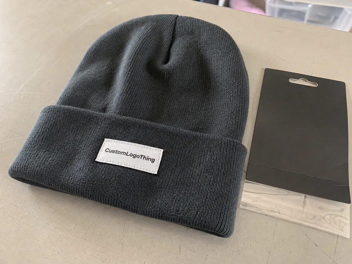
- Center front on the cuff for quick recognition and reorders that stay consistent.
- Above the cuff on the crown for a more styled, less conventional look.
- Off-center front for brands that want a streetwear feel without a large logo block.
- Side placement for subtle branding or when the front already carries too much visual weight.
The decoration method has to match the knit. Direct embroidery is still the most common choice because it is economical and fast, but it is not always the cleanest answer. Small text can close up on textured knit. Thin outlines can break visually at retail distance. Woven patches hold detail better and give the artwork a sharper edge. Leather patches can lift the perceived value of a beanie without overwhelming the soft shape, though they are poor fits for fine detail or multicolor logos. Applique can look strong on fashion programs, but it is less forgiving during production and sample approval.
Size limits are practical, not arbitrary. On most retail Slouchy Knit Beanies, a patch around 2 to 3 inches wide is enough for simple marks. Larger logos can work, but once the branding starts fighting the crown shape, the hat loses its balance. A slouchy beanie should still feel soft, not overbuilt.
Wear testing catches more errors than flat proofing ever will. A front-facing render can hide a logo that dips too low once the knit relaxes. A worn sample shows whether the cuff pulls the mark off-center or whether the stitch density distorts the fabric. For programs with a wide size range or dense packs, a physical wear sample is worth the extra time.
Cost, Pricing, MOQ, and Quote Variables
Custom beanie pricing is usually built from more moving parts than buyers expect. The blank cost is only the starting point. Decoration method, stitch count, logo size, patch tooling, thread colors, sample rounds, packaging, and order quantity all affect the final number. A quote that hides those details is not a clean quote; it is a placeholder.
For retail slouchy knit beanies logo placement, the added cost usually falls into predictable ranges. Basic acrylic blanks often land around $2.20 to $4.50 before decoration. Heavier or blended knits can run higher, especially if the yarn is softer or the gauge is tighter. Simple embroidery often adds about $1.10 to $2.40 per unit at mid-size runs. Woven patches commonly add $1.60 to $3.20. Leather patches are often $1.80 to $3.60. Applique and mixed-method builds can reach $2.20 to $4.50 or more because they add labor and sample risk.
Setup costs are easy to miss. Digitizing may run $35 to $120 depending on the logo and stitch complexity. Patch tooling, mold creation, and first-sample prep can add more, especially on programs with custom shapes or multiple revisions. At low MOQs, those costs hit the unit price hard. At 500 pieces, the same setup gets spread across more hats and the cost per unit usually improves.
| Decoration method | Typical added cost | Best use | Main tradeoff |
|---|---|---|---|
| Embroidery | $1.10-$2.40 | Simple logos, tighter budgets, softer retail look | Small text can blur on textured knit |
| Woven patch | $1.60-$3.20 | Sharper detail and cleaner edges | Less organic than direct stitch |
| Leather patch | $1.80-$3.60 | Premium, understated, giftable retail programs | Not ideal for highly detailed art |
| Applique | $2.20-$4.50 | Bold visual impact and textured branding | More labor and higher sample risk |
Ask for quotes that spell out the exact placement zone, logo dimensions, decoration method, blank fiber content, sample fee, revision policy, and shipping terms. If the quote says only "front logo," it is not comparable to another supplier's quote unless the method and size match. A lower price may just be attached to a smaller logo or a lighter blank.
MOQ also shapes the decision. A 100-piece order often needs to keep decoration simple because the setup cost is harder to absorb. A 300- to 500-piece run gives more room for a cleaner patch, heavier yarn, or a more precise placement. Buyers sometimes chase a lower MOQ and then wonder why the unit price climbs. The math is usually the reason.
If the program includes hang tags, belly bands, or insert cards, the packaging cost should be counted early. FSC-certified paper is a sensible request for retail programs that want documented sourcing on print components. The Forest Stewardship Council explains the certification at fsc.org.
Packaging can also affect the hat itself. Tight polybag compression can flatten the cuff and shift the logo downward. Overstuffed cartons can crease the crown. If the display plan involves folded shelf stacks, the packing spec should be tested before bulk production, not after.
Process and Timeline: From Artwork to Delivery
A stable production process is simple on paper and fragile in practice. The work usually runs in this order: artwork review, placement confirmation, digital proof, sample approval, bulk production, inspection, and ship date. Every delay I see in this category comes from one of two places: unclear artwork or changing the spec after proof approval.
Artwork is the first risk point. Vector files are the cleanest starting point because they scale without distortion and make placement proofs easier to judge. Thin type, tiny line work, and gradient-heavy logos often need adjustment before they can survive knit or patch production. Buyers sometimes try to save time by skipping cleanup. That rarely saves time. It usually creates a second round of proofs.
Timeline depends on the method. A straightforward embroidered beanie order can often move in 10 to 15 business days after proof approval if the blank is in stock. Woven or leather patches, multiple decoration locations, or larger quantities usually push production into the 15 to 25 business day range. Add transit time on top of that, and retail calendars start to get real fast. If the order needs custom packaging, leave room for assembly and final inspection.
Sampling is where the good decisions get proven and the bad ones get exposed. A front-view proof shows literal placement. A worn sample shows how the hat slouches and whether the logo still sits in the right visual zone. A folded sample shows whether the branding disappears under packing pressure. Those are three different tests, and each one catches a different failure.
Approval rules matter more than many buyers expect. Some suppliers count a reply email as sign-off. Others need a signed proof, a marked PDF, or a sample with initials. That sounds minor until the calendar is tight and nobody agrees on whether production has started. Clarifying the approval method before the first proof keeps the handoff from becoming a dispute later.
Key Factors That Decide the Best Placement
The best placement depends on the customer, the channel, and the price point. Streetwear buyers often accept bolder branding because the logo is part of the styling. Gift and premium retail programs usually work better with smaller, cleaner marks that feel intentional without shouting. The same beanie can serve both markets, but the decoration needs to act differently.
Sales channel drives visibility. Ecommerce photography rewards a crisp front read with minimal distortion. In-store mannequins favor a placement that stays visible at a slight angle. Shelf stacks demand a mark that survives folding. Hanger displays need the logo high enough to show around the crown. A brand selling through multiple channels should choose the primary display first and let that decide the logo zone.
Contrast is another practical issue. Tonal branding can look expensive, especially on premium knitwear, but only if the mark still reads from a few feet away. A charcoal patch on a black beanie may look elegant online and vanish in a retail aisle. Bright contrast is easier for fast recognition. Subtle contrast is better when the brand wants restraint. The right answer depends on how the product is merchandised, not on a universal rule.
Scale and balance have to work together. A slouchy beanie already carries visual weight through the crown, so a large logo can make the hat feel top-heavy. Too small, and the branding becomes decorative noise. The middle ground is usually best: a mark that is large enough to anchor the front, small enough to preserve the softness of the knit.
There are a few checks I would use before approving any placement:
- Does the logo read from 3 to 5 feet?
- Does it stay visible when the cuff folds?
- Does the hat still look balanced when worn?
- Does the method fit the logo detail?
- Does the placement match the retail display method?
If the answer to one of those is no, the layout needs another round. Fancy mockups cannot fix a placement that disappears on shelf or twists out of view on head.
Common Mistakes That Make Slouchy Beanies Look Off
The most common mistake is placing the logo too low. Once the knit stretches and folds, the artwork can sink into the cuff line or land in the part of the hat that gets compressed during packing. That creates a retail problem because the product loses legibility at the exact point where it needs to sell itself fast.
The second mistake is oversizing the logo just because the beanie has extra fabric. More area does not automatically mean better branding. A slouchy style needs space to drape. Put too much decoration on it and the hat starts looking stiff, even if the fabric is soft.
Another weak move is asking embroidery to do work it cannot really do. Tiny text, hairline outlines, and delicate symbols often look fine in digital art and muddy in production. Woven patches handle detail more reliably, but they still need enough line thickness to hold shape. If the artwork only survives at zoom level, it is too fragile for knit.
Flat-only proofing is a bigger problem than many teams admit. A flat render does not show how the crown slouches backward, how the cuff compresses, or how the side seam shifts the logo slightly off axis. For a retail beanie, wear testing is not a luxury sample. It is the difference between a clean read and a box of hats that need explaining.
Packing errors cause another class of mistakes. Heavy tissue, stiff inserts, and overcompressed polybags can distort the silhouette before the product reaches the floor. If the packaging plan is part of the merchandising story, fine. If it was added later, it can make the logo look misplaced even when the decoration itself was correct.
One more issue: not all retail buyers think through the same placement across sizes and colors. A logo that reads cleanly on a light gray beanie may disappear on black. A centered patch may feel perfect on a tall cuff and too crowded on a short one. Good QC compares more than one colorway and more than one fit.
That is why the best production teams inspect three things before bulk approval: placement accuracy, decoration quality, and how the hat behaves after folding or wearing. If any one of those fails, the product will show it later. Knit does not hide mistakes for long.
FAQ
Where should retail slouchy knit beanies logo placement usually go?
Most retail programs start with center front on the cuff or just above it on the crown. Those locations read quickly and photograph well. The better choice depends on whether the beanie is sold on a peg, stacked folded, or shown in a worn lifestyle image.
Is embroidery or a patch better for retail slouchy knit beanies logo placement?
Embroidery works well for simple logos and lower unit costs. Patches are stronger for small detail, sharper edges, or a more premium retail feel. On loose knit or highly textured blanks, patches often keep the logo cleaner.
How does MOQ affect the cost of slouchy knit beanie logo placement?
Lower MOQ usually raises the unit price because setup, digitizing, and proofing costs are spread across fewer hats. Adding a second placement, extra revisions, or a custom patch shape can raise the break-even point quickly.
What timeline should I expect for custom beanie logo placement?
Simple embroidered orders can often ship in about 10 to 15 business days after proof approval. Patch programs, higher quantities, and extra packaging usually need 15 to 25 business days. Shipping time is separate from production time.
What artwork works best for retail slouchy knit beanies logo placement?
Vector artwork is the safest starting point because it scales cleanly and makes placement proofs easier to review. Thicker lines, fewer colors, and minimal small text usually perform better on knit and patch decoration than fine, detailed art.
What should I inspect before approving production?
Check the logo size, the distance from the cuff, the placement on a worn sample, and how the hat looks after folding. Also confirm thread color, patch material, backing, and packaging method. Those details change how the beanie reads in retail.
Retail slouchy knit beanies logo placement works best when the garment, the logo, and the display method are treated as one decision. The hat has to look right on the shelf, survive the packing method, and still feel natural when someone wears it. That balance is what makes the product feel finished rather than merely decorated.


