Trade show Fleece Lined Beanies logo placement sounds straightforward until the hat gets thicker, stretchier, and more expensive than the version someone approved from a flat mockup. The wrong spot can turn a solid winter giveaway into a blurred, overworked stitch field that reads poorly from six feet away and feels worse in hand. That is not a dramatic failure. It is the kind of quiet miss that eats budget and leaves the brand looking less deliberate than it hoped.
Trade Show Fleece Lined Beanies Logo Placement: What Buyers Miss
The difficult part is not the logo itself. It is the surface. A fleece-lined beanie combines stretch knit, interior loft, and curved construction, so the visible area is smaller than buyers expect and less forgiving than a hoodie or tote. A mark that looks balanced in a PDF can shift once the fabric is pulled, backed, and stitched into a three-dimensional shape.
Trade show traffic makes the problem sharper. People glance, move, and keep walking. They are carrying samples, scanning signage, and talking to someone else at the same time. A beanie has to communicate quickly, which usually means the cleanest layout wins over the loudest one. A compact badge-style mark often works better than a large imprint because it feels intentional rather than crowded.
There is also a difference between a giveaway that will be worn once and a beanie that should survive outside the expo hall. The first can tolerate a slightly louder logo. The second needs proportion, restraint, and a placement that still looks normal in daily use. If the hat is likely to become winter apparel, not just event swag, the decoration cannot act like temporary signage.
“If the logo cannot be read while someone is walking, carrying a tote, and juggling a coffee, it is not doing brand work. It is just decoration.”
Placement should be decided before the art is finalized. Moving the logo after approval can force a new digitizing pass, a fresh stitch simulation, and another proof cycle. That sounds minor until the calendar is tight. Then it becomes the difference between a clean shipment and a panicked scramble.
One practical rule: do not choose a location because it looks symmetrical on paper. Choose it because it survives the fabric. A centered logo that lands on a seam or sits too close to the crown break can stitch poorly, while a slightly adjusted off-center placement may hold shape better and read more clearly.
How Embroidery Sits on Thick Knit and Fleece
A fleece-lined beanie is not a flat canvas. Most promo versions use an acrylic or acrylic-blend shell with a brushed polyester fleece interior, and that lining changes how thread sits on the surface. The knit stretches, the fleece adds loft, and the embroidery compresses the fabric instead of floating neatly on top of it. The result is simple: what looks crisp on screen can look softer, tighter, or slightly heavier once it is sewn.
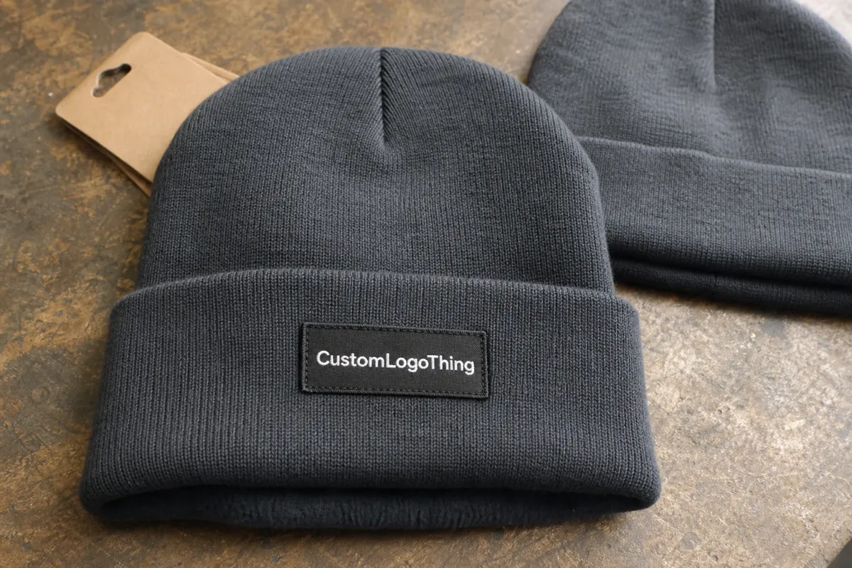
Front center remains the default for a reason. It usually gives the best sightline and the most usable stitch field. Cuff center is the other reliable zone because the fold creates a flatter surface and gives the thread a cleaner base. Side placements can work for small marks or fashion-leaning designs, but they give up visibility and leave less room for error.
Stitch direction matters more here than on flatter products. If the embroidery crosses the stretch in an unhelpful direction, the knit may pucker. If the density is too high, the logo can feel hard and slightly raised, almost like a patch without the patch. Too little density does the opposite. The mark looks thin, and the background fabric starts showing through.
Backing and stabilizer choices are part of the equation too. A stronger backing helps the design hold its shape, but too much support can make the front of the beanie feel stiff where buyers expect softness. That tradeoff matters on fleece-lined products because they are usually chosen for comfort as much as branding. A beanie that looks good but feels board-like tends to get worn less often.
For tiny text, gradients, or very thin contour lines, a patch often performs better than direct embroidery. Woven patches hold finer detail than stitches alone, and faux leather or PU patches can simplify a busy logo into a sharper shape. That is not a stylistic trick. It is a production workaround for artwork that would otherwise disappear into the knit.
As a rough starting point, many fleece-lined beanies look best with a front logo around 2.25 to 3.25 inches wide. Stitch counts often land in the 6,000 to 10,000 range for a moderately detailed design, though the exact count depends on shape, underlay, and thread changes. Go much larger and the hat begins to wear the logo instead of the other way around.
Material Specs and QC Checks That Change the Result
Material specs are where many orders go sideways. Buyers often ask for the color first and the decoration second, but construction drives the final look more than either of those. A beanie shell may be a lightweight 1x1 rib knit or a denser double-layer knit. One version stretches and rebounds easily. The other holds shape better but can feel heavier. That difference changes the size window for the logo and the amount of stitch pull the fabric can take.
Fleece linings vary as well. Brushed polyester fleece is common, but the pile can range from soft and plush to short and compact depending on the mill and price point. A softer lining feels warmer, yet it also increases bulk inside the hat. That bulk affects the front panel from the inside out. If the shell is thin, the embroidery can show more compression from the backing than expected.
Quality control should cover the hat itself, not just the logo file. Before bulk approval, a good sample check usually looks at seam alignment, cuff depth, stitch tension, and how the logo sits when the beanie is worn on a head rather than laid flat. A design centered perfectly on a table can drift when the cuff is folded unevenly. That is common, not rare.
A practical checklist helps:
- Confirm the shell fiber content and knit weight before quoting the decoration.
- Measure the actual visible area after the cuff is folded, not before.
- Check whether the logo sits near a seam, crown join, or shaping point.
- Review the stitch simulation for dense fills, thin lettering, and corner cleanup.
- Inspect a physical sample under daylight and overhead light; the same thread can read differently under each.
There is also a packaging checkpoint that gets ignored too often. Beanies shipped flat can develop a crease right through the logo, especially if they are packed tightly in cartons with no separation. A simple polybag helps, but the carton structure and compression matter more than buyers expect. That is why shipping tests exist. ISTA standards at ista.org are worth looking at if the order is large, drop-shipped, or headed to a show site where crushed product would be embarrassing.
None of this requires overengineering. It does require attention. The weak point is usually not the embroidery machine. It is the assumption that a product proof tells the whole story. On fleece-lined knit, it rarely does.
Cost, Pricing, MOQ, and Unit Cost Basics
Cost starts with the blank, not the logo. A plain fleece-lined acrylic beanie commonly lands in the $2.25 to $5.50 range at standard promo quantities, with heavier knit, better yarn hand, or more refined construction moving above that. Decoration adds another layer. Simple direct embroidery often runs about $0.85 to $2.50 per piece, while patch-based decoration usually sits around $1.50 to $4.00 depending on the material, size, and attachment method.
Digitizing is usually a one-time fee, often $25 to $75 for a clean logo. If the art needs to be simplified, redrawn, or broken into multiple color blocks, that fee can rise. PMS references help, but thread is not paint. It has sheen, texture, and absorbency differences that can make a matching color appear a touch darker or flatter than the equivalent on a screen. Buyers who expect exact visual parity between digital artwork and stitched thread usually end up disappointed.
MOQ changes the equation quickly. A 50-piece order carries more setup burden per unit, so the price stays higher. A 500-piece run spreads digitizing and approval costs across more hats, which usually lowers the per-unit number as long as the art stays simple. Add a complex logo, multiple thread changes, or a layered patch, and the price climbs again. Production does not reward complexity for free.
A pre-production sample or stitched strike-off can add $15 to $40, and that money is often well spent if the logo includes small type or a tricky placement. Skipping the sample can feel efficient right up until the finished goods show up with a mark that is too small, too dense, or too close to the seam. That kind of mistake is rarely cheap to correct.
For planning purposes, think in landed ranges rather than optimistic unit prices. A straightforward decorated run often lands around $4.50 to $9.50 per beanie at smaller quantities once the blank, decoration, and setup are included. Larger orders can move into the mid-single digits, but only if the design is production-friendly and the timeline gives the factory room to work carefully. Bigger logos are usually slower, costlier, and less forgiving.
Common decoration options and where they fit
| Decoration method | Typical add-on cost | Best for | Watchouts |
|---|---|---|---|
| Direct embroidery | $0.85-$2.50 per unit | Simple logos, fast event orders, bold text | Tiny letters and fine lines can fill in |
| Woven patch | $1.50-$4.00 per unit | Small detail, cleaner edges, sharper readability | Extra production step and more approval time |
| Faux leather or PU patch | $1.20-$3.00 per unit | Simple premium look, strong contrast | Not ideal for tiny text or busy art |
Process, Timeline, and Production Steps for Approval
Good orders usually follow the same path: vector art review, digitizing, stitch simulation, proof approval, sample or pre-production check, bulk production, then packing. The sequence sounds ordinary because it is. The failure points are also ordinary. Most problems come from rushing one of those steps or assuming a proof is the same thing as the finished hat.
File quality matters more than most buyers realize. JPEGs with fuzzy edges take longer to clean up. Logos with tiny gradients often need to be simplified before they can be stitched at all. If the placement keeps moving from front center to cuff center to side panel, the file has to be rewritten and rechecked each time. A half-inch change can completely alter how thread behaves on a small beanie.
Timeline depends on decoration method and artwork complexity. A simple one-color or two-color embroidery job might move from approved art to production in roughly 7 to 12 business days. Patch-based builds often need 10 to 15 business days, sometimes more if the approval round changes the construction. Add shipping, and the calendar stretches further. Domestic transit usually adds another 3 to 5 business days. International shipping can take longer, and customs can make that range less predictable than anyone likes.
- Art review and cleanup: often 1 to 2 business days if the file is clean.
- Digitizing and proofing: often 1 to 3 business days, longer for layered logos.
- Sample or stitch check: usually 2 to 5 business days if requested.
- Bulk production: commonly 7 to 15 business days after approval.
- Transit: usually 3 to 5 business days domestically, longer for international shipping.
Quality-control checks should happen before the run, not after. A useful proof review looks at logo size against the actual fold depth, thread color contrast against the shell, and whether the mark stays readable when the cuff is adjusted. If staff will wear the hats indoors under bright lighting, check that too. Some dark threads that look rich outdoors can become nearly invisible under trade show lights.
If the shipment is going directly to a show site or being split across multiple destinations, carton strength and labeling become part of the product. A small packing error can ruin a polished order. Two boxes with the same beanies inside can arrive very differently if one was packed with better compression control and clearer labels. Production is not only the decoration. It is the path the product takes after decoration.
Choosing Placement for Logo Size, Shape, and Hat Style
Placement should match both the hat shape and the logo shape. A wide mark on a tall slouchy beanie can sag visually if it sits too low. A compact logo on a cuffed beanie can look timid if it is pushed off to one side just to seem different. The best trade show Fleece Lined Beanies logo placement is the one that reads cleanly first, then still looks right when the hat is worn for real.
Front-center is the safest option for most brands because it gives the strongest visibility and the clearest branding. Cuff-center works well when the beanie has a fold and the logo needs a flatter, more stable field. Off-center placements suit monograms, small marks, or a quieter brand language. Side panels can look refined, but they are usually a poor fit for trade show giveaways where fast recognition matters.
Size matters as much as location. On most cuffed styles, a logo width around 2.5 to 3.25 inches is a practical target. On slouchier beanies, the logo may need to come down to 2 to 2.75 inches so it does not fight the extra fabric above the fold. If the design is vertical, reducing height may work better than widening it. Embroidery that spreads too far sideways tends to follow knit seams in ways the designer did not intend.
One small measurement can change the result: distance from the nearest seam. A lot of embroidery teams want at least a quarter inch of breathing room from a major seam or join, sometimes more depending on the beanie construction. That is not an arbitrary rule. It gives the needle cleaner access and keeps the finished mark from buckling against the structure of the hat.
Here is the practical version, not the pretty version.
| Placement | Visibility | Best for | Watchouts |
|---|---|---|---|
| Front center | Highest | Simple logos, booth staff, broad trade show visibility | Can look bulky if the art is too large or too detailed |
| Cuff center | High | Folded beanies, cleaner symmetry, stable stitching | Placement shifts if the cuff gets adjusted |
| Off-center left or right | Medium | Small marks, monograms, quieter branding | Less readable from a distance |
| Side panel or side patch | Low to medium | Fashion-leaning merch, special drops | Easy to miss at a busy expo |
Audience context matters too. Sales teams, reps, and event staff can wear a cleaner, quieter beanie and still look aligned with the brand. Giveaway hats need bolder front-facing placement because many recipients will never study the tag or remember the booth by name. If the hat is meant to be worn after the event, not just during it, choose a layout that feels like apparel instead of a banner.
Mistakes That Make Branded Beanies Look Amateur
The fastest way to make branded beanies look amateur is to overload the artwork. A logo that wraps into a seam, stretches across the crown, or uses too many tiny details will almost always look worse stitched than it did on screen. Embroidery is a useful process, but it does not reward optimism.
Tiny text is another trap. Copy that looks readable in a PDF can vanish once the thread hits thick knit. Thin lines, delicate icons, and tightly packed lettering are all at risk. If a wordmark needs to shrink below about 0.20 inch in letter height to fit the hat, it probably needs simplification or a patch-based build instead.
Color choice is just as unforgiving. Dark thread on a dark beanie, or heather gray thread on charcoal fabric, can create a low-contrast result that reads only after the viewer has already moved on. Strong contrast is not always flashy; sometimes it is simply legible. Navy with silver, black with white, and forest green with cream usually outperform clever-but-muted combinations.
The other common problem is choosing placement only for symmetry. A perfectly centered logo can be the wrong answer if it lands on a seam or collapses under stretch while a slightly offset option would have held shape better. The goal is not geometric purity. The goal is a hat people can identify in motion.
Another overlooked issue is finish quality on the logo edges. Loose trims, uneven border cleanup, or patch stitching that wanders at the corners can make even a good design look cheap. That is why a sample matters. A screen file cannot show thread trim quality, but a physical sample can.
If the logo is too detailed for direct embroidery, do not force it. Woven patches, embroidered patches, or faux leather badges can preserve the design better and often look more premium on fleece-lined knit anyway. That is especially true for logos with fine borders, small type, or multicolor gradients that would otherwise collapse into thread noise.
Next Steps for Cleaner Artwork and Better Orders
The cleanest ordering process is boring, and that is the point: pick the hat style, decide the logo zone, check stitch limits, and then ask for pricing. Buyers who skip straight to price often end up rewriting the artwork later. That turns a simple order into a longer one for no useful reason.
Before quoting, gather four things: a vector file, any PMS color targets, the intended logo width, and the decoration method you prefer. If the only file you have is a low-resolution image, send it anyway, but do not pretend it is production-ready. Someone will need to redraw it, and redraw time is real time.
- Choose cuffed or slouchy styles based on who will wear the hats.
- Set the visible logo area and target width before asking for a quote.
- Confirm whether embroidery, patch, or applique is the right build.
- Approve a mockup or sample before bulk production if the logo has fine detail.
If packaging matters for the handoff, specify it early. Swing tags, belly bands, and carton inserts all add cost, but they also affect how the order is perceived when it lands. FSC-certified paper from fsc.org is a useful benchmark if the paper components need to look considered rather than incidental.
Trade show fleece lined Beanies Logo Placement is one of those decisions that looks small until the wrong choice costs time, money, and visibility. Pick the placement that survives the fabric, keep the artwork legible at a glance, and the hat does the one job it was meant to do: make the brand easy to spot without turning the product into something nobody wants to wear.
Where is the best logo placement on fleece lined trade show beanies?
Front-center usually gives the cleanest read for simple logos because it is visible from the widest range of angles. Cuff-center is a strong alternative when the beanie has a fold and the artwork needs a flatter stitching surface. Side placements can work for small marks, but they are easier to miss in a busy booth environment.
Should I choose cuff embroidery or front placement for promo beanies?
Cuff embroidery is often cleaner when the beanie has a fold and the logo needs a stable panel. Front placement works better when the brand mark should still be visible even if the cuff gets adjusted. If the logo is wide, detailed, or text-heavy, compare both options before approval because the fabric shape can change the outcome more than the mockup suggests.
What logo size works best on a fleece lined beanie?
Most cuffs look balanced with a logo in the 2.5 to 3.25 inch range, while slouchy styles often need something a little smaller. The right size depends on the knit stretch, seam location, and the amount of detail in the art. Ask for a stitch-based recommendation, not only a width estimate.
Are embroidered patches better than direct stitching on winter beanies?
Patches usually perform better for small text, thin borders, and artwork that would get lost in the knit. Direct embroidery is still the better choice for bold, simple marks that need a faster turnaround. Patches add cost, but they can protect the design when the fabric is too thick or too soft for fine detail.
How long does production usually take for custom trade show beanies?
Simple embroidery jobs often take about 7 to 12 business days after approval, while patch builds and revision-heavy artwork can stretch to 15 business days or more. Shipping adds time on top of that. For trade show deadlines, lock the placement early so the calendar is not squeezed by a late redesign.