Fitness Studio Custom Poly Mailer Bags Logo Placement Guide: Why It Matters
A mailer can make a routine shipment feel considered, or it can make the brand look rushed. That difference is often just a few inches of artwork placement, but on a finished bag those inches decide whether the logo reads clearly after sealing, stacking, and labeling.
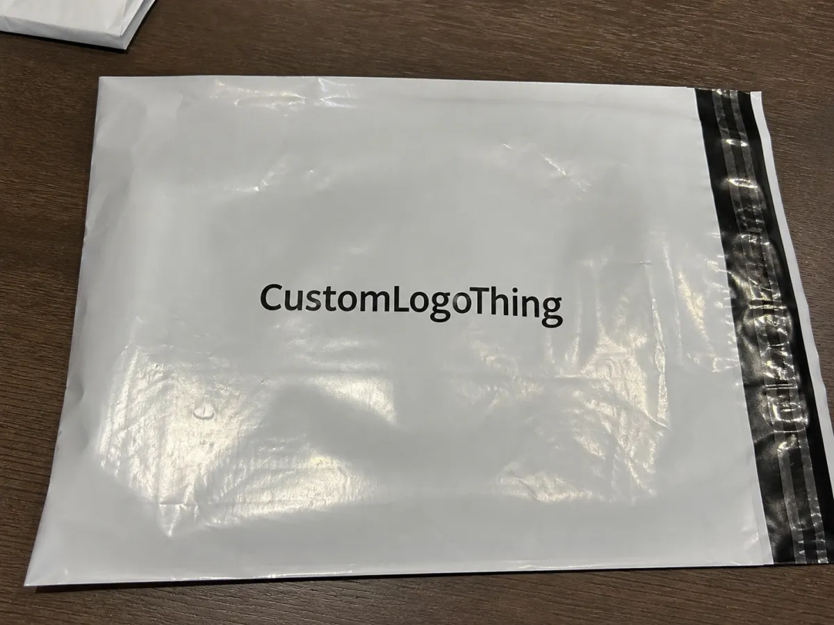
The fitness studio Custom Poly Mailer Bags logo placement guide matters because poly film is not a flat mockup. It flexes, reflects light, and gets covered by shipping labels. A logo that looks centered on screen can sit too low, too close to a seam, or too near the flap once the bag is produced.
For fitness studios, the bag is doing two jobs: protecting apparel, towels, bands, or membership kits, and carrying the brand. A centered mark, an upper-third placement, or a small corner logo can all work well. The best choice depends on bag size, film color, label placement, and how much visual space the shipment needs to stay readable.
Placement also affects cost and approval. A clean single-panel design is easier to quote, proof, and print than artwork that crosses multiple panels or demands tight registration. If the same brand uses Custom Poly Mailers for apparel drops or challenge kits, placement should be treated as part of the production spec, not as an afterthought. The same planning logic applies when a studio uses Custom Packaging Products such as inserts, labels, or cartons.
The most reliable logo placement is the one that still reads clearly after sealing, stacking, and label application.
How Poly Mailer Artwork Is Laid Out on the Bag
Most placement issues start with the dieline. In a flat file, the surface looks continuous and easy to center. In production, the printable area is interrupted by side seams, the seal flap, and the edge that gets folded or heat sealed. A logo that looks correct on the template can disappear into the construction of the bag if it sits too close to those boundaries.
That is why printers talk about a safe zone. Logos, taglines, QR codes, and return information should stay inside that area. Bleed is for backgrounds and edge-to-edge graphics, not for critical text. A few millimeters can be the difference between a clean result and a reprint.
Common layout styles are straightforward:
- Centered front branding creates a balanced look and is easy to spot at handoff.
- Upper-third placement helps the logo stay visible above a label or fold.
- Corner marks work for quieter packaging.
- Repeat patterns turn the mailer into part of the marketing message.
The right choice depends on the job. A 10 x 13 inch mailer can carry a modest logo without feeling crowded. A 14 x 19 inch mailer can support stronger branding. Thin line work, stacked text, and small icons need more breathing room than a bold symbol with heavier strokes.
Print method matters too. Flexographic printing, digital printing, and gravure each handle artwork differently. Some are better suited to simple one-color branding, while others handle larger coverage with fewer shifts in appearance. If a supplier needs plates or screens, placement should be settled before tooling is built because changes later affect both price and schedule.
Material color changes the result as well. White and light gray films give the most forgiving contrast. Black, deep green, and translucent films can make smaller marks harder to read unless the logo uses a strong underprint or thicker outlines. The same artwork that feels crisp on matte white may disappear on a dark glossy bag.
Placement Factors That Shape Visibility and Durability
Logo placement is a production decision, not just a branding choice. It has to account for visibility, abrasion, bag thickness, and the way the order will be used. A bag holding folded apparel or a towel set bends more than a carton, so it shows creases sooner and picks up scuffs where tape or sorting equipment touches the surface.
Size matters, but contrast is often more important. A pale logo on a translucent bag may look fine when the mailer is empty and disappointing once the product fills the space behind it. A simple icon usually survives smaller sizes better than a detailed wordmark. If the type is thin or delicate, it may need to be enlarged so it stays legible in print.
There is a difference between being visible and being readable. A logo can exist on the bag and still fail if it sits under a shipping label or too close to a fold. That is why upper-third placement is common: it keeps the brand clear of labels, tape, and the visual clutter that tends to gather in the center of the bag.
Thickness also affects the decision. Common poly mailers often sit around 2 to 4 mil, depending on the supplier and use case. Thinner film can lower cost, but it may show handling wear faster. Thicker film improves durability and can make the bag feel more substantial, although it raises unit cost. For recurring fitness orders, that tradeoff is worth discussing before artwork is approved.
Placement should match the order type:
- Retail apparel drops usually benefit from a bold front-panel logo that reads quickly on arrival.
- Welcome kits often work better with a higher logo position and room for inserts.
- Challenge promotions can tolerate more graphic coverage.
- Member replenishment orders usually look best with the cleanest front face possible.
It also helps to split functions. A mailer can carry the main mark while an insert carries the messaging. That often produces a cleaner result than trying to make the bag do everything. For studios that want to reduce plastic dependence, local recycling rules matter more than broad claims, so the packaging brief should reflect how the bag will actually be disposed of.
Cost, MOQ, and Quote Drivers for Custom Mailers
Logo placement has a direct effect on price. A small one-color logo on a single front panel is usually the least expensive option. Once the artwork expands across more of the bag, the quote reflects additional ink, more setup time, and tighter registration control.
MOQ is tied to the same logic. A simple placement can often be produced at a lower threshold than a design that wraps around multiple sides or needs extra print stations. Buyers sometimes assume MOQ is only about quantity, but in production it usually tracks how much setup the job requires.
Typical quote drivers include:
- Print coverage and whether the design stays on one panel or moves across several.
- Color count, including one-color, two-color, and full process work.
- Setup charges for plates, screens, or digital preparation.
- Proofing scope, especially if the placement needs a second mockup.
- Material thickness, film color, and bag size.
- Freight method, since cartons, pallets, and mixed packs all cost differently.
For budgeting, simple Custom Poly Mailer orders often land around $0.18 to $0.38 per unit at 5,000 pieces. That is not a fixed market number; it moves with film type, print coverage, color count, and shipping. Jobs with heavier coverage, unusual sizing, or special finishes can cost more, so the useful question is what is driving the quote rather than which supplier lists the lowest headline price.
| Placement Option | Typical Use | Cost Pressure | Best Fit |
|---|---|---|---|
| Single front logo | Clean studio shipments, member orders, apparel mailers | Lower | Budget-conscious branded packaging |
| Upper-third logo with detail | Orders that need visibility above labels and folds | Moderate | Balanced retail packaging and readability |
| Wraparound print | Launch kits, campaign mailers, high-impact branding | Higher | When the mailer is part of the marketing story |
| Two-sided branding | Premium unboxing or repeated logo exposure | Higher | When visibility matters at every handling point |
The best layout is the one that gives the strongest result for the money, the bag size, and the shipment type. A well-placed small logo can outperform a crowded design that forces extra setup and still ends up partly hidden.
Process and Turnaround Timeline From File to Delivery
The production path is predictable if the inputs are clean. It starts with the size, film color, thickness, and quantity. Then comes the logo file, placement note, and any brand color references. From there the supplier builds a proof or dieline mockup so the buyer can verify the artwork before the job goes to press.
The proof is where most delays are avoided. The key checks are simple: Is the logo in the safe zone? Does it avoid seams, seal edges, and label areas? Are the colors reasonable for the chosen film? Is the file strong enough for the print method being used?
A supplier should flag low-resolution files, tiny type, or artwork that sits too close to a fold. If the bag also needs a barcode, SKU label, or return address, those elements should be reviewed together instead of separately. Orders slip when each item is approved in isolation.
A typical workflow looks like this:
- Artwork intake and spec review.
- Digital proof or dieline mockup.
- Approval with final placement confirmation.
- Production and finishing, including curing or drying if needed.
- Packing and freight to the studio, warehouse, or fulfillment site.
For straightforward jobs, proofing often takes a few business days. Production commonly runs around 12 to 15 business days after approval, though larger quantities, specialty film, or multi-color artwork can stretch that timeline. Rush service is more realistic when the file is final and the placement is already settled.
For buyers comparing suppliers, ask for a placement mockup that shows the printable area, seam clearance, and label space. That file is often more useful than a sales quote because it reveals whether the supplier understands the bag structure and whether the layout will work in real packing conditions.
Common Logo Placement Mistakes That Cause Reprints
The most expensive mistake is placing the logo where a fold, flap, or seam cuts through it. On a flat proof, the artwork may look centered and balanced. On the finished bag, it can disappear into the construction of the mailer. If the error is caught late, the job may need a revised proof or a reprint.
Another problem is trusting the digital mockup too much. A screen image does not show how the bag will behave once it is sealed, stacked, or filled with product. A mark that looks elegant on a laptop can sit too low once the first packed order is checked in person.
File quality creates issues as well. Low-resolution art softens edges. Unconverted fonts can shift when the file is opened. Missing dieline references make it harder to confirm the correct placement. Even a one-color job can stall if the printer cannot tell whether the logo is supposed to sit high, low, centered, or off to one side.
Watch for these avoidable errors:
- Placing text too close to the edge of the printable area.
- Using a color that does not contrast with the bag film.
- Ignoring where a shipping label will land.
- Choosing a logo size that works on screen but disappears in hand.
- Skipping a second proof when the design has fine lines or small type.
A crowded mailer is another common mistake. Trying to fill every inch can make the package look busy instead of premium, especially once tape, labels, and handling marks enter the picture. In many cases, a single well-placed logo feels more intentional than full-coverage graphics that compete with the rest of the shipment.
Next Steps for a Cleaner Custom Mailer Order
The easiest way to keep the order on track is to start with a complete brief. Confirm the bag size, material color, thickness, final logo file, placement, color count, quantity, and delivery timing before requesting quotes. If those details are missing, the first number from a supplier is usually only a rough estimate, and the proofing round becomes harder than it needs to be.
Ask for a dieline mockup that clearly shows the printable area, seam locations, seal flap, and any label or barcode space. That step removes most placement surprises. If the logo is new, the film is dark, or the artwork includes thin lines, a sample run is worth considering before the full order is approved. A physical check can reveal contrast issues that are easy to miss on a monitor.
For studios comparing formats, the right choice should follow use case rather than preference. A launch kit may deserve a stronger visual treatment than a replenishment shipment. A high-volume apparel program may need a simpler front-panel logo to keep costs under control. Consistency matters, but it does not mean every bag has to look identical.
- Confirm the final logo file is vector-based.
- Send a placement sketch with simple measurements.
- Ask where the printer wants safe zone and bleed margins.
- Check whether the carrier label will cover any art.
- Review sample colors under the same lighting where orders are packed.
Used well, the fitness studio custom poly mailer Bags Logo Placement guide is less about decoration than control. It helps the brand read the way it should after the bag is folded, sealed, stacked, and delivered.
Where should a fitness studio logo go on custom poly mailer bags?
The safest default is the center of the front panel or the upper third of the bag. Keep the mark away from seams, the seal flap, and any label area so it still reads after folding and shipping.
Does bigger logo placement raise the cost of custom poly mailers?
Yes, larger coverage usually means more ink, more setup work, and more inspection. Wraparound or two-sided branding often costs more than a single front-panel logo, and a simple one-color placement is usually the most budget-friendly choice.
What artwork file should I send for logo placement proofs?
Send a vector file such as AI, EPS, or PDF whenever possible. Outline fonts, include Pantone colors or clear color references, and add a simple placement sketch so the printer can proof the exact location you want.
How long does custom poly mailer production usually take?
Proofing often takes a few business days if the artwork is ready and the placement is clear. Production and freight vary by quantity, print complexity, and supplier capacity, but rush timelines are more realistic when the file is final and no layout changes are needed.
Can I print the same fitness studio logo on both sides of the bag?
Yes, but double-sided branding usually increases ink coverage and print complexity. Ask whether a repeated pattern, front-only logo, or back-panel mark gives you better value, and make sure both sides still leave room for labels and handling.

