Buyer Fit Snapshot
| Best fit | Folding Cartons Logo Design projects where brand print, material claims, artwork control, MOQ, and repeat-order consistency need to be specified before quoting. |
|---|---|
| Quote inputs | Share finished size, material target, print colors, finish, packing count, annual reorder estimate, ship-to region, and any compliance wording. |
| Proofing check | Approve dieline scale, logo placement, barcode or warning zones, color tolerance, closure strength, and carton packing before bulk production. |
| Main risk | Vague material claims, crowded artwork, missing packing details, or unclear freight terms can make a low unit price expensive after revisions. |
Fast answer: Folding Cartons Logo Design: Board, Finish, Dieline, and Unit Cost should be specified like a repeatable production item. The safest quote records material, print method, finish, artwork proof, packing count, and reorder notes in one written spec.
Production checks before approval
Compare the actual filled-product size with the drawing, then confirm tolerance on folds, seals, hang holes, label areas, and retail display edges. Reserve space for logos, QR codes, warning copy, and material claims before decorative graphics fill the panel.
Quote comparison points
Review material grade, print process, finish, sampling route, tooling charges, carton quantity, and freight assumptions side by side. A quote is only useful when the supplier can repeat the same color, closure quality, and packing count on the next order.
Folding Cartons Logo Design: A Practical Branding Guide
Folding cartons logo design looks straightforward until the artwork meets a real press sheet. On screen, the mark can feel crisp, balanced, and ready to go. On board, the same logo can blur, drift across a fold, or get wiped out by a finish that looked harmless in the mockup. That gap is where a decent package turns into a frustrating one.
If you are planning a launch, a refresh, or a line extension, folding cartons logo design deserves more attention than it usually gets. The logo is not just decoration. It has to survive substrate choice, die-cut panels, glue zones, ink gain, shelf glare, and the short little window when a shopper glances at the carton and decides whether to care. That window is brutally short.
I have watched teams spend days arguing about tone and mood, then approve a logo placement that cannot survive the actual carton structure. That is backwards. The art direction matters, sure, but the box has rules. Ignore them and the brand ends up paying for it later. Usually in a rush. Sometimes twice.
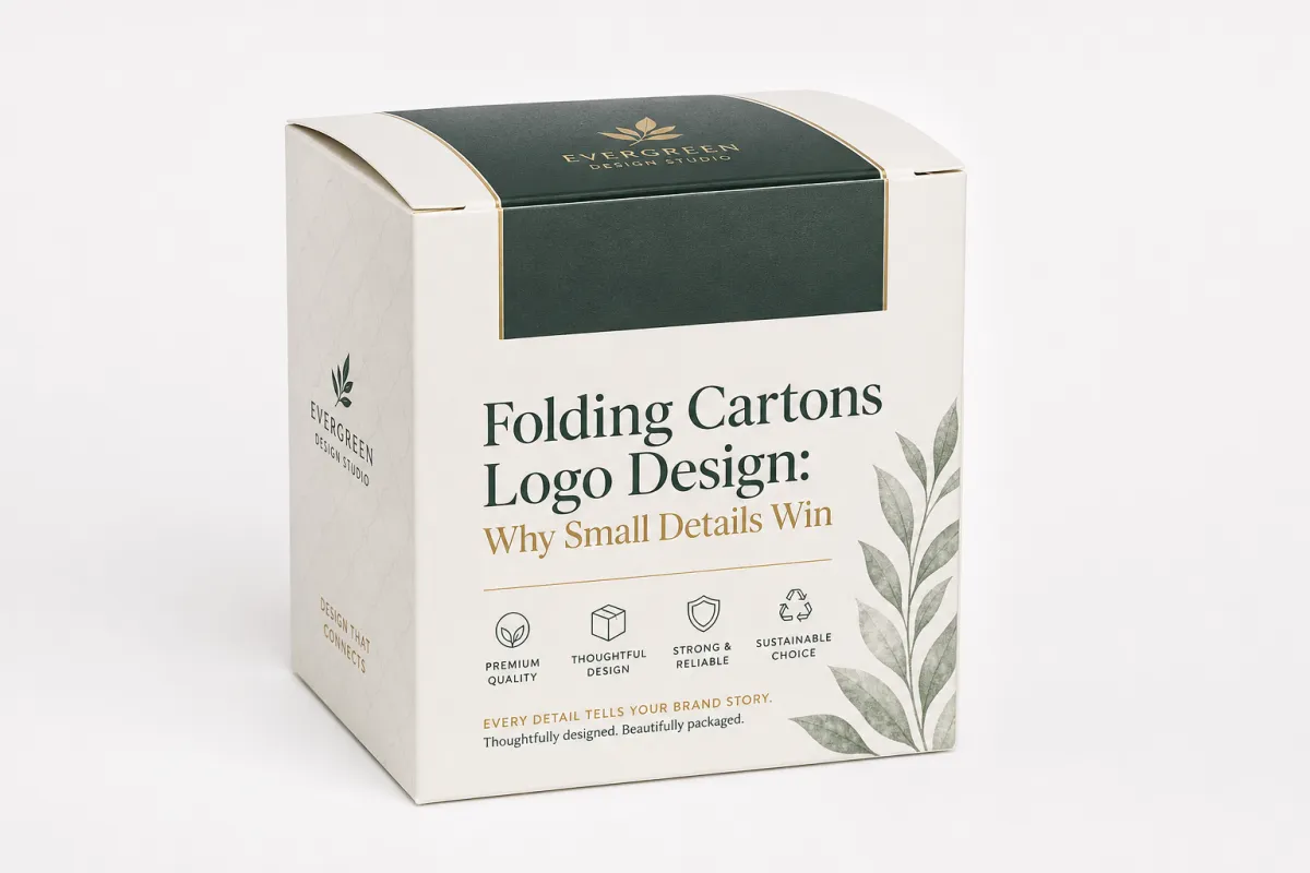
Folding Cartons Logo Design: Why Small Details Win
On a crowded shelf, a carton gets a tiny slice of attention. Folding cartons logo design matters because the brand mark has to speak fast, usually in less than three seconds. In that moment, the package lands as premium, ordinary, or forgettable. There is no dramatic second act. The shopper is already halfway to the next option.
Practically speaking, folding cartons logo design means adapting a brand mark for paperboard packaging that ships flat, folds on line, and still reads clearly once assembled. The idea sounds simple. The reality is less polite. Panel sizes shift, fold lines interrupt the composition, tuck flaps steal space, and glue seams remove the exact place where the logo wanted to sit.
Packaging is not a brochure. It is not a homepage banner, either. Folding cartons logo design has to survive registration tolerances, board caliper, finishing pressure, and the way light bounces off coated or uncoated surfaces. A logo that looks refined in a digital comp may need simplification before it works at carton scale. That is not a failure. It is part of the job.
That is the real task: scale, placement, and contrast turn a carton into a brand system. A strong folding cartons logo design can make one product family feel unified across flavors, sizes, and SKUs. A weak one creates visual noise and weird tension that buyers notice even when they cannot name it.
From a packaging buyer's point of view, the task is not "make the logo bigger." It is to make folding cartons logo design support the product name, the promise, and the compliance text without choking the front panel. The logo should carry the brand. It should not fight the rest of the design for oxygen.
A carton logo is rarely just a logo problem. Folding cartons logo design usually turns into a hierarchy problem, a production problem, and a shelf problem all at once.
That matters because the carton's real performance shows up after print, after die-cutting, after folding, and after distribution. Folding cartons logo design has to keep working through every stage, not only in a polished mockup review with everyone nodding at the screen. I have seen beautiful concepts fall apart because nobody checked the folded structure early enough. Ugly lesson. Useful, though.
How Folding Cartons Logo Design Works in Production
Folding cartons logo design starts with a dieline, not a glossy render. The brand artwork gets mapped onto the structural template, then checked against folds, panels, tuck flaps, seals, and barcode space. That is where a lot of teams meet the first hard truth: a mark that looks balanced on a flat canvas can get chopped up once the carton is folded and glued.
The production path usually runs through concept, artwork adaptation, proofing, and press approval. In folding cartons logo design, that order matters because each stage exposes a different kind of failure. Concept work tests brand expression. Artwork checks scale and placement. Proofing catches distortions, color drift, and panel conflict. Press approval tells you whether the chosen finish actually prints the way everyone hoped it would.
Print method changes the outcome more than many teams want to admit. Offset handles fine detail well, but it wants clean separations and accurate registration. Digital printing is useful for short runs and versioned SKUs, though subtle gradients or dense solids may behave differently than they do on a coated proof. Flexographic work can be efficient for cartons, but thin strokes and tiny type need extra caution. Foil can make folding cartons logo design look premium, or just loud, depending on the board and spacing. The material does not care about your mood board.
Substrate choice changes the logo before ink even touches the board. Coated stock sharpens edges and improves contrast. Uncoated board absorbs more and softens fine detail. Specialty boards, including textured or recycled-content stocks, can give folding cartons logo design a more natural tone, but that same texture may mute small letterforms. FSC-certified board often enters the discussion too, especially when the package needs to support sustainability claims without looking like it came from a very earnest spreadsheet. For packaging standards and testing context, teams often reference organizations such as ISTA for distribution testing and FSC for responsible fiber sourcing.
Technical details do the unglamorous work. Bleed keeps art from clipping at the cut line. Safe zones stop the logo from crowding a fold. Overprint settings prevent surprises in spot colors. Color management keeps the same mark from looking warm on one carton and cold on the next. In folding cartons logo design, those details are not background noise. They are the whole machine.
Proofing should be treated like risk control, not a ceremonial step before everyone signs off and hopes for the best. A digital proof catches basic composition mistakes. A press proof gives better color realism. A physical sample reveals structural issues such as a logo sitting too close to a score line or looking warped on a folded panel. Folding cartons logo design gets better fast when teams see something tangible before production, not after 20,000 cartons are already tied up.
Distribution can shift the result after the package leaves the plant. If a carton travels through humidity swings, compression, or vibration, the logo needs enough contrast and structural protection to survive real handling. That is why folding cartons logo design often deserves to sit alongside transport testing, including ISTA-style checks, instead of getting buried in a design silo where nobody thinks about what happens after shipping.
Key Factors That Shape Folding Cartons Logo Design
Hierarchy comes first. Folding cartons logo design has to decide what the shopper sees first, second, and third. Make the logo too small and the package feels nervous. Make it too large and it bulldozes the product name, flavor, benefit claims, or regulatory copy. The strongest cartons usually land in the middle, where the logo feels established without acting like it owns the building.
Color strategy is next. High-contrast palettes improve legibility, especially on cluttered shelves or under harsh retail lighting. Brand color accuracy still has limits. In folding cartons logo design, the final result depends on ink density, board tone, finish type, and even whether the surface is gloss, matte, or soft-touch. A brand blue that looks rich on a monitor can flatten fast on porous stock if the ink build is weak.
Typography is where shortcuts love to ruin a good plan. Thin serifs, delicate scripts, and narrow sans-serif strokes may look elegant in a brand manual, then fall apart at carton scale. In folding cartons logo design, sturdier letterforms usually reproduce better because they tolerate ink spread and minor registration shifts. That does not mean the logo has to feel blunt. It means the type needs to work in print, not just in a mood board.
Finishing choices can lift the mark or muddy the message. Embossing adds tactile depth. Debossing brings a quieter kind of polish. Spot UV separates the logo from the rest of the panel. Foil stamping can signal premium positioning, especially for cosmetics, confectionery, or gifting formats. Each finish also adds setup complexity, and each one changes how folding cartons logo design reads under different lighting conditions. Fancy is easy. Controlled fancy is harder.
Brand architecture matters too. A product line often needs one core logo treatment that can handle multiple SKUs, sizes, or variants without forcing a redesign every time a new flavor shows up. A rigid layout may work for one carton and then collapse the second the line extends. Folding cartons logo design works better as a system: consistent placement rules, controlled color use, and clear variant logic.
Shelf context changes the math. A carton does not sit alone. It sits beside competitors with different shapes, finishes, and visual rhythms. A logo that looks strong in a studio can look weak beside a louder neighbor. Folding cartons logo design should be reviewed against competitor comps, not in isolation. A smart comparison can show whether the mark needs more weight, more space, or just better contrast.
Practical test: shrink the carton mockup to shelf distance, print it, and put it under warehouse-style lighting. If the logo still reads in folding cartons logo design, the package is probably on the right path. If not, the screen version was lying to you a little.
Consistency across channels matters too. The carton logo should echo the brand's digital identity, but it does not need to copy it pixel for pixel. Folding cartons logo design often improves when the package version is slightly simplified. The goal is recognition, not rigid duplication. Packaging has a job to do. It does not need to cosplay as a website.
Folding Cartons Logo Design Cost and Pricing Factors
Cost gets vague fast, and vague gets expensive even faster. Folding cartons logo design pricing depends on concept count, revision rounds, dieline adjustments, artwork cleanup, proofing, and whether the logo needs multiple carton sizes or SKU variants. A straightforward adaptation can be relatively efficient. A heavily finished carton with tight registration and multiple brand assets usually costs more because more hands and more checks are involved.
Production decisions drive a lot of the price. A one-color logo on standard board is usually simpler than a multi-color mark with foil accents, embossing, and exact color matching across several cartons. Folding cartons logo design can also become more expensive if the layout needs extra prepress work for bleed, overprint, or specialty coatings. The design fee and the print setup fee are not the same line item, and they should stay separate.
Here is the clean way to think about it: the logo itself may be modest to adapt, but the packaging system around it is where the budget starts to stretch. If folding cartons logo design has to account for several sizes, flavors, languages, or panel variations, the scope grows quickly. That is normal. It is also why a clear brief saves money instead of burning it.
| Option | Typical Use | What Is Included | Common Cost Range |
|---|---|---|---|
| Basic carton logo adaptation | Single SKU, standard board, minimal finish | Artwork placement, dieline check, one or two proofs | $250-$900 |
| Standard packaging system | Two to five SKUs, modest print effects | Multiple logo placements, color guidance, revision rounds | $900-$2,500 |
| Premium carton program | Multi-SKU launch, foil, embossing, or strict color control | Extended prepress support, finish planning, sample review | $2,500-$7,500+ |
The table above is a planning lens, not a quote sheet. In folding cartons logo design, price moves with complexity, not just with the number of cartons. A small logo with difficult artwork can take more time than a larger, cleaner one. Size is not the villain. Complexity is.
There is a hidden cost that brands overlook all the time: rework. If the logo is too detailed for the carton, or if the team approves art before checking the dieline carefully, the brand may pay for corrections, new proofs, production delays, and sometimes a rushed reprint. Folding cartons logo design that is planned properly usually looks cheaper in the long run because it avoids those downstream hits.
Another useful split is design versus manufacturing. Design covers concept, layout, and brand adaptation. Manufacturing covers board, print, finishing, die-cutting, and assembly. If a buyer wants clearer budgeting, folding cartons logo design should be quoted separately from print and packaging costs so the team can see where the money is actually going and what can realistically be trimmed.
For example, a simple carton on a 16pt C1S board with standard CMYK print might stay in a lean budget range, while a 24pt SBS carton with soft-touch lamination, foil, and spot UV climbs fast. Folding cartons logo design gets more expensive not because the logo is "fancy," but because every premium choice adds setup and control requirements. Production people are not being dramatic here. They are just paying attention.
My blunt take: brands usually save more by simplifying the architecture than by squeezing the design fee. A cleaner, more repeatable folding cartons logo design can reduce reproofs, shorten approvals, and keep the same visual system alive across future launches. That is real value, not a feel-good line for a pitch deck.
Folding Cartons Logo Design Process and Timeline
A good workflow starts with the brief. Folding cartons logo design needs a clear answer to a few basic questions: what does the product promise, what size is the carton, which panels matter most, and what print process will be used? Without those answers, the first round of art is a guessing game. With them, the design is already tied to reality instead of floating around in presentation land.
Asset gathering comes next. The designer needs the logo files, brand colors, font rules, dieline, copy blocks, legal text, and any finish instructions already approved by the printer. Folding cartons logo design moves faster when the source files are organized in vector format and the team has one source of truth for measurements. The more fragmented the files, the more likely it is that small mistakes sneak into the carton.
Concept development should test a few directions, not twenty. Three solid options are usually better than a pile of almost-the-same ideas. One might push bold logo presence. Another might prioritize premium finishing. A third might support a cleaner hierarchy for a more functional shelf read. In folding cartons logo design, those options should differ in structure, not just in color. That gives feedback something useful to bite into.
Revision rounds need discipline. Comments about "making it pop" are not helpful. Comments about contrast, readability at actual size, fold-line interference, and SKU consistency are. Folding cartons logo design gets much easier when the feedback ties back to production or shelf behavior instead of personal taste. Otherwise everyone just circles the same problem with different adjectives.
Timing depends on complexity. A simple carton can move quickly if the dieline is final and approvals are centralized. A multi-SKU line with special finishes, content updates, and several stakeholders moves slower because each version adds another decision point. In practice, folding cartons logo design projects often run from a few weeks for straightforward adaptation to several more weeks for a larger packaging rollout. More proofing rounds and more finish variables mean a longer timeline. Shocking, I know.
There is a useful way to think about proof stages:
- Internal comp review: checks brand fit and hierarchy.
- Prepress proof: checks layout, bleed, and technical accuracy.
- Press proof or sample: checks real color, finish, and material behavior.
- Folded sample: checks structure, alignment, and panel interaction.
That sequence keeps surprises from showing up at the worst possible time. Folding cartons logo design is not only about making art; it is about reducing uncertainty before production locks everything down. A well-run project hands the printer a print-ready package with colors, finishes, dieline references, and version control spelled out clearly, so the job can move with fewer questions and fewer groans.
One practical rule: approve folding cartons logo design at actual size, not a zoomed-in monitor view. A carton logo that looks elegant at 200% can still fail at shelf scale if the strokes are too fine or the contrast is too soft. That mistake is common. It is also avoidable.
Common Folding Cartons Logo Design Mistakes to Avoid
The biggest mistake is designing only for the screen. Folding cartons logo design can look polished in a mockup and still fall apart the moment it gets reduced, folded, or printed on a textured board. Screen brightness hides weak spots. Print has a nasty habit of exposing them. It is rude like that.
Overcrowding shows up all the time. Too many claims, icons, seals, and decorative flourishes bury the logo and make the carton feel chaotic. In folding cartons logo design, restraint usually reads as more confident than decoration. A clear brand mark with room to breathe looks more credible than a packed panel trying to say everything at once.
Contrast problems are another constant headache. Pale logos on warm kraft board, thin type with low ink coverage, and subtle gradients on absorbent stock all risk turning muddy. Folding cartons logo design needs enough visual strength to survive retail lighting and real printing conditions. If the brand color is critical, test it on the chosen board before the run gets approved and everyone pretends that "close enough" is a strategy.
Finish mismatch can be expensive too. A premium foil treatment on a budget-looking carton can feel disconnected if the rest of the package does not support it. The result is not luxury. It is confusion with a shiny accent. Folding cartons logo design should match the whole brand experience, from board choice to print quality to secondary copy. The finish should feel earned.
Skipping dieline checks is another process failure that keeps costing brands money. If the logo sits too close to a score line, it may split awkwardly. If the artwork ignores glue zones, part of the design may disappear in assembly. If the team approves proofs too quickly, the mistake becomes a physical inventory problem instead of a design problem. Folding cartons logo design rewards slow, careful review more than speed theater.
Here are a few red flags I would watch for:
- The logo is built from thin strokes or tiny counters.
- Color decisions were made before board selection.
- The front panel is crowded with too many competing messages.
- No one reviewed the carton folded and flat.
- The printer never confirmed color management expectations.
Line extensions cause another subtle problem. A logo treatment that works for one flavor may break the system when the range expands. Folding cartons logo design should leave enough room for new variants so the brand does not need a redesign every time a new size or scent joins the lineup. Planning for growth is cheaper than cleaning up after it.
Short version: if the design only feels impressive before production, it is not ready. Folding cartons logo design should be judged by what survives the press, the die-cut, the fold, and the shelf. Everything else is just decoration in a nice font.
Expert Tips and Next Steps for Folding Cartons Logo Design
Start from the carton structure, not from the logo file. That is the cleanest way to improve folding cartons logo design. If the dimensions, panel hierarchy, and print limitations are understood first, the logo treatment can be tuned to the package instead of shoved onto it and hoped for the best.
Test at actual size. I cannot stress that enough. Folding cartons logo design needs to be seen at the carton's real footprint, in the real color system, and ideally on a folded proof. What looks balanced on a laptop may not read the same on a shelf. That gap is where a lot of packaging mistakes are born, then budgeted for, then regretted.
Build a packaging style guide if the product line has any chance of growing. Document logo spacing, minimum sizes, board preferences, approved finishes, and color rules. Folding cartons logo design gets easier to scale when the rules are written down. It also keeps procurement, marketing, and prepress from improvising every time a new SKU shows up. Improvisation sounds creative. In production, it is usually just expensive.
Cross-functional review matters more than most teams admit. Brand usually focuses on equity. Packaging focuses on structure. Procurement focuses on cost. Production focuses on press behavior. Folding cartons logo design works best when all four voices show up early, because each one catches a different kind of risk.
If you are planning the next round of artwork, use a simple sequence:
- Audit the current carton and list what is not working.
- Request a final dieline from the printer.
- Compare three logo treatment options at actual size.
- Check board, finish, and color assumptions before approval.
- Ask for a folded sample before the full run is released.
That process saves time later. Folding cartons logo design works best when it reduces uncertainty before print, not after. A cleaner brief, a cleaner proof cycle, and a cleaner handoff usually mean fewer surprises and a better-looking carton.
If I had to reduce the whole subject to one point, it would be this: folding cartons logo design is not about making the logo louder. It is about making the logo smarter, so the package can do its job without fighting the structure, the print method, or the shelf around it.
For brands that want packaging to do more than hold a product, that shift matters. Folding cartons logo design shapes perception, price point, and consistency in a way a flat graphic rarely can. Get the structure right, and the logo works harder for the brand. Miss that, and even a strong identity can look oddly unfinished.
That is why folding cartons logo design should be treated as a core packaging decision, not a finishing touch. The result shows up in shelf impact, in production efficiency, and in how credible the carton feels the moment a customer picks it up.
How is folding cartons logo design different from regular logo design?
Folding cartons logo design has to work on a real package, not just a flat digital canvas. Folds, flaps, glue zones, substrate texture, and panel size all shape the result. A carton logo also has to survive ink gain, finishing effects, and shelf distance, so the artwork needs more production awareness than a standard logo placement.
What file format is best for folding cartons logo design files?
Vector artwork is the safest starting point because it stays sharp at any carton size. For folding cartons logo design, provide print-ready files with outlined fonts, linked images if needed, and clear color specifications. Pair the logo file with the dieline and finish notes so the printer has the full context before prepress begins.
How much does folding cartons logo design usually cost?
Costs vary with concept count, revision rounds, packaging complexity, and whether the logo needs special finishes. In folding cartons logo design, a basic carton adaptation may stay in the low hundreds, while a multi-SKU program with foil, embossing, or strict color control can move into the low thousands. Design and production should be budgeted separately so the real cost drivers stay visible.
How long does a folding cartons logo design project take?
A straightforward folding cartons logo design project can move quickly if the dieline is final and approvals are organized. More complex packaging takes longer because proofing, revisions, and print testing add decision points. The fastest projects usually have one consolidated feedback source instead of scattered comments from multiple departments.
What should I check before approving folding cartons logo design artwork?
Check logo size, contrast, placement, and readability at the actual carton dimensions. Confirm bleed, safe zones, color specs, and finish instructions with the printer. For folding cartons logo design, a folded proof or sample is the best final check because it reveals panel misalignment, distortion, and real-world print behavior before full production begins.
Related packaging resources
Use these related guides to compare specs, costs, quality checks, and buyer decisions before making the final call.


