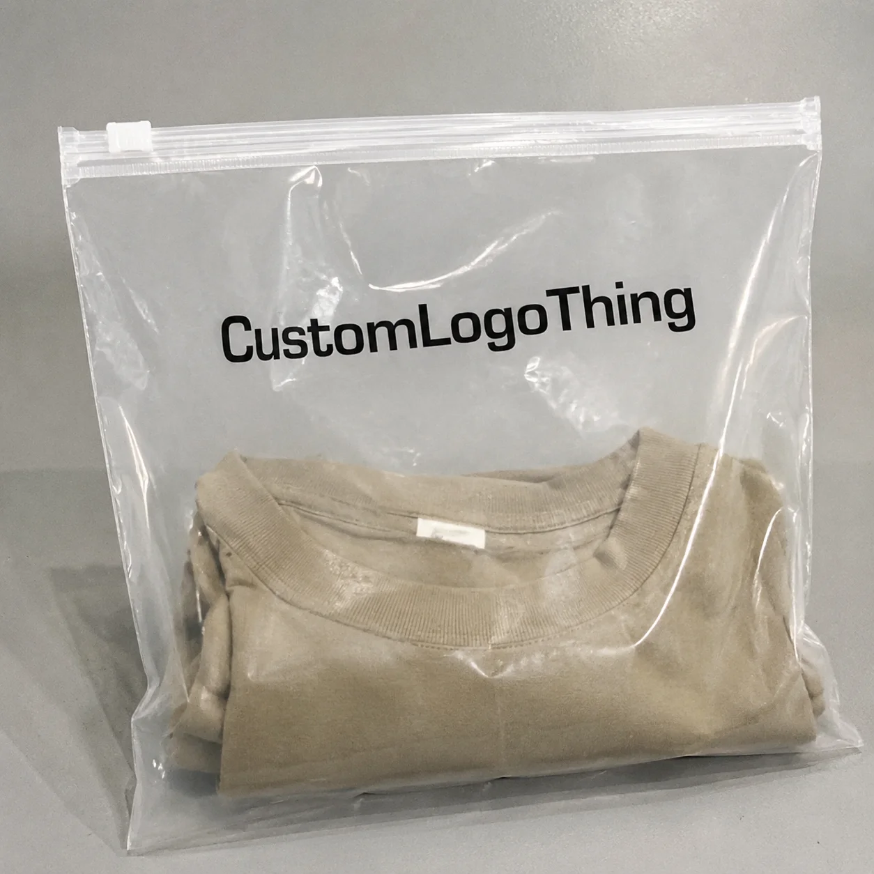
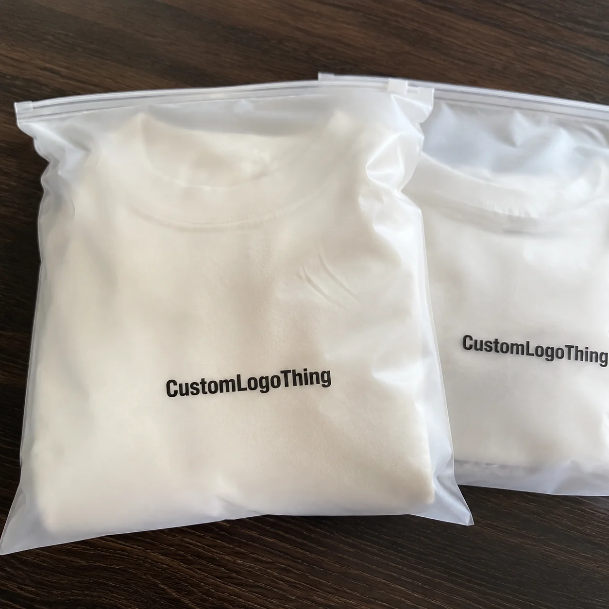
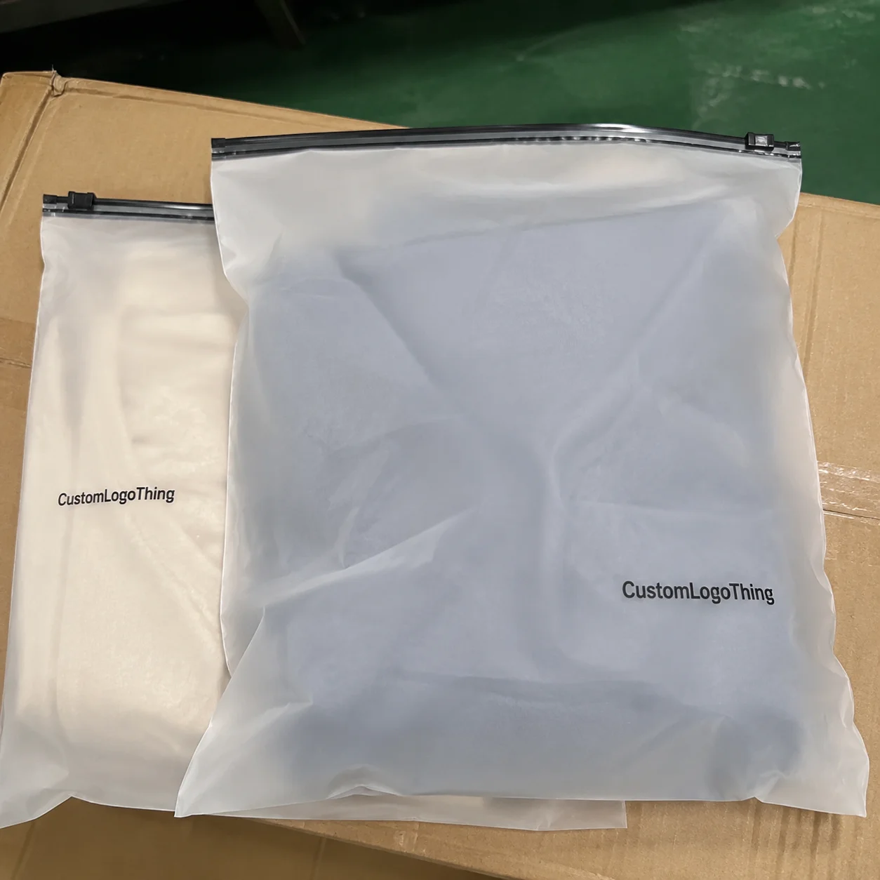
Print placement sounds simple until the bag hits production. Then the seal line shows up, the hang hole eats a corner, the barcode gets too close to the edge, and the “clean” layout suddenly looks like it was designed in a hurry. That is exactly why a Garment Poly Bags for apparel brands print placement guide has to start with the bag structure, not the artwork file.
For apparel brands, the print location affects more than appearance. It changes how the package reads on a retail hook, how quickly it moves through packing, and whether the scan code works without drama. A good layout makes the bag look intentional. A bad one creates avoidable reprints, slower approvals, and the usual round of “can we move this just a little?”
The tricky part is that poly bags are not flat posters. They are converted packaging with tolerances, folds, seals, machine direction, and film behavior. Once you understand those constraints, the design choices get a lot less mysterious and a lot less expensive.
What Print Placement Changes on a Garment Poly Bag
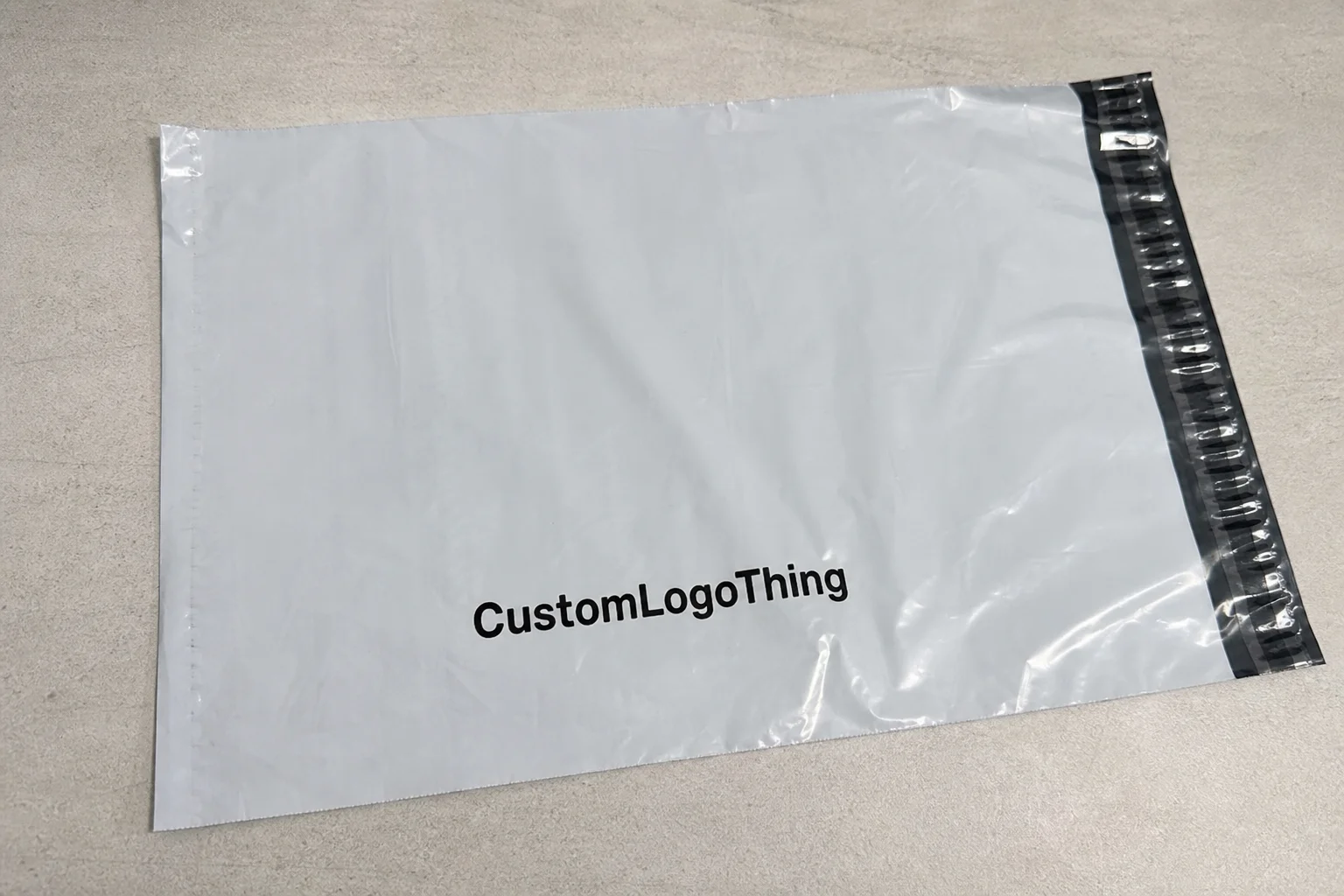
Print placement changes how the entire package feels. A logo centered on the front face can look polished and premium. Move that same logo too close to a seal and it suddenly looks cramped, cut off, or slightly warped. Same artwork. Different result. Packaging is rude like that.
On Garment Poly Bags, placement usually covers the logo, size callout, product name, barcode, warning copy, care symbols, and any recycling or compliance text. These elements need a hierarchy. If everything is competing for attention, the package becomes harder to read and weaker on shelf.
Brands usually care about four things at once: visibility, readability, compliance, and how the bag presents in storage or display. Retail teams want the front panel to look clean. Fulfillment teams want the barcode where the scanner can catch it fast. Operations teams want artwork that does not force extra handling. Those goals overlap, but they are not identical.
There is also a practical difference between what looks good on screen and what survives production. Thin plastic moves. Heat affects seals. Film tension affects repeat registration. A nice mockup is not proof that the real bag will land the same way.
Most garment bags use flexographic printing for standard branded runs, rotogravure for longer runs with tighter repeat consistency, and digital printing for smaller quantities or artwork that may change more often. Each method has its own sweet spot. Flexo tends to be efficient for spot colors. Gravure handles long runs and fine detail well. Digital can be useful, but it is not magic, and the unit cost can climb fast if the order is large.
The usable print window is always smaller than it looks at first glance. Seal widths, cut allowances, perforations, hang holes, and safe-edge margins all reduce the actual space available for artwork. Buyers often discover this only after the first proof. That is usually the wrong time to discover it.
Practical rule: if a graphic must be seen by a shopper or scanned by a warehouse worker, it needs a safe zone, not just a pretty mockup.
How Print Placement Works on Apparel Packaging Film
Print placement starts with the flat film. Not the finished bag. Not the mockup. The film layout has to account for web direction, repeat length, folding, sealing, and cut position. If the dieline is wrong, the print can shift into a seal area or land off-center once the roll is converted into finished bags.
That is why a printer usually asks for more than a logo file. Expect to provide the dieline, copy, barcode requirements, line art, color references, and any notes on how the garment will be folded and inserted. If the artwork team skips those details, production often ends up compensating for them later. Nobody enjoys that. Especially not the person signing off on the invoice.
Film choice changes the way print placement reads. Clear film keeps the garment visible, which is useful for retail presentation, but the garment color can fight the logo. Frosted film softens the background and usually improves contrast. On transparent film, light inks can disappear against dark garments, so a white underlay or a stronger spot color may be needed.
Orientation matters too. Artwork that looks centered on a screen can shift when the roll is printed and converted. Left-right positioning, top-to-bottom placement, and reverse orientation all need to be checked against the machine direction. If the bag has a hang hole, the top of the artwork should still read correctly once the bag is hung, not only when it is lying flat on a desk.
Registration tolerance is another real-world constraint. Thin film, large rolls, and temperature swings can all affect alignment. Fine type, thin rules, and multi-color logos are the first things to show strain. If the design depends on tiny details, it should be proofed at the actual production scale, not just viewed on a monitor and called “good enough.”
Proofing should show front and back orientation, safe margins, barcode placement, and any no-print areas around the seals or perforations. A layout that ignores those zones can still look fine in a JPEG. That does not make it printable.
Key Print Placement Factors: Bag Size, Film, and Branding Goals
Bag size is the first filter. A 10 x 14 inch bag for a folded tee gives a different printable window than a longer format used for outerwear, multi-packs, or folded bottoms. Smaller bags require tighter hierarchy. Larger bags give more room, but they also tempt brands to fill every inch. Usually a bad instinct.
The goal is not to use every millimeter. The goal is to make the bag readable at the distance it will actually be seen. A retail hook, a packing table, and a shelf stack all create different viewing conditions. The best placement works from the most common angle first, then supports the other use cases without clutter.
Film gauge affects both durability and print appearance. A 1.5 mil or 2.0 mil bag usually feels sturdier than a lighter gauge and resists scuffing better in transit. Gloss film makes colors look sharper and brighter. Matte and frosted finishes reduce glare and can make the bag look more controlled under retail lighting.
Branding goals change the layout just as much as the dimensions do. Premium apparel labels often want a restrained logo, generous whitespace, and minimal copy. Fulfillment-heavy brands may need the bag to carry size, SKU, barcode, warnings, and recycling language. Those are different jobs. A single layout rarely does all of them elegantly unless somebody has thought the structure through.
Product type matters too. Folded tees can usually support a centered brand mark. Socks and multi-packs often need a larger barcode area and a smaller logo footprint. Intimates, kidswear, and regulated product categories may require more compliance copy and stronger text contrast. If the information load is high, the front panel should not try to carry everything.
Sustainable film options, including recycled-content blends or downgauged material, can change print performance. Some recycled films have slightly different surface texture or clarity, which affects ink laydown and color appearance. That does not make them a poor choice. It does mean the proof needs to be run on the exact substrate, not on a generic substitute that looks close enough on paper.
| Option | Typical fit | Print behavior | Price pressure |
|---|---|---|---|
| Clear film, one-color spot print | Basic retail or fulfillment bags | Simple, readable, lower setup complexity | Lower |
| Frosted film, one- to two-color flexographic printing | Mid-tier branded apparel | Better contrast, cleaner shelf appearance | Moderate |
| High-clarity film, multi-color artwork | Premium apparel presentation | Sharper branding, more sensitive to registration | Higher |
| Recycled-content film with limited coverage | Sustainability-led programs | May need color adjustment and extra proofing | Moderate to higher |
Step-by-Step Process and Lead Time for Print Setup
The setup process usually begins with artwork intake. The printer should receive vector files, bag dimensions, copy, barcode specs, color references, and any notes about fold direction or insertion method. If the artwork is built in CMYK, the printer may still need spot color guidance for the logo or compliance text because plastic does not behave like coated paper. Different substrate. Different results.
Next comes proofing. This stage should include a digital mockup and a layout check against the dieline. The buyer should confirm safe areas, barcode placement, seal clearance, and whether the key copy is legible at the actual viewing distance. If the proof is rushed, the finished run will usually expose the problem later, which is the expensive way to learn geometry.
After approval, production moves into plate making or cylinder preparation depending on the print method. Flexographic printing requires plates. Rotogravure needs cylinders. Then the press is set up, color is adjusted, and the run is checked against the approved sample. A clean setup should also verify trim alignment and seal quality so the printed area does not get damaged during conversion or packing.
Lead time depends on the number of colors, the size of the bag, the film type, and how much setup is needed for the press. A simple one-color layout on a standard size bag moves faster than a multi-panel design with heavy coverage and fine text. If the order is custom printed rather than a stock bag with an applied label, the schedule usually stretches a little because the press has to be dedicated to that artwork.
For straightforward programs, turnaround from proof approval is often 12–15 business days. Larger quantities, more complex artwork, recycled-content film, and late revisions can extend that window. Once the proof is approved, changes may require new plates, new cylinders, or another sample round. That is why “small edits” after sign-off are rarely small.
Buyers comparing packaging options sometimes review broader product lines such as Custom Packaging Products and apparel packaging formats like Custom Poly Mailers to see how the bag fits into the full packaging program. A few teams also use Case Studies as a benchmark for typical print complexity and material choices.
For production and materials references, groups such as ISTA and EPA offer useful guidance on testing and packaging considerations. If sustainability claims are part of the brief, FSC can help provide context for paper-based components in mixed-material packaging programs.
Cost and Pricing Factors for Custom Printed Poly Bags
Pricing depends on print colors, coverage area, bag size, film gauge, and order quantity. A one-color logo on a standard bag usually costs far less than a multi-side layout with barcode, warnings, and full-coverage branding. The more the artwork wraps around the package, the more setup and press attention the run tends to need.
Setup costs matter most on smaller minimums. Plates, cylinders, color adjustment, and make-ready time all hit before the first sellable bag comes off the line. On a larger order, those costs are spread across more units, so the per-bag price drops. On a short run, they stay visible, and that is why a simple design can still look expensive.
Here is a practical way to read the cost bands buyers often run into:
| Run profile | Typical price behavior | Main driver |
|---|---|---|
| Small MOQ, one-color print | Highest per-unit cost because setup is spread over fewer bags | Plate or cylinder setup |
| Mid-volume, two-color print | Moderate per-unit cost with better unit economics than short runs | Color count and material grade |
| High-volume, repeat artwork | Lower per-unit cost after setup is absorbed | Quantity and press efficiency |
Layout choices can also affect downstream costs. If the bag already includes size, SKU, barcode, and compliance copy in the right location, there may be less need for separate labels or hand-applied stickers. That saves labor and lowers the risk of mismatched labels on the packing line. It also removes one more point where somebody can Peel and Stick the wrong thing upside down. Yes, that happens.
Film selection also changes price. Gloss, matte, frosted, and recycled-content materials all sit at different cost points. The cheapest film is not always the best value if it scuffs easily, prints poorly, or creates customer complaints once it reaches store shelves. The right material is the one that holds up under the actual packaging flow.
Common Print Placement Mistakes Apparel Brands Should Avoid
The biggest mistake is placing critical text too close to seals or edges. Heat and pressure can distort the print near those areas, and even a small shift can make a size callout or warning line harder to read. If the barcode sits too close to a seal, it can also scan poorly, which creates work for the warehouse team and delays for everyone else.
Another common issue is overloading the front panel. Too many elements in one zone make the bag look crowded, and crowded packaging usually weakens shelf presentation. A cleaner layout with one primary message and a limited amount of support copy almost always reads better than trying to squeeze in every possible detail.
Low contrast is a quiet problem on clear film. A pale logo can disappear once the garment is inside the bag, especially if the garment itself is light-colored or highly textured. In those cases, a darker print, a white underlay, or a more opaque panel may be the better choice. Visibility beats cleverness.
Orientation errors show up more often than brands expect. Sometimes the artwork is approved on a flat mockup without considering how the garment will be folded or which side faces outward during display. The result is a logo that reads the wrong way once packed. That is not a design detail. That is a process failure.
Another trap is approving artwork before the exact bag size is locked. If the bag dimensions change later, the safe zones can shift and the print may need to move with them. That means another proof, another round of revisions, and more time lost to a decision that should have been final before prepress started.
Expert Tips for Cleaner Layouts and Better Retail Presentation
Start with hierarchy. The brand mark should usually come first, product information second, and compliance copy third. If everything is equally large, nothing stands out. Good packaging design is mostly about deciding what deserves attention and what can stay quiet.
Leave more clear space than your first instinct suggests. Logos and barcodes both read better with breathing room, and that margin also protects against small movement during printing and conversion. On thin plastic, a little extra space can save a lot of cleanup later.
Always test the sample with the actual garment inside. An empty bag and a filled bag are not the same thing. The garment changes the contrast, the folds change the visual weight, and the film can reflect light differently once it is stretched. If the bag is frosted or made from recycled-content film, the sample check matters even more.
Match placement to the fold method and opening direction. If the package hangs on a hook, the strongest visual element should read upright in that position. If the product is stacked on a shelf, the top-down view matters more. These are small decisions, but they affect whether the package feels deliberate or just printed.
When the artwork uses fine type or more than one color, ask for a press proof or production sample before signing off on the full run. Digital proofs help, but they do not show every real-world issue. Ink behavior, registration, and film movement still need to be checked on the actual material.
Best practice: approve the layout with the garment packed inside the bag, not just floating on a template.
Next Steps: Build a Better Bag Spec Before You Request a Quote
If you want a useful quote, send a complete spec. Include bag dimensions, garment type, print colors, artwork files, quantity, target timeline, and any packaging constraints such as hang holes, seal requirements, or barcode positioning. The more complete the spec, the easier it is for the supplier to recommend the right print method and safe zones.
Decide which side carries the main message before you send the file. For many apparel programs, one face holds the logo and product name while the other carries barcode and compliance information. That split keeps the front panel clean and gives operations the information they need without compromising presentation.
A simple placement sketch helps more than people think. Mark the front, back, no-print margins, hang-hole area, and seal-safe zones before artwork goes into prepress. If the brand is comparing film options, ask how clarity, gauge, and print method affect appearance together, not one at a time. Packaging decisions are rarely isolated.
The strongest garment programs treat the poly bag as part of the product, not a random afterthought. When the layout, material, and print method all support the garment inside, the package looks sharper in retail and behaves better in fulfillment. That is the difference between packaging that merely exists and packaging that actually does its job.
Where should the logo go on garment poly bags for apparel brands print placement guide layouts?
Place the logo where it stays visible after folding and insertion, usually centered on the main face or slightly above the midline. Keep it away from seals, hang holes, and barcode zones so it prints cleanly and stays readable.
How much print area is actually usable on a poly bag for apparel?
Usable area depends on the bag size, seal width, and whether the film has a header, hole punch, or gusset. Your printer should mark a safe print zone on the dieline before artwork is finalized.
Does clear film change the best print placement for apparel bags?
Yes, because garments behind the film can affect contrast and make light colors harder to see. Darker logos or a solid print panel often work better when the product itself is visible through the bag.
What affects pricing the most when setting up print placement on garment poly bags?
The biggest cost drivers are print colors, coverage area, quantity, and setup requirements for the press. More complex placement across multiple panels usually increases setup time and price.
How do I avoid delays when ordering custom poly bags with print placement changes?
Send complete dieline-ready artwork, confirm the final bag size, and approve the proof quickly. Changes after proof approval can add time for new plates, revised setup, or an additional sample round.