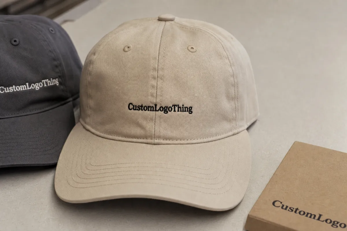
For a home fragrance brand, an embroidered baseball cap can carry more weight than it looks like it should. It travels to trade shows, showroom visits, retail floors, launch kits, and staff uniforms, where the logo has to read cleanly and still feel on-brand. That is why the home fragrance embroidered baseball caps Digital Proof Checklist matters before production starts: once the thread is down, every mistake gets more expensive. A flat mockup can hide the parts that actually affect quality, including crown curvature, seam breaks, stitch density, and how a thin mark behaves on a structured front panel.
Proofing is not a design formality. It is the point where the order stops being an idea and starts becoming a physical object with limitations. A good proof answers practical questions: Is the cap the right silhouette? Has the logo been adjusted for embroidery? Are the thread colors realistic? Does the size fit the front panel without crowding the seam? If those answers are visible, approval is faster and the stitched result is less likely to surprise anyone.
Home fragrance embroidered baseball caps digital proof checklist: what the proof must show
The proof should show exactly what will be made, not an attractive approximation. That means the correct cap style, the artwork in the correct scale, the intended thread colors, and any construction notes that affect embroidery. A sales mockup can help the brand team imagine the item. A production proof has a different job: it keeps the factory from guessing.
That distinction matters because caps are shaped objects. A six-panel structured cap behaves differently from a relaxed, low-profile cap; the same logo can sit more upright on one and more curved on the other. A design that looks centered on a screen may shift once it meets the front panel seam, and a wordmark that looks balanced in a digital layout can feel too high, too wide, or too cramped on the actual crown. For fragrance brands, this is not a minor detail. These caps often sit beside candles, diffusers, room sprays, or hospitality kits, where the item has to feel polished instead of promotional.
Most proof problems are predictable. The artwork is not the issue; the lack of specificity is. If the proof does not show the stitch field, the cap blank, or the alignment relative to the seam and bill, the buyer is forced to approve on instinct. That is risky. Embroidery carries physical limits: tiny text can fill in, thin strokes can break, and highly detailed marks can lose clarity once the thread is pulled through fabric.
A clean approval is cheaper than correction. Once a cap is stitched, rework usually means lost time, added labor, and a result that still may not match the original intention exactly.
Embroidery proof process and timeline: from artwork upload to approval
The smoothest orders start with usable artwork. Vector files such as AI, EPS, or PDF give the digitizer a clean foundation. If the file is a low-resolution JPEG or PNG, the proof stage often takes longer because someone has to interpret edges, rebuild shapes, or simplify details that were never built for thread. That is not a cosmetic issue; it affects the stitch path and, ultimately, the look of the final cap.
Digitizing is the real bridge between art and production. It is not a file conversion. The artwork is translated into stitch logic, which means the digitizer decides stitch direction, density, underlay, pull compensation, and how the design will behave on a curved front panel. A clean logo can still need changes. Thin serif letters may need to be thickened. Small counters may need opening up. Tight outlines may need to be adjusted so the design does not close in after stitching.
The usual path looks like this:
- Artwork review and file cleanup.
- Digitizing and stitch simulation.
- Initial digital proof delivery.
- Buyer review and revision notes, if needed.
- Final approval and release to production.
Timing depends on a few factors that buyers can actually control. File quality is one. Stitch count is another. Cap availability, thread color count, and the number of decision-makers on the buyer side also matter. A simple one-color mark on a standard cap may move quickly. A multi-color logo with tiny lettering, gradients that need simplification, or a special blank can require more back-and-forth. In many orders, the biggest delay is not machine capacity; it is waiting for a clear decision from the buyer’s side.
A consolidated response saves time. One person should gather comments, resolve internal disagreement, and send one clean approval or revision list. If marketing wants the logo larger, operations wants a darker cap, and procurement wants the price held at the original number, the proof can sit unresolved for days. The order does not move until the comments become one instruction set.
Placement, size, and structure checks for a clean baseball cap build
Cap structure changes the final look more than many buyers expect. A structured cap holds the embroidery with a firmer, more upright presentation. A softer cap allows the front panel to relax, which can make the same logo look slightly lower and less rigid. Neither is inherently better. They simply communicate different things. For a home fragrance brand trying to look tidy, premium, and retail-ready, the cap style should match the brand posture, not just the lowest available price.
Placement should always be reviewed on the actual cap silhouette. A logo centered on a flat artboard can still sit too close to the seam once it is mapped onto a curved crown. That matters because seam breaks can distort letters and make a mark harder to read. If a wordmark is forced into the center seam or pushed too close to the side panel, the embroidery can look uneven even when the proof image appears symmetrical.
Size is just as important. Too small, and the logo disappears at a distance or under retail lighting. Too large, and the cap starts to look loud rather than branded. The right size is usually the one that reads clearly from a few feet away while leaving enough breathing room around the front panel. That sweet spot changes by cap style. A mid-profile cap typically tolerates a broader logo field than a low-profile or unstructured style.
There are also practical construction details that affect approval. Bill shape changes the visual balance of the crown. Closure type can alter how the cap sits on the head. Fabric matters too: cotton twill, brushed cotton, polyester blends, and foam-front styles each behave differently under thread. A dense logo on a soft front panel may pull differently than the same logo on a firm buckram-backed cap. Buyers often spot that only after the proof is explained carefully, which is why the proof should note the blank spec, not just the decoration.
If the cap is part of a larger retail shipment or a bundled campaign, transit deserves attention. Packaging, insert cards, and hang tags should not be treated as afterthoughts. Programs that ship through multiple handling points benefit from packaging tests such as ISTA methods, while paper components should be specified early if FSC-certified materials are part of the brief. Those details are not decoration; they are part of the final product experience.
Cost and pricing: what changes the quote for embroidered caps
Pricing for embroidered caps rarely comes down to the blank alone. The biggest drivers are stitch count, thread color count, digitizing complexity, cap quality, and the turnaround window. A simple one-color logo with clean shapes may be efficient to run. A detailed mark with gradients, fine lines, or small text usually takes more setup time and can raise the unit price because the embroidery has to be simplified before it can be stitched cleanly.
Minimum quantity matters too. A 24-piece order and a 500-piece order may use the same artwork, but the setup cost is spread very differently. That is why small runs often look expensive on a per-unit basis. Premium blanks raise the price as well, especially when buyers want better fabric hand-feel, stronger front structure, or a more polished closure. A brushed twill cap and a foam-front trucker are not comparable jobs just because both end up with embroidery on the front.
Revisions can also affect cost. Some suppliers include one or two proof rounds in the setup, while others charge for extra changes after digitizing begins. The difference shows up fast when the buyer keeps changing the artwork after approval has already been delayed internally. A rushed order can add pressure too, because it compresses the approval window and leaves less room for corrections.
Here is the simplest way to compare quotes without getting lost in the language:
| Pricing Driver | What Usually Raises Cost | Buyer Check |
|---|---|---|
| Stitch count | Larger logos, dense fills, heavy outlines | Ask for an estimated stitch range before approval |
| Thread colors | More color changes and more setup time | Confirm whether a close match or exact match is required |
| Cap blank quality | Better fabric, stronger structure, specialty closures | Compare blank specs, not just the unit price |
| Digitizing complexity | Small text, thin lines, unusual shapes | Check whether any art simplification is needed |
| Turnaround | Rush production and compressed approval windows | Approve quickly if the schedule is tight |
As a rough market range, simple embroidered caps can land in the low single digits per piece at volume, while smaller runs, premium blanks, and intricate artwork can move into a noticeably higher band. Stitched samples are often priced separately, commonly around $35 to $85 plus shipping, because they require actual machine time and physical materials. That sample cost is easy to resist until the first round of production reveals a fit issue that would have cost much more to correct later.
Step-by-step proof approval checklist before production starts
This is the part that protects the order. A home fragrance Embroidered Baseball Caps digital proof checklist should be used line by line, not as a vague visual scan. If the proof is approved too quickly, the job may still ship on time, but it will ship with problems that were easy to catch.
- Check the artwork. Confirm spelling, punctuation, logo lockup, and the exact brand version that should be produced.
- Confirm the cap style. Match the proof to the correct silhouette, profile, closure, and front-panel structure.
- Review placement. Look at center alignment, height from the bill, and seam clearance on the actual cap shape.
- Verify scale. Make sure the logo reads clearly without crowding the front panel or disappearing at distance.
- Review thread intent. Compare thread colors with brand standards, cap fabric, and lighting conditions.
- Read the technical notes. Look for stitch limitations, simplifications, and any changes made for production.
- Lock the approver. Make sure one person signs off so the order does not stall in a committee loop.
That last point is often the one that decides whether the order stays easy. Proofs can bounce between marketing, sales, operations, and procurement, with each team asking for a slightly different change. The result is a moving target. A single owner who gathers feedback and responds once is usually the fastest path. It also creates a better paper trail if the order is reordered later.
Another useful habit is to compare the proof with the spec sheet side by side. If the quote calls for a mid-profile structured cap with a specific front height and the proof shows a different crown shape, stop there and ask for correction. Small differences at the specification stage can create large differences in the stitched result. A pretty mockup is not a substitute for the actual build.
If available, ask for an annotated proof. A marked file that identifies placement, thread colors, and stitch simplification is much easier to approve than a plain image. It also helps the production team stay consistent if there is a reorder, because the decision is documented instead of buried in an email chain.
Common mistakes that cause delays, reproofs, or avoidable rework
The first mistake is sending poor artwork and expecting the proof to rescue it. Low-resolution files can hide blur, jagged edges, and uneven curves until digitizing begins. At that point, the team has to rebuild the logo rather than simply place it, and that usually means more revisions. If the source file is weak, the proof cycle becomes a repair cycle.
The second mistake is forgetting that embroidery sits on a curved surface. A centered logo on paper can drift visually once it is stitched onto a bowed front panel. That is normal. It is also why a proof that looks balanced on a screen can still need adjustment before approval. The material is doing part of the design work, whether the buyer notices it or not.
Color causes its own trouble. Screen color, print color, and thread color are not the same thing. Thread has sheen; cap fabric absorbs light differently depending on its weave; and store lighting can shift a navy toward black or make a warm red feel darker than expected. Exact visual matching across every surface is rarely realistic. The better standard is an approved range that still protects the brand.
Vague feedback slows everything down. “Make it stronger” is not a production instruction. “Increase the logo by 10 percent, move it down slightly, and switch to the brighter blue thread sample” is. The same logic applies to quantity, packaging, and size runs. If the order changes after approval, it may need to be reworked from the beginning, which is expensive in both time and labor.
One of the more overlooked problems is a mismatch between the cap’s purpose and the proof expectations. A cap for a staff uniform does not need the same finish as a retail gift item. A giveaway cap does not need the same stitch density as a premium launch piece. If the brief does not say which result matters most, the proof team is left balancing cost, speed, and visual impact without a clear priority.
Expert tips and next steps for a smoother cap order
Send the cleanest file you have, plus brand color references and a short note on how the caps will be used. A field team cap, for example, may need a tougher and simpler build than a cap that will be tucked into a seasonal gift kit. That context helps the proof team choose a cap style and embroidery treatment that fits the use case instead of guessing at the intent.
Ask for a proof that is specific enough to live beyond the first order. It should show the cap style, the estimated stitch count, the thread colors, the placement measurements, and any simplification done for embroidery. If it only looks nice, it is not detailed enough for production decision-making.
It also helps to keep the approval path short. One owner, one response, one final sign-off. That sounds almost too simple, but it is usually what separates an efficient order from a stalled one. Launch calendars, retail windows, and seasonal programs do not leave much room for repeated internal debate once the proof arrives.
The cleanest sequence is straightforward: collect the right artwork, confirm the cap style, review the proof against the spec sheet, resolve every note, and approve only after the team is aligned. The home fragrance Embroidered Baseball Caps Digital Proof checklist is there to keep the stitch work honest, the budget clearer, and the final cap closer to the brand intent than a generic mockup ever could be.
What should a home fragrance cap digital proof include?
It should show the exact cap style, embroidery placement, artwork scale, and thread color intent. A useful proof also notes stitch limitations, simplifications made for production, and any blank-spec differences that affect the final look. The goal is to approve the real build, not a decorative preview.
How many revisions are normal on embroidered baseball cap proofs?
One to two revisions is common when the artwork is clean and the feedback is specific. More rounds usually happen when the source file is weak, the cap style changes, or multiple people keep sending conflicting comments. Consolidated feedback keeps the timeline under control.
What affects the price of embroidered cap proofs the most?
Stitch count, digitizing complexity, thread color count, cap blank quality, and rush timing are the main drivers. Small orders usually cost more per piece because setup is spread across fewer units. Extra proof rounds can add cost indirectly if they require more digitizing work or production delay.
How long does the proof and production timeline usually take?
A digital proof can often be turned around quickly if the artwork and specifications are ready. Production time depends on order size, blank availability, embroidery complexity, and how fast the buyer approves the proof. Clean files and fast sign-off usually protect the schedule better than anything else.
What file format is best for a baseball cap embroidery proof?
Vector files such as AI, EPS, or PDF are the most reliable starting point. They give the digitizer clean shapes to work from and reduce the chance of interpretation errors. If only a raster file is available, it should be large, sharp, and free of compression artifacts.