The beer embroidered baseball caps Digital Proof Checklist is the difference between a cap order that moves cleanly through production and one that starts leaking time, money, and patience the moment the proof arrives. On a curved crown with seams, vents, and a brim that cuts into the visual field, a polished mockup can look convincing while hiding the problems that matter most. Buyers who treat the proof as a manufacturing document, not decoration, usually catch the expensive mistakes early.
That matters more with brewery merch than with many other promo items. Beer-branded cap art often combines small type, badge shapes, hop icons, and tight color contrast. Those details may look crisp on a screen, then soften once they are translated into thread and placed on a structured front panel. A clean proof cannot guarantee perfection, but it can show whether the design is realistic before anyone starts stitching. If you need a wider view of decoration options across cap styles, the Manufacturing Capabilities page is a useful reference point.
Why the proof catches cap mistakes before you pay for them
Caps are not flat. That sounds obvious until a logo that looked balanced in Illustrator lands on a six-panel front with a center seam and suddenly reads smaller, lower, and less readable than expected. Structured buckram, foam front panels, and low-profile crowns all change how a design sits. Even the closure matters, because a snapback or strapback shifts the visual weight of the whole cap.
The proof exists to expose those conflicts before the order moves into production. A badge logo with thin borders, a brewery name set in narrow uppercase, or a hop cone made of fine interior lines can all survive on screen and fail in thread. Embroidery has limits. Small details can close up, outlines can thicken, and curved stitching can distort proportions in ways a flat mockup never shows.
A familiar failure pattern goes like this: the artwork is approved because it looks clean in a generic mockup. The finished cap then reveals that the logo is too low, the seam bisects the design, or the smallest text is no longer legible from a few feet away. None of those issues are mysterious. They are simply hidden until the proof makes them visible. Good buyers learn to look for them before signing off.
The practical rule is simple. If the proof cannot tell you size, placement, cap style, thread color, and seam clearance in one glance, it is not ready for approval.
A proof should make production risks obvious. If you have to imagine the final cap, the proof is incomplete.
Beer embroidered baseball caps digital proof checklist: what it should show
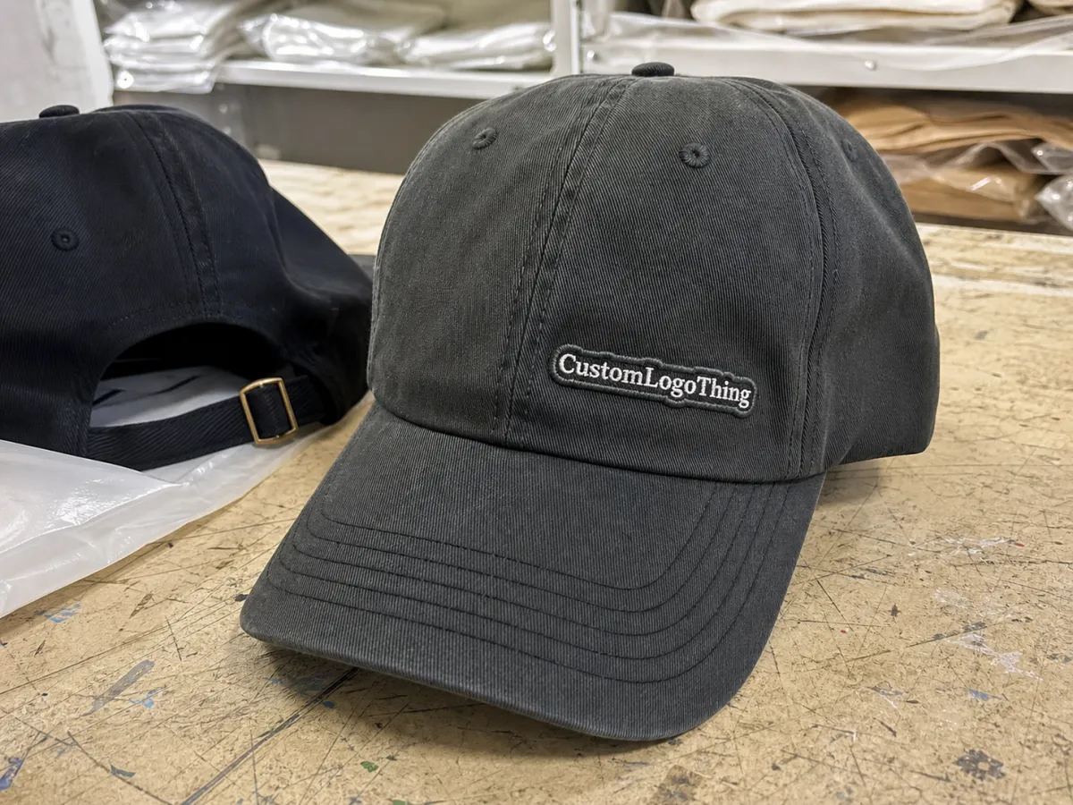
A proper proof is more than a logo dropped onto a stock cap. For a beer Embroidered Baseball Caps digital proof checklist to be useful, it needs to read like a production map. At minimum, it should show the exact cap blank, the decoration method, the art version being approved, the embroidery dimensions, and the thread colors. If the order includes a side hit, back embroidery, or a patch, those elements need their own callouts rather than being buried in a note.
The best proofs also make the invisible decisions visible. Look for the cap SKU, crown shape, whether the front is structured or unstructured, the stitch area in inches or millimeters, and the distance from the seam or brim. A decent production note might say: front embroidery, 3.0 inches wide by 1.25 inches high, centered 0.4 inches above the seam, two thread colors, no underbill print. That is the sort of detail that prevents confusion later.
There is an important difference between a mockup and an approval proof. A mockup is there to show direction. A proof is there to confirm what will actually be made. Mockups can flatter artwork, hide scale problems, and place the design in a visually pleasing spot that would be awkward to stitch. Approval-ready proofs should show what the machine will attempt, not what a marketing deck wishes it could do.
The buyer-side checklist should answer four questions without making you guess:
- How big? Use exact dimensions instead of vague terms like large or prominent.
- Where placed? Show center point, height from the brim, and seam clearance.
- Which cap? Confirm blank style, color, closure, and crown type.
- What threads? List thread colors by code or by a clear physical reference.
For more complex art, ask for multiple views. A single front image can be enough for a one-color logo with bold shapes. It is not enough for a brewery badge with small lettering, layered icons, or 3D puff embroidery. Front, side, and close-up views catch problems at different scales, which matters when the art depends on readable edges.
Not every supplier formats proofs the same way. Some use a polished visual mockup with notes underneath. Others send a more clinical production sheet. The second format is usually better for actual sign-off because it forces the important details into the open. The prettiest proof is rarely the safest one.
Production steps and turnaround: how approval moves
The production path is usually straightforward: artwork review, digitizing, digital proof, buyer corrections if needed, final approval, then production. If a sew-out sample is required, it usually comes before mass stitching. The fastest orders move in one clean loop because the buyer answers all the questions at once rather than piece by piece.
Digitizing is the step that gets underestimated most often. It converts artwork into a stitch file and determines how the machine handles fills, edges, density, and tiny details. Clean vector files in EPS, AI, or PDF format usually move faster and stitch better than a low-resolution PNG sent with a hope and a prayer. When the art needs tracing or redrawing, that extra work can add a day or two before the proof even appears.
Typical timing, assuming the art is usable and the supplier is not rebuilding the design from scratch:
- Artwork review: same day to 1 business day for clean files.
- Digitizing: usually 1 to 2 business days for a straightforward logo.
- Digital proof: same day to 2 business days after digitizing.
- Buyer revisions: a few hours to several days depending on response time.
- Production after approval: often 10 to 15 business days, longer for complex orders.
What slows the schedule? Missing vector art, unclear placement instructions, multiple decision-makers, and feedback delivered in fragments. “Move it a little left” is not enough if the buyer later wants the logo smaller, the cap color changed, and the slogan removed. One vague revision can quietly turn into three production pauses.
That is why the proof stage matters for timing as much as for quality. Once approval is given, the order becomes a chain. If the proof drifts, stitching starts late, packing starts late, and shipping shifts with it. For event merch, brewery launch drops, and promo runs tied to a release date, a delayed proof can be more damaging than a pricing increase.
Buyers who are comparing multiple decoration methods should review the cap decoration capabilities overview before asking for a quote. If the shipment will travel through a warehouse or event setup before anyone wears it, some teams also ask whether packaging should align with ISTA testing guidance. That is not dramatic. It is just a practical way to reduce crushed cartons and bent brims.
| Proof type | Typical cost | Turnaround | Best for | Main tradeoff |
|---|---|---|---|---|
| Digital mockup | $0-$25 | Same day to 2 business days | Early review, simple logos | Looks polished, but can hide stitch issues |
| Production proof | Often included or $15-$50 | 1 to 3 business days | Orders that need exact size and placement | Less attractive, more accurate for approval |
| Sew-out sample | $50-$150 plus shipping | 3 to 7 business days | Fine text, 3D puff, difficult artwork | Adds cost and extends the schedule |
That table explains why a clear proof is worth the attention it demands. If the buyer can lock the artwork quickly, the schedule stays predictable. If the proof needs repeated rebuilding, a routine cap run starts behaving like a rescue job.
Pricing, MOQ, and unit cost: what changes the quote
Cap pricing is rarely just the hat plus the logo. The quote moves with stitch count, number of decoration locations, cap style, and the amount of setup required by the art. A simple one-location embroidered cap can often land in the $3.50 to $6.50 range at moderate volume. Add a second location, 3D puff, a specialty blank, or more involved digitizing, and the unit cost can climb quickly. Low quantities almost always raise the per-piece price because the fixed setup costs have fewer units to absorb them.
MOQ matters for the same reason. Digitizing, machine setup, thread loading, and proof time still exist whether the order is 24 caps or 500. Spread across a larger run, the setup becomes less visible in the unit cost. Spread across a tiny run, it becomes hard to ignore. For staff giveaways or a limited brewery release, a higher price per piece may still be acceptable. For resale or wider distribution, quantity changes the math in a useful way.
Several items can change the quote after the proof stage:
- Art rebuilds: tracing or redrawing weak files takes time.
- Color swaps: more thread changes mean more machine time.
- Placement changes: adding side or back embroidery increases setup.
- Rush schedules: compressed timelines usually carry a premium.
- Special methods: 3D puff, appliqué, patches, or mixed decoration add cost.
Buyers should compare quotes line by line. Does the price include digitizing? Are revisions included? Is the cap blank in the proof the actual blank being priced, or just a placeholder image? Is shipping separate? A quote that looks inexpensive at first can grow once the proof gets approved and the extras surface.
Cap material can also affect cost and stitch behavior. Cotton twill absorbs thread differently than polyester mesh. Wool blend caps can handle certain looks well, but they may not be the best choice for dense embroidery in hot environments. Structured six-panel caps give a more stable embroidery field; unstructured or low-profile caps can look softer, but they leave less room for heavy logos. Those details do not just influence the appearance. They change the machine setup and the amount of adjustment needed to keep the design flat.
For programs that include printed cartons, inserts, or retail hang tags, paper sourcing may matter too. The FSC standard is the one buyers usually reference for certified paper components. It does not affect the stitch file, but it does matter if the cap is part of a packaged merch set with paper goods.
How to check stitch density, placement, and color match
Stitch density is one of the easiest details to ignore and one of the fastest ways to ruin a sample. Too light, and the logo looks thin or patchy, especially on dark caps. Too dense, and the front panel can pucker, flatten, or close up fine detail. The right balance depends on the cap fabric, backing, artwork size, and whether the design is flat embroidery or 3D puff. There is no universal setting that works for every beer cap order.
Placement should be checked with measurements, not instinct. Ask for the logo width and height, plus its distance from the brim and nearest seam. On a structured six-panel cap, a centered front mark might sit roughly 0.25 to 0.5 inch above the seam line, but taller badge art may need different spacing to avoid crowding the crown curve. If the design crosses a seam, ask whether it will be shifted, split, or simplified. Seam collisions are one of the most common reasons a clean logo looks awkward on a finished hat.
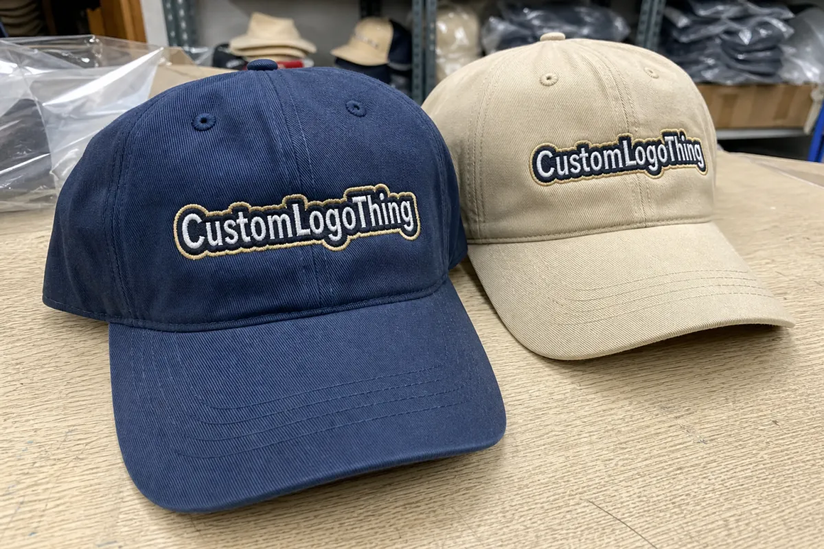
Color is another place where screen assumptions cause expensive surprises. A monitor is not a thread chart. Brightness, contrast, and color settings all distort what you are seeing. Thread should be matched against a Pantone reference, a physical thread card, or a previous approved sample. On dark caps, a mid-tone thread may disappear more than expected. On light caps, a bold thread can look harsher than it did in the mockup. Exact references beat descriptive guesses every time.
Beer branding often leans on details that embroidery struggles to preserve: thin outlines, fine line art, and small sponsor text. Those elements need a harder review than the main logo shape. Zoom in. Read the smallest type at actual size. Ask whether the line weight can survive the stitching process without closing up. If the design only works when everything is perfect, it is too fragile for cap production.
Practical check: before approving the beer embroidered baseball caps Digital Proof Checklist, confirm these three points:
- Can the main mark be read from arm’s length?
- Does the logo fit cleanly inside the embroidery area?
- Do the thread colors still work on the actual cap color?
If any answer is no, ask for another revision. Fixing the proof is inexpensive. Fixing 300 finished caps is not.
Common proof mistakes that wreck embroidered cap orders
The first mistake is approving the wrong cap color because the mockup looked close enough. Close enough is not a specification. Charcoal is not black. Forest green can shift under daylight. Navy can look nearly black on a monitor and obviously blue in hand. If the proof does not match the actual blank, stop and correct it before moving on.
The second mistake is ignoring seam placement. Some designs can cross the seam without issue. Others fall apart visually the moment the seam runs through the center of the mark. Round badges, shield shapes, and logos with text around the perimeter need especially careful review. If seam clearance is not shown, assume it has not been solved.
The third mistake is keeping tiny text that should have been removed. Thin lettering under about 0.12 inch tall can stitch poorly on many caps, especially if the crown fabric has texture. The common excuse is that it will probably be fine. That guess has ruined more merch than weather delays ever did.
Partial approval creates another trap. A buyer may accept the logo size after one revision, then miss that the entire mark is now too low. Or the thread colors are approved, but the art scale changed during the same edit. One correction does not clear the full proof. Every revision deserves a fresh review of the whole layout.
Very dense embroidery can also become a problem on lighter caps. The front panel may pucker, the fabric may lose its clean shape, and the cap can feel heavier than expected. That is especially true when a brewery logo includes a large filled shape, thick outlines, and more than one thread color. A machine can stitch it, but that does not always mean the final result is worth approving.
A good proof should make bad decisions obvious. If the final cap still depends on imagination, the proof is doing too little.
Clean input reduces most of the revision loop. Vector art, the exact cap blank, a target logo width, and one clear approval contact can eliminate a surprising number of delays. The rest comes from reading the proof carefully, which sounds basic until a thousand-dollar order is held up by a missed detail in a footer note.
Next steps before you send artwork and approve the proof
Before sending files, lock the cap model, decoration method, and quantity. If the order needs a structured front, say so. If the event date is fixed, say that too. Buyers waste time when they request “a baseball cap with a brewery logo” and expect the supplier to infer the rest. The cleaner the input, the cleaner the proof.
A short checklist keeps the process honest:
- Confirm the exact cap blank, color, and closure.
- Send vector art or the cleanest source file available.
- State the target logo width and placement preference.
- Ask for the proof on the actual cap style, not a generic template.
- Check seam clearance, thread colors, and small text before approval.
Then compare the proof against the original art line by line. Not vaguely. Line by line. Spelling, spacing, size, placement, and color references all deserve a second look. If anything still feels off, ask for another correction before production begins. The wrong time to discover a low logo or a cramped letterform is after the thread has already been laid down.
If the order includes printed cartons, inserts, or retail hang tags, ask how those pieces will be packed and shipped. Paper components may need certified sourcing, which is where FSC can come back into the conversation. If the caps are headed to a warehouse, trade show, or brewery event, the packing method matters as much as the embroidery. Crushed cartons and bent brims are avoidable problems.
Once the specs are locked, approve the proof, confirm the timeline, and move the order forward. That sequence is boring, which is exactly why it works. The beer embroidered baseball caps Digital Proof Checklist exists to catch the mistakes while they are still lines on a screen, not expensive inventory in a box.
What should a beer embroidered baseball caps digital proof include?
It should clearly show the cap style, the exact logo size, the decoration location, and the thread colors. Any seam limits, crown constraints, or secondary decoration locations need to be visible too. A useful proof matches the actual blank rather than a generic cap image.
How many revisions are normal for beer embroidered baseball cap proofs?
One or two small revision rounds are common on straightforward orders. Bigger artwork changes, file cleanup, or a new cap blank can add time. The fastest revision cycle is usually the one where all feedback is sent together.
Does the digital proof show the final stitch look on embroidered caps?
It shows the planned size, placement, and thread choice, not a perfect finished texture. Final stitch appearance depends on fabric, density, backing, and machine behavior. Thin lines and small text remain the highest-risk areas.
Why does pricing change after the proof on beer cap orders?
Pricing changes when stitch count, decoration locations, or art complexity changes. Rush timing, extra revisions, and sew-out samples can also affect the quote. A locked proof protects the buyer from most surprise adjustments later.
What is the fastest way to approve a beer embroidered baseball caps proof correctly?
Check logo size, placement, cap color, thread colors, and spelling in one pass. Confirm seam clearance and any tiny text before signing off. If one detail still looks questionable, ask for a final correction before production starts.