A hotel cap can look polished or careless in a split second, and the difference often comes down to hotel five panel Caps Logo Placement. For front-desk teams, concierges, valet staff, and event crews, the logo has to read cleanly from a few feet away, hold its shape under lobby lighting, and still feel controlled during a long shift.
Five-panel caps give buyers a different kind of surface than six-panel styles. The front panel is usually flatter and less interrupted, which can make a compact logo look sharper and more deliberate. That same surface can also expose weak artwork faster, especially if the logo is crowded, too detailed, or scaled without checking the actual cap size.
"A good placement does two things at once: it reads instantly and still looks calm when you study it."
That balance matters in hospitality. A hotel cap usually has to signal order, cleanliness, and taste without turning into a billboard. The best placement is rarely the biggest one. It is the one that fits the cap, the uniform, and the level of service the property wants to project.
Hotel five panel caps logo placement: why the front panel matters
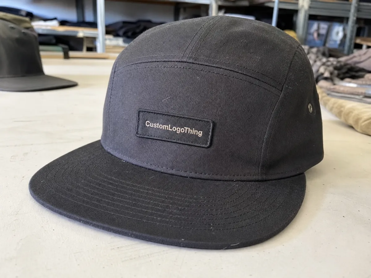
The front panel carries most of the visual weight on a five-panel cap. Unlike a six-panel cap, where a center seam can split a logo or force it into awkward halves, a five-panel front often gives you a cleaner field for branding. That makes it especially useful for short hotel names, monograms, crests, and compact wordmarks.
Placement is not only about where the logo sits. It is also about how the cap is read. Front-center placement tells guests the brand should be seen first. Slightly offset placement feels more restrained. A side hit or low-profile front mark can work for back-of-house or mixed-use uniforms, but those choices change the message.
In guest-facing roles, visibility usually matters most. Someone at a valet stand or front desk is being observed at close range and in motion, so the cap has to be legible quickly, not just attractive in a mockup. For housekeeping or maintenance teams, the logo can be smaller and quieter, but it still needs enough contrast to stay readable.
Spacing is where many orders go wrong. Too close to the brim and the logo feels compressed. Too close to the top button and it starts to look pinched. A clean gap above the visor and below the crown point gives the cap room to breathe, which is especially important on lower-profile five-panel shapes.
How the front panel changes visibility and balance
The five-panel front is often more forgiving than buyers assume, but it still has limits. Because the panel is flatter, small lettering can hold shape better than on a deeply curved crown. That helps with short names and tidy crests. It does not help much if the artwork is too detailed. Thin script, tiny serif text, or layered emblems can degrade quickly once stitched into fabric.
As a starting point, many hotel wordmarks land between 2.25 and 3.25 inches wide on a five-panel cap. That is not a rule, just a practical band that fits many crowns without crowding seams or the brim curve. Long property names often need to be shortened, stacked, or simplified. On a cap, the eye reads proportion, not pixel dimensions.
Decoration method changes the visual math. Embroidery gives a classic, durable result, but every thread path takes up space. Woven patches preserve detail better at small sizes. PVC or rubber patches create a sharper, more contemporary edge, while print or transfer can work for simple graphics and low stitch budgets. The right method depends on how the finished piece will be worn.
Color contrast deserves more attention than it usually gets. A dark logo on a dark cap may look fine in a render and disappear under desk lighting. White, gold, or high-contrast thread often performs better for guest-facing teams. If the palette is subtle, the fix is not always a bigger logo. Sometimes it is a different decoration method or a brighter thread choice.
Departments can share the same cap family without sharing the same placement. A front office cap may need a centered mark with stronger visibility. Banquet staff may do better with a cleaner, smaller front. A side logo can keep a uniform understated while still branded, as long as the overall program stays consistent.
Variables that shape wear, stitching, and brand consistency
Several production details affect the final result, and they are easy to overlook if the focus stays on artwork alone. Crown depth changes how much usable space sits above the brow line. Panel curvature affects whether a logo sits flat or starts to wrap. Stitch count changes both cost and texture. A dense fill can look premium, but it can also pull the fabric if the artwork is too large for the panel.
Material matters too. Cotton twill gives a softer, more familiar hand. Polyester blends can hold shape better and resist moisture more effectively in outdoor or high-traffic roles. Unstructured five-panel caps are lighter and casual; structured caps keep a cleaner front and are usually better when the logo needs to stay crisp. The cap body should be chosen with the decoration method in mind.
Consistency across the uniform program is worth protecting. If one department’s cap sits lower, uses a heavier patch, or shifts the logo an inch left, the overall brand starts to feel pieced together. Guests may not identify the reason, but they notice the drift. A uniform system looks strongest when the placement rules are shared, even if the logo treatments vary by role.
Practical quality control starts before production. Ask whether the supplier digitizes embroidery internally or outsources it. Ask how they handle stitch density for small text. Ask whether the proof shows real measurements, not just a floating logo. Good vendors will tell you where a design becomes unstable. A thin line, for example, can vanish in embroidery even if it looks acceptable on a digital proof.
Packaging and transit protection matter if the caps are being shipped in volume or folded into uniform kits. Cartons designed for repeat handling reduce crushed crowns and bent brims. If paper inserts or hang tags are part of the presentation, FSC-certified paper is a sensible sourcing standard. For transit testing, ISTA methods are the useful reference point.
Cost, pricing, and MOQ tradeoffs
MOQ means minimum order quantity, the smallest run a supplier will produce. For hotel buyers, that number can shape the entire order. A launch may only need 24 to 50 caps. A property refresh across several departments can require 200, 500, or more. The larger the run, the easier it is to spread setup costs. The smaller the run, the more every placement decision matters.
Hotel five panel Caps Logo Placement can influence price because larger artwork, more complex decoration, and extra digitizing work usually add labor. A simple front-center wordmark is the easiest route. A detailed crest, a layered patch, or a logo that has to be resized repeatedly for approval can raise both setup time and per-unit cost. A cleaner, slightly smaller placement often gives the property a better look and a better quote.
Common price ranges for decorated caps usually move with decoration type, artwork complexity, and quantity:
| Decoration method | Typical best use | Common added cost per cap | Notes |
|---|---|---|---|
| Flat embroidery | Simple wordmarks and front-center branding | $1.25-$3.50 | Strong daily-wear value; stitch count can push the price up |
| Woven patch | Fine lines, detailed crests, multi-color logos | $1.75-$4.50 | Holds detail better than small embroidery |
| PVC or rubber patch | Modern, high-contrast branding | $2.00-$5.00 | Durable, but not always the right tone for conservative hotel brands |
| Print or transfer | Very clean graphics and simple logos | $1.00-$2.75 | Depends on cap surface, wear conditions, and finish quality |
Artwork cleanup is another cost factor. Vector files are usually the safest starting point, but if the logo is low resolution or too detailed for the selected placement, digitizing or redraw work may be needed. Basic cleanup often lands around $15 to $45, with more complex fixes costing more. That is the difference between a logo that stitches cleanly and one that turns fuzzy on a curved front panel.
For quote comparisons, ask for three scenarios: 25, 100, and 250 pieces. Those numbers show the real spread between setup-heavy small runs and more efficient bulk orders. They also reveal whether a tighter placement saves money. In many cases, a 2.5-inch logo looks just as professional as a 3.5-inch one, and it keeps the project in a better cost tier.
Process and turnaround: from artwork to approved sample
Most orders follow the same path: artwork submission, placement recommendation, mockup review, sample approval, production, and shipping. The bottlenecks are usually not mysterious. They are nearly always artwork readiness and response time. If the logo file is clean and the placement is agreed early, the order moves faster. If the proof has to be reworked several times, the timeline stretches even when the supplier is doing everything correctly.
Simple embroidered orders on stocked caps often take about 10 to 15 business days after proof approval. Patch work, color matching, and custom sourcing can add time. Busy seasons stretch production schedules further. For hospitality openings, conference dates, and seasonal uniform refreshes, that buffer matters.
The proof should be treated as a decision document. It needs to show the logo at real size, not just centered in empty space. A front, angled, and wear-view mockup tells more than a flat render alone. If the cap is shown on a head model or mannequin, even better. Realistic presentation exposes problems with alignment and proportion that are easy to miss in a standalone artwork file.
Here is the workflow that tends to avoid rework:
- Send vector artwork, brand colors, and the exact wording that must remain unchanged.
- Identify the wearer: front desk, valet, housekeeping, events, or mixed use.
- Choose the decoration method before debating tiny placement changes.
- Review measurements on the proof, not just the look of the logo.
- Approve production only after the size, spacing, and finish all make sense together.
Sizing, proofing, and placement checks
The logo should be measured before it is placed. Width, height, and the smallest detail in the artwork all matter. A crest with tiny serif lettering may need more room than expected. A monogram that looks compact on a laptop screen may still need a wider field once stitched. The usable area on a five-panel cap is less generous than the full front surface suggests, because the brim curve and seam transitions reduce the working zone.
Before approval, check four points: alignment, distance from the brim, clearance from seams or panel edges, and legibility from a normal viewing distance. A good proof should answer whether the logo still works when the wearer is walking, turning, or bending forward. A flat image does not always reveal that. A wear mockup usually does.
For hospitality uniforms, sample-first thinking pays off. Guest services, food and beverage, and maintenance teams may wear the same cap shape, but their environments are different. Staff working outdoors need stronger contrast and sometimes a more durable decoration method. Indoor service roles may benefit from a smaller, quieter logo. A sample shows which choice survives real use.
A practical sizing range for many hotel wordmarks is 2.5 to 3 inches wide on a five-panel cap. Short logos can sometimes sit a little taller. Long hotel names may need to be stacked or abbreviated to avoid a crowded front. The logo should never feel forced just to preserve every character.
What buyers often miss: the cap has to behave well on a person, not just on a screen. A logo can be technically centered and still feel wrong if it sits too low, competes with the brim, or loses contrast in real light.
Common mistakes, expert tips, and practical close
The most common mistake is placing the logo too low. The next is oversizing it because the artwork looks small on a monitor. After that come seam conflicts, thin lettering that disappears in stitching, and decoration choices that do not suit the cap shape. None of these are hard to avoid, but they do require a careful proof and a willingness to simplify the artwork when the cap demands it.
Patterns that tend to cause trouble are predictable:
- Too low: the logo crowds the brim and looks compressed.
- Too large: the logo overwhelms the front panel and loses balance.
- Too detailed: thin lines and small text blur in embroidery.
- Wrong method: the decoration type fights the logo instead of supporting it.
- Weak contrast: the brand disappears under dim indoor light or bright outdoor conditions.
A few production habits help keep the order on track. Use simplified artwork for smaller placements. Ask for proofs that show the cap at actual viewing distance. Keep the branding bold enough to read, but not so large that it dominates the uniform. Make the same placement logic apply across departments unless there is a clear reason to deviate. That consistency is what makes the program feel designed rather than assembled.
In the end, the strongest hotel cap programs tend to share the same qualities: clear files, realistic placement targets, honest material choices, and proofs that are checked against the way staff actually move through the property. Those details do more for the uniform than a louder logo ever will. Good hotel Five Panel Caps logo placement is less about chasing attention and more about making the brand look settled, readable, and fit for daily use.
Where should the logo sit on a hotel five panel cap?
Front-center is the most common choice for guest-facing staff because it gives the fastest read. Keep enough space above the brim so the logo does not feel squeezed, and avoid pushing it too close to the top button. If the artwork is wide, a slightly smaller centered mark usually looks better than forcing the full logo into the panel.
Does embroidery or a patch work better for hotel caps?
Embroidery works well for simple logos and daily wear. Patches are better when the logo has fine detail, small lettering, or multiple colors that need sharper edges. The right answer depends less on trend and more on whether the logo can stay legible at the selected size.
How does placement affect pricing?
Large, dense, or highly detailed placements usually cost more because they need more thread, more machine time, or extra artwork preparation. A cleaner front-center logo often keeps the unit cost lower and reduces approval revisions. The budget impact becomes more obvious on small runs with higher setup weight.
What artwork should I send for an accurate quote?
Send a vector file if possible, along with the exact brand colors and the wording that must stay unchanged. Include the intended wearer and any placement preference you already have, even if it is approximate. That gives the supplier enough information to recommend a realistic size and decoration method.
How long does production usually take after approval?
Simple decorated caps on stock styles can often move in about 10 to 15 business days after proof approval. More complex patch work, color matching, or delayed approvals can extend the schedule. If the order has a hard deadline, the proof stage needs to close early so production time is not eaten by revisions.


