A cap can look polished in a render and still disappear on the show floor. That is the tension behind trade show private label Caps Logo Placement. The hat is moving, the aisle is crowded, and lighting is usually harsher than any approval mockup. A logo that is too small, too low, or too detailed for the crown shape loses the one job that matters: being recognized quickly.
Buyers often start with the decoration method and only later ask where the mark should sit. That sequence causes trouble. The more useful question is simpler: what will a visitor actually see from 10 to 20 feet away, under white expo lights, while someone is walking? The answer depends on blank style, stitch or patch method, logo complexity, and how much of the cap face is usable without distorting the artwork.
Why a front-panel logo can fail under expo lighting
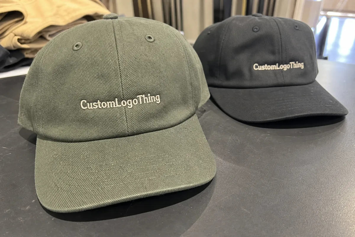
Expo floors are rough on weak artwork. Overhead lights create glare on structured fabrics, badge lanyards break up sightlines, and people only glance at booth staff for a second or two. A front-panel logo that looks crisp on screen can flatten out once it wraps a curved crown. Thin strokes bend. Small type fills in. Fine detail turns muddy faster than most buyers expect.
That failure usually comes down to three things: shape, contrast, and stitch density. A structured front panel gives the decoration a flatter base than an unstructured dad hat. High contrast helps a logo read at distance; dark thread on a dark blank can sink into the cap. Stitch density matters because embroidery is not ink. Heavy fill can make a mark feel solid, but if the design includes tiny counters or thin letterforms, the threads start competing with the art.
There is also the simple matter of viewing angle. Staff caps are often seen slightly above eye level as people walk by. That means a logo sitting too low on the panel can get lost under the curve of the brim shadow. A clean mark in a flat proof can still look cramped once sewn or patched onto a crown with real dimension.
A cap is not a billboard. It is a moving badge with a narrow window to do its job.
The practical test is not difficult. Put the mockup across the room. Look at it from a booth visitor’s distance, not your desk. If the brand reads instantly, you are close. If it needs effort, the cap is decorative first and promotional second.
How private label cap decoration actually works
Most private label cap orders follow a predictable chain: artwork cleanup, digitizing or patch proofing, blank selection, decoration approval, then packing. The step that gets skipped most often is the one in the middle. That is where a logo gets translated into thread, print, leather, PVC, or woven construction that can actually survive production.
Embroidery is still the most common choice for a reason. It is durable, familiar, and cost-efficient for simple marks. On structured truckers and classic dad hats, it usually gives the cleanest balance of price and appearance. The limit is detail. Small text, gradients, hairline strokes, and intricate icons are not embroidery’s strengths. They need simplification or they disappear into the stitch field.
Woven patches hold more detail and can look sharper when the logo includes tighter line work or small type. They are a strong choice for brands that want a retail feel without losing legibility. PVC patches add depth and a sportier edge, while leather patches lean premium and understated. Neither is automatically better. Leather can look elegant on lifestyle merchandise and oddly quiet on a booth staff cap that needs to be seen fast. Printed transfers are useful for gradients, shaded art, and more complex color transitions that do not translate well to stitch.
The decoration method and placement decision should be made together. A woven patch that feels crisp on the front may be too visually busy on a side panel. A small left-front embroidery may be exactly right for a clean retail cap, but useless if the goal is instant recognition from the aisle. If you are coordinating a broader branded kit, the identity on the cap should match the look of labels and tags so the whole package feels intentional. For that, our Custom Labels & Tags options can help keep the presentation aligned.
Blank choice changes the result too. A structured trucker supports bolder decoration and a larger logo field. A low-profile dad hat usually needs cleaner artwork and more restraint. Performance caps are less forgiving because the fabric is slicker, stretchier, and often shaped for athletic wear rather than promotional visibility. That is why solid vendors ask for more than a logo file. They need the blank style, quantity, use case, and expected viewing distance before they can give a useful recommendation.
Trade show private label caps logo placement
Placement is where the cap starts acting like a marketing tool instead of a generic accessory. For trade show Private Label Caps logo placement, the main options are center front, left or right front panel, side panel, and back. Each zone changes how the cap reads, how premium it feels, and how much attention the logo can claim.
Center front is the strongest choice for quick recognition. It is the first place most viewers look, and it usually supports the largest usable logo size. On a structured cap, a logo around 2.5 to 3.5 inches wide is common, with some simple marks able to run larger. On a curved or low-profile crown, that width may need to come down to prevent warping and keep the logo readable. Center front is the closest thing to a default for booth staff caps, but it still depends on the art. A wide wordmark may work; a stacked symbol with tiny text may not.
Left or right front panel gives a more retail look. It feels calmer and often reads as more premium, especially on caps meant to be worn beyond the event. This placement works well for subtle branding, but it is not the best answer if the cap must announce the company from across the hall. It rewards restraint and punishes overcomplicated art.
Side panel placement is intentionally quieter. It can support a short wordmark, icon, URL, or supporting message. Brands with stronger recognition sometimes use the side to make the cap feel like an actual product instead of a walking sign. The tradeoff is visibility. Most people do not see the side first, and on a crowded floor, that matters.
Back placement is best for secondary information. A small web address, event hashtag, or short tagline can work there. It is useful, but it should not carry the entire branding job. If the back is the only visible decoration, the cap usually stops working at trade show distance.
The better rule is practical: choose the placement based on first contact, not the flat mockup. If the cap will be worn by staff greeting visitors head-on, center front usually wins. If it is meant to feel premium and understated, a front-corner or side placement can be more appropriate. Subtle can be effective; subtle and invisible are not the same thing.
It helps to compare the cap with a shirt chest print. A chest logo sits on a flatter surface and has more room to breathe. A cap has more curve, less real estate, and a smaller usable field before the brim begins to interfere. The same logo often needs to be simplified before it works on headwear. That is not a design flaw. It is just the physics of the product.
Pricing, MOQ, and unit cost: what actually changes the quote
Cap pricing is usually more predictable than buyers expect. The biggest drivers are decoration method, logo complexity, cap style, color count, packaging, and minimum order quantity. Requesting a quote before those details are set almost guarantees a wide range. That is not a sign of evasiveness. It is how production math works.
For wholesale blanks, a typical five-panel trucker may land around $1.80 to $4.50 per cap depending on material and build. Dad hats often sit around $2.10 to $5.50. Performance caps usually start higher, commonly $3.50 to $7.00 before decoration because the fabric and construction are more technical. Decoration comes on top of that. A simple one-location embroidery may add about $0.60 to $1.50 per cap on a mid-size run. Woven patches often add $1.10 to $2.80. PVC or leather patches can push higher, especially if the shape is custom or the finish is premium.
| Option | Best For | Typical Add-On Per Cap | Main Tradeoff |
|---|---|---|---|
| Single-color embroidery | Simple logos, fast booth recognition | $0.60-$1.50 | Less detail, but efficient |
| Multi-color embroidery | Cleaner brand marks with 2-4 colors | $0.90-$2.25 | More stitch time, more setup |
| Woven patch | Small type, fine outlines, retail feel | $1.10-$2.80 | Better detail, slightly higher cost |
| PVC or leather patch | Bold branding, premium texture | $1.40-$3.75 | Stronger visual impact, more approval steps |
| Printed transfer | Gradients, shading, complex artwork | $0.75-$2.00 | Good for art, not always the richest feel |
MOQ matters because setup cost gets spread across the order. Digitizing, mold creation, print setup, and pattern adjustments can be easy to absorb over 1,000 pieces and annoying over 50. Smaller runs almost always carry a higher per-cap cost. That is normal. The better question is not how to get the cheapest cap, but how to get the best result for the quantity and deadline that actually exist.
There are sensible places to save. Standard blank styles cost less than custom builds. Fewer thread colors reduce setup. Simpler placement zones reduce production complexity. Skipping custom polybags, inserts, or branded cartons can save a few cents to a dollar per unit, depending on the spec. Still, a slightly better placement can raise perceived value in the booth more than the extra cost suggests. A cap that feels retail usually gets worn. A cap that feels cheap usually gets tucked into a tote and forgotten.
Packaging matters too, though not in a glossy way. A strong carton spec and a basic insert plan do more for arrival quality than decorative boxes that crush in transit. If paper sourcing is under review, FSC-certified cartons are a sensible default. For shipping durability, ISTA publishes widely used test standards that help buyers think beyond the mockup and toward actual transit conditions. That is practical diligence, not paperwork for its own sake.
Production steps and turnaround: from art file to carton
A clean cap order usually follows the same path: quote, artwork review, mockup, digitizing or patch proof, sample approval if needed, bulk production, QC, and packing. If one step is vague, the schedule starts to slip. Usually not by much at first. Then suddenly it does.
The most common delay is not sewing or printing. It is feedback. Buyers send artwork, then take days to answer a question about logo width. Or they approve a proof without confirming placement language. Or they change the cap color after the sample is already built. Those delays are small in isolation and expensive in combination, especially when the caps are tied to a fixed event date.
A straightforward private label cap run often takes 10 to 18 business days after artwork approval. Patch-heavy styles, special packaging, or higher quantities can stretch that to 18 to 25 business days. If a sample is required first, add a few more days for proofing and revision. Shipping time is separate from production time. Mixing those two up is how teams end up paying for expensive freight that was avoidable with better planning.
For trade show deadlines, work backward from the date the caps must be in hand, not from the day the quote arrives. Leave space for one round of art edits, one round of placement confirmation, and a shipping buffer if the order crosses regions or changes carton specs late. A proof sample is worth asking for when the logo has fine detail, unusual proportions, or a placement choice that is not obvious from the mockup. Catching a logo-width problem on a sample costs time; catching it on 5,000 caps costs money.
One useful habit is to review the cap at actual viewing distance, not only as a screen file. A low-profile crown can make a logo look wider or flatter than expected. A physical sample, or at least a large proof, usually reveals proportion issues faster than another email thread can.
If the cap is part of a broader branded package, this is also the point to coordinate with Custom Labels & Tags. The cap, hang tag, and packaging should speak the same visual language. Otherwise the kit starts to feel assembled from separate decisions.
Common mistakes that waste budget and visibility
The most obvious mistake is also the most common: logos that are too small to read from booth distance. If a cap worn by staff requires a close look, the branding is underperforming. The cap may still look expensive, but it is no longer doing the promotional work the buyer paid for.
Bad placement comes next. A main mark placed on a panel that rarely faces the viewer is wasted unless the brief calls for subtle branding. The same problem shows up when buyers choose embroidery for artwork that depends on tiny type. The method and the design have to agree. If they do not, the cap looks compromised rather than premium.
Color contrast is another frequent miss. Dark thread on dark fabric. Gray on charcoal. Tan leather on a tan blank. Those combinations can look tasteful in a sample image and vanish in the aisle. Proofs should be checked for contrast first, style second. A logo that pops on a white screen may disappear on a navy crown.
Brand drift is the slower, more expensive problem. A buyer approves one cap color, then realizes the booth graphics run warmer or cooler. Or they select a patch shape that feels premium but clashes with the carton. Or they overdecorate the cap and end up with something that reads busy instead of branded. Trade show Private Label Caps logo placement should support the identity, not fight with it.
Quality control deserves its own attention. Before bulk release, ask for checks on stitch registration, patch edge cleanliness, color matching, crown symmetry, and brim alignment. On patch orders, confirm that the bond is secure and the patch sits flat with no corner lift. On embroidered caps, inspect the density and the back side of the stitching so loose threads and puckering do not sneak through. Small flaws become obvious under booth lighting, and they are hard to ignore once the caps are worn by front-line staff.
Packaging can go wrong in a quieter way. A fancy box that crushes in transit does less good than a plain carton with a sane spec. If the shipment has to move through multiple hands, ask how the cap is packed, stacked, and protected. Responsible material choices and durable cartons are practical, not decorative. Fancy can wait until the product survives the trip.
Next steps: lock the spec before you request quotes
Before asking for pricing, make three decisions: cap style, decoration method, and logo placement zone. Those choices remove most quote confusion. Without them, the number you get is just a broad estimate. With them, the quote becomes useful.
A practical spec sheet should include the artwork file, Pantone or color references, target quantity, packaging needs, event date, and the cap’s use case. Staff caps need fast recognition. VIP caps can lean more premium. Giveaway caps need to look good enough that people keep them. Those are different jobs, and they should not be treated as interchangeable.
Then review the mockup at real size and real distance. Print it if that helps. Hold it at arm’s length, then across the room. If the logo still reads cleanly, the placement is probably right. If not, simplify. Fewer details, stronger contrast, a better placement zone, or a different decoration method usually solves the problem faster than adding more decoration.
The cleanest approval path is not the most elaborate one. It is the one where mockup, sample, and timeline all agree. If one of those three is off, the order is not ready. That applies whether the run is 50 caps or 5,000. The floor does not care about intent. It only registers whether the brand can be seen.
Where should trade show private label caps logo placement go for maximum visibility?
Center front is usually the strongest choice for fast recognition from a distance. Side placement can look more premium, but it is less immediate. The right answer depends on how staff move through the booth and whether the cap should lead with branding or stay understated.
Is embroidery or a patch better for trade show private label caps logo placement?
Embroidery works well for simple logos and feels permanent, but fine detail can get lost. Patches usually hold more detail and can look more retail-ready, especially in smaller private label runs. The logo itself should drive the choice, not the decoration trend.
How much does trade show private label caps logo placement affect unit cost?
Front embroidery is often the most cost-efficient option when the art is simple. Patches, multiple placements, and custom finishes usually raise the unit price. MOQ matters too, because setup costs are spread across the run and smaller orders carry more overhead per cap.
How long does production usually take for private label caps?
Simple orders can move quickly after artwork approval, but samples and revisions add time. Patch styles, special packaging, and larger quantities usually extend turnaround. Build in extra buffer if the caps must arrive before a fixed trade show date.
What should I approve before finalizing trade show private label caps logo placement?
Check the mockup at realistic viewing distance, not just on screen. Confirm cap style, decoration method, color match, and placement zone in writing. Ask for a sample or proof if the design includes fine details or the timeline is tight.
The short version is straightforward: choose the right cap, match the decoration method to the artwork, and place the logo where a real person will see it first. Do that well and trade show Private Label Caps logo placement becomes a working brand asset instead of another forgettable giveaway.


