For hotel retail merch caps logo placement, the challenge is not finding a cap blank. The real work is making a logo sit naturally on a curved crown that was built to bend, stretch, and hide seams rather than display artwork. That affects legibility, production cost, and how premium the hat feels once it lands in a lobby shop or resort gift store.
Retail caps sell in a very narrow window of attention. Most shoppers glance from 3 to 6 feet away, decide whether the item feels polished, and move on. If the branding reads clearly in that split second, the cap has a better chance of leaving the shelf. If it looks crowded, awkward, or too promotional, it gets passed over even if the fabric is good.
The strongest programs treat cap decoration as merchandising, not just logo application. That means the placement, artwork scale, fabric weight, and closure all need to support the same retail story. A cap can be casual, premium, sporty, or souvenir-like, but it should not feel undecided.
How hotel retail merch caps logo placement works on real caps
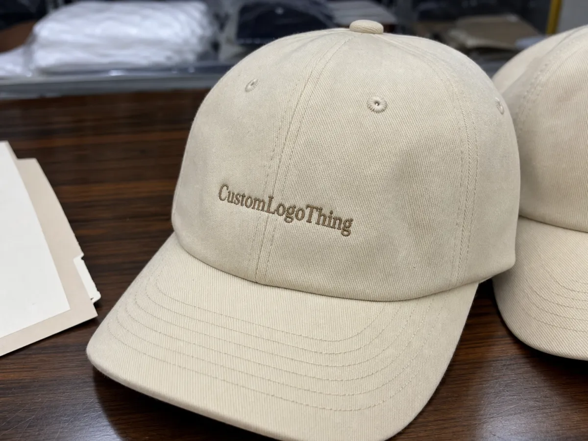
A cap front panel looks larger on a flat screen than it does in production. Once the crown curves, seams meet, and eyelets are punched, the usable branding area shrinks quickly. On a five-panel or six-panel cap, the center panel may be the only truly clean zone, and even that can distort if the artwork is too wide or too tall. That is why hotel Retail Merch Caps logo placement is usually decided by the cap structure first and the artwork second.
The basic terms matter because they shape the spec sheet. The front panel is the main face of the cap. A side hit sits on the left or right side panel and usually carries a smaller mark. A back arch is positioned above the closure and can hold a city name, property mark, or secondary brand element. An under-brim print is hidden from normal view and works best for novelty or premium pieces. A woven patch can preserve detail that stitches would lose, while direct embroidery adds texture and durability.
Hotel retail is different from staff headwear. A uniform cap has to identify the team. A retail cap has to sell itself before anyone puts it on. That changes the placement logic. The logo needs to be readable, but it also needs enough restraint to feel like merchandise rather than a giveaway. A guest will compare it with the rest of the shop assortment, not with the housekeeping uniform.
In practice, the most effective caps usually have one clear focal point. The front owns the brand, the side stays secondary, and the back either stays quiet or carries only a tiny detail. Overbranding a cap tends to make it feel cheaper, not stronger. A cleaner back panel can look more expensive than a crowded one, especially on textured twill or brushed cotton.
Common placement zones
- Front panel: best for primary logo visibility and quick retail recognition.
- Side hit: useful for a monogram, resort initials, or a quieter fashion look.
- Back arch: works for location names, small marks, or minimal text.
- Under-brim: better for limited drops and playful brand moments.
- Patch overlay: useful when the artwork needs detail that embroidery cannot hold.
One useful question can simplify the whole decision: what should the shopper notice first, and what should they notice second? That answer tells you whether the cap should act like a logo piece, a lifestyle accessory, or a subtle souvenir.
How decoration method changes what fits where
Decoration method changes the usable space almost as much as cap construction does. Embroidery works well for bold shapes, short words, and logos that can survive stitch density. Woven patches handle small type and fine borders better because they do not rely on stitch stacking. PVC patches are strong on color blocks and crisp silhouettes, though they can look too shiny for some hotel brands. Applique adds dimension but needs enough room to breathe. Screen print can be cost-efficient on some performance caps, though it usually reads more promotional than retail unless the artwork is simple and the cap is built for that look.
Cap style matters just as much. Structured caps hold their shape and give the logo a steadier base. Unstructured dad caps collapse more, which can make a wide wordmark wrinkle or tilt. Mesh truckers add ventilation, but the open back panels and seams can interrupt placement. Performance caps often have a cleaner technical look, yet their lighter construction can reject dense stitch work or show puckering faster than a heavier twill blank.
A mockup can hide a lot of risk. A mark that looks balanced on a flat template may collide with a seam once it is digitized. Thin letters can close up. A centered logo can appear slightly low after the cap is stitched and pressed. The problem is not always the artwork. Sometimes the cap model itself is the constraint.
That is why a proof should match the exact cap, not a generic silhouette. Ask for a placement view that reflects the crown height, seam layout, and closure type. If the supplier only shows a flat art file on a blank hat outline, the approval is too loose for retail work.
| Decoration option | Typical add-on cost per cap | Best placement zones | What it does well |
|---|---|---|---|
| Direct embroidery | $0.90-$2.25 | Front panel, small back hit | Durable, textured, easy to read from a distance |
| Woven patch | $1.10-$2.60 | Front, side, offset front panel | Holds fine type and small icons better than stitches |
| PVC patch | $1.40-$3.20 | Front, side, novelty retail pieces | Sharp edges, bold color blocks, modern retail feel |
| Screen print | $0.45-$1.20 | Flat front, lightweight performance caps | Low cost for simple art and larger runs |
In rough terms, embroidery is still the safest choice for immediate front-panel recognition. Patches usually win when the logo needs more detail or when the branding should feel a little more fashion-forward. That does not hold true for every cap, but it is a useful default before sampling starts.
Rule of thumb: if the logo has to be read instantly, front placement pays for itself. If the goal is a retail accessory that feels less like a uniform, a smaller side or back mark can work better.
Cost, MOQ, and unit price drivers for cap programs
Cap pricing is shaped by a stack of small decisions. The blank is the first one. A brushed cotton dad cap, a structured snapback, a trucker with mesh panels, and a performance cap are not interchangeable from a cost standpoint. Add decoration, and the gap widens again. Stitch count, patch construction, thread count, closure type, and finishing all change the final number.
MOQ has a direct effect on unit price. A run of 100 to 250 caps often costs more per piece than 1,000 or 2,500 because setup costs are spread across fewer units. That does not make small runs a mistake. It just means they are a test strategy, not the cheapest route. For a single hotel shop or a seasonal assortment, a smaller order can still be the smarter choice because it limits risk if the style does not move.
Watch the quote carefully. Digitizing, setup, sample charges, label application, hang tags, packaging, and freight can sit outside the headline unit price. A supplier with a low cap price may end up more expensive once the full landed cost is added. The number that matters is the cost to dock or to store shelf, not the number on the first line of the estimate.
Retail caps and promo caps are not priced the same for a reason. Retail versions often use denser fabric, cleaner stitching, better closures, and patches that feel more substantial in hand. That extra quality can matter if the cap is displayed next to other retail goods rather than handed out free. A hat that sells through quickly is cheaper in practical terms, even if the production cost is higher.
Typical planning ranges help set expectations:
- Decorated stock caps: often land around $4.50-$7.50 all-in before freight at moderate volumes.
- Retail-grade caps with patches: often land around $6.75-$11.00 all-in before freight, depending on blank quality.
- Custom packaging or hang tags: can add $0.25-$1.20 per unit, depending on materials and finishing.
Packaging deserves more attention than it usually gets. If caps are packed for shelf sale, the carton and inner packing should survive transit without crushing the crown or bending the bill. A supplier should be able to explain how they pack for shape retention. If their cartons have never been tested for shipment stress, that is a weak point. A testing reference aligned with ISTA is a sensible baseline. If the retail insert includes paper tags or printed cards, an FSC claim may matter to hotel buyers who care about responsible sourcing.
Production steps and turnaround from mockup to delivery
The production flow is usually straightforward: brief, art cleanup, digitizing, proofing, sampling, bulk production, finishing, and pack-out. The trouble shows up when a step gets rushed or skipped. Most late deliveries are caused by approval delays, missing information, or a placement change after sampling. Those are avoidable problems if the buyer is strict about the spec early.
- Brief: define cap style, decoration method, placement, target price, and pack requirements.
- Art cleanup: remove tiny details, confirm logo proportions, and simplify weak lines.
- Digitizing: convert the artwork for stitch output and check density, direction, and trim points.
- Digital proof: review scale, placement, and color against the actual cap model.
- Sample or pre-production proof: verify the finished look before bulk production begins.
- Bulk run and finishing: trim threads, press the cap, apply labels, and pack for shipment.
Lead times vary for reasons that are easy to underestimate. Stock blank availability can add days. Seasonal demand can slow a factory queue. If the stitch file needs revisions because the logo is too fine or the crown is too shallow, that can push the schedule by a production week or more. Custom tags, barcode labels, and polybagging add time too, even when the decoration itself is simple.
First-time orders almost always take longer than reorders. That is normal. The first round has to settle the artwork, placement, sample approval, and pack-out details. Once those are locked, a reorder moves faster because the supplier is repeating an approved build rather than recreating one.
One small habit saves a lot of back-and-forth: approve the placement on a written spec sheet before production starts. A request to move the logo higher or widen the patch after sampling sounds minor, but it can trigger a new proof and a new approval cycle. That is how a one-day decision turns into a week-long delay.
What a solid spec sheet should include
- Cap model, panel count, and closure type
- Fabric, color, and finish
- Decoration method and thread or patch colors
- Exact placement map with measurements
- Target retail price and packing requirements
A digital rendering is a forecast. A sample is the truth.
Brand rules that keep front, side, and back placements coherent
Strong hotel retail programs treat the cap like a small branding system, not a blank canvas. The front should carry the main message. Any secondary mark should be smaller and clearly subordinate. The back should stay quiet unless there is a strong reason to use it. That hierarchy keeps the cap from feeling cluttered or confused.
Contrast changes the reading of the logo more than many buyers expect. Thread sheen, cap color, fabric texture, and retail lighting all affect legibility. A tonal navy cap may look rich in a photo but disappear under warm lobby lights. A high-contrast woven patch can solve that without making the cap loud. On the other hand, a bright patch on a muted cap can feel too promotional if the rest of the merchandise is restrained.
Style also shapes perception. A dad cap feels relaxed and familiar. A snapback feels sharper. A trucker cap brings retro energy. A performance cap suggests lightness and utility. These cues matter because a front desk item, a spa item, and a gift-shop item usually do not need the same tone. The decoration should match the part of the property where it will be sold.
That is where hotel Retail Merch Caps logo placement stops being a decoration issue and becomes a merchandising decision. A front desk display may need a bolder logo with fast recognition. A premium welcome-gift cap may need a quieter side hit. A resort shop can tolerate more personality if the rest of the assortment is balanced.
Useful merchandising roles look like this:
- Front desk: high recognition, easy guest read, minimal confusion.
- Concierge: polished but approachable, often with restrained branding.
- Spa: softer materials, lower contrast, premium feel.
- Gift shop: stronger shelf impact and clearer logo ownership.
Many buyers try to apply one visual rule across every outlet. That tends to flatten the assortment. A better approach is to keep the placement logic consistent while allowing the cap styles and decoration scale to vary. One hero cap, one quieter version, and one alternate colorway is often enough to give the store range without losing cohesion.
Common mistakes that make branded caps look off
The fastest way to make a cap look cheap is to oversize the artwork until it collides with seams, eyelets, or crown curvature. Once that happens, the logo stops looking deliberate. It starts looking forced. The cap may still fit fine, but it will not hold its place as retail product.
Designing only for the mockup is another common mistake. A flat art file hides how the logo will wrap around a real cap. A circle can flatten. A wordmark can crowd the last letter. Thin type can fill in during embroidery. Small registration details can disappear. If the approval process ends at the digital proof, the buyer has not actually approved the finished look.
Hardware can ruin good placement too. Closures, mesh panels, seam intersections, and ventilation holes all affect where the logo can sit. A back arch can clash with a buckle. A side hit can land on an adjustment strap. A front panel can look centered in artwork and still drift once the cap is sewn, pressed, and packed.
Another strategic mistake is treating a retail cap and an employee cap as the same item. They are not. Retail headwear usually needs more polish and less operational messaging. Uniform pieces can be clearer and more functional. Blending the two jobs usually weakens both.
There is also a softer mistake that shows up often: too much branding for the fabric and style. On darker caps with texture, a smaller and cleaner logo often looks more expensive than a large one. A restrained mark can make the cap feel intentional. A big one can make it feel like an event giveaway, even if the materials are good.
Next steps: build the spec, quote, and sample plan
Start with a spec sheet that does the boring work properly. Cap style, fabric, color, decoration method, placement map, target retail price, and packing requirements all belong in the same place. If the hotel has multiple outlets, note which version belongs in each store. That avoids mixed stock and keeps the assortment readable to shoppers.
Create front, side, and back artwork views before requesting a quote. A single logo file is rarely enough for a clean cap program because placement changes how the brand reads. Suppliers can price more accurately when they see all relevant views. They can also flag conflicts earlier, before anyone starts sampling.
Request at least two quotes that include MOQ, sample timing, revision policy, and freight. Otherwise you are comparing headline pricing rather than landed cost. A cap that looks cheaper on paper can become the expensive option once shipping, label fees, and a second sample round are counted.
Approve a physical sample or a true pre-production proof before bulk production. Inspect the first dozen units against the spec, not just one pretty sample. Thread color variation, patch misalignment, and logos that sit slightly too low are easier to catch early. Fixing those issues on the first carton is far less painful than discovering them after the whole run is packed.
Keep the approved spec as the reorder template. That is how hotel Retail Merch Caps logo placement stays consistent across replenishment runs. Guests notice that kind of consistency even if they cannot name it. A coordinated shop feels more credible, and a credible shop usually sells better.
Where should hotel retail merch caps logo placement go for the best shelf visibility?
Place the primary mark on the front panel if the cap has to be recognized quickly from a distance. Use a side or back placement only when the front needs to stay clean for a softer or more premium look. Check the exact cap shape first, because seams and crown curvature can reduce the usable area more than expected.
Is front embroidery better than side placement for hotel retail caps?
Front embroidery usually wins for visibility and brand recall. Side placement works better when the cap should feel quieter or more fashion-led. The right choice depends on how the item will sit on the shelf and how much brand presence the property wants in that space.
What affects custom cap pricing the most for hotel retail programs?
Cap quality, decoration method, stitch count, and the number of placements drive most of the price swing. Setup fees, digitizing, packaging, and freight can shift the landed cost more than buyers expect. MOQ matters too, because smaller runs usually raise the unit price.
How long does a first run of branded hotel caps usually take?
First runs take longer because art cleanup, placement approval, and sampling happen before bulk production begins. Slow approvals and late changes are the most common causes of delay. Reorders move faster once the cap style and stitch file are already approved.
What should I approve before placing a bulk order for hotel caps?
Approve the exact cap model, placement map, decoration method, and thread or patch colors. Review a physical sample or pre-production proof whenever possible. Confirm MOQ, turnaround, and reprint policy so the order does not get derailed later.
For most properties, the winning formula is simple: define the brand hierarchy, price the cap on landed cost, and verify the sample before scaling. That is how hotel retail merch Caps Logo Placement becomes a repeatable retail system rather than a guessing exercise.


