If a guest opens a mailer and sees a clean logo right away, the bag feels considered; if the mark lands under a flap, a seam, or a shipping label, the whole piece loses value fast. That is why a hotel retail Custom Poly Mailer Bags logo placement guide is not just a design note. It is a production tool that keeps the bag looking polished after packing, sealing, sorting, and transit.
In hotel retail, the mailer often does two jobs at once: it protects soft goods and it acts as a small piece of retail packaging that carries the brand out the door. A good placement plan keeps the logo readable, keeps the bag reusable enough that guests may hold on to it, and reduces the risk of a print run coming back with artwork sitting too close to a fold line.
Why Logo Placement Decides Whether Guests Keep the Mailer
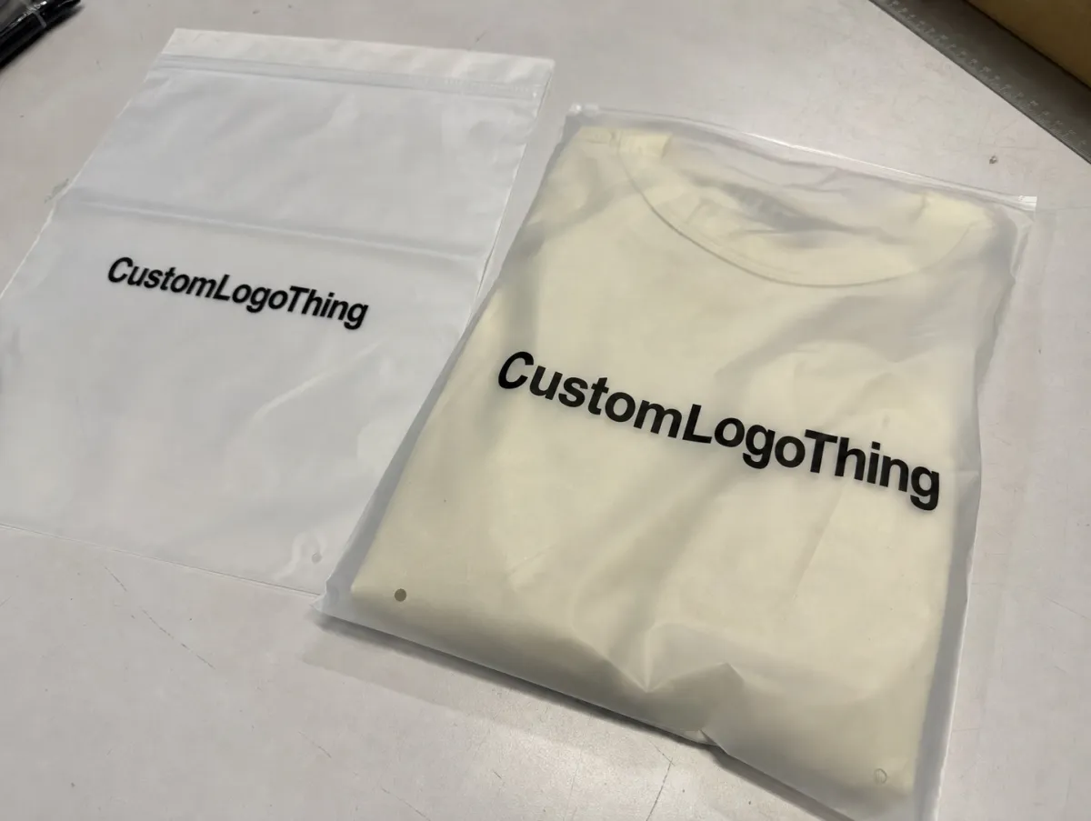
Think about the last time you received a nice package in a plain poly bag. If the print was centered, crisp, and easy to read, the bag probably felt closer to branded packaging than disposable shipping material. If the logo was cut off by a seal or hidden by the courier label, the bag still did its mechanical job, but it did very little for package branding.
That difference matters in hotel retail because the mailer is part protection device, part presentation layer. A front-panel logo feels closer to a finished product package. A logo buried near the edge can make even an expensive bag read like a generic shipper. Guests notice that difference, especially when the mailer holds apparel, slippers, robes, amenity kits, or other soft goods tied to the hotel experience.
The main printable zones are usually straightforward:
- Front face - the largest uninterrupted area and usually the best choice for the primary logo.
- Back face - useful for a secondary brand mark, a website, or a short support line.
- Flap area - only workable if the construction and adhesive layout leave enough room.
- Side zones - limited and often risky unless the bag style is built for side printing.
A placement plan should start with the visual goal, then be checked against the real bag structure. The best-looking artwork on a flat screen can still fail if the filled bag shifts the image into a crease or if the shipping label steals the first glance. In practice, the artwork is only half the equation; the other half is how the bag behaves once it is sealed and handled.
For buyers comparing formats, it helps to evaluate the mailer the same way they would evaluate custom printed boxes or other retail packaging: where will the customer’s eye land first, and what will still be visible after handling? That one question usually decides the layout.
How Custom Poly Mailer Printing Works on Film
Poly mailers are printed on film, not paper, and that changes how the logo should be prepared. Film can stretch slightly during production, heat sealing, filling, and transport, so artwork needs breathing room around the edges. A mark that looks perfectly centered in the file can drift a few millimeters on the finished bag if the safe zone is too tight.
Most Hotel Retail Buyers do better when they review a flat proof or dieline before production. That proof should show where the logo lands on the actual mailer shape, not just on a generic rectangle. The common mistake is approving a floating artwork file without checking the real fold, flap, and seal positions. Once the bag is filled, those details change how the print is seen.
Material choice matters as much as placement. A 2.0 to 2.5 mil LDPE mailer is often a practical middle ground for hotel retail: light enough to keep freight under control, thick enough to handle packing without wrinkling too aggressively. Thinner film can lower cost, but it shows crinkles sooner and makes small type harder to read. Heavier film holds a flatter panel, which gives centered logos a cleaner stage. Matte finishes cut glare under lobby or backroom lighting; gloss finishes look brighter, but they can make low-contrast art harder to read from a distance.
Print method matters too. Simple one- or two-color designs usually hold sharper edges and cleaner small type than dense multicolor artwork. On darker film, you may need white ink or a white underprint so the logo does not sink into the background. On metallic or patterned mailers, contrast becomes even more important because the surface already has visual movement.
Flexographic printing is still the common choice for larger runs because spot colors stay consistent and the cost per bag improves as quantity rises. Digital printing can make sense for lower MOQs or artwork changes, but the unit price is usually higher and color consistency depends more heavily on file prep. Gravure appears in higher-volume programs where image sharpness and repeatability justify the setup. The right answer is rarely the fanciest method; it is the one that matches the order size, color count, and timeline.
For teams that want a deeper technical reference on packaging and transit performance, the ISTA packaging testing standards are a useful benchmark. If the retail packaging also ties into sustainability goals, the EPA sustainable materials guidance is worth reviewing as well, especially when appearance, material use, and disposal need to be balanced without losing print quality.
One more practical note: keep the artwork file clean. Vector logos, outlined fonts, and clearly defined spot colors save time during prepress review, and they reduce the chance of soft edges on press. That matters even more when the design needs exact margins on a small bag.
Sizing, Panels, and Brand Factors That Change Placement
Bag size changes the visual balance more than many buyers expect. A logo that looks properly scaled on a small 10 x 13 mailer can feel undersized on a larger 14 x 19 bag if the art is not resized with the panel. The reverse happens too: a bold mark that feels elegant on a compact bag can overpower the face of a larger mailer.
The product mix matters just as much. Retail apparel, folded towels, gift sets, and amenity kits all fill a bag differently, and each fill level changes what the customer notices first. A slim item may leave the artwork flat and clean, while a bulkier item rounds the panel and pulls attention toward the center. That is why packaging design has to account for the contents, not just the empty bag.
For hotel retail, the most useful size questions are simple ones: how much of the front panel remains visible after the item is inside, how close is the opening to the brand mark, and will the bag still read clearly if the contents shift during handling? Those details matter more than the render.
Placement decisions usually come down to a few choices:
- Single-sided branding for a cleaner, more premium look.
- Double-sided branding if you want visibility from multiple angles.
- Logo-only art for a restrained hotel retail feel.
- Logo plus web or support text when the bag should also act as a contact point.
- Clean flap when the opening area needs to stay visually quiet.
Legibility should always win over decoration. Fine-line logos, small serif type, and thin taglines are all possible, but they need enough size and contrast to survive print on film. A useful rule of thumb: if the smallest stroke in the logo is hard to read from arm’s length on a screen, it is probably too delicate for a mailer unless the print method and bag size are especially forgiving.
Leave room for shipping labels and barcodes. A beautifully placed logo can still feel cluttered if the label lands on top of the design area or competes with the brand mark. Reserve a clear zone for fulfillment, and the bag usually looks far more finished.
One quiet but useful observation from production: most bad placements are not dramatic failures. They are 5 to 10 mm off. That is enough to make a centered logo feel crowded, especially once the bag is heat-sealed and folded for carton packing. On film, small errors read larger than they do on paper.
Cost, Pricing, MOQ, and Quote Variables
Price is usually driven by a handful of variables: bag size, film thickness, print coverage, color count, and whether the design is printed on one side or both. A simple one-color logo on a standard-size mailer is easier to price than a full-coverage design with multiple ink layers, white underprint, and back-panel copy.
Working ranges help buyers compare quotes. In many programs, a straightforward one-color mailer can land in the low tens of cents per bag at decent volume, while low-MOQ or specialty work can move into the mid-double-digits per piece or higher. Larger sizes, heavier film, extra colors, matte or metallic finishes, and freight all push the number upward. Exact pricing swings by supplier, region, and order quantity, so the quote matters more than any single benchmark.
MOQ changes the economics in a very real way. When a run is small, setup, proofing, and any plate or prepress work get spread across fewer bags, so the unit cost rises. Larger runs usually bring the per-bag price down, but only if the layout is stable and the print plan is already approved.
Here is a practical way buyers often compare options:
| Option | Typical Price Pressure | Best Use | Placement Notes |
|---|---|---|---|
| One-color front logo | Lower | Simple hotel retail runs, clean branding | Best for centered placement with strong contrast |
| Two-color logo with small text | Moderate | Retail packaging with website or support line | Needs wider safe margins and proof review |
| Front and back print | Moderate to higher | Broader brand visibility | Back panel should stay secondary to the main mark |
| Heavy coverage or specialty film | Higher | Luxury presentation, limited runs | Contrast, cure time, and alignment matter more |
Buyers should also expect separate line items for sample production, art cleanup, rush scheduling, and freight. Freight can surprise teams because poly mailers are light individually but bulky in cartons, and dimensional shipping can matter more than the bag weight. If you are comparing Custom Poly Mailers with other Custom Packaging Products, ask for the full landed cost, not just the print price.
Honestly, the simplest design is often the smartest. A strong logo placed well can do more for perceived value than a crowded layout that tries to say too much. In hotel retail, restraint usually reads as confidence.
Process and Timeline: From Artwork to Approved Proof
The process usually starts with four basics: logo file, bag size, quantity, and target ship date. If any one of those changes late, the proof may need to be rebuilt, which can push the schedule back. That is why a hotel retail custom Poly Mailer Bags logo placement guide should be part of the quote request, not an afterthought.
The first proof should show the exact placement on the chosen mailer style. A floating logo on a blank canvas is not enough. Buyers need to see the flap, the safe zones, the print area, and any line of text that might sit too close to an edge. That is where most revisions happen.
A practical revision loop looks like this:
- Check logo position against the actual mailer dimensions.
- Verify contrast on the chosen film color.
- Confirm that text clears seams, folds, and adhesive areas.
- Review how labels, barcodes, or return marks will interact with the print.
- Approve only after the filled-bag view still looks balanced.
Timelines vary, but a common production path includes file cleanup, proof revisions, production scheduling, printing, curing or drying if the ink system requires it, and then packing plus freight. Many custom runs move from proof approval to shipment in about 12 to 15 business days, while more complex jobs can take two to four weeks. If a sample is needed first, add time. If the art needs a white underprint, add more. Rush orders are possible, but they usually cost more and leave less room for correction.
From a buyer’s point of view, the fastest way to protect the schedule is to send a clean logo file and a clear placement request up front. Every extra round of guesswork costs time.
Quality control should not stop at proof approval. Ask how the supplier checks registration, color drift, seal strength, and label-clearance spacing before shipment. A good factory will usually confirm that the print sits within tolerance, the film is free of major scuffs, and the flap or adhesive area does not interfere with the logo. If a supplier cannot explain the check points, that is a warning sign.
Step-by-Step Placement Workflow for Hotel Buyers
Start with the bag spec. Confirm the finished dimensions, flap style, adhesive area, and whether the logo needs to stay away from an opening edge. A mailer that seals on the back flap needs different artwork spacing than a bag with a tucked closure, and that difference can change the whole layout.
Next, choose the primary side based on how guests first see the bag. Most teams place the main logo on the front panel because it gives the strongest first impression after packing. If there is a secondary mark, keep it small and deliberate. A back-panel URL or return message can work, but only if it does not compete with the main brand mark.
Then build the proof around a true safe zone. Think of it as leaving the logo enough room to breathe so seam shift, trimming variation, and filling distortion do not crowd the artwork. On film, tiny production changes can matter, especially when the art includes thin outlines or centered typography. A margin that feels generous in the file often looks normal on the finished bag.
Finally, test the layout with a sample or a mock pack. Put the real item inside the bag. A folded robe, a tee, or a boxed amenity kit changes the silhouette, and that silhouette changes what the guest sees. This step sounds basic, but it is one of the best ways to avoid approving a flat layout that looks good only when the bag is empty.
If the team is ordering multiple branded pieces together, this is also where package branding should stay consistent across the line. The mailer should feel related to the rest of the retail packaging, even if the materials differ. Color matching, logo spacing, and type treatment all help with that continuity.
A clean workflow also helps hotels that want to compare poly mailers with other custom printed boxes or outer packs. The same visual discipline applies: one clear message, enough white space, and a print area that respects the structure of the package.
For teams that want a practical shortcut, the review sequence can be boiled down to five questions: does the logo sit clear of the seal, is the contrast strong enough, will the label cover anything important, does the filled bag still read cleanly, and can operations pack it without guessing? If any answer is no, the placement needs another pass.
Common Mistakes That Make the Logo Hard to Read
The first mistake is placing the logo too close to a seal, fold, or edge. When artwork sits in that zone, it can get pinched visually, shifted during sealing, or partially covered once the bag is filled. A logo should never depend on perfect alignment right at the edge of the printable area.
The second mistake is trying to fit too much copy into a small space. Some buyers want the logo, website, QR code, return instructions, social handle, and tagline on one side of the bag. That usually creates clutter, not value. The piece starts to feel more like a flyer than a branded mailer.
Third, people sometimes ignore color contrast. A light logo on a glossy mid-tone film can disappear faster than expected, especially under warehouse lighting or hallway lighting at the property. Good contrast is not decoration; it is readability.
Common production issues show up repeatedly:
- Logo too close to a fold line.
- Artwork approved without label placement checked.
- Type too small for film printing.
- Insufficient contrast on dark or metallic mailers.
- Too many messages on one panel.
One more trap: approving a proof without considering the shipping label. A clean retail-facing layout can be ruined if the fulfillment team has no blank space reserved for labels and barcodes. The bag should be designed with operations in mind, not just the brand render.
If the logo includes a fine outline or a narrow wordmark, ask for a close proof review or a physical sample. Small type can survive on screen and fail on film. That gap between digital approval and printed reality is where a lot of avoidable errors happen.
Expert Tips and Next Steps Before You Request a Quote
Ask for the exact bag-size mockup first, not a generic concept. That single step catches a lot of problems early because the panel width, flap height, and safe zone can shift the visual weight of the logo more than buyers expect. The same artwork can feel elegant on one size and crowded on another.
Keep the primary mark strong and the supporting copy minimal. In hotel retail, a single memorable logo often performs better than a busy layout with too many messages. That cleaner approach usually prints with less risk too, which matters when the run is tied to a guest-facing launch.
Practical rule: if a detail is not needed for the guest to recognize the brand, it probably does not belong on the front panel of the mailer.
When the logo includes fine lines, small text, or delicate spacing, request a sample or at least a very close proof review. Film printing can soften detail if the artwork is under-scaled, and that softness becomes obvious once the bag is filled and handled. Designs that look almost right on screen often reveal their weaknesses only after packing, which is why a placement check is worth the extra hour.
If you are comparing suppliers, ask for the following before approving the order:
- Finished bag dimensions and flap style.
- Printable area and safe zone.
- Print method, color count, and any white underprint needs.
- MOQ, unit pricing at different tiers, and setup charges.
- Proof timing, production window, and freight estimate.
That checklist keeps the conversation focused and helps the final piece function as retail packaging, not just a shipping sleeve. It also gives your buyer, merchandiser, or operations lead a cleaner basis for comparison when reviewing options across the rest of the branded packaging program.
For hotel retail teams, the best results usually come from modest choices made early: a good file, a bag spec that matches the product, a primary logo placed on the widest usable face, and a proof that shows the real packaging, not an abstract layout. That is the difference between a mailer that merely carries an order and one that quietly extends the brand after the guest leaves the room.
Where should the logo go on hotel retail custom poly mailer bags for the best visibility?
Place the main logo on the largest uninterrupted face, usually the front panel, because that area stays visible after packing and handling. Keep it away from seams, flap edges, and shipping-label territory so the brand mark does not get cropped or covered. If you add a secondary mark, keep it small and support-oriented, such as a website or a subtle back-panel repeat.
How many colors should I use for custom poly mailer logo placement?
Use the fewest colors that still preserve brand recognition, because simpler art usually prints more cleanly and costs less. If the logo depends on contrast, ask whether a white underprint or spot-color conversion is needed for dark film. For most buyers, a strong one- or two-color layout is easier to place well than a dense multicolor graphic.
What MOQ should I expect for hotel retail custom poly mailer bags?
MOQs vary by size, print method, and number of colors, but smaller quantities usually carry a higher per-bag price. Ask whether the supplier can quote multiple tiers so you can compare unit cost at different order levels. If you only need a pilot run, verify whether the MOQ includes extra setup charges or sample approval steps.
How long does production usually take after the proof is approved?
The timeline depends on art complexity, print method, and the current production queue, so buyers should confirm it before finalizing the order. Build in time for proof revisions, file cleanup, and any sample approval if the placement must be exact. Also account for freight time, since a fast production run can still arrive late if shipping is not planned early.
Can I print both a hotel logo and return instructions on the same mailer?
Yes, but the layout should prioritize the logo first and treat instructions as secondary so the bag does not feel cluttered. Keep return text short, clear, and far enough from seals or labels that it stays readable after the mailer is filled. If space is tight, move instructions to the back panel or reduce them to a simple web address or support line.

