Buyers usually ask for a hotel retail frosted zipper plastic Bags Logo Placement guide because they need the logo to do a very specific job: read quickly from a distance, survive handling, and still look intentional after the bag is filled. Frosted film helps more than many teams expect. It softens glare under hotel lighting, reduces the visual noise behind the product, and gives a logo a cleaner edge than a fully clear bag covered in fingerprints, reflections, and whatever happens to be on the shelf behind it.
Still, placement is not a decorative afterthought. A zipper lane, top seal, side seam, and changing fill level can turn a neat mockup into a cramped real-world package. A logo that looks centered on screen may land too high once the closure is added or disappear behind a folded towel, amenity kit, or boxed retail set. The right answer is rarely the biggest blank space. It is the space customers actually see, with enough margin for the bag to look finished rather than forced.
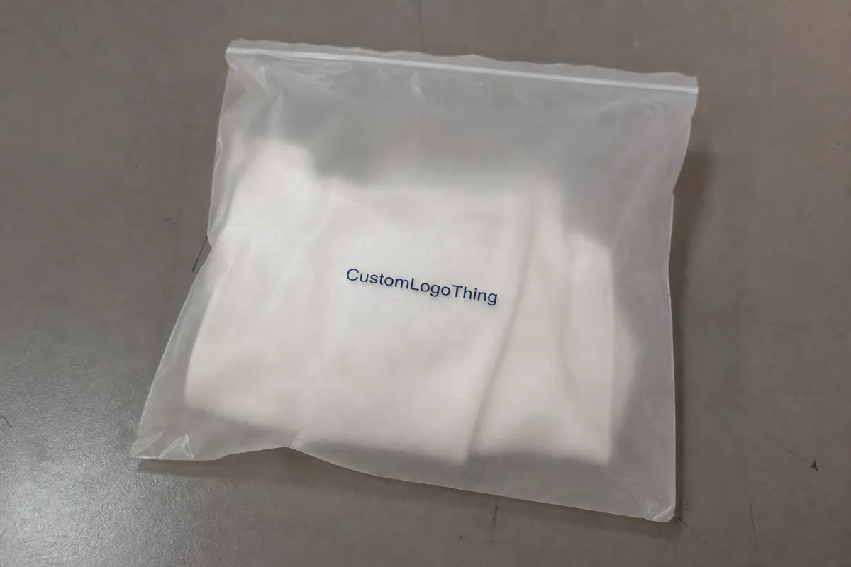
Hotel retail frosted zipper plastic bags logo placement guide basics
Frosted Zipper Bags sit in a useful middle ground for hotel retail. They feel cleaner than a plain transport pouch and less precious than rigid gift packaging. That makes them a good fit for spa items, minibar add-ons, local merchandise, travel-size kits, and bundled souvenirs. The finish also helps hide slight product imperfections, which matters when the contents are not perfectly uniform or when the same bag will hold different SKUs across a season.
The first placement decision should follow display behavior, not the artwork file. If the bag hangs, the upper half usually gets noticed first. If it lies flat in a basket or shelf tray, the center panel carries more visual weight. If the product sits tall inside the bag, the mark needs enough clearance to stay visible above the contents. That sounds obvious on paper. In production, it is one of the most common misses.
Most hotel retail frost bags use LDPE or an LDPE/LLDPE blend in the 2.5 to 4 mil range, though exact construction varies by supplier and price point. Thinner film is cheaper and lighter, but it can wrinkle more and show print distortion when the bag is packed tightly. Thicker film feels more substantial and tends to hold shape better on display, which gives the logo a cleaner frame. Neither choice is universally better. The right one depends on how the bag will be packed, displayed, and handled by staff.
Think of the package as a small billboard with a few irritating constraints. The zipper eats into the top edge. Side seals can clip artwork that pushes too far outward. Fill level changes the apparent scale. And frosted opacity changes contrast in a way that is easy to underestimate on a monitor. The best placement is the one that survives all four conditions at once.
Choosing the best print area on frosted zipper bags
Front-center placement is the safest default for most hotel retail packaging. It reads quickly, leaves room for a product name or short descriptor, and usually stays visible on a shelf. Upper-front placement works better when the bag will hang on a hook or peg, because the lower half can sag once the product goes in. Lower-panel placement can look polished on flat gift sets or pouches with a low fill line, but it is risky if the contents sit high or shift during transport.
The safe zone matters more than many proofs admit. Keep the logo at least 0.25 to 0.5 inch below the top seal and around 0.4 to 0.75 inch away from the zipper lane, depending on bag width and closure bulk. Side seams need similar caution. A design that touches the seam may appear stretched or clipped after sealing, especially on smaller bags like 6 x 8 inch or 7 x 10 inch formats. Larger pouches give more breathing room, but not enough to ignore the structure.
Contents should control the placement choice. A folded shirt, for example, can hide a lower logo if the fold sits high. A tube or narrow bottle may allow a centered mark because the product occupies a slim vertical band. Boxed sets are the trickiest: the box can cover the exact zone that looked perfect in a flat mockup. For that reason, the best proof is one that shows the bag both empty and filled. Flat-only approvals create expensive surprises later.
For smaller bags, legibility becomes a physical constraint. Thin type, long taglines, and delicate icon details often break down once the print area gets under about 2.5 to 3 inches wide. If the logo depends on hairline strokes or fine negative space, ask for a larger print width or a simplified version. A stronger silhouette almost always reads better than a crowded mark trying to say too much on a limited surface.
| Placement option | Best use | Strength | Watchout |
|---|---|---|---|
| Front-center | Shelf display, countertop retail, mixed contents | Fastest read and most balanced look | Can be blocked by bulky contents |
| Upper-front | Hanging display, lightweight bundles, tall products | Stays visible when the bag sags | Too close to the zipper can feel cramped |
| Lower-panel | Flat gift packs, boxed sets, premium retail kits | Looks deliberate when the fill level stays low | Easy to hide under product weight |
If the bag is going to be used across multiple hotel properties or room categories, choose one placement standard and stick to it. That consistency does more than save time. It gives the shelf a calmer rhythm, and that tends to read as premium even when the product itself is modest.
Material, opacity, and zipper details that change the logo outcome
Frosted bags are not all the same, and the differences show up fast in print. A more opaque film reduces glare and hides the contents better, but it also lowers contrast. A pale logo that looks crisp in a mockup can disappear on the actual pouch unless the printer adds a white underbase or uses stronger color density. On semi-clear frosted film, dark artwork often prints with enough contrast to stand on its own. On heavier frost, that same artwork may need help.
Finish matters too. Matte frosted film gives a soft, refined look, but very small type can lose sharpness. Semi-clear frost usually offers more predictable color and a little more depth. Thicker stock feels sturdier in the hand and keeps its shape better when the bag sits on a counter display, which is useful in hotel retail where the package is doing some of the selling. If the bag will travel through housekeeping carts, stockrooms, and multiple touchpoints before it reaches the shopper, a flimsy film can start to look tired before it is even opened.
Zipper construction is another quiet variable. A wide zipper lane reduces the usable print area at the top of the bag, and some closures create a visual band that makes artwork feel cut off even when the dimensions are technically correct. Ask for the exact closure width, not just the bag size. Two bags with identical outer measurements can have very different usable print zones once the seal, slider, or zipper profile is accounted for.
Print method affects the result as well. Flexographic and gravure printing are common for larger custom runs, while some smaller jobs use screen printing or other methods depending on the supplier. Each method has its own sweet spot. Fine detail, color coverage, and edge sharpness are all affected by how the ink sits on frosted film. If the logo uses gradients, small type, or a very thin stroke, ask whether the supplier recommends simplifying the art. A technically correct layout can still print poorly if the line work is too delicate for the film and method.
Good quality control starts before the press runs. Ask for the exact film thickness, closure type, and print method on the specification sheet. Then confirm ink coverage, registration tolerance, and whether the artwork will sit on a white base or print directly on the frosted surface. A digital proof alone does not tell you how the color will behave under hotel lighting. If the logo is color-sensitive, request a physical sample or drawdown when the supplier can provide one. Digital proofs are useful for placement. They are not a reliable substitute for color verification.
For shipping durability, cartons matter almost as much as print quality. A bag that arrives scuffed, creased, or warped can make a good press job look weak. The ISTA test standards are a useful reference when a buyer wants to think about compression, vibration, and drop risk during transit. That is not a print-spec issue, but distribution damage can ruin the presentation just as effectively as a bad proof.
Pricing, MOQ, and unit cost for hotel retail orders
Quote pricing usually comes down to bag size, film thickness, print colors, white underbase, zipper style, and whether the logo prints on one side or both. Special finishes can push costs higher, though Frosted Zipper Bags usually stay calmer than high-gloss promotional packaging. Placement by itself rarely changes cost much unless it affects artwork coverage, color count, or registration difficulty.
MOQ reality is straightforward. Smaller runs carry more setup cost per unit because the press work is spread across fewer bags. Larger runs bring the unit price down, but they also create inventory risk if the hotel updates the branding, switches product mix, or changes seasonal copy. For many hotel retail programs, a practical range sits around 3,000 to 10,000 pieces. Some suppliers go lower, others higher, but that range often balances price and storage without trapping cash in overbuilt inventory.
Here is a planning snapshot for a standard frosted zipper bag with one-color branding and no unusual finishing. Real quotes move around based on freight terms, bag dimensions, and print coverage, so these should be treated as working ranges rather than fixed rules.
| Quantity | Typical unit cost | What usually happens |
|---|---|---|
| 3,000 - 5,000 | $0.22 - $0.42 | Setup costs are felt most here, especially with white underbase |
| 10,000 | $0.14 - $0.28 | Often the middle ground for hotel retail programs with steady sell-through |
| 20,000+ | $0.09 - $0.20 | Better unit economics, but more storage and reorder risk |
Ask for at least three quantity tiers on every quote. That is the fastest way to see where the price drops sharply and where it barely moves. If 5,000 pieces and 10,000 pieces are close in price, the larger run may be the better buy. If the difference is wide, it may be smarter to stay conservative and protect working capital. A bag that sits in storage for a year is not a bargain just because the per-unit price looked good.
Color count changes the math faster than most buyers expect. A one-color logo is usually the most economical. A second color, a white base, or a large ink coverage area can move the quote more than a small tweak in placement. If a design can be simplified without losing brand recognition, the pricing and turnaround often improve together.
"The cheapest quote is not always the cleanest purchase. If the logo lands badly on the bag, you are just paying less to dislike the same problem."
For broader packaging references, the Flexible Packaging Association is useful for terminology and material context. It will not choose the logo placement for you, but it can help a buyer ask better questions.
Production steps, proofing, and turnaround for custom bags
The usual workflow is simple enough on paper: submit artwork, review a digital proof, approve a sample if needed, run production, inspect the output, then ship. The hard part is in the details. Clean vector files speed the process. Low-resolution JPGs slow it down because the proof stage turns into a repair job before the order has even been approved. That is how minor changes become schedule problems.
Proofing can move quickly, sometimes within a couple of days if the bag specification is already locked. Production takes longer. For a straightforward custom zipper bag run, 12 to 20 business days after proof approval is a practical planning range. Complex artwork, multiple print colors, special inks, or a crowded factory schedule can stretch that further. Freight sits outside the production clock and often becomes the part everyone forgot to budget for. It is a familiar pattern: the bags are ready, and then the shipping timeline becomes the real obstacle.
When reviewing the proof, verify the logo scale, the distance from seams and zipper, the bleed area, the final bag dimensions, and the print method. If the proof only shows a flat empty bag, ask for a filled mockup. That extra view often reveals whether the mark will sit above the product or get swallowed by it. For retail bags, that is not a cosmetic concern. It is the difference between visible branding and an expensive rectangle that no one notices.
Good buyers also ask about quality checkpoints. A serious production run should include checks for print registration, zipper closure performance, seal integrity, color consistency, and scuff resistance. Bags can pass a visual proof and still fail in handling if the seal is weak or the zipper feels flimsy. If the order is headed for multiple hotel properties, ask how the supplier handles carton packing and whether the bags are protected from pressure during transit. A crushed shipper can create curling, clouding, or seam stress before the product ever reaches the shelf.
Build a revision buffer into the launch schedule. One missed proof can delay a seasonal retail program long enough to miss the selling window. That is not dramatic. It is just packaging math. Small delays on the front end tend to become large problems when the bags are tied to an event, holiday, or property opening.
Common logo placement mistakes that make bags look cheap
The most common mistake is putting the logo too close to the zipper or top seal. The design looks cramped, and sometimes the top of the mark reads as if it were clipped off. Even a technically accurate print can look rushed if the placement ignores the structure of the pouch. Buyers often approve the artwork because the file looks balanced. Then the bag arrives and the top edge feels crowded.
Oversizing is the second major problem. A logo that stretches to the full bag width often loses proportion and begins to fight the shape of the pouch. A bag is not a poster. If the mark ignores the available vertical and horizontal space, it can feel heavy in one direction and empty in another. Centering does not solve that. Proportion does.
Contrast fails quietly. Thin type, pale ink, and decorative detail can vanish against frosted film, especially under warm hotel lighting or on a display shelf with mixed backgrounds. If the logo uses a delicate line weight, ask for a proof that shows how it reads from a few feet away. Design reviews on a bright monitor are often too forgiving. Real retail lighting is less generous.
Another mistake is designing for the artwork file instead of the actual bag shape. A logo can look clean in Illustrator and still fail on a hook, in a shelf tray, or inside a room-service presentation kit. Buyers see a packaging system. Suppliers see dimensions and print zones. The best results come when both views are aligned before production starts.
Reprints usually happen because the bag was never tested against its real use case. Not because the printer cannot print. That distinction matters. A lot of avoidable waste starts with a good-looking proof that never accounted for fill level, zipper bulk, or where the shopper’s eye lands first.
Expert tips for cleaner branding and faster reorder approvals
Create one placement standard for the whole product line. If each hotel retail kit uses a slightly different logo position, reorders become a search party through old files and half-remembered email threads. Standardization saves time, but it also improves the visual rhythm of the display. Repetition, in this case, is useful. It helps the packaging look planned rather than patched together.
Keep three logo formats ready: horizontal, stacked, and icon-only. That gives you room to adjust if the bag size changes or a smaller pouch needs a simpler mark. A single all-purpose file is convenient until the pouch gets shorter, the print zone shrinks, or the product needs more white space to stay readable. Then the original file becomes a compromise instead of a solution.
Save every approved proof with dimensions, placement notes, print method, and the exact bag style. Put the logo width in writing. Put the safe-zone distance in writing. Put the zipper type in writing. Reorder approvals move much faster when no one has to reconstruct decisions from the previous season’s archive. Version control sounds dull until it saves a two-week delay.
For color work, keep expectations grounded. Frosted film can mute bright tones, and a digital proof rarely matches printed output perfectly. If brand color matters, ask the supplier whether the production method allows for Pantone matching or whether the job will be printed as process color. That one question prevents a surprising amount of back-and-forth later. It also tells you whether the supplier understands the difference between a screen preview and a real press sheet.
Use the approved sample as the master, not the original art file. The sample reflects what actually shipped, how the logo sat on the bag, and how the print held up in handling. That should govern the next run. A lot of repeat orders go wrong because teams keep treating the design file as the source of truth when the production sample is the only version that has already proven itself.
Next steps for sending art, approving proof, and placing the order
Before placing the order, measure the bag, choose one placement zone, and confirm whether the logo will print on the front only or both sides. Then send vector artwork, specify the target print width, and ask for a proof on the exact bag style you plan to buy. A generic mockup can help, but it is not the same as seeing the design on the actual zipper, seal, and film construction.
Ask for tiered pricing at several quantities and confirm lead time before tying the bags to a promotion or seasonal retail launch. If the schedule matters, say so plainly. Suppliers respond better to a concrete deadline than to vague urgency. It is a small change in language, but it tends to produce a much cleaner quote and fewer surprises later.
For most buyers, the right hotel retail frosted zipper plastic Bags Logo Placement guide decision is not about making the logo the largest element on the pouch. It is about choosing the placement that reads clearly in real use, on real shelves, under real lighting, with real contents inside. That protects margin, reduces reprints, and keeps the packaging looking like it belongs in the hotel instead of in a discount bin.
Where should a logo go on hotel retail frosted zipper plastic bags?
Front-center is usually the safest choice because it reads fastest on a shelf or countertop. Keep the mark clear of the zipper lane, top seal, and side seams so the print stays visible once the bag is filled. If the product inside blocks the front, move the logo higher or consider a back-panel placement.
Do frosted zipper bags need white ink for logo printing?
Often yes, because white ink improves contrast on semi-opaque frosted film. It matters most when the logo uses dark detail, thin type, or brand colors that would otherwise mute against the bag surface. Ask for a proof with and without white underbase so you can compare readability instead of guessing.
What affects the quote for custom hotel retail frosted zipper plastic bags?
Size, thickness, print area, number of colors, white underbase, zipper style, and total quantity all influence the quote. Placement can affect cost indirectly if it increases artwork coverage or requires a more delicate setup. Always ask for tiered pricing so you can see the unit cost at low, medium, and high quantities.
How long does production usually take for logo-printed zipper bags?
Proofing can take a couple of days if the artwork is clean and the bag spec is already confirmed. Production time depends on quantity and print complexity, so ask for a realistic turnaround before you approve the order. Add shipping time on top, because freight can easily become the slowest part of the job.
What file should I send for the best logo placement result?
Send vector artwork when possible, ideally AI, EPS, or a clean PDF with outlined fonts. Include the exact logo size and any notes about safe zones, especially around zippers and seals. If brand color matters, request a proof that shows placement and print method together.


