The first mistake buyers make with Slider Lock Clothing Bags is assuming the logo can sit anywhere the artboard allows. It cannot. A slider closure, a top seal, a filled garment, and a retail hook all compete for the same few inches of visible space. That is why a slider lock clothing Bags Logo Placement guide has to start with the physical bag, not the mockup.
Placement affects three things at once: how fast a customer recognizes the brand, how much the bag costs to produce, and whether the finished piece still looks deliberate after it is packed. A logo can look balanced on a flat dieline and still disappear once the bag is folded, hung, or filled with a thick sweater instead of a thin tee. I have seen that mismatch more times than I can count, and it usually comes from treating packaging art like poster design.
The best approach is practical. Decide which side of the bag carries the main brand mark, keep clear space around the closure hardware, and make sure the packed product does not cover the artwork. Simple in theory. Tricky in execution.
Slider lock clothing bags logo placement guide basics
Start with the bag as an object with limits. A slider lock closure takes up usable space along the top edge, and that area is often the first place designers crowd with oversized logos or long taglines. On screen, a tall mark may feel elegant. On the actual bag, it can clash with the zipper track, the heat seal, or the fold line that appears once the garment is inserted.
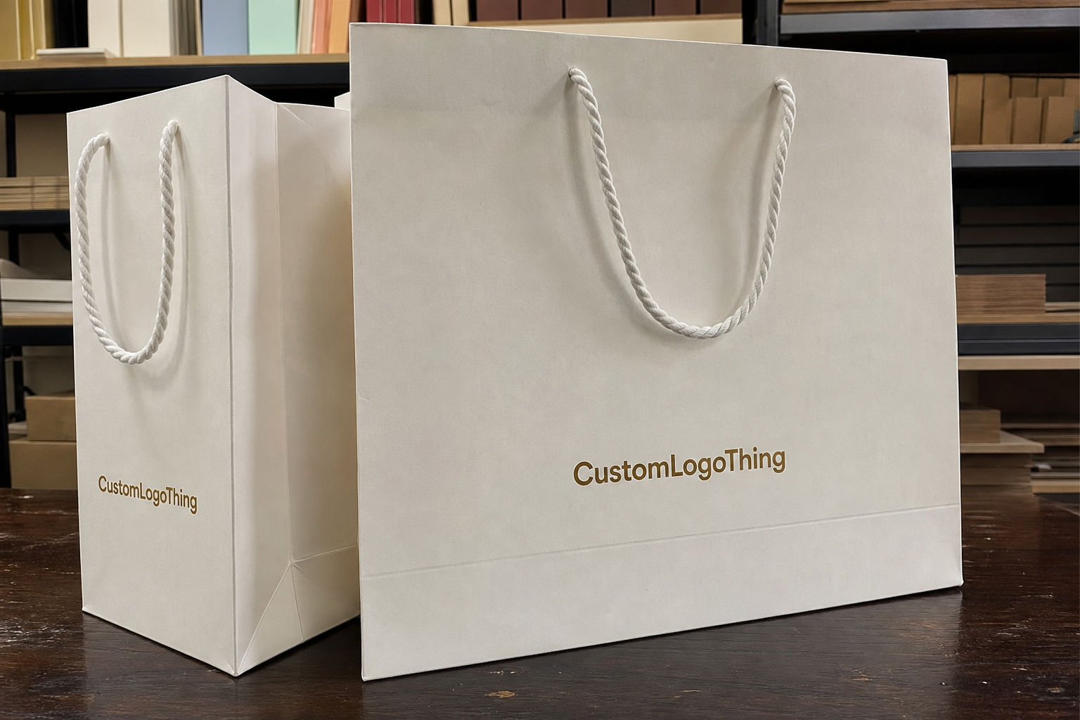
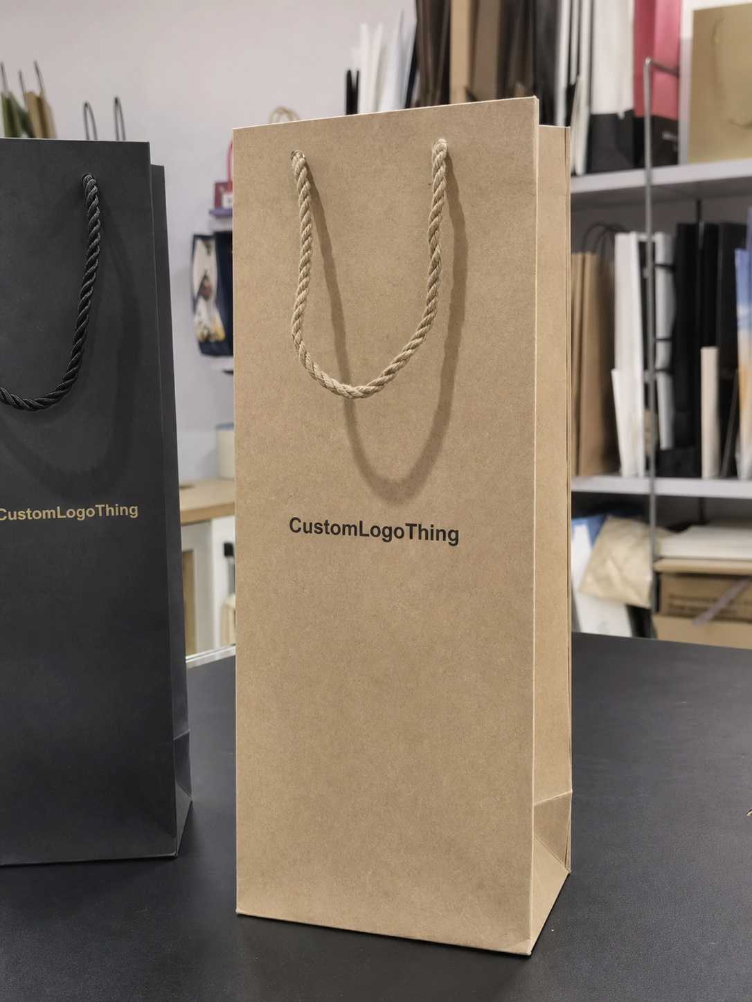
For most Slider Lock Clothing Bags, the useful print zones are the front panel, back panel, upper header area, and, on some constructions, the side gussets. The front panel usually gives the strongest brand recognition because it faces the shopper first. The back panel can carry sizing, care instructions, a website, or a secondary logo. Side gussets are support space. They are useful, but they should not carry the entire branding burden unless the bag is unusually wide and the display plan allows it.
These bags behave differently from a basic poly mailer or a plain garment bag. The slider track changes the top silhouette, so the visible field is not a clean rectangle. The closure line can hide part of the artwork even if the print technically fits within the dieline. That is why any slider lock clothing Bags Logo Placement guide should be built from the real dieline, the real packed size, and the real shelf or hanger view, not a generic template pulled from a folder.
A logo that looks centered on a flat proof can vanish once the bag is filled. Always judge placement in the packed orientation and at the final display angle.
One more thing buyers sometimes miss: placement is not only branding. It affects packing speed, visual order on shelves, and whether the bag looks premium or improvised. If the logo sits too low, the garment may cover it. If it sits too high, it can collide with the slider. The useful space is narrower than most teams expect, which is why small adjustments matter.
How the closure changes logo visibility
The slider mechanism changes the way the eye reads the bag. The top seal and track create a visual break, so artwork that approaches the top edge too aggressively can look clipped even when it is technically inside the printable area. Small type suffers first. Thin lines, delicate scripts, and tiny symbols lose clarity much faster than bold marks with solid stroke width.
Hanging orientation matters just as much as the artwork itself. If the bag is displayed on a peg, hook, or hanger, shoppers usually see the upper front third first. That makes the top third of the panel valuable space, but it also means the design has to stop short of the closure hardware. A logo placed too high can feel cramped; one placed too low may get buried behind the folded garment. There is no universal sweet spot. The bag size, fill level, and display method determine it.
One-sided printing usually works well for basic retail use. The front panel holds the primary logo, and the back panel stays functional with size information or care text. Two-sided printing makes sense if the bag is part of a premium presentation or if the back side will be visible in stores or in a shipping unboxing. If nobody sees the back, the extra print area usually does not earn its keep.
Transparency changes the visual math too. Clear film demands stronger contrast because the garment inside becomes part of the composition. Frosted film softens the view and can make a simple logo feel cleaner, but it may also mute fine detail. Tinted film can improve legibility for bold artwork, yet it can dull weak colors and small text. Matte finish reduces glare and usually helps a logo feel more expensive, though it can flatten delicate line work if the design is too light. The same logo often needs a different placement strategy depending on whether the bag is crystal clear, frosted, glossy, or matte.
Layout factors that decide the best print location
Bag dimensions come first. A tall garment bag and a shorter folded apparel bag do not share the same safe print area, even if both use a slider lock closure. The taller format gives more room to keep the logo away from the top seal while maintaining balance. Shorter bags force harder decisions, especially if the customer wants a large wordmark or a long brand line. A proof that looks spacious on a tall size can feel crowded on the smaller one.
Logo size and line weight come next. Blocky marks can sit higher because they stay legible at distance. Thin serif logos, script marks, and multi-line wordmarks need more breathing room. If the design includes a tagline, a registration line, or a website URL, those details often belong on the back panel or on an insert card. Squeezing them into the primary logo area usually makes the packaging look busier, not more informative.
The product inside changes placement more than many buyers expect. A lightly filled bag leaves more visible surface. A thick hoodie, jacket, or bundled multi-pack pushes against the film and can hide lower graphics or distort centered layouts. If the clothes are folded near the top edge, anything printed below the midpoint may vanish once the item is packed. That is why the fill level should be part of the artwork conversation from the start.
Retail mechanics matter as well. Barcode space, hanging hole placement, care labels, and tuck direction all compete for the same surface. If the bag will be stacked in cartons, the visible face in transit may matter more than the face on the hook. The proof should show all of these elements together. Isolated artwork proofs are convenient, but they do not expose the problems that show up in production.
- Front panel: best for the primary logo and the first view a shopper gets.
- Back panel: useful for sizing, care, a URL, or a secondary mark.
- Upper header area: high visibility, but only if closure clearance is respected.
- Side gussets: good for support copy or repeated marks, not for critical branding.
There is a simple buyer shortcut here: choose placement based on the packed product, not the empty bag. That single decision prevents a surprising amount of rework.
Materials, prints, and quality standards that affect placement
Material choice shapes placement because it changes how crisp the artwork will look and how much risk the print carries. Common slider lock clothing bags are made from LDPE or a blend of LDPE and LLDPE. Film thickness often falls somewhere around 2.0 to 4.0 mil for apparel use, with thicker gauges used for heavier garments or for bags that need a more substantial feel. Thinner film can save cost, but it also shows wrinkles more readily and can make small text harder to read.
Printing method matters too. Flexographic printing is common for larger runs and usually keeps unit costs under control once the plates are made. Gravure can deliver strong color consistency on high-volume work, though the setup burden is heavier. Digital printing helps on lower volumes or on jobs with frequent artwork changes, but it can limit special effects and may not be the cheapest route at scale. Each method has a different tolerance for fine type, solid blocks, and repeat positions, which means placement decisions should follow the print method rather than fight it.
Ink coverage is another constraint. Heavy solid areas near the top edge can show roller marks, scuffing, or slight color variation if the print sits close to a fold. Fine white text on a clear bag can disappear if the contrast is weak or if the garment behind it is also light. Dark bags hide some flaws but make color matching more sensitive. A buyer who approves a proof on a monitor often misses the way the material changes the same artwork under store lighting.
Quality control should include more than a visual check. The best production teams verify seal integrity, slider movement, print registration, ink rub resistance, and the placement tolerance of the logo relative to the closure. A common tolerance for this kind of packaging is around an eighth of an inch, but the acceptable range depends on the bag size and print method. On a small bag, an eighth of an inch can be visible. On a large garment bag, it may be negligible. The point is not to chase perfection for its own sake. It is to make sure the logo does not slide into the hardware zone or drift into the fold line.
For buyer teams, the practical checks are straightforward:
- Confirm that the artwork sits clear of the slider track and the top seal.
- Check that the logo remains readable after the bag is filled and hung.
- Test whether the print rubs off when stacked or packed in cartons.
- Inspect the bag under bright and dim light, since retail lighting hides and reveals different flaws.
Those checks sound basic, but they prevent expensive mistakes. A bag can pass a flat proof and still fail in handling if the closure interferes with the print or if the film is too thin for the chosen ink coverage.
Cost and pricing: what placement choices change
Placement choices affect more than appearance. They change setup work, print complexity, and sometimes the whole production method. A single front-panel logo is usually the simplest option. Add a second print location and the job often needs another screen, another plate, or another pass through the press. That is where cost begins to climb.
For standard custom runs, a simple single-location logo on slider lock clothing bags often adds roughly $0.05-$0.12 per unit at quantities around 5,000 pieces, depending on bag size, ink coverage, and whether the print is one color or several. A two-location layout can push the add-on closer to $0.12-$0.28 per unit. Large coverage, full-panel art, or tight registration can move beyond that, especially if the design needs multiple color passes or slower press speeds.
The cost spread is even more noticeable on smaller runs. With a low MOQ, setup charges are spread across fewer units, so a complex layout can feel expensive quickly. A buyer may save more by keeping the print simple and investing in better film thickness, a cleaner zipper, or a higher-grade surface finish. In apparel packaging, those details often matter more than a second logo location that few customers will actually notice.
Placement also influences waste. A mark too close to the seal can force a rerun if the first batch prints off position. Artwork that requires frequent realignment raises the chance of rejects during production. Even if the per-unit price looks fine on paper, the hidden cost can appear in delays, sample revisions, and extra approval rounds.
| Placement option | Best use | Typical complexity | Typical cost impact |
|---|---|---|---|
| Front panel only | Retail brand recognition with simple art | Low | Lowest setup cost; usually the cleanest pricing |
| Front + back | Brand on one side, sizing or care details on the other | Medium | Usually adds another print step and proof check |
| Upper panel + gusset | Premium look or display packaging | Medium to high | Higher registration risk and tighter alignment control |
| Large-area or wrap design | High-impact retail presentation | High | Highest setup burden, often with stricter tolerance control |
That is why a slider lock clothing Bags Logo Placement guide should include budget logic, not just design logic. A beautiful layout that forces a major price jump can work for a premium line, but for a commodity apparel run it often makes more sense to keep the branding simpler and let the packaging materials do some of the heavy lifting.
Production steps and timeline for artwork approval
The best workflow is not exciting, and that is a good sign. Spec review, dieline check, logo placement mockup, proof approval, then production release. If any of those steps is skipped, someone later discovers the logo is too close to the seal, the fill level was misunderstood, or the file was scaled from a low-resolution email attachment. That is how delays start.
Send the right files early. Vector artwork is the cleanest choice, ideally in AI, EPS, or PDF with outlined type. Include Pantone references if the color matters, plus the exact bag dimensions and the intended fill level. If you already have a previous sample, a rough placement reference, or a retail photo showing how the bag will be displayed, send that too. It shortens the proof cycle and reduces guesswork.
Timing is usually predictable if the job is well prepared. A reasonable planning window is often 1-3 business days for mockup and proof preparation, then 12-15 business days for production after proof approval on a standard run. Larger quantities, custom film, complex color matching, or late artwork revisions can extend that window. Samples add time as well, especially if the first physical sample reveals a placement issue that was invisible on screen.
There are also handling and distribution considerations. If the bags need to survive stacking, pallet movement, or long transit, ask what test method is used and whether it matches common distribution practices such as ISTA-based testing. That kind of check matters more for heavier apparel orders and for retail programs with a long shelf life. Packaging buyers do not need to become lab specialists, but they should know whether the bag has been tested against real handling conditions rather than idealized ones. For broader packaging terminology and material references, packaging.org remains a useful reference point.
Most timeline problems come from revisions, not from printing itself. A buyer who approves a measured proof quickly tends to move cleanly. A buyer who keeps shifting the logo position after color approval creates a chain reaction: new proof, new sign-off, new schedule. The press will wait. The calendar will not.
Common mistakes brands make with logo placement
The first mistake is placing the logo too close to the top seal, zipper line, or slider path. It can get clipped, compressed, or visually trapped between the closure and the artwork. Even if the print lands within the printable field, it can still look wrong. That distinction matters. Buyers sometimes approve a centered proof and assume the job is safe, then the finished bag tells a different story once the closure is installed.
The second mistake is dropping critical branding too low. If the garment inside covers the lower third of the bag, the logo becomes hard to see in cartons and on hooks. A lower placement can work for a back-panel detail or for secondary messaging, but not for the primary brand mark. Visibility should match the bag’s real use, not the designer’s preference for symmetry.
Oversized artwork is another classic error. Large designs look powerful until they hit folds, seams, or gussets and start to distort. A bag is not a poster board. It bends, compresses, and changes shape every time it is packed. The safe zone exists for a reason. Use it.
Orientation mistakes are common too. A logo can be approved on the side the designer preferred, only for the bag to hang the opposite way on the shelf. Then the customer sees the back or the wrong edge first. The art itself was fine. The view path was not. That is a production problem, not a creative one.
Another issue is trying to fit too much information into one bag. The logo, tagline, URL, size, care copy, barcode, and social handle all fight for space. The result is clutter, and clutter reads as cheap. A clean bag with one strong mark usually performs better than a crowded panel with five messages none of which get enough room to breathe.
Ask for the proof in the actual viewing orientation, not only flat. That one request catches more placement errors than most teams expect.
If there is one practical rule worth keeping, it is this: the logo should be visible in the bag’s real display position without fighting the closure or the product inside. That is the clearest way to keep a slider lock clothing bags logo placement guide grounded in how the package will actually be used.
Expert tips and next steps before you request a quote
Before you ask for pricing, gather the exact bag size, the intended fill level, and the display method. Is the bag going into a carton, hanging on a rack, or sitting folded in a retail set? Those details matter more than a pretty logo file. A buyer who knows the display environment can make a better placement decision before the first proof is even drawn.
Ask for a placement proof that shows the logo at real scale on the actual bag dimensions. A tiny centered mark on a blank template tells you very little. You need to see how much room the closure consumes, how the artwork behaves near the top edge, and whether the mark still reads once the bag is filled. If the supplier will not show that, the proof is not ready.
Confirm the color system, file format, and approval deadline before any artwork changes begin. If the job uses spot color, keep the Pantone references clear. If it uses multiple colors, ask how registration will be controlled and what tolerance is acceptable. If the bag requires recycled content, a specific resin blend, or any material claim, document it before the order moves forward. Those details are easy to overlook and hard to fix later.
Here is the buyer checklist I would use:
- Send exact bag dimensions and the final packed fill level.
- Choose the primary side for branding before approving the artwork.
- Mark any area that must stay clear for closure hardware, barcodes, or care text.
- Request a proof in the actual viewing orientation.
- Approve only after checking the packed sample, not just the flat drawing.
That workflow saves time and avoids the expensive kind of surprise that shows up after production starts. Treated properly, a slider lock clothing bags logo placement guide is less about decoration and more about production discipline: where the brand reads clearly, where the hardware interferes, and how the bag behaves once it is full. The bag should look intentional in a rack, in a carton, and in a customer’s hand. That is the real standard.
Where is the best logo placement on slider lock clothing bags?
The upper front panel usually works best because it stays visible when the bag is hung or stacked. Keep the logo clear of the slider track, top seal, and any fold lines that can hide the artwork.
Does a slider lock bag reduce the usable print area?
Yes. The closure hardware and top margin reduce the clean print field compared with a basic poly bag. That is why a proof should be based on the actual dieline, not a generic package template.
How does logo placement affect unit cost?
More colors, more print positions, and tighter registration all raise setup complexity. A simple single-location logo is usually cheaper than a full-panel layout or wraparound design.
What artwork files should I send for a logo placement proof?
Send vector files when possible, plus Pantone colors and the exact bag dimensions. If you have a placement reference or prior packaging, include it so the proof matches your intent.
How do I keep the logo from being blocked by the product inside?
Use the actual packed fill level when deciding on placement, not an empty-bag mockup. Keep important branding above the zone that gets covered once the garment is folded and inserted.
What film thickness works best for printed apparel bags?
Many apparel programs land between 2.0 and 4.0 mil, depending on garment weight and handling needs. Thicker film usually improves durability and helps the bag hold its shape, but it can raise cost.
Used well, the slider lock clothing bags logo placement guide is a production tool, not a design slogan. It helps the bag function in the real conditions that matter: on the shelf, in transit, and under a buyer’s eye. Packaging that works usually looks simple for a reason. Someone already solved the hard part.