Buyer Fit Snapshot
| Best fit | Art Deco Boxes for Premium Brand Appeal projects where brand print, material claims, artwork control, MOQ, and repeat-order consistency need to be specified before quoting. |
|---|---|
| Quote inputs | Share finished size, material target, print colors, finish, packing count, annual reorder estimate, ship-to region, and any compliance wording. |
| Proofing check | Approve dieline scale, logo placement, barcode or warning zones, color tolerance, closure strength, and carton packing before bulk production. |
| Main risk | Vague material claims, crowded artwork, missing packing details, or unclear freight terms can make a low unit price expensive after revisions. |
Fast answer: Art Deco Boxes for Premium Brand Appeal: Board, Finish, Dieline, and Unit Cost should be specified like a repeatable production item. The safest quote records material, print method, finish, artwork proof, packing count, and reorder notes in one written spec.
Production checks before approval
Compare the actual filled-product size with the drawing, then confirm tolerance on folds, seals, hang holes, label areas, and retail display edges. Reserve space for logos, QR codes, warning copy, and material claims before decorative graphics fill the panel.
Quote comparison points
Review material grade, print process, finish, sampling route, tooling charges, carton quantity, and freight assumptions side by side. A quote is only useful when the supplier can repeat the same color, closure quality, and packing count on the next order.
The right box can make a product feel like it belongs behind glass. That is why how to choose art deco boxes matters for brands that want order, luxury, and a little theater without sacrificing day-to-day practicality. The style has real commercial power, but only if the structure, paper, print, and finish support one another instead of fighting for attention.
In my experience, the strongest projects start with a plain, useful question: what should the customer feel before the product is even opened? With Art Deco packaging, the answer is usually confidence. Clean geometry, balanced borders, metallic accents, and crisp typography can make a candle, cosmetic set, specialty food item, or gift product feel far more considered than a plain carton ever could.
Style alone does not carry the job, though. Packaging still has to stack, ship, protect, and open without fuss, and that is where the real decisions begin.
What Art Deco Boxes Are and Why They Stand Out
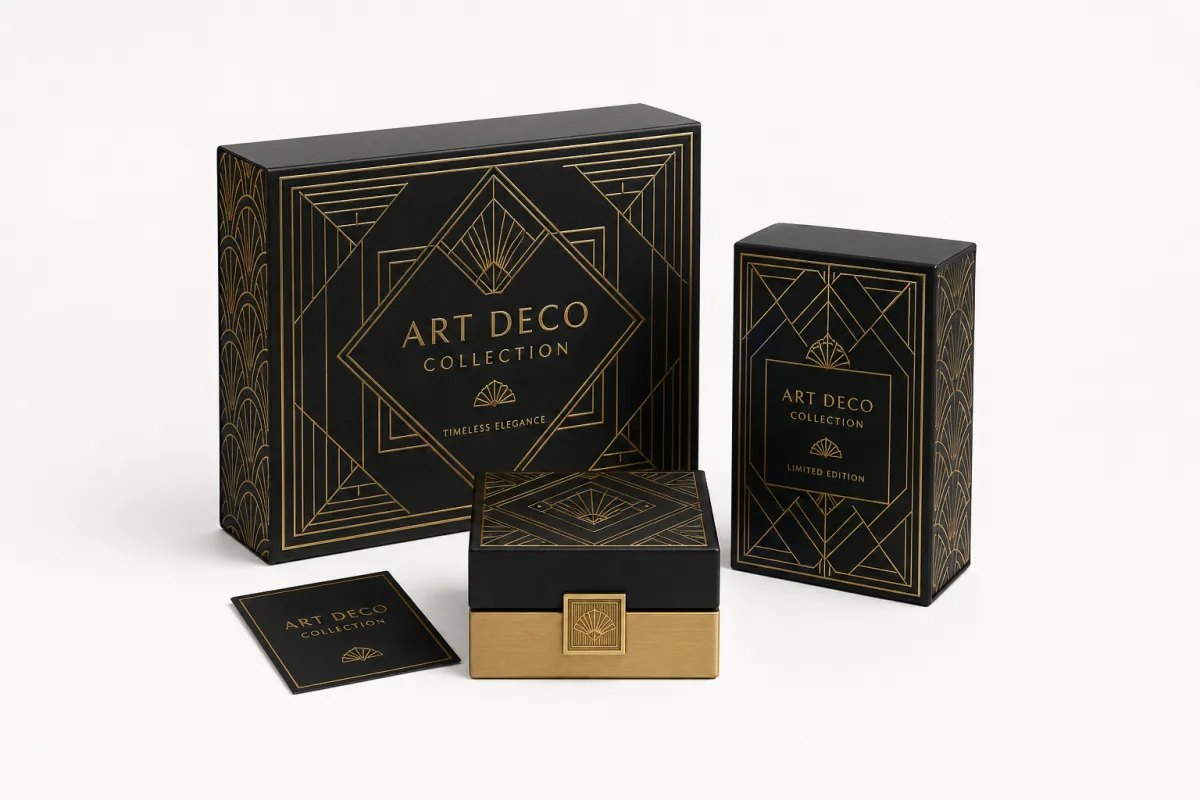
Art Deco packaging is not just decorative; it signals order, luxury, and confidence through geometry, symmetry, and metallic detail. In practical terms, how to choose art deco boxes starts with understanding that the style is built from visual discipline. You are usually working with stepped shapes, sunburst lines, framed panels, strong borders, and high-contrast color, all of which can make even a simple product feel deliberate on the shelf.
That look translates well across several packaging formats. Folding cartons can carry the style with sharp panel artwork and selective foil. Rigid Setup Boxes bring a heavier, more giftable feel. Sleeves can add a decorative outer layer to a simpler inner tray, and mailers can use the same visual language for ecommerce without becoming fragile or overbuilt. The style is flexible, but it rewards precision.
Where Art Deco boxes really shine is in categories that need premium signaling without demanding elaborate structure. Gift sets, skincare, candles, fragrance accessories, confectionery, and boutique retail products often benefit from a box that feels upscale but still efficient to produce. A well-scaled Art Deco carton can give you that lift without pushing the project into unnecessary cost.
There is also a practical reason buyers keep returning to this style: it photographs well. Strong borders and metallic details catch light beautifully, and symmetry tends to read as intentional in both shelf shots and product imagery. For brands selling through retail and online channels at the same time, that is a genuine advantage. A package that feels refined in hand and on screen tends to do more work for the brand.
Still, the strongest versions do not shout for attention. They feel composed. That is the difference between a decorative package and a box that truly supports premium positioning. If the artwork is too busy, the paper too flimsy, or the proportions off, the whole effect collapses.
Put simply, how to choose art deco boxes is not about copying old artwork. It is about translating the style into a package that fits your product, your channel, and your price point with enough discipline to feel authentic.
How Art Deco Boxes Work: Structure, Print, and Finish
Good packaging is layered work. The structure gives the box its shape and strength, the artwork establishes the visual rhythm, the print method determines sharpness, and the finish controls how the package feels in the hand. When those four pieces agree, how to choose art deco boxes becomes much easier because every decision points in the same direction.
Start with structure. Tuck-end cartons are common for lighter retail products because they are efficient, easy to assemble, and cost-conscious at scale. Rigid boxes make more sense for luxury presentation, especially when the product price can support a heavier package. Two-piece boxes remain a favorite for gifting because the lid-and-base reveal creates a formal opening moment. Sleeves and inserts are useful when the product needs both display and protection, or when you want the outer decoration to stay clean while the inner structure does the holding.
Print has a big influence on whether the style feels crisp or muddy. Art Deco artwork depends on sharp line work, symmetry, and well-controlled contrast. Offset printing is often the best fit for larger runs because it gives you clean solids and better control over fine detail. Digital print can be useful for shorter runs, prototypes, or projects that need rapid changes, especially when you are testing layout before committing to full production.
Finish choices matter just as much. Soft-touch lamination creates a smooth, upscale feel that works well with restrained Art Deco design. Gloss finish can intensify contrast and make metallic accents pop. Matte finishes lean more refined and architectural. Embossing adds depth to borders or monograms, while foil stamping is especially effective on frames, rays, logos, and medallions. The trick is not to use every effect at once.
A package can look expensive and still feel overworked. The strongest Art Deco boxes usually keep the decorative language disciplined: one or two focal areas, clear spacing, and enough breathing room for the geometry to be seen. That is why how to choose art deco boxes should always include a conversation about restraint, not just decoration.
For brands comparing options, it helps to think in terms of visual load and production load at the same time:
- Tuck-end carton: best for lighter products, lower freight weight, and efficient retail display.
- Rigid setup box: best for premium gifts, stronger shelf presence, and higher perceived value.
- Two-piece box: best for presentation-led items that benefit from a more ceremonial opening.
- Sleeve with tray: best for keeping a strong exterior design while protecting the product inside.
If the linework is the hero, print and substrate choice must protect it. Fine borders, stepped frames, and metallic accents look elegant only when the board holds a clean edge and the finish does not drown the artwork.
For shipping-heavy programs, it is smart to ask whether the pack should be tested to a recognized transit standard such as ISTA methods or compared against parcel performance expectations like ASTM D4169. That is especially useful if the product travels through ecommerce fulfillment and has to survive vibration, drops, and compression before the customer ever sees it.
How to Choose Art Deco Boxes for Your Brand
How to choose art deco boxes for your brand begins with personality. Ask whether the product should feel glamorous, heritage-inspired, modern-luxury, or collectible. The same visual vocabulary can move in very different directions. A black-and-gold palette with narrow pinstripes feels formal and high-contrast. A cream, emerald, and copper system can feel rich but less severe. A pale palette with crisp geometry may feel more contemporary than vintage.
That brand decision should connect directly to the product category. A small skincare serum does not need the same box architecture as a candle set or a boutique confectionery assortment. Weight, fragility, retail handling, and shipping distance all affect the structure you should choose. If the product is likely to be reused by the customer, the unboxing experience matters more. If it is a high-volume retail item, assembly speed and shelf efficiency may matter more.
Proportion is another place where many teams miss the mark. Art Deco design depends on symmetry and framing, so oddly stretched panels or crowded artwork can weaken the whole look. A box with generous margins usually feels more premium than one packed edge to edge with ornament. You want the eye to move through the design, not get trapped in it.
Material selection should support the style rather than fight it. For lighter retail products, 16pt to 18pt SBS or C1S board is a common starting point. For heavier presentation pieces, chipboard in the 1.5 mm to 3 mm range gives you the rigidity needed for a convincing premium feel. Inserts can be paperboard, molded pulp, or foam depending on the product and sustainability goals. If the product needs to sit centered, that alignment also helps the decorative layout read correctly.
From a packaging buyer’s point of view, how to choose art deco boxes is really about matching the package to the moment of sale. What does the customer see from six feet away? What do they feel when they lift the box? What happens when they open it? Those questions usually tell you more than a mood board alone. Pretty mockups are nice, but they do not tell the full story.
There is also the resale and gifting angle. Art Deco boxes often carry enough visual authority that customers keep them, which can extend brand presence well beyond the first purchase. That can be a real benefit for seasonal gift sets, limited editions, and boutique products sold through premium channels.
If you are evaluating multiple packaging paths, it helps to compare them side by side before locking in a direction. A careful review now is usually cheaper than redesigning after proof approval.
For brands building a product family, a consistent structure can make the line feel more organized. A repeatable box height, shared border motif, and stable logo position can create cohesion across SKUs while still allowing product-specific color or copy changes. That is one reason many teams work from a core packaging platform instead of designing every item from scratch. A packaging catalog can be useful here as a reference point, but the real work is deciding which format fits the product best.
How to Choose Art Deco Boxes: Cost, Pricing, and Value
Price is where style meets reality. How to choose art deco boxes on budget starts with understanding what actually moves the cost: construction, board thickness, print complexity, finishing, and quantity. A simple carton with one or two colors can be highly efficient. Add foil stamping, embossing, specialty coating, custom inserts, or multiple structural components, and the cost rises quickly.
Setup is part of the equation too. A project with die cutting, foil tooling, and multiple proof rounds will carry more prepress effort than a basic print-and-fold job. That does not mean you should avoid premium effects; it means the most successful buyers decide where the visual impact should land. One strong foil border usually gives better value than scattering foil across every panel.
Quantity changes the economics in a big way. Short runs often have a higher unit cost because setup is spread across fewer boxes. Larger runs usually lower the per-unit price, especially on offset work and rigid packaging. For many brands, the sweet spot is not the lowest unit price, but the package that balances perceived value, run size, and production efficiency.
Here is a practical comparison for common Art Deco box formats:
| Box Style | Best Use | Typical Unit Cost | Value Notes |
|---|---|---|---|
| Folding carton | Light retail items, cosmetics, small gifts | $0.35-$0.85 at 5,000 units | Best for efficient runs and strong shelf graphics |
| Rigid two-piece box | Gift sets, luxury products, presentation packs | $1.75-$4.50 at 3,000 units | Higher perceived value, more premium unboxing |
| Sleeve + tray | Products needing a display layer and secure fit | $0.70-$1.80 at 5,000 units | Good balance of structure, decoration, and protection |
| Mailer box | Ecommerce shipments and subscription kits | $0.90-$2.25 at 3,000 units | Useful if the exterior design must survive transit handling |
Those ranges will shift based on board grade, ink coverage, foil area, insert complexity, freight, and whether the run is short or long. Still, they give you a practical frame for how to choose art deco boxes without guessing. If a box is only a few cents cheaper but arrives damaged or looks plain on shelf, that is not a savings in the real world.
Budget tradeoffs should be deliberate. You can simplify the interior, reduce the number of foil passes, or choose a structure that protects the product without adding unnecessary layers. A strong layout with careful spacing can look much more luxurious than a design overloaded with effects. That is especially true for darker color palettes, where clean edges and proper registration matter more than volume of decoration.
Sustainability can affect cost and brand value at the same time. FSC-certified board may add a small premium, but it can also support retailer requirements and buyer expectations. If your program needs proof of responsible sourcing, ask for documentation from the start rather than trying to retrofit it after approval. You can learn more about certification standards at the Forest Stewardship Council.
The best value is rarely the cheapest box on paper. It is the one that supports the product price, reduces damage, fits the channel, and makes the brand look like it belongs at its target level. That is the real answer to how to choose art deco boxes for a commercial project.
Step-by-Step Process for Choosing Art Deco Boxes
The cleanest way to move from idea to production is to treat how to choose art deco boxes as a sequence, not a single design decision. Start with the product brief. List the exact dimensions, weight, fragility, shipping method, retail channel, and whether the package must be display-ready or just transit-safe. That information narrows the field before anyone starts drawing borders or choosing foil colors.
Next, gather reference points, but do it with intent. Look for Art Deco lines, framing systems, color pairs, typography treatments, and metallic accents that actually fit your brand voice. Then decide which parts should feel vintage, which parts should feel modern, and which elements should remain minimal. A good reference set is not a pile of pretty boxes; it is a set of decisions.
After that, review the dieline and structure. This is the stage where a lot of projects get rescued, because the layout must work on the actual panel sizes, flap positions, and closure points. A beautiful concept is not useful if a logo lands too close to a fold or if a sunburst motif gets broken by an opening flap. For Art Deco packaging, symmetry is not optional. It is the foundation.
Now compare materials and samples. Ask for board samples, finish samples, and if possible a prototype or pre-production sample with the real product inside. Artwork can look very different on white SBS board, coated stock, chipboard, or recycled substrates. A dark, foil-heavy design might feel rich on one board and dull on another. This is where buyers see why how to choose art deco boxes should always include physical sampling, not just digital approvals.
Timeline planning matters too. A straightforward carton program may move from artwork to production in roughly 12 to 15 business days after proof approval, while rigid boxes, foil tooling, or custom inserts can add more time. If you need structural sampling, it is safer to leave room for revisions than to rush a design that has not been stress-tested. Good packaging teams build room for proofing, sample review, and one or two correction rounds.
- Define the brief: product size, weight, fragility, and shipping path.
- Choose the structure: folding carton, rigid box, sleeve, mailer, or two-piece set.
- Develop the visual system: geometry, typography, borders, and accent colors.
- Test the materials: compare board, coating, and finishing samples.
- Approve the sample: check fit, color, opening behavior, and shelf presence.
If you are managing several SKUs, it helps to standardize as much as possible. One panel ratio, one logo placement rule, and one finish system can keep the line consistent while still allowing product-level changes. That approach reduces confusion during artwork setup and usually makes repeat orders easier to manage.
Here is the practical truth: how to choose art deco boxes gets easier when you move in order from product requirements to structure, then artwork, then finish, and only then to production. Skipping that sequence is how good ideas turn into expensive revisions.
Common Mistakes When Choosing Art Deco Boxes
One of the biggest mistakes is decorating every surface equally. Art Deco style can handle drama, but it still needs discipline. Too many line systems, too many foils, and too much contrast can make the package feel crowded instead of elegant. The result is usually less premium, not more. If you are serious about how to choose art deco boxes, restraint should be part of the brief.
Another common error is forgetting the product fit. A beautiful box that lets the item shift, rattle, or crush in transit will create returns and complaints. That is especially risky for candles, glass jars, cosmetic bottles, and gift sets with multiple components. Even a small amount of internal movement can make the unboxing feel cheap.
Production proofing is another place where teams get caught. Fine linework, dark solid backgrounds, metallic borders, and tiny typography all behave differently depending on the board and print process. A mockup may look sharp on screen and soft on press if the substrate cannot hold the detail. That is why how to choose art deco boxes should always include a real sample review.
Typography matters more than many people expect. Generic fonts can flatten the whole design, while well-chosen letterforms create a sense of structure and purpose. Art Deco packaging often benefits from confident, spaced typography with clear hierarchy. If the type feels hesitant, the box does too.
Budget mistakes are common as well. Teams often approve foil, embossing, specialty coating, and custom inserts all at once, then discover the box is now priced beyond the intended margin. A smarter path is to choose one hero effect and let the rest of the design support it. If the logo has the foil, maybe the borders stay printed. If the structure is rigid, maybe the surface decoration stays simple.
It is also worth checking the outside logistics. If the box must travel through ecommerce, ask about drop testing, compression, and environmental exposure. Moisture, vibration, and stacking pressure can all affect finished packaging. If the style is beautiful but the corners scuff easily, the customer will notice that long before they notice the border system.
Finally, do not assume the style can carry weak branding. Art Deco boxes work best when the brand has a clear tone and a tidy hierarchy. Without that, the decoration becomes surface-only. The package may still look attractive, but it will not feel owned by the brand.
Expert Tips and Next Steps for Art Deco Boxes
When a team wants strong results without overspending, I usually recommend starting with one hero element. That might be a central medallion, a foil logo, a stepped border, or a geometric frame around the main panel. Build the rest of the system around that focal point so the package stays readable. That is one of the simplest ways to approach how to choose art deco boxes with confidence.
Test the box under real conditions, not just in a render. View it from shelf distance. Hold it under indoor light. Check how the foil catches the room lighting. Slide it into a shipping tray and see whether the corners rub. Those checks matter because Art Deco details depend on precision, and precision can disappear fast if the pack is not built well.
Keep the color strategy tight. One or two strong base colors with a metallic accent often work better than a crowded palette. Black and gold is the classic route, but deep green, ivory, copper, navy, silver, and charcoal can all work beautifully if the contrast is controlled. The point is not to be loud. The point is to be memorable.
Sample approval should always happen with actual product units whenever possible. A flat board sample is useful, but it does not tell you whether the item sits too high, whether the lid closes cleanly, or whether the insert creates enough resistance. Those small details change the feel of the whole package. For buyers who want fewer surprises, this is a smart place to request a prototype or pre-production sample.
There is also a sustainability angle that can strengthen the project if you handle it honestly. FSC-certified board, reduced ink coverage, and efficient structures can all support a better packaging story. None of that replaces strong design, but it does help the package feel current and responsible. That matters for retail buyers, subscription programs, and giftable products alike.
If you are building a full line, keep a simple checklist. Confirm dimensions, list required finishes, decide whether the box needs transit testing, and define which details are non-negotiable. The more clearly you define those points early, the easier it becomes to compare options and avoid last-minute changes.
In practice, how to choose art deco boxes is not about chasing the most ornate version. It is about choosing the version that supports the product, the margin, and the customer experience at the same time. That is the kind of packaging decision that keeps working long after the first order ships.
If you need a starting point, define the product specs, collect three to five Art Deco references, shortlist one structure, estimate quantities, and then request a sample. That sequence keeps the project controlled, and it usually leads to a stronger result than trying to make design decisions in reverse.
For brands that want premium presentation without losing production discipline, how to choose art deco boxes comes down to matching style with structure, finish, and budget in a way that feels deliberate from the first glance to the final unboxing. Start with the product, choose the structure second, then let one hero finish carry the design. If you keep that order, the box stays elegant, shippable, and easy to live with in production.
How do I choose Art Deco boxes for a small product line?
Start with one consistent structure and one visual system so the line feels cohesive without forcing every SKU into a different format. A repeatable border, shared logo position, or common color family keeps the collection connected while still letting each product name or accent color change. That is the easiest way to manage how to choose art deco boxes for a small range without making the packaging feel fragmented.
What materials work best when choosing Art Deco boxes?
Use folding carton board for lighter retail items and rigid chipboard for premium gifts or heavier products. If foil stamping, embossing, or sharp geometric line work is part of the design, choose a substrate that holds detail cleanly and does not buckle under finishing pressure. For many brands, FSC-certified board is a strong option when sourcing and sustainability both matter.
How much do custom Art Deco boxes usually cost?
Cost depends on structure, size, order quantity, print colors, and finishing. As a general working range, a simple folding carton might land around $0.35-$0.85 per unit at 5,000 pieces, while a rigid presentation box can move into the $1.75-$4.50 range depending on inserts and decoration. The smartest approach to how to choose art deco boxes is to focus on the effect that justifies the price, rather than stacking every premium finish into one build.
What is the usual timeline for custom Art Deco box production?
The timeline usually includes sizing, artwork setup, proofing, sampling, approval, and production before shipping. Straightforward cartons can often move in about 12 to 15 business days after proof approval, while rigid structures, custom inserts, or specialty finishes often add more time. If the project depends on tight registration or detailed foil work, leave room for a sample round so the final box looks the way it should.
How can I make Art Deco boxes look premium without overdoing it?
Use strong geometry, clear spacing, and one standout accent such as foil or embossing instead of adding every effect at once. Keep typography, color contrast, and decorative detail disciplined so the design feels elegant rather than crowded. That is the practical side of how to choose art deco boxes without turning the package into visual noise.
Related packaging resources
Use these related guides to compare specs, costs, quality checks, and buyer decisions before making the final call.


