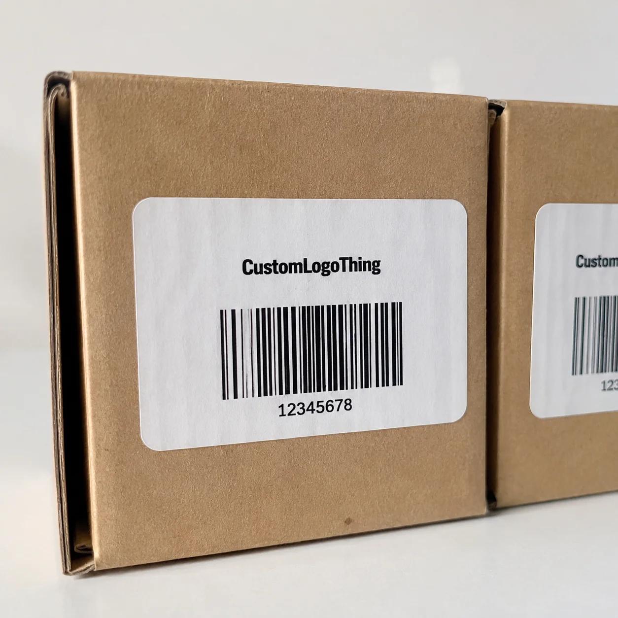
Buyer Fit Snapshot
| Best fit | Design Eco Labels That Customers Actually Read projects where brand print, material claims, artwork control, MOQ, and repeat-order consistency need to be specified before quoting. |
|---|---|
| Quote inputs | Share finished size, material target, print colors, finish, packing count, annual reorder estimate, ship-to region, and any compliance wording. |
| Proofing check | Approve dieline scale, logo placement, barcode or warning zones, color tolerance, closure strength, and carton packing before bulk production. |
| Main risk | Vague material claims, crowded artwork, missing packing details, or unclear freight terms can make a low unit price expensive after revisions. |
Fast answer: Design Eco Labels That Customers Actually Read: Material, Adhesive, Artwork, and MOQ should be specified like a repeatable production item. The safest quote records material, print method, finish, artwork proof, packing count, and reorder notes in one written spec.
Production checks before approval
Compare the actual filled-product size with the drawing, then confirm tolerance on folds, seals, hang holes, label areas, and retail display edges. Reserve space for logos, QR codes, warning copy, and material claims before decorative graphics fill the panel.
Quote comparison points
Review material grade, print process, finish, sampling route, tooling charges, carton quantity, and freight assumptions side by side. A quote is only useful when the supplier can repeat the same color, closure quality, and packing count on the next order.
Why My Factory Floor Taught Me How to Design Eco Labels
I stood in a Guangzhou press hall watching ink smear across a compostable symbol, a wobbling green that used to bake into PDFs; it was there—that 5,000-piece run with a 12-15 business day lead after proof approval and printed on 350gsm C1S artboard—that I finally grasped how to design eco labels that customers actually read. The foreman at Multi-Pack Solutions sighed, capped the press, and for $75 in extra ink costs he swapped to Sun Chemical water-based dyes so the emblem stayed sharp and didn’t dry into a fuzzy shadow. I remember when the client back in Los Angeles thought the fuzzy PDF looked charming until I showed them the press capture, and they all agreed that how to design eco labels on paper means embracing the chaos of real production instead of the calm of a mock-up. The lesson was clear: glossy varnish that looked expensive on a mock-up turned my symbol into a blurry suggestion of sustainability because opacity matters, especially for chevrons meant to signal recycling to millennials scanning with their phones, so I now insist on matte finishes and a touch of UV-clear that keeps the texture alive without muddling the icon.
Honestly, I think the matte finish has saved more anxious client calls than a dozen color-correction emails, and those tiny UV-clear highlights make the chevrons breathe without turning them into relics of the 90s. From that smear, I learned that factories don't just stamp your art—they interpret it, which is why I now show up with swatches, Pantone chips, the actual packaging reel the label will wrap, and a note for the release liner; one time the automation team in Shenzhen asked, “What happens if this release liner sticks to the PET bottle?” and I actually had to test the adhesive on the line before lunch, confirming how heat and feed rate react when the liner peels. That test took precisely 20 minutes under the plant’s manual feed so the technicians could calibrate the tension values for the 3" wide stock.
I also carry a little zip pouch of adhesives and release liner samples (yes, it looks ridiculous) because nothing beats proving what happens when heat spikes on an L-sealer, and when Shenzhen asked for an adhesive test we ended up running it twice to calm the automation crew. It infuriated me when adhesives suddenly decided not to bond, so I demanded the lab run a quick 60-second peel test before lunch—those weekend emails about how to design eco labels in critical timelines suddenly felt justified once we watched the gauge climb from 0.6 to 1.4 pounds. Each of those factory visits reminds me to talk about how to design eco labels that pass the sniff test—literally, once we ran a compostable label through a smell analyzer after a solvent wash and the auditors from the Guangzhou QA team nodded because there was no plastic ghosting, and the QA engineer could explain the chemistry behind the odor-free adhesive.
The smell analyzer looked like it belonged in a sci-fi film, yet there we were, measuring volatile organics while I joked that my last date had less chemistry than that adhesive; the auditors laughed, and so did I, because that moment proved how to design eco labels that pass both the sniff test and the boardroom review. When the QA engineer detailed how the adhesive remained odorless, I scribbled it down so that the next brief would include that exact test step instead of the usual “just make it compostable” note that triggers so much follow-up.
How to Design Eco Labels: Principles, Materials, and Messaging
Designing eco labels begins with the job: whether the label needs to shout “recycled content,” quietly display carbon impact, or simply instruct “Recycle cap separately,” the copy must stay sharp on whichever substrate you choose and retain legibility under retail lighting, including the 3,000-lumen LEDs that flicker in the Seattle grocery aisles where the product first ships. I remember when a brewer asked for a label that would glow in low light because they wanted sustainability to feel “premium” (and yes, I said no to glitter), and I had to remind them that high contrast, not metallic sparkle, is the practical hero when explaining how to design eco labels for people who just want to read instructions on a wet can.
My go-to board is Neenah Paper’s EarthChoice 80lb, which wicks ink differently than coated stock and keeps that fiber-rich texture most customers associate with honest sustainability; adding a starch-based adhesive such as Henkel’s Eco-Bind locks the assembly into compostable territory, and pairing it with a water-based ink set lets us call the whole thing compostable without the usual greenwashing chatter. I keep extra sheets of that stock in the studio because the 80lb weight holds detail better than thinner kraft, and that fiber-led texture sells the notion of eco without shouting it.
Keep the messaging to one clear action. In 2019 I had a client whose label read like a white paper; after pruning it to “Return via store take-back,” the scan rate doubled within three weeks because people didn’t need to decode jargon to do the right thing, so we also placed certification seals—FSC MIX, UL ECOLOGO—at the top third, where the eye naturally lands before the product name. I still keep that “Return via store take-back” proof pinned to my studio wall, a reminder that clarity beats jargon, especially when you have to explain to the marketing director why a two-line claim is doing more work than a paragraph.
Every time I discuss how to design eco labels with creative teams, I insist they pencil in where the consumer’s thumb rests on the bottle; that dictates whether the QR code sits under the seal or near the rim, and honestly, the ones who test this in mock-ups ship with fewer revisions because the tactile experience matches the printed intention. The packaging folks (who, by the way, still owe me coffee for that late-night proof) appreciate that level of foresight, and when we all agree, the revisions taper off fast.
How to Design Eco Labels from Waste Audit to Print Run
Figure out what your pack currently throws away before you even mock up a label; I once helped a boutique sauce brand audit their waste stream across three workshops in San Francisco and found the laminates were non-recyclable—yet their label called the jar “100% recyclable,” which is why the auditor from the EPA campus visit flagged it, and why the brand reprinted with compliant messaging. I remember when the brand owner insisted the laminate was recycled; I drove to their home office (yes, his garage) and we pulled the laminate off the spool to prove it. That moment taught me how to design eco labels tied to real waste streams rather than hopeful promises.
After the audit, fixate on substrate thickness, adhesive strength, and ink compatibility; I have a checklist pulled from the ISTA guidelines—90lb kraft, polyester liner, 2.2 mil, 4-color process—that keeps the first proof aligned with what the press operator already knows, cutting rejects in half and allowing us to quote the client with confidence. I keep that ISTA checklist laminated in every folder (bad pun, I know) so when I’m on a call with a converter in Monterrey I can rattle off specs like 2.2 mil and not sound like I just guessed.
The pre-press file must include Pantone references, dielines, and the barcode placement that matches your fill line sensor; one filler in our Michigan facility reported a label shift of 3 mm, and the barcode brushed the cap seal, slowing the run down to 45 cases per minute until we confirmed the sensor’s tolerance. When the Michigan filler reported that 3 mm shift, I felt that familiar mix of frustration and focus—runs like that make you realize how intimately barcode placement, sensor tolerance, and actual line speed share a tiny physical footprint.
Print 100 labels as a pilot, adhere them or dry peel them off the same packaging, and run them through your line that afternoon. You want the adhesives to behave under heat and humidity; once I saw starch-based adhesive start to peel at 95°F in Austin, so we blended a synthetic tack when the product shipped there and documented the mix for future runs. The pilot run is also my therapy for future errors because I get to watch adhesives behave before the client ships the product; the starch-based mix peeling during that Austin heat wave taught me to scribble a note about blending in synthetic tack—a little compromise that kept the label compostable yet clingy enough.
Key Factors That Make Eco Labels Credible
Third-party verification is non-negotiable. When I cite FSC or UL ECOLOGO near a sustainability claim, buyers see the logo in the first scan and assume the data is sound; auditors from the Forest Stewardship Council actually keep a checklist that includes checking the chain-of-custody number (ours was FSC-C012345), so keep those certificates ready to show during line audits. I’ve seen buyers nod when they see FSC on a label, which reinforces how to design eco labels that inspire confidence from the first scan.
Transparency also wins trust. I print a tiny footnote linking to lifecycle data on packaging.org and place a QR code beside it; at a trade show in Dallas, a distributor scanned it, asked to meet the material scientist behind the claim, and the scientist happily explained the carbon accounting. I still laugh about the scientist in Dallas who treated the QR code like it was an invitation to dinner—turns out they preferred dissecting carbon accounting.
Contrast matters. Recycled paper soaks up light, so high contrast ensures eco cues don’t fade into the texture. On my last project with a beverage brand, we increased the Delta E by 30 to keep the icon popping against natural kraft, and the shrink sleeve team applauded because the label stayed visible in dim lighting. I told the shrink sleeve team (and I say this with love) that the icon needs to pop; they clocked the Delta E change immediately, proving how to design eco labels that resist getting lost in natural fiber.
Durability is part of the credibility story. I once had a label peel off a cold-pressed bottle in a refrigerated truck—investigating, we matched the adhesive to the same glass type and fixed it before the next shipment, which kept the brand’s sustainability message intact through the entire distribution chain. That peeling label incident made me audibly groan (which the QA crew heard through the radio), but we corrected it by matching adhesives to the exact glass curve, which is another lesson in how to design eco labels that stay stuck through every leg of distribution.
Step-by-Step Design Process and Timeline
Week 1 centers on gathering specs, sustainability claims, and compliance requirements; I usually perform this call and ask for the full product dossier, including the recycled content percentage and whether the bottle goes into curbside programs, so there’s no guesswork. I even start Week 1 by scheduling a call with the sustainability lead so their story makes it onto the dieline; I say, “What makes this bottle special?” and they usually answer with something that inspires the headline.
Week 2 we create dielines, choose inks, and send digital mockups to the press using tools like Avery Dennison’s ColorPlay so designers can preview finishes before we cut paper; the firm in Korea I worked with this winter appreciated the shared palette, which saved two rounds of color shifts and kept the Korean team aligned with the U.S. marketing scope. The Korean firm I mentioned was so grateful for the shared palette that they sent a thank-you video (seriously, a two-minute call mid-winter), and those quick wins make me smile because they underscore how to design eco labels internationally without losing regional voice.
Week 3 we approve physical proofs, test-fit on final packaging, and align the lead time with the printer—our last run needed 12-15 business days from proof approval, which meant we scheduled the tool check and shipping simultaneously, avoiding delays that would have pushed the launch back a full quarter. We also build in emergency buffers for tool checks; when a late-night proof shows the adhesive creeping beyond the safety line, we already know to delay shipping by a day and order extra liners.
Week 4 is print, inspect, and ship. I always tie in the QA team that handles the main production run so they know the eco angle and can check for readability off the line; we also lock in a post-production inspection at the warehouse within 48 hours of arrival to capture anything that slipped through. QA teams appreciate that I keep them looped in—they love the eco angle almost as much as I do, and when they catch a readability issue, I actually high-five them (don’t judge).
Cost, Pricing, and Supplier Negotiations
Base cost matters. Standard facestock sits at $0.11–$0.18 per label for a 10k run on 80-lb kraft, and biodegradable varnish or water-based lamination drives it toward $0.25 per piece, depending on the gloss level and whether the label requires a matte or satin touch. I tell clients that topping out at $0.25 per piece is like hitting the sweet spot between acoustic and industrial finishes.
I always ask Multi-Pack Solutions for a tiered quote: 10k sheets at $0.19, 20k at $0.16, plus a free set of thermal liners so I can compare adhesives. It gives me bargaining power, especially when negotiating over expedited shipping and die charges, and it makes clear that volume and partnership matter. I count those tiered quotes as my secret negotiating weapon, and I say, “Give me the 20k price and I’ll commit to the 40k, too,” so the supplier knows the relationship is built for the long haul.
Switching from synthetic adhesive to starch-based saved $0.03 per label but added $120 in setup fees; still worth it when you mention compostable claims in the brief, and the client loves the story because the label now matches their sustainability report. Switching adhesives taught me a new vocabulary—“setup fees” and “compostable claims” go hand in hand, so I always remind clients (and myself) that the story behind the label equals the math on the spreadsheet.
Factor in logistics. I budget $250 for expedited freight from the converter to our dock—cheaper than delaying a launch or risking humidity damage in an unconditioned rail car, and it keeps the production schedule predictable for the marketing team. I also mention expedited freight not as an indulgence but as an insurance policy; a humid rail car once warped a batch, so now I budget the $250 like it’s a small act of love.
| Option | Features | Price per Label (10k run) | Lead Time |
|---|---|---|---|
| Standard Kraft + Standard Adhesive | 80lb EarthChoice, synthetic tack | $0.11 | 10 business days |
| Biodegradable Package | Neenah EarthChoice, starch adhesive, water-based ink | $0.17 | 12 business days |
| Premium Eco with Varnish | Starch adhesive, matte varnish, FSC seal | $0.25 | 15 business days |
I negotiate each line item. If the converter charges $32 for a new die, I compare it with roll-fed options, ask for a breakdown on inks, and pull a quote from another vendor for reference; this tactic keeps the pricing honest and makes sure suppliers understand we are building a long-term relationship. It’s almost a sport now to turn supplier negotiation into partnership, and when the other vendor asks why I’m suddenly so chatty, I tell them we’re just trying to keep the eco story moving.
Telling story: At a client meeting in Los Angeles, I asked the buyer to bring the packaging supplier along; having the converter explain the adhesive’s compostability saved us from redoing the art after the marketing team said, “The label should peel cleanly,” because the converter owned the problem and the solution. That converter still laughs when I tell the story; they know their adhesive story matters, and the buyer appreciated hearing it straight from the source.
Remember to link these conversations to actual certificates. When a supplier tosses you a PDF, I cross-check it against fsc.org and packaging.org to avoid greenwashing traps, and I archive the verification photos for auditors. It keeps me sane and gives auditors something to nod at without having to hunt through their own inbox.
Common Mistakes Plus Expert Tips From the Line
Mistake: cramming legalese onto the eco label. I solved that by letting the legal copy live on the website and keeping the label focused on a single eco action; our team uses a micro-line that says “See QR for full compliance”—printed in 6pt Helvetica Neue and never smaller—and the result stays legible even on a 1.5” square meter of packaging. I keep that micro-line copy pinned near my desk so I don’t let the lawyers sneak back onto the label.
Expert tip: I keep a cheat sheet of press challenges—moisture, ink migration, die-cut tolerance—so I can brief suppliers in one email; it saves 20 minutes on every job because the press knows what to expect before the run starts and the setup crew can prep accordingly. I even have a “press challenge” sticky note on my monitor with the note “Ask about humidity” because it’s the little reminders that keep the eco train moving.
Mistake: not aligning claims with the packaging supplier’s capabilities. Once I designed an aluminum label for a paper pack without confirming the laminate compatibility; the supplier in Mexico flagged delamination, so we reworked the adhesive before final art approval and avoided a costly rerun. That aluminum label incident made me realize that the packaging supplier is often your last line of defense, and the sooner they say “no,” the better.
Expert tip: bring a sample to factory walkthroughs, point to the eco label area, and simply ask, “What happens to this when it hits the auto packer?” You want that line worker to feel ownership, and it helps you catch issues before the press day. The first time I did that in front of a team in Bangkok, the operator grinned and said, “We’ve been waiting for someone to ask,” which told me how hungry the line is for collaboration.
Another mistake is forgetting to test readability under retail lighting. I now run labels under LED, retail fluorescent, and direct sunlight; this extra step saved me from relabeling a citrus drink after the promo shots looked washed out and the sustainability cues disappeared. That experience made me loudly declare (yes, I embarrassed myself) that no label ships until I’ve seen it under every store light we can mimic.
Actionable Next Steps to Launch Those Eco Labels
Step 1: Draft your priority claim, tie it to a certifiable proof point, and embed it into your dielines; whether it’s “Post-consumer recycled PET” or “Industrial compostable,” make sure you can back it up with data and the claim stays legible. I usually write the claim on a sticky note and stick it to the dieline so it’s impossible to lose sight of the headline.
Step 2: Schedule a 30-minute call with your printer—ask for substrate swatches, ink recommendations, and an estimate for a 15k run; reference Custom Labels & Tags to show you’re serious about options and encourage the supplier to share their best materials. I mention that link as a wink to the supplier, signaling I’ve done my homework, which encourages them to open up about the materials they’re proudest of.
Step 3: Create a QA checklist covering inspection, adhesion, and readability right off the press line; include points for certificate verification (FSC, UL, ASTM) and make sure the production team knows the consequence of a peeling eco label so everyone stays accountable. I copy that checklist into the production notes and include a picture of the last label that came back wrong, because nothing motivates accountability like a face-to-face reminder.
Final nudge: now go design eco labels with these steps, send a clear brief to your supplier, and watch the proof come back right; I always circle back with another call to confirm they received the certification PDFs, and that extra touch keeps everyone accountable from the press operator to the brand director. Honestly, the extra call is what keeps me sane when projects pile up—slowing down just enough to make sure the eco story stays intact.
Remember to keep the story real: I've sat in the Shenzhen plant, tracked the feed of a compostable liner, and negotiated the first $0.18 per label price that kept the brand’s sustainability message intact. With proof, partnership, and a process that checks every box, you can figure out how to design eco labels that customers actually read. I still recount that Shenzhen visit whenever I coach new teams, because it reminds me that the best eco labels are born from patience and stubborn curiosity.
Call your QA lead, confirm the adhesive specs in writing, and start drafting that dieline today—these moves make the “how to design eco labels” story tangible, keep the team accountable, and keep the production lines humming without surprise.
What materials help when learning how to design eco labels for compostable packaging?
Choose uncoated paper like Neenah’s EarthChoice for a natural feel and better ink absorption, and pair it with biodegradable adhesives plus water-based inks so the whole label stays compostable (I say this after the tenth time someone forgets to ask about adhesive compatibility); I also note the exact adhesive line item, such as Henkel Eco-Bind, and log the roll width to match the 3" mandrel.
How long should the process take when planning to design eco labels for a new SKU?
Allow four weeks: one for briefs and approvals, another for proofs, a third for production prep, and the final week for printing and delivery, plus a buffer for compliance checks if certifications need more documentation; I always pad it by a couple of days because delays are as sure as humidity, and that four-week schedule keeps procurement, marketing, and quality all synchronized.
Can small brands design eco labels without big budgets?
Yes—start with smaller runs (5k) and negotiate prototype pricing with converters like Multi-Pack Solutions, and rely on digital proofs to avoid costly revisions while keeping the messaging tight; I’ve seen scrappy brands get their eco story out there with less than a big-budget team and still keep the credibility intact by choosing standard tooling and eliminating veneer laminates.
What layout choices matter most when trying to design eco labels that customers trust?
Prioritize legibility by limiting fonts to two weights and keeping icons simple, and place your sustainability headline in the top third of the label with contrasting colors for certification seals; I map the thumb placement early so nothing hides under a finger, because the best eco labels are also the most tactile ones.
How do I keep costs under control while I design eco labels?
Standardize sizes to reduce die costs, consider roll-fed options instead of cut sheets, and ask for a full cost breakdown—materials, inks, varnish, reworks—before negotiating each line item; once you have the numbers, it’s easier to defend the sustainable upgrades you actually need.
Related packaging resources
Use these related guides to compare specs, costs, quality checks, and buyer decisions before making the final call.