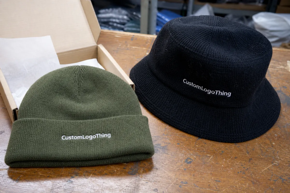
Knit Hats With Logo logo placement guide sounds technical, but the decision behind it is practical: keep the mark readable, keep the hat comfortable, and keep the mockup honest about how knit fabric actually behaves. A beanie is not a flat panel. It stretches, folds, relaxes, and shifts with the wearer, so placement matters more than it does on a tote bag or a cardboard label.
Knit hats with logo: why placement changes the whole look
One thing buyers often underestimate is how much a logo shifts once it moves from a flat proof to a soft beanie. A cuffed hat can look perfectly centered on screen and still read slightly high once it is worn low on the forehead. A slouchy style pulls attention backward. A pom can make the front mark feel smaller because the eye keeps climbing toward the top.
That is why any Knit Hats with Logo logo placement guide needs to start with the hat shape, not the artwork. The cuff, seam, knit density, and body height all change how much visual room the logo really has. A placement that feels balanced in a mockup can feel crowded in production if it sits too close to a fold or seam.
On knit, the fabric reveals everything. If the placement is off by even a small amount, the mistake is easier to see than it would be on a structured cap. The fix is not always to make the logo larger. Sometimes the better answer is to move it lower, reduce the width, or switch from embroidery to a patch that holds its shape more cleanly.
The most useful question is not “How do we fill the space?” It is “What should the hat communicate when it is being worn?” For staff uniforms and giveaways, a center-front mark usually makes sense. For retail beanies with a softer read, a compact patch or low-profile embroidery may look more expensive. The hat has to do two jobs at once: carry the brand and still feel like something people actually want to wear.
How knit texture affects embroidery, patches, and labels
Knit texture changes how decoration sits on the surface. A smooth acrylic or wool-blend beanie gives embroidery a better edge than a chunky rib knit, where the stitches can sink into the valleys of the fabric. Once that happens, tiny letters, narrow icons, and thin outlines start disappearing faster than buyers expect.
Embroidery is still the most common choice for knit hats, but it needs enough stitch area and backing support to survive stretch. If the logo has delicate serif text or hairline strokes, the art usually needs to be simplified before digitizing. Dense satin stitches can look sharp on a proof and too heavy on a hat, especially if the knit is loose.
Woven patches, faux leather patches, and sewn labels each solve a different problem. Woven patches can carry more detail than embroidery because the weave does the work, but they still need a practical footprint. Faux leather hides texture well and gives a clean retail look, though it is not a match for every brand style. Sewn labels are subtle and low-profile, but they are strongest with simple graphics rather than long taglines.
Material choice matters too. A 100% acrylic beanie is usually more forgiving on price and has a consistent surface for decoration. Wool blends feel warmer and often look richer, but they can be more sensitive to stitch density and heat during application. Recycled polyester knits are common in promotional programs, though their handfeel varies enough that a sample is worth checking before a full run.
For embroidery, the real constraint is not just artwork size. It is how the thread interacts with the knit. A production team will usually check stitch direction, underlay, and edge density so the design does not buckle the fabric. For patches, the important checks are edge finish, backing, and whether the patch sits flat on a curved surface. The logo should follow the decoration method, not the other way around.
If the art depends on gradients, tiny text, or layered detail, the first move is usually simplification. A clean shape in the right spot almost always beats a complicated logo squeezed into the wrong area.
Placement options for cuffed, slouchy, and pom beanies
The best placement depends on the silhouette. Cuffed beanies give you the clearest front zone, so center-front on the cuff is the default for a reason. It stays visible when the hat is worn low, and it is usually the easiest option to approve because the cuff creates a natural frame.
Slouchy beanies are less fixed. The front panel moves more, which means a slightly low-center or slightly off-center logo can look deliberate instead of rigid. That often works well for a compact embroidered icon or a small patch. If the mark sits too high, the back drape can separate it from the face and make the branding feel detached.
Uncuffed hats and thin-cuff styles need more caution. The usable front area is smaller than it appears, and a logo too close to the edge can disappear into the fold once the hat is worn. On these styles, a lower placement with modest height is usually safer than trying to use every available inch.
Pom beanies add another wrinkle. The pom draws the eye upward, so a front logo can look smaller than expected if it is placed too high. A centered front mark with controlled size usually works better than chasing the maximum imprint area. The front graphic should land first; the pom should read as the accent, not the other way around.
| Placement style | Best for | Typical look | Common risk |
|---|---|---|---|
| Center-front on cuff | Retail basics, teamwear, giveaways | Most visible and easiest to read | Can look crowded if artwork is oversized |
| Slightly off-center front | Slouchy styles, lifestyle brands | More relaxed and modern | Can feel accidental if not measured carefully |
| Low body placement | Uncuffed or thin-cuff hats | Subtle, lower-profile branding | May disappear into folds or stretch lines |
| Patch near crown front | Pom beanies, outdoor looks | Bold but compact | Can fight the crown shape if placed too high |
A useful rule: patch placement and embroidery placement do not always share the same measurements. A sewn patch usually needs a little more breathing room around the edge, while embroidery can sit closer to the visual center without adding bulk. The hat silhouette should decide the placement first. The decoration method comes second.
Cost, pricing, and MOQ tradeoffs by placement
Placement affects price because every extra decision adds production steps. A simple front-center embroidery on a cuffed beanie is usually the least expensive option. Once you add a larger patch, a second location, or art that needs careful simplification, unit cost climbs. Not wildly every time, but enough that buyers notice on mid-size runs.
For planning, front embroidery on a 100 to 250 piece order often lands around $1.25 to $3.50 per unit after digitizing, depending on stitch count, thread colors, and whether the art is straightforward or dense. Woven or faux leather patches commonly run higher, often $1.75 to $4.50 per unit, especially if the patch needs die cutting, sew-down, or extra assembly. Small runs push those numbers up because setup is spread across fewer hats.
Setup fees deserve attention. Digitizing for embroidery is usually cheaper than a fully custom patch tool path, but it still needs to be done correctly if the logo is complex. For patch work, ask whether the quote includes the patch itself, the application method, the backing, and any sew-out or sample approval. A low quote can become expensive once those details are added later.
Minimum order quantity changes with complexity. A clean one-color embroidery placement may be available at 24 or 50 pieces in some programs. A multi-step patch order with special backing, multiple sizes, or a second location may need 100 pieces or more to make sense. Smaller orders are not impossible; they just carry a different cost structure.
Price also shifts with hat construction. A basic acrylic beanie is usually the easiest to decorate, while thicker wool blends and heavyweight rib knits may need slower machine settings or a more conservative stitch count. If the hat is being packed with tags, inserts, or retail cards, those materials add both cost and handling time. The decoration price is only part of the bill.
A flat mockup can hide a lot of problems. On knit, the real question is not only whether the logo looks good, but whether it still looks right after the cuff is folded, the hat is stretched, and the wearer turns their head.
Process and turnaround from proof to production
A solid proof process starts with the beanie style, the logo file, and the exact placement goal. If those three things are not aligned, the first mockup tends to be too generic to be useful. The proof should show the actual hat silhouette, not just a logo floating in open space, because knit hats compress and bend in ways flat art does not capture.
Good approvals usually check four things: size, placement, thread or patch color, and fit on the beanie body. If the logo is being embroidered, the stitch direction and digitized file matter because they affect how the art sits on the knit. For patch work, the edge finish and backing are just as important as the graphic.
Sampling can prevent expensive mistakes. A single pre-production sample often catches issues like a logo that is too high, a patch that feels oversized, or a stitch density that makes the knit pucker. Fixing that once is much easier than correcting a full run after it has already been decorated.
Turnaround usually depends on three things: artwork approval speed, decoration complexity, and whether custom materials are required. A straightforward embroidery order can move quickly once the proof is approved. A custom patch order with multiple revisions, a new die cut, or specialty backing will add time. A practical planning window is often 7 to 15 business days after approval for simple runs, and longer if sampling or material sourcing is involved.
Production teams also need clean input. Vector art, a named hat style, and a placement described in plain language cut down on back-and-forth. “Front-center cuff, 2.75 inches wide, one-color embroidery” is much more useful than “make it look balanced.” Small notes matter too. If the logo must sit 3/8 inch lower to clear a seam, write that down before the order moves into production.
Step-by-step placement checklist for cleaner artwork
A good Knit Hats With Logo logo placement guide should make approval easier, not just prettier. The quickest way to get there is to reduce guesswork before anyone starts stitching or cutting patches.
- Measure the usable front area. Include the cuff fold, seam allowance, and how much height disappears when the knit stretches.
- Pick the wear scenario first. Retail display, staff uniform, outdoor team gear, and giveaway hats all favor different visual balance.
- Size the logo for the hat, not the file. The art should be bold enough to survive texture, but not so large that it flattens the beanie shape.
- Choose the decoration method before final art approval. Embroidery, woven patch, faux leather patch, and sewn label all handle detail differently.
- Ask for a mockup on the exact style. A generic beanie outline is not enough if the final hat has a deep cuff, heavy slouch, or a prominent seam.
Another useful habit is to check the mockup at actual size instead of relying on zoom. On a screen, a logo can look smaller or more centered than it really is. Printed or taped to a sample hat, the same art tells the truth faster.
Three quality-control checks catch most problems before production is locked. First, confirm the logo clears the seam and fold line. Second, inspect whether the decoration distorts when the beanie is stretched. Third, compare the color of the thread or patch to the pantone or reference swatch under normal shop lighting. A logo can be technically correct and still look off if the texture or color drifts.
For larger programs, keep the approved proof with the order record. If the decoration ever needs to be repeated, those notes become the reference point. That matters more than most people think. A placement corrected by only a few millimeters is the difference between a hat that feels intentional and one that keeps getting adjusted on the wearer’s head.
Common mistakes that make beanies look off-center
The fastest way to ruin a knit hat is to treat it like a flat cap. A flat-cap template can place the logo too high, too close to the seam, or too wide for the cuff. That mistake shows up as soon as the beanie is worn and the fold line shifts the visual center.
Another common issue is putting the logo too close to a seam. Even if the machine sews exactly where it was told to sew, the human eye reads the seam as a directional line. The mark can look tilted or pulled to one side. On textured knits, that pull is stronger than buyers expect.
Oversizing causes trouble too. A huge logo can turn the hat into a billboard and flatten the soft shape that makes beanies attractive in the first place. The better branded hats usually feel deliberate, not loud. They show the mark clearly, but they still let the knit breathe.
Small text creates its own problems. Thin strokes and crowded lettering can blur once the knit relaxes, especially after wear and washing. If the artwork has a long wordmark or a tiny tagline, it may need to be split, simplified, or moved into a patch format to hold up.
One more mistake is reusing the same placement across every beanie style. Cuffed, slouchy, and pom hats do not wear the same way, so the logo should not be treated as if they do. A placement that works on one silhouette can look awkward on another, even with the same artwork and decoration method.
Next steps: lock the spec and request a cleaner quote
If you are pricing a run, send the hat style, quantity, logo file, and target decoration method together. That gives the supplier enough information to quote the actual build instead of guessing at a generic beanie order. For a knit hats with logo logo placement guide to be useful in practice, it has to lead to a tighter spec sheet, not just a nicer mockup.
Be explicit about the placement you want: front-center, slight off-center, cuff-only, low body, or a custom position that avoids a seam. If the logo has small detail, ask for a simplified proof and compare it to the original art before you approve anything. That step prevents a lot of frustration later.
Review the mockup at real size, then keep the approved proof with the order record. If the production team has to revisit the file later, those notes are what keep a repeat order from turning into a correction job. In this category, placement is not decoration trivia. It affects visibility, fit, perceived quality, and how often the hat gets worn.
For brands comparing options, the right placement is usually the one that respects the hat structure first and the logo second. Get that balance right and the beanie reads cleaner, costs less to fix, and holds up better once it leaves the packaging line.
FAQ
Where is the best knit hat logo placement for a cuffed beanie?
Center-front on the cuff is usually the most visible and reliable placement. Keep the mark clear of the fold line and seam so it stays level when the hat is worn.
How big should a logo be on knit hats with logo embroidery?
Most logos work best when they are sized to the usable front area, not the full width of the hat. Simple art can go smaller; fine text usually needs more room to stay readable.
Is a patch or embroidery better for beanie logo placement?
Embroidery is a strong choice for classic branding and simple artwork. Patches can hold more detail and often look cleaner on textured or chunky knits.
What affects pricing for knit hats with logo placement?
Decoration method, logo complexity, quantity, and whether the design needs digitizing or a custom patch all affect price. Multiple placements or specialty finishes usually increase unit cost and setup time.
How long does knit hat logo production usually take?
Time depends on artwork approval, decoration method, and whether samples are needed before full production. Cleaner files and a clear placement choice usually shorten the process and reduce revision delays.


