Buyer Fit Snapshot
| Best fit | Kraft Shipping Cartons with Logo projects where brand print, material claims, artwork control, MOQ, and repeat-order consistency need to be specified before quoting. |
|---|---|
| Quote inputs | Share finished size, material target, print colors, finish, packing count, annual reorder estimate, ship-to region, and any compliance wording. |
| Proofing check | Approve dieline scale, logo placement, barcode or warning zones, color tolerance, closure strength, and carton packing before bulk production. |
| Main risk | Vague material claims, crowded artwork, missing packing details, or unclear freight terms can make a low unit price expensive after revisions. |
Fast answer: Kraft Shipping Cartons with Logo: Benefits, Costs & Fit should be specified like a repeatable production item. The safest quote records material, print method, finish, artwork proof, packing count, and reorder notes in one written spec.
Production checks before approval
Compare the actual filled-product size with the drawing, then confirm tolerance on folds, seals, hang holes, label areas, and retail display edges. Reserve space for logos, QR codes, warning copy, and material claims before decorative graphics fill the panel.
Quote comparison points
Review material grade, print process, finish, sampling route, tooling charges, carton quantity, and freight assumptions side by side. A quote is only useful when the supplier can repeat the same color, closure quality, and packing count on the next order.
Kraft Shipping Cartons With Logo: Benefits, Costs & Fit
A shipping carton is usually the first branded thing a customer touches, and Kraft Shipping Cartons with logo can turn that moment from forgettable into deliberate. That matters. The box still has to survive picking, packing, carrier abuse, warehouse stacking, and dimensional weight math before anyone even sees the mark. Packaging never gets to be just “pretty.” It has a job.
Buyers tend to treat cartons like a background item until something goes wrong. Then the box becomes the whole conversation. A good carton protects the product, keeps shipping costs in check, and gives the brand a clean first impression. A bad one leaks money through damage, extra filler, and reships. A bad branded box also makes the logo look like it was added after someone remembered branding existed. I have seen that happen more than once, and it never looks as clever as the team thought it did.
Practical rule: a carton that protects well but hides its logo under tape, labels, or scuffing is underperforming twice. It costs the same to ship, but it tells a weaker story.
What Are Kraft Shipping Cartons with Logo?
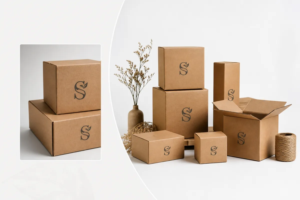
Kraft shipping cartons with logo are corrugated or paper-Based Shipping Boxes made with kraft liner or kraft-look stock and branded with a company mark, name, or simple graphic. In plain English, they are the workhorse cartons many ecommerce and wholesale teams already rely on, just with an identity printed on the side. People usually choose them for protection, recyclability, and the natural surface tone that makes even a simple print feel intentional.
The kraft surface does part of the branding work for you. A loud full-color image can fight the texture and lose. A clean one-color mark usually looks better, sharper, and less desperate. That is why kraft shipping cartons with logo often read as more premium than glossy packaging that is trying too hard. The material already has some character. Use it.
Common use cases include ecommerce shipping, subscription box fulfillment, retail replenishment, wholesale cartons, and direct-to-consumer order fulfillment. Apparel brands often use lighter E-flute mailer-style cartons. Heavier goods usually need B-flute or C-flute strength, plus a better board grade. Same logo. Different box. That part matters a lot more than most first-time buyers expect.
There is also a strategic reason to look at the carton this way. Kraft shipping cartons with logo sit at the intersection of shipping materials and brand presentation. They can do plain protection, or they can do protection plus recognition. That second job pays off more than people expect, because repeat customers notice the familiarity before they even open the box. Familiarity is boring in the best possible way.
If your packaging mix includes fillers, mailers, and outer shipper boxes, treat the carton system like one family instead of a pile of random parts. Brands often compare Custom Packaging Products first, then narrow into a specific format like Custom Shipping Boxes or lighter-weight mailers. That comparison usually makes the tradeoffs obvious. Which item needs a logo? Which one only needs a label? Which one should stay plain?
For a first order, the smartest expectation is simple: kraft shipping cartons with logo should feel clean, durable, and easy to reorder. If the design depends on a weird print effect or an unusual board, the project gets harder to repeat. And repeatability is the thing that keeps packaging from turning into a one-time headache with a storage bill attached.
One more thing people forget: kraft is not a magic material. It can be recycled, it can look natural, and it can still fail if the board spec is wrong. I always ask for the exact board test, not just the phrase “kraft box,” because that phrase tells you almost nothing.
How Kraft Shipping Cartons with Logo Work in Transit
The carton has one job before branding matters: keep the product intact through picking, packing, stacking, warehouse handling, carrier sorting, and final delivery. That is the functional side of kraft shipping cartons with logo. If the structure fails, the logo is irrelevant. If the structure holds, the logo gets a chance to do its job.
Branding can be applied several ways. Direct printing is common for large volumes and simple graphics. Flexo-printing gives a clean, repeatable look for ongoing runs. Stamping creates a subtle, almost handmade feel on kraft. Digital printing works for shorter runs and more detailed art. Labels are the least integrated option, but they still have a place for pilot launches or seasonal campaigns. The right choice depends on quantity, artwork complexity, and how much abrasion the carton will take.
Kraft changes how ink behaves. Dark colors usually hold up better on a brown or natural surface. Light colors can look softer, muted, or less crisp than they did on a monitor. That does not make them wrong. It means the print method, ink coverage, and line thickness need to match the substrate. On textured board, tiny typography disappears faster than a buyer wants to admit.
Transit conditions matter too. Warehouse abrasion can wear corners down. Moisture can soften surfaces. Tape can clip the mark. Shipping labels can block the front panel if the layout is careless. A carton that looks polished in a mockup may look very different after a few rounds of conveyor contact and carrier handling. That is normal. Real-world packaging rarely behaves like a render.
Kraft shipping cartons with logo perform best when the branding and the box structure are designed together. If the logo lands on a seam, a fold, or the exact spot where a label always goes, it disappears in the moment that counts. If the mark sits on a clean front panel and the carton closes without drowning it in tape, the brand survives the trip looking deliberate.
The tradeoff is easy to see. A carton with beautiful graphics but weak board strength creates replacement costs. A carton with strong construction but weak branding protects the order, but misses a clean recognition moment. The best kraft shipping cartons with logo do both. That is not flashy. It is just smart.
For brands that test transit performance seriously, standards keep the conversation honest. The International Safe Transit Association publishes common test methods for distribution hazards, and the basic question is simple: can the package survive real transport conditions instead of just looking nice in a studio? For a deeper reference point, see the testing framework at ISTA.
Package protection and dimensional weight also collide here. A box that is too large wastes cube. A box that is too small risks damage. The best kraft shipping cartons with logo land in the middle: enough clearance for protection, not so much excess that shipping costs climb for no reason.
I once watched a brand approve a carton because the proof looked clean and the logo sat nicely centered. On the line, the front panel got swallowed by a return label and half an inch of tape. The carton still shipped fine, but the branding might as well have stayed in the file. That is the kind of mistake a sample catches fast.
Kraft Shipping Cartons with Logo: Cost, Pricing, and ROI
Pricing for kraft shipping cartons with logo depends on more variables than many buyers expect. Size matters. Board grade matters. Flute type matters. Print method matters. So does the number of colors, the amount of coverage, whether a custom die is needed, and how many pieces you order at once. In practice, you are buying both a container and a production process.
For standard sizes, unit cost usually falls as volume rises. That part is familiar. What catches people off guard is that smaller runs can still make sense if the logo is simple and the structure is standard. A startup does not need ten thousand cartons just to prove a concept. A growing company may want to preserve cash by ordering in smaller batches and accepting a slightly higher unit cost. The right answer depends on inventory planning, warehouse space, and reorder frequency.
Here is the part buyers miss until it bites them: the cheapest carton on paper can turn into the most expensive carton in operation. Setup charges, plate fees, sampling, freight, and storage add up fast. If the quote looks low because the board is thin or the print is watered down, the savings can vanish the second damage claims or customer complaints start rolling in. A few cents saved on each carton can become dollars lost on each bad shipment. Packaging math has a rude streak.
| Print / Branding Option | Typical Best Fit | Approximate Cost Impact | Visual Result | Operational Notes |
|---|---|---|---|---|
| Flexo-printing | Mid to high volume, simple one- to two-color branding | Often adds about $0.04-$0.12 per carton at larger runs | Clean, consistent, scalable | Good for repeat kraft shipping cartons with logo that need fast replenishment |
| Digital printing | Short runs, seasonal launches, more detailed artwork | Can add $0.20-$0.60 per carton or more at low volume | Sharper detail, broader color range | Useful when design changes often or inventory risk is low |
| Stamping | Simple brand marks, natural or artisan positioning | Usually low per carton after setup, but setup can vary | Subtle, tactile, understated | Works well on kraft when the logo is compact and bold |
| Label application | Small batches, test runs, temporary branding | Variable, often tied to labor and label stock | Flexible, but less integrated | Can be practical for pilot orders of kraft shipping cartons with logo |
That table is only a starting point. For a realistic quote, ask for pricing at three quantities, such as 1,000, 5,000, and 10,000 units. Ask for samples separately. Ask whether tooling, plates, or die charges are one-time or recurring. Then compare the actual unit economics instead of chasing the lowest headline number like it means anything by itself.
ROI is not always measured in direct savings. Sometimes kraft shipping cartons with logo support repeat purchase behavior by making the unboxing feel coherent. Sometimes they reduce the need for extra inserts because the exterior already carries the brand. Sometimes they make a social post more likely. None of that is guaranteed. All of it is plausible enough to factor into the buying decision.
There is also a certification angle. If your brand wants paperboard from responsibly managed sources, FSC certification can support that story. The Forest Stewardship Council explains its chain-of-custody and labeling requirements clearly at FSC. For buyers building a sustainability claim, that detail matters more than a vague “eco-friendly” promise.
For many teams, the best approach is to compare kraft shipping cartons with logo against other shipping materials in the same package system. A heavier item may need reinforced cartons. A lighter, flatter item may be better in a branded mailer. If you also use Custom Poly Mailers, the question is not whether everything should be branded; it is which touchpoint carries the most value.
Kraft shipping cartons with logo often deliver the strongest ROI when they stay simple, repeatable, and properly sized. Fancy is not the goal. Fit is the goal. Protection is the goal. Brand clarity is the part that makes the spend feel justified instead of decorative.
Kraft Shipping Cartons with Logo: Process and Timeline
The production process for kraft shipping cartons with logo usually follows a predictable path: brief, sizing, dieline approval, artwork prep, proofing, sampling, production, and shipment. The steps sound easy. The delays usually come from the details people assume someone else already handled. A clear carton project is often a fast carton project.
Problems tend to show up in the same places. Dimensions are incomplete. Artwork arrives in the wrong file format. The logo uses too many colors for the chosen print method. Someone wants copy changes after proofing because they finally read the thing. The carton might be straightforward, but the coordination often is not.
Timelines vary with structure and print complexity. Standard cartons with simple branding usually move faster than custom die-cut shapes or multi-color print jobs. If you are planning a product launch, a seasonal campaign, or a warehouse changeover, build in cushion. Do not schedule packaging like it will always arrive on the exact day you wished for.
Proofing deserves real attention. Digital proofs are useful for layout, panel placement, and copy checking. Physical samples are better for tone, fold behavior, stacking, and fit. A sample may feel like a delay, but it usually saves time. Catching a logo scale issue before mass production is cheaper than discovering it after thousands of units are already printed.
The logistics side is easy to ignore and annoying to fix later. The packaging schedule should line up with inventory arrival, warehouse setup, and carrier pickup. If the cartons show up after the product, fulfillment stalls. If they arrive too early and storage is tight, they become a space problem. Kraft shipping cartons with logo are part of the supply chain, not a standalone design exercise.
For teams comparing options, the fastest path is usually the one with the fewest unknowns. Standard size, one-color branding, approved art files, and a single decision-maker can compress the timeline significantly. Add a custom size, multiple print colors, and a long approval chain, and the calendar stretches out fast.
That is why kraft shipping cartons with logo should be planned alongside order fulfillment, not after the fact. A well-timed carton order supports launch dates, warehouse labor planning, and supplier coordination. A late carton order becomes everyone’s emergency, which is a charming way to ruin a week.
Step-by-Step: Ordering Kraft Shipping Cartons with Logo
Ordering kraft shipping cartons with logo works best when the buyer treats it like a packaging spec, not a vague creative exercise. Start with the product, not the artwork. Define the actual load before choosing the box that will carry it. That simple shift prevents half the mistakes people make later.
- Measure the product and protection need. Record length, width, height, and weight. Then add room for inserts, wraps, or void fill if the product needs cushion. A carton that is one inch off can change everything from fit to freight.
- Decide the logo role. The logo may be a simple mark, a full brand name, a product cue, or a shipping message. The less clutter on kraft shipping cartons with logo, the more durable the visual impact tends to be.
- Request a white sample or structural sample. Fit, stacking, and empty-space balance matter as much as artwork. A sample tells you more than a mockup about whether the carton feels efficient or wasteful.
- Prepare artwork in the correct format. Confirm vector files, ink colors, print area, and any safe zones. Ask where labels, tape, or handling marks will land so the logo is not crowded out later.
- Review the proof like an operator. Check folds, panel orientation, barcodes, seal lines, and the position of the branding when the carton is closed. A design that looks clean open may look awkward sealed.
- Set reorder logic before the first shipment lands. Decide minimum stock, safety buffer, and reorder trigger. A useful carton system is one that survives both slow months and spikes in ecommerce shipping demand.
If your business uses more than one package type, compare the carton against your other shipping materials at the same time. For example, a flat item may ship better in a branded mailer, while a heavier item needs a box from Custom Shipping Boxes. That comparison prevents over-packaging, which usually pushes cost and dimensional weight higher than needed.
One detail gets overlooked constantly: a supplier can only build what you specify. If the board grade is not named, someone may assume a lighter board than you meant. If the print coverage is not stated, the quote can drift. If the quantity target is fuzzy, inventory planning gets messy. The cleaner the brief, the more predictable the outcome for kraft shipping cartons with logo.
That is why many teams create a one-page packaging sheet. It should list dimensions, board grade, flute type, logo file, print method, quantity target, and acceptable sample. Small document. Big difference. Less drama, too.
Common Mistakes with Kraft Shipping Cartons with Logo
The most common mistake with kraft shipping cartons with logo is trying to print artwork that is too detailed for the surface. Kraft texture can soften thin lines, small type, and delicate gradients. A logo that looks crisp on a screen may lose clarity once it hits corrugated board. Screens are generous. Boxes are not.
Another mistake is choosing a carton size that looks neat in a mockup but wastes space in real use. Too much empty volume means more void fill, more material handling, and often higher dimensional weight. That adds shipping cost without adding value. Too little space creates squeeze points, crushed corners, and annoyed receiving teams who have no interest in your brand story.
There is also a materials error that shows up often. Some boxes look “recyclable” because they are brown, but the board grade may still be too light for the product weight or stack load. The surface color is not the same thing as structural performance. Kraft shipping cartons with logo should be specified for the actual load conditions, not just for appearance.
Brand placement causes trouble too. A logo on the bottom panel is invisible. A logo near the seam can split across a fold. A logo where tape always lands can disappear on the first shipment. A logo placed where carriers rub the box hardest can look worn before the carton even reaches the customer. Tiny layout choices decide whether the branding survives transit packaging stress.
Testing matters more than assumptions. If the cartons will move through humid warehouses, cold storage, or automated conveyor lines, sample them under those conditions. The carton that behaves fine in a clean room may act differently in the real supply chain. The carton that passes in a warm office may not be the carton that survives the fulfillment center.
Skipping a sample run is probably the costliest mistake. Many teams discover too late that the ink tone is off, the logo is too small, or the carton is stiffer or flimsier than expected. At that point, the issue is not just packaging. It is inventory, cash, and sometimes a launch date. Kraft shipping cartons with logo are too visible to guess at.
For buyers who want a more disciplined process, using a testing framework like ISTA helps separate opinion from performance. The point is not perfection. The point is repeatable package protection under realistic handling. That is the actual standard for shipping materials that have to work at scale.
I have also seen teams overdesign the branding and underdesign the actual transit path. Fancy art on a weak carton is a bad trade. If the box gets crushed, the logo is just a souvenir from the failure.
Expert Tips and Next Steps for Kraft Shipping Cartons with Logo
If I had to reduce the decision-making to a few practical rules, I would start here: keep the carton system simple, keep the print clean, and keep the fit honest. Kraft shipping cartons with logo work best when they are easy to spec, easy to reorder, and easy to recognize from across a warehouse aisle.
Choose one primary carton size and, if needed, one backup size. That keeps forecasting manageable. It also makes replenishment less fragile when demand changes. Brands often try to support too many SKUs with too many carton variations, and the result is a packaging shelf full of near-duplicates. Simpler usually wins.
Use the logo treatment that matches shipping reality. A one-color print can outperform a busy design because it reads clearly on kraft and tolerates wear better. A stamp-like mark can feel premium without demanding perfect registration. For many kraft shipping cartons with logo, restraint beats decoration.
Ask for samples from actual production methods, not just mockups. A digital render cannot show texture, ink spread, or fold-line behavior. A real sample can. That matters even more if your cartons need to work with inserts, labels, or branded mailers from Custom Packaging Products. The full system should feel coherent, not stitched together in a rush.
Build a packaging spec sheet and keep it updated. It should include dimensions, board grade, flute type, print area, target quantity, approved artwork, and reorder trigger. A good spec sheet saves time not because it is fancy, but because it stops people from re-explaining the same carton every time they reorder.
For replenishment, set a reorder point based on average weekly usage plus a safety buffer. That buffer matters more during promotions, seasonal spikes, or supply disruptions. Stockouts on packaging are annoying on a normal week and expensive on a busy one. The carton should never be the thing that slows fulfillment.
My last practical suggestion is to compare fit, sample quality, price, and lead time before the first order. Do not pick kraft shipping cartons with logo based on one attractive quote. Compare the box construction, the print result, and the timeline together. That is how you avoid the cheapest mistake in packaging: buying a carton that looks fine until it has to do real work.
The takeaway is pretty simple. If you want kraft shipping cartons with logo to earn their keep, choose a size that fits the product, a print method that matches the run, and a board spec that survives the route. Do that, and the branding stays visible instead of getting shredded by transit. That is kinda the whole point.
Are kraft shipping cartons with logo strong enough for ecommerce orders?
Yes, if the board grade and flute type match the product weight and handling conditions. A carton built with proper package protection can be just as durable as a plain box, and kraft shipping cartons with logo often perform well in ecommerce shipping because the branding does not have to interfere with the structure. Test corner crush, stacking, and void space before scaling up. If the shipment is heavy or the route is rough, ask for the exact board spec instead of assuming brown automatically means tough.
What print method works best for kraft shipping cartons with logo?
Simple one- or two-color branding usually works best because kraft texture can soften fine detail. Flexo and stamping are common for clean, repeatable results, while digital printing helps with smaller runs or more complex art. The best method depends on quantity, artwork, and how much abrasion the carton will see during transit packaging. If the logo has thin lines or tiny type, simplify it before you print it.
How much do kraft shipping cartons with logo usually cost?
Pricing depends on carton size, board grade, print method, quantity, and setup charges. Higher volumes usually lower the unit price, but tooling and premium print effects can raise the upfront total. Ask for three quote tiers and separate sample pricing so you can compare true economics for kraft shipping cartons with logo. A quote without setup fees is usually not the full story, so read the fine print.
How long does it take to produce kraft shipping cartons with logo?
Timeline depends on artwork approval, proofing, sampling, and production capacity. Standard cartons with simple branding are usually faster than fully custom structures or multi-color jobs. Build in extra time if the cartons need to arrive before a launch, a warehouse move, or a seasonal fulfillment spike. The longest delays usually come from revisions, not from the press itself.
Can I use kraft shipping cartons with logo for both shipping and retail display?
Yes, if the logo placement and structural design support both transport and shelf visibility. A cleaner outside panel can help the box work as a branded shipper and a presentation package. Ask the supplier to review how the carton looks before and after sealing, because that is where the real customer-facing experience begins. If the sealed box looks clumsy, the retail version will not save it.


