Buyer Fit Snapshot
| Best fit | logo packaging practices for stronger brand impact for packaging buyers comparing material specs, print proof, MOQ, unit cost, freight, and repeat-order risk where brand print, material, artwork control, and repeat-order consistency matter. |
|---|---|
| Quote inputs | Share finished size, material target, print colors, finish, packing count, annual reorder estimate, and delivery region. |
| Proofing check | Approve dieline scale, logo placement, barcode or warning zones, color tolerance, and any recyclable or compostable wording before bulk production. |
| Main risk | Vague material claims, crowded artwork, or missing packing details can create delays even when the unit price looks attractive. |
Fast answer: Logo Packaging Practices for Stronger Brand Impact: Dieline, Finish, Proof, and Buyer Review should be specified like a repeatable production item. The safest quote includes material, print method, finish, artwork proof, carton packing, and reorder notes in one written spec.
What to confirm before approving the packaging proof
Check the product dimensions against the actual filled item, not only the sales mockup. Ask for tolerance on folds, seals, hang holes, label areas, and retail display edges. If the package carries a logo, QR code, warning copy, or legal claim, reserve that space before decorative graphics fill the panel.
How to compare quotes without losing quality
Compare board or film grade, print process, finish, sampling route, tooling charges, carton quantity, and freight assumptions side by side. A lower quote is only useful if the supplier can repeat the same color, closure quality, and packing count on the next order.
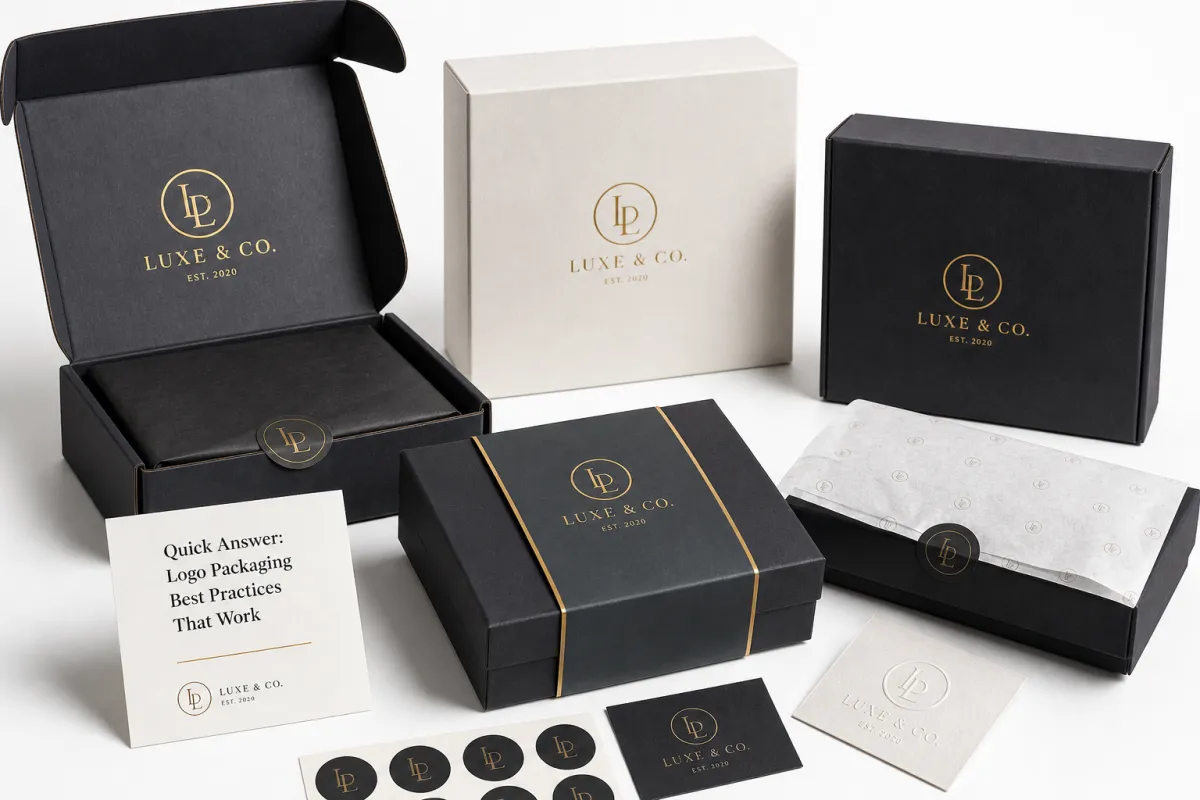
Logo Packaging Best Practices start with a blunt truth I have seen on enough packing floors to trust: most packages do not fail in the mockup stage. They fail in the hand, on the truck, in the stockroom, and at the first opening. A box that dents at the corners, a coating that scuffs on the third touch, a logo that fades under warehouse lighting - those are the moments that decide whether a brand feels deliberate or improvised. The strongest branded packaging has to do three jobs at once: protect the product, support the unboxing experience, and preserve brand consistency from warehouse to customer handoff.
For most packaging teams, the smarter move is to match substrate, print method, and structural strength to the product, not to a polished render that only lives on a screen. That is the working logic behind logo Packaging Best Practices, whether the format is custom printed boxes, mailers, or retail cartons: protect the product first, present the brand second, and keep the budget honest the entire way. For custom printed cartons, mailers, and branded packaging options, a practical starting point is the product range on Custom Packaging Products.
I see the same mistake over and over: brands overspend on decoration and underspend on structure. A soft-touch finish can look rich in a render, then arrive with crushed edges or weak seams that make the whole package feel thin. Logo packaging best practices only work when visual ambition is tied to the way a package actually behaves in production, freight, and daily handling. Otherwise, the package is kind of just dressed up cardboard.
Most packaging looks premium in a sample room and ordinary in transit. The distance between those two moments is where the real brand decisions happen.
What Are the Logo Packaging Best Practices That Work?
Logo packaging best practices are straightforward once the priorities are clear. Pick a structure that protects the product, a print method that keeps the logo sharp, and a finish that survives handling without turning into a maintenance problem. That means deciding what the package must do before deciding what it should impress people with.
A familiar failure pattern shows up all the time. A brand chooses a premium finish because the mockup looks expensive, then discovers it fingerprints easily, cracks at the folds, or pushes the order into a cost bracket that blows up the budget. That is how logo packaging best practices become an expensive lesson. A package can look elegant and still be the wrong package for the job.
The cleaner approach is to compare packaging through six filters: protection, shelf impact, tactile feel, print consistency, lead time, and cost per unit. When those six line up, the logo has room to work. When they do not, the package becomes a decorative tax.
From a packaging buyer's point of view, the order of operations should stay simple:
- Choose the product size and structure first.
- Confirm how the item ships, stacks, and opens.
- Pick the print method that fits quantity and detail.
- Add only the finishes that support the logo.
- Test the sample for scuffing, collapse, and color drift.
That sequence sits at the center of logo packaging best practices. It keeps the package tied to actual use, not just to how it photographs. For cosmetics, apparel, food, gifts, and accessories, that discipline often matters more than a long list of decorative extras.
Another point is worth stating plainly: the cheapest package is not always the best value, and the most expensive package is not always the strongest signal. The best answer usually sits somewhere in the middle, especially once the box has to move through e-commerce, retail backrooms, or mixed freight before anyone sees it.
Top Logo Packaging Options Compared
People usually ask about logo packaging best practices because they are choosing among a few familiar formats: folding cartons, rigid boxes, mailers, sleeves, labels, and inserts. Each one carries the logo differently, handles shipping differently, and creates a different sense of value in hand.
The real comparison is not "which looks nicest?" It is "which gives the strongest result for the product, the budget, and the channel?" Retail packaging faces different pressure than e-commerce packaging, and a delicate accessory needs different treatment than a lightweight skincare tube. That is why logo packaging best practices depend on use case, not taste alone.
| Format | Best For | Typical Unit Cost at 5,000 Units | Strengths | Trade-Offs |
|---|---|---|---|---|
| Folding carton | Cosmetics, supplements, small retail goods | $0.18-$0.65 | Good shelf presence, efficient shipping, flexible printing | Less premium feel than rigid packaging |
| Rigid box | Luxury gifts, electronics, premium sets | $1.40-$4.00 | Strong tactile impression, excellent unboxing feel | Higher cost, more storage space, heavier freight |
| Mailer | E-commerce apparel, subscriptions, direct-to-consumer kits | $0.60-$1.20 | Ships well, easy to pack, strong brand surface | Less elegant than a rigid box, limited structure |
| Sleeve | Simple branding on existing trays, wraps, or cartons | $0.12-$0.35 | Low cost, quick to produce, good for seasonal branding | Minimal protection, limited logo area |
| Label | Jars, bottles, pouches, flexible containers | $0.03-$0.18 | Fast, economical, easy to update | Relies on container shape and application quality |
| Insert | Gift sets, protection, product separation | $0.08-$0.45 | Improves fit, reduces movement, supports premium reveal | Can add assembly time and material waste |
For shelf-heavy products, folding cartons usually strike the best balance of cost and visibility. For premium accessories, rigid boxes give the logo more authority because the structure itself feels substantial in hand. For e-commerce, mailers often make the most sense because they travel better, stack better, and still leave enough space for branded packaging.
Labels and sleeves work well when the container already does the structural heavy lifting. That makes them a strong fit for fast-moving lines, launch tests, and products that change artwork often. In those cases, logo packaging best practices are less about creating a dramatic box and more about keeping brand marking clean, legible, and consistent across SKUs.
Giftable products reward inserts and presentation trays more than many buyers expect. They control movement, and they also frame the reveal. A simple insert can create a stronger brand memory than a pricier outer box. The package opens in layers, and the logo gets a clear moment instead of being buried in design noise.
Detailed Reviews of Logo Packaging Best Practices by Format
To judge logo packaging best practices properly, the materials, print methods, and finishing choices have to be examined separately. A beautiful structure can still fail if the board is too flimsy, and a strong box can still look flat if the logo treatment is muddy or off-register.
The best reviews come from the details that show up in production: coating behavior, corner crush, glue alignment, ink density, and how the package feels after a few days in a real warehouse. Those are the questions many teams do not ask until they are staring at a pallet of imperfect boxes. That is exactly where logo packaging best practices save money.
Folding Cartons and Paperboard
Folding cartons remain one of the most versatile formats for branded packaging because they print cleanly, die-cut efficiently, and ship flat. For most retail packaging, they are still the workhorse. A 300gsm to 400gsm SBS or C1S paperboard is common for smaller products, while heavier constructions are needed when the contents have real weight or the retailer expects strong shelf rigidity.
For logo treatment, offset printing or high-quality flexo can deliver sharp detail, especially when the design uses one or two bold brand colors. Spot color logos tend to hold up better than highly detailed full-bleed art if the budget is tight. If a brand wants premium cues without overloading the design, soft-touch lamination or aqueous coating is often more practical than layering on multiple specialty effects. That is a classic example of logo packaging best practices: one controlled finish usually does more than three competing ones.
The failure modes are predictable. Too much ink coverage can curl lighter board, low-quality folds can crack at the score, and poor registration can make a crisp logo look tired. In production, a sample may look perfect, then the line changes once speed and quantity increase. Paperboard is reliable, but only when artwork and structure are tuned together.
Rigid Boxes and Chipboard
Rigid boxes sit near the premium end of the market because they use chipboard wrapped in printed paper or specialty paper. The structure feels substantial immediately, and that weight helps package branding do its job. For luxury items, electronics, or giftable sets, a rigid box often creates the strongest first impression.
Here, logo packaging best practices usually favor restraint. A blind emboss, a single foil hit, or a precise matte wrap can create more impact than a crowded layout. Plenty of rigid boxes get overworked until they feel less premium, not more. Customers notice when a box is trying too hard. Clean alignment, tight corners, and a smooth lid fit matter more than stacking on effects.
The common problems are corner crush, lid warping, wrap bubbles, and adhesive bleed at the edges. Those issues are easy to miss in mockups and much harder to forgive once the box reaches retail. Rigid packaging rewards precision, and precision comes with higher cost and tighter quality control.
Mailers for E-Commerce and Subscription Programs
Mailers are a smart choice when the package has to survive shipping and still present the logo well. Corrugated mailers, especially E-flute or B-flute structures, provide more protection than a thin carton and can carry strong branding across the lid, flaps, and interior panels. For direct-to-consumer brands, this is where logo packaging best practices and practical logistics meet.
Digitally printed short runs can work well here, especially for seasonal promotions or variable artwork. Larger orders often benefit from flexographic print, which can lower the cost per unit. The key is controlling how the logo reads on the corrugated surface. Heavy ink coverage can make a mailer look uneven if the board texture shows through too much. A disciplined layout with clear hierarchy usually performs better than a crowded one.
Mailers also live in the warehouse. They need to fold, stack, and ship cleanly. If the board is too weak, the logo may survive, but the contents will not. That is not a branding win. It is a returns problem waiting to happen.
Sleeves, Labels, and Simple Brand Layers
Sleeves and labels are the leanest route for many brands, and they are often underestimated. A sleeve can turn plain packaging into branded packaging without forcing a full structural redesign. Labels can do the same for jars, bottles, tubes, and pouches, especially when the container already handles the protection.
These options sit near the center of logo packaging best practices for companies that need flexibility. The print surface is smaller, the setup is easier, and the artwork can change without rebuilding the entire structure. For seasonal SKUs, product line extensions, or pilot launches, that saves time and cash.
The trade-off is obvious: limited protection, limited visual drama, and greater dependence on application quality. A crooked label or badly cut sleeve can make a good logo look careless. If this route makes sense, the design should stay simple, the adhesive should match the container, and the finish should resist scuffing. That keeps the package from feeling improvised.
For a useful reference point on broader packaging design and sustainability conversations, the industry resources at packaging.org are worth reviewing. No single source settles every decision, but it helps to compare your choices with established packaging guidance.
Inserts and Presentation Components
Inserts rarely get the spotlight, yet they are a major part of logo packaging best practices for premium kits and gift boxes. A molded pulp insert, paperboard cradle, or custom tray can make the product sit correctly, protect it in transit, and improve the reveal when the customer opens the package.
Material choice matters here. Paperboard inserts are easy to print, simple to recycle in many cases, and often cheaper than molded alternatives. Molded pulp can be a smart Sustainable Packaging Choice if the form is right and the product does not need a very tight cosmetic presentation. Specialty foam still appears in some categories, but it is harder to justify unless the product truly needs that level of protection.
The best insert does not fight the logo. It supports it. That means the package should open in a logical sequence, the item should be centered, and the logo should appear where the eye lands first. Small improvements there often create more brand impact than extra print decoration on hidden surfaces.
For shipping validation, the testing side matters too. The International Safe Transit Association documents a range of transit test methods and performance requirements, and the overview at ista.org is a useful reminder that real-world handling should always be part of packaging decisions.
A package does not need every premium effect available. It needs the right effects, placed where the customer actually notices them.
Logo Packaging Best Practices: Price Comparison and Budget Planning
Budgeting is where logo packaging best practices become concrete. A strong concept means little if the order gets swallowed by setup charges, plate fees, die costs, or freight. I tell buyers to separate unit cost from project cost, because the first quote is rarely the full story.
The main price drivers are easy to name: material grade, print coverage, number of colors, type of finish, die complexity, order volume, and how much hand assembly the pack requires. In custom printed boxes, a simple two-color design can stay manageable, while a full-coverage, foil-stamped, embossed, soft-touch box can rise quickly. That is not a problem if the brand benefit justifies it, but it needs to be a deliberate choice.
For brands comparing packaging options, the first-order total often includes setup costs for tooling, proofing, sampling, and freight. A small run can look expensive because the fixed costs are spread across fewer units. A larger run lowers the per-piece rate, but it also creates inventory exposure if the artwork changes or the product line shifts. That tension sits at the center of logo packaging best practices.
Here is a practical way to think about the budget bands:
- Low band: labels, sleeves, simple folding cartons, and basic digital print.
- Mid band: heavier board, nicer coatings, moderate print coverage, and cleaner structural upgrades.
- Premium band: rigid boxes, specialty papers, foil, embossing, inserts, and higher assembly labor.
The biggest savings usually come from removing unnecessary finishing layers. If the package sits on a shelf, spend where the logo is visible and the touch points matter. If the inside of a mailer is hidden by tissue or filler, there is little value in treating every surface like a front cover. Good logo packaging best practices concentrate budget where the customer actually sees and handles the box.
For brands that want a clearer view of material sourcing, the Forest Stewardship Council offers information on certified fiber standards and chain-of-custody concepts at fsc.org. That does not answer every sustainability question, but it does help buyers make more informed paper stock choices.
One more cost reality matters here: higher quantity usually lowers unit price, but it does not always lower total risk. Seasonal packaging, fast-moving promotions, and regulated product labels can make a smaller run the safer decision. That is why logo packaging best practices are not only about price per unit; they are about the entire life of the packaging decision.
How to Choose the Right Logo Packaging for Your Product
The most useful way to apply logo packaging best practices is to start with the product and work outward. If the item is fragile, heavy, oily, moisture-sensitive, temperature-sensitive, or highly giftable, those conditions change the structure you need. The logo should follow the product, not force the product to follow the logo.
From a packaging buyer's point of view, the questions are simple to ask and expensive to ignore. How much does the product weigh? Does it ship alone or inside another carton? Will it sit in retail packaging under bright lights, or arrive through e-commerce after multiple handling points? Every answer changes the final spec.
Use Case by Use Case
Minimalist brands usually do best with clean structures, restrained color palettes, and one strong logo application. A matte carton with a crisp black logo can be more memorable than a crowded package with too many visual moves. That is one of the quieter truths behind logo packaging best practices.
Luxury brands often benefit from rigid boxes, specialty papers, and a single tactile accent such as embossing or foil. The logo should feel intentional, not loud. A soft-touch wrap can work well, but only if the package is handled carefully enough to avoid fingerprint issues and edge wear.
Artisanal brands tend to do well with natural paper tones, simple one- or two-color print, and visible material texture. If the brand story is about craftsmanship, the packaging should not feel overprocessed. A paper sleeve or folding carton can support that story without pushing the cost too high.
Mass-market products need efficient production, easy assembly, and consistent print. In that setting, logo packaging best practices are about clarity and repetition. The logo should be easy to read, the box should stack cleanly, and the format should remain economical at scale.
Giftable products usually need more attention to reveal, interior structure, and opening sequence. Even a simple product can feel elevated if the package opens in layers and the logo appears at the right moment. Presentation matters here, but it still has to stay tied to structural fit and cost discipline.
Technical Fit Checklist
- Confirm product dimensions with clearance for inserts or protective wrap.
- Check closure style: tuck, magnetic, telescoping lid, sleeve, or adhesive seal.
- Define the shipping method: parcel, pallet, retail replenishment, or mixed freight.
- Reserve space for barcode, regulatory copy, ingredients, or warning text where needed.
- Test stacking strength if the package sits in back stock or distribution channels.
- Review tamper evidence if the product needs it.
That checklist feels basic, and it prevents the most common errors. A logo cannot rescue a package that is the wrong size, opens too loosely, or collapses under load. Logo packaging best practices start with physical accuracy and end with visual consistency.
If you are ordering branded packaging for a new launch, keep the structure as simple as possible while still doing the job. Complicated structures raise costs, extend approvals, and increase the chance of manufacturing variation. Simple does not mean plain. It means controlled.
Process and Timeline for Logo Packaging Production
Strong logo packaging best practices also depend on a clean production process. Most delays are not caused by a factory moving too slowly; they come from bad inputs, late decisions, or artwork that never matched the dieline correctly. In practice, workflow matters almost as much as material choice.
The usual path runs through brief, concept, dieline, artwork, proofing, sampling, correction, production, quality control, and delivery. Each step can move quickly if the buyer is prepared. Each step can also stall if structural questions are being solved after the artwork is already finished.
Where Time Gets Lost
Artwork revisions are the biggest timeline thief. One logo correction can trigger a new proof, a new color check, and a new approval cycle. Unapproved dielines cause another frequent delay, especially when the product size changes after design work has started. Last-minute shifts in material, finish, or board weight can also push the schedule back because the sample has to be rebuilt.
For a simple folding carton, a straightforward run may move in roughly 12 to 15 business days after proof approval, depending on quantity and press load. A rigid box with specialty wrapping, foil, or inserts often takes longer, sometimes 20 business days or more. Those are normal ranges, not promises, and real schedules depend on artwork readiness, factory capacity, and freight timing. That is why logo packaging best practices should always leave buffer time.
What a Clean Approval Process Looks Like
Good approvals are specific. The buyer signs off on the dieline, the color values, the finish, the exact logo placement, the materials, and any compliance copy before the run starts. If a package needs a pre-production sample, it should be reviewed against the real product, not just a photo. A slower approval is better than a rushed run with preventable mistakes.
When color accuracy matters, a press proof or pre-production sample is worth the extra step. If the brand uses a tight Pantone match or carries multiple SKUs under one visual system, sampling can save more money than it costs. That is not a luxury. It is one of the better logo packaging best practices for avoiding expensive inconsistencies later.
If shipping performance matters, the package should be tested for abrasion, compression, and transit handling before full production. For larger or more fragile programs, it makes sense to compare the packaging against transit expectations instead of hoping the first run will hold up. The point is not to make the process slow; it is to make it stable.
Many buyers also underestimate how much cleaner the process feels when files are organized. Keep the logo files, dieline notes, version control, and target quantities in one place. That simple discipline shortens back-and-forth and makes the supplier's job easier. Clean information is part of logo packaging best practices, even though it never appears on the box.
Our Recommendation: Best Next Steps for Logo Packaging
If I had to reduce logo packaging best practices to one sentence, it would be this: choose the strongest structure first, then add the finish that genuinely improves how the brand feels in the customer's hands. Not every package needs to feel premium. Every package does need to feel appropriate.
For most buyers, the best next step is to gather product dimensions, target quantity, shipping method, logo files, and a realistic budget range before asking for quotes. That makes comparisons meaningful. Without those details, a quote is just a number; with them, it becomes a planning tool.
Then ask for two or three realistic samples, not ten fantasy versions. Compare them for scuffing, stack behavior, print sharpness, and shelf presentation. Open them, close them, drop them a short distance if the product can tolerate it, and see whether the logo still reads clearly after handling. That hands-on check is one of the most practical logo packaging best practices there is.
For brands that want a simple place to begin, the Custom Packaging Products page is a sensible starting point because it keeps the conversation focused on real structures instead of abstract ideas. Once the format is selected, the package can be refined with print, finish, and insert choices that support the brand rather than distract from it.
My recommendation is plain: compare, sample, test, then place the order. That sequence protects margin, reduces surprise, and gives the logo a better chance to do its job. Logo packaging best practices are not about making the box complicated; they are about making the brand clear, durable, and worth remembering.
What are the most important logo packaging best practices for small brands?
Start with a structure that protects the product and shows the logo clearly, even if the finish is simple. Use one or two strong brand elements instead of crowding the package with too many visual effects, and test the package in real shipping and retail conditions before committing to a full run.
How much does custom logo packaging usually cost per unit?
Unit cost depends on size, material, print coverage, finish, and quantity. Setup costs can make small runs look expensive, so compare the total project cost, not just the per-piece number, and ask suppliers for pricing at multiple quantities to find the best break point.
Which finish makes logo packaging look premium without overspending?
A clean matte or soft-touch finish often gives the strongest premium feel without stacking on too many extras. Choose one accent detail, such as foil or embossing, instead of combining several costly effects, and make sure the finish still resists scuffs, fingerprints, and shipping abrasion.
How long does logo packaging production take from artwork to delivery?
Simple printed packaging can move faster than custom structures with specialty finishes or complex inserts. Artwork approval, sample feedback, and proof corrections are the most common delays, so build extra time into the schedule if the launch date is fixed or inventory has to arrive by a certain day.
What should I send a supplier before requesting a quote for logo packaging?
Send product dimensions, desired quantity, target use case, and any structural or finishing preferences. Include logo files, dieline notes if available, and your target budget range, plus whether the package must survive shipping, sit on a shelf, or support gift-style presentation.
Good logo packaging best practices come down to fit, finish, and function in that order. Before you approve a run, print the dieline at full size, fit it around the actual product, and inspect it after a short shipping-style test. If it passes those three checks, you are close enough to place the order with confidence.


