Buyer Fit Snapshot
| Best fit | Luxury Rigid Box Logo Placement projects where brand print, material claims, artwork control, MOQ, and repeat-order consistency need to be specified before quoting. |
|---|---|
| Quote inputs | Share finished size, material target, print colors, finish, packing count, annual reorder estimate, ship-to region, and any compliance wording. |
| Proofing check | Approve dieline scale, logo placement, barcode or warning zones, color tolerance, closure strength, and carton packing before bulk production. |
| Main risk | Vague material claims, crowded artwork, missing packing details, or unclear freight terms can make a low unit price expensive after revisions. |
Fast answer: Luxury Rigid Box Logo Placement: Board, Finish, Dieline, and Unit Cost should be specified like a repeatable production item. The safest quote records material, print method, finish, artwork proof, packing count, and reorder notes in one written spec.
Production checks before approval
Compare the actual filled-product size with the drawing, then confirm tolerance on folds, seals, hang holes, label areas, and retail display edges. Reserve space for logos, QR codes, warning copy, and material claims before decorative graphics fill the panel.
Quote comparison points
Review material grade, print process, finish, sampling route, tooling charges, carton quantity, and freight assumptions side by side. A quote is only useful when the supplier can repeat the same color, closure quality, and packing count on the next order.
A logo can look perfectly centered on screen and still feel slightly off once it is wrapped around board, covered in paper, and built into a real rigid box. That is the part of luxury rigid box logo placement that catches even experienced teams. Board thickness, wrap tension, seam location, and finishing method all change how the eye reads the mark in hand. Screens are neat. Boxes are not. They never have been.
For a buyer, that tiny shift matters. For a brand team, luxury rigid box logo placement can change how premium the package feels, how consistent it looks across a run, and how much setup time and cost the project carries before production even starts. A strong placement plan does more than decorate a lid. It helps the box tell the right story the moment someone picks it up, opens it, and sees the product nested inside. That first impression is doing a lot of work, whether people admit it or not.
There is a practical side to this, too. luxury rigid box logo placement is not only a visual decision; it is a manufacturing decision shaped by the dieline, the board caliper, the wrap stock, and the decoration method. If the design ignores those realities, even a beautiful logo can end up too close to a fold, too small after embossing, or crowded by a magnetic closure or wrap seam. The best results usually come from balancing brand intent with production discipline, not from chasing the biggest possible mark. Bigger is not automatically better. Sometimes it just looks louder.
"A rigid box is honest. If the logo placement is off by a few millimeters, the box will tell on you immediately."
Luxury rigid box logo placement: what it is and why it matters
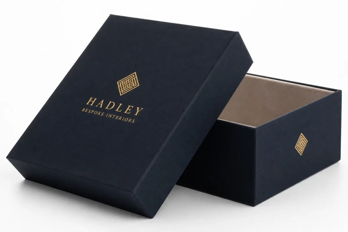
At its simplest, luxury rigid box logo placement is the decision about where the brand mark lives on the package: the top lid, the sidewall, the base, the spine, the inside lid, the insert, or even a sleeve that sits over the box. That sounds straightforward until you remember that each of those surfaces behaves differently once the box is built. The top lid may be the first thing a customer sees, but the side panel might be the surface that faces outward on a shelf. The inside lid may never be photographed by a retailer, yet it can create the most memorable reveal when the customer opens the box slowly and notices a second, more restrained mark.
This is why luxury rigid box logo placement affects perception so strongly. A centered logo on a flat PDF can feel formal and balanced. The same logo on a wrapped rigid box may drift slightly because the board wraps around corners and the paper stock pulls differently across edges. On a premium package, that small visual shift can be enough to make the design feel precise or sloppy. Buyers notice it even when they cannot explain it in technical terms. They just know something feels wrong, and trust me, they can smell fake polish from across a room.
From a packaging buyer's point of view, the logo is part of the hierarchy. The eye should know where to land first, what to notice second, and what to discover later. That is where luxury rigid box logo placement becomes strategic. A bold lid mark can establish confidence. A subtle side stamp can support retail display. A secondary interior mark can reward the opening experience without turning the package into a billboard.
The manufacturing side matters just as much. Rigid boxes are built from wrapped board, often with 2 mm to 3 mm grayboard or similar chipboard, and that structure creates seams, turn-ins, and edge build-up that change how any printed or stamped element sits on the surface. If you are planning luxury rigid box logo placement, you need to think about wrap allowance, fold compensation, and the way foil, embossing, or direct print will behave on the chosen stock. The logo does not live on a drawing. It lives on a formed object.
That also affects the unboxing moment. If the mark is on the lid, the package announces itself immediately. If it is on the inner panel, the box feels quieter on the outside and more surprising on the inside. If it repeats across lid and insert, it can create a layered presentation, but only if the hierarchy is clear. Good luxury rigid box logo placement keeps the package refined rather than crowded, and it gives the brand room to breathe.
How luxury rigid box logo placement works across the box structure
To understand luxury rigid box logo placement, it helps to think like a converter or a packaging engineer. The rigid box is not one flat canvas. It is a set of surfaces that each accept artwork differently, and each surface has its own risk points. The lid top gives you the largest uninterrupted field. The shoulder or neck can support a subtle brand cue, but it is rarely the place for delicate artwork. The base can carry a mark for tracing, batch control, or a secondary identity element. The spine or sidewall may work well when boxes are stacked upright or stored in a retail display.
The wrap seam is one of the first things I check during luxury rigid box logo placement. If a logo lands too close to the seam, the design can look pinched or interrupted once the wrap is trimmed and turned in. The same is true near corners, magnets, and closure points. A clean file can still become an awkward box if the critical details sit where the material takes the most stress. The dieline is not a background document. It is the map that tells the logo where it can safely live.
Safe zones matter. So do margins for wrap, turn-ins, and tolerances. A standard rigid box may need several millimeters of breathing room around a logo so the finishing team can stay inside acceptable registration without risking a crooked or clipped impression. For luxury rigid box logo placement, I usually prefer a more generous safe area than teams expect, especially if the mark includes thin letters, fine line art, or tiny type. Those details can disappear under foil pressure or look fuzzy when the stock has texture.
Decoration method changes the logic even more. Foil stamping gives a crisp, reflective mark that can look elegant on a matte wrap or soft-touch lamination, but it needs clean artwork and reliable pressure. Embossing raises the design and creates depth, yet it needs enough line weight to hold detail. Debossing pushes the form inward and can feel quiet and expensive when the art is simple. Direct print can handle more color and more detail, but it also asks for tighter attention to registration and surface absorbency. In each case, luxury rigid box logo placement is part art direction and part production planning.
Here is the practical rule I give teams: let the box structure do some of the storytelling. The exterior lid might carry the primary identity, the inner lid might carry a restrained mark or pattern, and the insert or sleeve can extend the system without competing for attention. That turns luxury rigid box logo placement into a sequence, not a single graphic decision. Better packaging usually has rhythm. It does not scream the same line from every angle.
If you want a good technical reference point for broader packaging structure and terminology, the Packaging School and packaging industry resources are useful background reading. For transport performance and distribution testing, ISTA is a dependable place to start when a project needs to survive more than a single shelf interaction.
I have seen projects look flawless in a PDF and then drift the moment the wrap stock changed from coated art paper to a textured sheet. That is why the structure conversation belongs at the beginning, not after approval. Once tooling starts, you are kinda locked in.
What affects luxury rigid box logo placement, cost, and pricing
Most teams ask about cost early, and that is fair. luxury rigid box logo placement changes pricing more often than people expect because every placement decision affects setup, tooling, and quality control. The main cost drivers are board thickness, wrap stock, finish type, logo size, number of placement locations, and the amount of hand work needed to keep everything aligned. A simple foil stamp on one lid panel is usually easier to run than the same mark repeated on the lid, sidewall, and inner lid.
Material choice is a major factor. A 2 mm grayboard with coated art paper behaves differently from a 3 mm board wrapped in textured specialty stock. Soft-touch lamination can make a lid feel upscale, but it also changes how foil and embossing read. Dark wraps often require more careful inspection because a tiny shift is easier to see. For luxury rigid box logo placement, the more complex the surface, the more careful the setup. Pretty simple. The board will tell you what it wants if you pay attention long enough.
As a rough planning range, a single foil logo on the top lid of a Custom Rigid Box might add about $0.08-$0.20 per unit at 5,000 pieces, depending on size, coverage, and tooling. Embossing or debossing can sit in a similar range or slightly higher if the art is large or the plate needs more detail. Multiple placements across the exterior and interior can push the premium higher, especially when the artwork requires extra registration checks or a second pass through production. Those are not fixed prices, of course, but they are useful planning numbers when a buyer is building a budget for luxury rigid box logo placement. If a supplier quotes far outside that range, ask what changed. There is usually a reason.
To keep the decision grounded, I like to compare options side by side:
| Placement option | Best use | Typical cost impact | Production notes |
|---|---|---|---|
| Top lid center | Primary brand reveal and photography | Low to moderate | Usually the cleanest option for luxury rigid box logo placement |
| Top lid off-center | Modern, editorial, or asymmetric layouts | Low to moderate | Needs careful balance so the mark does not feel accidental |
| Side panel | Retail stacking or shelf-facing displays | Moderate | Watch seam location, corners, and closure hardware |
| Inner lid or reveal panel | Premium unboxing moment | Moderate to high | Excellent for secondary branding in luxury rigid box logo placement |
| Multiple surfaces | High-end systems, sets, or gift packaging | High | More alignment checks, more setup time, more waste risk |
Waste is part of the math too. If the logo sits too close to a fold or seam, a converter may need extra sample pulls to confirm the fit, and that takes time and material. If a plate or die has to be remade because the artwork was approved too late in the process, the budget takes another hit. Good luxury rigid box logo placement reduces that risk by making sure the design is production-friendly before anyone commits to tooling.
There is also a common temptation to make every surface carry branding. I get why teams do it; they want the box to feel rich. But on a premium package, restraint usually looks more expensive than overload. Spend the decoration budget where the customer will notice it first. Let the material, the structure, and the tactile finish do part of the work. That is often the difference between a polished result and a package that feels busy.
When sustainability matters, the cost conversation may include FSC-certified wraps or recycled board content as well. Those choices can affect sourcing and print behavior, but they also support a stronger brand story. If that is part of your positioning, keep the sustainability claim aligned with the actual material spec and the supplier documentation. luxury rigid box logo placement should support that story, not distract from it.
Step-by-step luxury rigid box logo placement process and timeline
The cleanest luxury rigid box logo placement projects usually follow the same basic rhythm: discovery, dieline review, proofing, sampling, approval, and production. Skip a step and the risk goes up. Slow down at the right moment and the box usually improves. That is not glamorous advice, but it is how good packaging gets built.
1. Discovery and intent
Start by defining the audience, sales channel, product size, shipping method, and desired unboxing experience. A box for a retail counter display does not need the same placement logic as a box that ships in an outer carton and is opened at home. If the team is using luxury rigid box logo placement to signal quiet luxury, the logo may need more breathing room and a more tactile finish. If the box is meant to shout on a shelf, the mark may need stronger contrast and a more direct orientation.
2. Dieline review
Once the box structure is known, the logo gets placed against the actual dieline, not a guess. This is where safe zones, wrap margins, fold lines, magnet positions, and turn-in areas come into play. A good packaging team will mark the no-go areas before artwork is finalized. That step alone prevents many of the worst luxury rigid box logo placement mistakes.
3. Digital proofing
Digital proofs are useful for proportion and layout, but they do not tell the full story. They show position, not the behavior of foil on textured paper or the effect of embossing on a dark wrap. Still, a digital proof is the right place to settle the basic alignment of luxury rigid box logo placement before any physical sample is made.
4. Physical sampling
A flat mockup, folded sample, or fully finished prototype is where reality shows up. In hand, the logo may feel larger or smaller than expected. Under warm retail lighting, metallic foil may read stronger than it did on screen. Under camera flash, a gloss finish may create reflections that flatten the mark. A physical sample is often where teams make their smartest luxury rigid box logo placement adjustments.
5. Final approval and sign-off
A serious approval process should confirm dimensions, finish choice, alignment tolerances, version control, and any special notes for the factory. If the project uses embossing, make sure the emboss height and plate direction are clear. If it uses foil, confirm the foil color, coverage area, and registration tolerance. If the box will be tested for shipping, tie the sign-off to performance requirements as well. For distribution-ready packaging, a test profile aligned with ISTA guidance is often a sensible checkpoint.
On timing, simple luxury rigid box logo placement can move quickly once the dieline and artwork are approved, sometimes with digital proofing inside 24-48 hours and production starting soon after sample approval. More complex projects often need 5-10 business days for sample turnaround and 12-15 business days, sometimes longer, for full production after sign-off. If the design involves custom tooling, multi-location decoration, or a new structural format, build in extra days. It almost always pays off.
One practical note: if the box is part of a launch campaign, do not wait until the end to evaluate the logo in context. Mock it up on the shelf, in the shipping sleeve, and in a handheld unboxing scenario. Luxury rigid box logo placement can look right in a file and still feel wrong in the real retail or social media environment. Context changes everything.
Common mistakes in luxury rigid box logo placement
The most common mistake is designing for the flat artwork file instead of the wrapped box. I see this all the time. A logo looks centered on a screen, but once the board is wrapped and the corners are turned, it sits a few millimeters too high, too low, or too close to a fold. In luxury rigid box logo placement, a few millimeters is not a small thing. It is the difference between polished and slightly awkward.
Another frequent issue is placing the mark near a seam, corner, or closure. Magnetic closures, ribbon pulls, thumb cutouts, and lid shoulders all eat up usable space. If the logo sits too close to those features, the layout can feel crowded even when the artwork itself is beautiful. For luxury rigid box logo placement, the cleanest design is usually the one that respects the hardware and structure instead of fighting them.
Detail can also betray a premium design. Thin strokes, tiny type, and highly intricate line work often look elegant on a digital render but become less reliable after foil stamping or embossing. On textured paper, the impression can soften. On dark stock, the mark may lose contrast. If you want luxury rigid box logo placement to feel precise, keep the art bold enough to survive the decoration method you have chosen. Tiny elegance is lovely right up until it turns into mush.
Over-branding is another trap. If every face of the box carries the same weight, the package stops feeling curated and starts feeling crowded. Premium packaging usually benefits from hierarchy. Let one surface lead. Let the other surfaces support. That is especially true in luxury rigid box logo placement, where the eye should have a clear first stop and a clear second stop rather than ten competing messages.
There is also a subtle production mistake that shows up late: approving logo placement before confirming the exact wrap stock. A matte coated sheet, a soft-touch laminate, a textured paper, and an FSC-certified uncoated wrap all behave a little differently. Adhesion, gloss level, edge wrap, and foil clarity can shift with the material. If the logo is not tested on the actual stock, the final result can surprise everyone. That is not always the fault of the printer or the converter; it is usually a planning gap in luxury rigid box logo placement.
Finally, teams sometimes choose a logo size that is too small for the finish. This is especially risky when the box uses embossing or a very restrained one-color layout. Small can be elegant, but it still has to read. If a customer has to tilt the box under light to find the mark, the brand has probably gone too far in the minimalist direction. The goal of luxury rigid box logo placement is balance, not invisibility.
Expert tips for a cleaner luxury rigid box logo placement
If I had to reduce luxury rigid box logo placement to one habit, it would be this: start with the first-touch surface. Usually that means the top lid. That is where the customer’s hand lands, where the eyes go first, and where product photography often begins. A well-placed lid logo gives the package instant confidence, and it lets the rest of the box stay quieter if needed.
Use scale carefully. Bigger is not automatically better. In fact, a smaller logo with a stronger finish often feels more expensive than a large graphic that covers too much of the lid. Foil stamping, debossing, and embossing can carry a premium impression even when the artwork is restrained. The tactile cue matters. So does the amount of empty space around the mark. Good luxury rigid box logo placement leaves room for the material to be seen.
Context testing is a habit worth keeping. I like to see a mockup in the same environment where the box will be noticed: on a retail shelf, inside a shipping sleeve, under warm display lighting, in a product photo, and in an unboxing video frame. Each of those views changes how luxury rigid box logo placement reads. A centered mark may look ideal in a hand but too static in a wide camera frame. A corner mark may feel dynamic in a video but uneven on a shelf.
Think in layers. Exterior branding should not do all the work. If the box has a lift-off lid, a shoulder box, or a reveal tray, the interior can carry a second mark, a short line, or a pattern that supports the brand without competing for attention. That layered approach is one of the most effective ways to make luxury rigid box logo placement feel intentional. It turns the package into an experience instead of a single printed object.
Here are a few practical habits that help:
- Leave more clearance near folds, corners, magnets, and turn-ins than you think you need.
- Keep thin type and fine lines away from heavy wrap tension areas.
- Choose the decoration method first, then tune the artwork for that method.
- Use one primary logo location and only add secondary marks if they truly add value.
- Review proofs under the same lighting temperature the box will likely be seen in.
One more thing: communicate with production early. If the factory knows the exact intent behind luxury rigid box logo placement, it can flag problems before they become costly. That includes plate sizing, foil direction, emboss depth, wrap direction, and whether the artwork must avoid a seam on a specific edge. Small notes like that save real money, and they save a lot of frustration too. Nobody enjoys discovering a seam conflict after the tools are already cut.
When a team gives the converter a clear target, the samples get better faster. When they do not, everybody spends extra time guessing what "premium" was supposed to mean. Spoiler: guessing is expensive.
How to finalize luxury rigid box logo placement before production
Before sign-off, I recommend a simple checklist. Confirm the box dimensions, the board thickness, the wrap stock, the logo size, the exact location of the mark, the decoration method, and the tolerance expectations. If the artwork has a second mark on the inside lid or sidewall, confirm that too. A final luxury rigid box logo placement review should leave no ambiguity about what the production team is meant to build.
Then compare 2 or 3 placement options on a folded mockup or a 3D proof. The best choice is not always the most symmetrical one. Sometimes a slightly off-center placement feels more modern and more expensive, especially on a tall rigid box or a box with an unusually wide lid. Sometimes the most balanced result is the one with the most breathing room around it. The final test is simple: does the logo read clearly in hand, on camera, and from the distance where the box will actually be seen? If not, keep refining luxury rigid box logo placement.
Production notes matter as much as the artwork file. Lock down any direction on foil color, emboss depth, registration tolerance, and the exact area where the mark must not drift. If the project uses a sleeve, tell the team whether the logo must align with the sleeve window or remain intentionally offset. If the box needs to pass a shipping profile, make sure the structure has been considered against the chosen test standard. That level of specificity is what keeps luxury rigid box logo placement from becoming a last-minute correction.
For sustainable projects, this is also the right time to confirm the material claim chain. If the wrap is FSC-certified or the board contains recycled fiber, keep the documentation handy and make sure the brand language matches the actual spec. A premium box should feel honest all the way through the process. In that sense, luxury rigid box logo placement is not only about aesthetics; it is also about trust.
If I had to give one takeaway, it would be this: check the dieline, mark every seam and turn-in, and approve a physical mockup before tooling. That one habit catches most of the expensive mistakes. The rest is refinement.
Final thought: the best luxury rigid box logo placement does not shout, and it never looks accidental. It feels measured, it respects the structure, and it makes the box look like the brand knew exactly what it was doing from the first proof to the finished run.
Where is the best place for luxury rigid box logo placement?
The top lid is usually the strongest choice because it is the first surface customers see, touch, and photograph. Side panels can work well for stacked retail displays or multi-box sets, but they usually support the main lid mark rather than replace it. If the box has an inner reveal, a secondary logo inside can add a premium moment without crowding the exterior, which is often the smartest use of luxury rigid box logo placement.
How does luxury rigid box logo placement affect cost?
A single, well-positioned logo is usually less expensive than multiple placements across the lid, side, and interior surfaces. Foil stamping, embossing, and combined finishes add tooling and setup costs, especially when the artwork is large or highly detailed. Keeping the mark away from seams and folds also reduces the risk of alignment issues, rework, and extra samples, which is why luxury rigid box logo placement can have a real budget impact.
Should logo placement change for foil, embossing, or print?
Yes. Each finish reads differently on board and wrap stock, and some treatments need more clearance or simpler artwork. Foil usually benefits from bold shapes and clean edges, while embossing needs enough line weight to hold detail. Print can support finer elements, but it still has to respect the box structure and wrap tolerances. That is why luxury rigid box logo placement should be adjusted for the finish, not copied across every method unchanged.
How long does the logo placement process usually take?
Simple placements can move quickly once the dieline and artwork are approved, but custom finishes or samples add time. A digital proof may come back in a day or two, while a physical sample often takes several business days depending on the structure and decoration method. If the box is highly engineered or uses multiple decorative methods, build in extra time for coordination and sign-off. That pacing is normal for luxury rigid box logo placement when quality matters.
What is the most common mistake in logo placement on rigid boxes?
Designing for the flat layout instead of the wrapped box is the most common issue, and it often causes off-center or crowded results. Another frequent problem is placing critical details too close to folds, seams, or corners. A final mistake is making the logo too small or too detailed for the finish and material being used. Careful luxury rigid box logo placement avoids those traps before they become expensive to fix.
Related packaging resources
Use these related guides to compare specs, costs, quality checks, and buyer decisions before making the final call.