For a cosmetic brand, a hang tag is not filler. It is often the first tactile proof that the product belongs in a certain price tier, and a solid Branded Hang Tags for cosmetics brands Print Finish Comparison can make that judgment easier before a shopper reads a single ingredient line. Matte, gloss, soft-touch, foil, and emboss do more than alter appearance; they change how the tag feels, how it survives handling, and how clearly the copy reads under store lighting.
That matters because beauty packaging is judged fast. The difference between a calm skincare line and a trend-driven color cosmetics launch can come down to sheen level, paper stiffness, and whether the finish helps tiny text stay legible. If you are comparing options for Custom Labels & Tags, the real question is not “What looks premium?” It is “What finish supports the product, the margin, and the shelf environment?”
Branded hang tags for cosmetics brands print finish comparison: why the finish changes the sale
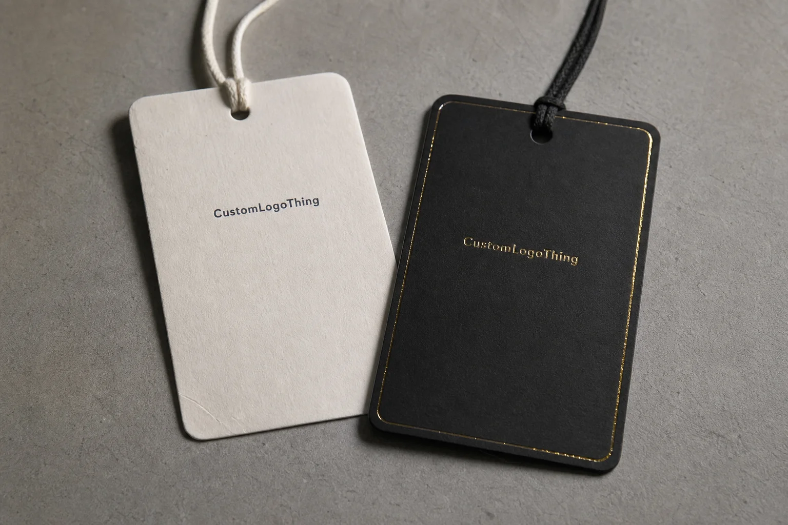
A hang tag has a small footprint and a long checklist. It needs to carry brand language, legal copy, sometimes a barcode or QR code, and still look intentional next to a bottle, carton, or jar. The finish changes how all of that is read. A matte or uncoated surface usually signals restraint, skincare credibility, and quiet confidence. Gloss reads brighter and more promotional. Soft-touch feels more curated. Foil pushes the line into a more obvious premium tier.
That visual language is not random. A buyer in a department store, salon, or specialty retailer often decides in seconds, and the finish becomes part of the shorthand. A soft-touch tag can make a simple formula feel more considered. A high-gloss tag can help a bold launch feel energetic. A restrained matte hang tag often works better for botanical or dermatology-led positioning because it does not fight with the pack art.
Print finishing affects function too. Better contrast makes microcopy easier to read. The right coating can improve scuff resistance so the tag survives kitting, shipping, and in-store handling. A clean barcode or QR code is easier to scan on a surface that does not throw glare back at the scanner. If the finish muddies the code, the problem is operational, not cosmetic.
If the finish looks expensive but the copy becomes hard to read, the tag is doing half its job at best.
That is why Branded Hang Tags for Cosmetics brands print finish comparison should be treated as a business decision, not a style argument. The right choice depends on category, product margin, and retail context. A luxury fragrance line can justify more aggressive effects. A clinical skincare range usually benefits from calm surfaces and crisp typography. The smart move is to align finish with what the line is trying to prove.
For teams that want a broader packaging benchmark, the trade group resources at Packaging School are useful for understanding material behavior and print terminology before specs are locked.
How print finishes change color, texture, and readability
The basic finish families are straightforward, but the results are not. Uncoated stock absorbs ink more than coated stock, so it often looks softer and less reflective. Aqueous matte adds a light protective layer without turning the surface into plastic. Gloss lamination increases shine and saturation, which can make CMYK artwork look punchier. Soft-touch adds a velvety feel that people notice immediately. Spot UV highlights selected artwork with a glossy contrast. Foil stamping brings metallic light play. Emboss and deboss create physical depth instead of just visual contrast.
On cosmetics hang tags, those differences are easy to spot. Gloss boosts color density and makes bright pinks, corals, and blues feel more vivid. Matte reduces glare, which helps small serif type and ingredient details stay readable. Soft-touch does not just feel premium; it also quiets the visual noise in artwork with many elements. Foil can lift a logo or short line name, but it should be used with discipline. Too much metal on a tiny tag can look like a gift card, not a beauty label.
There is also a technical side. Heavy texture can interfere with fine barcodes or tiny QR codes. Ultra-gloss can reflect store lighting at the wrong angle, especially under LED shelves and retail case lights. Dark matte surfaces hide fingerprints better, but they can also show abrasion if the coating is too thin. That is where proofing matters. A finish that looks elegant on screen may behave very differently on press.
Most brands get cleaner results by matching the finish to the artwork structure. Photography-heavy layouts usually benefit from glossy or semi-gloss treatment. Thin serif logos and minimal layouts often look better with matte or soft-touch. Narrow gradients, especially in beauty packaging, should be checked carefully because some finish combinations can make banding more visible. Offset printing is still the best fit for precise brand color control on larger runs, while digital printing can be more practical for short runs, seasonal launches, or frequent artwork changes. Flexographic printing comes up less often for premium cosmetics hang tags, but it can matter in simpler converter workflows or ancillary components.
For buyers who want to sanity-check terminology, the industry references at ISTA help frame handling and distribution risks, which is useful if the tags are shipped with cartons or other retail components.
Cost, pricing, and MOQ tradeoffs by finish
Cost differences usually come from setup, not just ink. The paper stock matters. The finish matters. The number of passes matters. Die work, foil plates, embossing plates, and double-sided printing can move pricing more than the tag shape itself. If a vendor is quoting only a single unit price, that is not enough detail to compare options cleanly.
Here is the practical pattern: simple matte or gloss tags tend to scale better at lower quantities, while foil, emboss, and other multi-step effects usually need more setup and more quality control. That does not automatically make them bad choices. It just means the economics work differently. A hero fragrance SKU can carry more embellishment. A trial-size skincare line usually cannot.
| Finish option | Typical best use | Typical unit range at 5,000 pcs | Cost and setup notes |
|---|---|---|---|
| Aqueous matte | Skincare, botanical, clinical | $0.14-$0.22 | Efficient on medium runs; good readability and lower glare |
| Gloss lamination | Bold color cosmetics, promotional lines | $0.16-$0.26 | Better color pop; can reflect retail lighting |
| Soft-touch | Premium skincare, luxury beauty | $0.22-$0.35 | Higher material cost; strong tactile value |
| Spot UV | Logo accents, selective shine | $0.24-$0.40 | Needs careful placement and registration control |
| Foil plus emboss | Fragrance, prestige launches | $0.30-$0.55 | More setup, more inspection, higher risk of waste |
The fastest way to lose money is to apply a premium finish to every SKU because the prototype looked good. That can compress margins, especially in fragrance lines, holiday editions, and retail exclusives where packaging already carries pressure. A better approach is to reserve premium treatment for hero items, then keep the supporting SKUs visually aligned through typography, stock choice, and restrained finishing.
Ask for quotes in a way that separates the variables. Base print. Finish upgrade. Proofing. Die cut. Stringing or attachment. Shipping. Once those pieces are visible, you can compare apples to apples instead of guessing where the money went. If a quote looks unusually low, it may be hiding thinner stock, a weaker coating, or a different production method.
That is also where a useful vendor conversation starts. A line built around Branded Hang Tags for cosmetics brands print finish comparison should not be priced as a generic paper tag. It should be quoted as a spec. The more clearly the spec is written, the less room there is for substitution later.
Process and turnaround: from proof to packed shipment
Most delays happen before press ever runs. The normal sequence is artwork prep, digital proof, material selection, finish approval, press setup, finishing, die cutting, string or attachment prep, final inspection, and packing. Each step is simple on paper. The problems show up in the handoff points.
Unclear foil placement is a classic one. So is low-resolution artwork, especially if the logo contains hairline strokes or small reversed type. Another common issue is last-minute size changes after the proof has been approved. That seems minor internally. In production, it can trigger a new die, a new setup, or a new proof cycle.
Turnaround also shifts by finish. Straightforward coated tags can move quickly because there are fewer steps and fewer opportunities for variation. Foil stamping, embossing, and layered special effects usually extend the schedule because the shop has to manage alignment, pressure, and post-press inspection. If the brand has never seen the finish in person, a physical sample is worth the time. Screen previews are not enough to judge sheen, texture, and color drift.
A realistic calendar for a custom cosmetics hang tag often looks like this: one to two business days for artwork cleanup, two to four days for proofing and approvals, and roughly 7 to 15 business days for production after signoff, depending on the finish and quantity. Add time if the project needs special paper, imported stock, or FSC-certified material sourced for sustainability claims. FSC is not just a logo exercise; it affects procurement and documentation. If that matters to your brand, make sure the supplier can prove the chain of custody through FSC.
Packaging teams also tend to underestimate shipping and packing. If tags are traveling with cartons, sleeves, or other components, ask how they will be packed to reduce edge crush and corner wear. For mixed-component shipments, ISTA-style thinking is useful because it shifts the conversation from “Will it arrive?” to “Will it arrive saleable?”
Choosing the right finish for skincare, fragrance, and color cosmetics
Skincare usually benefits from matte, soft-touch, or uncoated papers because they feel calm, controlled, and a little more clinical. That is especially true for derm-style brands, clean beauty lines, and products that rely on trust rather than flash.
Fragrance is different. It can support richer metallic cues, deeper embossing, and more dramatic contrast because the category already sells mood and aspiration. That said, too much decoration can flatten the brand if every bottle and tag shouts at once. One strong effect often works better than three competing ones.
Color cosmetics usually sit in the middle. Gloss and spot UV can amplify bold palette energy and help compact-friendly shades feel lively. But if the surface is too shiny, the line can start to feel disposable instead of premium. That is a real risk in mass-premium retail, where a tag has to communicate value without looking overdesigned.
Line architecture matters too. Hero products can carry a signature finish, while extensions and travel sizes should reuse the same logic so shelf recognition stays strong. If the top SKU is soft-touch with foil, the supporting items should not drift into a different visual system unless the brand wants a deliberate tier shift. The point is consistency. Not sameness, but consistency.
From a packaging buyer’s point of view, the best test is physical, not theoretical. Place the tag next to the jar, bottle, and carton under warm and cool lighting. Then tilt it. Then hold it at arm’s length. That is where you will see whether the finish is helping or fighting the pack. A good Branded Hang Tags for Cosmetics brands print finish comparison should include the actual retail environment, not just a desk lamp and a PDF.
- Botanical or clean beauty: matte, uncoated, or soft-touch
- Luxury fragrance: foil, emboss, or selective gloss accents
- Trend-driven color cosmetics: gloss, spot UV, or strong CMYK color
- Clinical skincare: restrained matte with high-contrast type
Common mistakes that make hang tags look cheaper
The first mistake is mismatch. A glossy tag on a matte carton can look accidental unless there is a deliberate reason for the contrast. The same is true in reverse. If the tag, carton, and label all speak different finish languages, the line can feel unplanned even if the artwork is strong.
The second mistake is overloading the small format. Foil plus emboss plus heavy spot UV can be useful on a prestige launch, but on a tiny tag it can turn into clutter. The logo gets lost. The hierarchy breaks. The shopper sees effort, not confidence. On a cosmetic package, restraint usually reads better than decoration for decoration’s sake.
Type is another weak point. Tiny text, low contrast, and metallic inks that do not separate well from the background can make compliance information hard to read. That is not a design problem only; it can become a production issue if the substrate and finish do not support the copy. Black text on a dark matte surface may need more contrast than the digital proof suggests. Reverse type on foil needs careful testing because small counters can fill in under press conditions.
Stock quality also matters. A luxury finish on flimsy paper still feels low-end in the hand. People notice stiffness before they can explain why. If the tag flexes too easily, the finish will not save it. That is why paper caliper, coating choice, and finish need to be specified together. Print finishing cannot disguise poor substrate selection for long.
A useful quality-control habit is to ask for a physical sample whenever the finish is central to the brand story. That is true even at moderate quantities. One extra day on a sample is cheaper than a full run that looks different from the approved proof because the lighting, coating, or foil reflectivity was never tested in person. If the brand is comparing options against a Case Studies library, pay attention to the finish details as much as the layout itself.
It is also smart to ask whether the shop is using offset printing, digital printing, or a hybrid production path. That choice affects color stability, setup cost, and how well spot color or CMYK artwork holds up across versions. A line that changes every month may be better served by digital printing. A stable hero SKU may deserve offset printing and tighter control.
Next steps: test samples, lock specs, and request quotes
Start with a side-by-side sample set. Ask for two or three finishes on the same artwork so the team can compare sheen, readability, texture, and scuff resistance under real retail lighting. Do not compare different designs. Compare the same design across different surfaces. That is the only way to isolate the finish.
Then lock the spec before quoting. Size, stock, print sides, finish type, hole style, string or fastener method, quantity, shipping destination. If any of those variables are still floating, the pricing will be soft too. Vendors can only quote accurately when they know exactly what they are building.
A simple decision matrix helps internal teams move faster. Score each finish on brand fit, cost, turnaround, durability, and shelf impact. Marketing usually cares about look and story. Operations cares about consistency and lead time. Finance cares about margin. Put all three in the same frame and the decision becomes clearer.
It is also worth pressure-testing the quote itself. If one finish is dramatically cheaper or slower than the others, ask why. Sometimes the shop is changing the stock. Sometimes it is changing the finishing method. Sometimes it is changing the ink system or moving from spot color to CMYK. Those changes are not wrong, but they need to be visible before approval.
The final step is simple: shortlist two finishes, sample them, approve one proof, and move into production. If you keep the process disciplined, branded hang tags for cosmetics brands print finish comparison becomes less of a design debate and more of a reliable buying tool. That is the point. The tag should make the product look right, read clearly, and hold up from packing line to shelf.
Here are the questions buyers usually ask once they start a branded hang tags for cosmetics brands print finish comparison and realize the finish affects more than appearance.
Which finish works best for branded hang tags for cosmetics brands?
Matte and soft-touch usually work best for skincare and premium beauty because they feel calm and expensive. Gloss is better when the artwork depends on bright color, sharp contrast, or a more promotional shelf presence. The best choice depends on the product story, not just the finish category, so test samples under real store lighting.
What affects pricing most when comparing cosmetics hang tag finishes?
Special processes like foil, embossing, and spot UV raise setup cost more than standard matte or gloss coatings. Paper stock, quantity, and whether the tag is printed on one side or both sides also shift unit cost. A vendor quote is easiest to compare when base print, finish upgrades, and shipping are listed separately.
How long does turnaround usually take for custom hang tags with special finishes?
Simple coated tags are usually faster than foil-stamped or embossed versions because they need fewer setup steps. Proof approval is a common delay point, so turnaround depends heavily on how quickly artwork is signed off. If the finish matters to the brand story, allow time for a physical sample instead of relying only on screen proofs.
Should skincare hang tags be matte or gloss?
Matte is often the safer choice for skincare because it feels cleaner, calmer, and less promotional. Gloss can work when the line needs brighter shelf pop or a more mainstream retail look. If the tag carries small text, matte often reduces glare and improves readability.
How do I test finishes before placing a large order?
Request a small sample set with the same artwork in two or three finishes, not separate design versions. Check the samples next to the actual bottle, jar, or carton under warm and cool lighting. Review touch, color shift, readability, and scuff resistance before approving the production spec.