The chocolate Woven Label Beanies Material Sample guide matters for one simple reason: a label can look clean in artwork and still fail on a knit cuff. Thread density, fold behavior, and backing choice all change once the label meets a real beanie body. A good sample shows those problems early, while they are still cheap to fix.
Buyers usually notice the logo first and the construction second. That ordering causes trouble. A woven label that is slightly too stiff can wrinkle at the seam, scratch the forehead, or sit crooked after sewing. A sample is less a formality than a small technical audit of the finished hat.
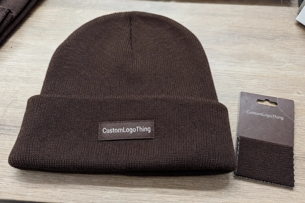
The best sample is the one that tells you what the final beanie will do, not just how the artwork looks on a screen.
What the sample actually proves
A proper chocolate woven label Beanies Material Sample guide is not just about color matching. It tests whether the woven structure holds small text, whether the backing behaves on stretch fabric, and whether the label still feels comfortable after it is sewn into place. On a beanie, comfort and appearance are tied together. If the trim feels wrong, the product feels cheaper, even when the logo is perfect.
Flat mockups do not reveal much. They cannot show edge curl, fold memory, or the way a label shifts when a rib knit relaxes after stitching. They also hide the difference between a label that looks crisp under studio light and one that reads clearly in retail lighting or daylight. Those differences are subtle on a table and obvious on a head.
The first four checks I use are hand feel, edge finish, fold memory, and stitch visibility. Hand feel tells you whether the customer will notice the trim on contact. Edge finish shows whether the label will fray or stay clean after repeated wear. Fold memory matters on cuff placements, where a rigid label can keep trying to spring open. Stitch visibility is the quiet one; if the seam is too exposed, the label loses the polished look that buyers expect from higher-end headwear.
Color is only one part of the story. A deep chocolate base with cream thread can look rich, but only if the weave preserves enough contrast. If the thread count is too low, small lettering fills in and loses definition. If the weave is too tight, the label can become visually sharper while also feeling stiffer. That tradeoff is normal, and it is why a sample beats a proof image every time.
For lines that use multiple trims, the same construction logic applies across products. The Custom Labels & Tags range is a useful comparison point for fold styles, backing options, and finishing methods that affect wear.
How the sample is made and what happens before approval
Most suppliers start by translating the art into a woven draft. That means converting the logo into thread counts, color blocks, and edge limits rather than pixel shading. A design that looks simple on a monitor can become difficult once the supplier tries to fit it into a small woven label size. Thin lines may need to be thickened. Tiny text may need to be enlarged. Borders may need to be simplified so the label stays readable at a practical size.
The sample itself usually arrives in one of three forms: a flat woven swatch, a stitched demo, or a pre-production piece attached to a test panel. For beanies, the stitched demo is the most useful middle step. It shows color, but it also shows how the label bends, how it sits against knit fabric, and whether the fold lands where it should. A flat swatch can confirm thread quality, but it cannot tell you how the label behaves under tension.
Good suppliers will ask for more than artwork. Expect questions about label dimensions, placement, fold style, backing, and the final beanie material. That is not overreach. A label that looks balanced on a shallow cuff may look oversized on a slouchy cap. A label that sits fine on a smooth panel may pucker on a thicker rib knit. These are production details, not design niceties.
If the supplier offers a sample attached to a beanie-like substrate, request that version. Woven labels behave differently on acrylic, cotton, wool blends, and mixed yarn knits. Stretch changes the visual weight of the label. Stitch lines move slightly under tension. A sample on the wrong surface can look approved and still fail once it reaches the actual product line.
For broader trim programs, keep the sample brief tied to the garment brief. The same discipline used for Custom Labels & Tags applies here: size, placement, backing, and wear expectations should travel together, not in separate emails that drift out of sync.
Key material factors that change the final label
Three variables shape most of the result: thread count, backing, and edge treatment. Those are the pieces that decide whether the label feels refined or merely adequate.
Thread count controls detail. Lower counts are easier to read at a glance and usually suit bold branding or small placements on beanies. Higher counts hold finer type, thinner borders, and more detailed icons, but they also make the weave denser. On a cuff that sits near the face, that extra density can change how soft the product feels. The right choice is usually a practical middle ground, not the highest possible resolution.
Backing changes both drape and durability. Sew-on backing is still the standard for most retail beanies because it keeps the label stable through wear and washing. Iron-on backing can help in some production lines, but thick knit caps do not always bond evenly. Adhesive backing is useful for temporary positioning, not usually for final attachment unless the supplier has tested it carefully. No-backing labels can feel softer, but they depend on cleaner stitching to stay flat.
Yarn type and finish influence color depth. A matte yarn on a chocolate base reads warmer and more textile-like. A slightly polished yarn can make the same brown appear deeper and more saturated under store lighting. Cream or tan thread against chocolate gives a clean contrast, but only if the tone difference is strong enough. If the colors are too close, the logo loses distance readability. That is a common mistake when buyers approve from digital mockups alone.
Edge treatment and fold style decide how the label sits on the beanie. Straight-cut labels can work in some placements, but folded labels usually look more finished on visible trims. End folds are useful when the sew line needs to disappear into a seam. Center folds can work well on front panels if the artwork is symmetrical and the label width is generous enough. A poor fold choice can make an otherwise strong label look pinched or off-center.
There is also a practical question of visibility versus comfort. If the label sits on the front cuff, legibility matters most. If it sits along the side seam or inside edge, softness and stability matter more. That small shift in priority saves a lot of rework later.
For beanies sold as premium basics, many buyers prefer a label that uses a midweight damask weave, moderate thread count, and soft sew-on backing. For limited-edition or fashion-led products, a slightly denser weave can be worth the extra stiffness if the art needs it. The sample should help you decide which direction fits the product, not force the choice for you.
Cost, pricing, and MOQ for sample requests
Sample pricing depends more on complexity than on size alone. A simple woven swatch is usually inexpensive. A stitched sample with custom folds, multiple thread changes, and a beanie panel costs more. If the supplier needs special color matching or a nonstandard backing, the price climbs again. That is normal. A sample is doing real work, and the price usually reflects the amount of setup involved.
Typical ranges for a beanie label sample request look like this:
| Sample type | Typical cost | Lead time | Best for | Main tradeoff |
|---|---|---|---|---|
| Flat woven swatch | $15-$35 | 3-5 business days | Checking weave, color, and artwork clarity | Does not show real garment behavior |
| Stitched demo on knit panel | $35-$90 | 5-10 business days | Checking hand feel, fold behavior, and placement | Higher cost, but much better decision data |
| Pre-production sample | $60-$120 | 7-15 business days | Final approval before bulk run | Tied closely to full production specs |
MOQ affects the picture too. A small custom order can carry a higher per-piece cost than the sample itself, especially if the factory needs to change loom setup, backing type, or thread allocation. Buyers sometimes assume the sample is overpriced because they compare it with bulk pricing. That comparison misses the point. The sample is absorbing the cost of uncertainty so the bulk run does not have to.
Ask whether the sample fee is credited toward production. If it is, the sample functions more like a refundable setup step. If it is not, treat it as insurance against a bad decision. That framing is usually more accurate than thinking of it as a throwaway fee.
Shipping should be part of the budget. Physical samples are often packed in corrugated cardboard mailers with kraft paper inserts to keep them flat and readable. If the supplier mentions FSC certification or ISTA handling standards, that generally signals attention to packaging and transit protection. For brands that care about recycled materials or biodegradable packaging, it is reasonable to ask what the outer mailer and insert stock are made from. The label is the priority, but the shipping materials still carry a message.
One useful trick is to request the first sample in a plain mailer, then evaluate branded packaging separately. Presentation can be tested later. Weave quality cannot.
Process, timeline, and turnaround before bulk order
The cleanest timeline starts with art review, moves to draft confirmation, then sample production, shipping, and one revision if needed. Straightforward labels can move quickly. Complex artwork, unusual yarn colors, or nonstandard fold styles stretch the schedule. If a supplier gives a fast promise before they have seen the art, size, and placement details, the timeline is probably optimistic.
A realistic schedule usually looks like this:
- Art review and spec check: 1-2 business days
- Woven draft or digital proof: 1-3 business days
- Sample weaving or stitching: 3-7 business days
- Shipping: 2-5 business days, depending on location
- Revision round, if needed: another 3-7 business days
Simple projects sometimes finish inside a week. More often, the total lands in the 10-15 business day range before shipping if the label needs color matching or if the fold style is being refined. That is still workable, but only if the sample is scheduled before the launch plan hardens. Brands often make the opposite mistake: they set the photo shoot, the wholesale deadline, and the launch date first, then discover the sample is the bottleneck. That creates avoidable pressure.
The sample should arrive protected, not overpacked. A decent mailer with corrugated support or kraft inserts keeps the label flat and easy to inspect. Extra packaging can be fine, but presentation should never hide transit damage or distract from construction issues. The approval target is the woven label, not the envelope.
Seasonal programs need a written cutoff date. A vague promise is not enough. If the sample supports a retail drop, a lookbook, or a wholesale line sheet, the schedule should include the full path from art approval through revision and final sign-off. That is the difference between a realistic lead time and a wish.
Step-by-step: how to request the right sample
If the goal is to use the chocolate Woven Label Beanies material sample guide properly, the brief has to be complete on the first round. Incomplete instructions usually produce incomplete samples. A useful request is specific, not long-winded.
- Send vector artwork, not a screenshot. AI, EPS, or PDF files give the supplier clean edges and editable structure.
- State the exact label size and placement. Include width, height, and where it will sit on the beanie: cuff front, side seam, edge fold, or inside seam.
- Provide color references. Pantone values are best, but clear visual references help when the target tone is chocolate, cream, tan, or a dark neutral with a warm cast.
- Rank your priorities. Softness, durability, visual sharpness, and premium appearance are not interchangeable.
- Ask for one alternate version if there is any uncertainty. A second backing or fold style is usually cheaper than revising a bulk order later.
Once the sample arrives, test it on the actual beanie body. Not a desk. Not a catalog page. Put it on the knit fabric it will live on and stretch the material slightly. Fold the cuff. Check whether the label twists, puckers, or sits too high. A beanie with a thick rib behaves differently from a loose slouch cap, and a label that looked centered in the sample tray may shift once the fabric is under tension.
Lighting matters as much as shape. Review the label in daylight and in warm indoor light. Chocolate tones can look deeper under yellow light and flatter under cooler light. If the product will be photographed for e-commerce or wholesale, that color shift can affect how the brand reads online. A sample that looks good only in one kind of light is not fully approved.
Keep the paperwork together as well: approved sample photos, written spec, revised artwork, and any comments about backing or fold style. That sounds administrative, but it prevents the most common production argument later: which version was actually approved?
For broader trim references, the Custom Labels & Tags page is a practical side-by-side reminder of how construction choices affect final approval.
Common mistakes and next steps
The biggest mistake is approving from a screen only. Woven labels are physical objects, not digital assets. Thread fills space differently than pixels. Small gaps close in. Thin type thickens. Borders that looked delicate can dominate once the label is woven. Skipping the sample is a gamble that the loom will reproduce the artwork exactly as imagined. It will not.
Another frequent problem is ignoring stitch placement and seam allowance. Even a well-made label can look awkward if the sew line lands too close to the fold or too far from center. On a beanie, where the surface is flexible and the eye notices symmetry fast, a few millimeters can change the whole impression. That kind of mistake is common, and it is usually preventable.
Practical checks worth doing every time:
- Compare the sample in daylight and indoor light.
- Review it on the actual beanie, not only on a sample card.
- Do a stretch test on the knit panel.
- Request a wash check if the cap will be worn often.
- Confirm final approval in writing before bulk production starts.
For smaller runs, a hand wash or two normal wash cycles can reveal more than a long discussion about durability. If the sample frays, shifts, or loses edge definition, that is useful information. Better to learn it before the loom run and not after hundreds of units are packed.
Packaging should still align with the brand story. If the line claims low-waste presentation, the sample shipment should at least avoid unnecessary plastic and should use material claims that are easy to verify. Small signals matter because customers notice them, especially when the product itself is simple and the trim carries much of the branding weight.
The best way to use a sample is to treat it like evidence. It should answer whether the label is soft enough, sharp enough, stable enough, and costed correctly for the final beanie. If it does that, it has done its job.
What should I look for in a woven label beanie material sample?
Check weave density, edge quality, backing, and how the label feels against knit fabric. Read the logo at arm's length and up close so you catch both branding and construction issues. Compare the sample in daylight and indoor light to spot color shifts early.
How much do chocolate woven label beanie samples usually cost?
Pricing usually depends on thread count, color changes, backing type, and whether you need a stitched prototype. Simple swatches are usually cheaper than sewn samples with custom folds or special finishes. Ask whether the sample fee is credited toward production so you can judge the true program cost.
How long is the typical turnaround for a beanie woven label sample?
Simple samples can move in a few business days, while color matching or complex folds can take one to two weeks before shipping. Shipping time adds to the total, so confirm whether the clock starts at art approval or at order placement. If the launch date is fixed, ask for a written timeline that includes any revision round.
Can I test a woven label sample on different beanie fabrics?
Yes, and you should, because rib knit, acrylic, cotton, and wool all change how a label sits and stretches. If the final cap material is heavier or looser than expected, the label can look smaller or pucker at the edges. Request a substrate-specific sample if the beanie fabric is unusual.
What files and specs should I send to avoid sample delays?
Send vector artwork, target dimensions, Pantone or reference colors, placement mockup, and the quantity you want. Add notes on backing, fold style, softness goals, and whether durability or premium appearance matters more. Include your target approval date so the supplier can map the sample timeline correctly.

