staples Custom Return Address Labels are a small part of the package, but they carry more operational weight than most teams expect. If the sender line is wrong, hard to read, or inconsistent with the rest of the shipping file, the label turns into a correction job instead of a utility item. That is a quiet cost until the reprints, delays, and support tickets start adding up.
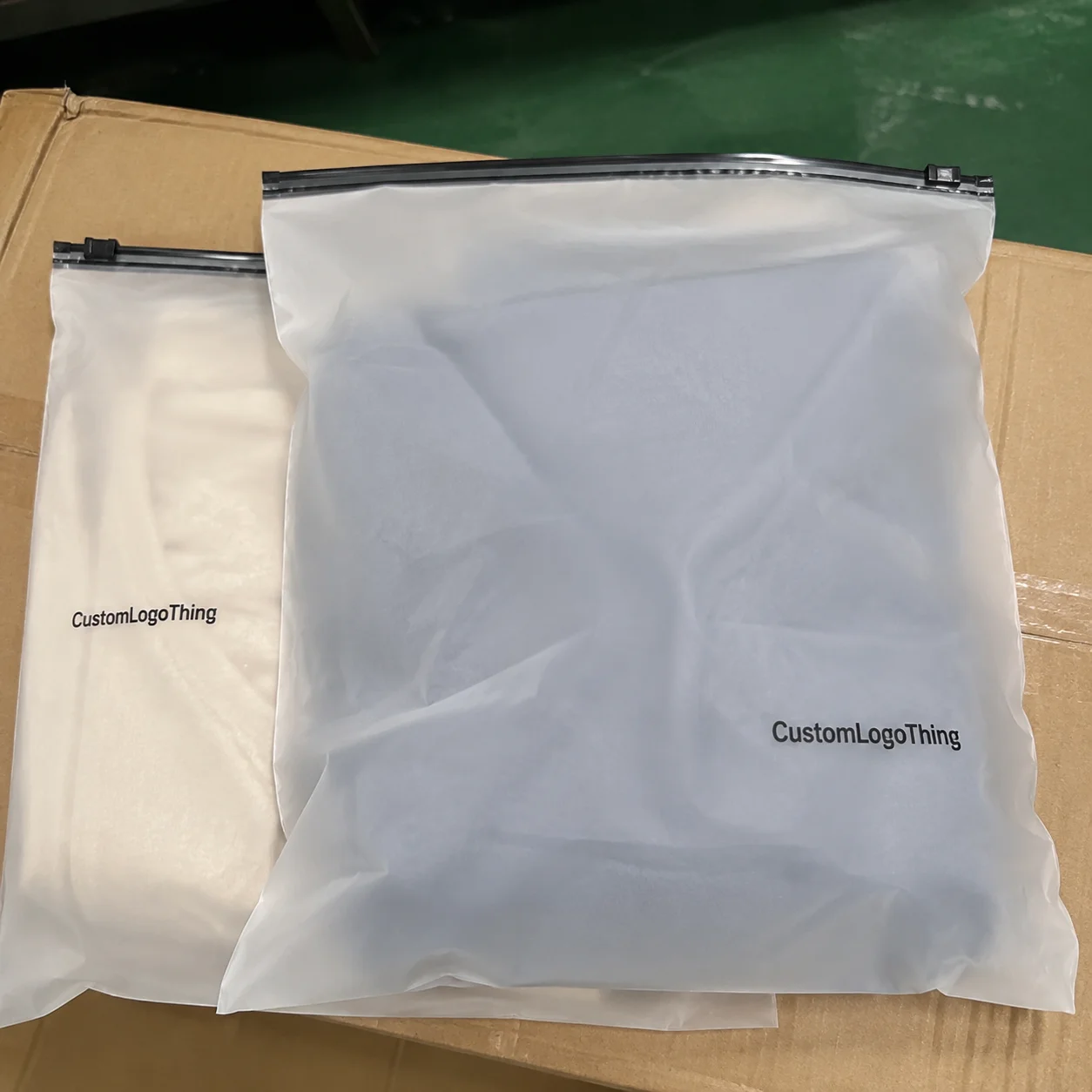
For clothing brands, the return address is not just a postal detail. It sits in the same visual field as the mailer, the shipping label, and whatever branding the customer sees first. A clean sender block supports the rest of the packaging system, whether the order ships in a poly mailer, a rigid carton, or a return envelope tucked inside a larger parcel. The same level of discipline that goes into Custom Packaging Products or Custom Labels & Tags should extend here as well.
From the buyer side, the job is simple: keep the address readable, keep the format consistent, and keep the reorder process predictable enough that nobody has to rebuild the file each time. That sounds easy on paper. It gets harder once multiple warehouses, seasonal launches, and different packing stations enter the picture.
Why staples custom return address labels matter on clothing mailers

Apparel shipping makes small mistakes visible. A crooked label, a weak adhesive bond, or an address that no longer matches the shipping record stands out fast on a mailer that was otherwise packed with care. That is why staples custom Return Address Labels deserve more attention than they usually get during procurement.
The sender information has to stay aligned across the order system, the packing slip, the return workflow, and any customer service records that reference the shipment. If one team uses a suite number and another leaves it out, returns can go to the wrong place. If the warehouse prints a city line differently from the address stored in the brand system, staff end up reconciling records by hand. None of that is complicated, but it is slow.
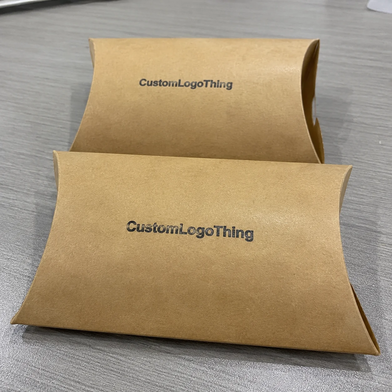
Clothing also raises the bar on presentation. Customers tend to judge apparel packages more visually than they do plain utility shipments. A low-contrast or blurry label makes the whole package feel less considered, even if the product inside is exactly right. That is one reason return labels should be treated as part of the packaging design rather than an afterthought.
The hidden cost is rarely the label itself. The real expense is the chain reaction: reprints, labor interruptions, replacement shipments, and support messages asking whether the return address is correct. One bad run can ripple across fulfillment, finance, and customer care. A reliable label spec prevents a lot of that friction.
Labels should be boring in the best possible way. If the address scans quickly and reads clearly, the packaging team spends less time fixing avoidable issues.
How the label format fits a clothing shipping workflow
The useful way to think about a return address label is as one step inside a larger shipping workflow. Artwork gets approved, the proof gets checked, the labels are printed, the stock is packed, and the application step happens during carton or mailer prep. After that, the parcel moves into outbound shipping, while the return-handling process sits in reserve.
That sequence is ordinary, but it is also where time gets lost. A file error can stop the proof. A proof delay can hold the packing line. A packing line delay can push back the whole order queue. A small label issue can interrupt a much larger packaging schedule if the template is not locked early.
Most apparel teams end up choosing between three basic formats:
| Format | Best for | Typical use case | Relative cost |
|---|---|---|---|
| Sheets | Small teams, office packing stations, low-volume reorders | Hand application with minimal equipment | Lower setup complexity, higher labor per label |
| Rolls | Faster fulfillment lines and repeat batch jobs | Frequent application with dispensers or printers | Better labor efficiency, especially at scale |
| Fanfold or stacked packs | Mixed-volume teams with limited storage | Simple warehousing and easy loading | Usually sits between sheets and rolls |
Placement matters almost as much as format. On poly mailers, the label needs a flat enough area to sit without wrinkling. On kraft mailers, a matte or uncoated surface generally holds ink and adhesive better than a slick coating. On cartons, there is more room, but the label still has to avoid seams, tape edges, and corners that flex in transit. If the label is going on an insert or return envelope, folds and pressure points should be avoided entirely.
For brands that already use branded packaging, the return address label should feel like part of the same system. It should support the packaging language without competing with the shipping label or the product story. That means the type size, ink contrast, and finish need to match the way the rest of the package behaves, not just how it looks in a mockup.
Two outside references are worth keeping in mind if you care about durability and material sourcing. ISTA testing is useful for thinking about how labels and packaging hold up under distribution stress, and FSC certification is a practical marker when the stock comes from responsibly managed fiber sources: ISTA and FSC.
Cost and pricing drivers that change your quote
Pricing for staples Custom Return Address Labels usually comes down to five variables: size, stock, adhesive, print coverage, and quantity. Proofing, finishing, and custom cutting can move the number again. Buyers sometimes focus too much on the per-label figure and not enough on what the run actually includes.
For a basic one-color return label on standard stock, a mid-size apparel order might land around $0.08 to $0.20 per label at 5,000 pieces. Short runs often sit closer to $0.25 to $0.45 because setup labor and material overhead are spread across fewer units. Those are working ranges, not promises. Artwork complexity, material choice, and whether the job needs a custom die all affect the final quote.
Material choice changes the economics faster than many buyers expect. Matte synthetic stock usually costs more than paper, but it can hold up better on dark mailers and resist scuffing during handling. Gloss can look polished, yet under bright warehouse lights or near scanning equipment it may create glare that hurts readability. That is one reason many apparel brands choose matte for utility rather than decoration.
The tradeoffs usually look like this:
- Cheaper stock lowers the unit price but can fail sooner on textured or flexible surfaces.
- Stronger adhesive raises the price slightly but reduces edge lift on mailers that curl.
- More print coverage can improve visual consistency but adds ink cost and proofing time.
- Larger quantities usually reduce unit cost, but only if storage and reorder timing are under control.
Shipping can matter as much as print cost on short deadlines. Rush production, split shipments, and expedited transit all push the quote upward. If the label run is part of a broader packaging order, the cost conversation should include the rest of the system too. Coordinating label production with custom printed boxes, inserts, or hang tags often makes more sense than treating each item as a separate purchase.
Process and turnaround: what happens after you order
Once the order is placed, the production path is usually predictable: file submission, proof review, approval, print production, finishing, packing, and delivery. The proof stage is where most delays begin. If the sender details are not final, the printer cannot move forward safely, and a one-day delay there often turns into several more once transit is added.
The common hold-ups are usually mundane. Missing logo files. Low-resolution art. A suite number that lives in one spreadsheet but not another. A ZIP code copied from the wrong office. None of these issues are dramatic, but they are enough to stop a job or force a revision cycle.
For apparel operations, it helps to separate production time from shipping time. A standard label run may take roughly 5 to 10 business days after proof approval, while rush orders can sometimes compress to a few days if the supplier has the right stock ready. Transit is separate. Teams that forget that distinction often feel like the order is late even when the production schedule was met.
Repeat orders become easier after the first run because the template is already locked. The address, format, size, and finish no longer need to be rebuilt from scratch. For teams that reorder regularly, staples custom Return Address Labels become a process file rather than a design project, which is where they should be.
Keeping the file history organized makes the next order cleaner. Store the approved spec, supplier contact, and artwork name in one place. The person placing the reorder should not have to search through old email threads to find a sender block or confirm a finish.
Choosing the right size, adhesive, and finish
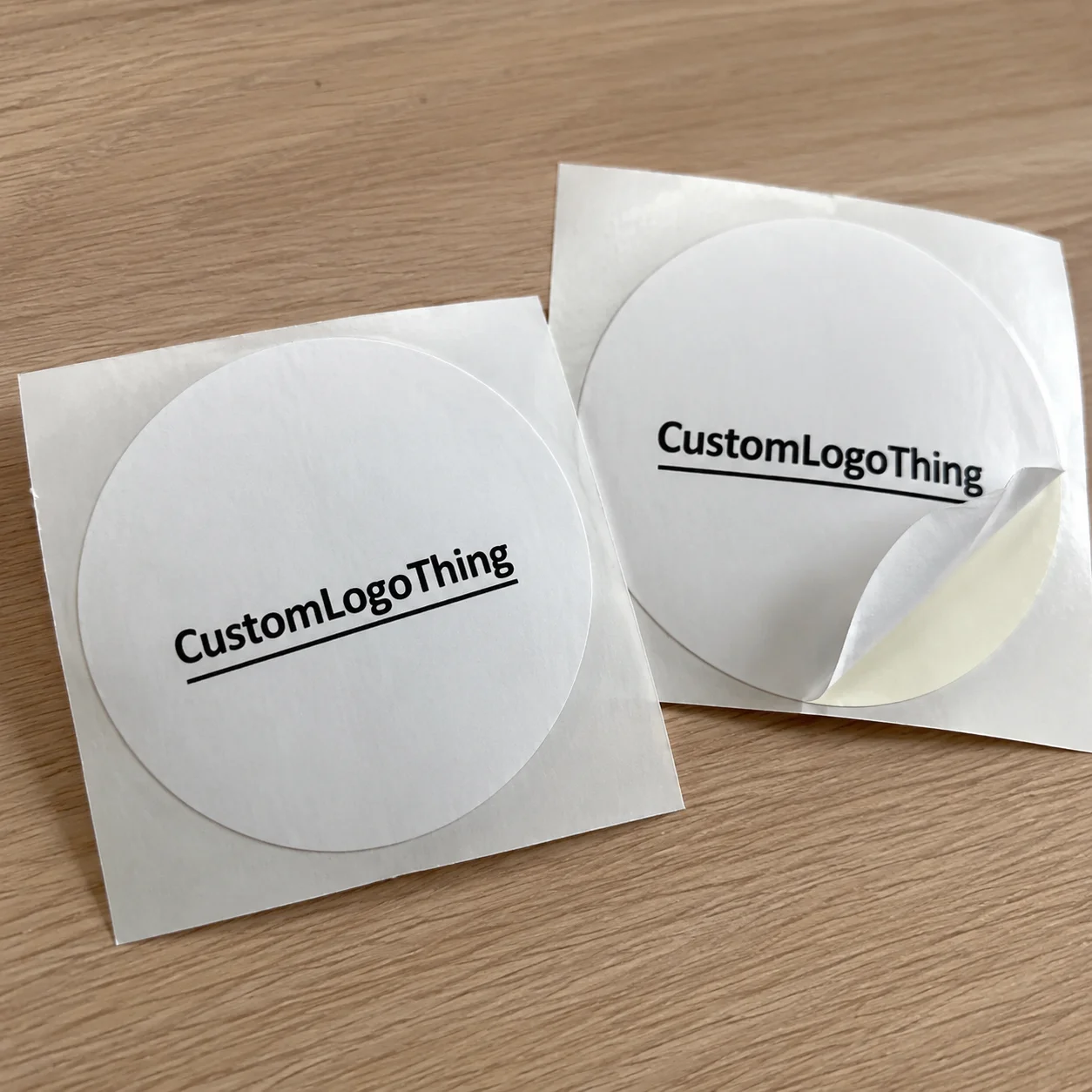
Size should follow the use case, not the layout on a screen. A return address has to read comfortably at a glance, but it should not dominate the package. For most apparel orders, the label needs enough space for the sender name, street address, suite or unit number, city, state, and ZIP code without forcing the type into a cramped block.
Adhesive choice is just as practical. Permanent adhesive is the default for outbound mailers, but some jobs need a stronger bond if the surface flexes, gets cold, or has a slightly dusty finish. That can happen with certain kraft stocks and lower-cost mailers. If the label starts lifting at the corners during a test application, the spec needs to be adjusted before production scales.
Finish affects readability more than many people realize. Matte usually wins for utility because it reduces glare and keeps the text readable under bright lights or scanners. Gloss can look cleaner on some branded packaging, but it is less forgiving when the mailer moves under light. Uncoated stock has a more tactile feel, though it can scuff sooner if the parcel is handled heavily.
A few details are worth testing before final approval:
- Text contrast on dark, patterned, or recycled mailers.
- Edge adhesion on textured cartons and flexible poly surfaces.
- Barcode compatibility if the label shares space with a routing code or internal reference.
- Placement discipline so the return address does not compete with the shipping label.
In practice, the cleanest option is often the least decorative one. The goal is not to make the label itself memorable. The goal is to make the package easier to process, easier to return, and less likely to create a support issue later.
Common ordering mistakes that create reprints
The most expensive mistake is a bad address record. A missing suite number or the wrong ZIP code can slip through proofing and only show up after hundreds of labels are already printed. At that point, the reprint cost is only part of the damage. The rest is the lost time, the delayed launch, and the cleanup across shipping and support.
Over-design causes a different kind of problem. Return address labels are utility items first. If the artwork is too busy, too small, or too low resolution, readability drops. A fashion brand can still keep the label on-brand, but the hierarchy has to stay clear: sender information first, decoration second.
Inconsistent records create quiet waste. If invoicing shows one company name, shipping software shows another, and the label art uses a third, nobody is fully certain which version is final. That kind of mismatch is easy to ignore until the batch needs to be corrected.
Proofing errors happen fastest when too many people approve the file without a single owner. One person checks the logo, another checks the address, and nobody checks the label against the master record. The fix is straightforward: one accountable reviewer and one source of truth.
Brands that reduce reprints usually audit the label the same way they audit product packaging. The sender block, finish, size, and application surface should all be checked against the real materials, not only the digital mockup. That physical test catches issues the screen hides.
Next steps for a cleaner reorder system
Start with an address audit. Confirm the exact sender name, street format, suite number, city, state, ZIP code, and any return-handling instructions before the next run. One character off in the address can create more downstream work than the whole order is worth.
Then build a master template that can be reused. Test at least two sizes on real mailers and boxes before committing to the full batch. What feels balanced on screen can look crowded once it is printed and handled in the warehouse.
Inventory planning matters more than many buyers admit. Set a reorder trigger based on remaining stock, not on panic. A small buffer gives room for proof review, revisions if needed, and normal shipping transit. That buffer is much cheaper than a rush replacement.
If the apparel line is tightening the rest of its packaging system, keep the label spec aligned with other assets so the sender information, print tone, and material feel work together. A consistent spec creates a cleaner package without making the label complicated.
For the next order of staples custom return address labels, keep the approved size, adhesive, finish, supplier contact, and file name in one place. That one habit removes a surprising amount of friction once reorders become routine.
Are staples custom return address labels better on sheets or rolls for apparel orders?
Sheets are usually easier for small teams and lower-volume packing stations because they store flat and do not require a dispenser. Rolls make more sense on a faster fulfillment line where labels are applied repeatedly and speed matters. The right choice depends on daily volume, equipment, and how much room the packing area has.
What information should a clothing brand put on a custom return address label?
Use the exact sender name, street address, suite or unit number, city, state, and ZIP code. Keep the line order consistent with your shipping software so returns are not misrouted. Avoid extra copy unless it helps packing, returns, or compliance.
How do I keep custom return address labels readable on poly mailers?
Use strong contrast, such as dark text on a light background, and keep the font simple. Test the label on the actual mailer surface before approving production, because some finishes handle adhesion and glare better than others. If the mailer flexes, check edge lift after application, not only at the moment it is applied.
What drives the unit cost of custom return address labels most?
Quantity usually has the biggest effect because setup costs spread across more pieces. Material, finish, and print coverage also move the price. Rush production and shipping can matter as much as print cost on short deadlines, especially for small runs.
How far ahead should I order custom return address labels before a launch?
Place the order early enough to allow for proof review, revisions, printing, and transit. A launch date with no buffer tends to force rush fees or shortcut quality checks. Keeping a small inventory reserve makes reorders less disruptive.