Poly Mailer Bags logo placement rules for wholesale buyers sound simple until the first production run comes back with a logo clipped by a seal, crowded by a zipper, or too low to read once the bag is filled. A mockup can look perfect on screen and still fail in the real world. Shipping bags move, bend, and crease. They also get handled by people who are not looking at your branding.
That is why a practical Poly Mailer Bags logo placement guide starts with usage, not design polish. The right question is not “What looks balanced?” It is “What still reads after packing, sealing, stacking, and transit?” A strong logo on the wrong part of the bag is expensive decoration. A smaller logo in the right zone does the job better.
A logo that looks centered on a flat dieline can drift once the mailer is stuffed. The bag changes shape; the artwork does not.
For buyers sourcing Custom Poly Mailers, the most useful placement decision is often the least dramatic one. Pick one face to carry the brand clearly. Let the rest of the bag support operations. If you try to turn every panel into ad space, the bag usually looks busy and costs more than it should.
Poly Mailer Bags Logo Placement Basics
The usable print area is smaller than the bag size listed on a spec sheet. Heat seals, tear strips, closures, and fold lines all take space away from the art. As a working rule, I treat the safe zone as roughly 10% to 20% smaller than the outer dimensions until the supplier confirms exact allowances.
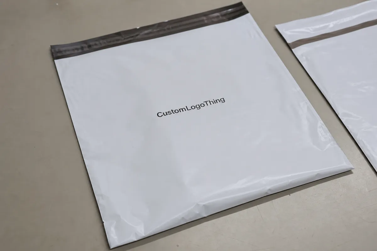
The front panel is usually the best starting point. It is the face people see on a packing bench, in a warehouse, and on a doorstep. If the logo needs to be read quickly, keep it centered or slightly above center. If the brand leans premium and minimal, give it more breathing room and let the film color carry some of the visual weight.
There is a difference between branding a mailer and designing a poster. A shipping bag has to survive folding, tape, labels, and rough contact. That usually means one primary mark, one secondary message if it adds real value, and very little else.
- One primary brand mark on the front panel usually gives the best return on space.
- One secondary line can work if it is short, such as a website, tagline, or return note.
- Smaller type should be used carefully on compact bags or glossy films.
Most wholesale buyers get a cleaner result when they decide what matters most before the artwork is finished. If the logo must be visible from a distance, size and contrast matter more than decorative detail. If the bag also needs to carry shipping labels or compliance marks, those operational needs should take priority. Packaging works better when it behaves like packaging, not a brochure.
It also helps to compare the mailer against the rest of the packaging system. If the rest of the line uses restrained, practical branding, the poly mailer should not suddenly become loud. The customer experience feels more deliberate when the visual language stays consistent across cartons, inserts, and mailers from the same order.
For a standard custom run, common film thicknesses are 2.5 mil to 3 mil for light shipping use and higher in heavier-duty programs. Thicker film can make the mailer feel more durable, but it does not fix poor placement. A thick bag with a bad layout still looks wrong.
How the Print Area Works on Film, Seams, and Gussets
Before artwork gets approved, map the bag into zones. Front panel, back panel, side gussets, top seal, and bottom seal do not all behave the same. Buyers lose time when they approve a flat proof and only later discover that a seal line cuts through a logo or a gusset swallows half the copy.
Keep critical artwork away from heat-seal areas and fold lines. Those are the places where distortion appears first. Ink can compress slightly near a seal, especially on softer or thinner films. Tiny registration marks, thin outlines, and fine serif fonts tend to suffer more than bold shapes. If a logo depends on delicate details, simplify it for the mailer version.
Centered placement works well when the bag will be viewed from multiple angles and the logo needs to read fast. Slightly offset placement can make sense when one side is more likely to face the customer or the packing team. There is no universal rule here. The right answer depends on how the bag is handled in the warehouse, during transit, and at the final handoff.
Finish changes the visual result too. Matte white film tends to give strong contrast for dark logos. Glossy film makes colors appear brighter, but it reflects more light and can reduce readability for thin type. Colored mailers are a different exercise entirely. A light logo may need a white underbase to stay legible, and that adds cost as well as another production step.
If the bag uses a zipper, tear strip, or peel-and-seal flap, check the actual usable canvas before locking the design. Those features can take more space than the sample photo suggests. A placement chart is only useful if it reflects the real build. Generic templates are a starting point, not proof.
Some suppliers measure printable area differently. One may include a sliver of border that another would exclude. Another may subtract more space for seal tolerance or hardware clearance. That is how avoidable rework starts. Ask where the safe print zone begins and ends, then have them mark it directly on the proof.
For buyers who want a broader packaging reference, transit testing standards such as ISTA are worth reviewing: ISTA packaging testing resources. For general packaging guidance and industry basics, packaging.org is a useful reference point.
Cost, MOQ, and Unit Price Drivers
Every extra color, print pass, or full-coverage effect raises the price. That is not a negotiation tactic; it is how the setup works. One-color printing on a single panel is usually the cheapest because the press setup is simpler and registration is easier to hold. Once a design moves to two colors, gradients, or double-sided coverage, the run needs more attention and often more proofing.
For common wholesale quantities, a simple one-color front-panel print often lands around $0.16 to $0.32 per unit at 5,000 pieces, depending on bag size, film thickness, and ink coverage. Two-color work usually moves into a higher band. Full-coverage or two-sided printing can rise further, especially if the art requires a white underbase or tighter registration. If a quote comes back suspiciously low without asking about quantity, artwork, or placement, it is probably incomplete.
MOQ shifts with print method, bag size, film color, and the amount of customization. Short runs are possible, but they rarely produce the best unit pricing. A buyer who wants to test a new SKU with 1,000 pieces may be making the right strategic choice, but the premium should be understood upfront rather than discovered later.
| Print Option | Typical Use | Rough Unit Price at 5,000 | Tradeoff |
|---|---|---|---|
| One-color front panel | Clean brand mark, small logo, basic shipping bag | $0.16-$0.32 | Lowest setup cost, simplest approval |
| Two-color front panel | Logo with accent color or stronger contrast | $0.22-$0.40 | Better impact, more proofing attention |
| Full coverage or two-sided | Promotional bag, retail shipping, high brand visibility | $0.30-$0.60+ | Highest cost, strongest presence |
Always compare landed cost, not just the print quote. Sampling, freight, color matching, and rush fees can change the math quickly. A slightly higher unit price with fewer revisions and a cleaner approval process often wins in practice, especially when the buying team is busy and cannot manage multiple rounds of corrections.
It also pays to ask for pricing at more than one quantity. The jump from 3,000 to 5,000 pieces, or from 5,000 to 10,000, can expose a breakpoint where the higher tier is more efficient. Packaging pricing rewards volume in a very direct way. It rarely hides that fact for long.
Process and Lead Time: From Proof to Production
Send the supplier the bag size, material, artwork file, number of print colors, and preferred logo location before asking for a quote. If the request is vague, the pricing will be vague too. That usually becomes a second round of questions and a slower start.
The proof stage is where many problems are caught cheaply. Review the dieline or mockup first. Check whether the logo sits too low, stretches too wide, or gets interrupted by a seal. A few minutes here can prevent a rerun that costs time and freight.
For anything where placement or color matters, approve a digital proof before requesting a physical sample. If a sample is needed, inspect it under normal lighting, not only under a phone camera. Film color can shift under office lights, warehouse lights, and daylight. A mailer that looks correct in one setting may read differently in another.
Typical lead times break into separate steps:
- Quote - often 1 to 3 business days when the artwork is clear.
- Proof - usually 1 to 2 rounds if the file is organized.
- Sample - often 3 to 7 business days if a physical sample is needed.
- Production - commonly 12 to 15 business days after approval, sometimes longer for larger runs.
- Shipping - depends on freight mode, lane, and destination.
One decision-maker is better than five people making small changes at different times. Every time the logo moves by 5 mm because someone opened the mockup on a different screen, the schedule slows down. Production slots do not wait politely.
For transit-heavy programs, ask whether the supplier has experience with test methods aligned to ISTA. That question does not need to become a huge technical discussion. It simply shows whether the bag has been considered as a shipping item rather than just a printed item. Those are not the same thing.
Common Placement Mistakes to Avoid
The most common mistake is putting the logo too close to the top seal. Once the bag is sealed, the print can pinch, warp, or disappear into the fold. It may look acceptable on a flat proof and still fail once the machine runs. The fix is simple: leave more room than your first instinct suggests.
Tiny type is another problem. Flexible film is not kind to delicate linework. A thin font that looks refined on a monitor can lose clarity after it is printed on glossy plastic, stacked, taped, and handled. If the logo has very fine details, create a simplified mailer version.
Buyers also forget the filled shape. A centered logo can drift visually once product pushes the mailer outward. That is one reason a slightly higher placement often works better. It keeps the mark visible even after the lower half bulges.
Do not ignore the back panel just because the front looks attractive. If labels, barcodes, or compliance marks are going on the main face, the logo may need to move to a cleaner side. A bag usually performs better when branding and operations are separated instead of competing for the same square inch.
Another avoidable problem is assuming every supplier measures printable area the same way. Some include a border that others exclude. Some subtract more room for hardware or edge tolerance. If you do not ask for their actual safe zone, you may approve a layout that cannot be printed as shown.
A quick checklist helps catch most of these issues:
- Is the logo readable at arm's length?
- Does it still work when the bag is full?
- Is it clear of seals, zippers, and fold lines?
- Is the back side needed for labels or barcodes?
- Has the supplier marked the true printable area?
Final Checklist Before You Approve Production
Measure a real bag, not only the spec sheet. Check seal width, zipper position, and any area that disappears when folded. If a sample is available, use a ruler and verify the visible canvas yourself. Packaging mistakes like assumptions because they are fast.
Pick one primary face for the logo and keep any supporting text secondary. A crowded front panel usually looks cheaper, not more informative. A cleaner layout almost always reads more expensive, even when the unit price is identical.
Build a scale mockup and print it out. If the logo feels crowded on paper, it will feel more crowded on the real mailer. It is better to reduce the size slightly and preserve balance than to force a larger mark against the seal line just to make the brand louder.
Request the quote with the artwork, quantity, target delivery date, and desired print location so the supplier can price the job correctly. If you want a better comparison, ask for a split quote between one-side and two-side printing. That gives you a real decision point instead of a rough estimate dressed up as certainty.
Before signoff, the team should be able to answer these without guessing:
- Which face is primary?
- How large is the safe print area?
- What happens to the design once the bag is filled?
- What is the actual landed cost, including freight and sampling?
- Who owns final approval?
Used well, this Poly Mailer Bags logo placement guide is less about style and more about control. It protects the print area, keeps the logo readable, and helps the bag do its job without turning your brand into a correction order.
Where should a logo go on a poly mailer bag for the best visibility?
The front panel is usually the best place, with the logo centered or slightly above center. That position reads quickly and avoids getting lost after the bag is sealed and filled. Keep it clear of seals, zippers, and fold lines.
How big should the logo be on a custom poly mailer bag?
Large enough to read at arm's length, but not so large that it crowds the edges or runs into seams. The right size depends on bag dimensions, film color, and how much of the panel the shipment actually exposes. A full-scale mockup is the safest check.
Should I print on one side or both sides of the mailer?
One side is usually cheaper and cleaner when the bag already carries shipping labels or barcodes. Both sides make sense if the bag gets handled often and you want the brand visible from more than one direction. For many programs, one strong side is enough.
How long does turnaround usually take for printed poly mailers?
Plan for quoting, proofing, sampling, production, and shipping as separate steps. A straightforward run can move quickly when artwork is final and the placement is approved on the first proof. Complex color matching or multiple revisions will add time.
What do I need to send for an accurate quote?
Bag size, material, print colors, quantity, artwork file, logo placement, and target delivery date. If you want tighter pricing, include whether you need samples, color matching, or printing on both sides. Clear inputs usually produce a cleaner quote.

