Buyer Fit Snapshot
| Best fit | Printed Box Sleeves with Foil Stamping projects where brand print, material claims, artwork control, MOQ, and repeat-order consistency need to be specified before quoting. |
|---|---|
| Quote inputs | Share finished size, material target, print colors, finish, packing count, annual reorder estimate, ship-to region, and any compliance wording. |
| Proofing check | Approve dieline scale, logo placement, barcode or warning zones, color tolerance, closure strength, and carton packing before bulk production. |
| Main risk | Vague material claims, crowded artwork, missing packing details, or unclear freight terms can make a low unit price expensive after revisions. |
Fast answer: Printed Box Sleeves with Foil Stamping: Board, Finish, Dieline, and Unit Cost should be specified like a repeatable production item. The safest quote records material, print method, finish, artwork proof, packing count, and reorder notes in one written spec.
Production checks before approval
Compare the actual filled-product size with the drawing, then confirm tolerance on folds, seals, hang holes, label areas, and retail display edges. Reserve space for logos, QR codes, warning copy, and material claims before decorative graphics fill the panel.
Quote comparison points
Review material grade, print process, finish, sampling route, tooling charges, carton quantity, and freight assumptions side by side. A quote is only useful when the supplier can repeat the same color, closure quality, and packing count on the next order.
A plain carton can disappear in a crowded aisle. Printed box Sleeves with Foil stamping give the eye a clear place to land, and when the fit, stock, and foil area are chosen well, the package gains presence without forcing a full box redesign. That is why this format shows up everywhere from cosmetics to specialty foods to gift sets and seasonal kits. It does the job without turning the whole pack into an expensive showpiece.
A sleeve has to earn attention fast. The carton underneath handles protection; the sleeve handles the first impression, the brand story, and a lot of the perceived value.
Foil earns its place for the same reason. Used with restraint, it creates a bright focal point that catches overhead light, separates brand elements from the rest of the artwork, and makes the package feel more deliberate. Used too freely, it muddies the design, pushes up cost, and weakens the sustainability story. The tradeoff is not subtle. Good packaging is not about stuffing every option into one piece. It is about choosing the few details that do the heavy lifting.
If recycled fiber, certification, or transit performance is part of the buying brief, treat the package like a system instead of a finish. The FSC chain-of-custody standard helps with sourcing and documentation, while ISTA test methods are useful for thinking through the knocks, drops, and compression a pack will face before it reaches a shopper. For broader packaging references, the Packaging Association is a practical starting point.
Printed Box Sleeves with Foil Stamping: What They Are
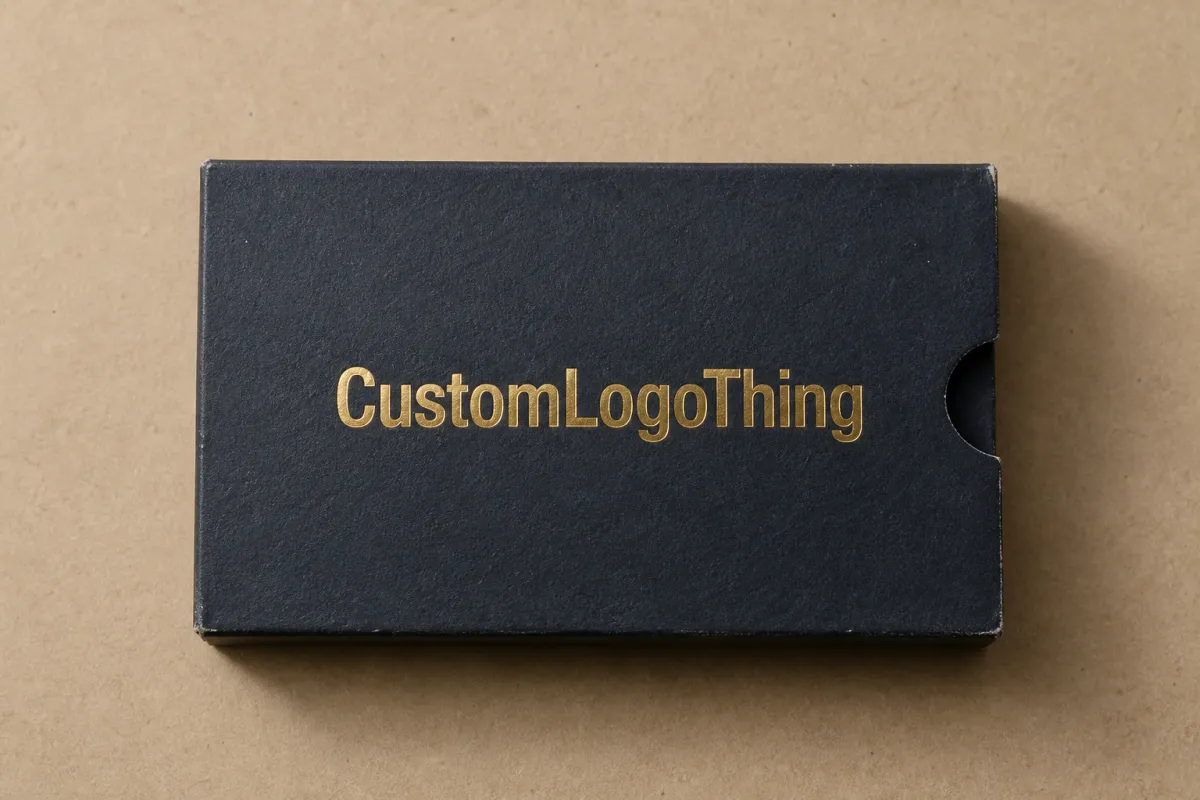
A printed box sleeve is a wraparound component that slides over a primary carton, tray, or rigid box. It does not replace the structure underneath. It adds graphics, branding, product information, or seasonal artwork in a format that can change without rebuilding the base pack. That makes sleeves especially useful for product lines with multiple SKUs, limited editions, or frequent promotions. The base box stays stable while the outer graphics shift.
Foil stamping adds a second layer of visual weight. A heated die, pressure, and a foil film transfer metallic or pigmented areas onto the printed sheet, usually in controlled zones like a logo, border, seal, or product name. In the right amount, foil creates a clean pause on shelf. It does not need to cover the whole sleeve to feel premium. In fact, the strongest designs often use foil as a small accent, because contrast is what makes it read.
That distinction matters. Full-surface print gives you the most freedom with images, gradients, and brand color. Spot foil gives you a targeted shine that works well for logos and key callouts. A restrained treatment might pair a matte printed field with one metallic hit, which often looks sharper than a busy layout crowded with too many finishes. From a packaging buyer's point of view, the job is not to impress another designer; the job is to make the product easier to sell, easier to handle, and easier to repeat on future runs.
There is a sustainability angle too. A sleeve can reduce the need for a fully printed rigid box or an overly decorated outer pack. That can lower material use, simplify inventory, and make seasonal updates less wasteful. A sleeve still needs good structure, accurate sizing, and solid print quality, but it can be a cleaner route to a premium look than building everything into the base carton.
One more point: foil stamping is a finishing process, not a repair kit for weak design. If the artwork is crowded, the paperboard is wrong, or the sleeve fit is loose, the foil will not rescue the pack. It will just make the flaws louder. Strong packaging starts with the basics first: board, dieline, fit, print contrast, then finish.
How Printed Box Sleeves with Foil Stamping Are Made
The production path is straightforward, but every step matters. First comes artwork setup and dieline confirmation. The printer or converter checks the dimensions, fold lines, trim zones, glue areas, and any window openings or security features. That stage sounds routine, yet it is where a large share of problems get stopped early. If the sleeve is even a few millimeters off, the final assembly can look crooked or feel too tight over the carton.
After the dieline is approved, the file moves into print prep. The artwork is separated into print layers and a foil layer, and the foil area is usually treated like its own precise shape rather than a decorative afterthought. Foil needs registration that is tight enough to feel intentional but forgiving enough to survive the press and the substrate. Very fine type, thin lines, and tiny reversed details can look beautiful on screen and fail in production if the line weight is too light or the spacing is too narrow. A good prepress team will flag that before the die is made.
Foil stamping itself uses heat, pressure, and a custom die. The die is made from the approved artwork, then mounted to the press so it can transfer foil only where the design calls for it. Depending on the setup, the run may happen in one pass or across multiple operations. Once the sheet is stamped, it is cut, scored, and die cut into the sleeve shape. After that, the sheet is folded or glued, depending on the construction.
Common foil methods
Not every foil process behaves the same way. The best choice depends on quantity, artwork detail, and the surface of the stock.
| Method | Best use | Setup profile | What it tends to cost |
|---|---|---|---|
| Hot foil stamping | Sharp logos, clean borders, premium accents on paperboard and coated stocks | Requires a custom die and press setup | Usually the best value for medium and larger runs; tooling is front-loaded, then unit cost settles |
| Digital foil | Short runs, prototypes, detailed artwork, fast turnaround samples | No traditional metal die, but precise setup still matters | Good for short quantities; less attractive on very large runs |
| Cold foil | Inline production, larger coverage areas, some process efficiencies on coated sheets | Integrated into the print line | Can be efficient at scale, especially where foil coverage is broader |
The substrate changes the result as much as the method does. Kraft paper gives a natural, earthy look, but the surface texture can soften the edge of the foil. Coated paperboard usually gives crisper edges and brighter contrast. Recycled board can be an excellent fit for brand positioning, although the sheet still has to run flat enough to hold register well. Specialty stocks can look fantastic, but some need testing because unusual coatings or fibers can reduce adhesion or create uneven shine.
Surface texture is not a small detail. A smooth coated sheet reflects foil cleanly. A rougher uncoated sheet absorbs light and can make metallic areas appear less brilliant. That does not mean the rough sheet is wrong. It means the design should fit the material instead of forcing the material to imitate something else.
At the end of the line, the sleeve has to work in the actual packout sequence. It must slide over the carton with enough friction to stay put, but not so much that operators slow down or the printed surface scuffs. Fold accuracy matters here. A sleeve that looks perfect flat on press can still disappoint if the score is off, because the wrap may bow, ripple, or misalign against a closure flap or window.
One practical check saves a lot of pain: have the printer test the sleeve on the actual carton, not only on a dimensionally similar sample. Carton tolerances, board caliper, humidity, and even the way the board springs after scoring can all change the final fit. That is especially true for retail packs that need the sleeve to sit straight on a shelf and survive handling through distribution.
Key Factors That Affect Foil Stamped Sleeves
Three things usually decide whether the sleeve feels refined or just expensive: artwork, material, and fit. Everything else is secondary.
Artwork detail and foil behavior
Very thin foil lines can look elegant in a mockup and fragile in production. Small type, tiny counters, and narrow reversed shapes are the first places trouble shows up. If the foil area is too small, the die may not pick it up cleanly or the registration may drift enough to soften the edge. Bold vector shapes, clear spacing, and simple geometry tend to stamp more reliably than intricate linework.
That does not mean the design has to be plain. It means the foil should be given a job it can actually do. A logo mark, a seal, a product name, or a border treatment often works better than a dense field of metallic detail. If you want the sleeve to feel quiet and premium, less foil usually gives more payoff.
Substrate selection and print contrast
Uncoated recycled sheets can support a more natural and honest look, which is useful for brands that want the packaging to feel grounded and responsible. Coated sheets usually give better foil sharpness and stronger print contrast, especially if the artwork includes fine line art or dark background fields. White-lined boards often produce the cleanest metallic flash because the foil sits on a more even surface.
If the design relies on soft color transitions or photographic imagery, a coated sheet may be the safer path. If the story is about craft, traceability, or low-ink presentation, a textured or recycled board may be the better fit. The right answer depends on the brand position, not on one material somehow being better in every case. Packaging rarely works that way, no matter how much people wish it did.
Finishes around the foil
Foil rarely lives alone. It is often paired with matte varnish, soft-touch lamination, embossing, debossing, or spot UV. Each of those finishes changes how the foil reads. Embossing can lift a logo enough that the foil catches more light across the top edge. Spot UV can create a glossy contrast next to a metallic area, though it gives a different effect than foil. UV coating can help protect printed areas, while lamination can change the tactile feel and moisture resistance of the sleeve.
Those finishes can work beautifully together, and they can also crowd the design. If the sleeve already has strong typography, multiple color fields, and a large foil area, adding soft-touch lamination plus UV coating plus embossing can make the result look overworked. A better strategy is to choose one main finish and one supporting effect, then let the paper and print carry the rest.
Sustainability needs the same kind of honesty. Limited foil coverage, thoughtful use of paperboard, and reduced ink density can support a lighter package story. Heavy lamination, oversized metallic coverage, and unnecessary mixed materials can pull in the opposite direction. If the client or retailer wants answers about recoverability, fiber sourcing, or recycled content, be ready to explain the finishing stack clearly. Material transparency builds trust faster than vague green talk ever will.
For shipping-heavy programs, the sleeve also has to survive the route, not just the display shelf. That is where route testing and distribution simulation become useful. ISTA-style thinking helps teams ask practical questions: does the sleeve rub, shift, scuff, or crush under stacking pressure? Even a beautiful finish loses value if the pack shows up damaged or worn.
Cost and Pricing for Printed Box Sleeves with Foil Stamping
Pricing is shaped by more than ink and paper. The main cost drivers are tooling, setup time, press complexity, substrate choice, quantity, and any extra finishing work. A sleeve with one clean foil hit is a very different job from a sleeve that needs multiple print stations, embossing, a special coating, and a tight die cut. The production sequence matters because every additional pass adds labor, waste risk, and inspection time.
Small runs usually cost more per piece because the setup work is spread across fewer units. That is true for most print work, and foil stamping is no exception. The die still has to be made, the press still has to be dialed in, and the first sheets still have to be approved. Larger runs can lower the unit cost because the tooling gets amortized over more sleeves, but that only helps if the design is stable and waste stays under control.
Foil coverage is another lever. A small logo hit can be relatively affordable. A large foil field or multiple metallic colors can move the price quickly because press time, registration control, and make-ready waste all increase. Specialty stocks, heavier boards, and complicated folds can add cost too, especially if they need more careful scoring or extra quality checks.
| Configuration | Typical use case | Relative unit cost | Budget note |
|---|---|---|---|
| Printed sleeve + small foil logo | Mainstream retail, gift sets, seasonal packaging | Lower | Often the best balance of shelf impact and spend control; tooling is usually manageable |
| Printed sleeve + foil + embossing | Premium launches, beauty, specialty food, limited editions | Medium | Adds tooling and alignment steps, but can raise perceived value noticeably |
| Printed sleeve + broad foil coverage + special coating | Hero items or display-first packaging | Higher | More waste risk and more press complexity; best only if the visual return justifies it |
For a practical buying benchmark, many teams see a small foil die in the low hundreds of dollars, depending on size and complexity, while per-unit sleeve pricing can land in the low cents to mid double-digit cents range at moderate quantities, then shift based on board, coverage, and finishing. A 5,000-piece order with a simple foil logo is usually much easier to price efficiently than a short run with broad foil and multiple passes. Those are broad ranges, not promises, because sheet size, registration tolerance, and finishing sequence can move the number quickly.
Ask for itemized quotes. That sounds basic, but it is one of the smartest ways to compare apples to apples. If one quote hides print, foil, die, scoring, and folding in a single number while another breaks them apart, the second quote is often more useful even if it looks higher at first glance. You can see exactly where the spend is going and decide whether a narrower foil area, a different stock, or a simpler finish stack would improve the economics.
It also helps to compare the design against the real retail job. If the sleeve must sit inside a display shipper, survive parcel handling, or line up with a tamper feature, the cost conversation should include those realities. A slightly stronger board or a cleaner dieline can save money later by reducing rejects and rework. Cheap on paper is not always cheap in the plant.
Process and Timeline: From Artwork to Finished Sleeves
A workable timeline starts with a clear brief. Before any tooling is made, the printer needs the carton dimensions, the sleeve target size, artwork files, the print method, the foil method, the expected quantity, and any special finishing details. If the sleeve has to fit a pre-existing box, send a sample of the actual carton. A measurement sheet helps, but a physical sample helps more because board caliper and fold behavior can surprise people.
From there, the designer or converter reviews the dieline and marks the print and foil layers. That stage is where the most expensive mistakes are avoided. The foil should stay away from trims, folds, and glue tabs where possible, because those zones take pressure and movement during assembly. If the artwork crosses those areas, the result can crack, distort, or wear faster than expected. Great on screen. Annoying in real life.
Proofing usually happens in layers:
- Digital mockup to check layout, copy placement, and basic proportion.
- Material sample to judge how the stock reacts to print and finish.
- Press-ready approval to confirm the artwork and foil layer before full production.
- First article or press proof when the job needs tighter quality control.
Each step catches different risks. A digital mockup might reveal that the logo is too close to a score line. A material sample might show that the foil is less brilliant on a recycled sheet than expected. A press proof can reveal registration drift or a shade shift once the ink and foil are actually on the paper. Those are not failures of the system; they are the reason the system exists.
Foil stamping can add time, but the impact is usually manageable if the job is planned properly. The die has to be made, mounted, tested, and adjusted. If the foil area is large or the artwork is tight, the press team may need extra setup sheets to balance heat, dwell time, and pressure. That is normal. What stretches schedules is not the foil itself, but late artwork changes, unclear specs, and stock substitutions that show up after approvals have already been given.
Timeline also depends on stock availability and shipping. Common paperboards may move quickly, while specialty or FSC-certified stocks can require lead time if the exact sheet is not in warehouse stock. If the job has a fixed launch date, build a buffer for sample review, correction rounds, and freight. A sleeve that needs to be right for a retail reset or holiday launch should never be planned on the tightest possible calendar.
One more practical habit helps a lot: sign off on a final fit check before production release. That means the sleeve is tested on the actual carton, folded the way it will be used, and judged under normal light. It is a simple step, but it saves more headaches than most people expect.
Common Mistakes to Avoid Before You Order
The first mistake is putting foil too close to folds, trims, or corners. Those areas flex, rub, and take pressure during handling, so metallic details there can look worn before the product ever reaches the shelf. A better layout gives the foil a safe zone and lets the eye find it without risking damage.
The second mistake is picking a dramatic finish before picking the right stock. Some papers make foil look crisp and bright. Others make it look soft, earthy, or uneven. None of those effects is automatically wrong, but they are different. If the intended result is a high-contrast luxury look, a rough or absorbent sheet may work against the design. If the intended result is a natural, handcrafted appearance, that same roughness may be exactly right.
The third mistake is skipping the physical sample. Screen previews are useful for layout, but they do not show how light bounces off foil, how the paper feels in the hand, or how the sleeve behaves after scoring and folding. A printed proof on the actual substrate is the closest thing to a real answer before production starts. It matters even more if the pack uses embossing, spot UV, or a matte-laminate finish, because those effects change how the foil reads.
The fourth mistake is sending files that are not ready for prepress. Low-resolution art, missing layers, unlabeled foil shapes, or a dieline that does not match the actual carton can all create delay. Worse, they can create expensive rework. Clear file naming and clean artwork organization save time because the press team can focus on printing instead of hunting through an overloaded file package.
The fifth mistake is overdesigning the sleeve. More finish does not always mean more value. A sleeve with foil, embossing, soft-touch lamination, spot UV, and multiple print effects can look rich in a presentation deck and muddy in the hand. The strongest packs usually choose one visual anchor and support it with one or two quiet details. That gives the design room to breathe.
There is also a recycling and compliance angle buyers should not ignore. Heavy lamination, mixed-material layers, and oversized foil coverage can complicate recovery. If sustainability is a selling point, ask what the end-of-life story looks like in your target market. A package that claims recyclability should have a material stack that supports the claim, not just a line of copy that says it does.
Finally, do not forget distribution. A sleeve may look perfect on a sample table and then arrive scuffed after a few days in transit. If the product will travel through parcel networks, retail back rooms, or stacked pallets, ask about the test profile early. Small changes in board strength, fit, or finish can make a large difference in the real world.
Expert Tips and Next Steps for Better Results
Start with the job the sleeve needs to do. Does it need to highlight a logo, support a launch, guide the opening experience, or reinforce a premium product story? That answer should shape the design before anyone talks about foil color or special effects. A sleeve trying to do five jobs at once usually does none of them particularly well.
Use foil where the return is strongest. In many cases, a small, precise metallic accent does more for the package than broad coverage. It keeps the finish clean, lowers the risk of production problems, and makes the shelf signal easier to read. For brands with a sustainability message, restraint often feels more confident than decoration.
Choose one main tactile move and one supporting visual move. For example, a matte stock with a spot foil logo can feel controlled and premium. A soft-touch lamination with a small deboss and selective foil can work too, if the design stays open and legible. The key is not to stack effects until they fight each other.
Request samples of the substrate, the foil, and any companion finishes before final approval. Ask the supplier to show how the sleeve behaves on the real carton. Verify the die line, the fold positions, and the trim allowance. Those checks take less time than a reprint, and they protect both the budget and the launch date.
Ask for a quote that separates the moving parts. Print, foil, die, scoring, die cutting, folding, and any extra finishing should be visible. Once you can see the cost pieces, you can make better tradeoffs. Maybe the foil area shrinks by 20 percent. Maybe the stock changes. Maybe the sleeve drops one finish and keeps the stronger one. That kind of decision-making is where packaging buying gets smarter.
If you are comparing options across a portfolio, create a simple decision grid: shelf impact, sustainability goals, turnaround, and unit cost. A sleeve with a single foil accent may be the right answer for one product, while another needs a more tactile finish or a different substrate. There is no universal formula, but there is a clear process. Define the goal, match the material, test the fit, and keep the finish honest.
That is the practical strength of Printed Box Sleeves with foil stamping: they can raise perceived value without forcing a full structural rebuild, and they can do it with enough flexibility to support seasonal campaigns, product families, and cleaner material choices. The best results come from disciplined artwork, a sensible finish stack, and a packaging partner who understands both the pressroom and the shelf.
FAQ
Are printed box sleeves with foil stamping recyclable?
Often yes, if the sleeve is made from recyclable paperboard and the foil coverage stays limited. Local recycling rules and the exact finishing stack still matter. Heavy lamination or mixed-material constructions can make recovery harder, so ask the printer what substrate and finish combination fits your target recycling stream before you approve the job.
What is the minimum order for printed box sleeves with foil stamping?
MOQ depends on the printer, the foil method, the sheet size, and how much setup the die and press require. Short runs are possible, especially with digital foil, but the unit price is usually higher because the setup labor gets spread across fewer pieces. If you are comparing production options, ask for several quantity tiers so you can see where the price curve starts to improve.
Does foil stamping add a lot to the turnaround time?
It usually adds some time because the foil die must be made, tested, and aligned before full production begins. The schedule impact is manageable when artwork is approved early and the substrate is selected before quoting is finalized. Build in extra time if you need samples, revisions, or specialty papers that may have to be sourced ahead of the run.
How can I keep the cost of foil stamped sleeves under control?
Keep the foil area focused on the logo, the product name, or one strong visual accent rather than using it across large panels. Choose a substrate that prints and stamps cleanly the first time, because waste and rework raise the true cost very quickly. It also helps to request an itemized quote so you can see where the money is going and make tradeoffs with open eyes.
What artwork works best for printed box sleeves with foil stamping?
Bold vector shapes, clean type, and generous spacing usually stamp more reliably than hairline detail or tiny reversed text. Plan the foil areas with the dieline in mind so important elements do not land on folds, seams, or trim zones, and always review a proof on the actual substrate because the paper surface changes how the foil reads in real light. For most brands, that careful pairing of art, stock, and finish is what makes printed box sleeves with foil stamping feel intentional instead of overworked.
Practical takeaway: If you are specifying printed box sleeves with foil stamping, lock the actual carton sample, the dieline, the foil area, and the finish stack before you ask for final pricing. Those four choices drive most of the cost, most of the fit issues, and almost all of the approval headaches. Get them right early, and the sleeve does its job without drama.


