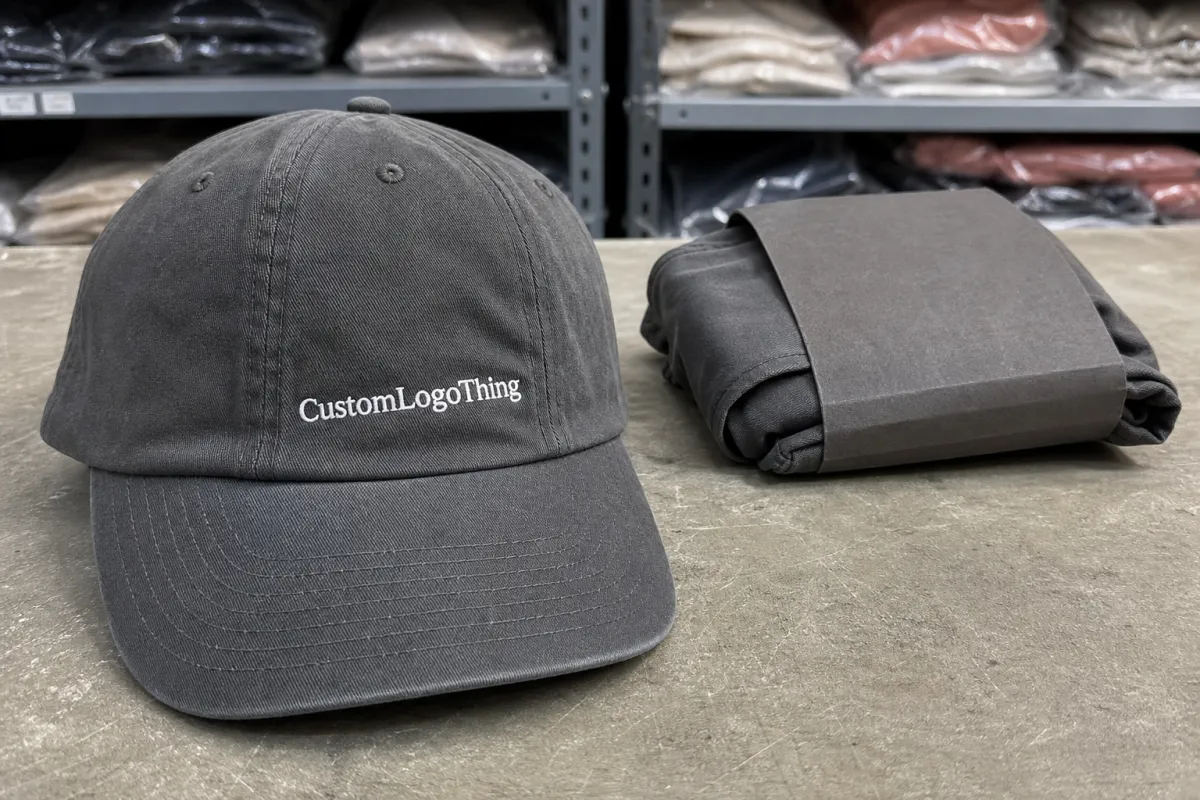
Printed dad hats reveal artwork problems quickly. The low crown, curved front panel, and soft structure leave less room for error than a structured cap, so a Printed Dad Hats Artwork Checklist for Fashion Boutique Orders needs to do more than keep files tidy. It should protect the order from revision loops, prevent avoidable production changes, and keep launch dates intact. For boutique buying, the file package should be treated like production paperwork, not a loose creative concept.
The best place to start is with the cap itself. Dad hats are casual by design, but that relaxed shape creates practical limits. A logo that looks balanced on a screen can drift too high, hit a seam, or feel visually compressed once it is printed on the actual hat. That is why a clean checklist matters: it forces the buyer to define the hat, the art, the placement, and the expected finish before pricing begins. If the production partner has to guess, the quote gets less accurate and the proof stage gets slower.
For fashion boutiques, timing matters almost as much as presentation. Small retail runs can carry a healthy margin, but only if the order lands before a seasonal display, drop date, or photo shoot. A day lost in approvals can push a shipment into the wrong week, and that can change the economics of the whole run. The goal is not just a prettier file. It is a better production outcome with fewer surprises.
A file can be visually polished and still be wrong for a dad hat. The cap shape decides what will actually print cleanly.
That is the value of a printed dad Hats Artwork Checklist for fashion boutique orders: it keeps the buyer focused on the decisions that affect the final product, not the ones that only look good in a presentation deck.
- Confirm the exact hat style, because crown height and panel shape affect how artwork sits.
- Send the version meant for production, not a draft still being edited in-house.
- State the desired look clearly: bold retail graphic, restrained logo, or something in between.
- Call out any color restrictions tied to brand standards, collection palette, or packaging.
- Ask for a mockup on the real cap shape before committing to inventory.
Printed Dad Hats Artwork Checklist for Boutique Orders
Most artwork issues show up in the same places: too much detail, too many colors, copy that is too small, or a logo built for a flat surface. Dad hats rarely reward complexity. The front panel curves away, the center seam can interrupt the image, and soft fabric tends to mute delicate linework. A design that holds up on a t-shirt often needs trimming before it can live on a cap.
A practical checklist begins with the bare essentials. What blank is being used? Which colorway is going on that blank? Where should the print land on the front panel? How large should it feel from a customer’s point of view? Those questions sound basic, but they are the ones that keep production from drifting. If the answers are vague, the order usually becomes a series of assumptions.
From a buyer’s perspective, the payoff is simple. Clear artwork instructions reduce proof rounds, make quoting easier, and help the vendor schedule the job without backtracking. On a small boutique run, that matters more than people expect. When quantities are limited, every extra revision eats into margin and pushes the inventory closer to the wrong delivery window.
Keep the art focused on what the cap can actually support. If the original design includes fine typography, layered textures, or thin decorative rules, ask whether those details still read from a few feet away. Retail viewing distance is not a close-up screen zoom. If the graphic needs a magnifying glass to make sense, it is probably too fragile for a dad hat front panel.
- Safe zone: keep key elements away from the center seam and the steepest part of the curve.
- Print width: most front logos land around 3 to 4 inches, but the cap shape should decide the final number.
- Text size: very small copy can blur once the fabric bends and the ink settles into the weave.
- Blank contrast: test the logo color against the actual hat shade, not a white digital canvas.
That is why the printed dad hats artwork checklist for fashion boutique orders should always include the hat color, the panel layout, the final print size, and any placement preferences before the order is priced. A design that looks balanced on an ivory blank may need a different treatment on washed black, sand, olive, or navy.
Dad Hat Construction Details That Affect Print Placement
Dad hats used for boutique runs usually share a few traits: an unstructured or lightly structured front, a soft six-panel crown, a curved brim, and an adjustable closure. Cotton twill is common. Pigment-dyed cotton gives the hat a washed, lived-in look that suits many retail assortments. Brushed cotton and garment-washed finishes can feel softer in hand, though they also change how the print color sits on the surface. These are not cosmetic details only. They shape the final visual result.
The front crown is the biggest production constraint. Unlike a flat panel, the dad hat front curves and folds slightly as it is formed and sewn. Artwork that sits too wide may break over the seam or wrap toward the side panels. Artwork that sits too high may feel awkward once the crown is worn. Even a logo that looks perfectly centered on a mockup can land differently on the physical cap because of that curve.
Light blanks and dark blanks also behave differently. A cream, stone, or natural hat can show clean linework and subtle tone better, but it will also reveal registration issues, weak ink density, or overspray more easily. Black, navy, and forest blanks make bright artwork pop, yet low-contrast details can disappear fast. For boutique orders, color decisions should be tied to the artwork itself, not treated as a last-minute styling note.
Material choice also affects the print method. A smooth cotton twill generally handles spot-color screen printing well. Softer or more heavily washed fabrics can be less forgiving because the texture absorbs and breaks up small details. Heat-applied transfers can carry more complexity, but they need careful testing for hand feel, edge quality, and long-term wear. None of these methods is universally better. The best choice depends on the artwork and the blank, not on habit.
One mistake shows up again and again: keeping every line from the original brand file. On a flat logo sheet, the detail may feel elegant. On a curved front panel, it can become cluttered or unreadable. A better approach is to simplify the artwork for the hat and let the rest of the brand system live on the hangtag, insert card, packaging, or product description.
- Panel curve: the usable print window is smaller than the front of the hat appears on screen.
- Seam placement: avoid placing critical details where stitching can cut through the design.
- Fabric finish: garment-washed and pigment-dyed blanks can soften crisp edges.
- Method fit: match the artwork complexity to the decoration method instead of forcing a single approach.
Because of those constraints, the checklist should always include the exact cap color and the intended placement. A front graphic that looks polished on one blank may need a scale change or a line-weight adjustment on another. That is not a failure of the design. It is just the reality of printing on a curved textile surface.
Artwork Specs That Keep Files Production-Ready
The safest file for production is usually vector art: AI, EPS, or a properly prepared PDF with fonts outlined. Vector files scale cleanly, keep edges sharp, and reduce the chance that a logo will look fuzzy when it is enlarged for print. High-resolution raster art can still work, but only if the file is large enough for the final size and the edges were built with printing in mind. A screenshot dropped into a document is not production art.
Fonts should be outlined before the file is sent. That simple step prevents substitution problems and keeps the proof from shifting after it leaves the buyer’s computer. Transparent backgrounds also matter, especially for logos that float, cut out, or use negative space. If spot colors are part of the brand system, label them clearly and keep the references consistent. A file with mixed naming or hidden layers slows everyone down.
There are also practical limits on fine detail. Thin type and hairline strokes can disappear once they are printed on curved fabric, especially on darker blanks or textured finishes. If the design depends on tiny copy, ask whether that copy can survive at normal retail distance. A customer standing three or four feet away should be able to read the design without effort. That is the real test.
It helps to give the production team a short, specific note set:
- List the final artwork size in inches or millimeters.
- State the placement, such as centered front print or slightly lower placement.
- Confirm the number of colors and any brand color requirements.
- Call out any elements that must remain open, transparent, or unprinted.
- Use version control so the proof matches the correct logo file.
If the order includes packaging or shipping inserts, that information should be bundled with the art notes rather than added later. Paper components such as hangtags or folded inserts may benefit from sourcing references like FSC if documentable paper sourcing matters to the buyer. For cartons and transit packaging, the technical guidance at ISTA can help when the hats need to survive distribution without getting crushed before they reach the floor.
Good file prep also means resisting the urge to over-explain. A long story does not help production if the key instructions are buried. A simple, complete file package does.
Pricing, MOQ, and Quote Factors for Boutique Runs
Pricing for boutique printed hats usually comes down to the same few variables: blank cost, decoration method, number of colors, placement complexity, packaging, and setup time. The blank itself can move a lot depending on fabric weight, dye method, closure hardware, and finish. A garment-washed cap with premium hardware will not price like a basic cotton twill hat. The decoration can stay economical or become expensive quickly depending on how much prep the artwork requires.
MOQ shifts for the same reasons. If the order uses a standard blank with a single front print, the minimum may be fairly flexible. If it calls for a specific colorway, special finish, or multiple print versions, the minimum often rises. Boutique buyers should compare the quote against total sell-through margin, not just against the unit cost of the blank. A slightly higher-priced cap that fits the collection better often sells faster and supports a stronger retail presentation.
| Decoration option | Typical MOQ | Setup range | Typical unit price* | Best fit |
|---|---|---|---|---|
| Single-color front print | 24-48 pcs | $35-$75 | $3.50-$6.50 at 100 pcs | Bold logo, retail script, simple icon |
| Two-color front print | 48-100 pcs | $60-$120 | $4.50-$8.00 at 100 pcs | Clean boutique branding with limited color layers |
| Full-color transfer | 24-50 pcs | $20-$60 | $5.00-$9.50 at 100 pcs | Artwork with gradients, fine detail, or multiple tones |
*Blank hat cost, freight, and retail packaging add to the total. On many boutique runs, the blank itself may land around $2.50-$6.50 depending on material and finish, while the decorated total can move higher if the order includes special labeling, folded bagging, or a rush schedule.
To get a fast and accurate quote, send the information that changes the job:
- Quantity by colorway
- Final artwork count and size
- Blank color choice
- Target delivery date
- Shipping destination
- Any packaging or tagging requirements
If the boutique plans seasonal replenishment, review the vendor’s Wholesale Programs before placing the first order. Breakpoints, repeat approvals, and packaging add-ons can affect the overall cost more than a small difference in the front print price. On short runs, those details matter.
The main point is straightforward: the checklist should be finished before pricing starts. Incomplete art files usually trigger a second quote, and that slows the order just when the buyer is trying to lock inventory.
Artwork Review Process and Production Timeline
A clean order usually moves in a predictable sequence: file submission, artwork review, proof creation, buyer approval, production, quality check, and packing. Delays most often happen at the proof stage. The buyer notices the logo needs to be larger, the placement should shift, or the colors need more clarity against the blank. None of that is unusual. It simply costs less to adjust before production begins.
Proof turnaround for a straightforward job is often one to two business days, though that can stretch if the file package is incomplete or if the vendor needs to confirm a specific blank. Once approval is in hand, production commonly takes about 10 to 15 business days for a standard boutique run. Inventory availability, decoration method, and packaging work can change that window. Freight should always be added on top.
The biggest scheduling mistake is assuming production time starts when the file is sent. It does not. It starts after the details are signed off. If the proof sits waiting while a launch date gets closer, the order can be squeezed behind other jobs and the receiving date can slip. That is how a simple cap order becomes a stressful week of follow-up messages.
Seasonal assortments feel that delay across the rest of the lineup too. Hats often sit alongside apparel, accessories, and small goods, so one late item can hold up merchandising plans, photography, and store setup. A good checklist keeps the order moving, but it also forces the buyer to finalize the details that actually affect the schedule.
- Submit final art, not a working draft.
- Approve the proof only after checking spelling, placement, and color contrast.
- Confirm whether packaging is included before production starts.
- Allow time for freight and receiving, not only factory time.
That is where the printed dad hats artwork checklist for fashion boutique orders earns its keep again. It shortens the path between file submission and production scheduling, which is exactly what a time-sensitive boutique order needs.
Quality Checks Before You Approve the Sample
The sample is where the artwork meets the actual cap. Check it with the same attention you would use on a retail buy-in. A soft hat can make small flaws look larger than they seemed on a screen. Start with the basics: spelling, alignment, placement, size, and color contrast. Then look at how the print sits across the crown curve and whether the design feels balanced from the front, not just technically centered.
Lighting matters. So does viewing distance. A logo that looks acceptable under a desk lamp can feel weak under bright store lights. Hold the sample at normal browsing distance, then step closer for detail. If the design depends on tiny linework or delicate copy, check whether it still reads after the fabric flexes a bit. That quick test catches more problems than any mockup file can show.
The common misses are easy to name: artwork too detailed for the cap, text too small, contrast too weak against the blank, or a logo centered on paper but not centered on the crown. Another frequent issue is believing the flat proof fully represents the hat. It does not. The curve changes the visual footprint, and the real sample should always win over the digital rendering.
Use this final pass before sign-off:
- Verify that the logo sits where the buyer expects on the front panel.
- Check that no important element disappears into the seam or curve.
- Confirm the color choice against the actual blank, not a white background.
- Make sure secondary copy is readable from retail distance.
- Review packaging, tagging, and carton counts before release.
If the sample is for a boutique drop, also check how the hat feels beside the rest of the assortment. A cap can be technically correct and still feel off if the print weight, blank finish, or label presentation does not match the collection. That is a merchandising decision as much as a print decision.
One final production note: if the first sample comes back with a minor placement shift, do not assume the issue will fix itself on the full run. Fabric movement, seam structure, and machine setup all affect repeatability. A small change approved too casually can become a larger issue across the whole order.
Next Steps to Place a Clean Boutique Hat Order
The cleanest path is still the fastest one. Gather the vector art, confirm the exact quantity, choose the blank color, write down the due date, and request a mockup or quote before committing to inventory. If the order includes multiple logos, multiple colorways, or retail packaging, list those separately so nothing gets lost in the email thread. One organized note usually saves several rounds of back-and-forth.
Send a reference image if the placement is visual rather than technical. Add any instructions about how the hats should be packed, whether they need branded polybags, and whether carton labeling must match a retail receiving requirement. Those details are part of the job. The more complete the first submission is, the less time production spends untangling it.
For buyers who plan recurring replenishment, keep the approved art file, the final blank name, the print size, and the packaging instructions together in one folder. That keeps reorders clean and reduces the chance that the second run looks slightly different from the first. Consistency is easier to maintain when the instructions are easy to find.
If the order needs to move without unnecessary revisions, use the printed dad hats artwork checklist for fashion boutique orders as the starting point and send the exact files and decisions needed to quote, proof, and schedule the job. That is the difference between a vague cap idea and a boutique-ready product that can actually be made on time.
FAQ
What files do I need for printed dad hats artwork checklist for boutique orders?
Send vector artwork first if possible, preferably AI, EPS, or a properly saved PDF with fonts outlined. If you only have raster art, use a high-resolution file with a transparent background and clean edges. Include brand colors, placement notes, and version names so the proof matches your intent.
How large should the logo be on a dad hat front panel?
Size the design to the visible front panel area, not the full flat template, because the curve reduces usable space. Simple logos can sit a little larger than text-heavy layouts, but thin strokes and small copy need extra caution. Ask for a mockup on the actual cap shape before approving any order over a boutique launch quantity.
What MOQ should I expect for boutique printed dad hats?
MOQ depends on blank availability, print method, and whether you need multiple colorways or placements. Smaller boutique runs usually cost more per unit because setup work is spread across fewer hats. If you need flexibility, ask for tiered pricing so you can compare 24, 48, and 100-piece scenarios.
How long does production usually take after artwork approval?
Proof approval is often the fastest step, but production time starts only after all details are signed off. Standard lead time depends on inventory and decoration method, while rush orders may require stock confirmation first. Build in extra time for revisions, sampling, and shipping if the hats support a seasonal or launch-date delivery.
Can I mix colors or logos in one printed dad hat order?
Yes, but each logo version or colorway may add setup time and change the unit price. Keep the artwork family consistent when possible so the quote stays efficient and the production plan stays simple. Label every version clearly in your file package to avoid mix-ups during proofing and packing.