Printed Dad Hats Artwork Checklist for Coffee Shop Merch
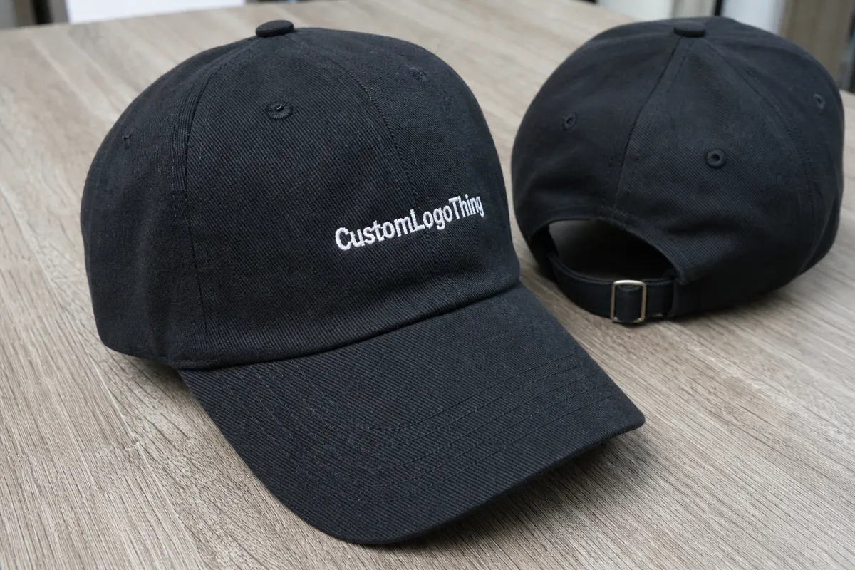
A printed dad hats artwork checklist for Coffee Shop Merchandise is useful because cap artwork fails in ways larger products do not. A logo that looks crisp on a screen can turn soft, crowded, or oddly stretched once it lands on a curved crown. The hat is small, the front panel is interrupted by seams, and the usable area is tighter than most buyers expect. That combination changes how type, line weight, and spacing behave.
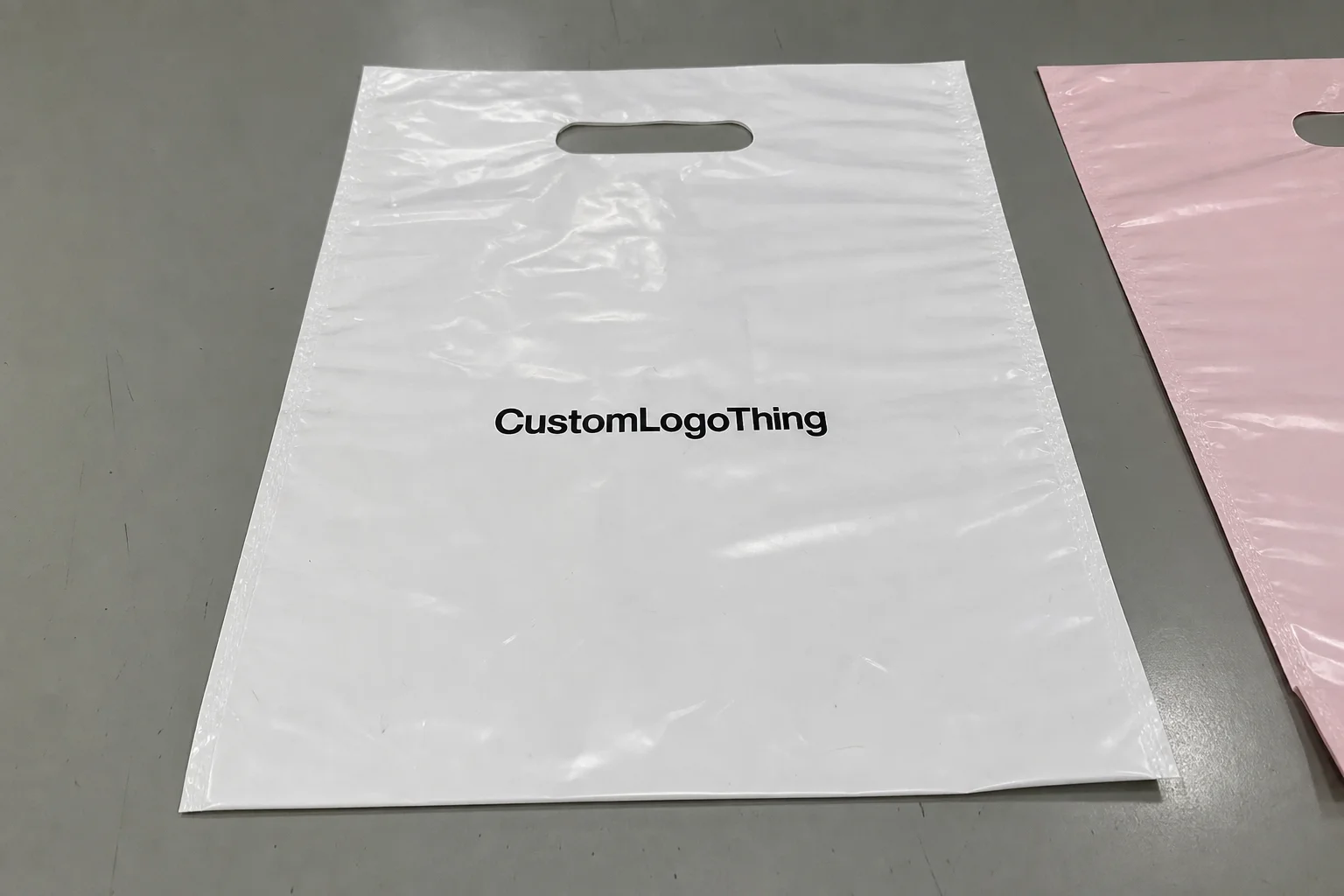
For coffee shops, the hat usually sits inside a broader merch story. It may live beside bags, mugs, sleeves, gift cards, and seasonal retail displays, so the artwork has to do two jobs at once: read clearly at a glance and feel like it belongs to the brand shelf. That is why the file matters as much as the hat blank. A well-chosen hat can carry a simple mark beautifully. A crowded file can make even a quality blank look cheap.
The most reliable designs tend to be the least fussy. Bold contrast, controlled detail, and a clear focal point usually outperform layered badges, tiny taglines, or dense illustration. If the logo needs a paragraph of explanation, it probably needs to be simplified before production. A hat is not the place to force every brand element into one small space.
There is also a practical buying angle here. Coffee shops rarely order one style of merch forever. They test, restock, and adjust to season, audience, and price point. That means the artwork process should be repeatable. Keep the file clean, keep the approvals tight, and keep the final specs easy to find later. A launch that can be reordered without rebuilding the art saves time and money on every run.
On a curved front panel, the file is the product as much as the hat is.
Use this checklist to keep the artwork aligned with the decoration method, the hat structure, and the merch goal:
- File readiness: vector preferred, outlined type, and no missing elements.
- Decoration fit: art scaled to the cap panel, not copied from a flat apparel layout.
- Approval discipline: one version, one decision path, one final sign-off.
How the Artwork Process Works From File to Sample
The production path usually starts with source art, not the mockup. Once the file arrives, it gets checked for format, resolution, font handling, hidden layers, and whether the design can survive at cap size. If the artwork is a clean vector file, the review is straightforward. If it arrives as a screenshot, a compressed social image, or a PDF with live text and missing fonts, the decorator may need to rebuild pieces before a quote is even dependable.
That matters because most delays happen before a hat is printed or stitched. A design may need type outlined, colors separated, strokes thickened, or small elements removed. The proof should answer production questions, not just look polished. Does the art clear the seams? Is the text still readable at actual size? Does the placement sit high enough to avoid the most curved part of the crown? If those answers are uncertain, the sample stage tends to expose the problem later, when fixes are slower and more expensive.
- Source file review: confirm format, resolution, transparency, and missing assets.
- Artwork cleanup: outline fonts, remove stray pixels, and simplify weak detail.
- Digital proof: place the art on the exact hat style with size and position callouts.
- Sample or strike-off: verify how the design holds up on fabric and on the head.
- Production approval: release the order only after the sample matches the approved intent.
Timing depends on the art and the method. A simple one-color front mark on in-stock hats can move from file receipt to proof in a couple of business days. A badge with layered elements, patch construction, or a design that needs multiple revision rounds may take a week or more before approval. If the blanks are on hand and the decoration is local or domestic, the schedule is easier to control. If the blanks are incoming, the artwork can be perfect and the order still waits on inventory.
For launch kits or shipped merch bundles, packaging matters too. A crushed box or bent insert can make the rollout feel careless even if the hat itself is fine. If the product is traveling, look at transit protection early rather than treating it as an afterthought. That is especially useful when hats are bundled with cups, roast cards, or other fragile retail pieces.
Artwork Specs That Protect Print Quality on Curved Caps
Hat artwork behaves differently from a flat print. The crown curves, the center front often has seam structure, and the fabric stretches a little during wear. All of that changes how the art reads. A good printed hat graphic is usually slightly bolder and slightly simpler than the same logo on a sign or a sleeve print. That is not a downgrade. It is a technical adjustment.
Vector artwork is still the safest starting point: AI, EPS, or PDF with fonts outlined. If the file must stay raster, 300 dpi at final size is the practical floor. Thin strokes are risky because they can fill in or vanish once reduced to cap scale. For front placement, many shops stay near 4 to 4.75 inches wide and about 2.25 to 2.75 inches tall, but the exact size depends on the hat profile, the panel shape, and whether the decoration method needs extra room.
Material choice changes the result as well. Washed cotton, brushed twill, and heavier chino fabrics all accept detail a little differently. Unstructured Dad Hats tend to drape more softly, which gives them a relaxed look but also makes placement more sensitive. Structured fronts hold shape better, though they can make a cap feel more promotional if the artwork is too large. Strapback closures, low-profile crowns, and six-panel construction all influence where the eye lands.
Three specs protect output better than almost anything else:
- Line weight: keep strokes thick enough to survive fabric texture and scale reduction.
- Safe margins: leave breathing room so seams and curves do not clip the design.
- Color separation: define spot colors or clean separations so the printer is not guessing.
Simple iconography often sells best in a cafe setting. A single strong symbol, one readable line of text, and good contrast usually outperform a detailed illustration with multiple type sizes. If the main logo is a script or a complex badge, consider a simplified merch version for the hat and keep the full identity for menus, packaging, or wall graphics. That gives the product a cleaner read without drifting away from the brand.
For shops that include hang tags, belly bands, or sleeve inserts with the hats, paper stock choice affects the final impression more than many buyers expect. FSC-certified paper can be a sensible option for those pieces, particularly if the brand already talks about sourcing or packaging. The point is not to make a sustainability claim louder than the product. It is to keep the presentation consistent with the rest of the retail line.
Pricing, MOQ, and Quote Triggers for Coffee Shop Orders
Once the artwork is cleaned up, the quote gets easier to read. A printed dad hats artwork Checklist for Coffee Shop merchandise should separate art prep from blank cost, because a file that needs rescue can add more to the job than the hat itself. Rebuilding art, adding extra proof rounds, or delaying approval can turn a simple order into a margin squeeze, especially at lower quantities.
Five things usually drive the price: number of colors, decoration size, placement, setup time, and whether the design uses embroidery, a woven patch, printed transfer, or another finish. The blank dad hat is only one part of the total. A better comparison is the all-in decorated price, including sample costs and any revision fees that are part of the process.
| Decoration option | Best for | Typical setup | Ballpark decorated price | MOQ signal |
|---|---|---|---|---|
| Printed finish | Bold one-color logos and simple type | Low setup, fast proofing | $8-$14 per hat at 100-250 pieces | Good for a test drop |
| Woven or embroidered patch | Badge-style art with a retail feel | Moderate setup and patch prep | $10-$18 per hat at 50-200 pieces | Often better at mid-size runs |
| Direct embroidery | Simple marks, initials, and durable branding | Digitizing fee often applies | $11-$20 per hat at 24-100 pieces | Works well for small orders |
| Hybrid patch plus stitch | Launch pieces and heavier branding | Highest setup, strongest finish | $12-$22 per hat at 50+ pieces | Best for limited editions |
MOQ is where many buyers first feel the tradeoff between testing and efficiency. Some shops can start with 24 to 48 hats. Others need 50, 72, or 100 pieces before the unit price looks workable. The smaller the run, the more setup and proofing matter. If the order is small, ask whether the price includes cleanup, one revision cycle, sample shipping, and a reprint policy if the approved file is not matched.
That last part is easy to skip and hard to fix later. A quote that looks low can become the most expensive option if it excludes the steps most likely to change. Ask for the full picture before approval. It is far easier to compare offers when every vendor is quoting the same scope.
Step-by-Step Approval Checklist Before You Place the Order
A clean approval path keeps the order from drifting. Use the Printed Dad Hats Artwork Checklist for coffee shop merchandise as an actual production tool, not a loose reminder. Rework usually starts with assumptions, and assumptions are expensive once the sample is already in motion.
- Confirm the logo version. Decide which mark is official before anyone edits the file.
- Remove tiny text. Anything that cannot survive at hat size should be cut or simplified.
- Convert type to outlines. That avoids font substitution and missing-glyph surprises.
- Check final dimensions. Compare the art with the usable decoration area on the chosen hat style.
- Verify color calls. Use spot references, PMS targets, or a clearly approved equivalent.
- Review placement. Make sure the art stays centered and clear of seams and panel changes.
- Test contrast. Light on light and dark on dark rarely reads well unless the effect is intentional.
- Look under shop lighting. Warm bulbs, daylight, and fluorescent light can change how the art reads.
Ask for the proof at actual size whenever possible. A ruler overlay is more useful than a polished render, because it shows how much visual room the art really has. For launches, a sample is worth the extra time. It reveals things that are hard to predict from a flat mockup: whether the print sits too low, whether the embroidery feels stiff, whether the crown shape changes the spacing, or whether the chosen color loses contrast under real lighting.
Once the sample arrives, check it the way a customer would. Put it on a head form or wear it. Look at the front from six feet away, then from arm’s length. Check the hand feel of the front panel, the quality of the stitching or print edge, and whether the mark still looks balanced when the brim is angled down. A hat can pass a tabletop review and still fail on head shape.
If more than one person approves merch, define one final approver before the sample stage. That single decision maker is the easiest way to avoid a last-minute color dispute. Version control also matters. Every proof should carry the same version number so nobody is commenting on an older file by mistake.
Common Mistakes That Turn Simple Hat Art Into Rework
The biggest failure is usually not a bad logo. It is a logo that was never adapted for a hat. Thin strokes, oversized detail, low-resolution source art, and crowded layouts often look fine on a monitor and then collapse once they are reduced to front-panel scale. On a dad hat, a little too much information becomes visual clutter fast.
Another common issue is relying on a flat mockup as the final check. A rectangular art board does not behave like a curved crown. Once the design crosses a seam, bends toward the brim, or sits on a washed fabric, the spacing changes. That is why the proof and the sample matter more than a polished digital render.
- Weak source files: screenshots, clipped logos, or web art that need rebuilding.
- Microscopic details: fine lines, tiny dates, and subtext that disappear at scale.
- Improvised approvals: one person signs off, another expects a different color or placement.
- Too many focal points: icons, slogans, and badges all fighting for the same space.
There is also a cash-flow issue that is easy to miss. A short run with a one-time reprint can wipe out the margin on the order. That is why cleanup, sample review, and version control matter so much. The cost of preventing a mistake is usually much lower than the cost of correcting it after production.
Clear records help. Save the approved file, the exact blank SKU, the decoration method, and the sample photo together. That folder becomes the difference between a repeatable merch line and a scramble every time the shop wants another batch.
Expert Tips for Selling More Coffee Shop Hats
Good artwork improves more than print quality. It also affects whether a hat feels like a real retail item or something left over from an event table. The same principles that make a cap easier to produce tend to make it easier to sell. Simple shapes, clear spacing, and controlled color choices usually look more finished on the shelf.
Start with a narrow color range. Two or three hat colors are easier to stock, photograph, and restock than a broad set of options. Most shops do better with a few dependable combinations than with too many variants. A tight palette also makes it easier to match the hat to the rest of the coffee shop merchandise, from bags and boxes to menu accents and seasonal packaging.
Use the merchandise the way you would use a packaging system. The cap should feel related to the cup sleeve, the bag label, or the sign above the register. It does not need to repeat every visual element. It just needs to share a consistent rhythm. A small badge, a monogram, or a short line of type often works better than a full identity lockup on a hat.
Placement changes perception quickly. A centered front hit at the right scale feels intentional and retail-ready. Too small, and it can read as an afterthought. Too large, and the cap starts to feel like a promotional giveaway rather than a product someone would wear outside the shop. The best middle ground is usually one confident focal point with enough air around it.
Packaging can lift the perceived value without changing the decoration itself. A simple hang tag, belly band, or insert card makes the hat feel like part of a considered launch. If the paper stock is FSC-certified and the rest of the presentation is clean, the product reads as finished rather than assembled. That matters most for giftable merch and seasonal drops.
Photography should show the hat in context. Pair it with the coffee bag, mug, or pastry box it is meant to live beside. Cross-merchandising works better when customers can see the complete story in one frame. People are much more likely to buy a bundled item when the bundle already looks planned.
Next Steps: Build the Final File, Sample, and Reorder Plan
The smoothest path from concept to shelf is simple: finalize the artwork, Request a Quote with exact specs, and approve a proof before production starts. If the decorator needs cleanup, let it happen once and then lock the file. A clean source file now makes the next order faster too, which matters if the hat becomes a regular part of the shop’s merch mix.
After the proof, order one sample and check it in the shop lighting, not just under a desk lamp. Place it next to the menu board, packaging, and whatever else already represents the brand. That side-by-side test shows whether the hat belongs in the current visual system or whether the size, weight, or color still needs adjustment. Often the fix is small: a stronger line, a slightly warmer ink, or more empty space around the mark.
Then build a reorder folder with the final assets and specs. Keep the vector file, approved proof, blank SKU, decoration method, color callouts, and a sample photo together. The next restock order should not depend on memory or buried email threads. It should depend on records that can be reused without guesswork.
- Save the final source art: AI, EPS, or outlined PDF.
- Archive the approved proof: include size, placement, and color notes.
- Record the blank style: hat color, closure type, and vendor SKU.
- Store a sample photo: use the same lighting and angle for later comparison.
That system makes future launches easier to quote, easier to approve, and easier to restock. More than anything, it turns a one-off merch idea into a repeatable process. For coffee shops that want hats to feel like part of the brand instead of a side project, that consistency is the real payoff.
What file format works best for a printed dad hats artwork checklist for coffee shop merchandise?
Vector files such as AI, EPS, or PDF with outlined fonts are the safest choice because they stay crisp at small cap sizes. If the artwork only exists as a raster file, it should be high-resolution and cleaned up before a quote is finalized.
How small can logo details be on printed dad hats?
Fine lines, tiny text, and crowded icons are the first things to break down on a curved crown. If a detail matters to the brand, it usually needs to be simplified into a thicker, bolder version before approval.
What affects the quote most on coffee shop merchandise hats?
Artwork complexity, decoration method, number of colors, placement, sample needs, and quantity drive the price more than most people expect. Rush timing and extra proof rounds can also add cost quickly.
How long does the artwork and production process usually take?
Simple files can move through proofing in a couple of business days, while complex artwork may need a week or more before approval. Final timing also depends on blank availability, sample review, and shipping.
Should a coffee shop use print, patch, or embroidery on dad hats?
The best method depends on the artwork detail level and the look you want at retail distance. Simple marks often do well with embroidery, while badge-style art may hold up better as a patch or printed finish.