Buyer Fit Snapshot
| Best fit | Printed Padded Mailers for Cosmetics Print Finishes projects where brand print, material claims, artwork control, MOQ, and repeat-order consistency need to be specified before quoting. |
|---|---|
| Quote inputs | Share finished size, material target, print colors, finish, packing count, annual reorder estimate, ship-to region, and any compliance wording. |
| Proofing check | Approve dieline scale, logo placement, barcode or warning zones, color tolerance, closure strength, and carton packing before bulk production. |
| Main risk | Vague material claims, crowded artwork, missing packing details, or unclear freight terms can make a low unit price expensive after revisions. |
Fast answer: Printed Padded Mailers for Cosmetics Print Finishes should be specified like a repeatable production item. The safest quote records material, print method, finish, artwork proof, packing count, and reorder notes in one written spec.
Production checks before approval
Compare the actual filled-product size with the drawing, then confirm tolerance on folds, seals, hang holes, label areas, and retail display edges. Reserve space for logos, QR codes, warning copy, and material claims before decorative graphics fill the panel.
Quote comparison points
Review material grade, print process, finish, sampling route, tooling charges, carton quantity, and freight assumptions side by side. A quote is only useful when the supplier can repeat the same color, closure quality, and packing count on the next order.
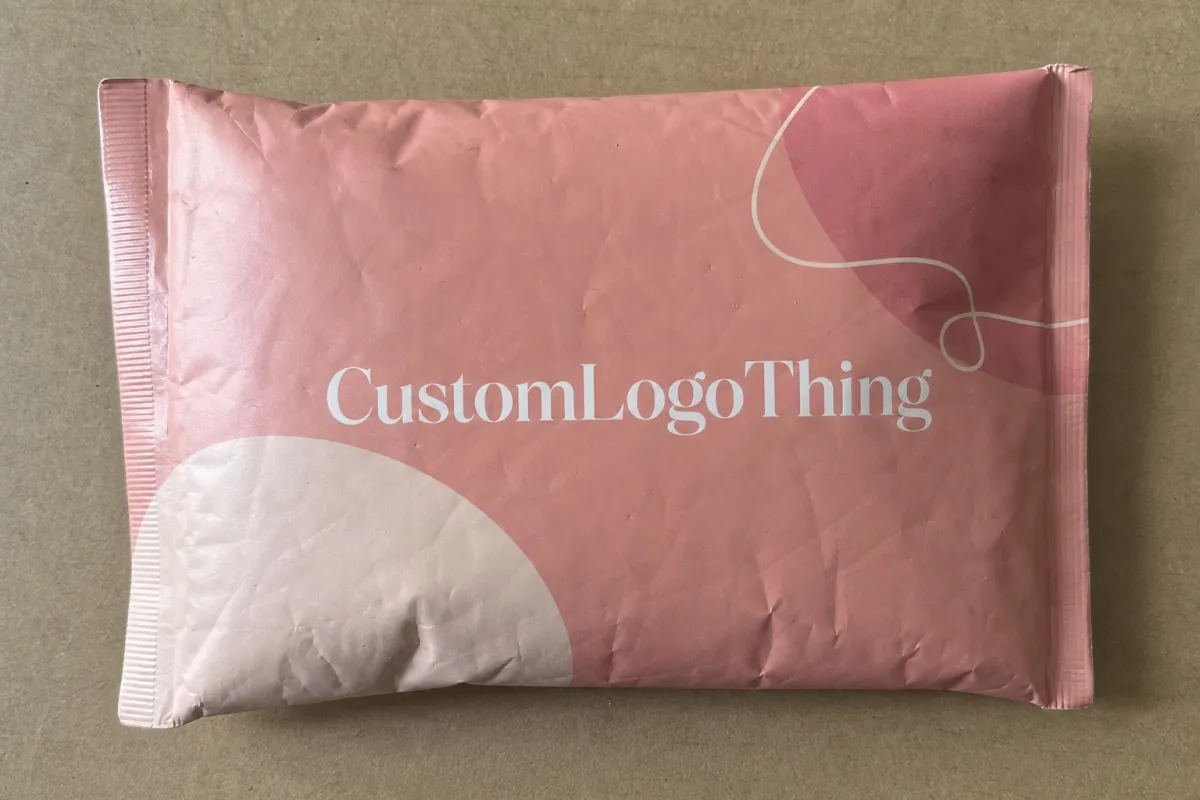
Two skincare orders can land on the same porch, both intact, both packed correctly, and still trigger completely different reactions. That gap is exactly why a printed Padded Mailers for Cosmetics brands print finish comparison deserves more than a quick aesthetic vote. The outer mailer sets the tone before the customer touches the cleanser bottle, serum carton, or sample sachet inside, and the surface finish can quietly signal luxury, hygiene, energy, restraint, or, frankly, cheapness.
For cosmetics brands, the shipping mailer is not just a protective shell. It is often the first physical proof that the brand looks as polished in real life as it did on Instagram, TikTok, a landing page, or a product shot. A plain white padded mailer can protect a $48 serum just fine. It rarely builds anticipation. A Branded Padded Mailer with the right print coverage and finish can protect the order and strengthen trust at the same time.
That matters even more for lightweight but presentation-sensitive beauty products such as lip oils, travel-size skincare, sample kits, sheet masks, lash items, brow products, and single-unit makeup orders. These products do not always need a corrugated shipper. They do need packaging that survives parcel handling without looking flimsy or forgettable. Printed padded mailers sit in that useful middle ground: lighter than a box, more protective than a standard flat mailer, and large enough to carry real branding without eating the shipping budget.
The interesting part is how much the print finish changes the result even when the mailer structure stays exactly the same. A matte surface can feel clinical and refined. Gloss can make shades and graphics look brighter. Soft-touch can add a premium hand feel customers usually associate with higher-end cartons and rigid boxes. Metallic effects can push a seasonal launch or PR send toward a more dramatic reveal. One-color and flood-print designs can beat more elaborate artwork if the branding is confident and the execution is tight.
This guide breaks those finish families down in practical terms: appearance, durability, cost, lead time, and production fit. It also looks at how substrate, ink, handling, abrasion, and order volume interact, because a nice mockup is not the same thing as a mailer that still looks sharp after conveyors, bins, vans, weather exposure, and doorstep delivery.
If you are still narrowing options, treat the mailer as one part of a larger pack system. A brand deciding between matte and soft-touch for a padded shipper should think about how that choice sits beside inserts, labels, tissue, seals, cartons, and the rest of the visual language. Many teams compare mailers alongside other Custom Packaging Products so the shipped experience feels coordinated rather than assembled by committee.
Why printed padded mailers can change a cosmetics brand's first impression
Beauty is a category where small visual cues do a lot of work. A customer may never say, "this gloss coating made me trust the moisturizer more," but they often feel that reaction anyway. Clean print, crisp logo edges, a controlled color palette, and a surface that feels intentional all shape the impression that the formula inside was handled with the same care.
That first impression starts earlier than many brands think. The customer sees the package before the product. They may photograph it unopened. They may hand it to a friend, leave it on a desk, or post an unboxing clip where the mailer sits on screen for several seconds before the item even appears. For a direct-to-consumer cosmetics brand, those seconds have value.
Printed padded mailers combine two jobs beauty teams usually care about: protection and branding. The outer layer provides the printable face. The internal cushioning helps absorb shocks and reduce edge impact for lightweight products. Common structures include co-extruded poly mailers with bubble lining, paper-exterior padded mailers with internal cushioning, and hybrid builds designed to stay flexible while adding puncture resistance. For single lip products, travel minis, brow gels, or two-to-four sample cartons, these formats often provide enough protection without the extra bulk of a box.
There is a practical fulfillment advantage too. A padded mailer can simplify the pack station, especially for a small SKU mix or repeatable bundle sizes. Teams can drop in the item, add an insert or tissue wrap, seal, label, and move on. Saving even a few seconds per order starts to matter once a brand is processing a few thousand orders a month. That is not glamorous, but neither is paying extra labor to overpack products that did not need a box in the first place.
Looks still matter. The same poly mailer in a stock finish can feel generic, while a custom flood-printed version with controlled color and finish can feel much closer to a prestige retail experience. That is why brands reviewing Custom Poly Mailers usually ask about more than thickness and size. They want to know how colors will reproduce, how the finish will wear, and whether the result will still look branded after actual shipping rather than a carefully lit photo shoot.
Practical rule: if the shipped product is emotionally purchased rather than purely functional, the outer mailer deserves more attention than many teams first assume.
For cosmetics, finish also affects perceived cleanliness. Reduced glare can make a package feel more clinical and controlled. High gloss can look fresh and energetic, especially for color cosmetics. Dark matte mailers can look elegant, but they can also show rub marks if the coating system is chosen badly. Surface finish is not decoration alone. It changes how the customer reads the brand before opening anything.
A careful mailer choice can also help newer brands punch above their weight. A strong logo, one or two disciplined brand colors, and a sensible finish often outperform complicated graphics with weak durability. Buyers and founders can review examples in packaging portfolios or relevant Case Studies to see how restrained branding sometimes produces the most expensive-looking result.
Printed padded mailers for cosmetics brands print finish comparison: what each finish really does
A useful printed Padded Mailers for Cosmetics brands print finish comparison starts with a basic question: what is the finish actually doing on the surface? Brands throw around terms like coating, lamination, metallic, satin, and matte as if they mean the same thing. They do not. Some change feel. Some change light reflection. Some mainly protect print. Some do all three, with tradeoffs attached.
Basic mailer structure first
Most beauty mailers are built around a printable outer surface paired with internal cushioning. On poly-based padded mailers, the outside may be a white or tinted film suited to flexographic printing, gravure-style production, or digitally assisted decoration depending on supplier capability. On paper-faced padded mailers, the outer layer may absorb ink differently and produce a softer, less reflective result. Internal cushioning can be standard bubble, lightweight air-cell structures, or protective fiber-based padding depending on the format.
That structure matters because finishes do not behave the same way on every base. A spot gloss effect that looks clean on a rigid folding carton may not hold the same precision on a flexible mailer that creases, bends, and rubs against other parcels. This is where buyers get tripped up. They approve a reference from a paperboard box and expect the same crispness on a shipping mailer. Reality tends to be less flattering.
What common finishes look and feel like
Gloss usually increases saturation and makes colors appear more lively. That helps with bright makeup branding, limited-edition shade drops, or youth-oriented beauty lines that depend on visual energy. Hot pink, electric coral, vivid red, and deep cobalt generally look stronger on a gloss-finished surface than on a flat matte one. Gloss can also make certain photographic or gradient-heavy graphics feel sharper, although glare can work against readability if the design carries a lot of small copy.
Matte cuts glare and gives a more controlled, understated presentation. It often suits minimalist skincare, fragrance discovery kits, clean-label positioning, and clinical-style formulas that want to look measured rather than loud. On light neutrals, dusty pastels, and off-whites, matte can look refined and expensive. On very dark flood coats, scratch and rub visibility can become a real problem unless the coating has decent abrasion resistance. A matte black mailer looks great for about twelve seconds if the spec is weak.
Soft-touch adds a velvety hand feel that many buyers associate with premium cartons. It can elevate prestige skincare and giftable formats, especially if the brand already uses soft-touch on folding cartons, labels, or rigid boxes. The tradeoff is cost and, in some constructions, greater sensitivity to fingernails, pressure marks, or transit wear. Soft-touch works best when the graphic design is restrained. Too many competing elements kill the effect fast.
Metallic effects, whether created through metallic inks, foil-style treatments, or printed simulation, bring shine and drama. They can work well for holiday sets, PR mailers, fragrance samples, or high-contrast makeup branding. They appear less often on everyday replenishment mailers because they add process complexity and can push the package toward a louder personality than some skincare brands want. Not every order needs to arrive like it is auditioning for a holiday campaign.
Satin or low-sheen finishes sit between gloss and matte. They do not get discussed as often, but they are useful. A satin surface can preserve some color lift while reducing harsh glare and visible fingerprints. For brands that feel gloss is too loud and matte is too flat, satin is often the compromise that keeps everyone from arguing over swatches for two weeks.
Spot treatments such as spot gloss over matte backgrounds can create contrast and pull attention toward a logo or key graphic. On padded mailers, confirm how well the treatment holds up on a flexible surface and whether registration tolerance is realistic for the chosen print method. What looks impressive on a rigid carton does not always behave the same way on a soft mailer that bends and slides through parcel systems.
One-color or flood-print approaches should not be dismissed as budget-only choices. Plenty of strong cosmetics brands use a white base with a single spot color logo, or a full flood color with reversed-out text, and get a cleaner result than they would from crowded artwork. Simplicity also helps control registration issues, color shifts, and readability problems. If the design system is strong, less print can look more expensive. Annoying, maybe, if someone spent weeks on a complex pattern, but still true.
Category fit matters
Playful makeup usually benefits from gloss, satin, or high-contrast color. Minimal skincare often leans matte or low-sheen. Clinical beauty brands tend to prefer restrained palettes, quiet surfaces, and easy-to-read typography. Premium fragrance sampling can support richer effects, including metallic accents, if the mailer is part of a campaign rather than an everyday shipping supply.
Touch matters too. In beauty, the surface feel can subtly suggest formula quality. A soft-touch package hints at richness. A crisp gloss surface feels bright and energetic. A clean matte can read as calm and modern. None of those signals are universal, and they are not always worth paying for, but they affect perception whether a team admits it or not.
Supplier questions get better once the terms are separated correctly: Is the finish printed, coated, laminated, or embellished? Is it a surface coating applied after print, or an integrated film layer? Does it affect sealing performance, recyclability messaging, or abrasion resistance? Those details usually matter more than whatever polished label appears on a sales sheet.
How the material, print method, and finish work together in transit
The finish does not perform by itself. It sits inside a larger system that includes the base material, ink set, curing conditions, artwork coverage, packing method, and shipping environment. A design that looks excellent on a press sheet can behave very differently after two distribution handoffs and 600 miles of parcel movement.
Poly-based padded mailers are common in e-commerce because they resist moisture fairly well, flex without tearing easily, and keep shipping weight low. Their printable surfaces can support bold branding, but ink adhesion and surface energy have to be handled correctly. Poor adhesion shows up quickly on high-contact zones such as corners, fold areas, seal edges, and any area dragged repeatedly across bins or belts.
Paper-faced padded mailers can look more natural and may align better with certain sustainability narratives, but they are not automatically better for every cosmetic program. They can mark differently, absorb inks differently, and respond differently to humidity. They may also produce a more muted graphic result than glossy poly-based formats. That can be a benefit or a problem depending on the brand language.
Most larger-volume custom mailers use flexographic printing or gravure-style processes because those methods are efficient for repeat orders and broad coverage. Flexo has improved a lot, but it still behaves differently from premium carton printing. Fine type, subtle gradients, and controlled skin-tone imagery need review. Some short runs or sample work may involve digital printing, which can be useful for concept testing or pilot launches before a brand commits to volume tooling.
Offset printing is more commonly tied to cartons and premium paperboard, yet buyers bring it up often because they want that same crispness on a mailer. Reality is less romantic. Flexible shipping formats rarely reproduce exactly like a 350gsm SBS or C1S carton. That does not make them worse. It means the artwork needs to be adapted to the structure instead of pretending the structure does not exist.
Artwork decisions that affect finish performance
Dark flood backgrounds can look sharp, but they are less forgiving. Black, navy, forest green, oxblood, and deep plum can show scratches, dusting, and conveyor rub more quickly, especially on matte finishes. Pale beige, muted sage, warm white, powder blue, and sand usually hide handling better. If a brand insists on a dark field, a more protective coating spec matters more than usual.
Pastel-heavy cosmetics layouts can look beautiful on matte surfaces, though they may lose some energy if the ink laydown is too light. Bright shades in CMYK can shift noticeably from screen expectations, so brands with signature colors often request custom spot color matching. Fine line logos, ingredient callouts, QR codes, and promo text should be checked at actual size. On flexible mailers, 5 pt text may technically print, but 6 to 7 pt with strong contrast is the safer move for shipping applications.
Minimalist layouts are popular in skincare, yet they expose every flaw. A large unbroken area of cream or pale gray makes dirt, banding, and uneven finish more visible than a more active graphic field would. Sometimes a subtle pattern, micro-texture, or secondary tone helps hide wear without making the design feel busy. That is not compromising the aesthetic. It is designing for reality.
Transit is harsh on pretty packaging
Padded mailers bend, slide, stack, and rub against other parcels. They get tossed into carts, pressed under mixed loads, dragged across sort belts, and dropped at doorsteps. That is normal. The useful question is not whether the package will be treated gently. The useful question is whether it will still look acceptable after standard abuse.
Brands shipping one-to-two ounce items such as lip glosses, sample ampoules, or mini sheet mask sets can often use thinner structures, while heavier skincare bundles, glass components, pumps, or multi-step routines may need stronger film gauges or a different pack style. A reasonable supplier should be able to talk about puncture risk, seal strength, and abrasion performance, not just aesthetics.
If the order includes glass droppers, compact mirrors, or metal applicators, the mailer may still need an insert, wrap, or small inner carton. Cushioning helps. It does not magically make every product safe when dropped loose into a bubble mailer. That should be obvious, but somehow it keeps needing to be said.
Transit testing can be formal or simple. High-volume programs may reference ISTA distribution testing. Smaller brands can still run practical checks: packed samples, drop tests from 30 to 36 inches, rub tests, temperature exposure in a parked vehicle, and a handful of real shipments across different zones. Those checks will not replace a full lab program, but they usually reveal problems early enough to avoid an expensive mistake.
Key factors to compare before choosing a finish
Choosing a finish should be less about personal taste and more about fit. A useful decision framework usually includes six variables: brand position, product risk, order volume, artwork style, shipping exposure, and total pack presentation.
Brand position comes first. Prestige skincare, derm-style beauty, and ingredient-led brands often lean toward matte, satin, or soft-touch because those finishes support calm and control. Bold color cosmetics, subscription drops, and trend-led launches may gain more from gloss, contrast-heavy graphics, or selective shine.
Product risk is next. If the contents are fragile, leak-sensitive, or easily dented, then protective structure matters more than surface effect. A finish can elevate perception, but it cannot solve a poor mailer spec. For heavier serums in glass, a mailer may still need internal support. For sachets or sample cards, the finish may carry more of the customer-facing job because the contents are less physically demanding.
Readability needs closer attention than many teams give it. Cosmetics mailers often carry more than a logo. They may include web URLs, social handles, ingredient stories, caution copy, shade launch messaging, or QR codes linked to tutorials. Matte finishes can improve readability by reducing glare, but weak contrast on muted colors still hurts legibility. Gloss surfaces can intensify contrast, yet overhead reflection sometimes makes small text harder to read in bright light.
Fingerprints, scratches, and rub are another deciding factor, especially for brands using dark neutrals or black-on-black themes. Soft-touch black looks rich at first glance, but if the package is likely to rub against corrugated edges, conveyor rails, or packed accessories, it can mark more than expected. Matte dark surfaces can also chalk or scuff if the coating is not right. Gloss may hide some rub damage better, though it can show dents and creases more clearly.
Sustainability perception needs to be handled carefully and honestly. Finish choice alone does not make packaging eco-friendly or not eco-friendly. Material combinations, adhesive systems, liners, inks, and local recycling access all influence the message. If the brand plans to make disposal claims, those claims should match the actual structure and customer geography. For broader guidance on package waste and recycling language, the EPA is a useful reference, and fiber certification details can be checked through FSC.
Pack system consistency matters too. A premium soft-touch mailer paired with a low-resolution insert and a flimsy label rarely feels coherent. The strongest beauty shipments usually carry one visual logic from the shipper to the internal wrap, carton, sticker, and thank-you piece. That does not mean every component has to be expensive. It means the pieces should look like they belong to the same brand, not like they were sourced in separate panic purchases.
| Finish Option | Best Fit | Visual Strength | Typical Risk | Relative Cost |
|---|---|---|---|---|
| Matte | Skincare, clinical beauty, minimal brands | Soft, refined, glare-controlled | Dark colors may show scuffs | Low to medium |
| Gloss | Makeup, bright launches, vivid graphics | Strong color pop and contrast | Can feel less premium for some prestige brands | Low to medium |
| Soft-touch | Prestige skincare, gift sets, premium kits | Velvety hand feel, upscale presentation | Higher cost, possible rub or pressure marking | Medium to high |
| Metallic or specialty shine | PR mailers, seasonal drops, fragrance samples | High drama, standout effect | More process complexity | High |
| One-color or flood print | Strong brands, cost control, repeat DTC orders | Clean and focused | Needs disciplined artwork | Low |
| Satin or low-sheen | Brands balancing premium feel with practicality | Moderate sheen, controlled reflection | Less dramatic than gloss or soft-touch | Low to medium |
Process and lead time: production steps from artwork to delivery
Custom mailers go through more steps than many first-time buyers expect. A typical project starts with size selection, then moves through material confirmation, artwork setup, color review, proofing, sample approval, production printing, converting, packing, and shipment. Add a specialty finish and one or more extra steps may appear for coating, lamination, cure time, or inspection.
For a standard custom padded mailer, a common production window after final proof approval is roughly 12 to 20 business days, plus freight time. A more complex finish can push that to 18 to 30 business days depending on volume, queue, and whether the supplier is handling print and finishing in one facility or routing the job through multiple operations. Overseas freight can add several weeks. Domestic finishing can shorten transit but may raise unit cost.
Where delays usually happen
Artwork files are a frequent bottleneck. Missing dielines, unresolved bleeds, RGB files instead of print-ready color builds, fonts not outlined, and tiny reversed type can all stall approval. If the branding depends on exact color, the team should define whether the target is CMYK, custom spot color, or a supplier-matched approximation. "Match our website beige" is not a production instruction. It is a complaint waiting to happen.
Finish specification is another delay point. A buyer may approve a visual mockup that says "matte," while the supplier still needs to know whether that means a standard matte coating, matte lamination, a paper-look substrate, or a satin compromise with better rub resistance. Those are different outcomes with different costs, different wear characteristics, and sometimes different minimums.
Small text and code readability create late-stage revisions too. Cosmetics brands often add campaign URLs, influencer-specific coupon codes, or ingredient callouts on the outer mailer. If that copy is under 6 pt, low contrast, or placed near seal areas, it may need redesign after proof review. Late changes can cost several days even before the press schedule shifts.
Beauty launch timing needs buffer
Cosmetics launches are rarely isolated. The mailer may need to arrive in sync with formula fill dates, carton arrivals, insert printing, PR seeding, influencer drops, and creator mailouts. If one component slips, the launch starts to look patched together. For that reason, I usually recommend a planning buffer of 2 to 3 extra weeks beyond the quoted factory timeline for a first run, especially if the brand has never tested that finish on that mailer format before.
Physical samples matter. A production proof can confirm graphic placement and approximate finish, but brands should also test a packed sample with the actual product load. A single lip gloss behaves differently from a boxed serum duo or a six-piece sheet mask set. Weight concentration, corner pressure, and movement inside the pack all affect the final result.
Before approval, ask these questions clearly:
- Does the quoted lead time start after final artwork approval or after deposit?
- Is freight transit included or only factory completion?
- Will the supplier provide a digital proof, a printed proof, or a preproduction sample?
- What finish tolerance should be expected on large solid areas?
- Can the supplier share a sample with similar ink coverage and mailer structure?
- Is the quoted finish the same one used on the reference sample, or just a close visual match?
Those questions prevent a lot of last-minute frustration, especially on first orders.
Cost, pricing, MOQ, and unit cost tradeoffs for cosmetic mailers
Pricing for cosmetic mailers usually comes down to seven core drivers: size, material thickness, cushioning style, print colors, finish type, coverage area, and order quantity. Freight destination and timeline urgency add more variation.
For a rough benchmark, a custom padded poly mailer for cosmetics at 5,000 pieces might land around $0.22 to $0.45 per unit for a standard branded treatment, depending on size and print coverage. A small format with one-to-two color branding may sit near the lower end. A larger mailer with heavier gauge material, full flood printing, and extra finishing can move toward or above the higher end. At 10,000 to 25,000 pieces, unit cost often drops in a meaningful way because setup costs are spread across more units.
Specialty effects change that equation quickly. Soft-touch can add roughly $0.04 to $0.10 per unit in many programs. Metallic treatments, foil-like effects, or layered finish combinations can add more, sometimes pushing a mailer from standard DTC supply into campaign packaging territory. That does not make the upgrade wrong. It just means the brand should be honest about the use case instead of buying with wishful thinking.
MOQ matters because print tooling and setup have to be paid for somewhere. Flexo plate costs, color matching, coating setup, and converting line changeover are easier to absorb over 10,000 units than 2,000 units. A young brand may want a premium finish, but if monthly usage is only 800 mailers, the economics may favor a simpler look until order volume grows or the packaging is reserved for higher-value launches.
Another cost that gets missed is the cost of choosing the wrong finish. A scuffed black matte mailer that arrives looking dusty can create customer disappointment and force a rerun. An overbuilt specialty treatment on a repeat replenishment order may not create enough customer value to justify the added spend. A cheap-looking gloss on a prestige serum launch may save a few cents while quietly undercutting the whole brand position. Not exactly smart.
Quote comparison example
| Scenario | Quantity | Approx. Unit Cost | Lead Time Range | Best Use |
|---|---|---|---|---|
| 1-color matte branded mailer | 5,000 | $0.22-$0.28 | 12-18 business days + transit | Everyday skincare DTC orders |
| Full-color gloss mailer | 5,000 | $0.26-$0.34 | 14-20 business days + transit | Bold makeup graphics or launches |
| Soft-touch premium mailer | 5,000 | $0.32-$0.45 | 18-25 business days + transit | Prestige skincare or gifting |
| Specialty metallic effect | 5,000 | $0.38-$0.55+ | 20-30 business days + transit | PR kits and seasonal campaigns |
| Satin finish branded mailer | 5,000 | $0.24-$0.31 | 13-19 business days + transit | Balanced premium everyday use |
These are realistic planning ranges, not universal market prices. Material markets move. Freight shifts. Factory capacity changes. The exact structure always matters. Still, the numbers help frame the discussion before a team starts comparing quotes that were built on completely different assumptions.
The smartest quoting approach is usually to request two finish options and two quantity tiers. For example, ask for 5,000 and 10,000 units in matte and soft-touch, or gloss and matte. That makes the tradeoff visible immediately. If the premium finish adds $0.07 per piece and the customer sees it only once on a low-value replenishment order, it may not be worth it. If the same finish supports a launch kit with a $120 average order value, the math changes.
Use case should drive investment. Subscription shipments need repeatable cost control. PR mailers can justify more dramatic surface treatments. Daily direct-to-consumer orders need durability first. Limited-edition bundles can carry a higher package cost if the margin and brand goal support it. Pretty is nice. Repeatable is nicer.
Common mistakes, expert tips, and next steps for choosing the right finish
The most common mistake is choosing a finish from a screen render. Screens lie a little. They hide texture, flatten glare, and make every package look more perfect than it will in transit. Another mistake is ignoring scratch visibility on dark designs. A third is crowding the mailer with too much information, which weakens branding and print performance at the same time.
Brands also fall into the trap of assuming "premium" always means better. A soft-touch finish can be beautiful, but if the brand ships 8,000 monthly replenishment orders of a mid-priced cleanser, a clean matte, satin, or gloss may create a better balance of appearance, durability, and cost. Specialty coatings should earn their place. Sentiment is expensive.
A more subtle mistake is comparing quotes that are not actually comparable. One supplier may be quoting a standard gloss over a white poly base. Another may be quoting a heavier film, different cushion structure, and a matte lamination. If the spec sheet is vague, the cheapest quote can be the fastest route to a disappointing result.
Expert tips that save money and disappointment
- Order physical finish samples, not just PDF proofs.
- Review color under daylight, office light, and warm indoor light.
- Test the mailer with the real product load, including inserts and labels.
- Rub, crease, and lightly scratch the sample before approval.
- Check barcode, QR, and small-type readability at true size.
- Ask whether the sample reflects actual production material and coating, not just a representative visual.
- Compare at least one lighter colorway if the first concept uses a dark flood background.
A simple scorecard can help internal teams make decisions with less subjectivity. Rate each option from 1 to 5 on look, feel, durability, print clarity, cost, and lead time. A matte finish may score highest on readability and cost, while a soft-touch version may score highest on tactile appeal but lower on durability and lead time. That exercise clears up a surprising number of internal debates.
If you are moving toward supplier outreach, send complete information. Include the mailer dimensions, expected quantity, product type, whether the items are glass or plastic, your target finish, artwork coverage, shipping region, and desired delivery date. Mention whether the mailer is for daily e-commerce orders, a launch campaign, a subscription cycle, or a PR kit. Vague quote requests usually produce vague pricing, vague lead times, and then vague apologies.
It also helps to describe the internal packout. A single lip gloss in a tissue wrap is very different from a three-piece skincare set with a fold card and sample sachet. Total pack thickness affects mailer selection, seal area, and cushioning requirement.
The next steps are straightforward:
- Narrow your shortlist to two finish options that fit your brand and budget.
- Confirm the exact product load and finished pack dimensions.
- Request side-by-side quotes at two quantity levels using the same mailer structure.
- Approve physical samples only after handling and shipping checks.
- Review final proofs against brand standards and real-world wear expectations before production release.
The best outcome is rarely the flashiest one. It is the finish that still looks intentional after packing, travel, doorstep delivery, and customer handling. That is the real test.
Viewed that way, a printed Padded Mailers for Cosmetics brands print finish comparison is not just about aesthetics. It is about matching brand expression, protection, print behavior, cost, and repeatable production so the package performs as well in the shipping lane as it does in the brand deck.
If a cosmetics team wants the shortest actionable answer, here it is: choose matte or satin for calm skincare branding and everyday reliability, choose gloss for vibrant makeup graphics, reserve soft-touch for higher-margin premium sends that justify the wear risk and added cost, and do not approve any finish until you have handled a physical sample packed with the real product. That one step filters out most expensive mistakes.
FAQ
Which print finish is best for printed padded mailers for cosmetics brands?
There is no single best finish for every beauty brand. Matte often suits clean skincare, clinical beauty, and ingredient-led positioning because it reduces glare and feels controlled. Gloss tends to support vivid makeup graphics and brighter campaign colors. Soft-touch can work well for prestige skincare or gifting. Satin is a practical middle ground for brands that want some polish without full gloss. The deciding factors are product category, color palette, shipping wear, budget, and whether the mailer is used for everyday DTC orders or a special campaign. Physical samples with your actual artwork remain the fastest way to avoid picking a finish that looks strong digitally but disappoints in transit.
Do matte or gloss printed padded mailers hold up better during shipping?
Performance depends on the material and coating system, not the finish name alone. Gloss often keeps colors lively and can disguise some rub better on bright graphics, while matte may show scuffing more readily on dark flood backgrounds if the coating is specified poorly. Matte can also look cleaner on light minimalist designs and reduce visible glare. Ask the supplier about abrasion resistance, ink adhesion, and whether they can provide a sample that matches your actual ink coverage and mailer structure.
Is soft-touch a smart choice for everyday cosmetic shipments?
Sometimes, but not automatically. Soft-touch can create a premium first impression and works well for prestige skincare, gifting, and launch kits where tactile feel matters. For routine replenishment orders, especially at higher monthly volume, the extra cost and possible rub sensitivity may not deliver enough value. Brands should compare soft-touch against matte or satin using the same structure, artwork, and shipping conditions before making the call.
How much do printed padded mailers for cosmetics brands usually cost?
Unit cost changes with size, film gauge or paper basis weight, cushioning type, quantity, print coverage, and finish complexity. As a practical range, many standard custom cosmetic mailers land around $0.22 to $0.45 per unit at 5,000 pieces, while specialty effects can push higher. Soft-touch, metallic treatments, and low-volume runs generally increase cost faster than clean single-color or standard flood-print designs. The most useful quote compares at least two quantity levels and two finish options so you can measure visual impact against unit economics.
What is the typical lead time for custom printed padded mailers with specialty finishes?
Lead time usually includes artwork review, proof approval, production printing, converting, packing, and freight transit. Standard custom runs often take 12 to 20 business days after final approval, while specialty coatings or more complex finishing steps may push production closer to 18 to 30 business days before transit. Brands supporting a launch date, influencer drop, or subscription cycle should build in extra approval buffer time and test physical samples before locking a volume order.
What should cosmetics brands send when requesting a quote for printed padded mailers?
Send the mailer dimensions, estimated quantity, product type, whether components are fragile, your target finish, artwork coverage, delivery timing, and destination. It also helps to mention whether the mailer is intended for everyday e-commerce orders, PR kits, sample mailings, or heavier bundled sets, because that affects material and cushioning recommendations. If possible, include reference visuals or brand standards so the supplier can recommend finish options that align with both your visual direction and production realities.


