Buyer Fit Snapshot
| Best fit | Printed Rigid Box Sleeves projects where brand print, material claims, artwork control, MOQ, and repeat-order consistency need to be specified before quoting. |
|---|---|
| Quote inputs | Share finished size, material target, print colors, finish, packing count, annual reorder estimate, ship-to region, and any compliance wording. |
| Proofing check | Approve dieline scale, logo placement, barcode or warning zones, color tolerance, closure strength, and carton packing before bulk production. |
| Main risk | Vague material claims, crowded artwork, missing packing details, or unclear freight terms can make a low unit price expensive after revisions. |
Fast answer: Printed Rigid Box Sleeves: Branding, Cost, and Fit should be specified like a repeatable production item. The safest quote records material, print method, finish, artwork proof, packing count, and reorder notes in one written spec.
Production checks before approval
Compare the actual filled-product size with the drawing, then confirm tolerance on folds, seals, hang holes, label areas, and retail display edges. Reserve space for logos, QR codes, warning copy, and material claims before decorative graphics fill the panel.
Quote comparison points
Review material grade, print process, finish, sampling route, tooling charges, carton quantity, and freight assumptions side by side. A quote is only useful when the supplier can repeat the same color, closure quality, and packing count on the next order.
Printed Rigid Box Sleeves: Branding, Cost, and Fit
Printed rigid box sleeves look straightforward until you start pricing them, fitting them, and trying to move them through production without creating a small mess. That is usually the moment the “quick packaging update” turns into a real project. A well-made sleeve can change how a rigid box reads in seconds, which is exactly why printed rigid box sleeves often beat a full structural redesign when the goal is faster launches, stronger shelf presence, and tighter budget control.
The appeal is practical. Keep the rigid base. Change the outer layer. Now the brand can swap seasonal graphics, compliance copy, collection cues, or campaign messaging without rebuilding the whole package every time someone upstairs wants a fresh look. Printed rigid box sleeves make limited editions, subscription drops, product refreshes, and gift sets much easier to manage. For teams juggling too many SKUs already, that flexibility is not a luxury. It is survival.
There is a money angle too. Premium packaging does not need premium construction everywhere. The rigid box handles the structure. Printed rigid box sleeves carry the visual load. That split keeps the package looking considered while separating long-life hardware from high-change artwork. Smart brands use that split all the time because it keeps the system cleaner and the quote less painful.
What follows is the part buyers usually need most: how printed rigid box sleeves are built, what pushes cost up or down, where fit problems start, and why so many sleeve programs look better in a mockup than in the warehouse. If the goal is packaging that feels deliberate instead of improvised, the details matter.
What printed rigid box sleeves actually do
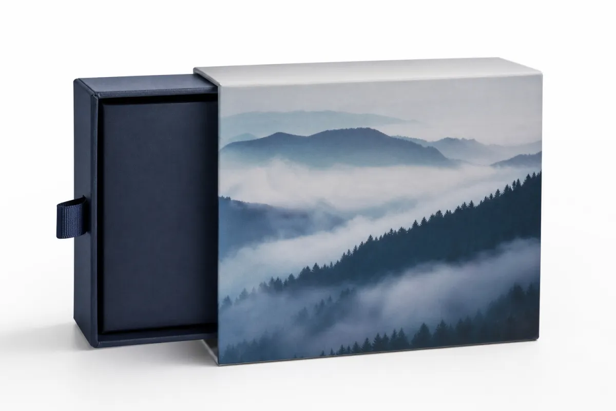
Retail shelves move fast. People glance, decide, and move on. Printed rigid box sleeves matter because they change that first impression without changing the core box. The structure stays familiar. The face of the package gets a new story.
At the simplest level, a sleeve is an outer printed wrap that slides over a rigid box. It can be open-ended, partially closed, or shaped with a window, thumb cut, or reveal area depending on the product. Printed rigid box sleeves add graphics, messaging, and sometimes tactile finishing while leaving the inner box alone. That sounds modest. It is not. It gives the brand a lot more control than most people expect.
Brands keep coming back to printed rigid box sleeves for the same reasons. A standard base box can support multiple campaigns or SKUs. Inventory stays easier to manage because the rigid structure can be ordered in steadier quantities while the sleeve changes more often. The package also feels more collectible. A second layer tends to read as care, and customers notice that even if they cannot explain why.
There is a shelf effect too. A plain rigid box can look expensive. Printed rigid box sleeves make it feel edited. That distinction matters for cosmetics, electronics accessories, premium food gifts, wellness products, and corporate gifting. The sleeve becomes the part that signals seasonality, price tier, or brand story. The rigid box underneath keeps everything from feeling flimsy or disposable.
From a buyer perspective, the value is control. If the promo changes, the sleeve changes faster than the box. If artwork needs to be localized, the sleeve carries the variation. If the team wants to test a new look before committing to a structural overhaul, printed rigid box sleeves give room to experiment without paying for a complete rebuild. That alone saves a lot of bad ideas from becoming expensive ones.
They are not just decorative. They are a system choice. A good sleeve program can reduce SKU complexity, support phased launches, and keep a premium appearance across a line that needs to evolve. The box stays durable. The brand language stays current. That is the point.
A sleeve is not a patch for weak packaging. It works best when the base rigid box already does its job and the sleeve sharpens the message instead of hiding a problem.
One detail gets ignored more often than it should: printed rigid box sleeves change how value is perceived before the product is even touched. Texture, contrast, and wrap alignment all signal precision. A loose or generic sleeve looks cheap. A fitted, coherent sleeve reads as intentional, and that can support a higher retail price without changing the product itself. Nice trick. Not magic. Just good packaging.
How printed rigid box sleeves are manufactured and applied
The manufacturing path for printed rigid box sleeves starts with artwork and ends with fit. In between, the sleeve is printed on paper or board, then cut, folded, glued, and formed into a shape that slides over the rigid box with controlled friction. It has to move easily during assembly and still feel secure after placement. That balance is narrow, and it is usually where sleeve projects either look premium or fall apart visually.
Most printed rigid box sleeves begin as a flat dieline. The dieline defines panel dimensions, score lines, glue flaps, cutouts, and any openings the design needs. Once the artwork is set, the file goes to print, then through finishing, die-cutting, creasing, and converting. Short runs may be hand-assembled and hand-applied. Larger programs can move through semi-automated workflows, but only if the dimensions are disciplined enough to survive the line.
Fit is not a side note. It is the whole thing. Printed rigid box sleeves that are too tight slow down assembly and can scuff corners, compress edges, or distort the printed surface. Sleeves that are too loose broadcast low quality immediately. They slide, shift, or sit unevenly. Even a millimeter mismatch can show up at pack-out, especially on tall or narrow rigid boxes.
That is why tolerance checks deserve more attention than they usually get. A rigid box made with a slightly different caliper, a wrapped board with a thicker finish, or a box that varies across suppliers can change the fit enough to matter. If the base structure is not locked before sleeve sizing begins, printed rigid box sleeves turn into guesswork. Guesswork costs money and time, which is a lovely way to ruin a launch.
Finishing choices shape the production path too. Soft-touch coating, matte or gloss lamination, foil, embossing, debossing, and spot varnish each change the look and the timeline. A soft-touch sleeve can feel refined in hand, but it may need extra drying or careful handling. Foil creates a strong focal point and adds setup complexity. Spot UV can make a logo pop, though it gets ugly fast when the artwork is crowded.
Some teams keep the finish restrained for a reason. The rigid box already carries a premium signal. If the sleeve tries to do everything, the result looks busy instead of elevated. A good sleeve usually makes one or two strong moves and stops. That is enough.
For packaging teams that want a formal fit and shipping reference, the test methods published by ISTA are a useful starting point. Sleeve work is not the same as transit testing, but the mindset fits: verify the package under real conditions instead of pretending the drawing will survive contact with production and logistics.
Applied correctly, printed rigid box sleeves work as part of the packaging stack. The rigid box protects and structures the product. The sleeve carries the marketing layer. Together they create a package that is durable and adaptable. That is why the format keeps winning approval in categories that want a premium look without a fresh structure every time the artwork changes.
What drives cost, print quality, and material choice
Pricing for printed rigid box sleeves usually comes down to a few inputs, and buyers who understand them can compare quotes without getting played by formatting tricks. The biggest drivers are substrate selection, print coverage, finishing complexity, dimensions, quantity, and whether the sleeve is a repeatable format or a custom shape that needs more setup. Each one pushes the number in a different direction.
Scale matters more than a lot of first-time buyers expect. A small order carries setup overhead across fewer pieces, so the per-unit price is usually much higher than the same sleeve on a larger run. That is not a sales tactic. It is manufacturing math. Prepress, die cutting, make-ready, quality checks, and waste all need to be spread somewhere.
Material choice is the next big variable. Heavier paperboard and specialty papers often feel more premium in hand, but they can increase waste, make folding harder, or raise freight weight if the sleeve is large. A 14pt, 16pt, or 18pt stock may be enough for one program, while another needs a sturdier board because the sleeve spans a larger panel or carries heavy finishing. There is no universal answer. The right answer depends on the look, the box size, and the handling demands.
Print coverage matters too. Heavy ink coverage, dark solids, and fine reverse type may look elegant on screen, but they demand tighter press control and more careful inspection. If the artwork is a simple brand mark on a clean field, the job is easier. If the design uses gradients, metallic accents, or rich black backgrounds, the cost usually rises because the process gets more sensitive to variation.
Finishing is where budgets can jump fast. A sleeve with matte lamination and basic print might stay in a modest range. Add foil, embossing, multiple print passes, or spot UV and the number usually climbs. None of those effects is bad on its own. The problem is stacking them without a clear hierarchy. Once a sleeve tries to be glossy, tactile, metallic, and heavily illustrated all at once, the quote tends to reflect that ambition.
There are hidden costs too. Sampling rounds can add time and money, especially if the fit needs adjustment after the first physical prototype. Plate or die updates are another possibility. Artwork corrections, rush production, and stricter quality checks all add friction to the schedule. Buyers often focus on print price alone, then discover that the support work around the print matters just as much.
Here is a simplified way to compare common sleeve directions. These are not universal prices; they are planning ranges for a run near 5,000 units, assuming standard complexity and no unusual freight or warehouse requirements.
| Option | Typical Look | Approx. Unit Cost | Notes |
|---|---|---|---|
| Basic printed SBS sleeve with matte aqueous coating | Clean, retail-ready, efficient | $0.16-$0.24 | Good for straightforward branding and repeatable programs |
| Heavier stock with soft-touch lamination | Muted, tactile, premium in hand | $0.22-$0.35 | Popular for gift sets and beauty packaging |
| Textured paper with foil accent | High contrast, more ceremonial | $0.35-$0.55 | Works well when the sleeve needs a focal logo or badge |
| Specialty construction with embossing and spot UV | Strong shelf impact, more layered finish | $0.42-$0.70 | Requires tighter proofing and more careful fit validation |
Read that table as a planning tool, not a promise. A small sleeve can cost less than a large one even with a higher finish level. A custom die can shift the math. So can window cutouts, narrow tolerances, or unusual pack-out requirements. The pattern still holds: printed rigid box sleeves get more expensive as the substrate gets heavier, the finish stack gets busier, and the order size gets smaller.
Print quality is not just image sharpness. It is registration, color consistency, crease behavior, and how the finish interacts with the artwork. A sleeve with deep matte coating can make color feel denser. A gloss finish can brighten an image and expose alignment errors. A foil stamp can look exceptional on a clean field, then lose impact if it has to fight with too many other visual elements.
If sustainability claims are part of the brief, the substrate question gets more specific. Buyers should ask where the paper comes from, what coating is used, and whether the supply chain documentation supports the claim. The FSC system is one of the clearest references for responsibly sourced fiber, and it is much easier to sort that out before artwork lock than after a label claim has already gone to proof.
Honestly, the best cost conversations connect design choices to factory reality. If a sleeve needs a unique shape, extra finishing, and a small quantity, the quote will reflect that. If a team can standardize the base format and keep the print architecture disciplined, printed rigid box sleeves can stay premium without becoming financially awkward. Strange concept, I know.
A step-by-step process from dieline to delivery
The cleanest sleeve projects follow a predictable sequence. It is not glamorous, but it prevents the problems that usually show up late. Start with a clear brief. Define the product dimensions, target quantity, retail environment, launch date, finish preferences, and any constraints tied to sustainability claims, tamper evidence, or seasonal rollout timing. Printed rigid box sleeves work best when the job is described like an actual manufacturing task, not just a branding idea.
Next comes dieline development. The sleeve has to be measured against the actual rigid box, not a hopeful dimension from an old spec sheet. Clearance matters because the structure needs enough room to assemble cleanly, yet not so much room that it shifts or rattles in transit. If the base box is wrapped with a thicker paper or a heavier laminate, that thickness has to be captured in the measurements. A sleeve built around the wrong caliper will look fine in the file and wrong on the table.
After the dieline is set, the artwork needs a hard review. Check bleeds, barcode placement, copy hierarchy, finish callouts, and color expectations before the job moves forward. A common mistake is approving graphics before the structural measurement is final. Another is placing legal copy where the fold or glue flap will interfere with readability. Printed rigid box sleeves punish last-minute shortcuts because every correction touches both design and production.
Sampling should follow, especially if color accuracy, tactile finish, or fit are critical. Physical samples tell the truth that PDFs hide. A sleeve can appear balanced on screen and still sit strangely on a box because of paper memory, finish reflection, or a slightly different panel height. A pre-production sample is usually cheaper than a re-run, and much cheaper than discovering the problem after the full order is packed.
Production then moves through printing, finishing, die-cutting, converting, inspection, and packing. Depending on volume, the sleeves may ship flat for local assembly or be pre-formed for a more controlled pack-out. Timing varies with complexity, but simple sleeve jobs often move faster than highly finished custom projects. A straightforward program may run through the process in roughly 10-15 business days after approval, while a more complex run can stretch if samples, finish tests, or correction rounds are involved.
Packaging teams that want better process discipline usually document each checkpoint. That sounds tedious until one artwork version goes missing or one finish code gets misread. Version control is not bureaucracy. It is how printed rigid box sleeves stay consistent when multiple people touch the same project.
One practical habit helps a lot: test the sleeve on the real box at the real stage of the workflow. Not a sample box from a different batch. Not a simulation. The actual box. That one step often shows whether the fit is truly clean or only looks clean on paper.
Approval should happen on the object, not the render. A sleeve that fits the drawing but fights the box is already off track.
That principle matters because printed rigid box sleeves are both print and structure. They are not just artwork wrapped around air. They are a physical product with tolerance, friction, and handling behavior. Once teams think that way, the workflow becomes more predictable and the quote conversations get better too.
Common mistakes that make sleeves look cheap
Size errors are the first and most obvious problem. A sleeve that is too loose reads as low-end because it shifts and floats. A sleeve that is too tight creates packing friction and can scuff the corners of the rigid box. Printed rigid box sleeves need just enough resistance to feel finished, but not enough to make line workers force the fit. The difference is subtle on paper and obvious in the hand.
Overdesign is the next trap. Too many finishes, clashing graphics, and dense text can flatten the premium effect instead of helping it. A sleeve does not need to shout from every panel. One strong logo treatment, one controlled texture, or one clean color field usually says more than three competing visual ideas. The eye likes hierarchy. Packaging buyers should too.
Brand inconsistency causes trouble as well. If the sleeve feels like a one-off promotional item instead of part of a packaging system, it weakens the product story. That happens when logo placement is off, the color palette drifts from the rest of the line, or the messaging tone does not match the range. Printed rigid box sleeves work best when they look planned, not patched on.
Material mismatch can also sink the result. A thin stock with a high-gloss, high-impact design can look impressive in a mockup and underwhelming in hand. The reverse is true too: a textured paper with a quiet layout can feel expensive without a heavy finish stack. The stock and the design need to support each other. If the material says one thing and the graphics say another, the package feels unfinished.
Operational mistakes are the most expensive kind because they show up late. Skipping line testing, ignoring carton tolerances, approving artwork before the final measurements are confirmed, or failing to define the finish sequence clearly can all lead to rework. Printed rigid box sleeves are a good example of a packaging element that looks easy until the first production batch exposes the weak point.
Another common problem is treating the sleeve as a decorative afterthought. That usually creates a package with no structural logic. The box, insert, and sleeve should all support the same message. If the base box is plain but sturdy, the sleeve should add clarity and focus. If the base structure is already ornate, the sleeve may need to stay quieter. Balance matters more than decoration count.
There is also a supply-chain issue that gets overlooked: not all boxes are identical across suppliers or production lots. A sleeve designed against one base box and then applied to another can drift off-center, especially if board caliper, wrap thickness, or corner build varies. Printed rigid box sleeves are sensitive to that variation, so consistency in the base box is part of the sleeve quality plan.
From the outside, these may seem small. In reality, they are the difference between a package that feels premium and one that feels rushed. Buyers who have lived through enough production runs recognize the pattern quickly: the sleeve was not the problem by itself, the system around it was.
Expert tips for better branding, fit, and finishing
The strongest sleeve programs are designed as systems, not add-ons. That means the rigid box, insert, and sleeve all speak the same visual language. If the sleeve carries seasonal storytelling, the base box can stay calm and durable. If the box already has a strong interior reveal, the sleeve can focus on structure and brand recognition. Printed rigid box sleeves work better when they are planned alongside the rest of the pack architecture.
Use contrast on purpose. One tactile or metallic effect usually does more good than a long list of finishes. A foil logo on a soft-touch field can feel refined because the eye has a place to rest. A sleeve crowded with spot UV, embossing, and multiple gloss areas can feel noisy. The best premium cues are often the least fussy ones.
Test the visuals on real boxes under real light. Matte coatings can flatten color more than expected. Foil can shift dramatically depending on angle. Textured papers can soften fine type. Printed rigid box sleeves are especially sensitive to lighting because they sit on the outside of the product and catch the first glance. What looks balanced in a studio can read differently under retail LEDs or warehouse fluorescents.
Campaign flexibility should be part of the design brief from the start. If a brand wants to rotate art by season, the sleeve should be built so the base box stays the same while the outer layer changes. That approach reduces long-term complexity and can also limit waste because the base packaging does not need to be rebuilt every time the campaign changes. For subscription programs and gift sets, that modularity is a serious advantage.
Production discipline is the last piece, and it is not optional. Keep dielines version-controlled. Document exact finish specs. Confirm color targets early. Hold on to approved samples. Printed rigid box sleeves move through multiple hands, and small ambiguities become expensive when they multiply across print, finishing, and assembly. A clean spec file is not admin overhead; it is the thing that keeps the package from drifting.
There is a smart middle ground between maximalism and austerity. The sleeve can still feel special without becoming overworked. In practice, that often means a restrained palette, one clear focal point, enough tactile interest to reward handling, and a fit that feels precise the moment the box is picked up. That combination tends to age better than trend-chasing decoration because it relies on proportion instead of novelty.
For teams that want extra assurance on recycled content or responsible sourcing, the supplier conversation should happen before final art is signed off. The claim needs to be supportable, the material needs to match the claim, and the documentation needs to be available if a retailer asks for it. That level of diligence is boring right up until it saves a launch.
In a broader sense, printed rigid box sleeves are a good reminder that packaging design and packaging operations should talk to each other early. A beautiful sleeve that cannot be packed efficiently is a problem. A cheap sleeve that damages the box is also a problem. The sweet spot is where branding, fit, and workflow all point in the same direction.
Actionable next steps before you request quotes
Before asking for pricing, build a packaging brief that gives suppliers the facts they need. Include the exact box dimensions, target quantity, expected finish level, budget range, launch date, storage assumptions, and any special requirements such as sustainability claims or phased rollouts. Printed rigid box sleeves can only be priced accurately when the supplier understands the full use case, not just the artwork.
Gather the right files next. Dieline files, logo assets, copy decks, color references, and sample boxes do more for quote accuracy than a long email thread ever will. If the base rigid box already exists, ship a sample to verify fit. If it does not, define the intended structure clearly. The supplier cannot price friction, tolerance, or finishing cleanly without seeing the actual packaging context.
Ask for apples-to-apples quotes. That sounds obvious, but it is where comparisons often go wrong. Keep the substrate, finish set, approval process, and order assumptions consistent across vendors. Otherwise one quote will look cheaper simply because it excludes something another quote includes. Printed rigid box sleeves deserve a clean comparison because tiny scope differences can hide real cost gaps.
Compare the quote against operational reality, not just the headline number. Ask how the sleeves will be packed, how many cartons will be needed, where inventory will be stored, and whether the run is intended for a one-time launch or a repeatable system. A slightly higher unit cost can still be the better choice if it saves labor, reduces damage risk, or makes reorders easier.
Then apply a simple decision rule: choose the sleeve concept that gives the strongest shelf impact, the cleanest fit, and the most manageable production path. If two options look similar visually, favor the one that is easier to run consistently. Printed rigid box sleeves are most valuable when they make the brand easier to present, not harder to produce.
If the project is going to a partner such as Custom Logo Things, the best brief is one that answers the practical questions before anyone asks them. That usually speeds up quoting, improves the first sample, and cuts down on back-and-forth that slows the launch.
And if the budget is tight, remember this: printed rigid box sleeves do not need every finish effect to do their job. A precise fit, a coherent visual system, and a clean production path often create more value than an overloaded design. That is the useful part of the format. It gives brands a premium layer without forcing them to rebuild the whole box every time the message changes. For many programs, printed rigid box sleeves are the smartest way to keep packaging current, controlled, and commercially sensible.
What are printed rigid box sleeves used for in branding?
They add a premium outer branding layer without rebuilding the rigid box itself. Printed rigid box sleeves are useful for seasonal campaigns, limited editions, product launches, and gift sets, and they help brands change artwork quickly while keeping the core box consistent.
How do I choose the right material for printed rigid box sleeves?
Start with the look you want: smooth coated stock, textured paper, or a specialty paper feel. Match the material to handling demands, since heavier coatings can improve durability but change the tactile experience. Ask for samples on the actual box size before approving the final material for printed rigid box sleeves.
How much do printed rigid box sleeves usually cost?
Pricing depends on quantity, stock choice, size, print coverage, and finishing complexity. Small runs usually cost more per unit because setup and tooling are spread across fewer pieces. Foil, embossing, and rush production are some of the fastest ways to raise the quote for printed rigid box sleeves.
What is the typical timeline for printed rigid box sleeves?
The timeline usually includes brief development, dieline confirmation, proofing, production, finishing, and shipping. Simple projects move faster; custom finishes, complex fit checks, and sample revisions extend the schedule. Final approval often depends on physical samples, especially when fit and color accuracy matter for printed rigid box sleeves.
Can printed rigid box sleeves be reused for different products?
Yes, if the rigid box dimensions stay the same and the branding architecture is planned around a consistent base. Printed rigid box sleeves are especially efficient for brands that refresh artwork by season or collection, and reusability improves when the sleeve is designed as part of a modular packaging system.
For most brands, printed rigid box sleeves earn their keep when they improve shelf impact without complicating the base box. That is the real test: if the sleeve strengthens the brand story, fits cleanly, and stays manageable to produce, it is doing its job well. If you're spec'ing one this week, lock the base box, verify the caliper, and approve the sleeve on the actual carton before you ask for final quotes.
Related packaging resources
Use these related guides to compare specs, costs, quality checks, and buyer decisions before making the final call.


