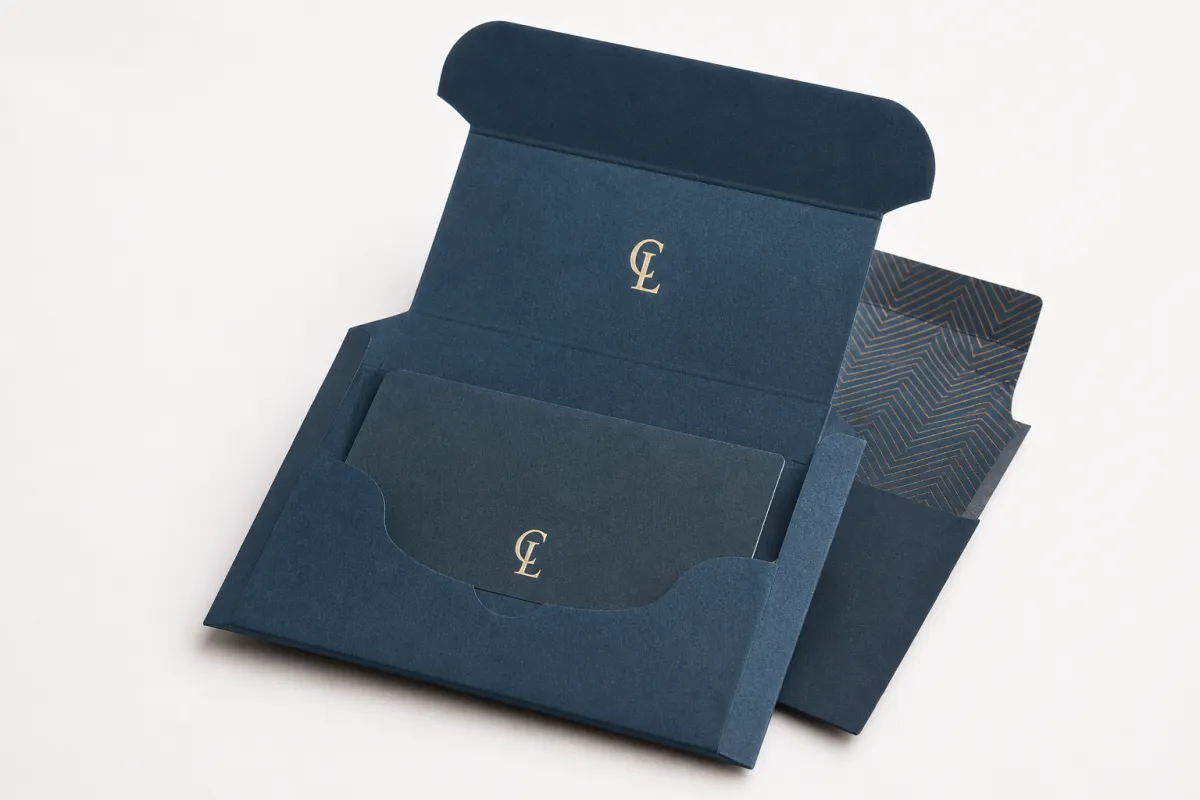
Buyer Fit Snapshot
| Best fit | printed subscription box inserts for packaging buyers comparing material specs, print proof, MOQ, unit cost, freight, and repeat-order risk where brand print, material, artwork control, and repeat-order consistency matter. |
|---|---|
| Quote inputs | Share finished size, material target, print colors, finish, packing count, annual reorder estimate, and delivery region. |
| Proofing check | Approve dieline scale, logo placement, barcode or warning zones, color tolerance, and any recyclable or compostable wording before bulk production. |
| Main risk | Vague material claims, crowded artwork, or missing packing details can create delays even when the unit price looks attractive. |
Fast answer: Printed Subscription Box Inserts: Branding That Lands should be specified like a repeatable production item. The safest quote includes material, print method, finish, artwork proof, carton packing, and reorder notes in one written spec.
What to confirm before approving the packaging proof
Check the product dimensions against the actual filled item, not only the sales mockup. Ask for tolerance on folds, seals, hang holes, label areas, and retail display edges. If the package carries a logo, QR code, warning copy, or legal claim, reserve that space before decorative graphics fill the panel.
How to compare quotes without losing quality
Compare board or film grade, print process, finish, sampling route, tooling charges, carton quantity, and freight assumptions side by side. A lower quote is only useful if the supplier can repeat the same color, closure quality, and packing count on the next order.
Printed Subscription Box Inserts may sit low on a production checklist, yet they often carry more influence than their size suggests. The outer carton sets the first expectation, but the insert is usually the piece that explains the offer, clarifies the product, or points the customer toward the next action once the box is open.
That small card, sheet, or folded piece lands in the middle of the unboxing experience, right when attention is focused and the customer is already handling the product. Printed subscription box inserts deserve serious planning for that reason alone. A well-built insert can cut confusion, reinforce a brand voice, and create a clear path toward reorder, referral, or product education without adding much cost to the packout.
From a packaging buyer's perspective, few tools inside the box deliver as much value per dollar. A few cents of print can support retention in a way that larger decorative elements rarely manage, because the customer is already opening the shipment, touching the materials, and reading with more intent than they would give to a social feed or a banner ad. Printed subscription box inserts do not just decorate a shipment; they shape what the shipment means.
The formats vary. Welcome cards, product education flyers, loyalty notes, coupons, QR-code prompts, folded mini-brochures, and referral pieces all belong in this category. Some are direct and practical, some carry a little story, and some are built to trigger a measurable action the day the box arrives. The form changes, but the purpose stays steady: printed subscription box inserts help the customer understand the experience and respond to it.
There is a useful marketing truth tucked inside all of this. The outer box gets the first glance, but the insert often gets the strongest read because it is opened at the emotional peak of the unboxing moment. Clear language, the right stock, and a call to action that feels easy to follow can give a small printed piece more commercial weight than a much larger package panel.
I have seen a plain, well-written postcard outperform a fancier folded piece simply because the message was clearer and the next step was obvious. That kind of result is not magic, and it is not luck either. It is the basic payoff of good print discipline: the right words, on the right paper, at the right moment.
The rest of this piece stays grounded in the practical side of the work. I cover how printed subscription box inserts fit inside the packout, what affects quality, how lead times usually move, what drives cost, and where the most common mistakes show up. If the goal is to make the insert earn its place, the details matter more than the hype.
Printed Subscription Box Inserts and the Unboxing Moment
Timing matters inside a subscription box. The customer has already waited for delivery, opened the shipper, and given a few seconds of full attention to whatever sits inside. That is the moment printed subscription box inserts can do their best work, since the insert is not competing with a browser tab, a scrolling feed, or a pile of unrelated sales messages.
Picture a common scenario. The box arrives looking polished, the fill is arranged neatly, and the first thing the customer sees is a clean insert that explains what is inside, how to use a product, or what reward comes next. That one piece can answer questions before they turn into support tickets, and it can do it before uncertainty has time to create friction. Printed subscription box inserts are powerful because they are simple and direct.
In plain language, printed subscription box inserts are the printed materials placed inside a subscription shipment: cards, flyers, folded sheets, coupons, thank-you notes, product education pieces, or loyalty messages. Some brands use them for welcome messaging, some for upsells, some for care instructions, and some for referral offers. The format stays flexible, while the job remains tied to the customer's next decision.
That is why these pieces matter beyond decoration. A strong insert helps shape perception, reduce confusion, and guide customers toward reuse, reorder, review, or referral. It also protects the customer experience by answering the questions that tend to appear after the package lands: How do I use this? What should I do next? Is there another product that pairs with it? Printed subscription box inserts can answer those questions in a compact space.
Print carries trust in a way that digital touchpoints often do not. A clean, well-registered card on decent stock feels deliberate. A flimsy sheet with crowded copy feels rushed. The customer may not be able to name the difference in technical terms, but they feel it immediately. Good printed subscription box inserts signal that the brand paid attention to the details.
"The insert is not filler. It is the conversation you get to have after the customer has already said yes."
That is the real job of printed Subscription Box Inserts: they turn a shipping event into a brand moment. Clear language and a physical piece that feels intentional give the insert a rare kind of power, one that can guide emotion and action in the same pass.
How Printed Subscription Box Inserts Work in the Packout
Printed subscription box inserts begin as a design decision, then become a handling decision. The piece has to make sense in two places at once: on screen during approval and on the line during fulfillment. Ignoring either side makes the job harder than it needs to be.
The usual path is straightforward. Copy gets written, artwork gets approved, a proof is checked for trim and color, and the piece moves into production. After that, the insert may be cut, scored, folded, or trimmed to size before it is counted, kitted, or handed off for packout. Simple runs can move quickly. More complex jobs depend on handling details nearly as much as print specs.
Common insert types include welcome notes, product usage tips, cross-sell offers, QR-code cards, loyalty prompts, and referral incentives. Those messages can shift by subscriber tier or campaign goal, which helps because not every customer should receive the same ask. A new subscriber often needs reassurance and instruction. A repeat buyer may respond better to a replenishment reminder or a higher-value bundle offer. Printed subscription box inserts work best when the message matches the audience.
Format changes the way the message lands. A postcard is fast and direct, which makes it a strong fit for a short CTA. A folded sheet gives room for product details, care notes, or a sourcing story without crowding the front. A tear-off piece can support coupon codes or sign-up offers. Each version of printed subscription box inserts has a different rhythm, and that rhythm affects how likely the reader is to act.
Brand consistency matters as well. The stock, color palette, finish, and tone should feel like they belong with the outer box and the product inside it. If the carton feels premium but the insert looks rushed, the mismatch is obvious. If the whole package feels aligned, the customer experiences it as one complete system. Printed subscription box inserts become part of the package rather than a loose extra.
Packout workers also need pieces that behave well on the table. A card that curls badly, a sheet that sticks together, or a fold that opens the wrong way can slow the line down. For high-volume programs, printed subscription box inserts should be chosen with the realities of fulfillment in mind, not just the marketing calendar.
For brands that want more technical context around packaging practices, the FSC site helps with paper sourcing language, and the ISTA site is useful when the insert sits inside a shipment that also needs distribution performance thinking. Those references are not there to make the task sound complicated; they matter because printed subscription box inserts live inside a wider packaging workflow, not apart from it.
Printed Subscription Box Inserts Process and Timeline
Printed subscription box inserts usually move through the same basic production stages as most short-run print items, though timing can shift quickly if artwork is late or the insert needs special handling. The smoothest jobs start with a clear goal, a final size, and copy that has already been edited down to one message hierarchy. The slower jobs usually begin with a vague idea and a long list of revisions.
The process normally runs in this order: concept and copywriting, layout and design, proofing, prepress setup, print, finishing, and delivery. If the insert needs folding, die cutting, perforation, or coating, those steps are added before the job ships. Printed subscription box inserts can look simple on paper and still require careful setup at press, especially when there are multiple versions or a tight fit inside the box.
Delays tend to show up in the same places. Late artwork, untested barcodes or QR codes, changed dimensions after proof approval, and color adjustments after the file has already been built all cost time. A buyer can avoid a lot of stress by locking the size early and treating the proof as a real check rather than a formality. With printed subscription box inserts, the smallest revisions often create the biggest ripple effect.
Fulfillment timing matters too. A piece that arrives flat may be easy to store, but if it needs to be pre-folded or counted into a kit, that work has to fit the packout schedule. Some inserts are hand-inserted, others are fed into an automated line, and some are kitted as part of a larger bundle before the box is assembled. Printed subscription box inserts should be specified with that handling path in mind from the start.
Lead time depends on complexity, though practical planning goes a long way. A simple one-sided card can often move faster than a multi-panel fold with a soft-touch coating or a die-cut shape. If the design is stable and the press schedule is open, simple pieces may be ready in a short window after proof approval, while custom finishes or multiple versions need more breathing room. That is not marketing language; it is how print and finishing behave in the real world.
Version control is another place where subscription programs can get messy. If different subscriber groups need different offers, the project has to track which file goes to which audience, which region gets which code, and which version is scheduled for which box run. Printed subscription box inserts become much easier to manage when naming, proof approval, and packout instructions are organized before the job reaches the printer.
Printed Subscription Box Inserts Cost, Pricing, and MOQ
Pricing for printed subscription box inserts is usually driven by the same handful of variables every time: paper stock, size, color coverage, finish, fold style, quantity, and any special handling after print. If a buyer understands those pieces, comparing quotes becomes much easier, because the lowest line item is not always the best value once quality and packout behavior are included.
MOQ matters because print economics change quickly with scale. A higher quantity spreads setup costs across more units and usually lowers the per-piece cost. A short run gives you more flexibility for testing, but it can feel expensive on a per-unit basis because press setup, finishing, and handling do not shrink just because the order is smaller. Printed subscription box inserts often live in that tradeoff space between agility and unit cost.
Budget-friendly options are usually simple digital print cards on modest cover stock with basic trim. Premium options tend to move toward heavier stock, richer coverage, soft-touch or matte coatings, or Custom Die Cuts. Neither approach is automatically better. The right choice depends on whether the insert is supposed to be a quick utility piece or a stronger brand statement. Printed subscription box inserts can succeed in both categories if the spec matches the goal.
Design changes can affect price more than some buyers expect. Multiple versions, variable data, longer proof cycles, or late changes to the fold and layout can add both time and cost. A project that starts as one flat card can become a more involved job if the messaging expands into a folded brochure with two or three audience-specific versions. That is one reason printed subscription box inserts should be scoped before creative work goes too far.
For a practical quoting framework, gather the trim size, final folded size if there is one, paper stock, print side count, finish, quantity, version count, and packout method. If the piece must be pre-folded, counted, or packed in a specific orientation, say so early. A supplier can only price printed subscription box inserts accurately when the handling requirements are clear.
| Insert Format | Best Use | Typical Specs | Typical Unit Range |
|---|---|---|---|
| Flat postcard | Short CTA, thank-you note, promo code | 14pt C1S, 4/0 or 4/4 CMYK, matte or no coating | $0.08-$0.22 each at 5,000+ |
| Folded insert | Product education, care steps, brand story | 100lb text or 16pt stock, scored and folded | $0.16-$0.38 each at 5,000+ |
| Premium card | Welcome piece, loyalty message, premium tiers | 16pt-18pt SBS, soft-touch or aqueous coat | $0.18-$0.45 each at 5,000+ |
| Die-cut or specialty piece | High-impact promo or seasonal campaign | Custom shape, kiss-cut, perforation, special finish | $0.30-$0.75+ each depending on setup |
Those numbers are a working range, not a promise. The actual quote will shift with paper market conditions, press choice, shipping destination, and finishing complexity. Even so, the table shows the pattern clearly: printed subscription box inserts become more expensive as the job becomes more tactile, more customized, or more labor-heavy. The numbers above also assume the insert price only; kitting, hand insertion, and outbound freight can move the final spend quite a bit.
If a team wants to keep costs steady, the biggest savings often come from simplifying the structure instead of chasing a lower paper grade. A strong, clean 4-color postcard can outperform a fancier piece if the message is sharper and the call to action is easier to read. That is one of the most useful lessons in printed subscription box inserts: price matters, but response matters more.
How to Plan Printed Subscription Box Inserts Step by Step
The strongest printed subscription box inserts start with one clear business goal. Is the insert supposed to improve retention, educate the buyer, drive a reorder, support a referral, or tell a stronger brand story? If the goal is unclear, the copy gets scattered and the layout ends up carrying too much weight. A good insert should make the next action obvious within the first few seconds.
Step 1: Set the message priority. Decide what the reader must see first. A headline, a short subhead, and one primary call to action usually do more than a crowded block of content. Printed subscription box inserts work best when the eye has a clean path from top to bottom and the customer does not need to hunt for the point.
Step 2: Match the format to the action. If the goal is a coupon, use a format that supports a code and a visible expiration window. If the goal is product education, give the reader enough room for instructions or a simple visual sequence. If the goal is brand storytelling, a folded piece may be better than a flat card because it gives you room for a beginning, middle, and end. Printed subscription box inserts should follow the message rather than fight it.
Step 3: Build for readability. Use short headlines, enough white space, and type sizes that can survive quick reading under warehouse lighting or at a kitchen counter. QR codes should have clear quiet space around them, and the reason to scan should be stated in plain language. Printed subscription box inserts that are easy to read usually do a better job of holding attention.
Step 4: Confirm the technical fit. Final trim size, bleed, paper weight, fold direction, and orientation all need to be checked before print. If the insert must fit inside a tray, pouch, or divider, those measurements need to be confirmed against the actual packout spec. Plenty of projects get delayed by a half-inch error that could have been caught early. Printed subscription box inserts live or die on fit.
Step 5: Test the response path. If the insert includes a QR code or promo code, make sure the landing page works, the code is unique, and the offer can be tracked cleanly. That turns the insert into more than a printed piece; it becomes a measurable part of the package program. Printed subscription box inserts gain value when the response can be reviewed later and improved on the next run.
Material choices that usually make sense
For lighter, short-life campaigns, 80lb to 100lb text can be enough, especially if the piece is folded and does not need to stand upright. For a card that should feel more substantial, 14pt or 16pt cover stock is a common choice. If the insert is going into a premium box, a heavier board or a soft-touch finish can support the brand feel without making the packout difficult. Printed subscription box inserts should feel like they belong to the product tier they accompany.
There is one caution here: very heavy stocks can look impressive, but they can also fight the folding or insertion process if the box has tight tolerances. That is the kind of detail that sounds small in an email thread and becomes very real on the line. A good spec keeps both the tactile feel and the handling reality in balance.
Message versions and audience splits
One of the smartest ways to use printed subscription box inserts is to match the content to the subscriber stage. New customers need confidence and clarity. Long-term customers may respond better to a loyalty reward or a refill reminder. Seasonal subscribers might need an offer that fits the current cycle. The closer the insert matches the audience, the less likely it is to read like generic mail merge copy.
That kind of segmentation does not have to be complicated. Even two or three versions can make a difference if the offers are cleanly separated and the packout instructions are accurate. The trick is to keep versioning disciplined so the project stays manageable instead of turning into a paperwork puzzle.
Common Mistakes with Printed Subscription Box Inserts
One of the most common mistakes with printed subscription box inserts is trying to say too much. A small card overloaded with offers, disclaimers, QR codes, and brand copy ends up looking busy, and busy print gets ignored fast. The customer should be able to identify the main action almost immediately.
Weak copy is another problem. A well-printed insert cannot rescue unclear language. If the card does not tell the customer what to do next, why the action matters, or what benefit sits on the other side of the QR code, then the print piece becomes decoration. Printed subscription box inserts need a strong message before they need fancy finishing.
Mismatch is another issue that shows up often. A premium subscription box with a low-grade insert can feel off, even if the product itself is excellent. The reverse is true too: a clean, straightforward print piece can make a modest box feel more considered. The point is alignment. Printed subscription box inserts should match the rest of the package, not compete with it.
Production errors are usually self-inflicted. Incorrect bleed, low-resolution images, missing fold marks, and skipped proof checks are all avoidable. So are barcode or QR issues that were never tested on a real phone. A proof should be read like a production document, not just admired for layout. Printed subscription box inserts do not forgive sloppy prepress.
The final mistake is treating every customer the same. If the box goes to new buyers, VIP subscribers, and seasonal reorders, the insert should probably not be identical for all of them. Different segments need different asks. When one generic piece is used everywhere, the message loses force. Printed subscription box inserts perform better when the audience is part of the planning.
For teams working under certification or sustainability claims, extra care is wise. If recycled content, chain-of-custody language, or responsible sourcing is part of the message, the facts should be checked before the insert is printed. Claims should line up with the paper and the supplier documentation. It is better to be precise than persuasive. Printed subscription box inserts build trust when they stay truthful.
One more issue I see from time to time is the “good enough” proof review, where everyone assumes the last round was fine and nobody actually checks the QR code, the expiration date, or the version code on the sheet. That habit is kinda harmless right up until a bad link lands in ten thousand boxes. A slower proof review is cheaper than a reprint, every single time.
Expert Tips for Better Printed Subscription Box Inserts
Start with one primary action. That is the strongest habit I can recommend for printed subscription box inserts. If the reader is supposed to scan, redeem, and share all on the same card, the message gets muddy. One action, one reason, one obvious next step usually works better than a pile of competing asks.
Test different message versions whenever the audience size justifies it. A small wording change can shift scan rates, redemption rates, or reorder behavior more than a whole redesign. That may be as simple as changing the headline, moving the QR code, or swapping a discount for a usage tip. Printed subscription box inserts are easy to overdesign and under-test.
Treat the insert like a compact brand moment, not disposable filler. If the campaign calls for it, spend a little more on texture, finish, or a heavier board that feels deliberate in hand. Not every insert needs premium treatment, but the pieces that carry the brand story often deserve it. Printed subscription box inserts are one of the few print items that get read during a genuinely emotional moment, and that gives them more weight than their size suggests.
Use scannable elements carefully. QR codes need enough quiet space, a clear landing page, and a reason to scan that is worth the extra step. A code without context is just a square on paper. Printed subscription box inserts should make the digital handoff feel natural rather than forced.
Track performance with a unique promo code, a dedicated landing page, or a campaign-specific URL tied only to the insert. That makes it easier to see whether the piece is driving the behavior you wanted. If the goal is retention, watch reorder timing. If the goal is referrals, measure share or sign-up response. Printed subscription box inserts get smarter with every batch when the results are reviewed honestly.
For brands that want to keep the quality conversation grounded, standards can help. The Institute of Packaging Professionals offers useful packaging industry context, and that kind of reference can keep a project focused on function instead of buzzwords. If you are choosing paper with sustainability claims, the FSC framework is a sensible reference point for sourcing language and chain-of-custody awareness.
Do not ignore the packout team. A brilliant insert that slows the line is not a good insert. Ask how it will be counted, stacked, folded, and placed. That practical check often reveals the best version of the idea, because the version that survives the line usually survives the customer journey too. Printed subscription box inserts work best when the creative idea and the handling reality agree.
Next Steps for Printed Subscription Box Inserts That Perform
The smartest next move is to audit the current box journey and find the exact point where a printed insert can add value. Maybe it reduces confusion. Maybe it nudges a reorder. Maybe it introduces the brand story in a cleaner way. Whatever the role, printed subscription box inserts should solve a specific problem instead of being added just to make the box feel fuller.
Write a single-sentence goal before design starts. That one sentence helps keep the copy, layout, and production spec on the same track. If the insert is supposed to drive a coupon redemption, say so plainly. If it is supposed to teach product use, keep the content focused on that outcome. Printed subscription box inserts get stronger when the purpose is narrow and obvious.
Gather the core specs before requesting a quote. Size, quantity, stock, finish, print sides, fold style, and version count are the minimum details that let a supplier price the job in a realistic way. If the piece needs to be kitted or inserted in a particular orientation, include that too. Printed subscription box inserts are much easier to budget when the production picture is complete.
Set up a proofing checklist that covers branding, artwork, fold direction, QR links, readability, and fulfillment handling. That checklist is boring in the best possible way because it catches problems before they become waste. Printed subscription box inserts reward that kind of discipline.
After launch, review the response data and make a decision based on the numbers. If one version gets more scans, keep the structure and refine the message. If a certain stock feels too light or a finish slows the line, adjust it. The strongest programs improve in small, controlled steps. Printed subscription box inserts are no exception.
Done well, printed subscription box inserts turn a shipping event into a stronger brand conversation, and they do it without asking for a huge material budget. The actionable takeaway is simple: define one job for the insert, lock the size and stock early, and proof the QR, code, and fold path before anything goes to press. That sequence keeps the piece useful, readable, and easy to pack.
What are printed subscription box inserts used for?
They are used to welcome customers, explain product use, promote reorder offers, share brand stories, and guide people toward a next action. Printed subscription box inserts also help make the unboxing feel more intentional and can support retention without changing the outer packaging.
How much do printed subscription box inserts usually cost?
Cost depends on quantity, paper stock, size, color coverage, folds, and finishing, so the same concept can vary a lot from one project to another. A larger run usually lowers unit cost, while short runs or multiple versions raise the price because setup and handling are spread across fewer pieces.
What is the best paper stock for subscription box inserts?
The best stock depends on the message: a lighter sheet can work for simple promos, while a heavier card feels more premium for welcome notes or educational pieces. Choose a stock that matches the brand, prints cleanly, and fits the box without curling, snagging, or creating packout issues.
How long is the typical lead time for printed subscription box inserts?
Lead time depends on artwork readiness, proof approvals, print method, finishing, and whether the insert needs folding or special packing. Simple designs usually move faster, while custom shapes, multiple versions, or complex finishes need more time before shipment.
How can I measure whether printed subscription box inserts are working?
Track a unique promo code, QR code landing page, or offer tied only to the insert so you can see what response it drives. Compare redemption, repeat purchase, or scan rates against boxes without the insert or against previous versions of printed subscription box inserts to see what changed.

