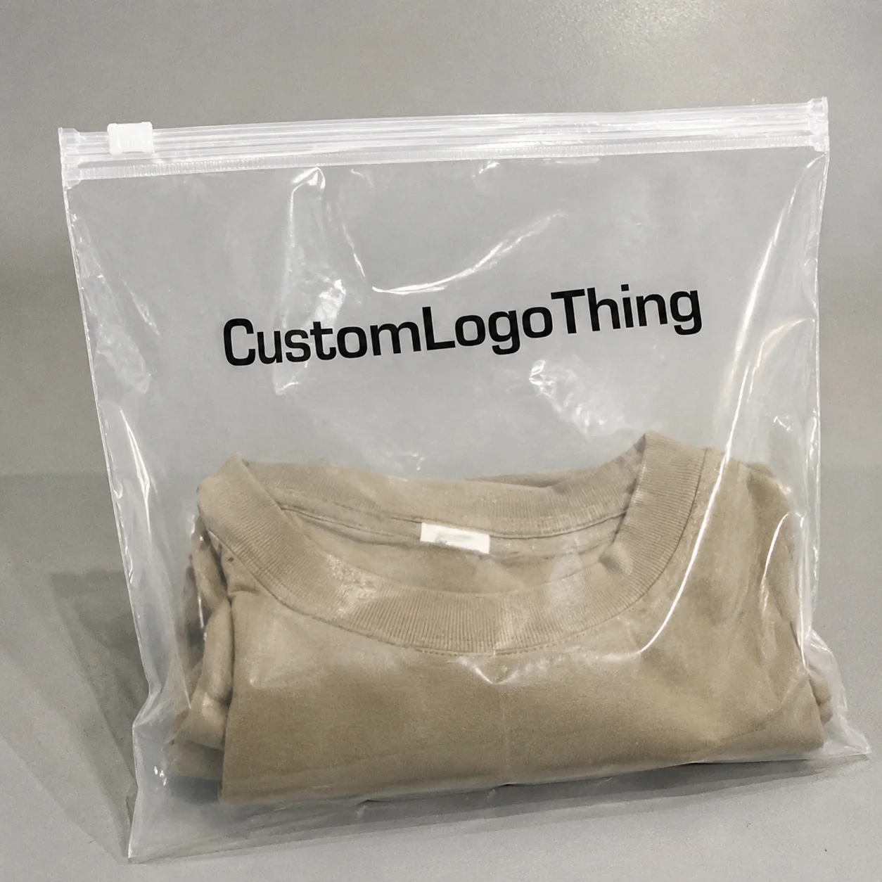
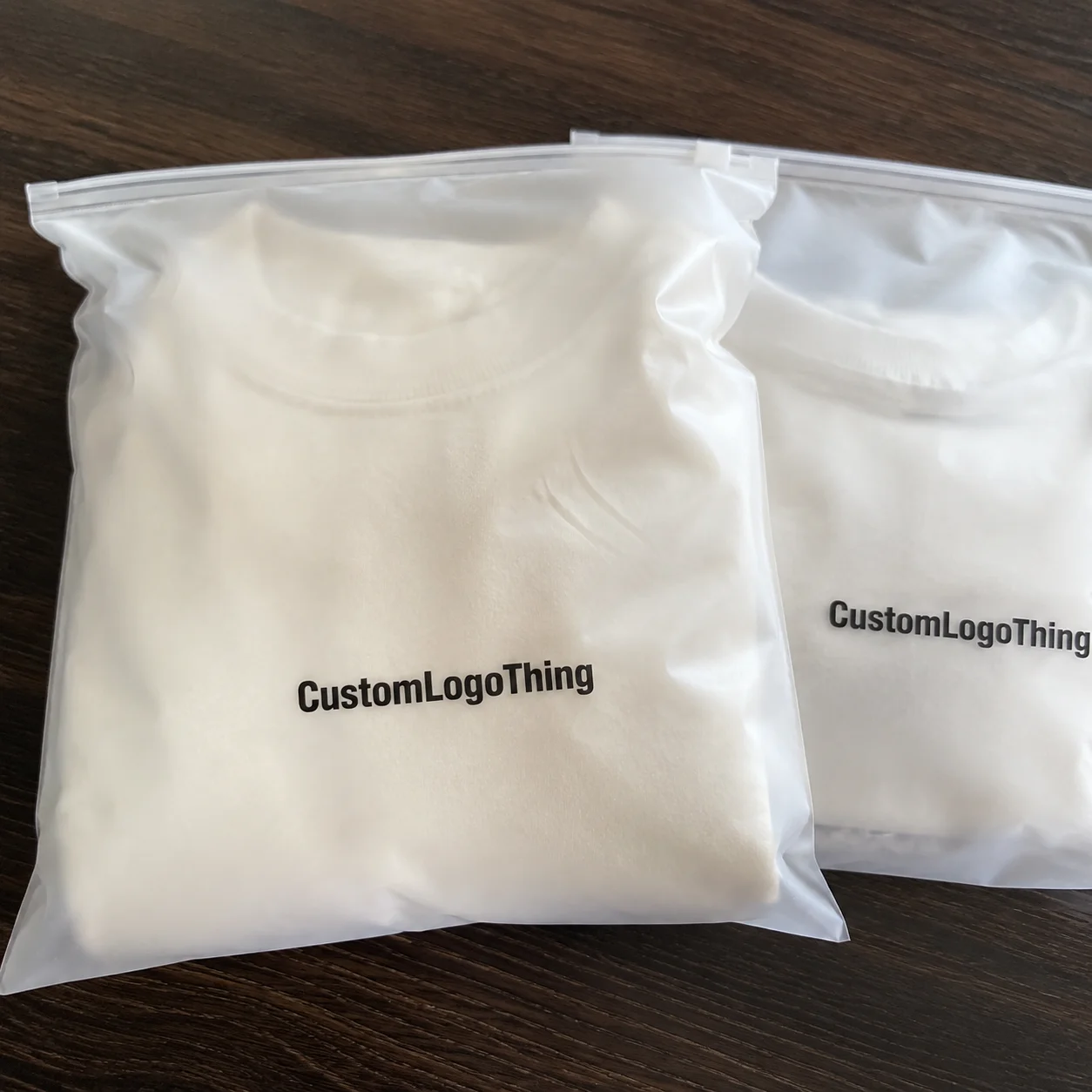
Retail launch frosted zipper plastic bags logo placement guide
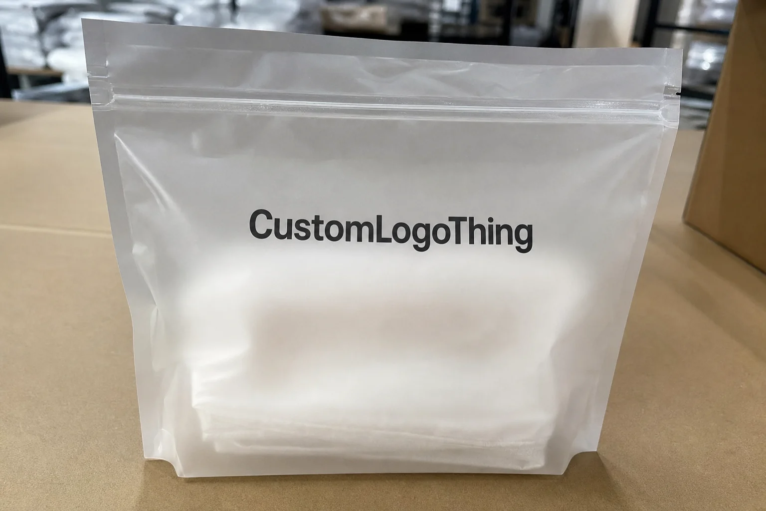
The retail launch Frosted Zipper Plastic Bags logo placement guide is really a guide to readability. A logo has to survive frosted film, store lighting, shelf distance, and the way a filled pouch changes shape. What looks correct on a flat proof can lose clarity once the package is made and merchandised.
The first decision is not the artwork file. It is where the brand mark should sit on a pouch that will be handled, filled, sealed, and faced by retail staff. On frosted film, the material softens edges and diffuses light. If the logo is too low, it gets lost behind product fill or a shelf lip. If it sits too high, it competes with the zipper and looks cramped.
A practical placement strategy starts with three questions: how high is the zipper, how full will the bag be, and what needs to be seen first? If the contents are part of the selling story, the front panel needs more breathing room. If the product itself is visually quiet, the logo may need more weight. The right answer is usually cleaner placement, not just bigger art.
The best pouch design does not ask for attention twice. It earns it once, then stays readable as the product moves through the store.
How frosted film changes logo visibility and contrast
Frosted film behaves differently from white or clear plastic. It scatters light, which softens the look of printed art and can weaken fine details. Thin type, narrow icons, hairline rules, and low-contrast gradients are the first elements to suffer. A mark that feels balanced in software can look muddy under LED or fluorescent retail lighting.
Ink choice matters more than many teams expect. White ink usually gives the strongest contrast on frosted film because it stays distinct against the translucent surface. Black can work well, but only if the strokes are bold enough to hold up. Metallic inks add shelf pop, though they can become noisy if the neighboring packaging is already reflective. Spot colors are useful for brand consistency, but they still need enough density to read clearly.
Product fill changes the result again. A logo that looks perfect on an empty flat sample may not read once the bag contains powder, granules, rolled goods, or a soft product that pushes outward against the panel. Even a few millimeters of bowing can affect readability. That is why a filled-bag view is more honest than a flat proof.
A simple field test is usually enough: place the filled pouch at arm's length and look at it for two seconds. If the brand mark does not read immediately, the contrast is too weak or the logo is too small. If the package only works in a studio render, it is not ready for retail.
Using logo size and hierarchy to set the front panel
Safe zones are not theory. They are what keep the pouch from looking stretched by its own structure. The zipper line, side seals, and bottom gusset all create boundaries that can distort artwork or pull attention away from the brand. Keep the logo clear of the zipper teeth and away from the seal edges so it does not feel accidental.
Hierarchy comes next. On a retail pouch, the brand mark should lead, but it cannot be the only thing on the front panel. The SKU name, flavor, scent, variant, size, or key claim still need room. The mistake is loading the panel with too much copy and then shrinking the logo to make everything fit. That creates a package with no clear reading order. Buyers usually want brand first, product second, proof points last.
Placement should also match the category. A specialty beauty pouch can sometimes carry a smaller logo because the shelf environment is calmer and the shopper is already expecting a premium signal. A food, convenience, or sample-size launch usually needs a stronger mark because the package competes with more visual noise. The logo has to survive distance, glare, and a crowded shelf set.
One quick check catches a lot of problems: hold the filled mockup at arm's length and give it two seconds. If the logo is not the first thing the eye understands, it is probably too low, too small, or too close to competing copy. If the SKU line fights the brand mark, the panel will feel busy. Busy packaging asks the shopper to work, and retail rarely rewards that.
Leave enough open area for the material to breathe. Frosted film already has a visual texture. If every inch of the panel is packed with text or ornament, the pouch loses the premium effect that frosted packaging can create in the first place. The most effective layouts are usually the ones that look restrained after production.
Logo placement process and production timeline
Logo placement should be checked in three stages: on the dieline, on the physical sample, and on the filled bag. Skipping any one of those steps is how good artwork becomes rework. A pouch is not a flat poster. Once it is sealed and filled, the panel changes shape and the art sits on a moving surface.
The approval path usually has three checkpoints. First is the digital proof, which catches the obvious layout errors. Second is the sample, which exposes contrast and registration issues that do not show up on screen. Third is the final sign-off after the bag has been checked in the same condition it will face in retail. On more complex jobs, a print test is worth the time, especially if the design uses metallic ink, white underprint, or thin detail on frosted film.
Timeline problems usually start when specs are still shifting. If the zipper height changes after artwork is approved, the logo may need to move. If the fill weight changes, the front panel may read differently. If the print method changes, the color balance can shift enough to require another proof. Once the spec is locked, leave it alone unless there is a real fit or compliance issue.
A realistic planning window for straightforward jobs is often 12 to 15 business days from proof approval to production-ready sign-off, not counting sample shipping or internal review delays. More complex builds need more time. A launch team can lose a week by treating packaging like a live design file instead of a manufacturing item.
For external references on packaging testing and process context, ISTA is useful for distribution testing, and PMMI provides broader packaging machinery and production context. Neither replaces a proper sample review, but both help anchor the decision in production behavior rather than presentation logic.
Cost, pricing, MOQ, and unit cost tradeoffs
Pricing for printed Frosted Zipper Bags moves with familiar variables: bag size, film thickness, zipper style, ink count, print coverage, and order quantity. A simple one-color logo on the front panel is usually easier to produce than a design with full-panel coverage, multiple colors, or layered effects. If the design needs white underprint plus a second color, the quote usually rises because the printer has more steps to control.
MOQ changes the math quickly. Small runs spread setup costs across fewer units, so the per-piece price rises. Larger runs lower the unit cost, but only if demand is real enough to justify the inventory. For a launch test, the cheapest quote is not always the right quote. A cleaner one-color mark may be more efficient than a full wrap. For a flagship shelf product, a stronger print spec can be worth the extra spend because the pouch becomes part of the brand's retail presence.
The tradeoff is usually between visibility and production complexity. A one-color upper-center logo gives you a low-friction build with fast proofing. A two-color or metallic treatment improves shelf pop, but it adds registration control and often more sample iteration. Full-panel artwork can look strong in the right category, yet it also increases the chances of crowding, inconsistent ink density, and revision cycles.
| Option | Visibility | Typical Use | Indicative Cost Impact |
|---|---|---|---|
| One-color logo, upper-center placement | High | Retail launch tests, limited SKUs | Lower setup and faster proofing |
| Two-color logo, top-front placement | Very high | Mainstream retail introductions | Moderate increase for extra ink and registration |
| Full-panel artwork | High but can feel busy | Premium brands, story-driven packaging | Higher print coverage and tighter quality control |
| Metallic accent plus white underprint | Strong under bright retail lighting | Beauty, gift, specialty food | Usually the most expensive of the four |
If you are managing the larger packaging system, FSC can matter for paper-based inserts, secondary cartons, or shippers even though it does not change the plastic pouch itself. That distinction matters because buyers often collapse the whole package stack into one line item when the sourcing decisions are actually different. The pouch, the carton, and the insert may all have separate constraints.
The most practical rule is this: if the launch is uncertain, spend where visibility is highest and avoid unnecessary print complexity. If the product is going to live on shelf for a while and the bag is acting like a small billboard, spend on the stronger print build. Better placement can protect the launch budget rather than inflate it.
Common placement mistakes that weaken retail shelf appeal
The most common mistake is placing the logo too low. Once the pouch is filled, the lower panel becomes unreliable real estate. It can disappear behind a shelf edge, a tray lip, or the product itself. Teams often miss this because they approve the art on a flat dieline and never revisit the filled version. On paper, the layout looks centered. On shelf, it looks buried.
Weak contrast is the second problem. Pale ink on frosted film can look refined in a render and nearly vanish in a store aisle. Thin sans serif type, narrow icons, and light stroke weights are all vulnerable. A package can lose shelf impact simply because the mark is too delicate for the substrate. The film is doing exactly what it should do, which is soften the surface. The logo has to be built for that reality.
Another common error is overloading the front panel with claims, seals, and badges. Once everything is emphasized, nothing is. The logo ends up competing with the product description, and the package starts to feel promotional instead of branded. Retail buyers usually prefer a cleaner first read. They can turn the pouch over if they want more detail.
Geometry also causes trouble. Artwork that looks balanced on a flat file can shift once the zipper closes, the pouch fills, and the side seals pull the panel inward. That is not necessarily a production defect. Often it is a layout that never respected the physical shape of the bag.
Finally, there is the false confidence of the studio mockup. A glossy render hides a lot. It hides how the bag bows, how the ink reflects, and how the product inside changes the front panel. A plain sample under store-like lighting will tell you more than a polished presentation image ever will.
Next steps before you approve artwork and place the order
Start with a specification checklist. Confirm the bag dimensions, zipper type, film finish, fill weight, print method, and shelf orientation. Then ask for the proof on the correct material, not a generic mockup. A translucent pouch with a pale product inside behaves differently from one filled with a dark product or a dense powder.
Review the bag in three views: front-on shelf view, hand-held view, and stacked carton or case view. The front-on view shows whether the logo reads from a distance. The hand-held view shows whether the pouch feels intentional in the buyer's hand. The stacked view matters because retail display rarely starts with a single untouched pouch. Cases get opened. Bags get nested.
Lock the spec before final approval. A revised zipper, altered fill level, or changed print method can pull the artwork back into review. Every late change increases the chance that the logo lands in the wrong place or the contrast is no longer strong enough for the finished material.
There is no benefit in overworking the final file once the layout already holds up in the filled sample. The better move is to stop adjusting it and let production do its job. The packages that look deliberate on shelf usually got there because someone respected the constraints early.
Where should the logo go on retail launch frosted zipper plastic bags?
Place it in the upper or upper-center front panel whenever the structure allows it. That keeps the mark visible above product fill and above most shelf edges. Leave enough clearance from the zipper and side seals so the logo does not distort during sealing, packing, or display. The filled bag should still read cleanly, not just the empty proof.
How big should the logo be on frosted zipper bags for a retail launch?
Large enough to read from arm's length, but not so large that it crowds the product name or the transparent area. The filled-bag mockup is the better sizing tool because an empty dieline often makes the logo look more visible than it will be in store. If the mark only works in the artwork file, it is probably undersized for shelf use.
Does white ink work best on frosted zipper plastic bags?
White ink often performs well because it gives strong contrast against frosted film and keeps the logo crisp. The best choice still depends on the brand palette, the product color inside the bag, and the lighting on the shelf. Bright aisles, dark aisles, and reflective neighboring packaging can all change the result.
What affects pricing for logo placement on frosted zipper bags?
Artwork complexity, number of colors, print coverage, bag size, zipper style, and order quantity all affect the quote. A clean one-color placement is usually more efficient than a full-panel design with gradients or multiple print layers. Lower MOQ levels raise the unit cost because setup gets spread across fewer pieces.
How long does the logo placement process take for a retail launch?
For straightforward runs, 12 to 15 business days from proof approval to production-ready sign-off is a practical planning window, not counting sample shipping or internal review delays. Complex artwork, specialty inks, or moving specifications can extend that timeline. Build extra time into the calendar so the final proof can be checked on the correct material and in the filled state.
The packages that win retail attention are usually not the most decorated ones. They are the ones with the clearest hierarchy, the strongest contrast, and the least confusion about where the logo belongs. Treat the front panel like a decision surface, not a blank canvas, and the retail launch frosted zipper plastic Bags Logo Placement guide becomes a production tool instead of a style argument.